A new website showcases the results of Letterform Archive’s yearlong program in type design.
The Class of 2021 was the first Type West cohort to meet entirely online. The program brought together a group of 19 students from across the globe who logged into sessions multiple times a week. It was not only a space for learning the tools and techniques necessary to make fonts, but an international gathering place of shared interests and goals.
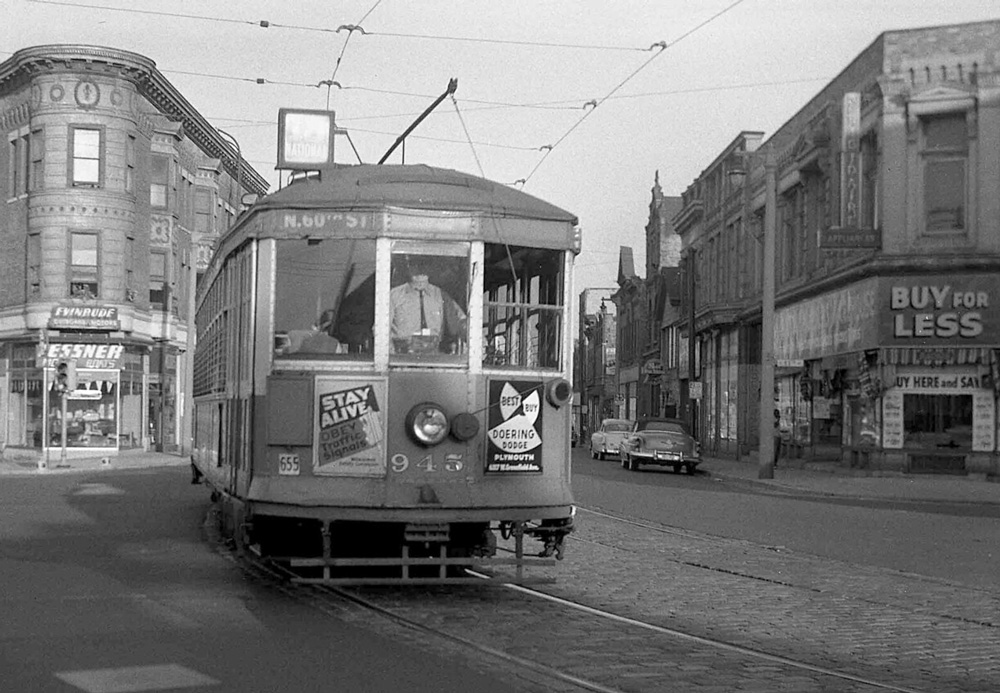
In the 1930s–60s, Milwaukee Electric Railway & Light Company offered trolley and bus riders a weekly burst of color and hand lettering. About 300 of these tickets are now in our collection.
A Milwaukee streetcar, 1955. Photo courtesy Barry Lennon.
Milwaukee claims to be the inventor of the weekly transit pass, and for several decades they could also boast to have some of the most beautiful ones. On August 18, 1919, Milwaukee Electric Railway & Light Company (TMER&L) launched a weekly pass experiment for its extensive streetcar service. It was an overnight success and went into full operation in 1921. The design of the passes was utilitarian and banal until the 1930s when they brought the production in-house and added color, public-service announcements, information about local events, and illustrated depictions of civic history.
For design and letterform lovers, the passes issued between 1937 and 1972 stand out as particularly colorful and cohesive. They follow a fairly consistent design program of large hand-drawn numbers for the week of the year, lettering for the valid range of dates, and small-print information set in type, all functionally decorated with jaunty banners, frames, and rules. Thanks in part to a donation from type designer Tobias Frere-Jones, the Archive now holds about 300 tickets between 1932 and 1969.
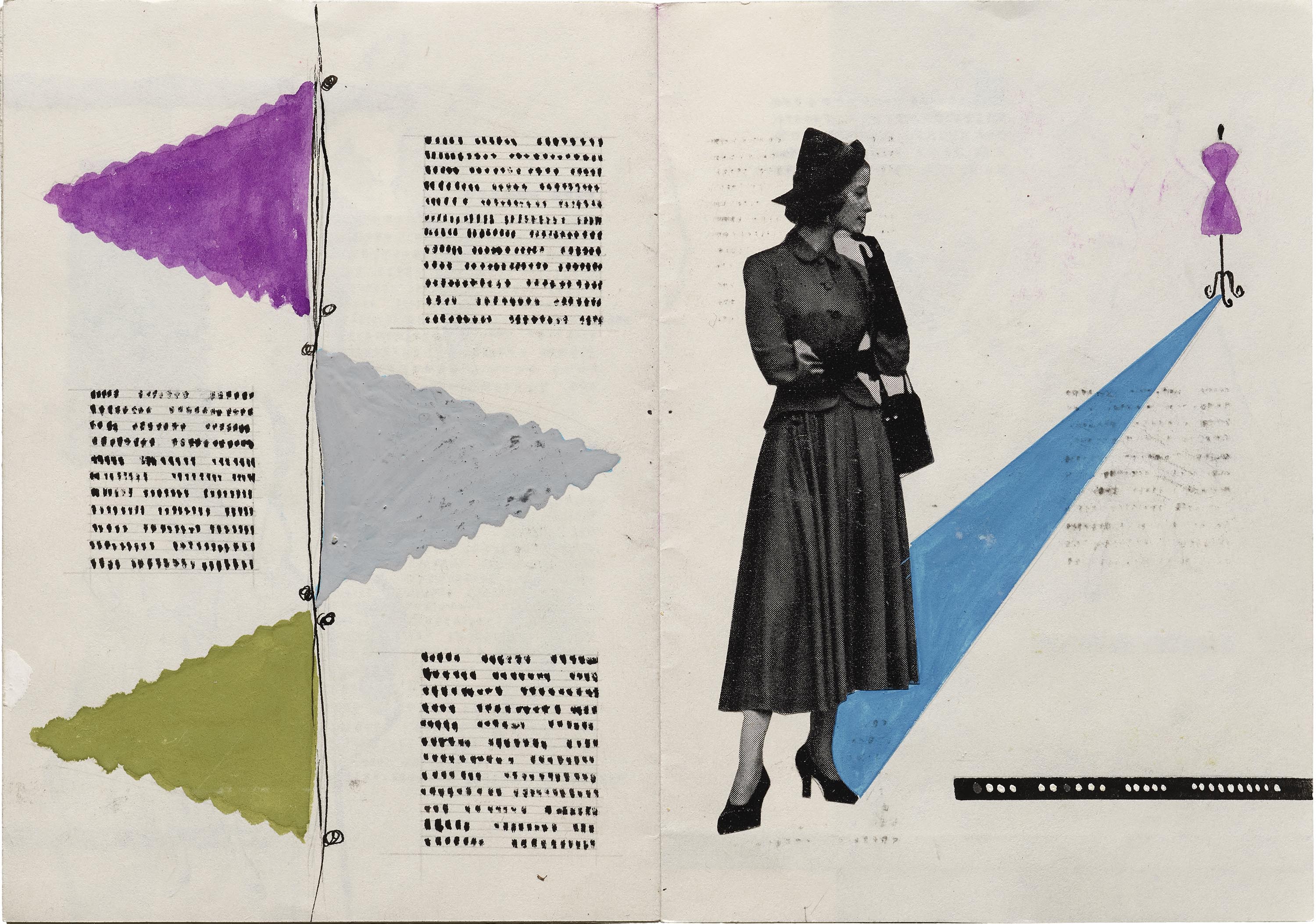
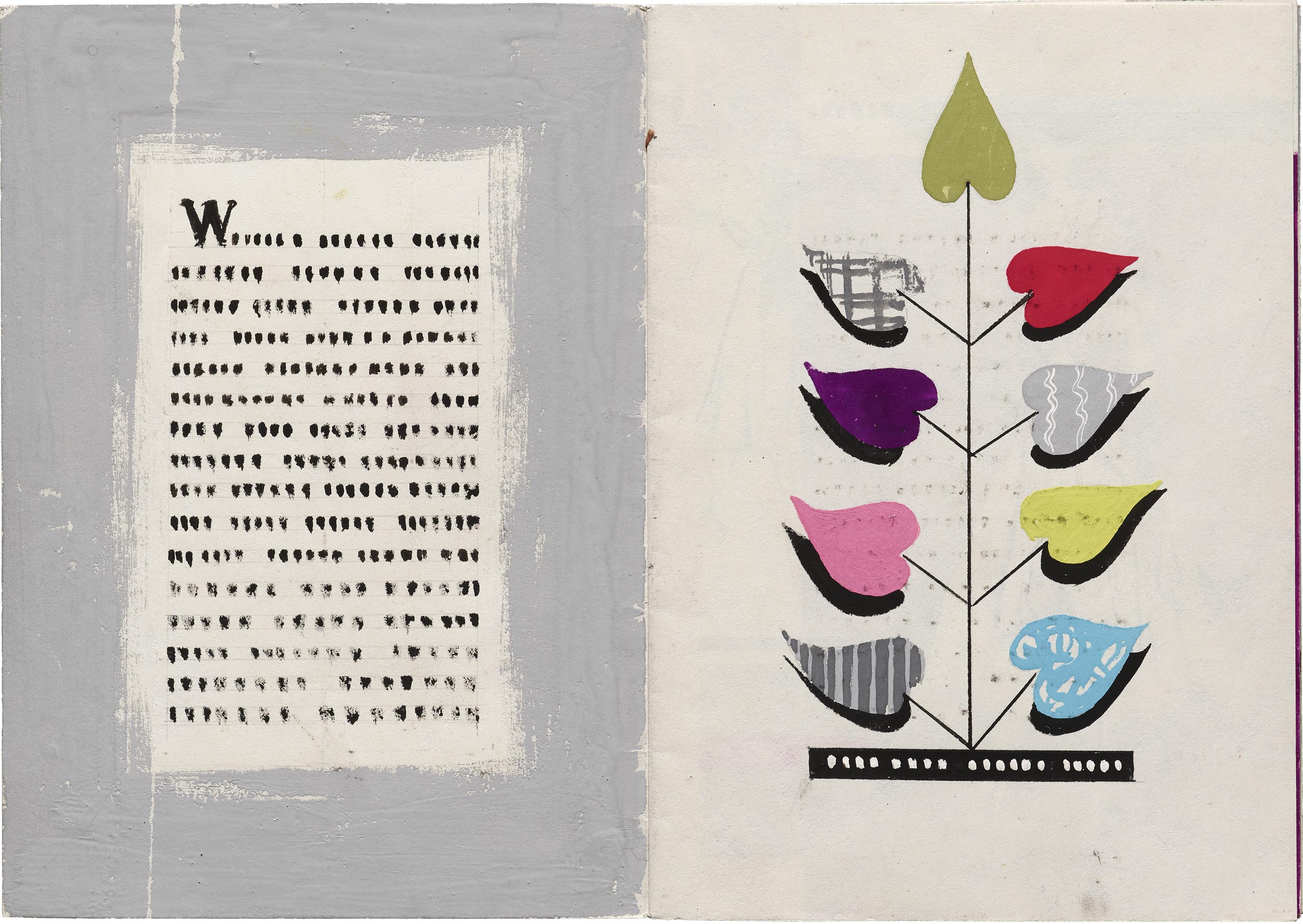
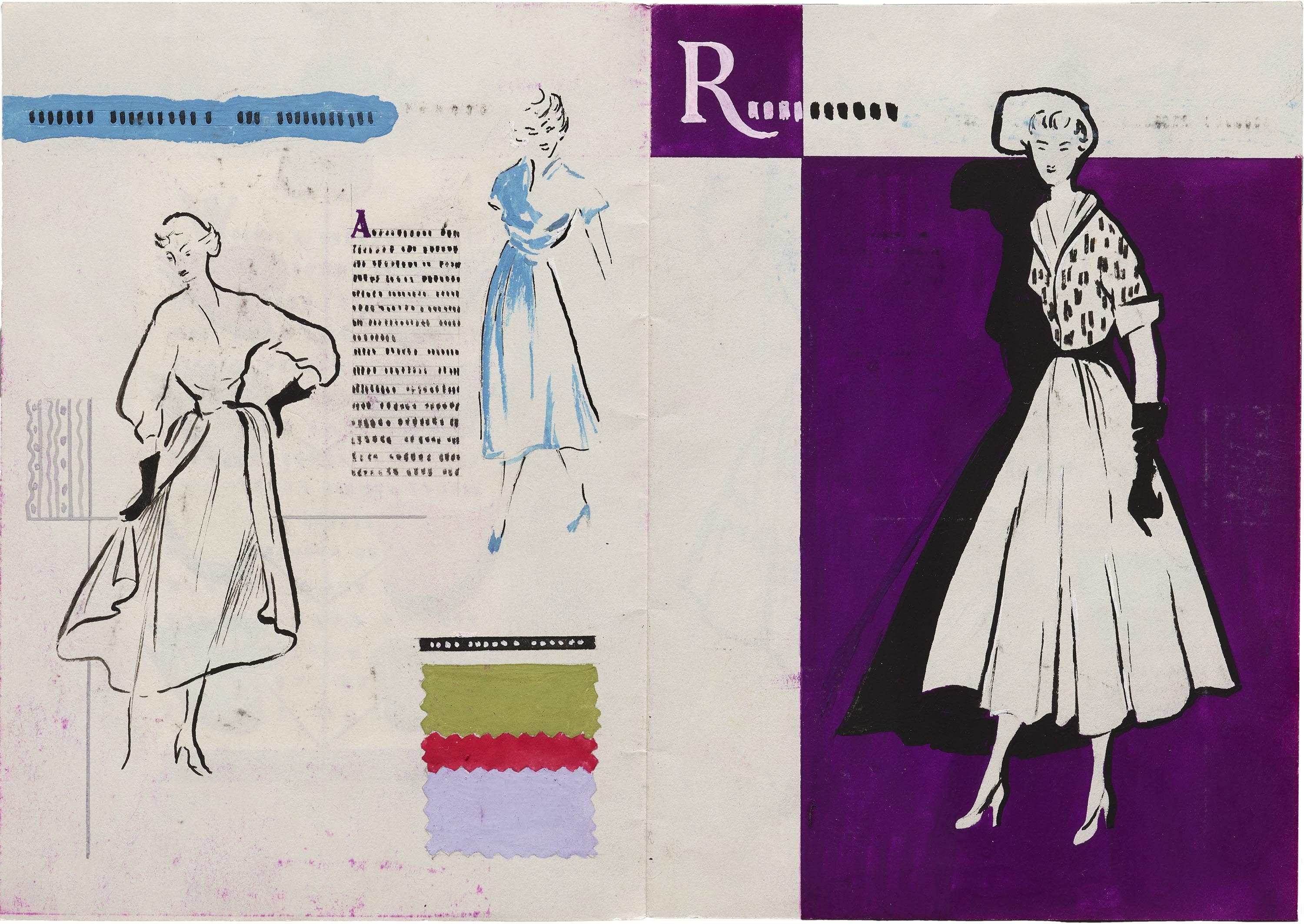
Original artwork from an Austrian student’s portfolio reveals the process of mid-century fashion advertising and illustration.
Selected spreads from a fashion catalog dummy created by Ludmila Kavalla as a student. (All images on this page are displayed at high resolution. Pinch or zoom to enlarge.)
Ludmila Hellmann-Kavalla, also known as Mila Kavalla, was an Austrian illustrator and graphic designer. Born in Baden, Lower Austria in 1924, she graduated from Vienna Academy of Applied Arts in 1950 where she trained under E. J. Wimmer-Wisgrill in the master class for fashion. While at the training academy, she met her future husband and business partner Roman Hellmann with whom she set up the “Hellmann-Kavalla” design office where she worked until about 1955.
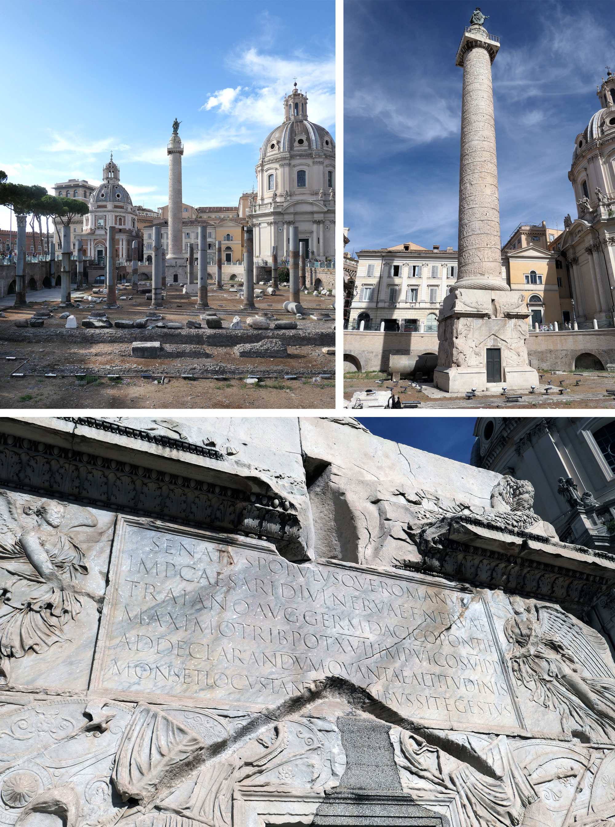
A 1970 rubbing by Father Edward Catich and a 2021 recutting by Paul Herrera bring the classical Roman capitals to life at the Archive.
Trajan’s Forum and Column in Rome, Italy. Photos by Carl Rohrs, September 2017.
The letters found at the base of Trajan’s Column, a second-century celebration of the Roman emperor, are widely considered the archetype of Roman capitals. Their shapes and proportions have inspired calligraphy, lettering, and type design for centuries. While we can’t transport the 100-foot, 700-ton marble monument to San Francisco, two recently acquired works offer some of the most true-to-life representations of the inscription.
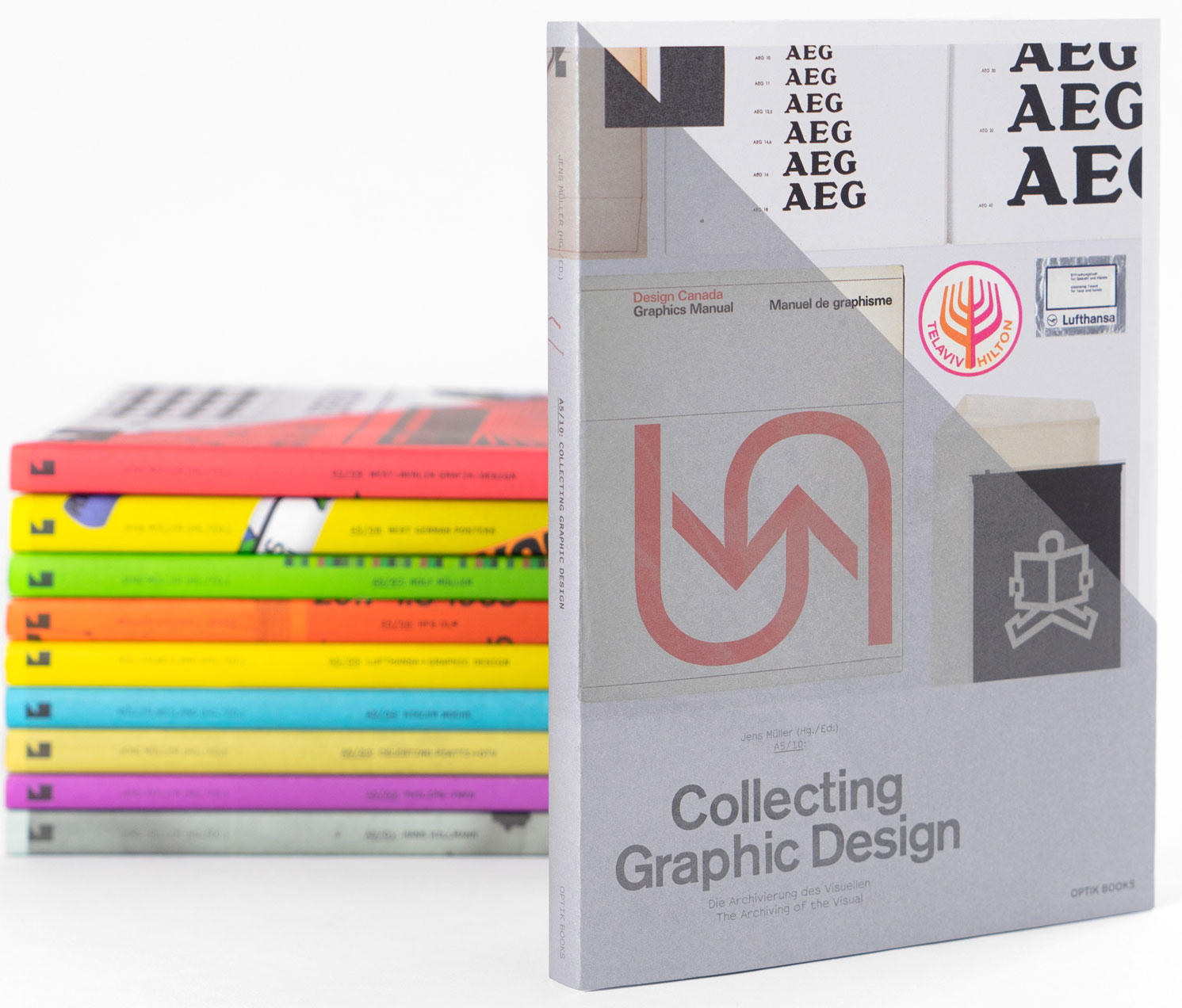
The Optik Books title highlights 10 collections around the world which specialize in a discipline that is traditionally overlooked by art and design institutions.
Archives are more than just warehouses; they are greenhouses for the nurturing of narratives. Out of archival seeds, mighty stories grow. — Steven Heller on Collecting Graphic Design
A5/10: Collecting Graphic Design — The Archiving of the Visual, Optik Books, 2021
Based in Düsseldorf, Jens Müller has authored, edited, and published dozens of books on design. The A5 series — under his own Optik Books imprint — offers affordable and beautifully documented snapshots of design history at a digestible length and (you guessed it) A5 size. The 10th volume in this series, Collecting Graphic Design, calls attention to the few institutions and private collectors who concentrate on preserving and sharing objects of graphic design, such as posters, logos, book covers, design manuals, and ephemera.
Watch 12 presentations that showcased diverse approaches to letterform history and creation across the globe.
The letterform lecture series continued to be held virtually this past year. It has become an opportunity to practice the radical accessibility Letterform Archive strives for while also fortifying the virtual Type West program. While we look forward to a future where we can also have free and open sessions at the San Francisco Public Library, the nature of these online sessions allowed us to host speakers from across the country as well as other parts of the world. Thanks to support from Adobe Fonts, recordings of these lectures are available to all within a few weeks after each event. We bring to you a roundup of all the talks the Archive hosted in the past year and quick access to the ones you might have missed or wish to revisit.
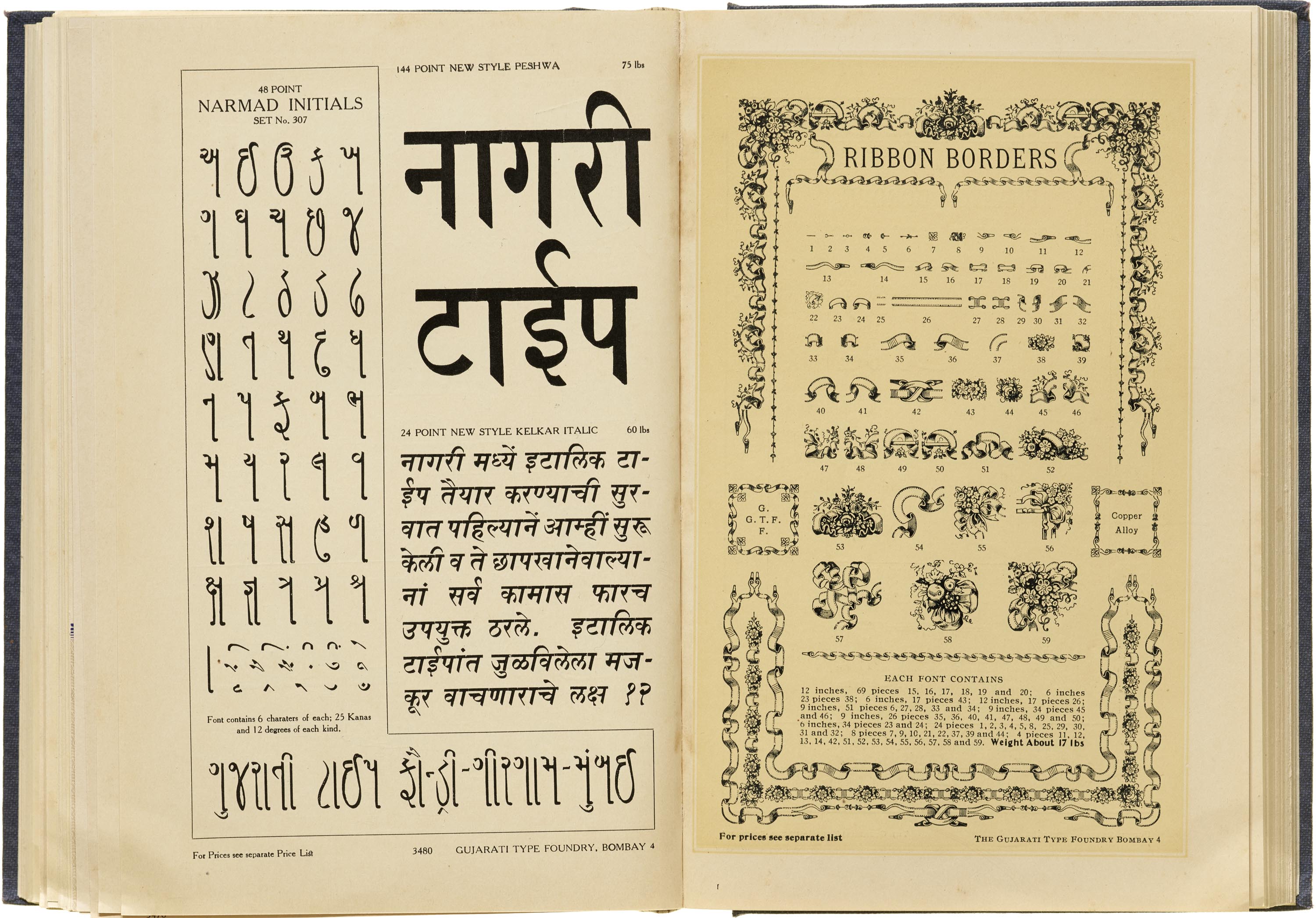
Reporting from India, Tanya George offers a glimpse into one of the country’s most extensive catalogs of locally produced metal type.
Based in Bombay for most of the twentieth century, the Gujarati Type Foundry was one of India’s leading metal type manufacturers. Tanya George, our new regular correspondent, makes her Letterform Archive News debut with an in-depth look at the Indian scripts shown in the company’s catalog, a highlight of the Tholenaar Collection.
The Book of Typefaces and Printers’ Auxiliaries, Gujarati Type Foundry, ca. 1937, showcasing display weights for Gujarati and Devanagari in upright styles as well as a slanted italic style. (All images are displayed at high resolution. Pinch or zoom to enlarge.)

.png)