

News
In Conversation with the Authors of Super-Veloz
With the launch of a new book preview site, we asked Alex Trochut and Andreu Balius for a crash course on the modular type marvel from Spain.
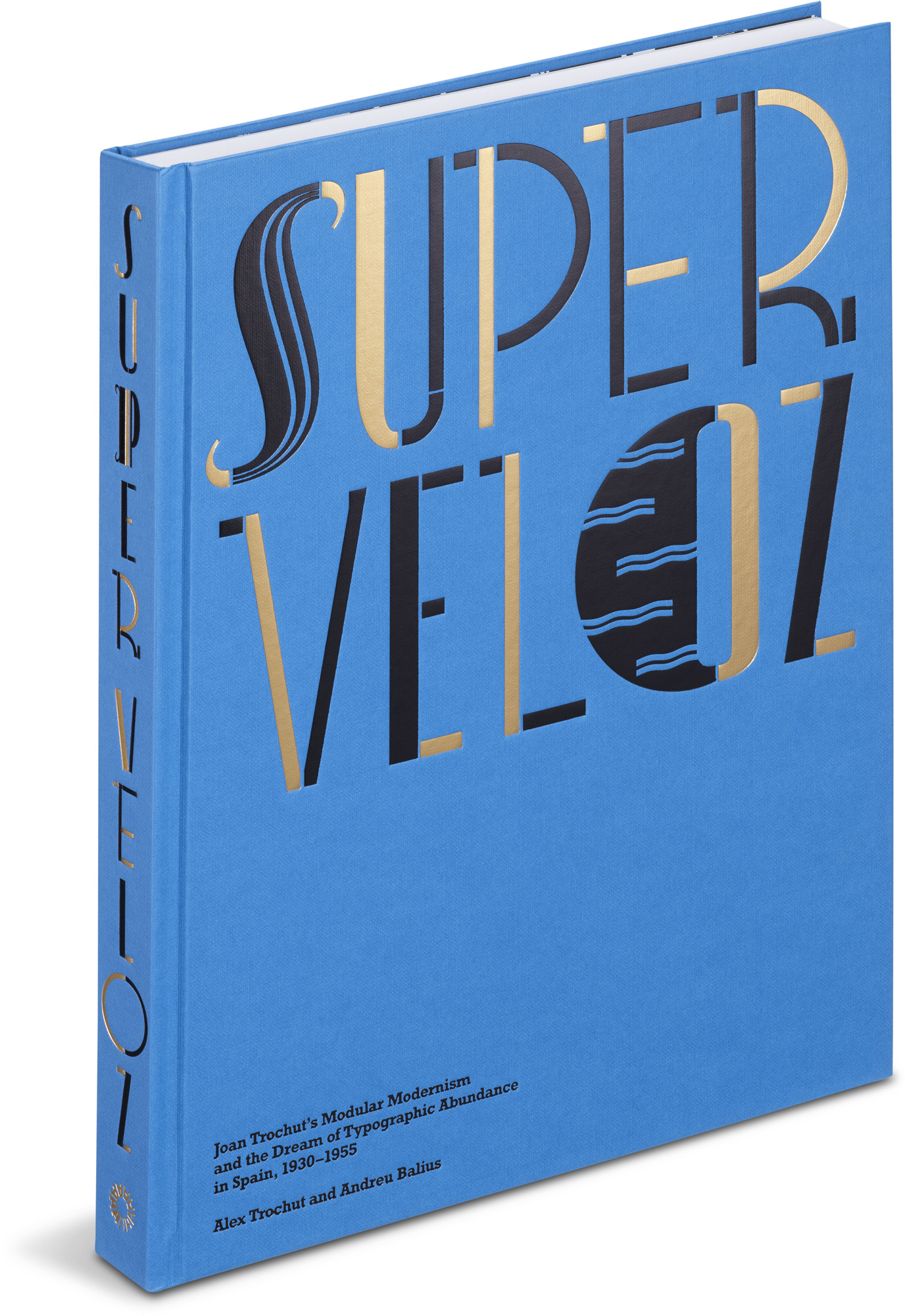
by Alex Trochut and Andreu Balius
Hardcover, 9½ × 12½ inches, 256 pages
Super-Veloz: Joan Trochut’s Modular Modernism and the Dream of Typographic Abundance in Spain, 1930–1955 tells of an artist’s quest to transform design with an elaborate system of shapes cast in metal. Taking readers into a wonderland of original prints and archival materials, authors Alex Trochut and Andreu Balius reconstruct this Spanish design story while exploring its rich personal and historical contexts.
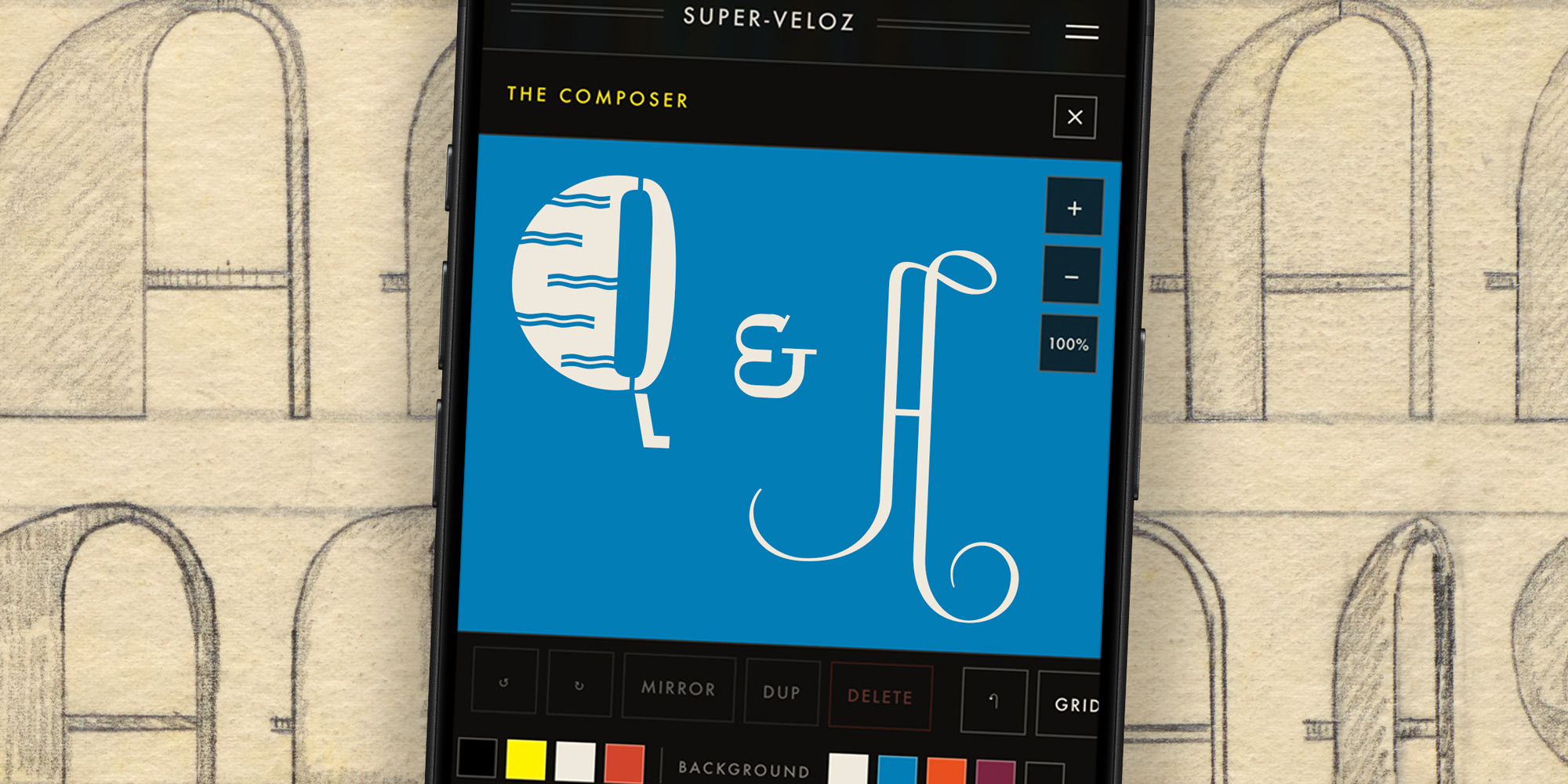
Today we’re excited to announce super-veloz.com, a book preview site featuring audio from Super-Veloz creator Joan Trochut and an online composer that brings Super-Veloz to your browser. Pick up pieces, combine, dream, and share — no heavy letterpress equipment required!
In celebration of the book and its site, we bring you this interview with the authors of Super-Veloz. Accomplished designers and devoted storytellers, Trochut and Balius discuss the magic behind the Super-Veloz system, as well as the value of design history for contemporary practice.
For those who may not know: What is Super-Veloz?
Andreu Balius: Super-Veloz is a modular — and playful — type system where letters are built up out of a large variety of modules. Released in the 1940s, it is, simply, Spain’s most significant contribution to modern type design.
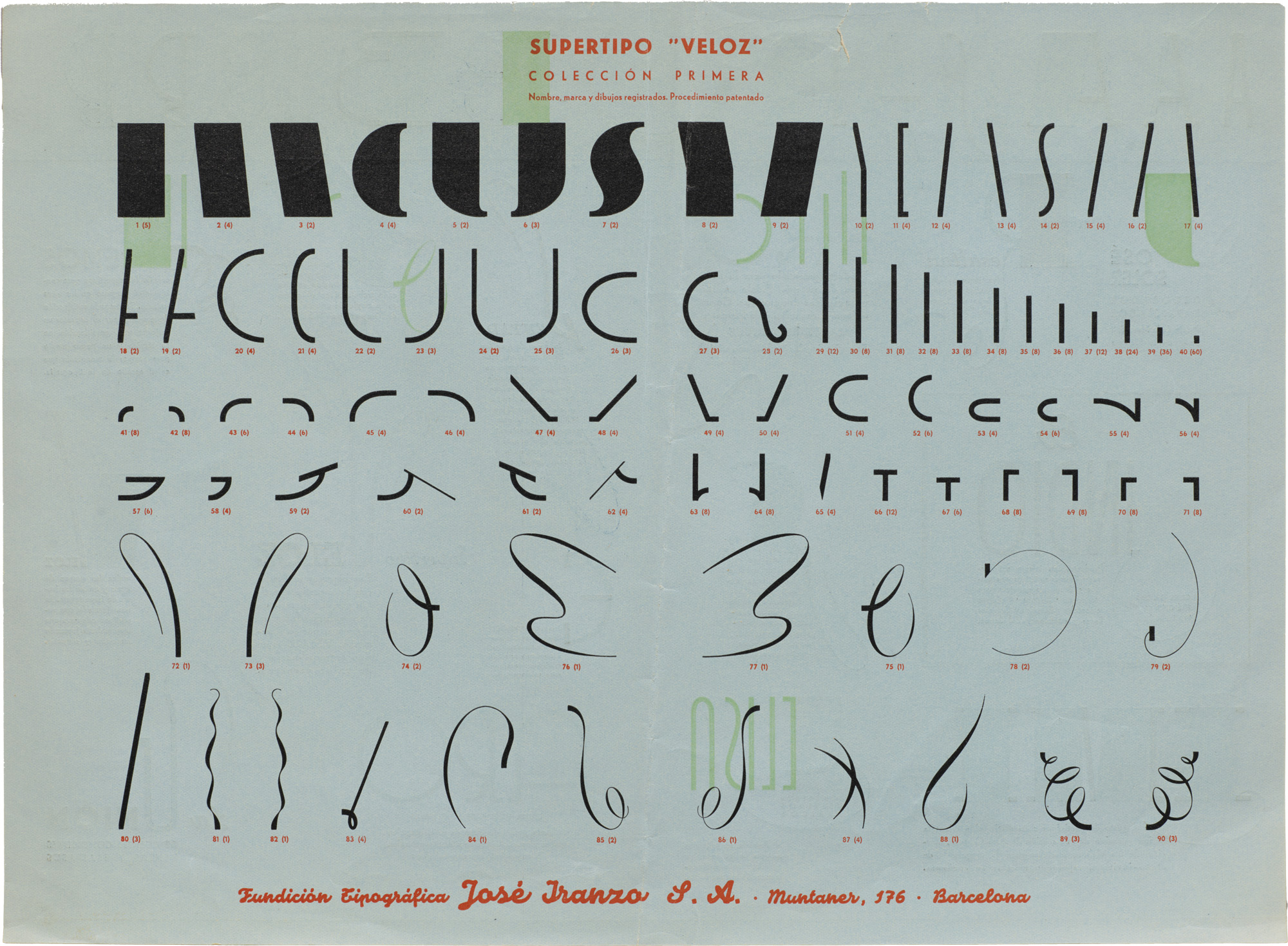
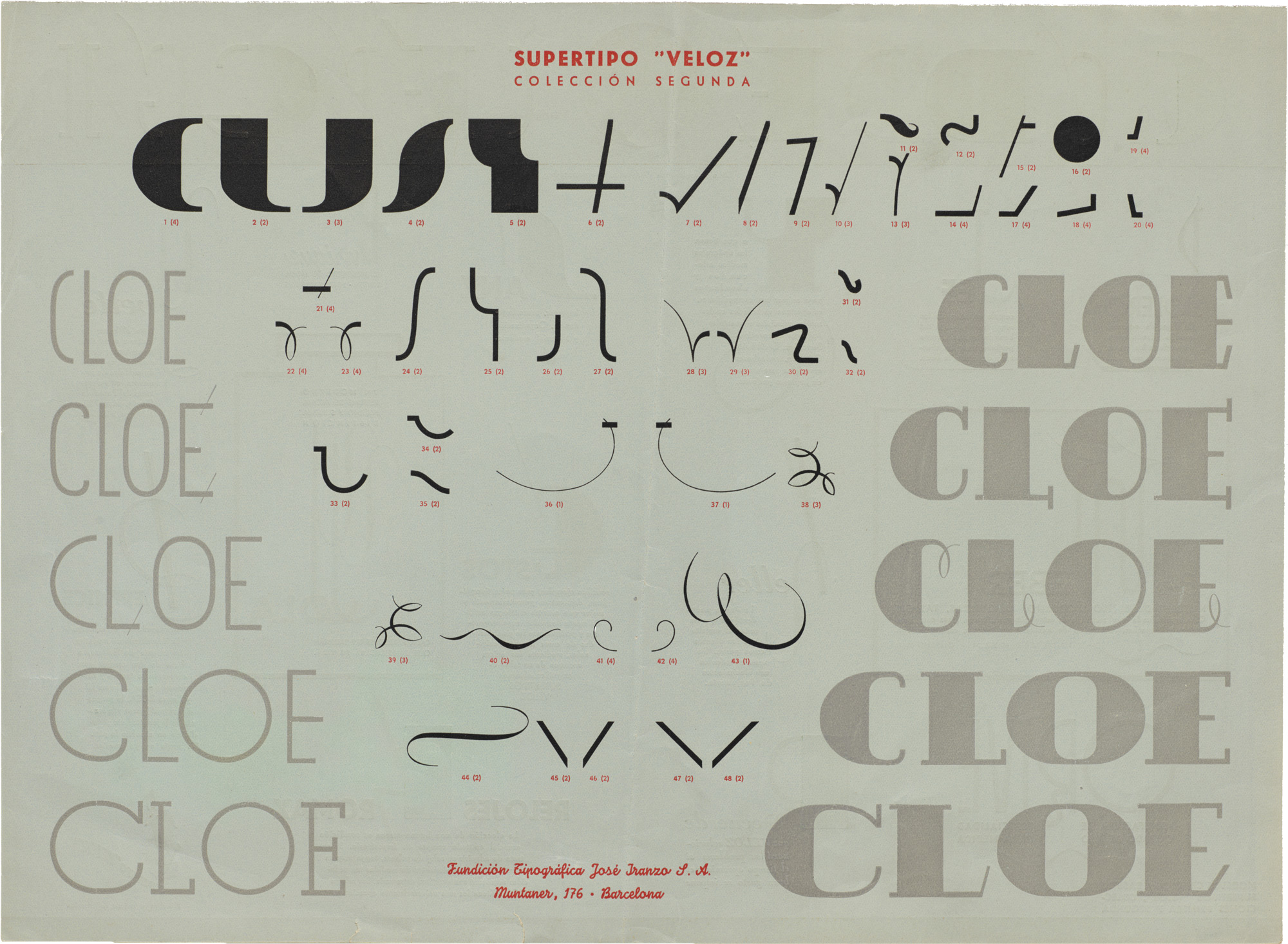
Alex Trochut: One way to understand Super-Veloz is to think of it as the LEGOs of typography: a finite set of modular pieces for constructing letters and images. Where conventional type yields relatively uniform results once typeset, Super-Veloz allowed every printer and designer to generate original work from the same set of pieces, encouraging them to participate directly in the design process and make the output genuinely their own.
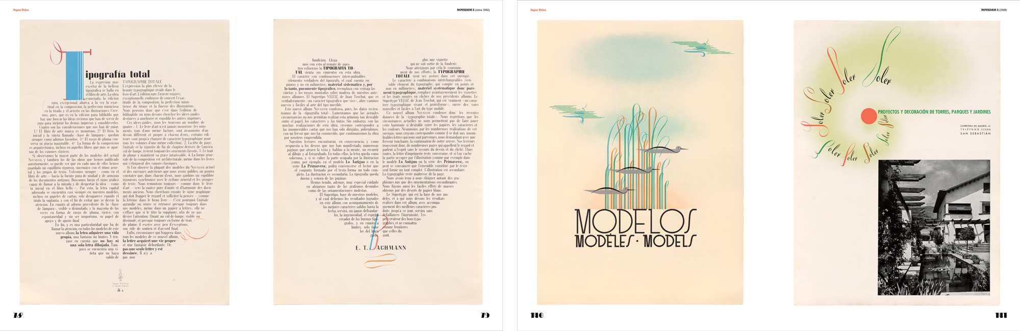
The images of original Super-Veloz specimens below are hi-fi captures. Click an image to enter fullscreen view, then click or pinch to enlarge.
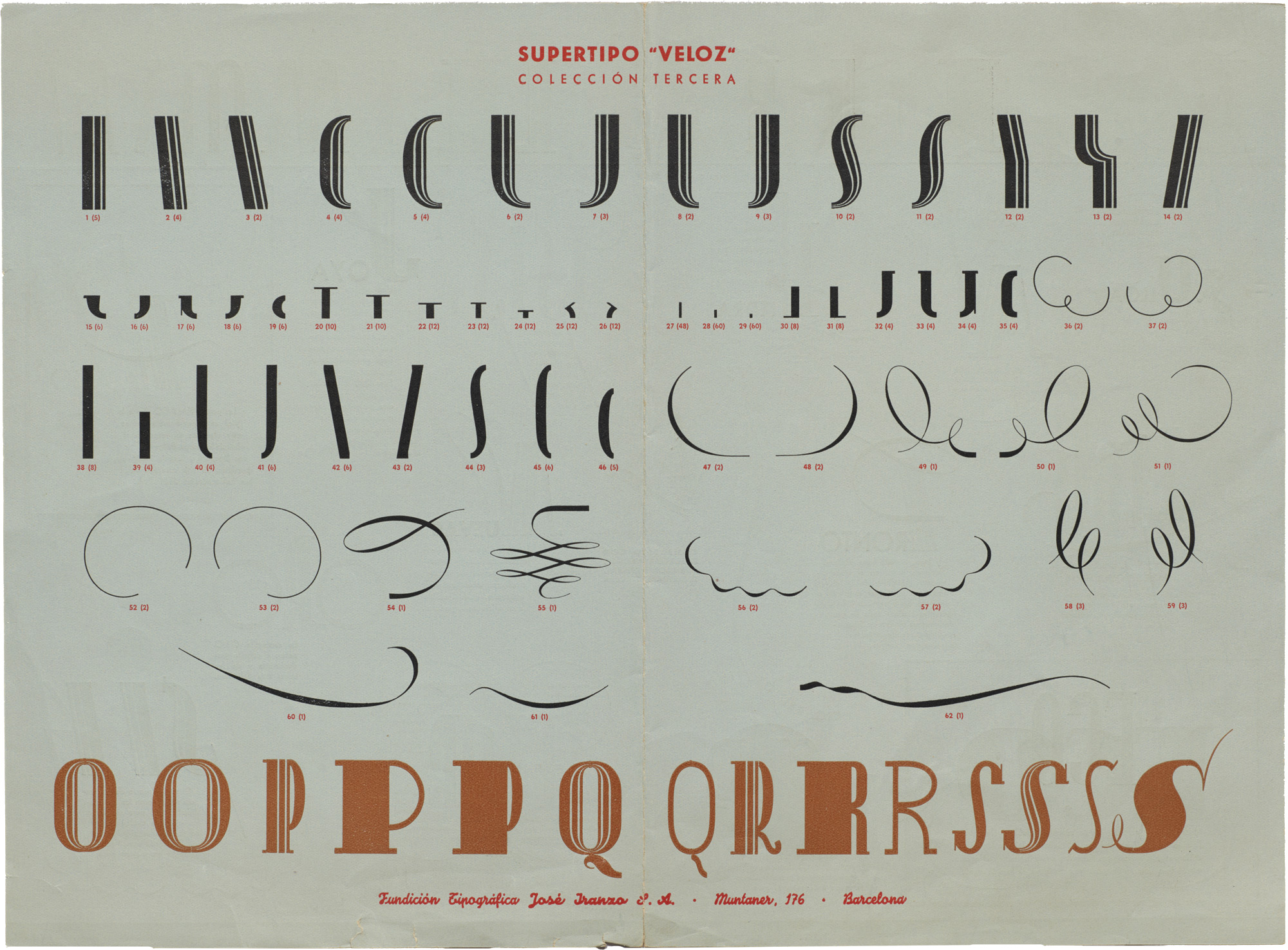
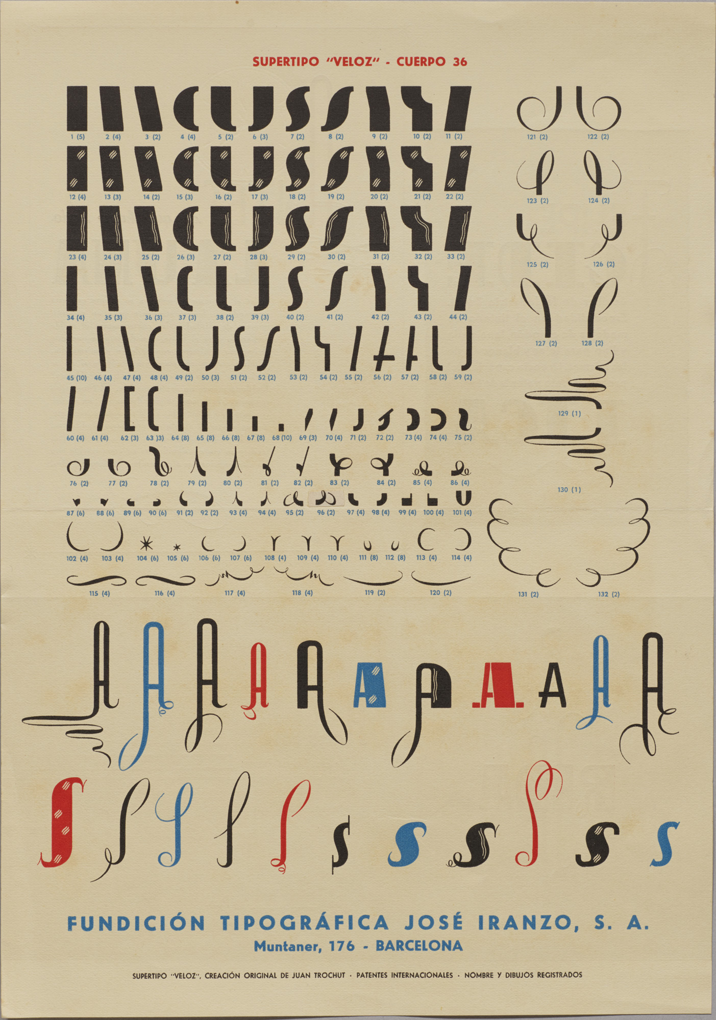
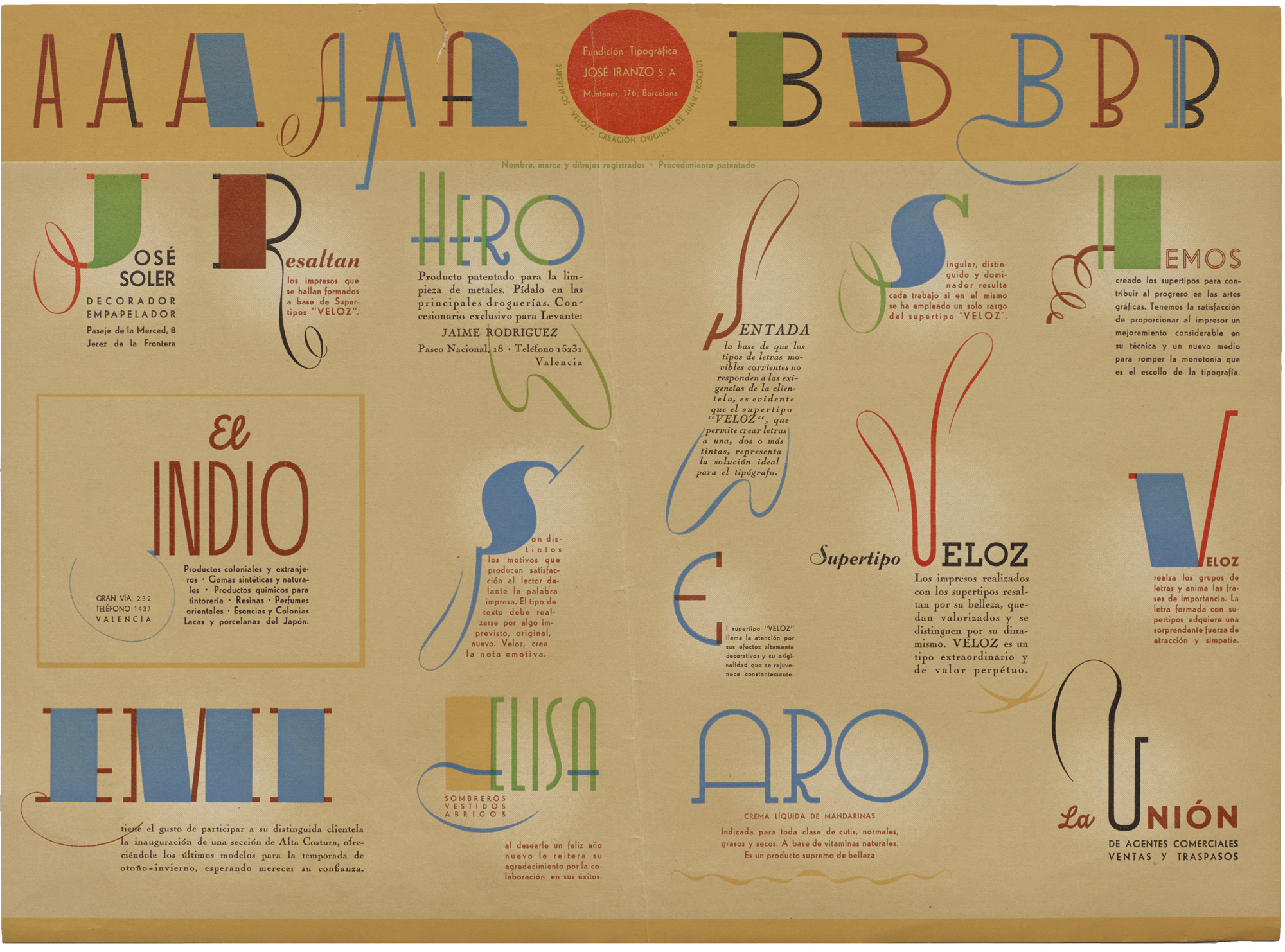
There’s such unique style and personality to designs made with Super-Veloz. Is there a key to its charm?
AT: Its distinctiveness lies partly in the unity of its formal vocabulary. Each module belongs to a single family of forms and can function equally as a typographic element or as figurative representation. This allows users to achieve a kind of absolute harmony, in which every composition resolves as a coherent whole.
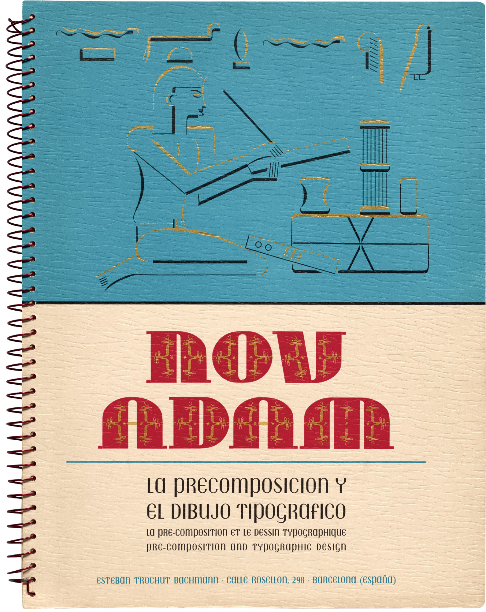
AB: When you look at how Super-Veloz was used in the NOVADAM design albums that Joan Trochut produced with his father, you see how the type encouraged an innovative and experimental approach. These are volumes of commercial samples, yet they are closely connected with the avant-garde. And the type system itself takes cues from the era’s modernist ideas. There’s an overall sense of freedom in the work, reflecting the fact that Super-Veloz allowed typographers (who were neither type designers nor lettering artists) to create their own letterforms and offer their clients something original.
Alex, your grandfather, Joan Trochut, designed the Super-Veloz system. On the book’s preview site, you share recently rediscovered audio in which Joan talks about his life and career. After months of research and writing about his story, what was it like for you to hear this recording?
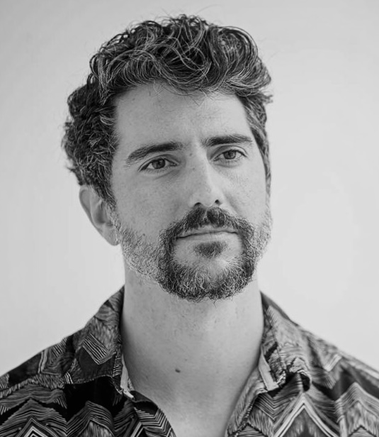
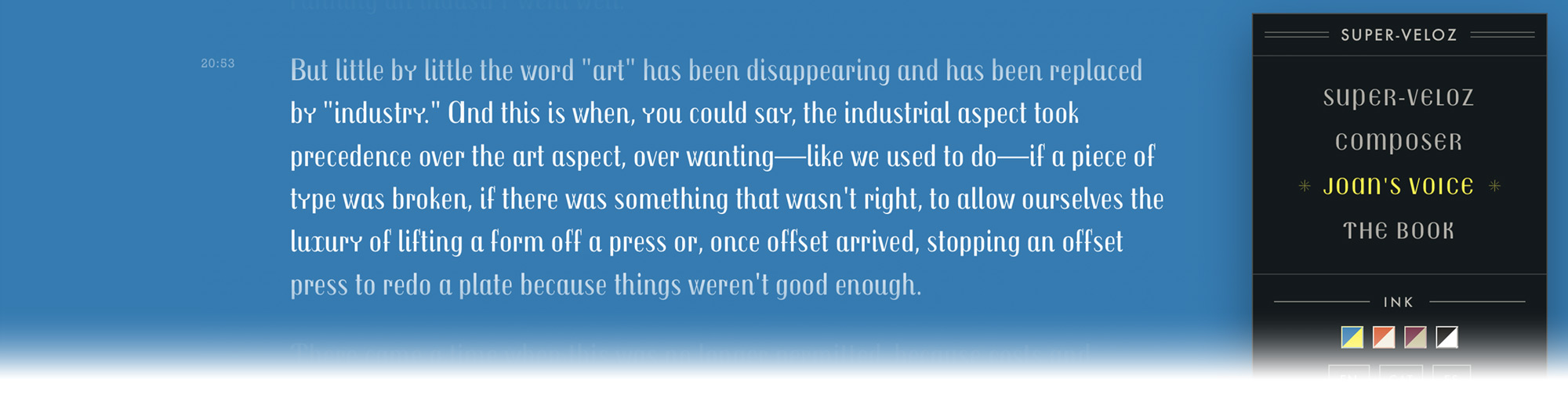
AT: Yes, my father Josep Maria asked his dad, Joan, to record a short autobiographical description of his life. The recording was made in 1979, just one year before Joan’s passing, and took place while he was painting in his Collserola studio.
For me, it was an emotional experience, because I never met my grandfather and had never heard his voice.
What struck me most was the familiarity of his struggles. He talks about the technological transitions he confronted, and the persistent tension between industrial optimization and craft. His words brought to mind Marshall McLuhan’s idea that the tools available to a creator shape the creator one becomes; each technological shift transforms the artists of its period and allows new ones to emerge. In one sense, it’s easy to relate to Joan’s desire to open a space for artistry as newer print methods were reshaping the field.
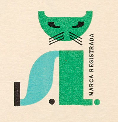
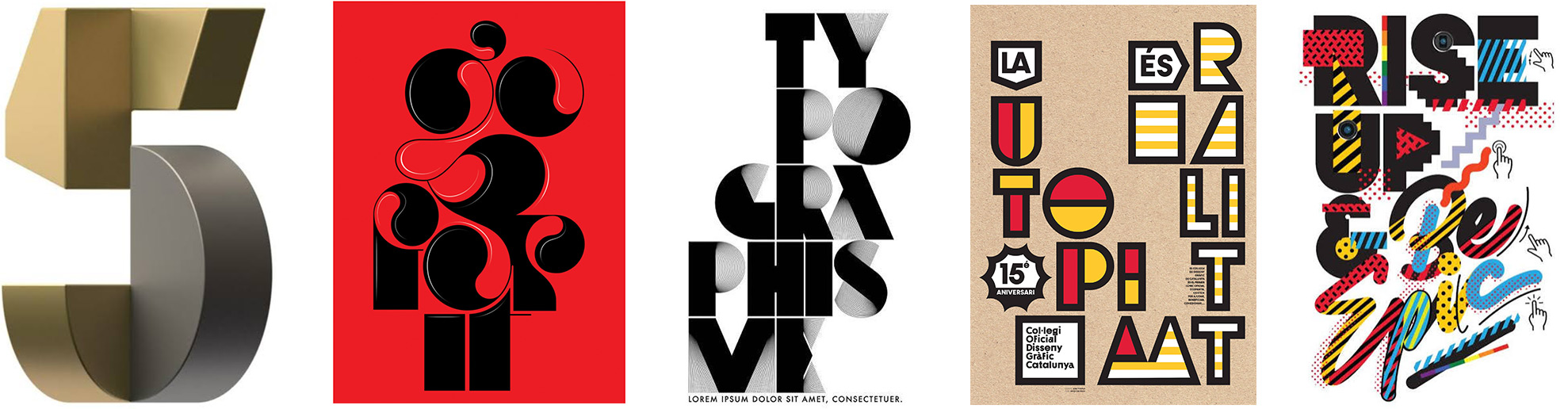
Your own lettering and illustration for brands like Nike and musical acts such as the Rolling Stones and Katy Perry has a certain kinship with Joan’s expressive uses of Super-Veloz. What ideas about design or creativity do you think you share?
AT: Probably the biggest lesson I learned from my grandfather is that type and illustration can share the same family of shapes. He found a hybrid between the two: He gave letters a very rich, illustrative character, and he reduced illustration to its simplest graphic expression.
Super-Veloz was his means of bringing illustration and type together in a way that works on both practical and aesthetic levels. Joan suggested that when a letter is decomposed into its anatomy, its constituent parts prove to be the essential shapes of everything that can be drawn. That idea is something I tend to gravitate to a lot.
Andreu, you started designing type in the 1980s, when computers were creating new possibilities for the craft. Were you aware of Super-Veloz then? How was it viewed at the time?
Photo © Lefteris Heretakis
AB: I first became aware of Super-Veloz when I was a student. Once, a professor brought some type specimens to the classroom, and these included some of the NOVADAM albums he had in his print shop. I was so amazed by those albums, and I soon started to look for more information to fulfill my curiosity.
At that time, not many people knew about Super-Veloz. Only printers who had used it in their letterpress machines were still aware of it. In the ’80s, offset printing was the mainstream; letterpress machines and metal type were thrown away or sold as scrap metal. As a result, very little has survived.
In the early 2000s, the two of you collaborated on a digital revival of Super-Veloz. What inspired you to take on that project?
AB: At a certain point, it was important — and necessary — to pay homage to our type design history. I was disappointed to read books on design history (most of them in English) that were too Euro-Anglocentric and said little or nothing about countries such as Spain. I wanted to digitize Super-Veloz as a way to bring this amazing modular system into broader awareness and into the hands of digital designers.
AT: I remain grateful to Andreu for including me in that process. The revival was his initiative; I was a student at the time, and his guidance allowed me to understand the significance of my grandfather's work. Vectorizing and digitizing those designs was, for me, the most direct way of internalizing that legacy.

Andreu, your research has explored important figures and moments in the history of graphic design in Spain. What interests you most about Spain’s design legacy? How does Super-Veloz fit into it?
AB: From my point of view, you cannot face the future without taking a good look at the past. Design history is a source of inspiration for me, but not in a nostalgic way. It has shaped the way I think about type design.
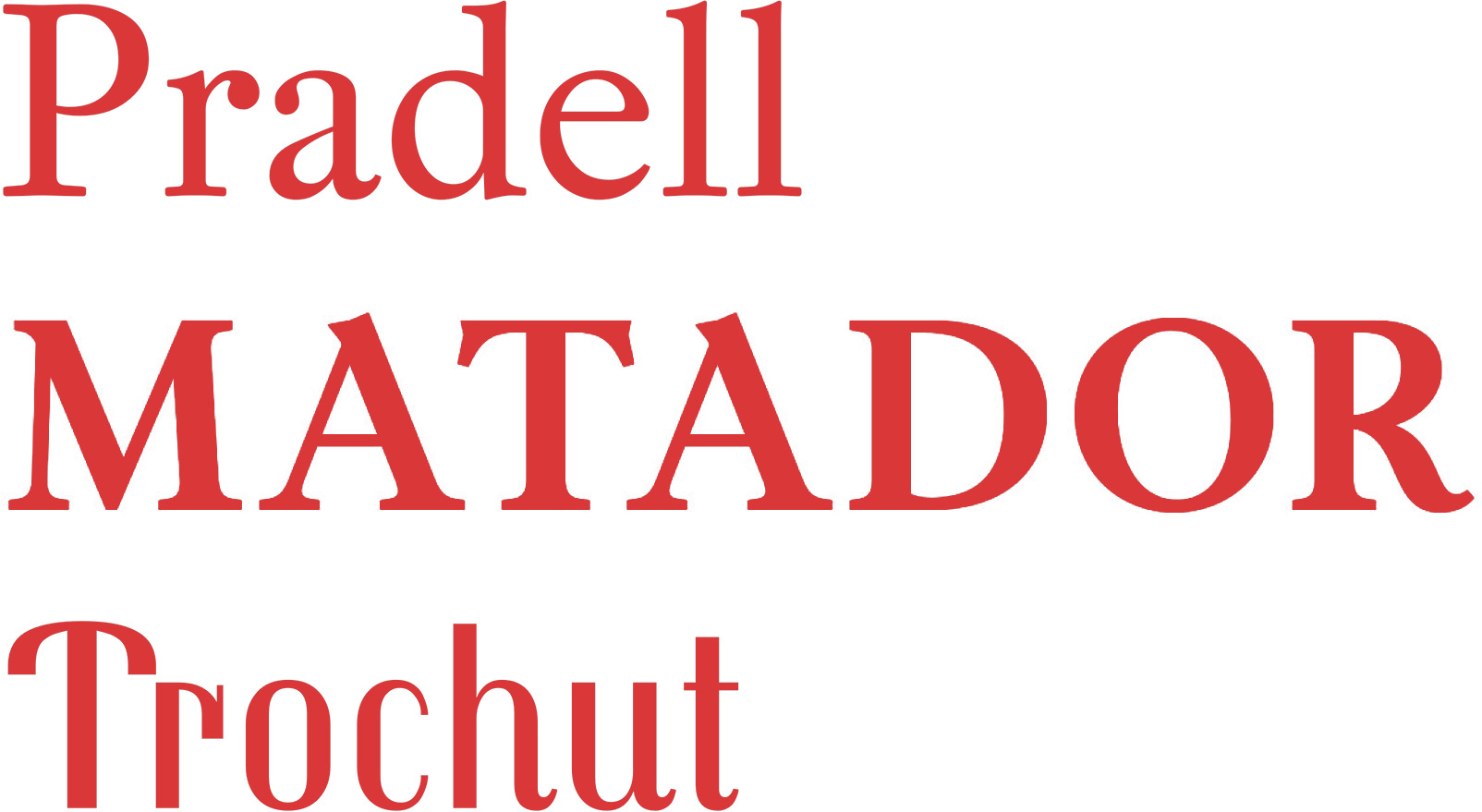
For instance, I researched the 18th century, a brilliant period in Spanish type design, and from that research, I designed Pradell and Matador (a custom typeface for Matador magazine). I think if we, Spanish designers, don’t find ways to engage with our legacy, it’s likely that no one will. This has nothing to do with a political position; it’s simply about recognizing a tradition, paying tribute, and learning from the best of it.
I think if we, Spanish designers, don’t find ways to engage with our legacy, it’s likely that no one will.
Andreu Balius
In the 20th century, before the digital age, Super-Veloz was the best example of modern type design in Spain, if by no means the only one. Bisonte, for example, was a quirky sans serif typeface by Joan Trochut on which I based a digital interpretation, Trochut. The country’s design legacy, with its lights and shadows, is part of European design history, and Super-Veloz has so much to tell us about the spirit of its time.
Probably the most exciting feature of the book’s preview site is a digital composer that gives everyone a chance to play with Super-Veloz pieces. Do you have any hopes for how visitors will use this tool?
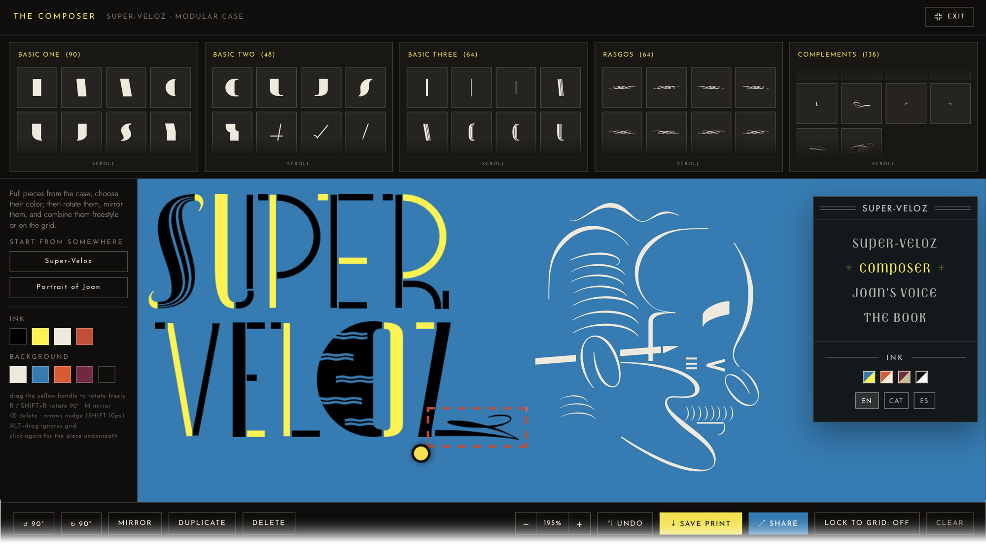
AT: The composer is an invitation to engage with the Super-Veloz system directly: It offers a digital simulation of the original process. In that sense, it makes explicit what Super-Veloz already was — a form of proto-software. I hope users get a feel for the skill required to produce something crafted within its constraints, and the intensity of the visual language such constraints can generate.
The composer . . . offers a digital simulation of the original process. In that sense, it makes explicit what Super-Veloz already was — a form of proto-software.
Alex Trochut
AB: Experimenting with the type is one of the best ways for people to start to understand how Super-Veloz worked and what it could do. Hopefully, they’ll take those possibilities even further. In our book, we explore the rich theory behind the practice, put it all into context, and show much of what its designer managed to achieve with Super-Veloz.
Do you have any advice for someone who might be trying out Super-Veloz for the first time through this composer?
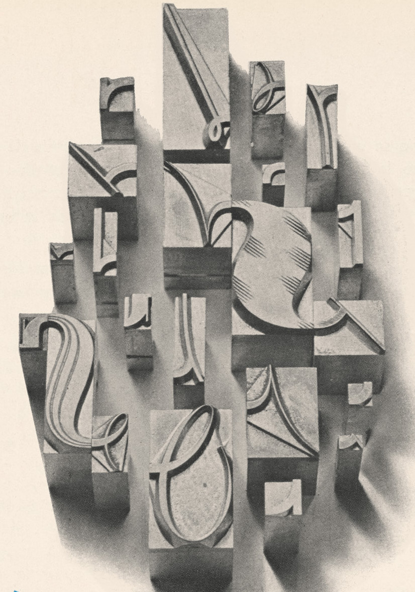
AT: Allow the pieces to guide you. Composing with Super-Veloz is a dialogue: As the work develops, it indicates what it requires, and each added piece contributes a further statement. It is a form of puzzle work, best approached through play. One should be willing to lose oneself in the process in order to discover what the system makes possible.
AB: Explore freely, and remember that Super-Veloz was originally a system of movable type that had to be fitted together on a press bed. Try to imagine what it was like working with Super-Veloz in a traditional print shop, back in the days of metal type.
The historic albums featured in your book, which were originally made to show what could be done with Super-Veloz, are among our most requested research items at Letterform Archive. Why do you think designers are so drawn to this material today?
AB: It’s wonderful to hear! I’m sure these albums are quite rare, and they were always unique, even among the type specimens and design publications of their time. Spanish type design is still not widely known, so perhaps there’s curiosity to see material that differs from what usually appears in design books.
AT: That’s indeed great to hear. The albums were self-initiated projects, and although Joan and his father produced them to demonstrate the possibilities of their printing house, they exceeded that function. They also served as essays in both visual and written form. When design magazines were still uncommon, and essentially absent in Spain, the albums became a vehicle for articulating the ideas and concerns of their moment. They remain a remarkable record of their era. I’m so happy the Archive has them and that people are studying them.
What are you most excited to share with readers of Super-Veloz? What do you hope they’ll discover as they read and explore the book?
AB: I hope readers will discover, in new ways, the value of design legacy. This book is largely about keeping memory alive, so that ideas from the mid-20th century can continue to inform future designers and inspire generations to come.
AT: I couldn’t agree more. With Letterform Archive, we set out to make the definitive book about Super-Veloz. It is a comprehensive look at the type and its story, and I think readers are in for many surprises.
I will add that for the Trochut family, this book also represents an act of historical recognition. It grants Super-Veloz an honor my grandfather perhaps did not receive at the end of his life. We are deeply grateful to Letterform Archive for recovering a body of work that might gradually have been forgotten, and for making it widely available.
We’re so proud to bring this book to the world. Thank you, Alex and Andreu!
To learn more about this title, check out the preview site and visit our shop at the link below. Members receive 10% off all Letterform Archive books.
— Chris Westcott, Editor, Letterform Archive Books