News
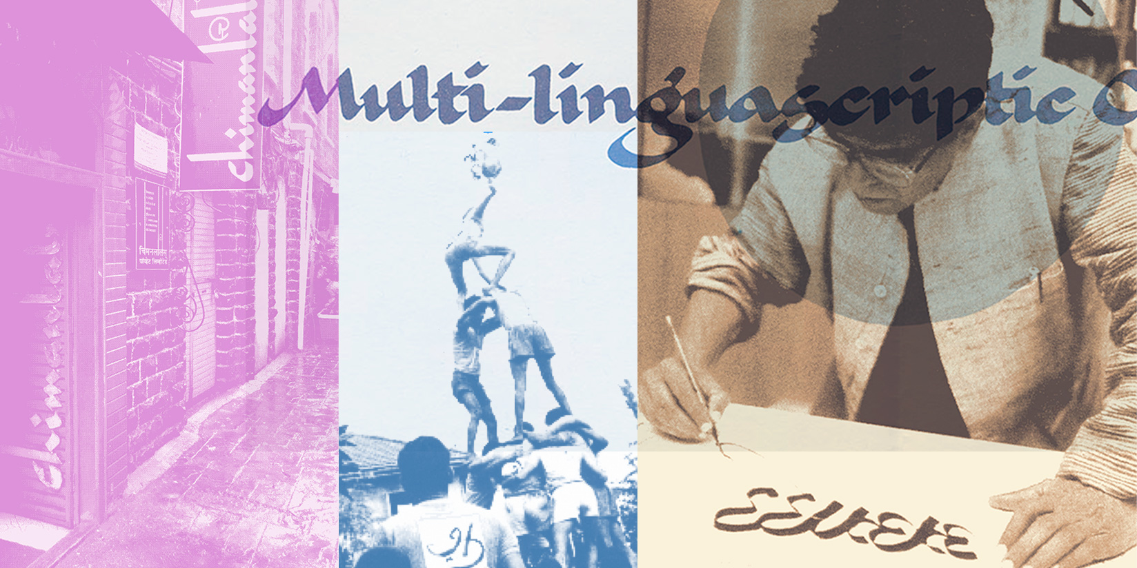
The Multilinguascriptic Life of R. K. Joshi
From calligraphy, to concrete poetry, to digital type, Raghunath Krishna Joshi’s influence on Indian letters is boundless. Meet the man who used writing to unite the subcontinent.
My name [is] Raghunath Krishna Joshi. I am Ra. Kru./R.K. Birth was in Sangli in 1936. My ophthalmologist is A. School Education Satara, Kolhapur, Sangli, and other places. [My] Nose ear throat specialist is B. Art education 1952 to 1956 in J.J. School of Arts in Bombay. Dentist is C. Joined Bensons Ltd as a commercial artist in 1960. [My] Cardiologist is D. Since then [I] have been art director at Ulka Advertising. The blood belongs to the pressure. First letter poetry [sic] from the study of calligraphy. The hands belong to the aches. Then [I] got typographic poems, sound poems, formal poems and poster poems published in Satyakatha at various times. The legs belong to the street. These were the first attempts at concrete poetry in Marathi. The brain belongs to the office. Manuscripts, explorations in Roman and Devanagari calligraphy, research in typography, these are the preferred focuses. Half the salary belongs to my wife. Reading and writing barely moderate. Half of me belongs to Delhi. [I] Lectured in a hands-on manner in Art Institutes. The phone belongs to the neighbor. [I am] Credited with two travels abroad to read papers at conferences. The TV and fridge belong to the mechanic. . . . The poem belongs to the letters. [I] Tried to start a movement regarding the idea of the beauty of letters and their practical reach but regretfully was unsuccessful. Only mine, just one piece of wealth. For the last 12 years [I] have more or less worked as poet artist graphic designer calligrapher typographer word-event creator student of numerous styles of transcription and letter art. Every minute that I experience/live. Collection of poems lectures notes about letters yet unpublished.
This autobiographical poem originally appeared in Punha Ekda Kavita. Translation courtesy of Anjali Nerlekar, Bombay Modern, Arun Kolatkar and Bilingual Literary Culture.
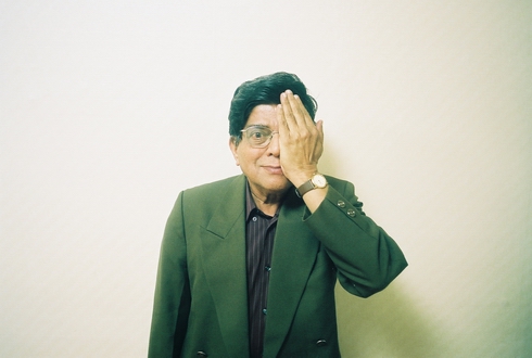
Raghunath Krishna Joshi (1936–2008), commonly known as R. K. Joshi, was a highly acclaimed — yet still under-appreciated — figure in the world of design, typography, poetry, and calligraphy. His significant contributions to the field of type design for Indian scripts and his unwavering dedication to preserving and promoting Indian languages and typography have left an indelible mark. Joshi was not only a prolific letter maker but also a passionate advocate for typographic education and experimentation in India. He played a pivotal role in shaping the Indian calligraphic and typographic landscape and his legacy extends to the fields of poetry, film, and beyond.
Joshi at the Archive
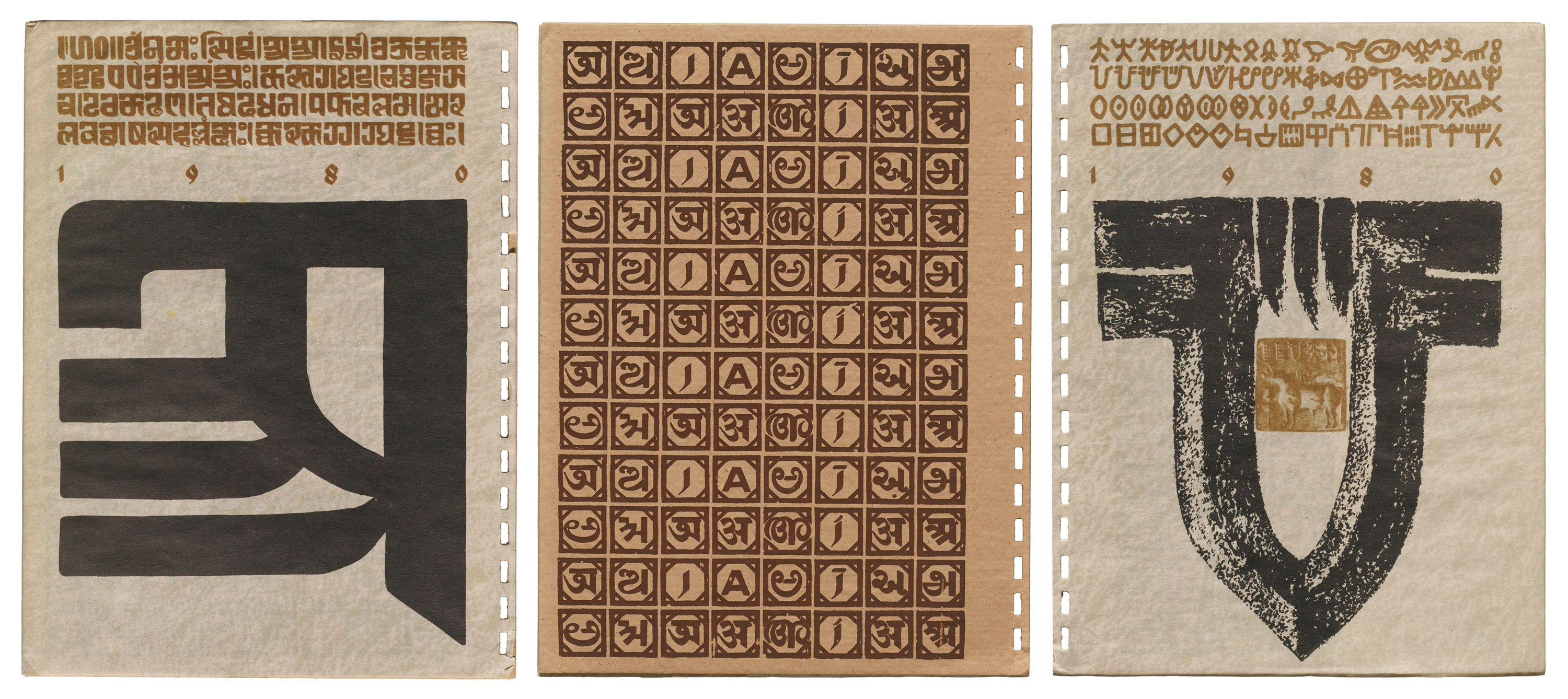
Letterform Archive was introduced to Joshi through a single object in the collection: Indian Calligraphy, the Chimanlals annual diary for the year 1980, one of many stationery products produced by the paper company throughout the late 20th century. This well illustrated notebook was designed by Joshi during his tenure at Chimanlals, where he was a creative director for more than a decade. While the diary explicitly credits Joshi for his calligraphic mastery, it becomes evident that the entire publication, from concept to execution, bears the hallmarks of his experimental approach to design, respect for the history of writing, and penchant for linguistic diversity — a pattern that can be consistently traced across his more than 30-year career.
Throughout the piece, we are treated to a diverse array of designs showcasing Joshi's expertise and profound love for India’s languages and scripts. The object opens doors to Indian typography, while also inviting us to uncover the life and work of Joshi himself.
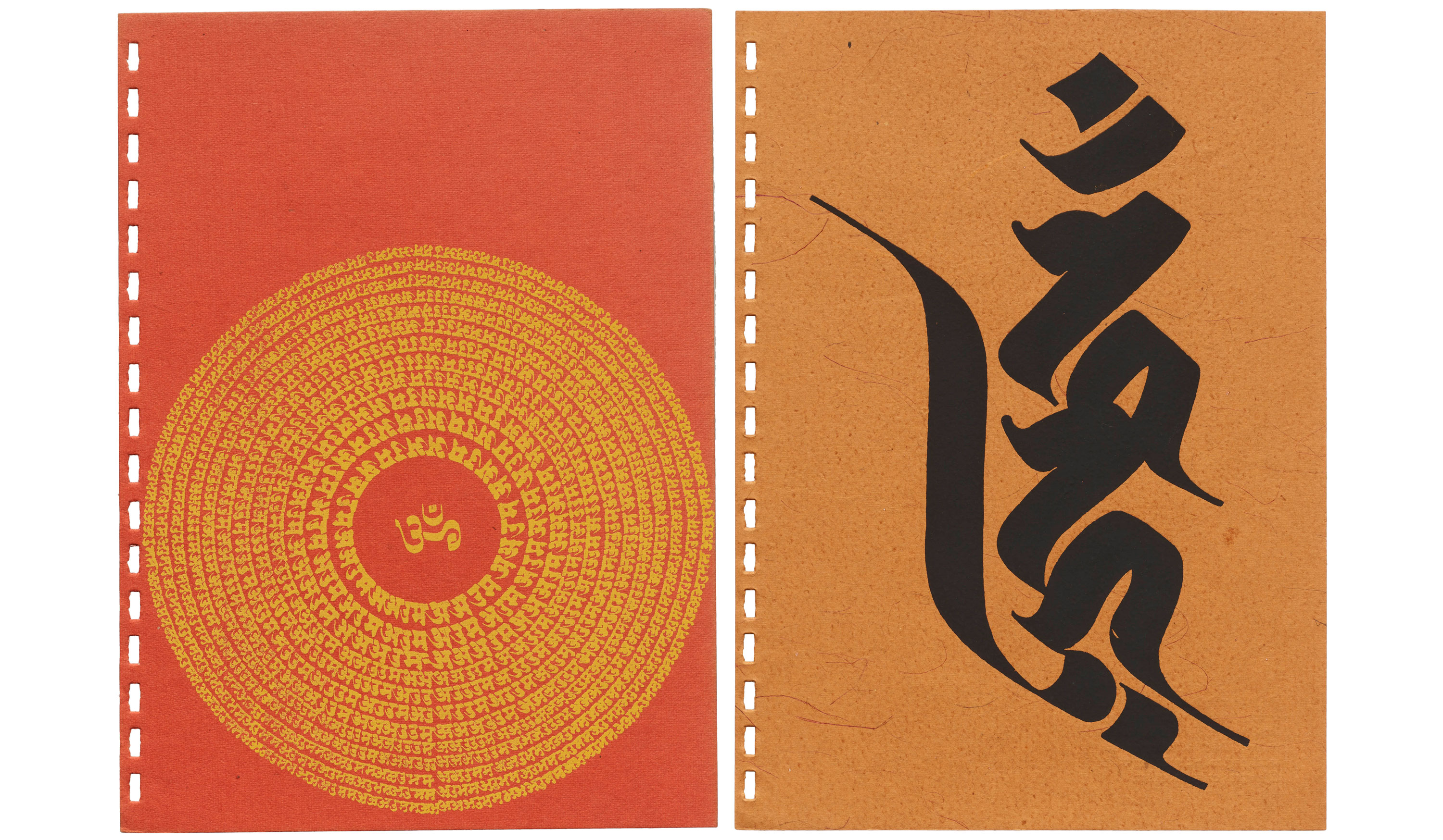
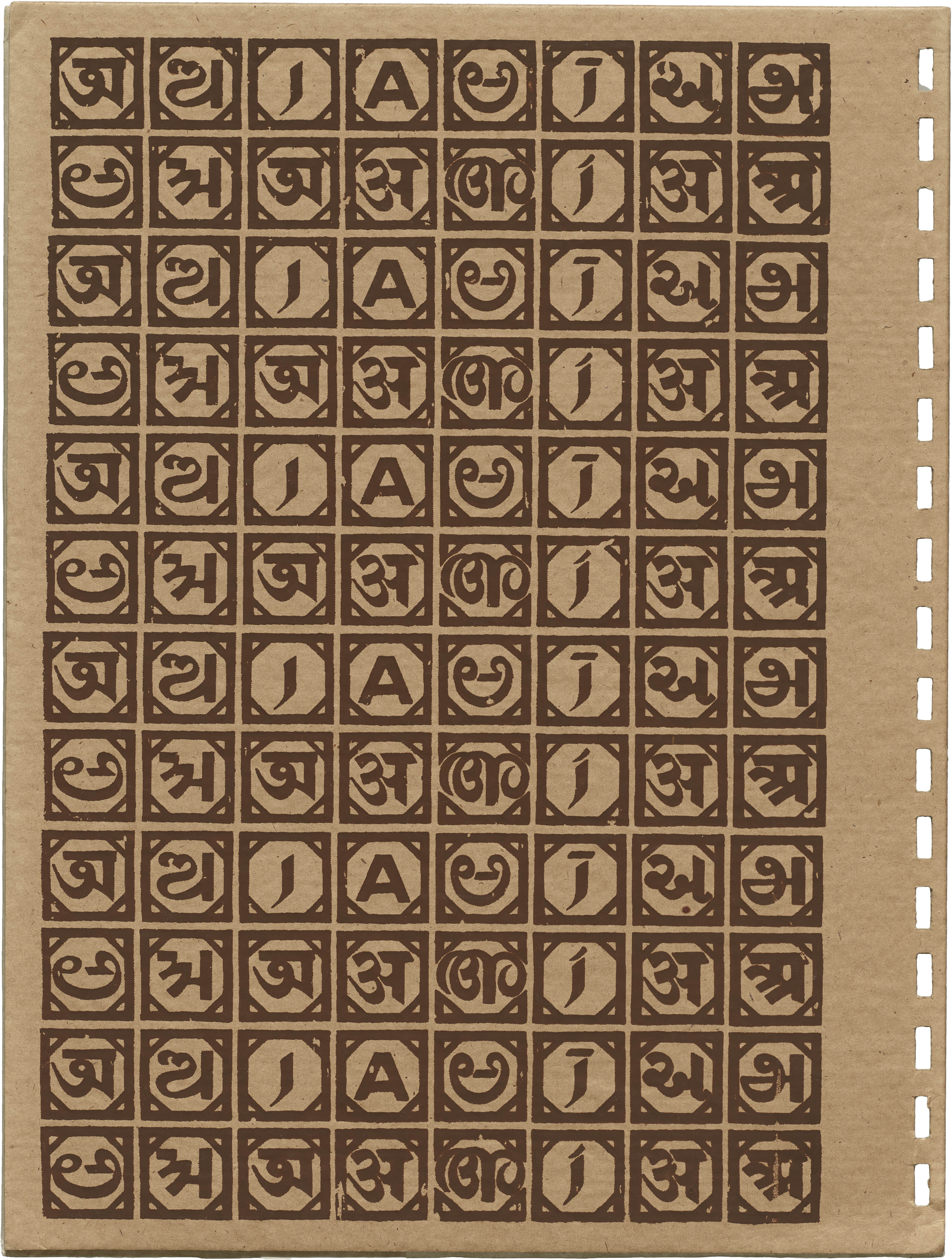
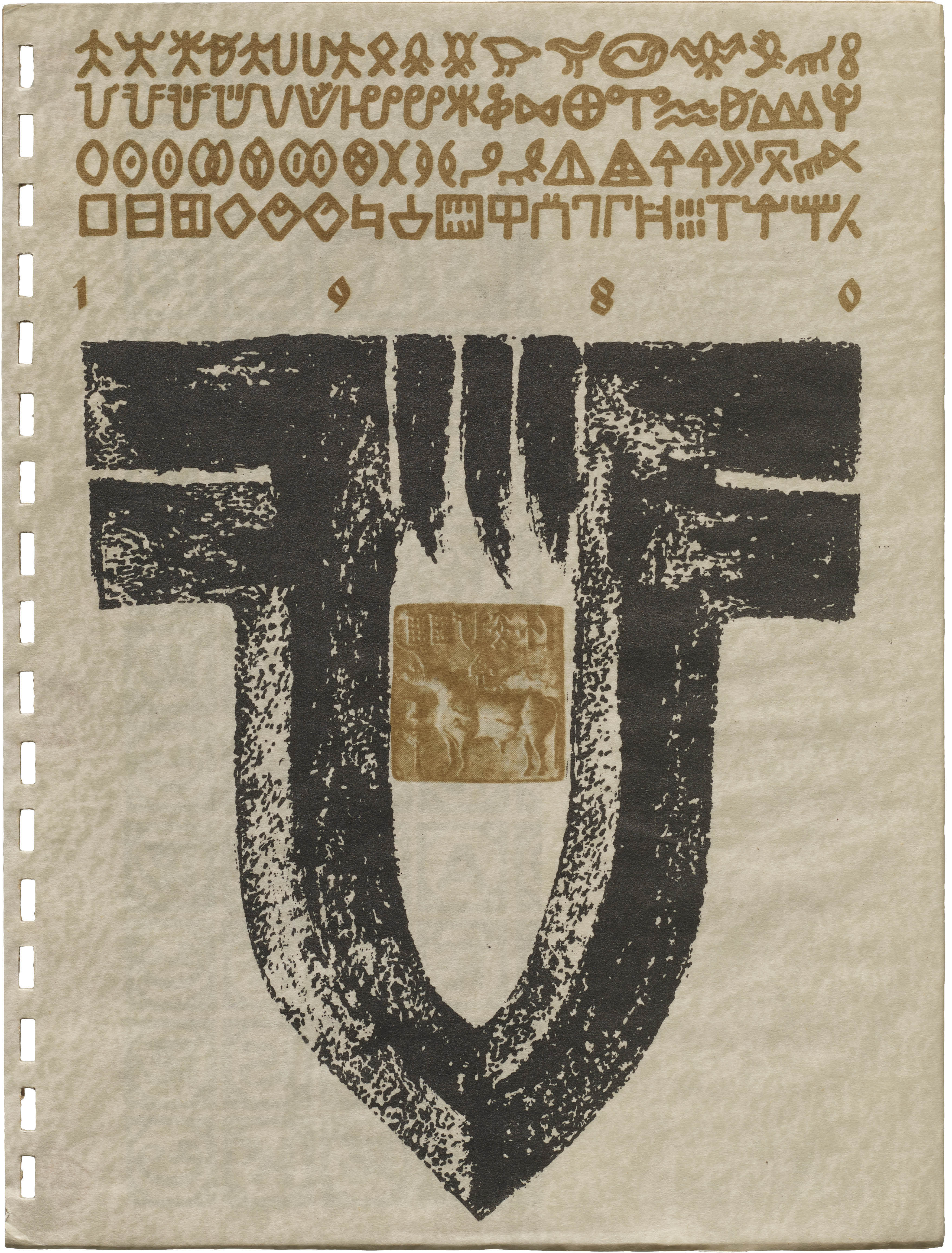
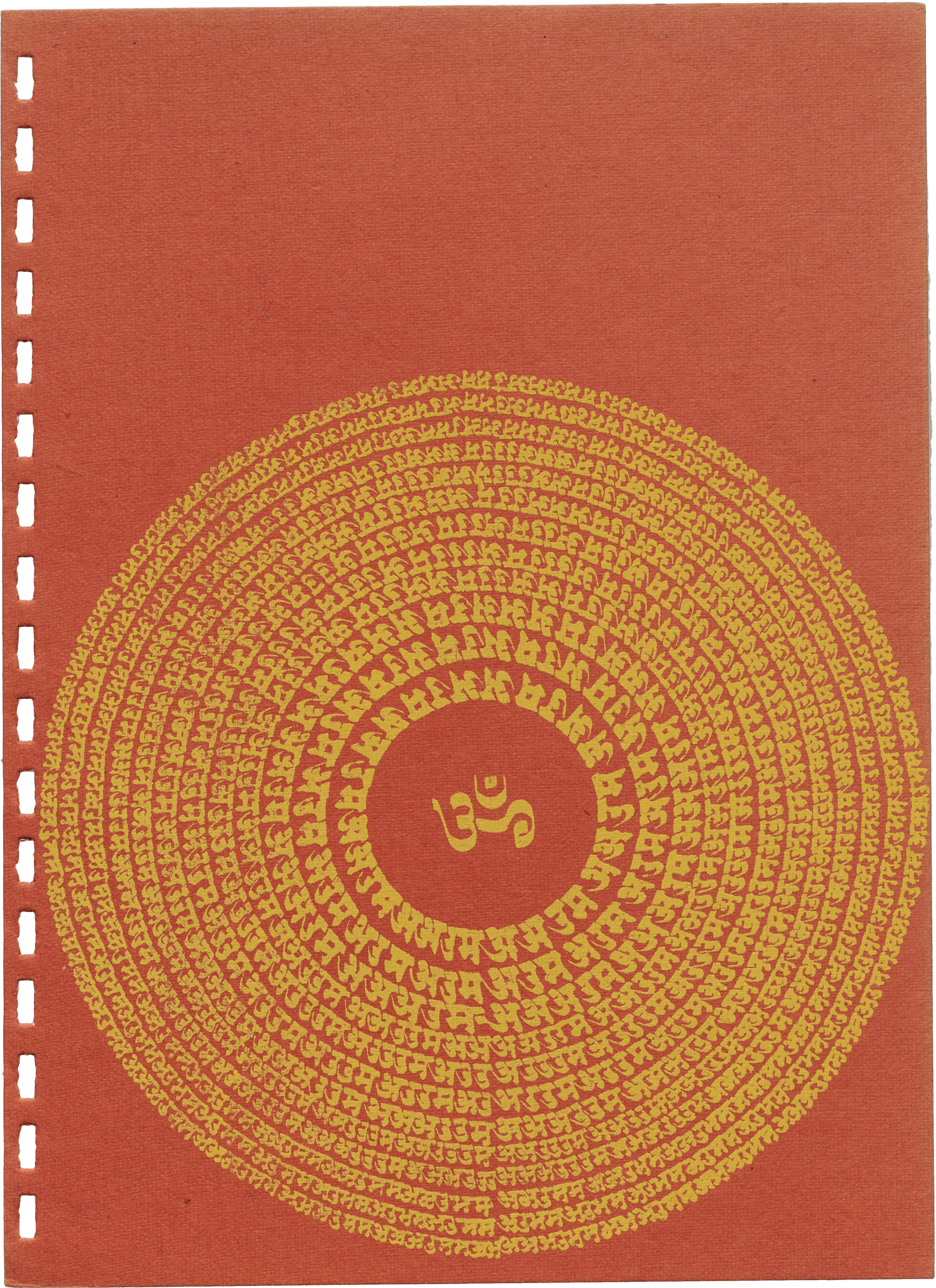
The notebook's cover is adorned with an assembly of symbols from the ancient Indus civilization, dating back to 2500–3000 BCE. One of these symbols is recreated using calligraphic marks to make a captivating graphic centerpiece that frames a replica of an Indus Valley seal. Another cover leaf carries a grid-like arrangement featuring the vowel sounds for a as it appears in various scripts used in India. This arrangement serves as a prelude to the rich tapestry of scripts awaiting exploration within.
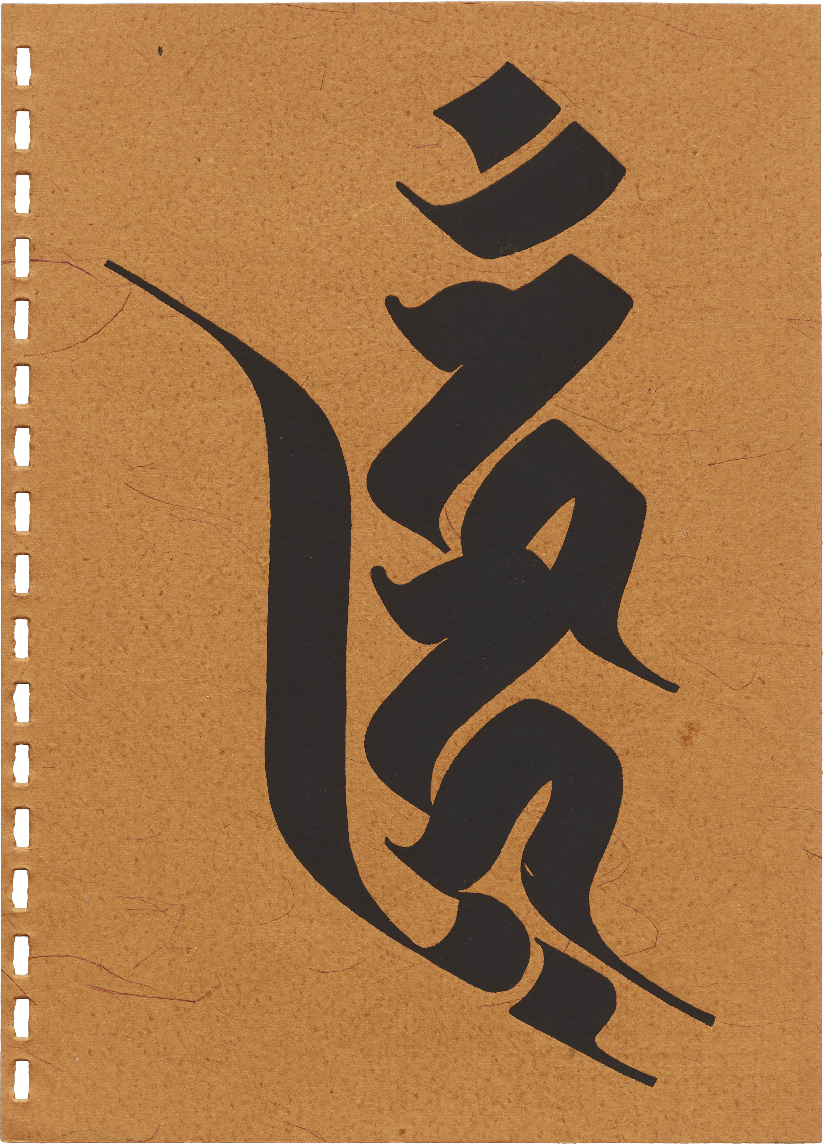
The back cover mirrors this layout by replicating the same grid-like arrangement on the inside, while the outside carries on it an older form of the Devanagari script, with an enlarged rendering of what is better known as the Calcutta Style of the letter अ.
Calligraphic Explorations
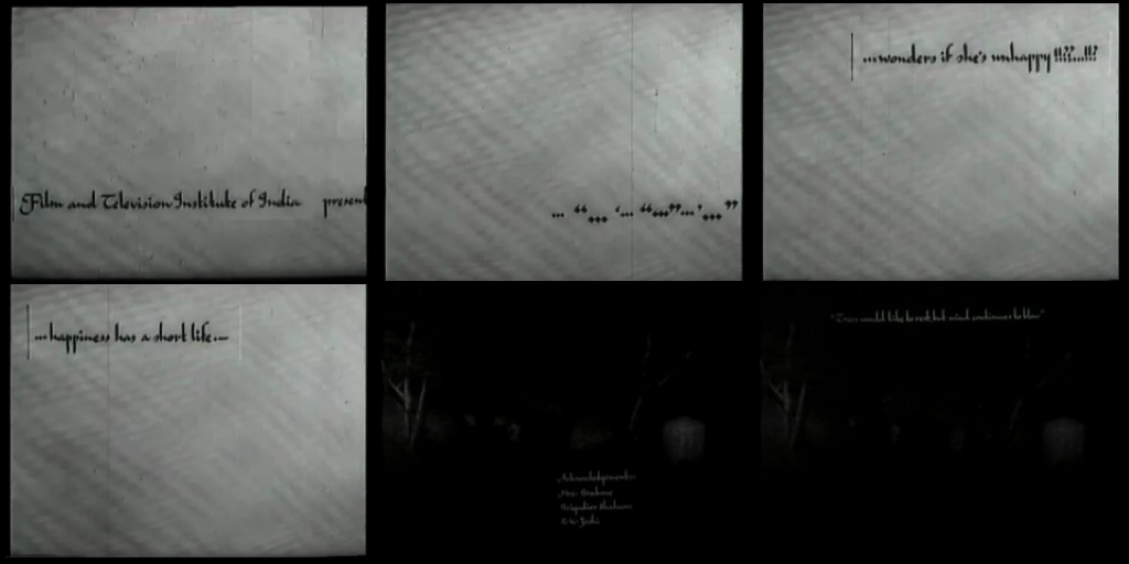
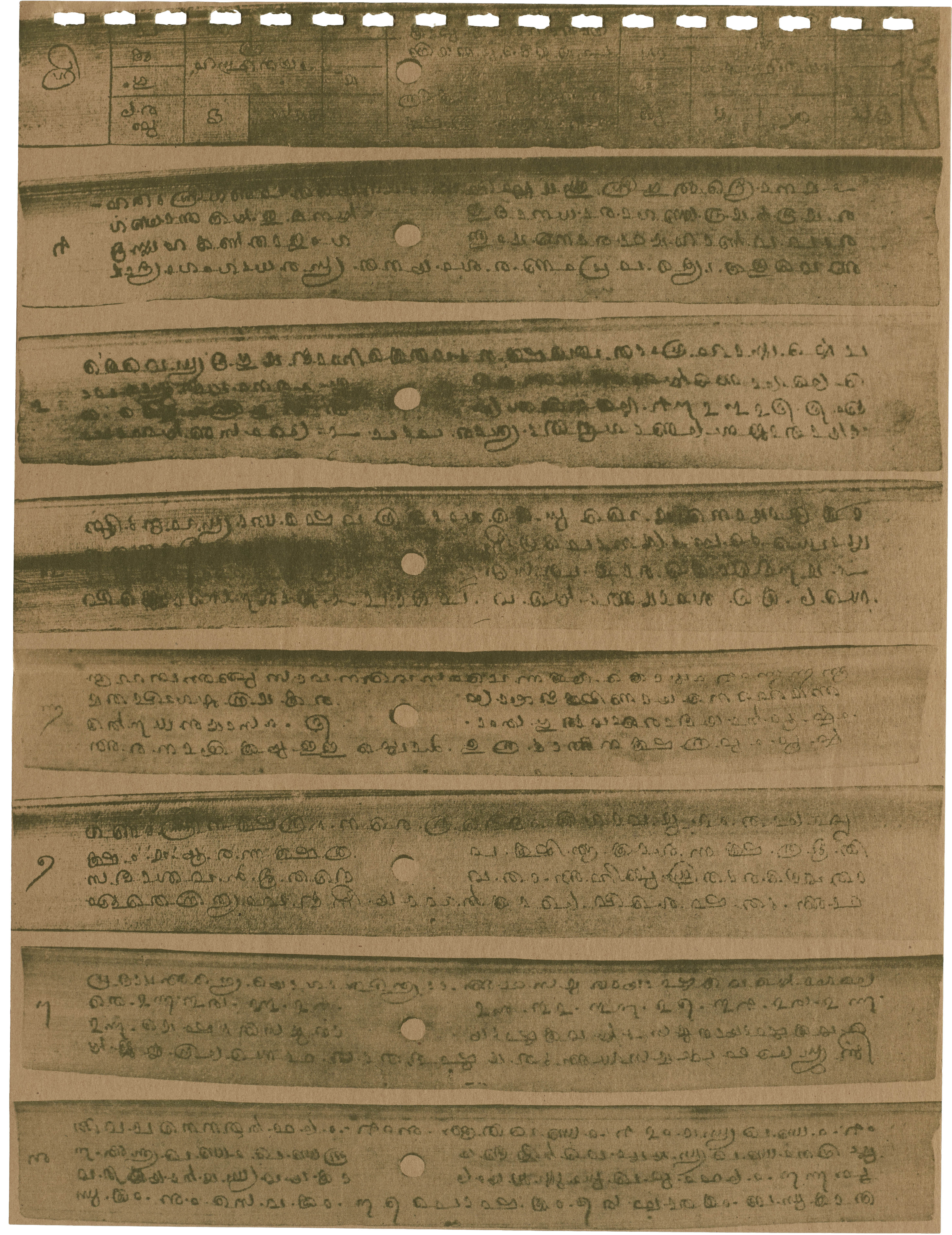
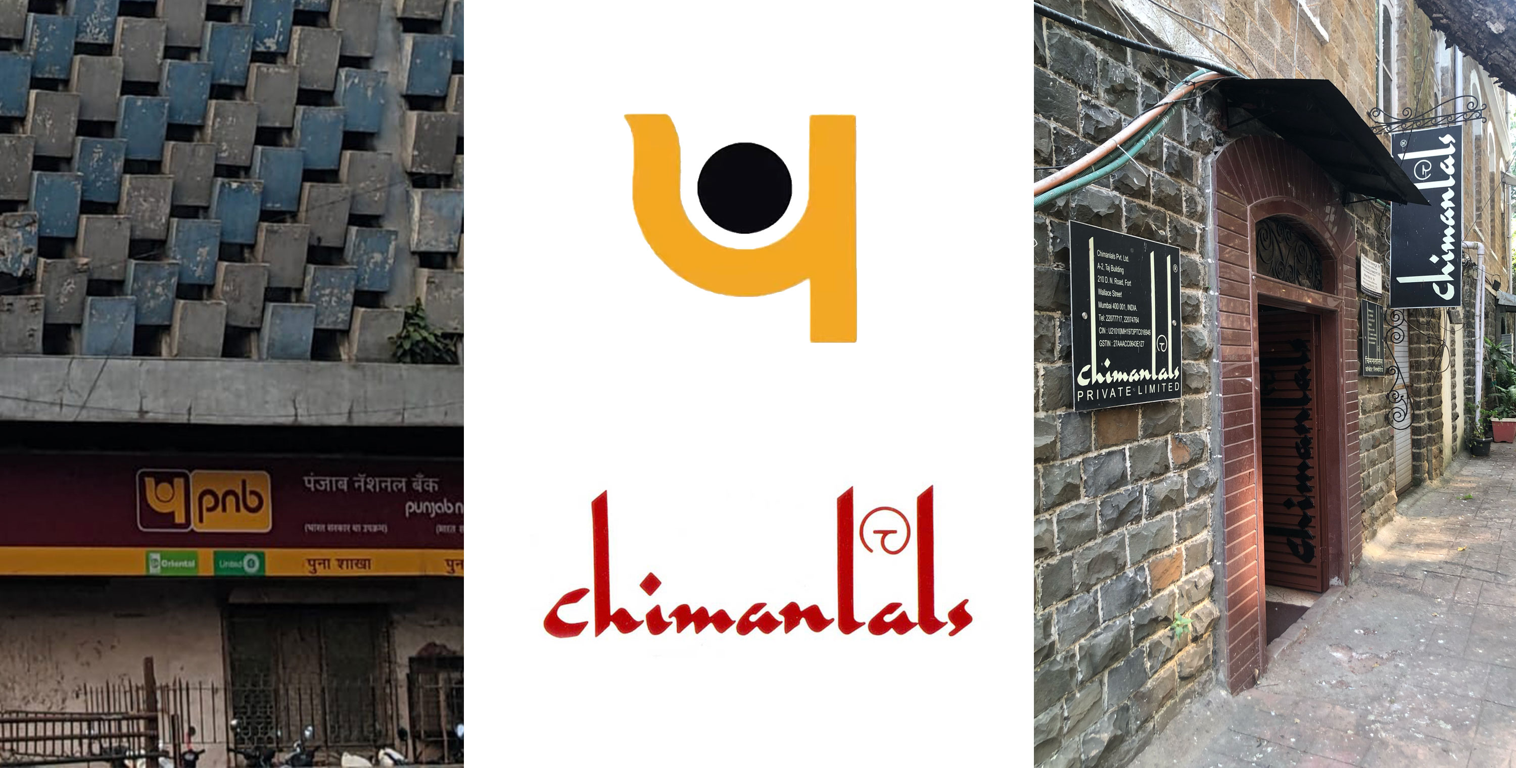
The Archive’s copy of the diary contains only one leaf from the lined blank pages of the original product. It includes a note in English, the language used to label other languages, as well as charts included in the book. The calligraphy here feels a bit informal as compared to the hand used for other languages. You can occasionally spot the tall ascenders, a Joshi signature that can be seen in his other English calligraphy, including his design for the Chimanlals logo and the titles shown throughout the 1974 film Teevra Madhyam.
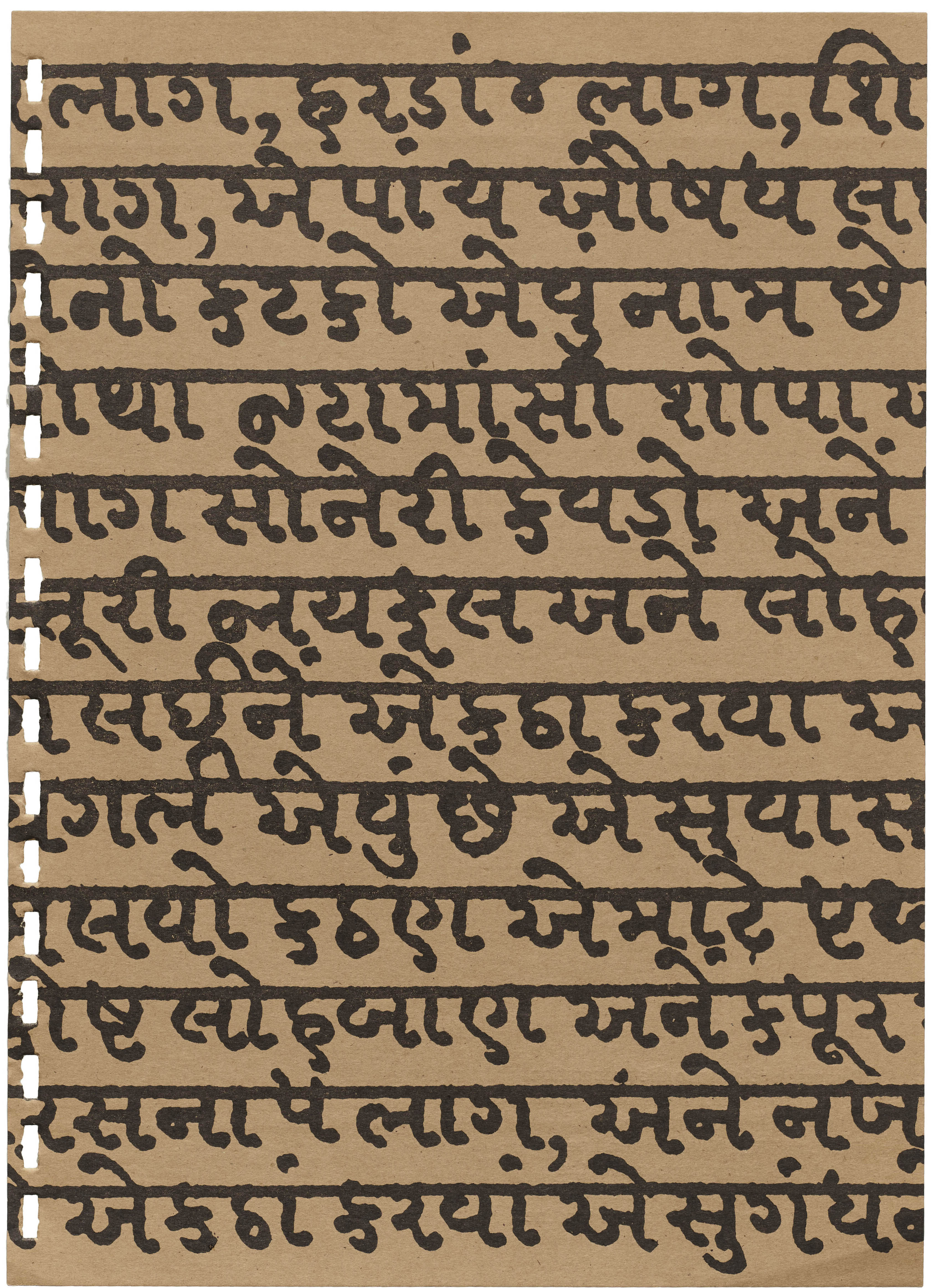
The remaining pages of the diary, which would have functioned as month and section separators, were designed to be a showcase of India’s scriptural and linguistic abundance. Each of the pages highlights a different script from various regions across India, celebrating the vast tapestry of the country’s writing systems.
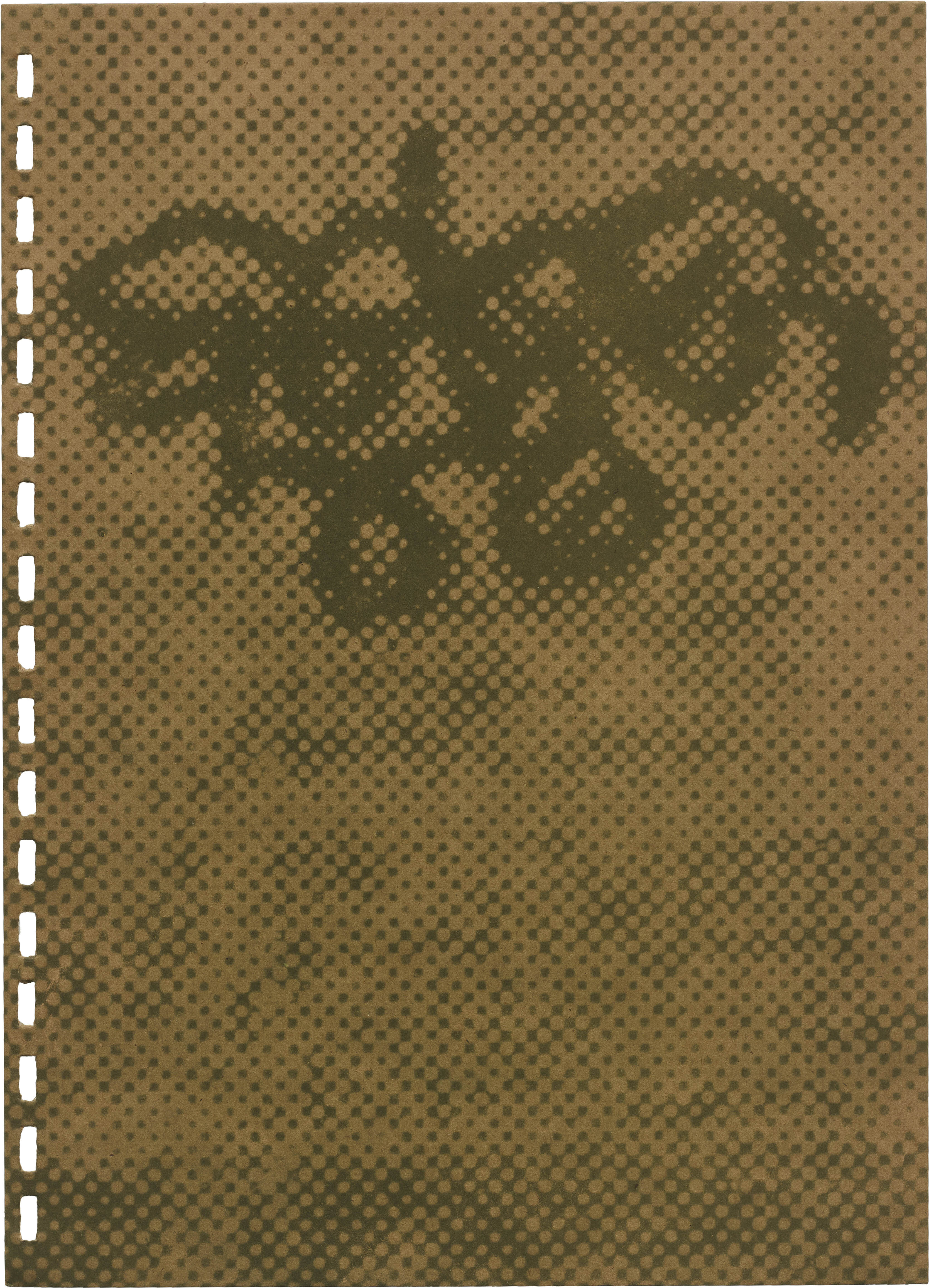
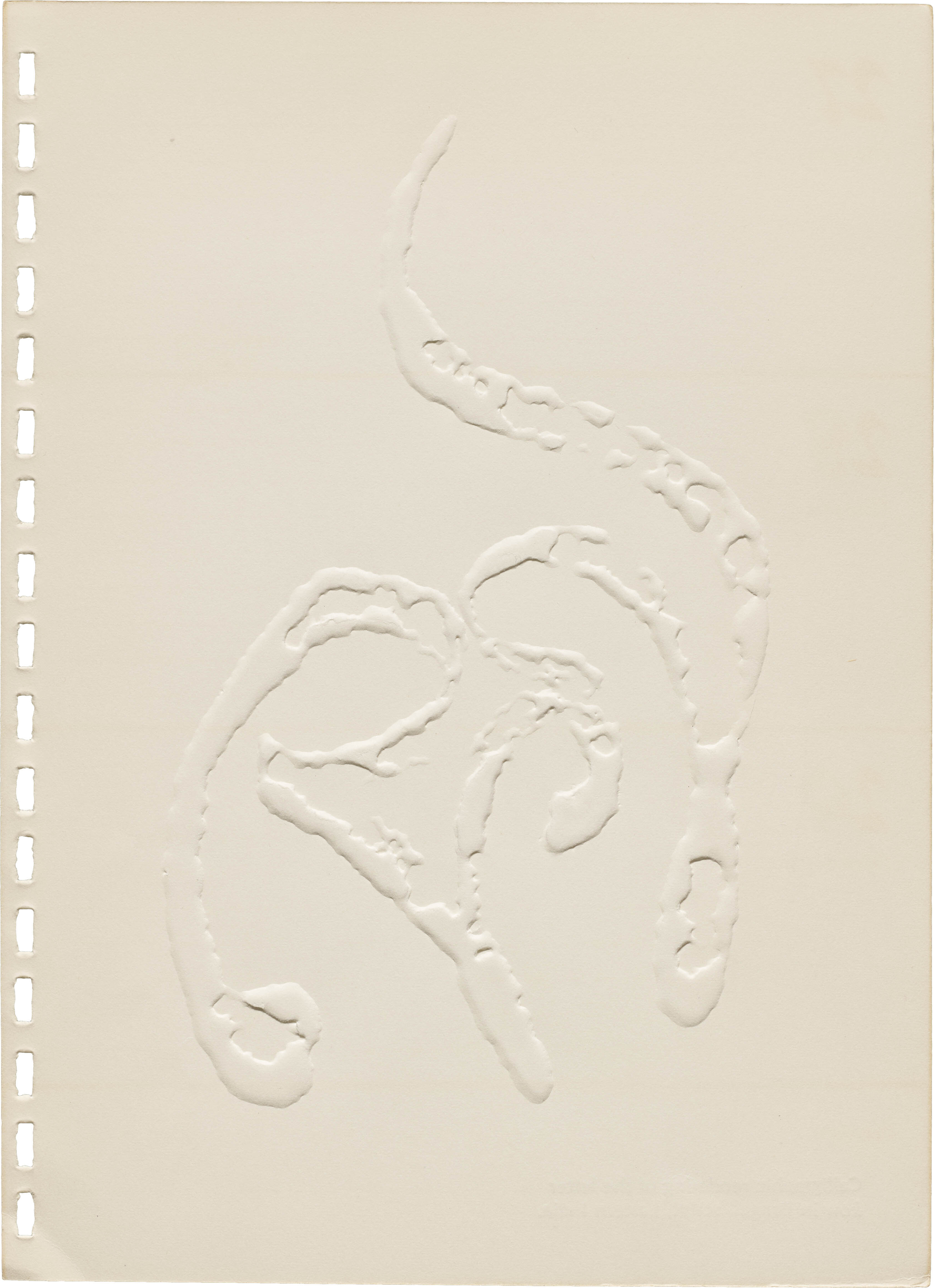
Some pages include calligraphic samples from other Indian scripts, while others are reproductions of found typographic samples. One of the most striking compositions depicts the chanting of OM. A calligraphic rendition of the Devanagari characters अ उ म are repeated with varying permutations to recreate the many possible intonations. Calligraphy is again used to represent the Siddham script with a vertical arrangement. Folios from Jain manuscripts are included, and while most of the artifacts are reproduced in a straightforward way, in this case Joshi incorporates a halftone texture, juxtaposing something ancient with something modern, a technique he uses repeatedly in the diary.
Celebrating Indian Languages
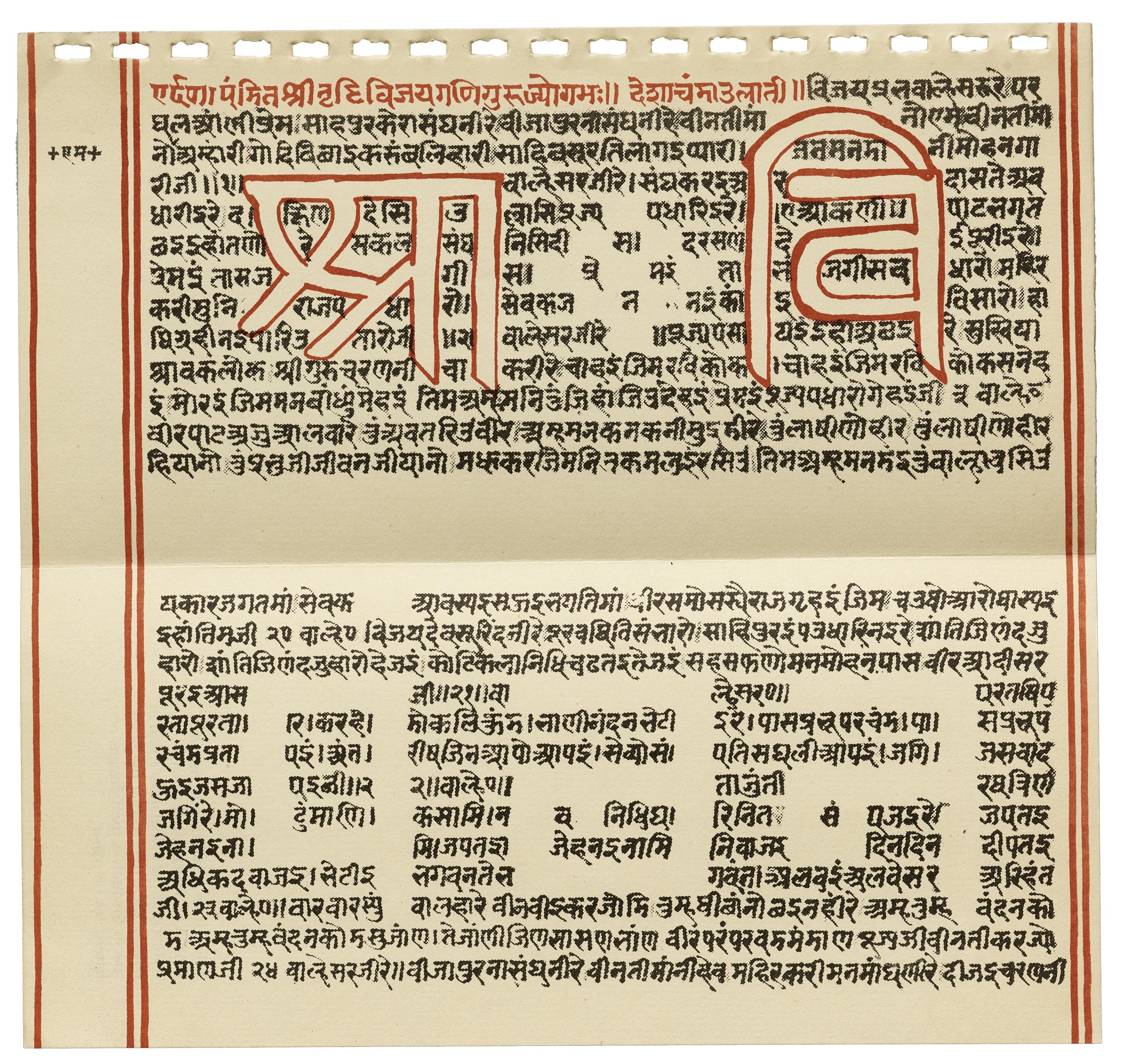
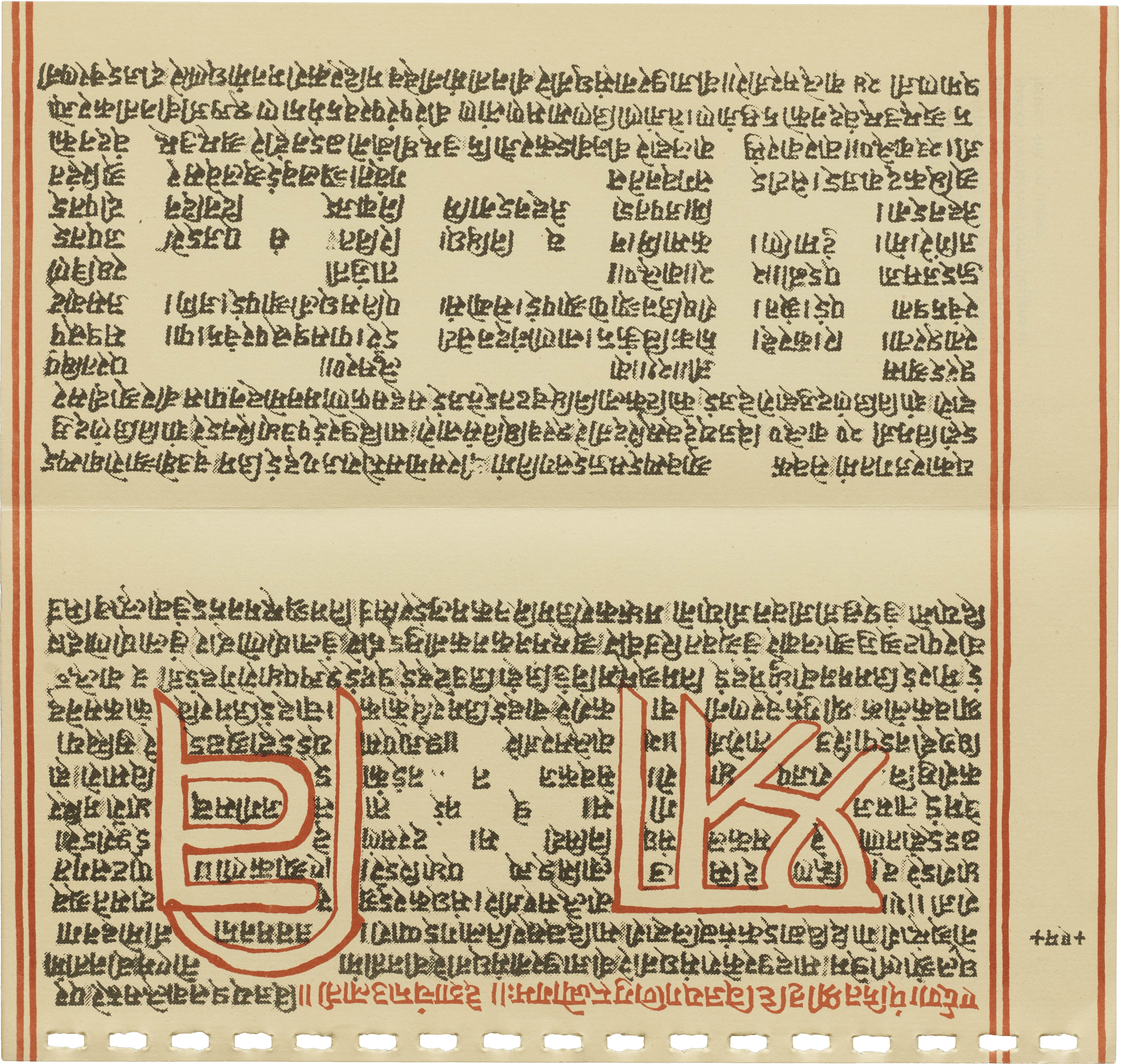
For the notebook, scripts were sampled from all across India to showcase their variety and application. Representing the northwestern region, a Hukamnama showcases Gurumukhi, while a Post-Gupta script appears on a recreation of text from two Kundeshwar rock inscriptions. King Harshavardhana's signature is inked in the center, but it's sandwiched by the two letters kau and naim, from the inscriptions that appear in relief. Archive docent Siddharth Jayashankar noted how the paper selection attempts to achieve the feel of the original object. The inscriptions appear embossed into rough handmade paper, possibly imitating the texture of its source. Also included in this collection is a page with the Modi script. Once favored to write the Marathi, the script has been displaced by Devanagari, but Joshi chose to include a royal order dated from the 17th century. Another page features three South Indian scripts of different periods, with visual emphasis on the letter Shri.
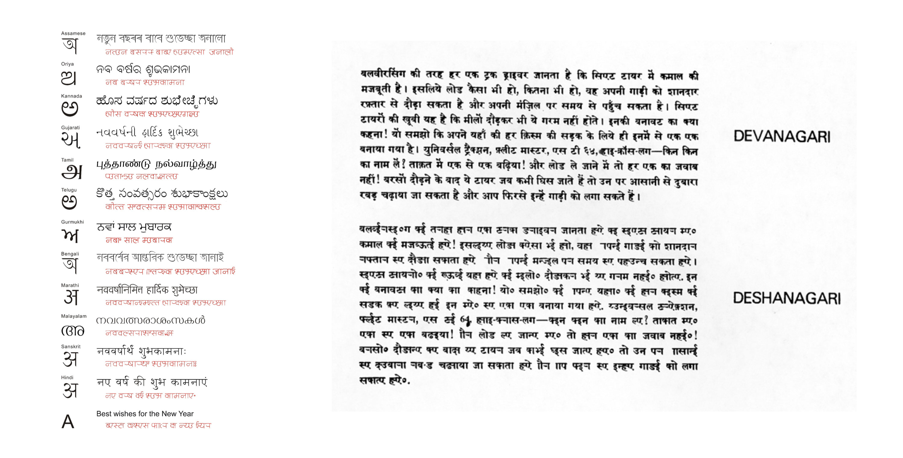
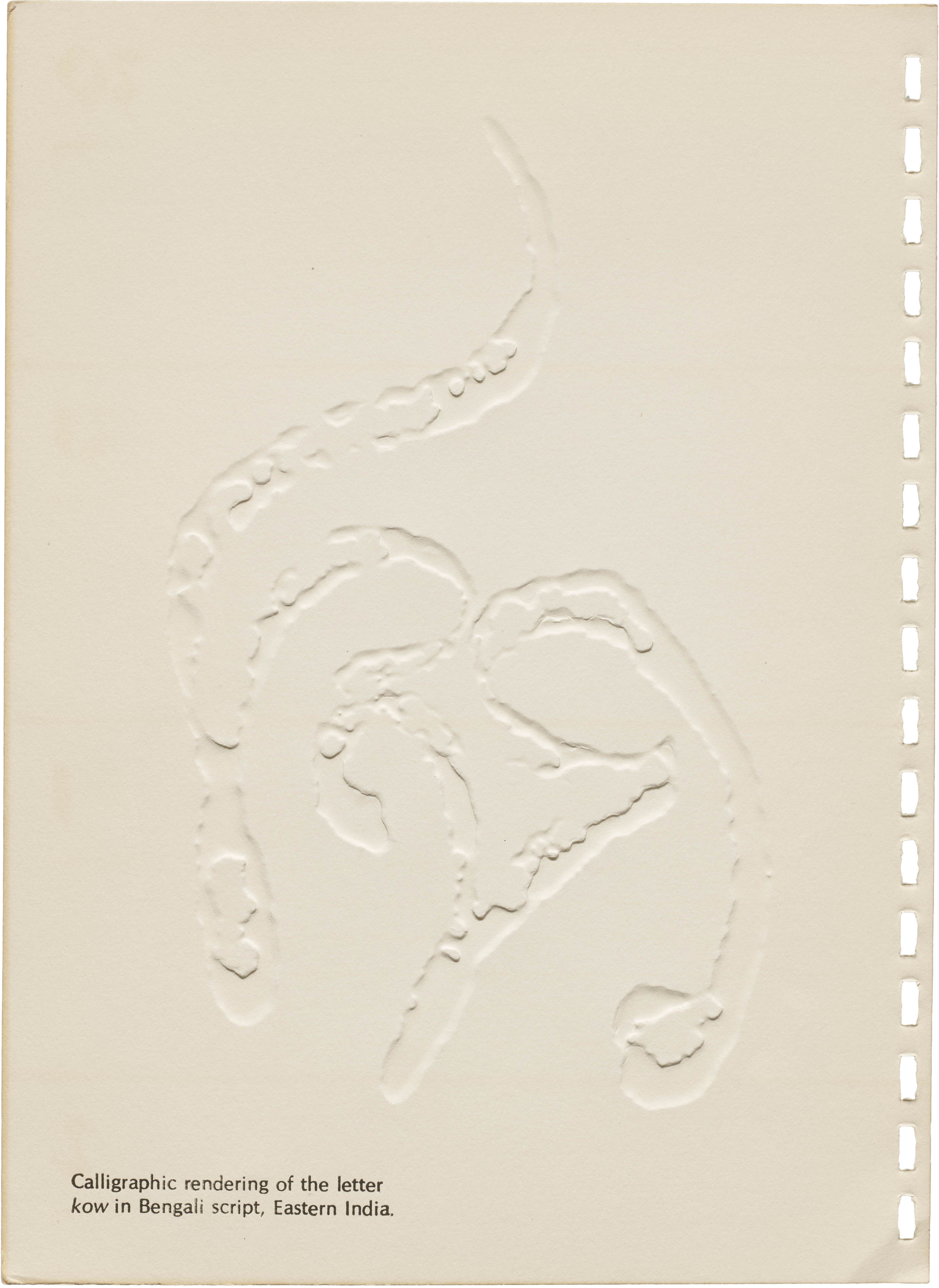
The diary's pages also feature languages still in use — such as Urdu, Gujarati, Odia, Bengali, and Malayalam — but in unique contexts. Urdu is presented through a document detailing the sale of a plot of land, complete with a site plan. Malayalam represents the southwestern coast of India through a photocopy of an astrological medieval manuscript. The Odia script is creatively distorted, with a halftone technique. The design is then scaled up so one can really appreciate its texture. Even Gujarati, known today for its lack of a headline, is represented using an older form that features a headline. This diary stands as a testament to Joshi's skill in creatively harmonizing traditional and modern technologies while connecting the past with the present.
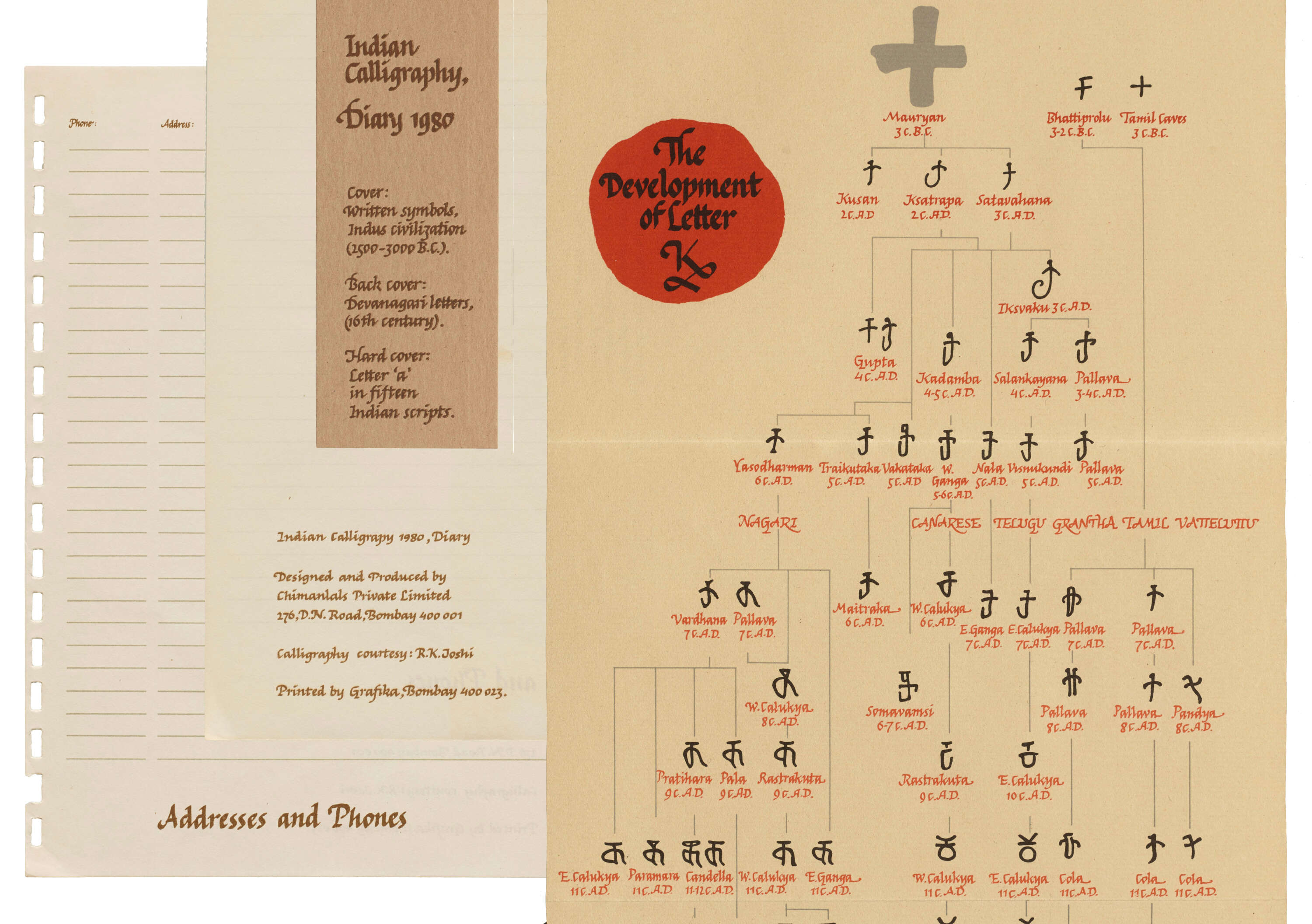
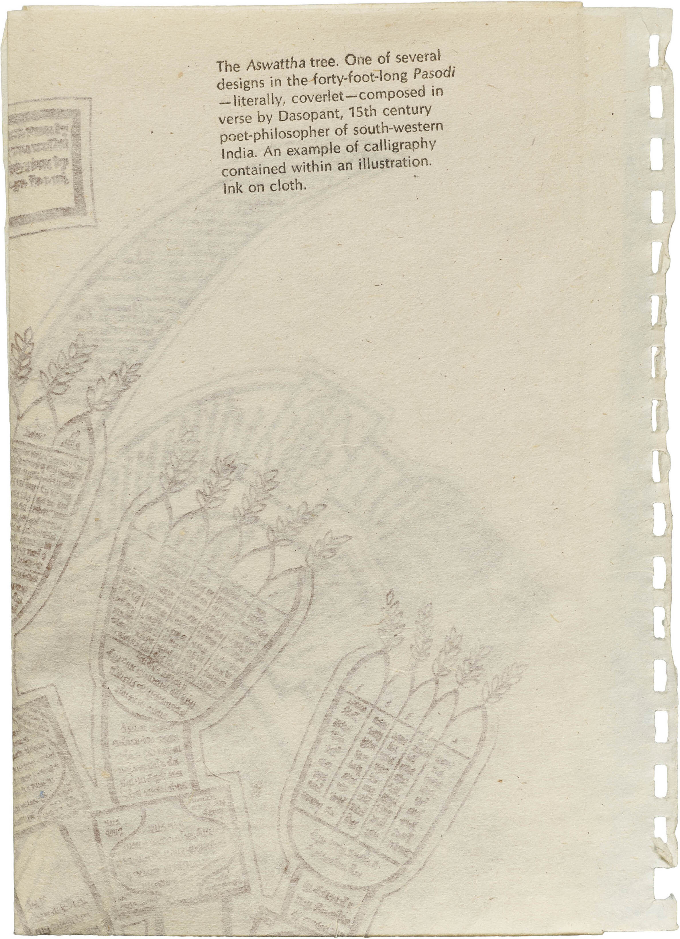
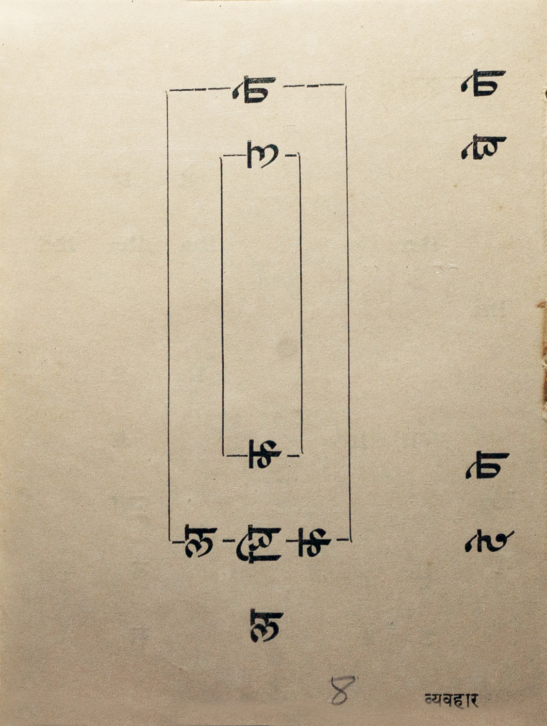
The notebook also contains three elaborate fold-out charts. A block-printed Aswattha Tree is an example of text contained within an illustration. Originally part of a Pasodi, and created with ink on cloth, the diary reproduces the design on a thin tissue-like paper. A script evolution chart shows the development of the consonant क changing forms over 2,300 years and its manifestations across the Indian subcontinent.
A multi-script chart (below) lists 15 languages used in the Indian subcontinent along with the scripts commonly associated with them in relation to IPA, along with an entirely new invention: Deshanagari, Joshi’s idea of a common script for all Indian languages. In an elaborate proposal published in Design for Need. The Social Contribution of Design (Julian Bicknell, Liz McQuiston) Joshi dedicates many pages explaining the logic behind the script, as well as possible benefits and methods of implementation.
The Deshanagari system consists of twenty-two vowel letter signs and fifty-two consonant letter signs — a comprehensive range with which it is possible to write any message in any Indian language. In other words, it will serve as a common script for our country — Desh. Hence it is called Desh-anagari.
R. K. Joshi
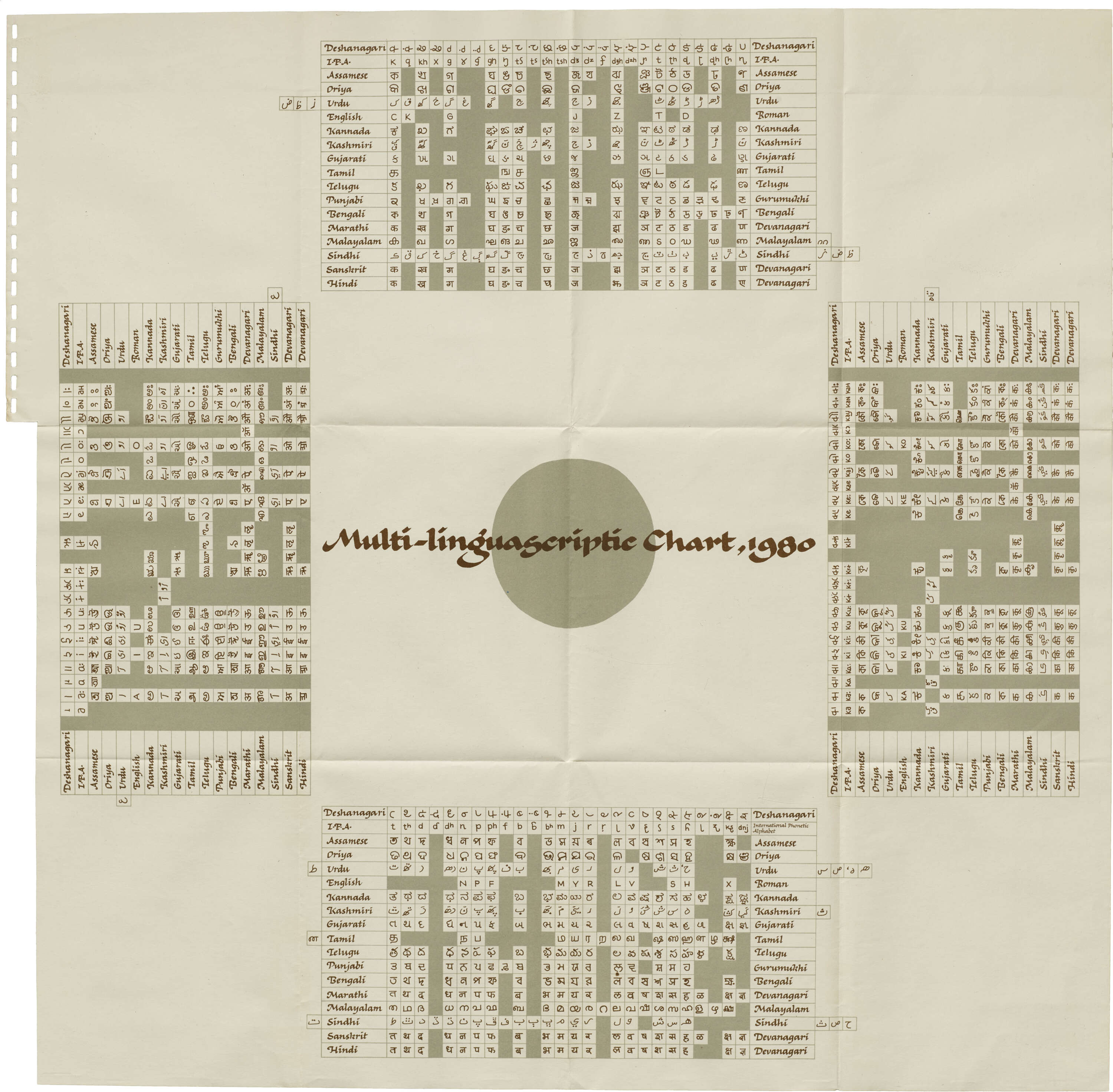
Multilingual chart depicting the 15 Indian languages and their scripts, in relation to the International Phonetic Alphabet (in Roman letters). The additional script is Deshanagari, Joshi’s proposed common script for all Indian languages.
The chart captures Deshanagari’s entire character set showing the consonants on the top and bottom sections. The list on the left consists of vowel characters in the scripts while the right shows the vowel marks anchored to a consonant. These indicate the substitutions possible for the various scripts that could be represented using Deshanagari.
In essence, the Chimanlals notebook operates as a captivating time capsule, preserving the evolution of letterforms but also pairing them with modern reproduction techniques. These reproductions also bring to life the beauty and heterogeneity of Indian scripts, making each page a unique and captivating exploration of the country's immense linguistic heritage. The motley explorations that make up this planner is emblematic of the many ways Joshi explored his love for letterforms throughout his lifetime.
Indian Calligraphy Diary Gallery
The selected sample images below are high-res scans. Click an image to enter fullscreen view, then pinch or click to enlarge.
Advertising Career
Originally hailing from Sangli, a small town in what was then Bombay Presidency, Joshi’s love for letters started at the young age of six or seven. In an interview he recollected appreciating signs on shops around him. He eventually embarked on a journey that began with his education at the Sir J. J. Institute of Applied Arts where he first experimented with calligraphy and got a chance to immerse himself in ancient Indian manuscripts for a diploma project. After graduating in 1956, his first professional foray led him to the advertising firm K. J. Keymer. He eventually moved to Ulka Advertising in 1961 where he was part of the founding team as an art director, actively championing the development of multilingual ad campaigns. His visionary approach recognized the potential of reaching a broader and more diverse audience through language diversity. About a decade later he joined Chimanlals, where he went on to create the identity and many other printed products for the brand.
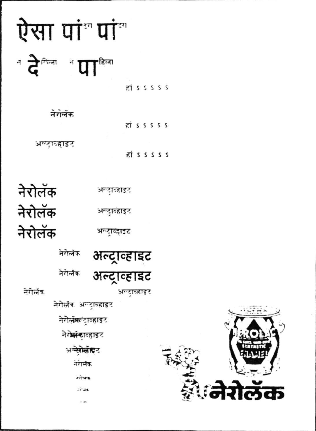
One notable element of the Chimanlals logo is the Marathi wordmark, featuring the letter चि (Chi) nestled between the ascender of the two ls, making the mark bilingual. Vinay Saynekar, who joined Chimanlals in 1981 and was mentored by Joshi and eventually worked on various type design projects with him as well, explains that Joshi’s championing of Indian scripts was a result of growing up in smaller towns and speaking Marathi. Joshi describes his first multilingual campaign in 1962 where he had to come up with the copy as well as the design, because the agency lacked writers who spoke languages other than English. The result of Joshi’s multilingual advocacy can be seen in his logo for Punjab National bank, which is still in use. The wordmark uses the Devanagari syllable पं (Pun) which also works for Gurumukhi the script used to write Punjabi, as the forms are similar. He also worked on logos for ITC Hospitality, CEAT Tyres, and India Post, as well as multilingual campaigns for Nerolac, and family planning initiatives for the government of India.
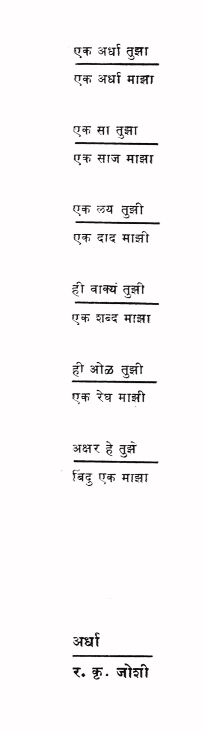
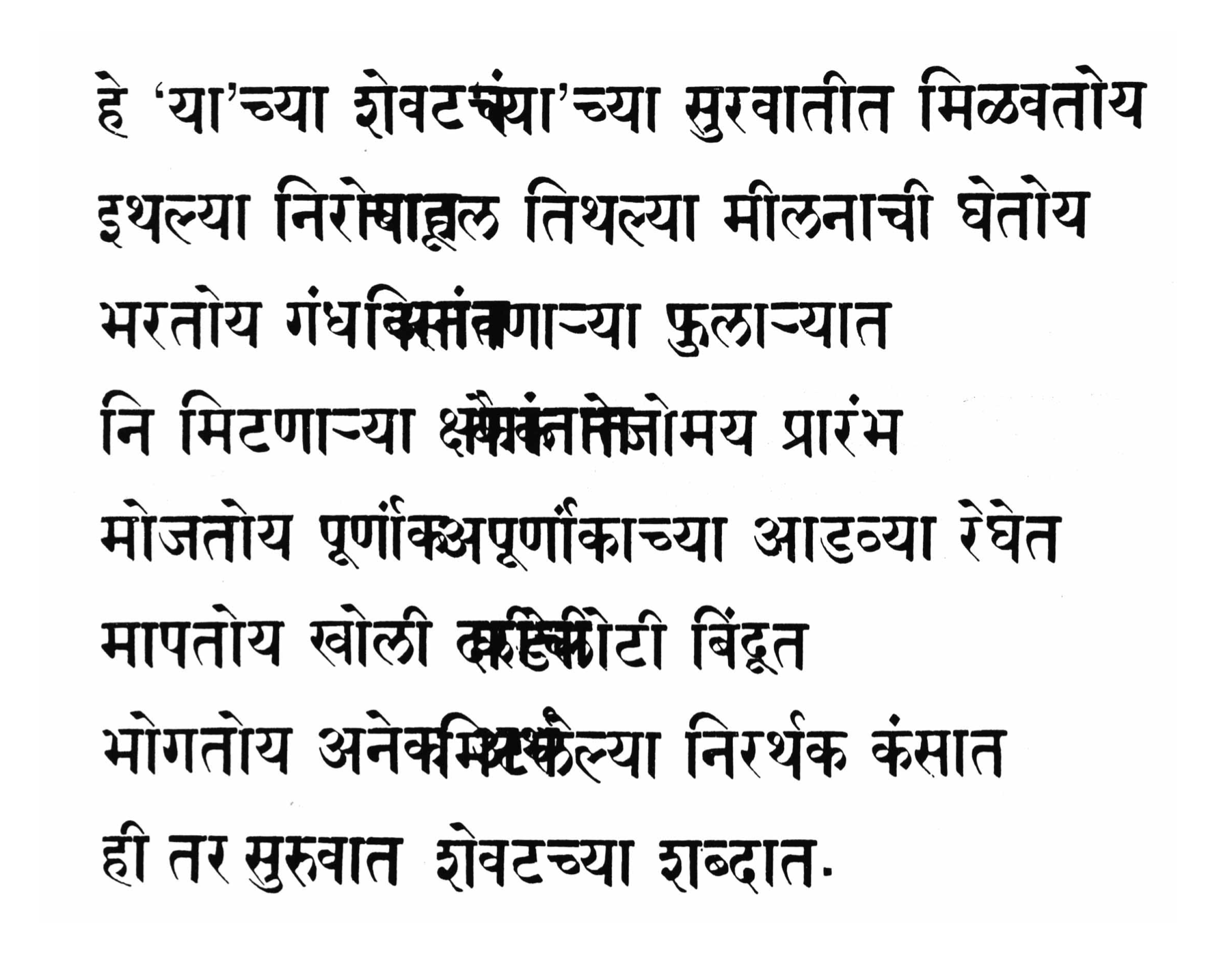
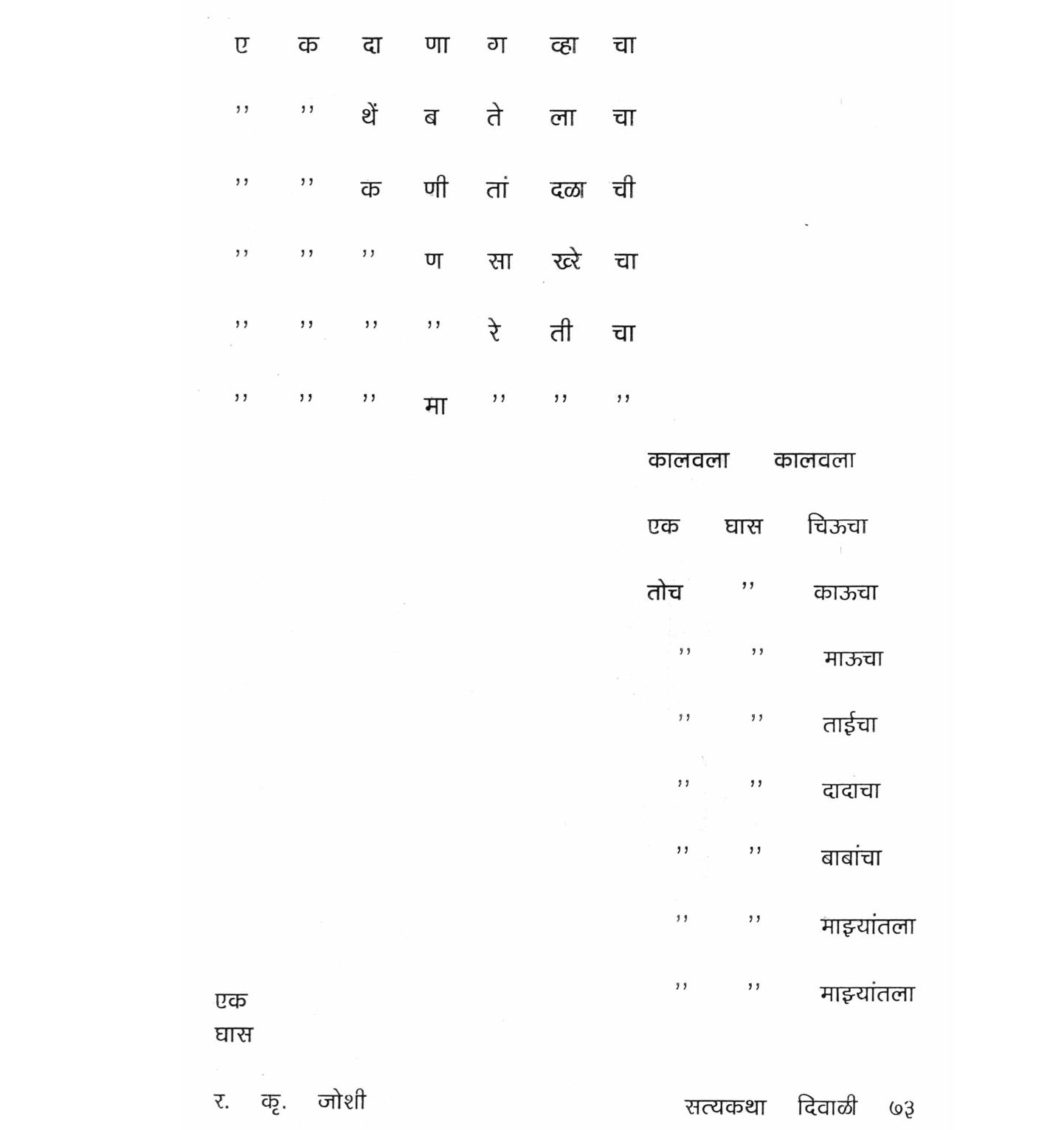
Concrete Poetry
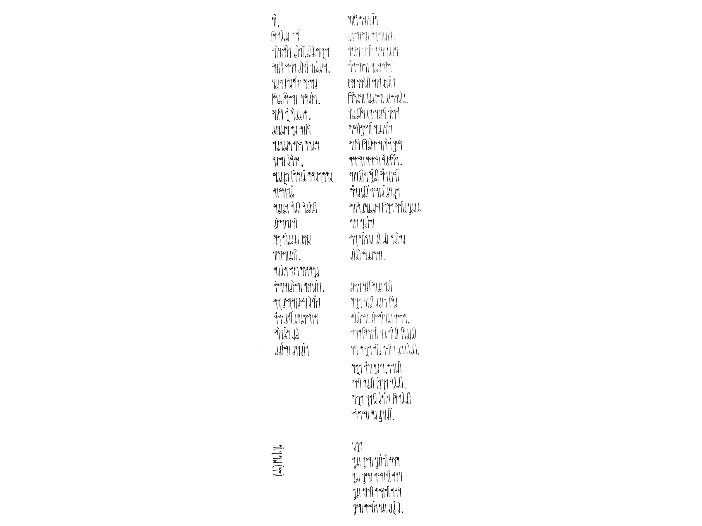
Anjali Nerlekar, in her book Bombay Modern: Arun Kolatkar and Bilingual Literary Culture, describes Joshi as “the real concretist in Marathi poetry.” In her translation of the poem that opens this article she retains the italicization of text, a technique she suggests Joshi used to separate the factual from the emotional.
Joshi’s poetry seems to first appear in popular Marathi literary magazines Moj and Satyakatha in the mid- to late ’60s. Saynekar remembers seeing these poems almost a decade later as a design student, and describes how they stood out from other Indian poetry because of their spacing and layout. Saynekar paraphrases a conversation in which Joshi defended his style against detractors who looked down upon concrete poetry.
Why should connoisseurs of poetry deprive themselves from enjoying the visual form of a poem along with its content? There is nothing wrong with a poet “visualizing” a poem as he composes it. If a poem follows an in-built pattern of rhythm and its content is drenched in visual imagery, then these virtues should be transformed into a visual form that does not follow the routine.
R. K. Joshi
Concrete Poetry Gallery
The selected sample images below are high-res scans. Click an image to enter fullscreen view, then pinch or click to enlarge.
Joshi was an active participant in the Little Magazine Movement within the state of Maharashtra, engaging with the literary and artistic communities of the 1960s and dovetailing with the formation of the state of Maharashtra and its capital, Mumbai. Irregular magazines from small independent publishers offered a vehicle to express the angst and joy of living in a young nation. The publications showcased many poets, writers, and artists who were active participants in the Dalit Panthers movement.
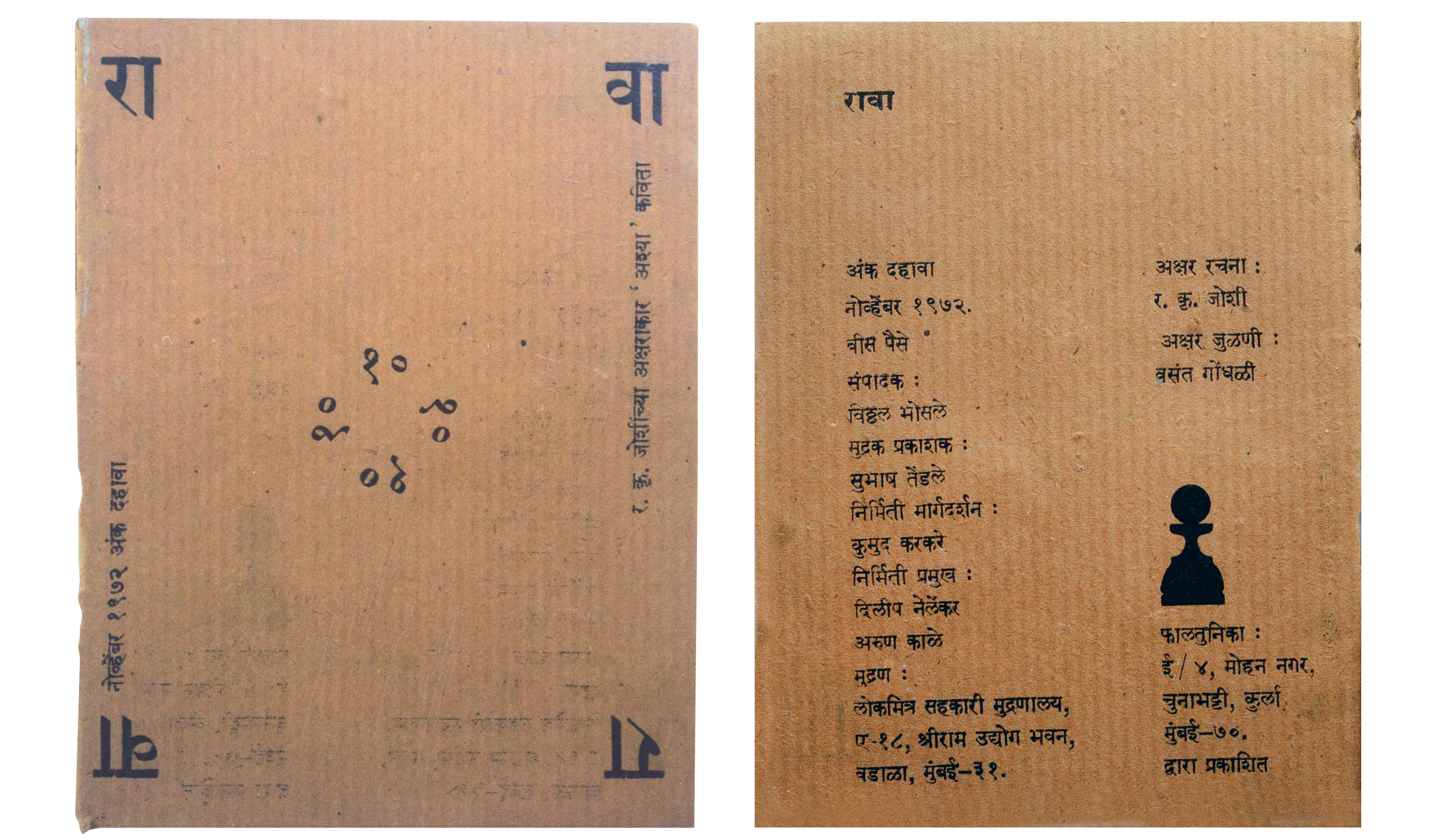
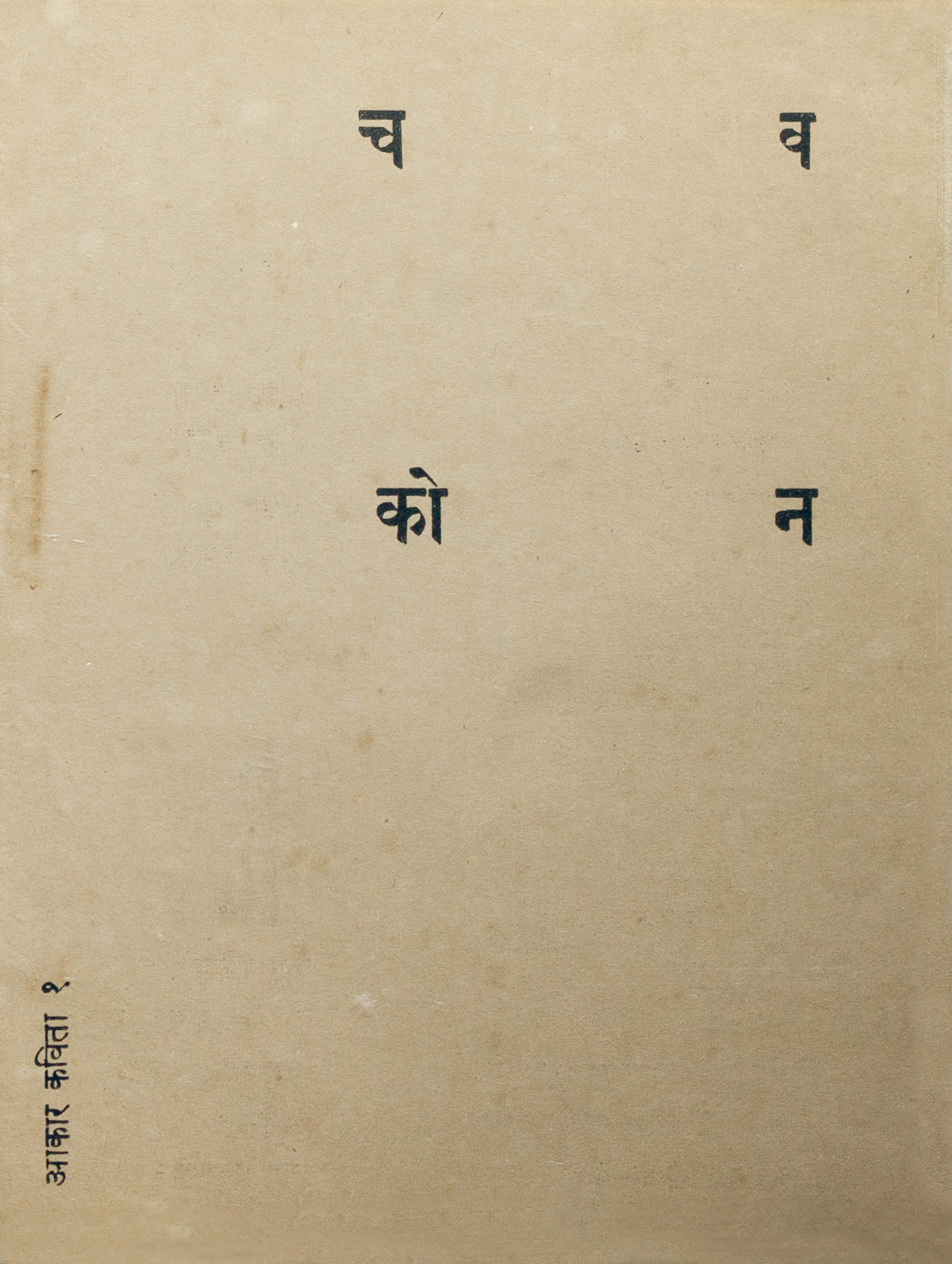
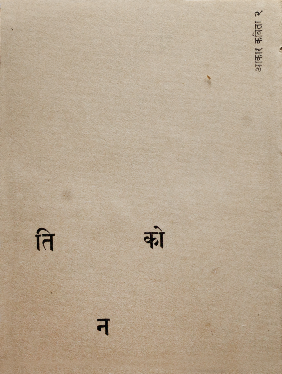
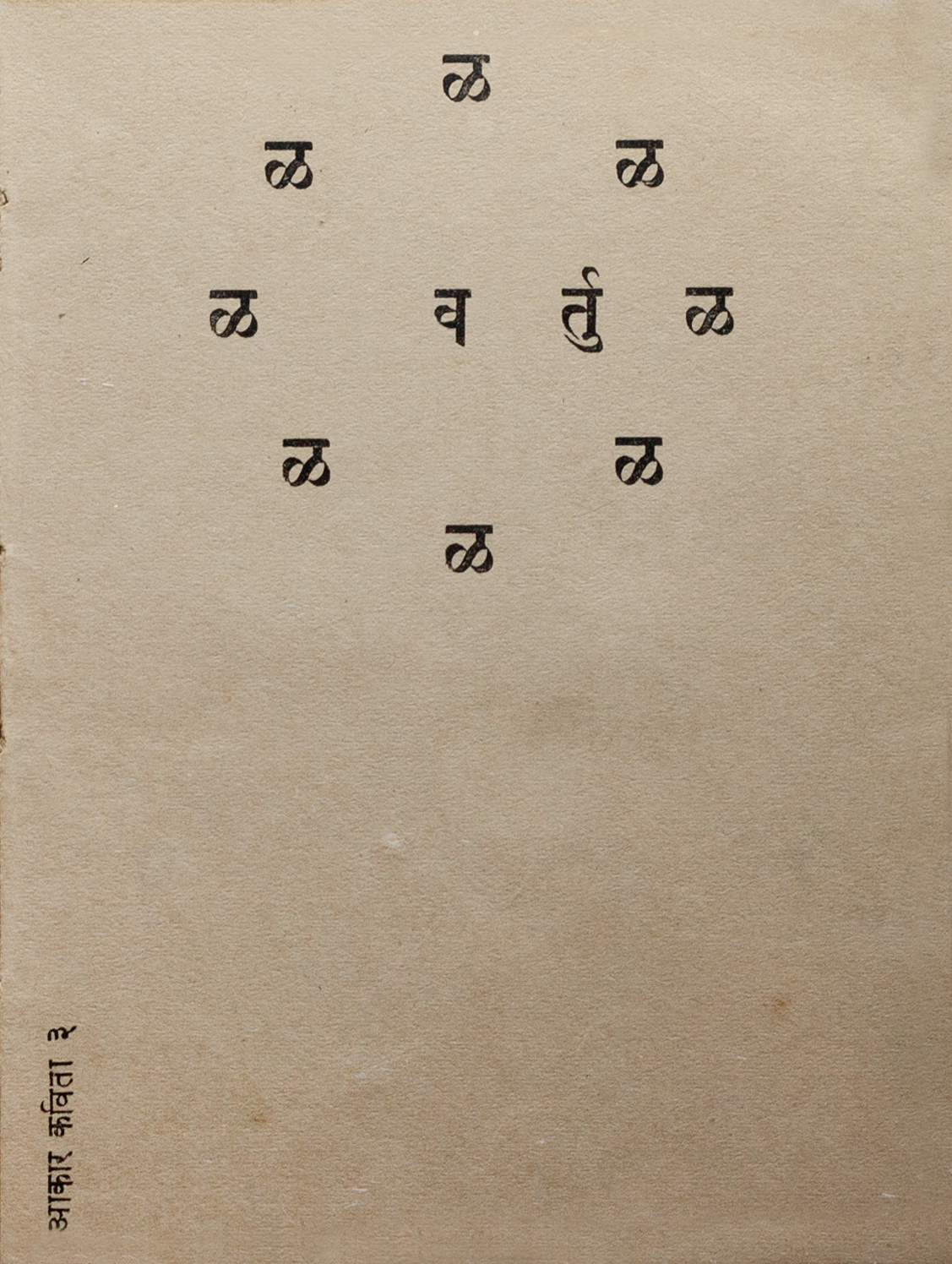
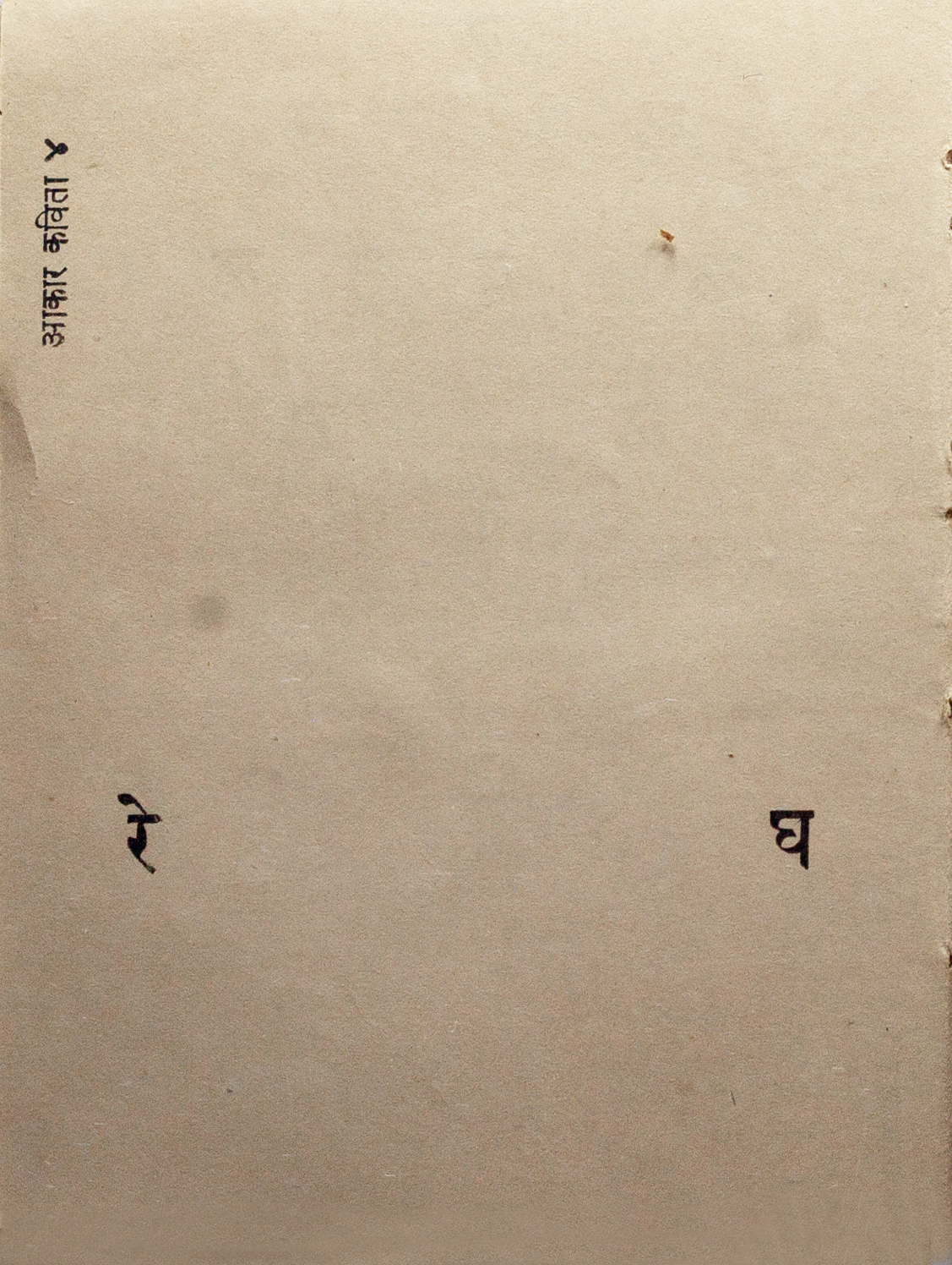
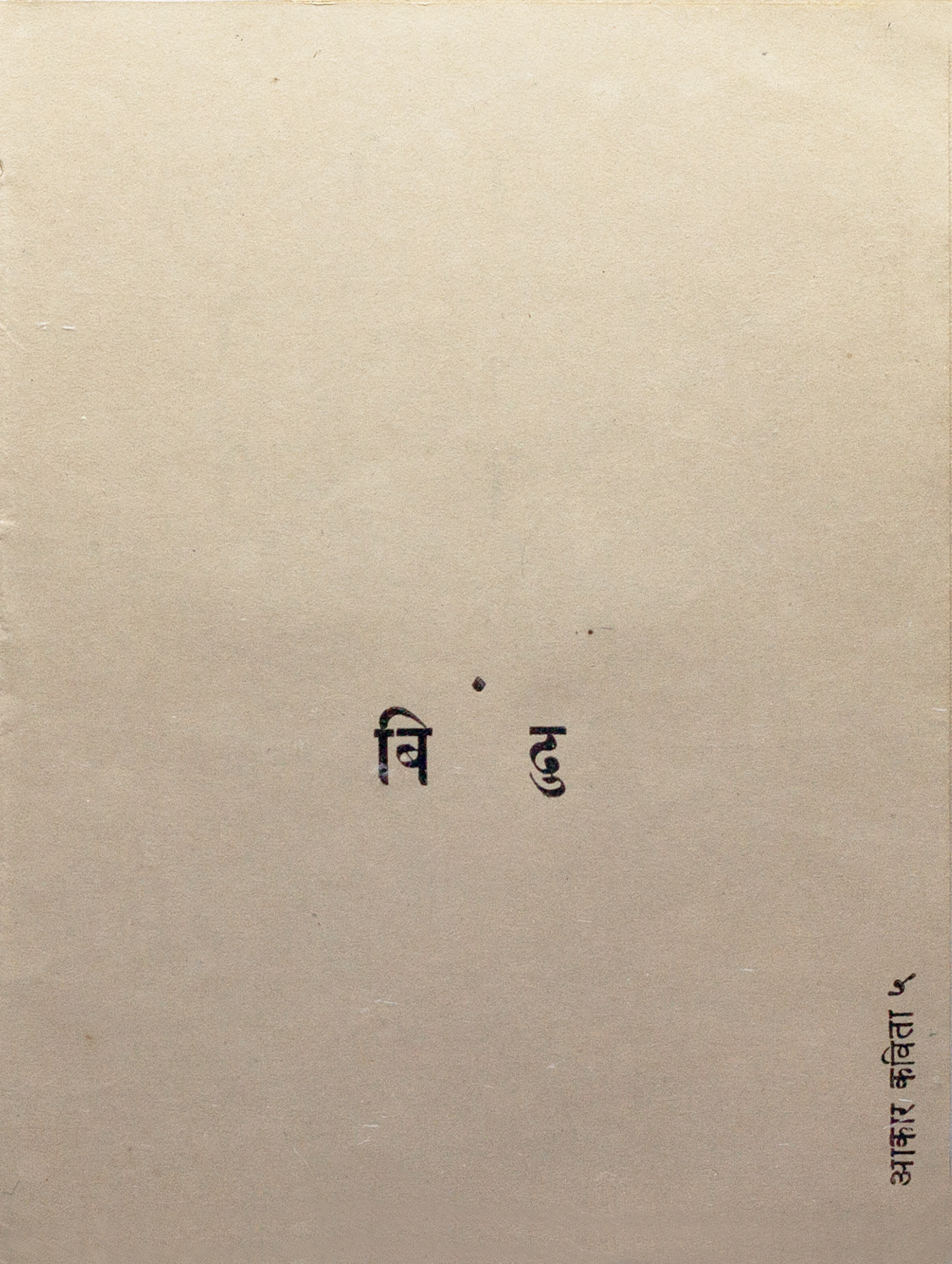
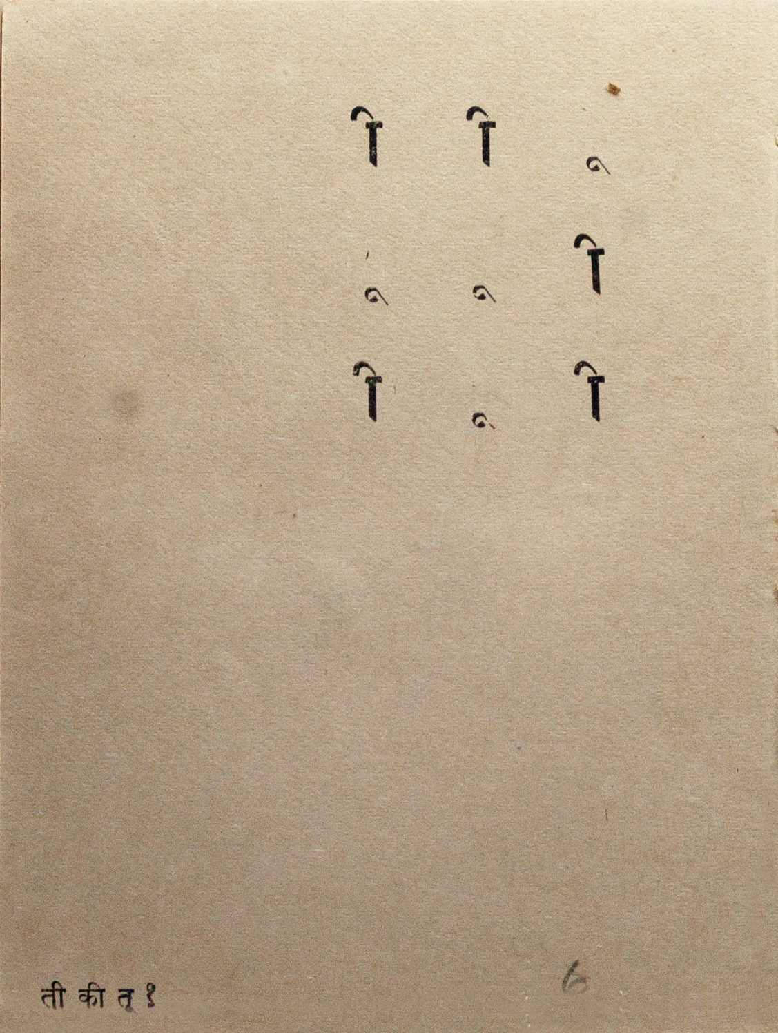
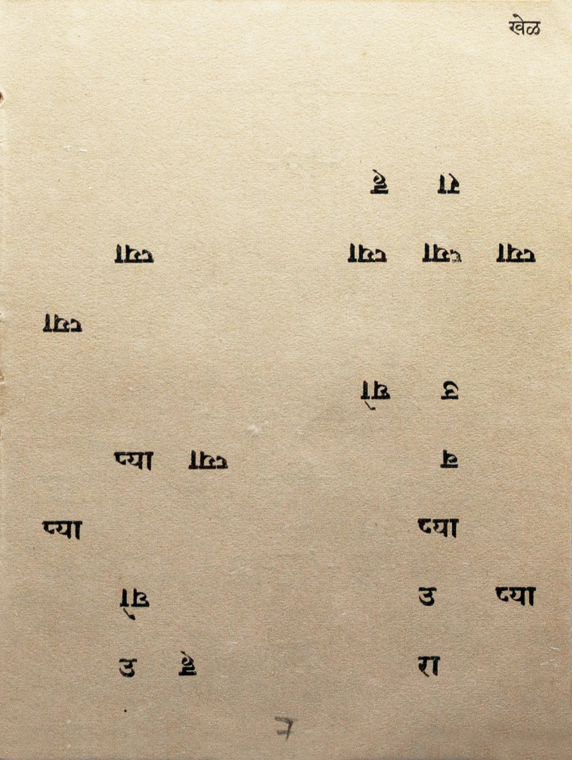
Joshi edited and designed the tenth issue of the Panthers’ रावा (Rava). The striking cover, without a traditional nameplate, uses the text as image, breaking the word “RAVA” into its two syllables and repeating it to fill the four corners with “रा" "वा”. The issue is filled with Joshi’s concrete poetry, and he titles this on the cover as “र. कृ. जोशींच्या अक्षराकार ‘अश्या’ कविता.” He invents the term “अक्षराकार” (Aksharakar), playing with the Marathi words for “letter” and “shape”, which can also be used to describe concrete poetry. Nerlekar translates this phrase as “poems like those of the wordsmith.” Typeset by Vasant Gondhali in Devanagari fonts, and letterpress printed on cheap paper, Rava was sold for 20 paise (one fifth of a rupee) per issue. Joshi titled the works of आकार कविता or concrete poetry by numbering them. The text was used to illustrate the shapes it spelled out in Marathi.
Rava Gallery
The selected sample images below are high-res scans. Click an image to enter fullscreen view, then pinch or click to enlarge.
Multilingual Happenings
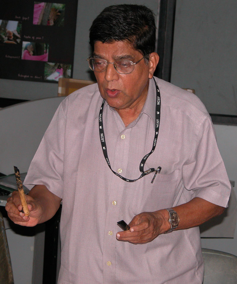
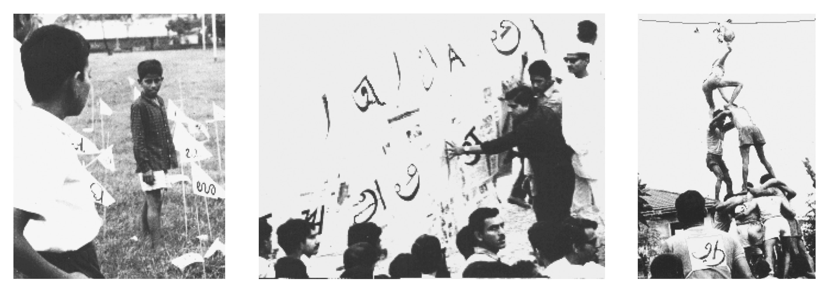
From 1983 to 1996, Joshi taught calligraphy, typography, and type design at the Industrial Design Centre, IIT Bombay. He also organized several exhibitions and typographic happenings, which he described as a way to "expose the common people to the rich heritage we have in our languages and scripts, and how beautiful they look and sound. It was to urge them to come together to sing, dance, and interact." Saynekar remembers one happening at the Asiatic Library in Mumbai where Joshi and several volunteers recited poetry in different languages while inviting onlookers to participate. Another time, for the festival of Dahi Handi, a popular celebration in Maharashtra where participants gather to form a human pyramid, Joshi conscripted climbers to wear letters with Indian scripts on their vests. The organizer thought the idea strange, but harmless, and went along. In his interview, Joshi recounts that he staged 16 events in a year, many of which required extensive practice and rehearsals.
Designing Fonts for Indian scripts
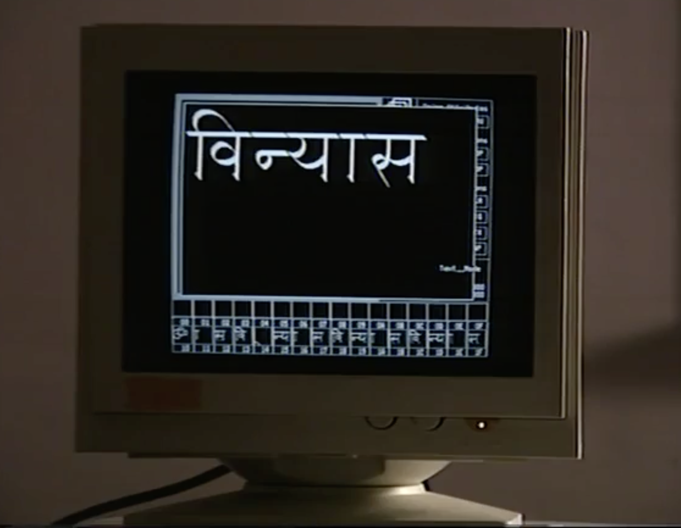
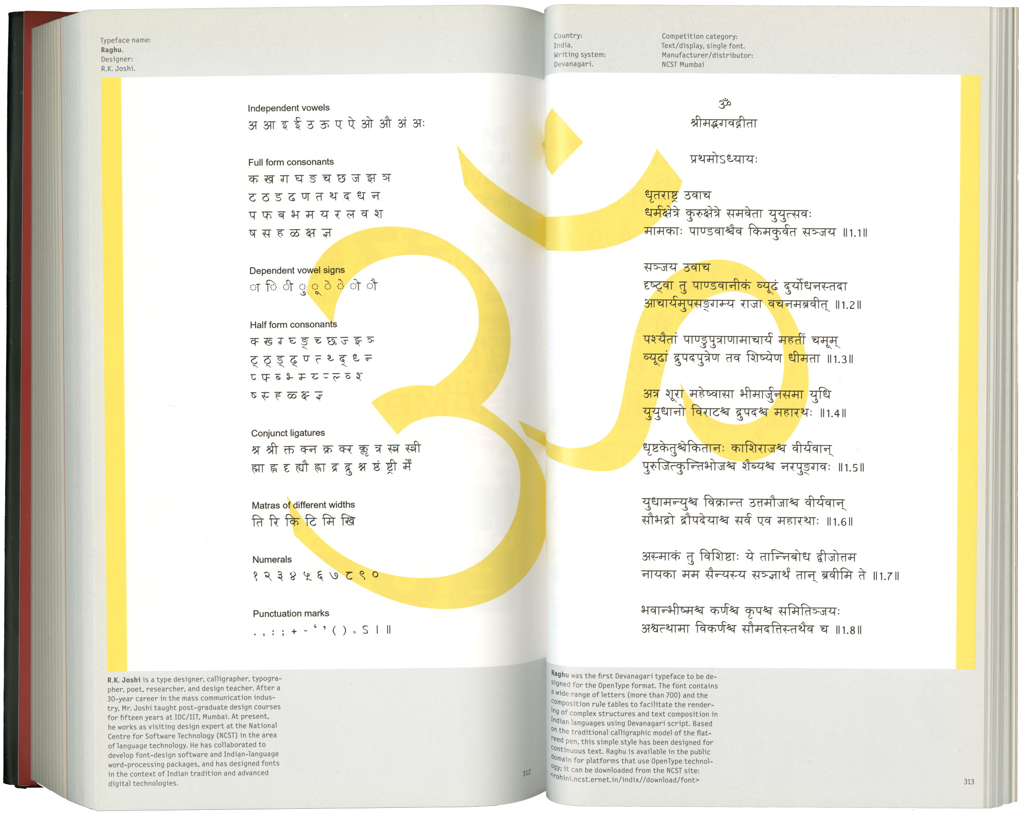
It seems only a natural progression for someone so passionate about letters to design a typeface. Joshi talks about having first designed two typefaces in 1966 that were never cast, but he eventually worked with C-DAC (Centre for Development of Advanced Computing) where he created fonts for Indian scripts, such as Raghu (see below). He was also involved in computer programming, designing and developing the type-generating software Vinyas, which he described as a calligrapher’s tool, and Vividha, a text editor that enabled transliteration between Indian scripts. Joshi went on to design the core set of Indian fonts for Microsoft’s Windows operating system, such as Gautami, Karthika, Latha, Raavi, Shruti, Tunga, Vrinda, and Mangal which was awarded a Bukva:raz! prize.
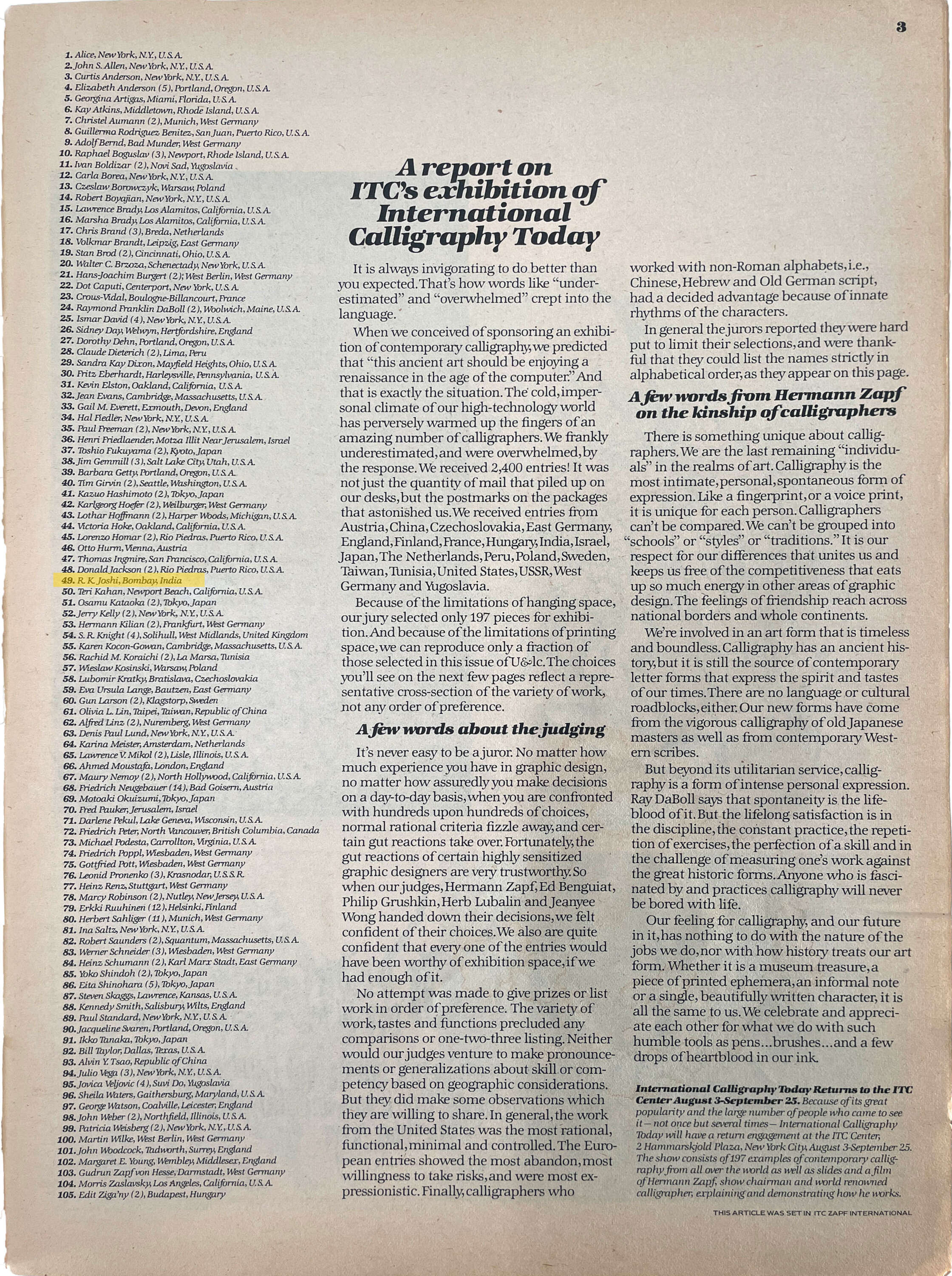
In the early 2000s, Joshi was the AtypI (Association Typographique Internationale) delegate from India, a role he shared with Rathna Ramnathan, and he gave presentations at the organization’s conference in Rome in 2002 and Lisbon in 2006. Two years later, he was on his way to San Francisco to attend the Unicode conference when he passed away.
Joshi's commitment to Indian scripts, language, and design left an indelible mark on the world of type and technology. For over 50 years, he facilitated multilingual communication, from the time when India was a young nation, all the way into the digital age. While many are still getting to know his work, he is certainly one of the most influential figures in Indian graphic design at large, and especially in calligraphy, typography, and type design.
Tanya George is a Mumbai-based designer and educator with a wide-ranging freelance practice that includes designing letterforms for brand identities as well as fonts across different Indian scripts. She also conducts type walks around Mumbai, along with typography workshops, and writes about type.