News
This Just In: Michael Doret’s Disney and Pixar Title Treatments
Dozens of title treatment sketches by the renowned lettering artist and designer have found a home at the Archive.
There are designers who choose to master their craft for a specific industry. And then there are designers, like Michael Doret, who refuse to stay in one lane. Doret brings his lettering talent to a range of clients: designing logos for sports teams, fast food chains, titles for comic books, children’s animations, drama movies, and typefaces. He sees each project as a unique design challenge: embracing the differences and running with them to come up with the most exciting solution possible. To put it simply, nothing is out of Doret’s reach. In 2018, Doret donated half of his working archive to Letterform Archive and the other half to the Herb Lubalin Center in New York. We are honored that Doret’s final proofs for early movies, as well as developmental sketches and inked comps for Disney and Pixar animated features, have found a home in our growing collection of process material.
Selections of early titles
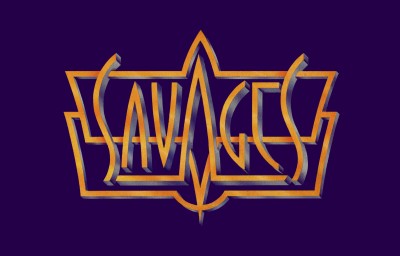
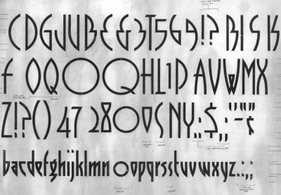
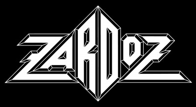
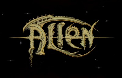
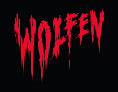
Early on in his career, Doret dove into the world of movie promotion, designing titles for Savages (1972), Zardoz (1973), Alien (1979), and Wolfen (1980). For Savages, the Merchant Ivory Productions’ feature, Doret drew on Art Deco forms and designed an exclusive typeface, which was used in the movie’s credits, on posters, and on title cards in the movie. A year later, Doret designed the title for Zardoz, directed by John Boorman. Doret described the logo, which features geometric letterforms with razor-sharp edges, as one of his best title treatments for ironically “one of the worst sci-fi films ever made.” Fans of Academy Award–winning movie Alien might not recognize Doret’s title, since it was not used much for promotion. Together with pop-surrealist artist Todd Schorr, Doret created a highly detailed title that captured the look and feel of the veiny, skeletal alien characters. For Wolfen, Doret approached the title as a “tongue-in-cheek take” on ’40s and ’50s horror movies — a style which can also be found in our collection of German movie programs from the period — with letters that looks like ripped flesh and dripping blood.
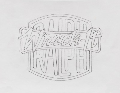
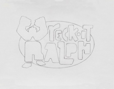
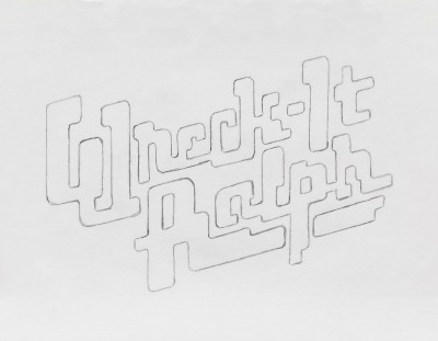
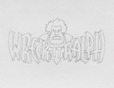
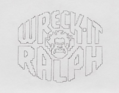
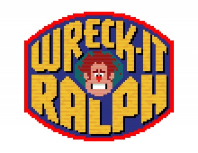
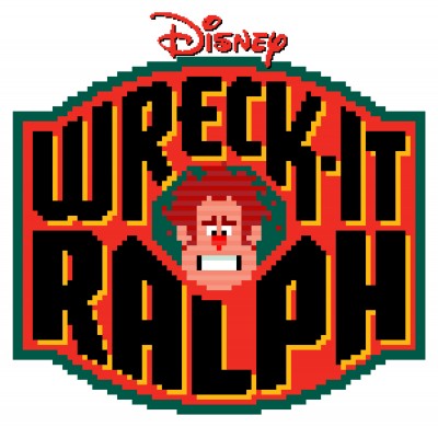
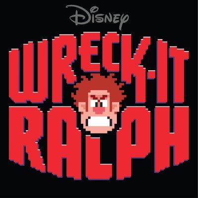
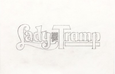
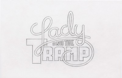
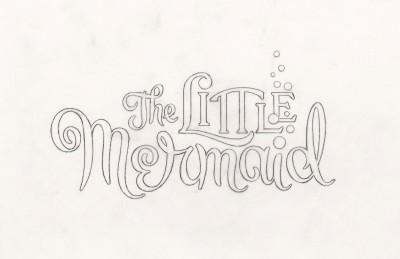
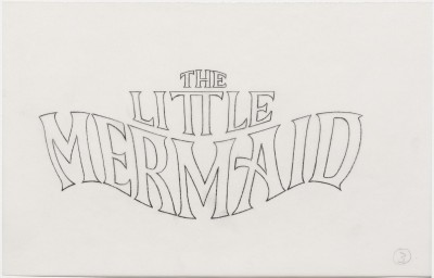
After Wolfen, it was more than 20 years before Doret worked on title treatments again. This time, he was commissioned by two of the best animation studios in the world: Disney and Pixar. Doret’s first title treatment projects for Disney were in 2005 for the DVD of Lady and the Tramp and the re-release of The Little Mermaid. In 2012, Creative Director and Disney Executive Vice President of Creative Print, John Sabel, approached Doret to design the title treatment for Wreck-It Ralph. The logo stands out as a turning point in the Disney portfolio, with bitmap letters and a pixelated portrait of Ralph inspired by 1970s arcade games.
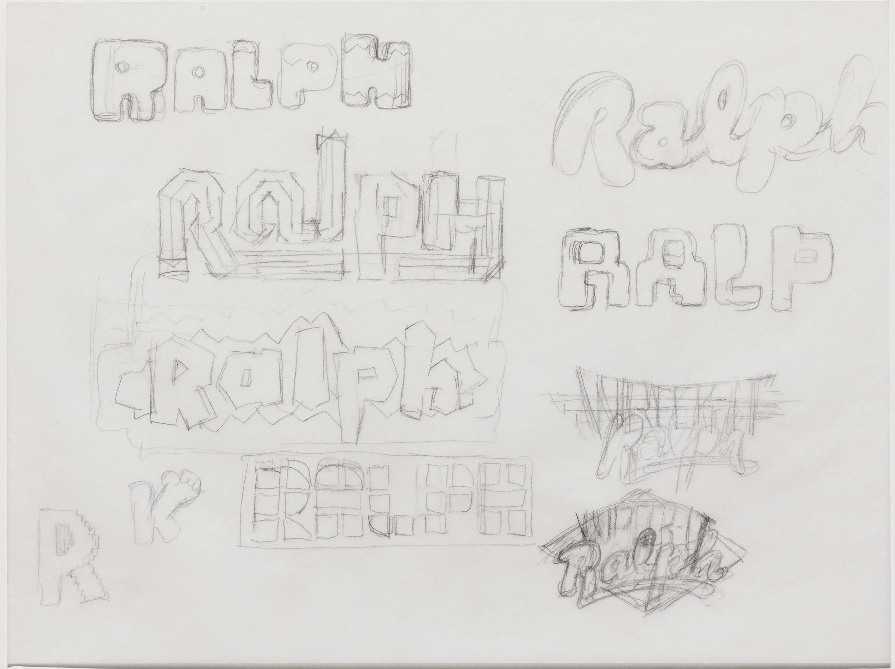
Wreck-It Ralph (2012)
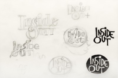
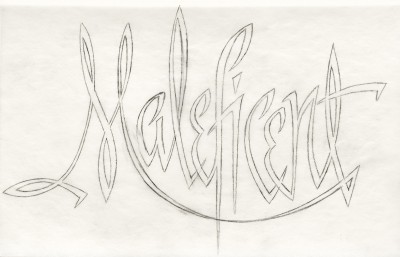
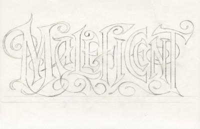
“Up until that time, the title treatments for Disney movies were conservative and rather tame. We broke out of that mold with a title completely different from anything Disney had done before. We tried to shake up the status quo, and that success led to a long string of assignments,” he recalled. From there, he went on to contribute designs for more animated features. His playful work for Oz the Great and Powerful, Maleficent, Inside Out, Tomorrowland, Moana, Coco, Big Hero 6, Zootopia, and many more reimagines the ways lettering can represent a movie.
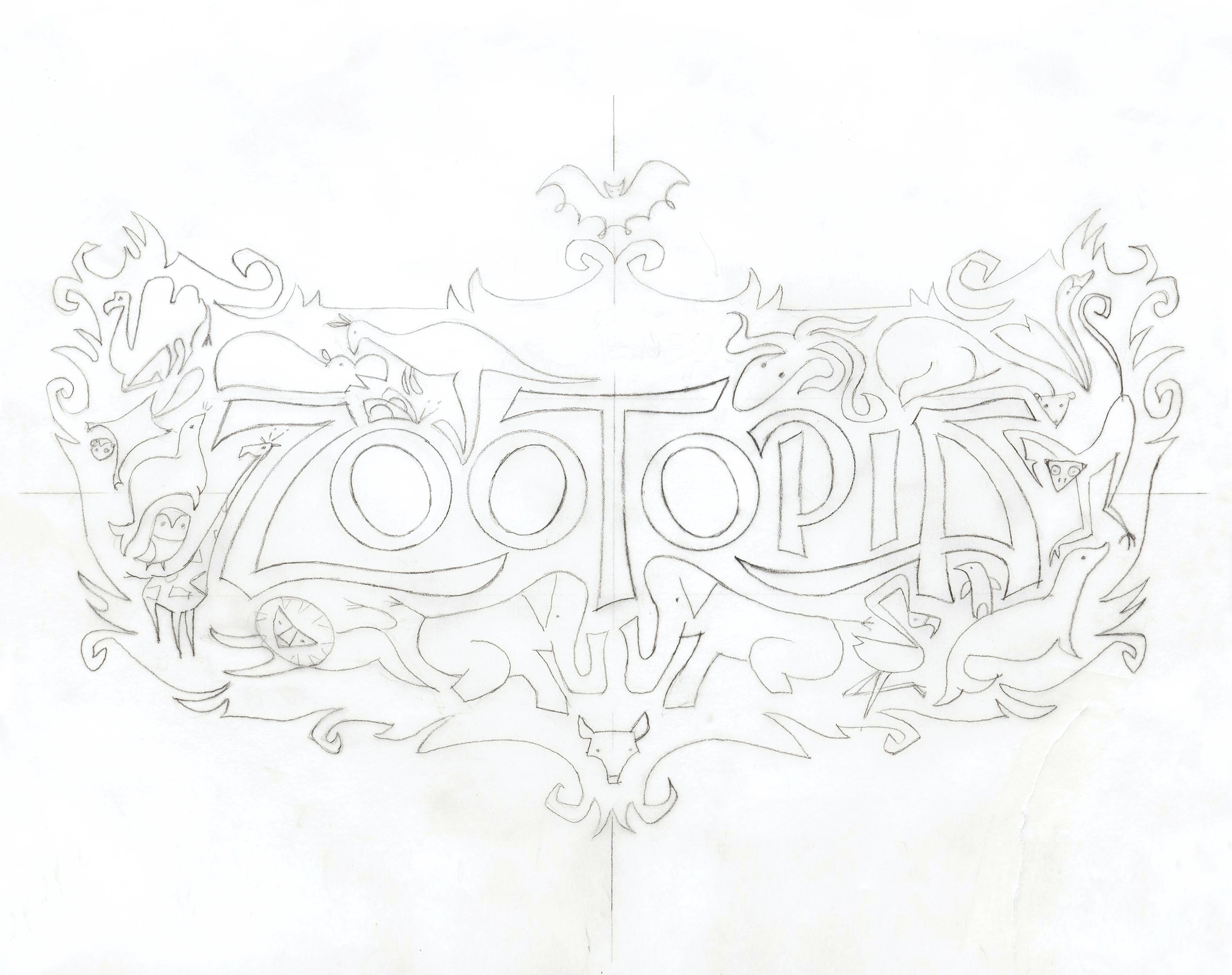
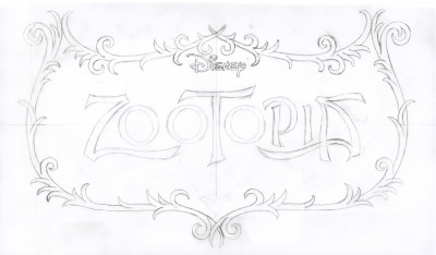
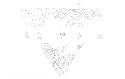
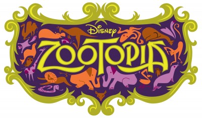
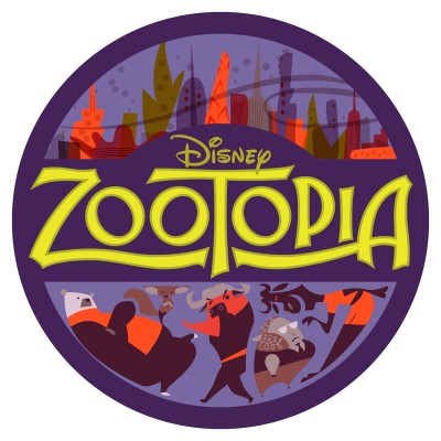
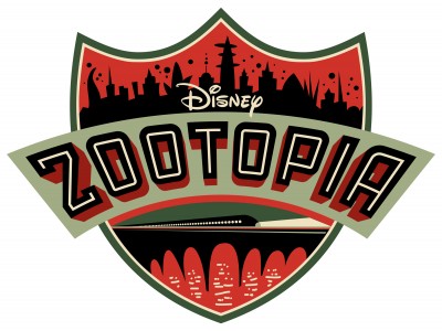
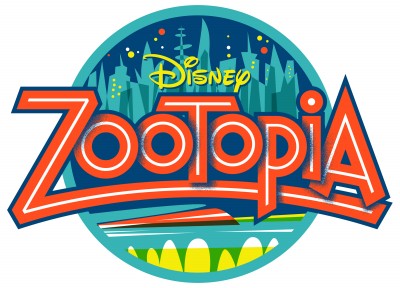
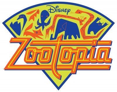
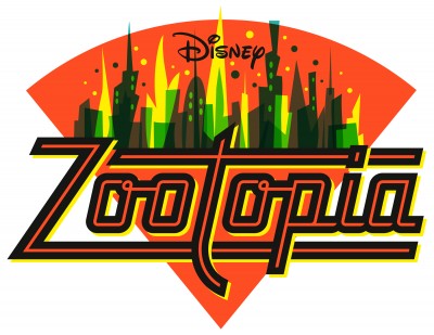
Zootopia (2016)
Everyone knows that Disney and Pixar movies take several years — and several hundred creative professionals — to produce, involving everyone from writers and concept artists to art directors and animators. Where does Doret fit into the timeline? It varies from project to project, but there is usually quite a bit of lead time. He began Wreck-It Ralph in the summer of 2011, and the movie was released in the fall of 2012. With Moana, he was brought in very early on, two years before the release date in 2016. Working with a huge team, there are many moving parts, with many stakeholders weighing in on almost every aspect of the design process. As a result, there are times when Doret’s titles “just end up on the cutting room floor.”
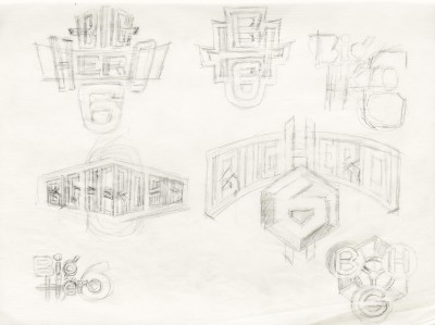
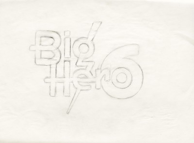
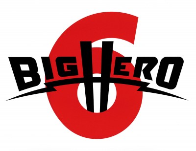
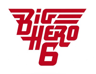
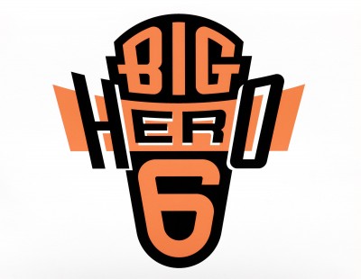
Big Hero 6 (2014)
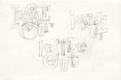
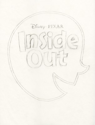
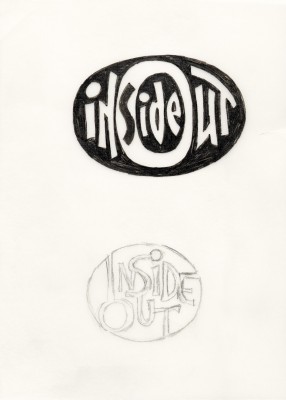
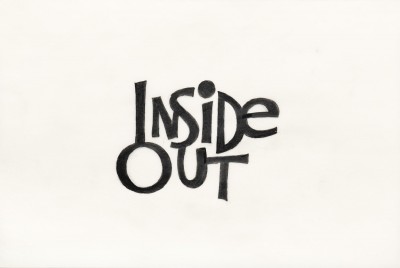
Regardless of the outcome, Doret believes it’s his responsibility as a designer to generate multiple ideas. “It has always been puzzling to me that many design studios provide large numbers of digital iterations of designs with only minute tweaks between the designs. I have always endeavored to provide as many real alternatives as I can when working on design projects — especially in the early stages when the client may not be sure of the direction in which they would like to go,” he said. Looking at sketch after sketch, you begin to understand how much Doret honors and enjoys this process. He doesn’t sacrifice quality for quantity — each sketch is a comprehensive exploration of a new idea.
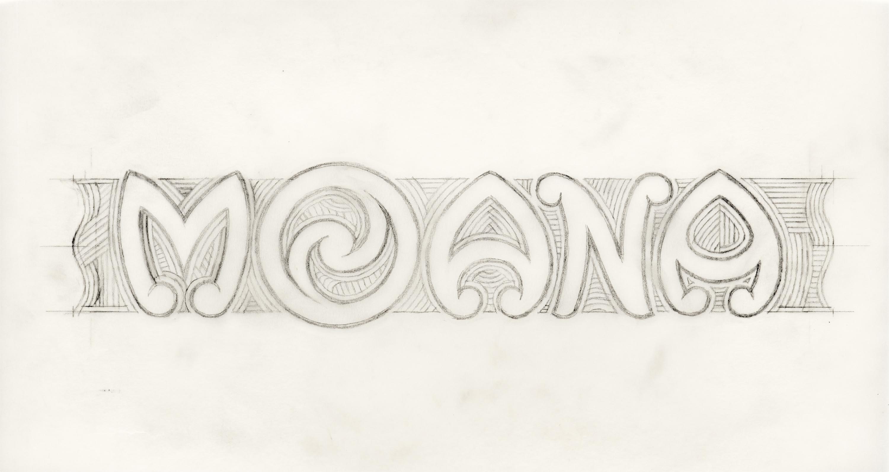
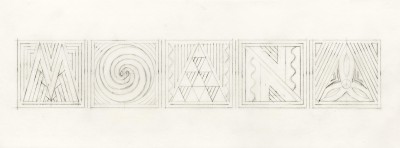
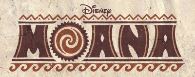
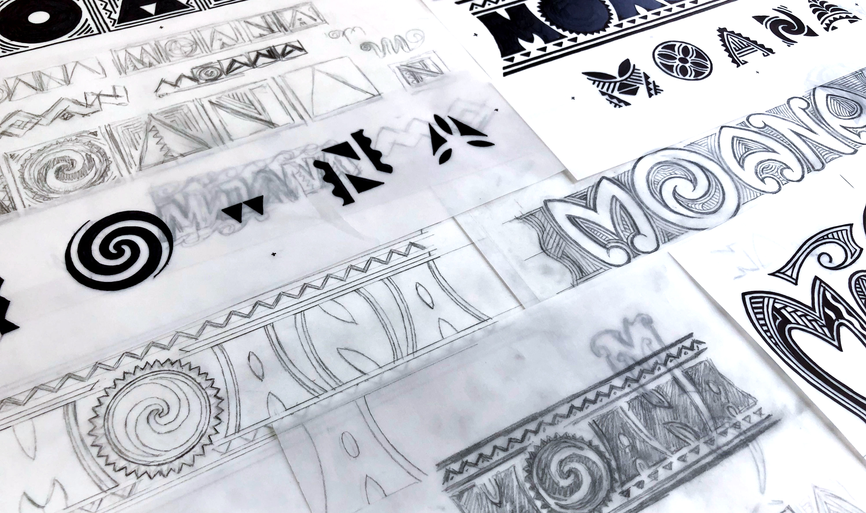
Moana (2016)
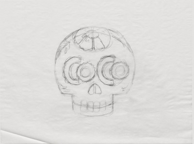
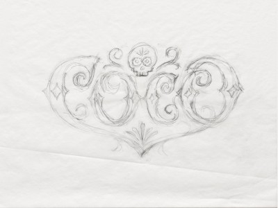
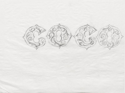
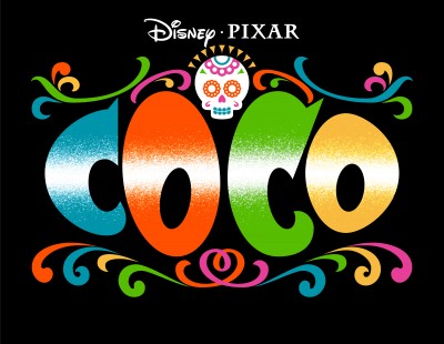
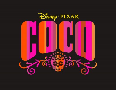
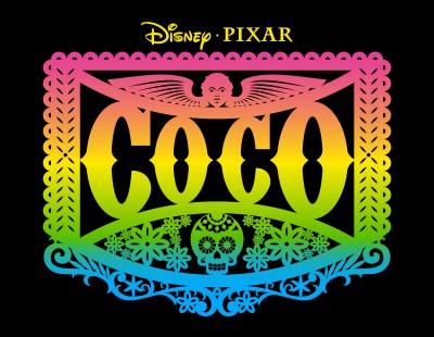
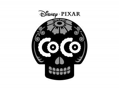
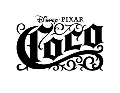
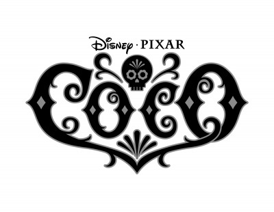
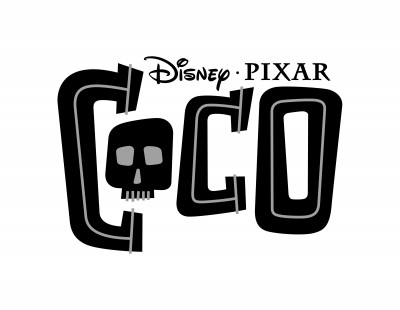
The amount of information Doret receives about each movie, whether visual or narrative, also varies. He was provided many references for Moana, including indigenous patterns, tattoos from the character Maui, and 3D renderings of Moana’s boat. However, for most movies, he received only bits of narrative info and was tasked to pursue his own research. “For Coco, the visual research I did centered on Day of the Dead, other types of Mexican graphics, and my memories of visiting the city of Oaxaca during el Día de los Muertos,” he said. This shows up in his lettering treatments referencing decorative skulls, papel picado lace paper designs, and marigold flowers. Most of the time, however, Doret is on his own — following his intuition and “making it up as [he] goes along.”
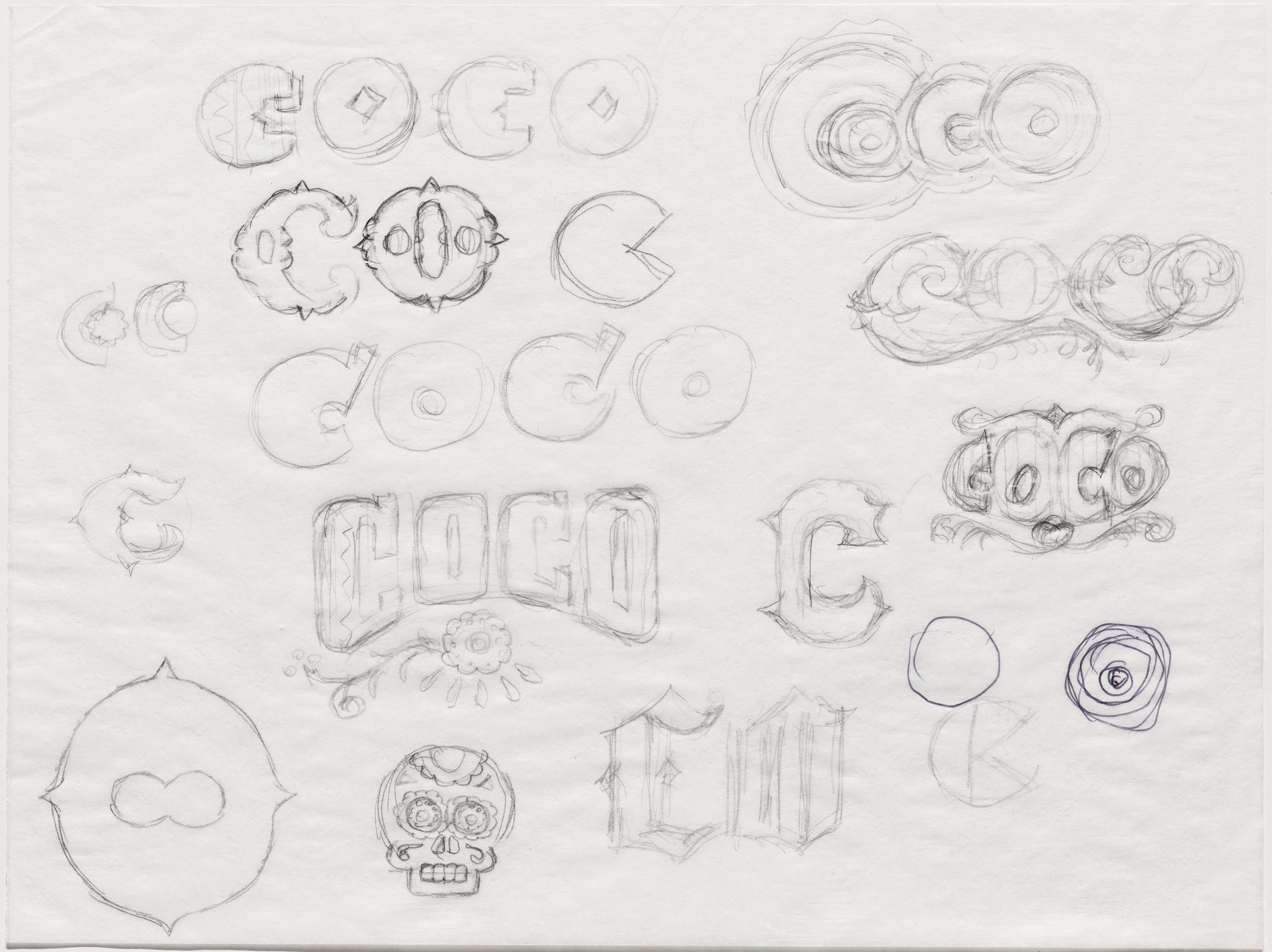
Coco (2017)
With letters and words as his fundamental puzzle pieces, Doret begins to play — testing the limits of these forms and the ways they can relate to one another. He has clearly mastered a range of lettering styles — from serifs to scripts to styles of his own invention, like letterforms that reference the muscular character Ralph. Doret also adds depth to the lockups by considering how words and graphic elements can be framed. As seen in his work for Wreck-It Ralph and Zootopia, molding the stylized letters into shapes like triangles, circles, ovals, arcs, fisheyes, and crests adds another dimension of personality and dynamism to his compositions.
Another distinguishing element of what makes a Doret piece distinctively “Doret” is his color palette, seen in the vibrant renderings of Zootopia and Coco. Their palettes are inspired in large by his experiences growing up in Brooklyn near Coney Island and spending time in his father’s office in Times Square, surrounded by bright lights, dazzling signage, and brilliant colors. From letterform and word, to shape and color — all of Doret’s details thoughtfully relate to one another, and the sum of the parts merge together as one confident, unifying lockup.
More selections from the Doret Collection
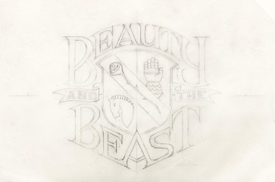
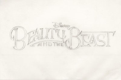
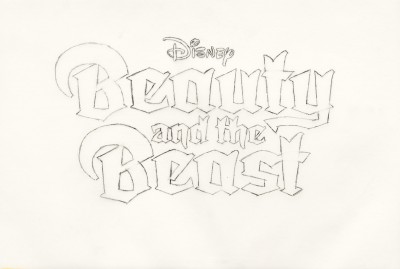
While some of Doret’s titles did not make it to the big screen, his sketches offer a peek into his mind and creative process. In his own eyes, these projects were some of the most exciting work he has done in his career, and his joy is evident in the overflowing folders of pencil drawings, inkings, and comps. The Archive is humbled to preserve this part of his portfolio. Flipping through page by page, from conceptual rough sketches to refined variations, you can follow his journey wondering what he will come up with next. You might question when you will reach the end of the pile, and perhaps even ask yourself if he really found all of the possible ways of lettering a one- or three-word title. But this is exactly what is inspiring and admirable about Doret: just when you think he’s done, he proves to be a never-ending well of ideas, powered by a wholehearted enthusiasm to bring them to life.
— Florence Fu, Editorial Associate
Update, July 2024: Doret’s story is now captured in a new monograph from Letterform Archive Books: Growing Up in Alphabet City: The Unexpected Letterform Art of Michael Doret

