News
Periodicals as Collections, No. 4: Counterculture Newspapers and Magazines
An explosion of independent publishing in the 1960s and ’70s took advantage of new, accessible technology to spread countercultural messages around the world.
- See all the periodicals from this collection in the Online Archive. (Note that this link combines multiple decade and format filters. Try your own filter combos!)
- Take a deeper dive into this collection: Join us for a virtual salon on June 25, 2020.
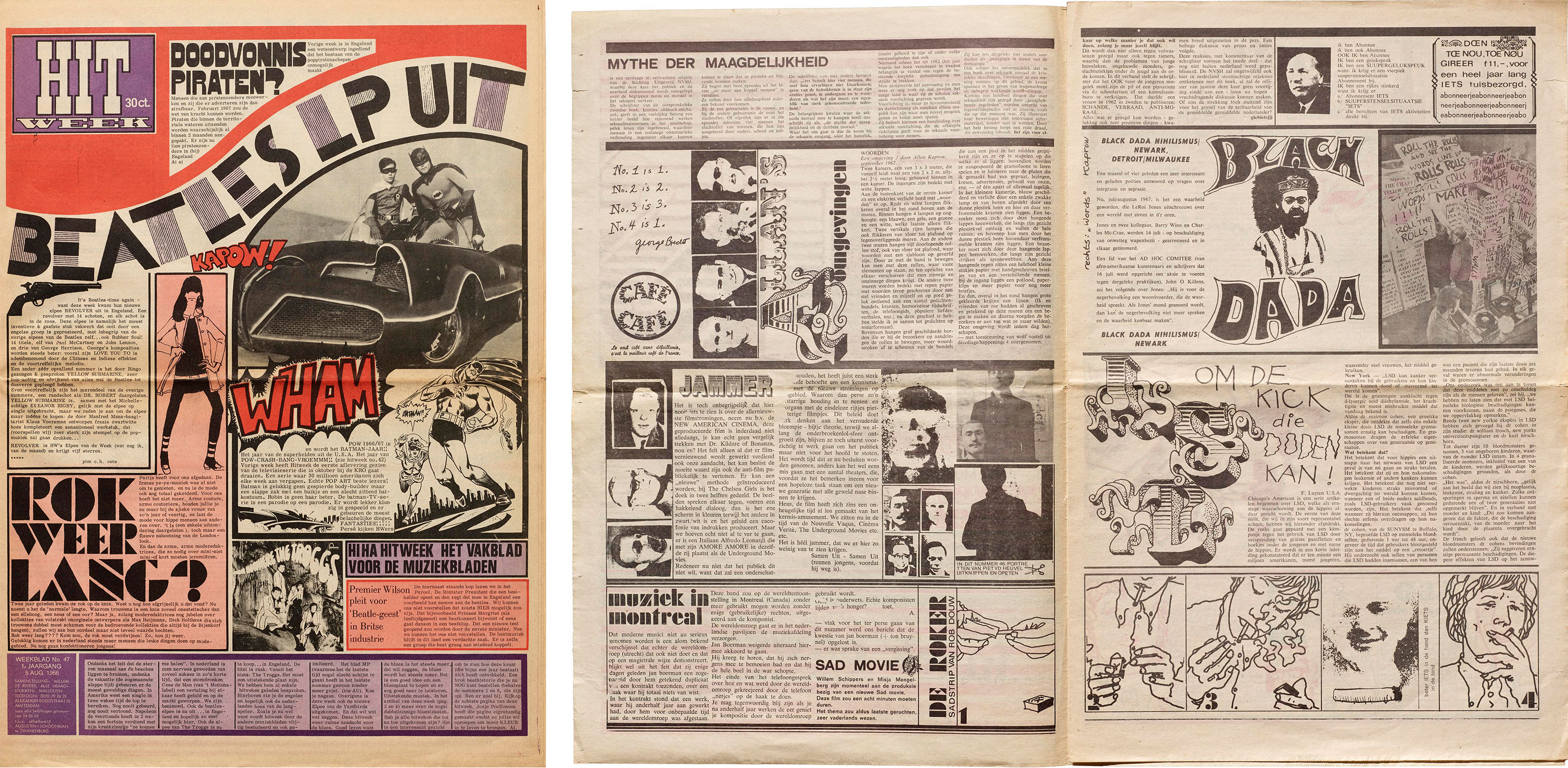
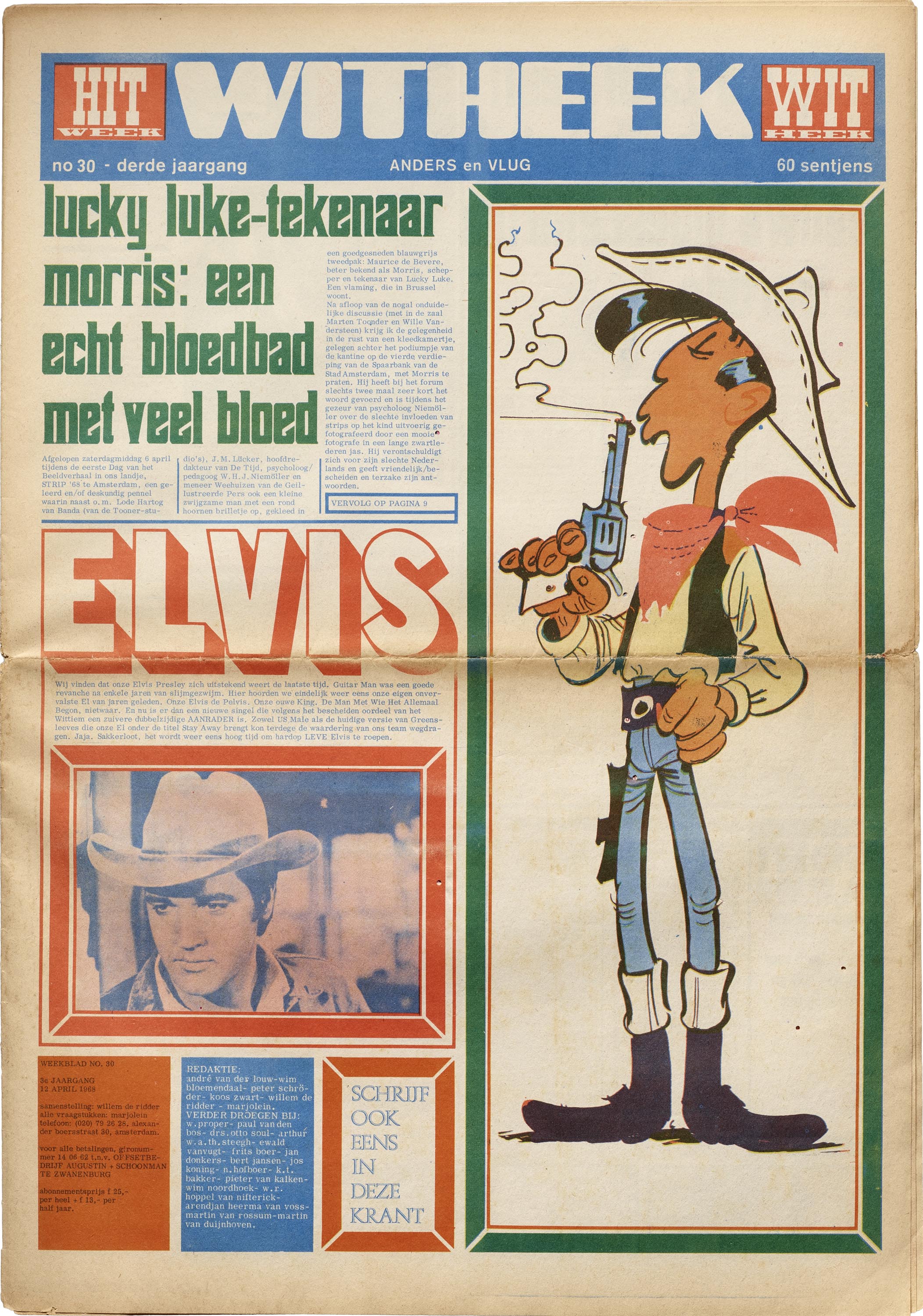
In the first installment of this series on avant-garde periodicals, we featured a Dutch magazine from the 1920s called Wendingen, characterized by editor Hendrik Wijdeveld’s distinctive typographically constructed letterforms and ornaments. So when a collection of hippie and counterculture periodicals from the 1960s and ’70s arrived at the Archive last year — a selection of which is now available for browsing in the Online Archive — we couldn’t help noticing some suspiciously familiar lettering on a 1966 issue of Dutch rock-and-roll newspaper Hitweek.
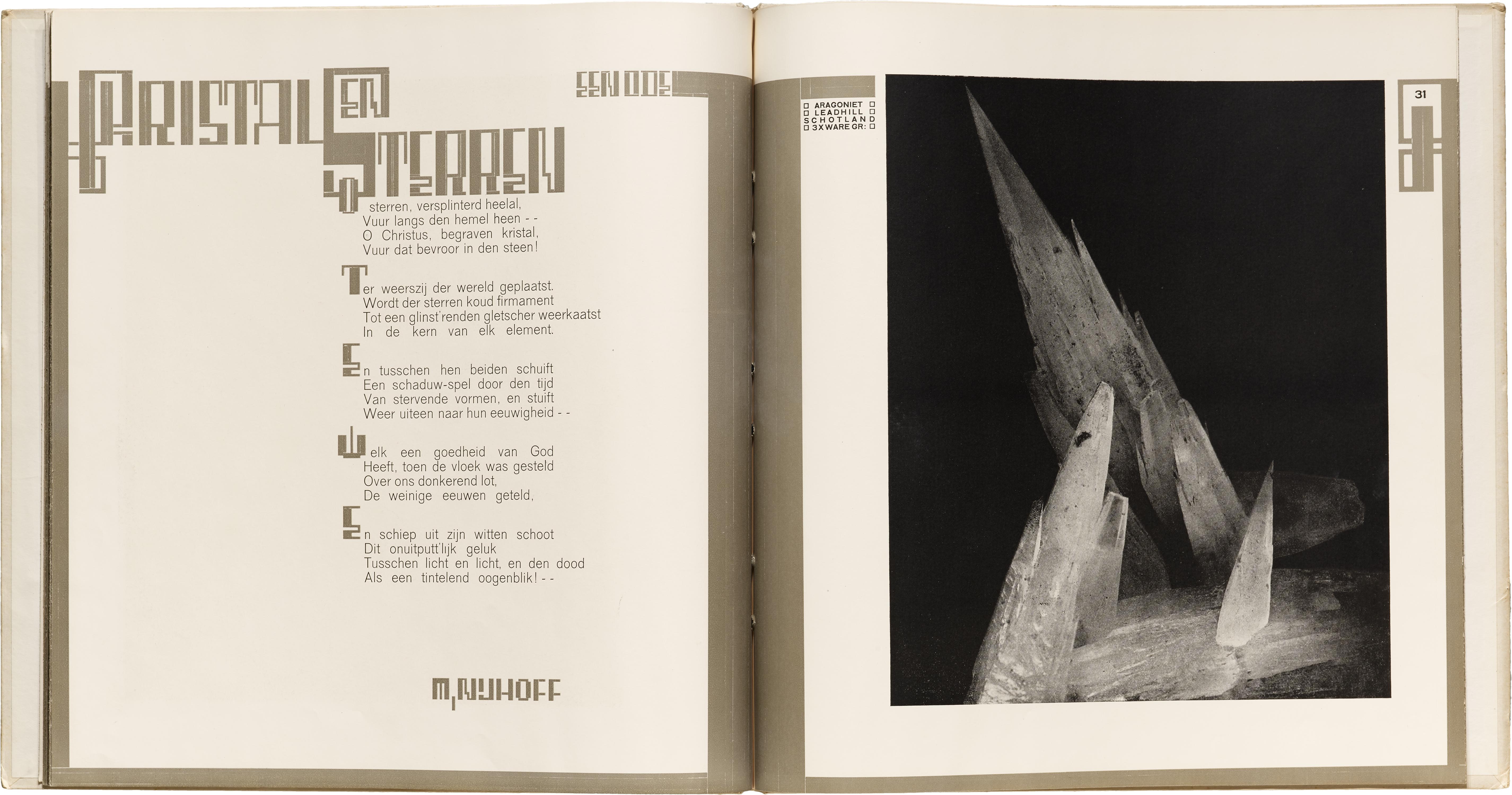
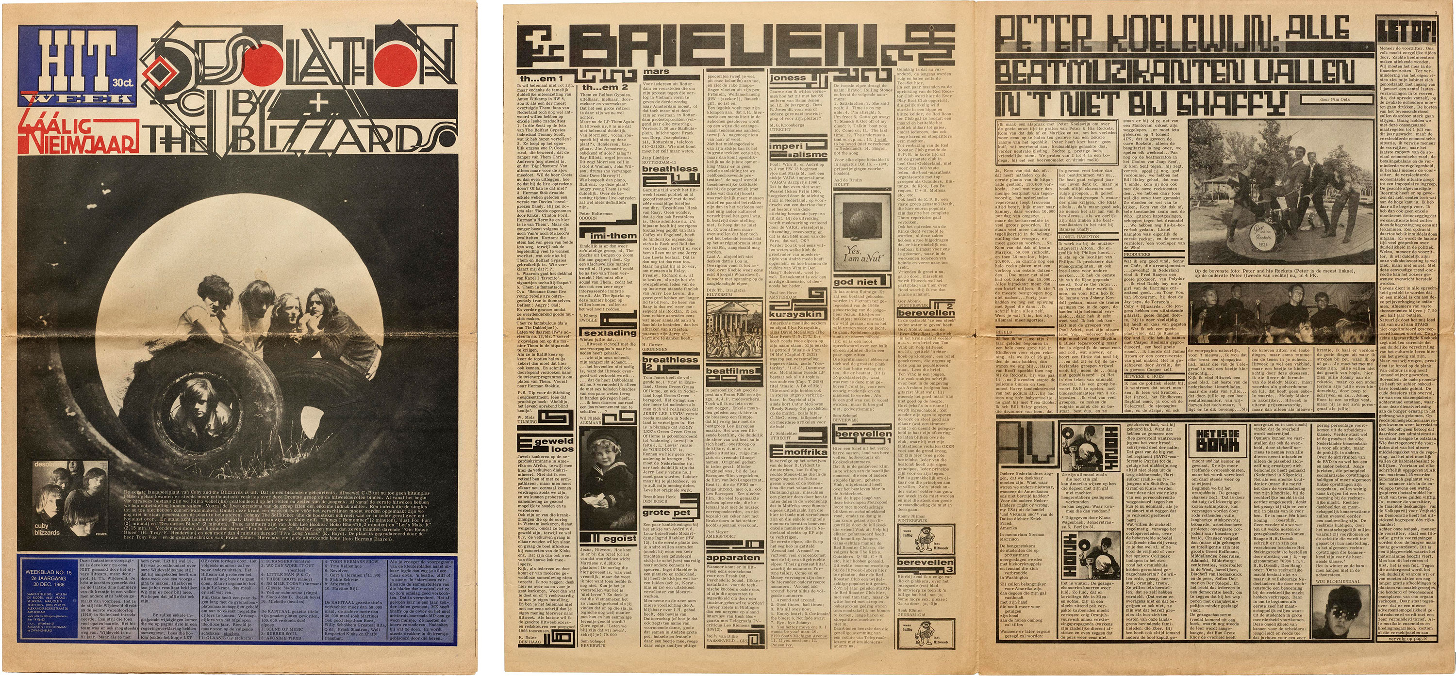
We assumed the lettering was a reverential imitation by Hitweek’s editor and designer, Willem de Ridder, until researching this article, when we noticed a small box on the fourth page of the newspaper crediting it to Wijdeveld himself, who would then have been 81 years old. Despite being a generation apart, De Ridder (who was also affiliated with the international Fluxus group) apparently felt there was some affinity between his new music magazine and the old Dutch avant-garde. Equally, Wijdeveld must have seen kindred spirits in the burgeoning counterculture to so willingly lend them his talents. He even offers a short lyric in the newspaper, intended for any of the “Dutch beat groups that see something in it”, to be set to music.
While not strictly falling into the so-called “historical” avant-garde movements of the first part of the 20th century, the print productions of the ’60s counterculture were made in a similar spirit of radical experimentation and disregard for convention, as well as in comparable conditions of political and social upheaval. Many participants in the new underground publishing were consciously and explicitly referencing the early avant-garde groups, recycling or riffing on their predecessors’ works and techniques — and sometimes, as in the case of Hitweek, bringing in the older generation directly.
A number of new — and newly accessible — technologies for typesetting and printing in the mid-20th century served as catalysts for this explosion of DIY and independent publishing. Phototype and Letraset (or similar dry transfer lettering) made eye-catching display text easier and cheaper to set. Their manipulability and flexibility meant that they were also more amenable to play and experiment than inherently rigid metal type, so typesetting (and type styles) increasingly imitated the freeform lettering popular on psychedelic posters of the same era.
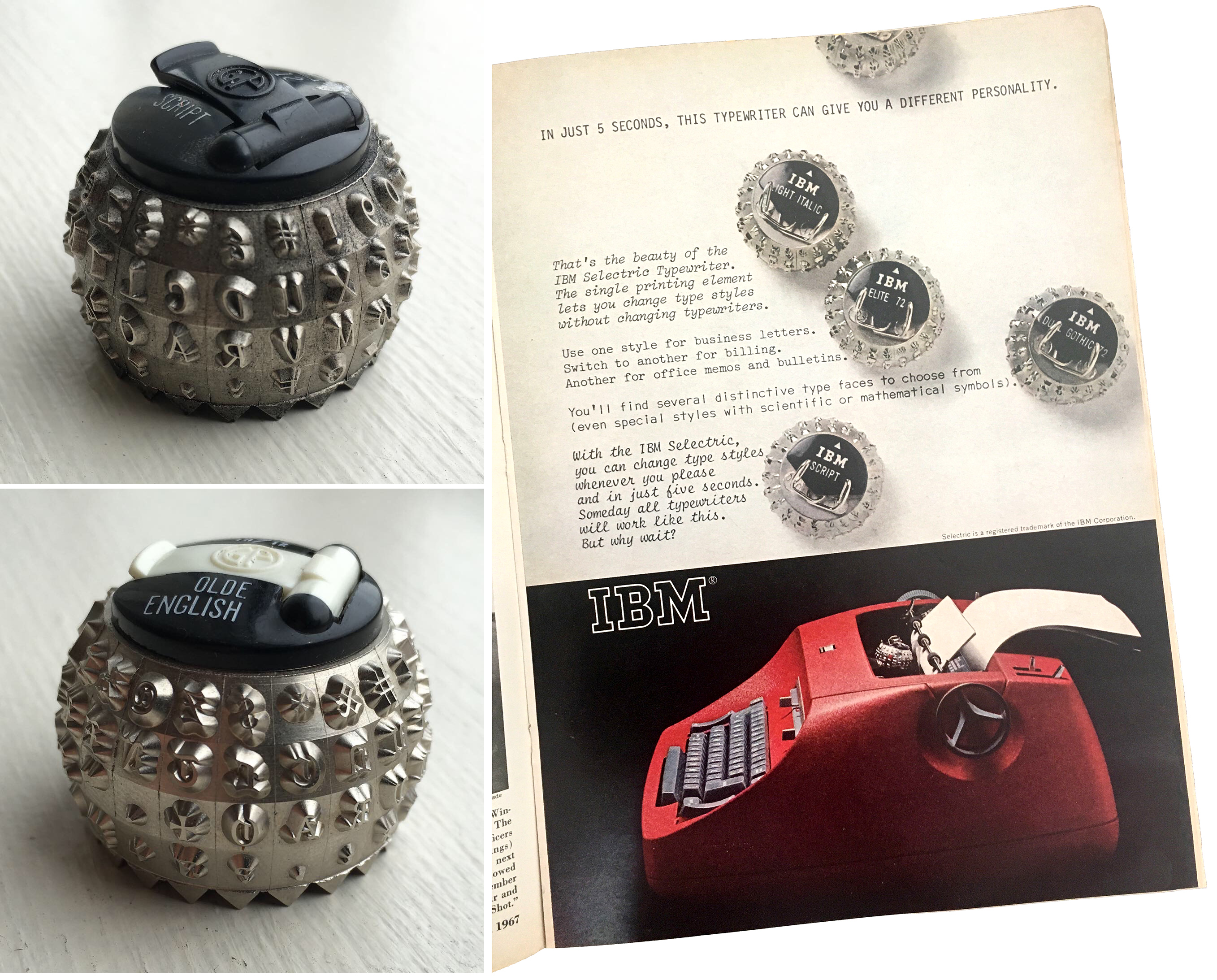
Similarly, the introduction in 1961 of the Selectric typewriter by IBM did for text typography what phototype did for headlines. Not only did the single “golf ball” shaped typing element (which replaced the separate type bars in a traditional typewriter) make typing quicker and free of jams, but it was also interchangeable with other font elements. This meant that in the middle of a text, typists could switch to italic or bold for emphasis, or even combine multiple serif, sans-serif, script, and decorative typestyles in the same publication. The more expensive Selectric Composer could even set text with proportional spacing and justification, and offered font balls in a range of typefaces associated with professional printing, like Bodoni, Century, and Univers. With the Selectric, then, DIY typesetters could set the entire contents of a newspaper, in diverse typestyles, by investing in a single typewriter.
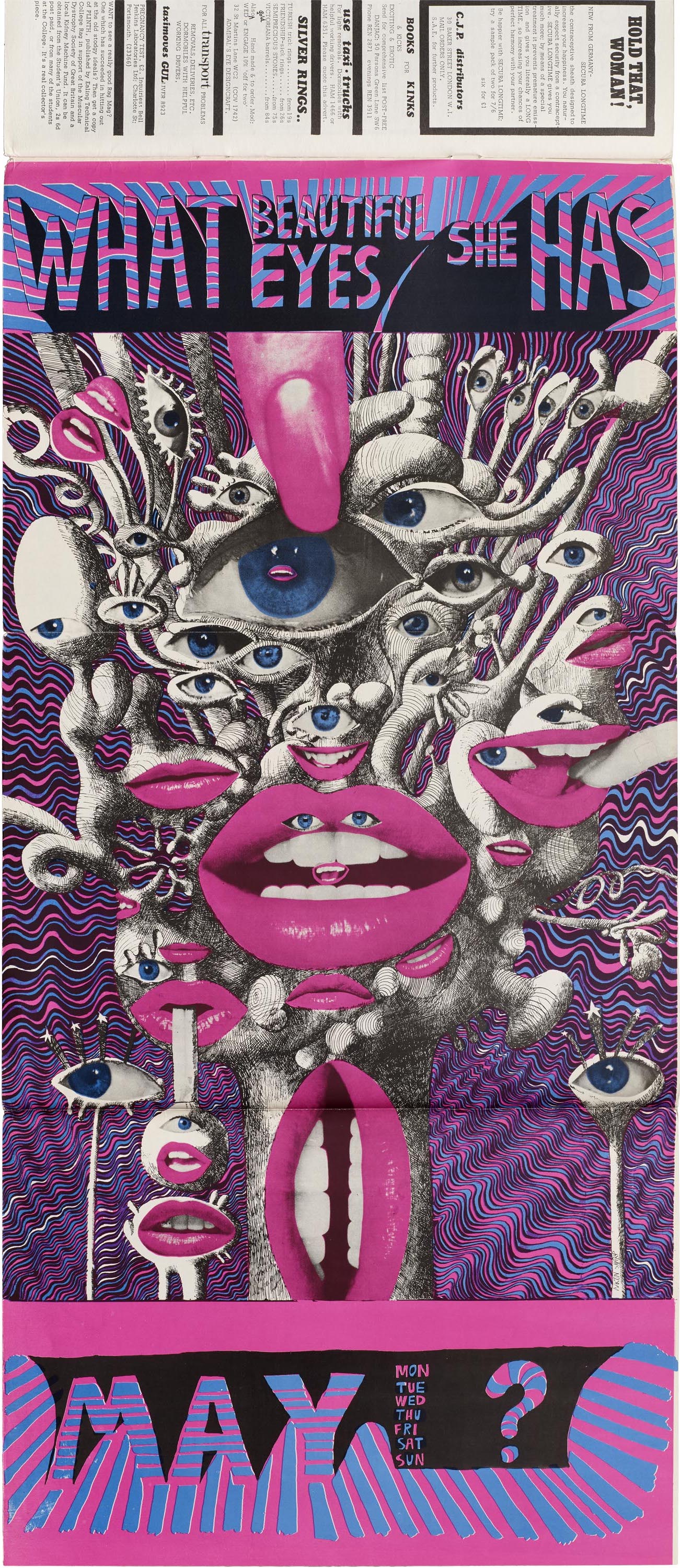
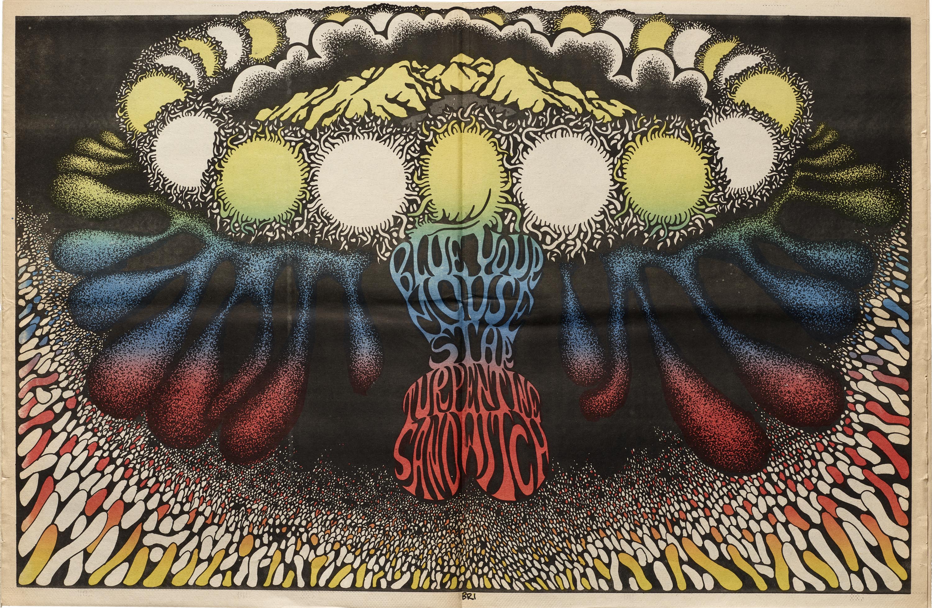
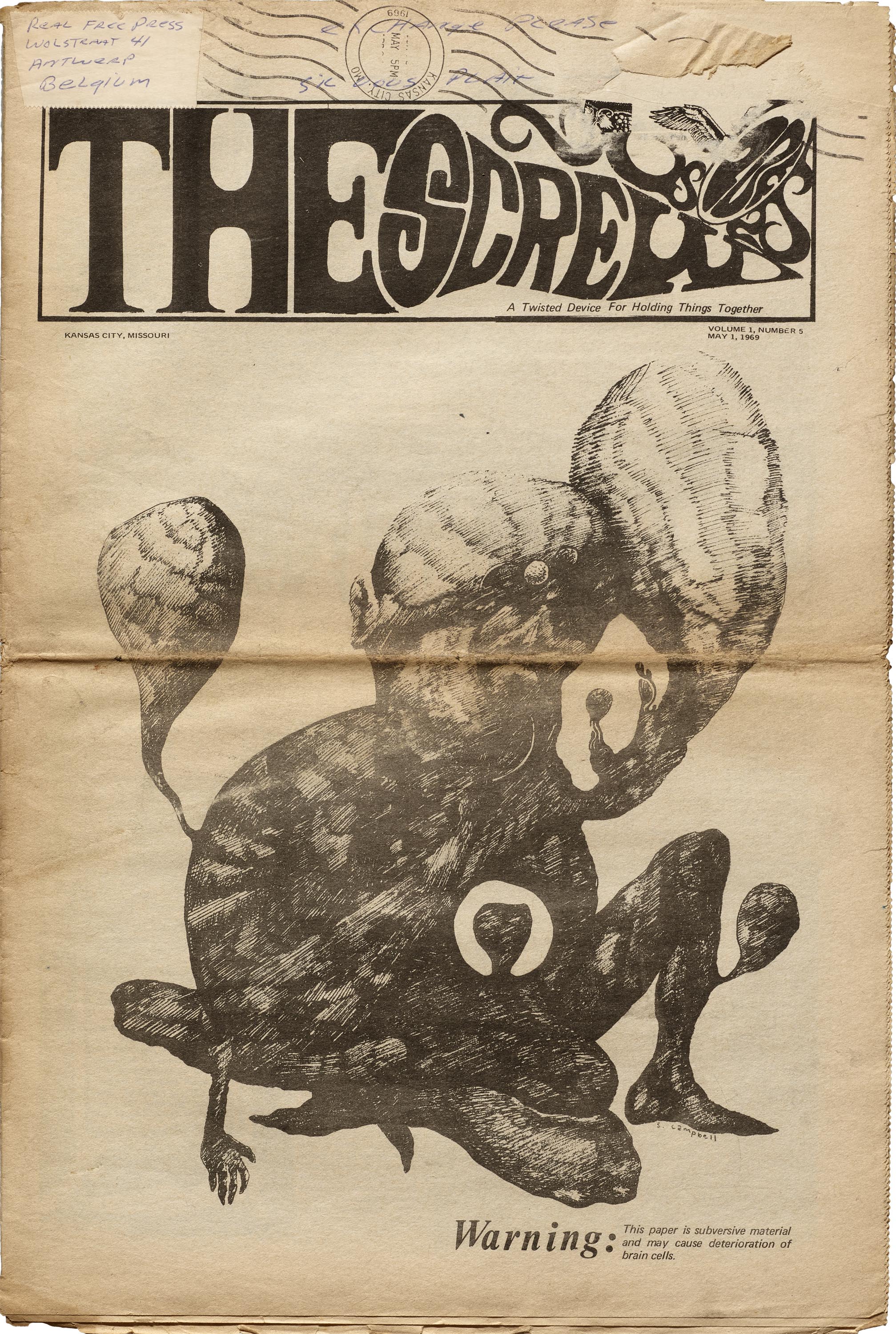
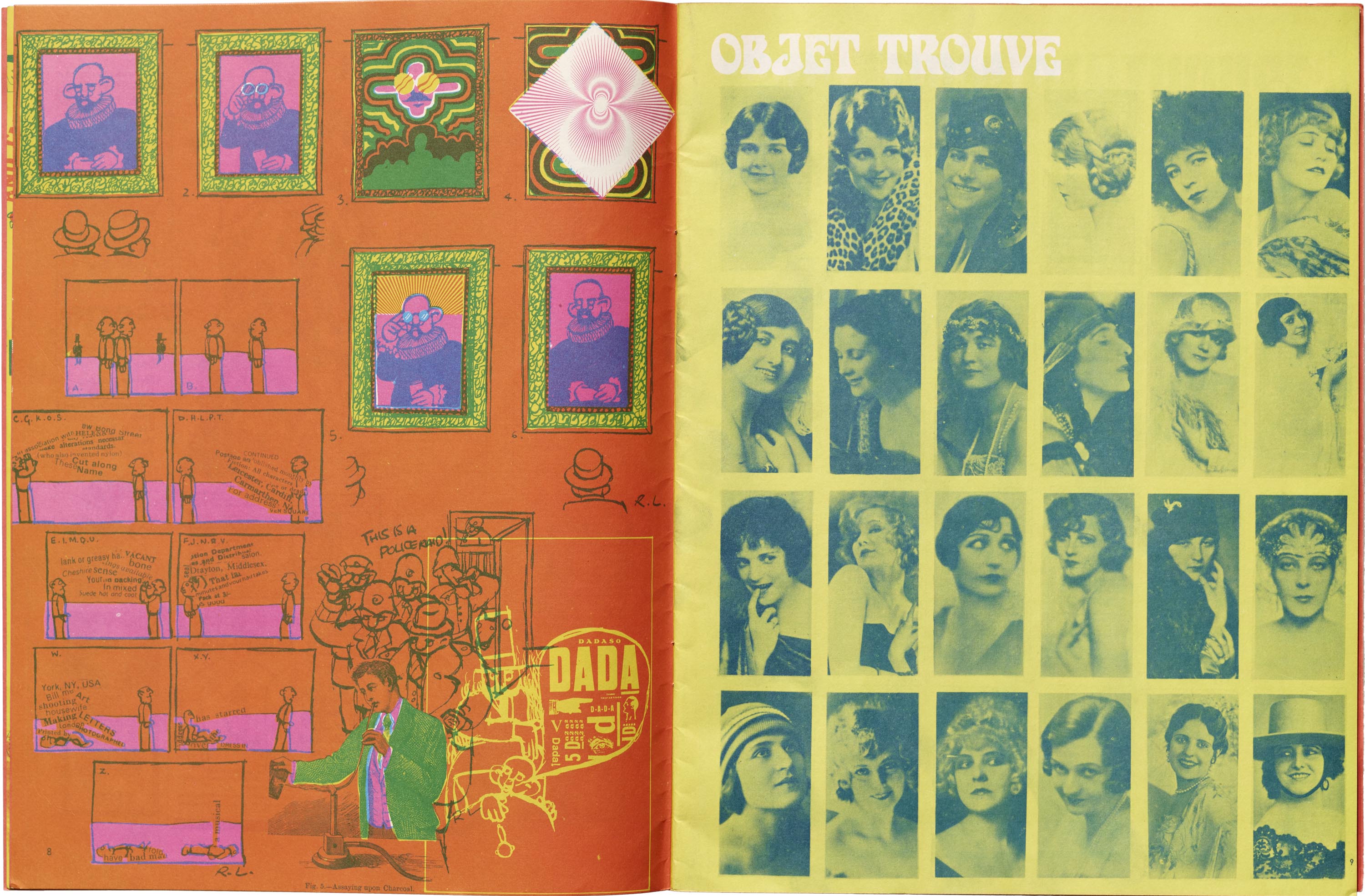
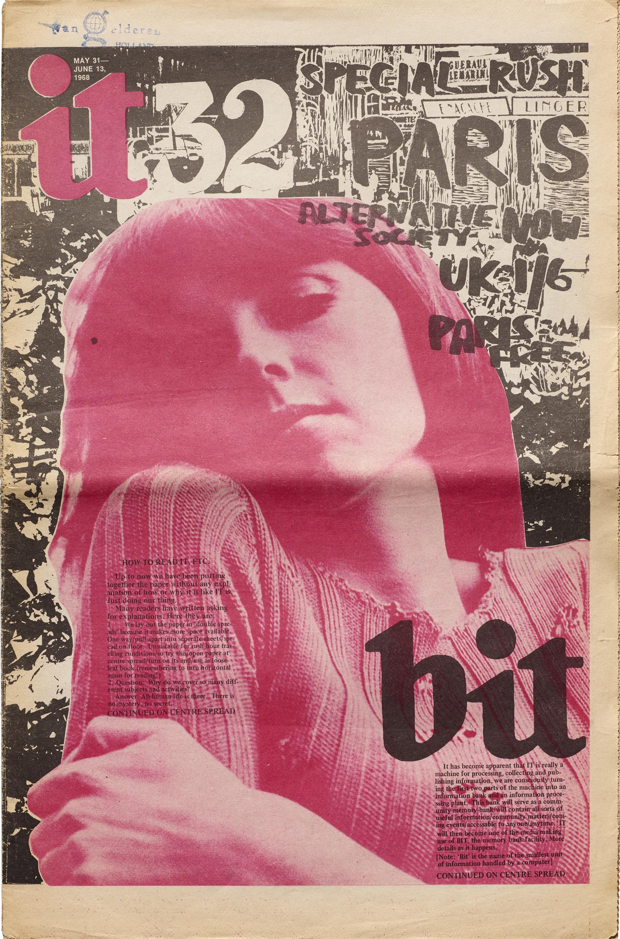
With these and other technologies at their disposal, a whole generation of young amateur designers, printers, publishers, and reporters — in small towns just as much as the big capitals of culture — turned their kitchens and garages into underground print operations. Certainly not all of what they produced might be considered “good” design by traditional standards, but often their DIY and vernacular quality lends to a sense of immediacy and necessity. On the other hand, some of the best examples — Hitweek, The City of San Francisco Oracle, and Oz among them — are unequivocally dynamic publications, employing a maximalist design ethos to playful and electrifying effect. Paging through them is a psychedelic experience unto itself.
Another effect of the increasing affordability and availability of print technologies was that marginal (and marginalized) viewpoints — structurally barred from circulation or expression — suddenly had access to the means of production and distribution. In some cases their countercultural messages coalesced around political struggles, covering them in ways that were opposed to one-sided or nonexistent coverage by traditional media sources.
In publications from the U.S., liberation and civil rights movements (see The Black Panther newspaper) and opposition to the Vietnam War feature prominently, while in Europe strikes and occupations by students and workers culminating in the events of May, 1968 receive wide coverage. Many counterculture newspapers belonged to an international network called the Underground Press Syndicate, which facilitated distribution and allowed members to freely reprint content from other newspapers belonging to the Syndicate. In this way, up-to-the-moment news of events in metropolitan centers would quickly reach the provinces, and small-town happenings could become national news overnight.
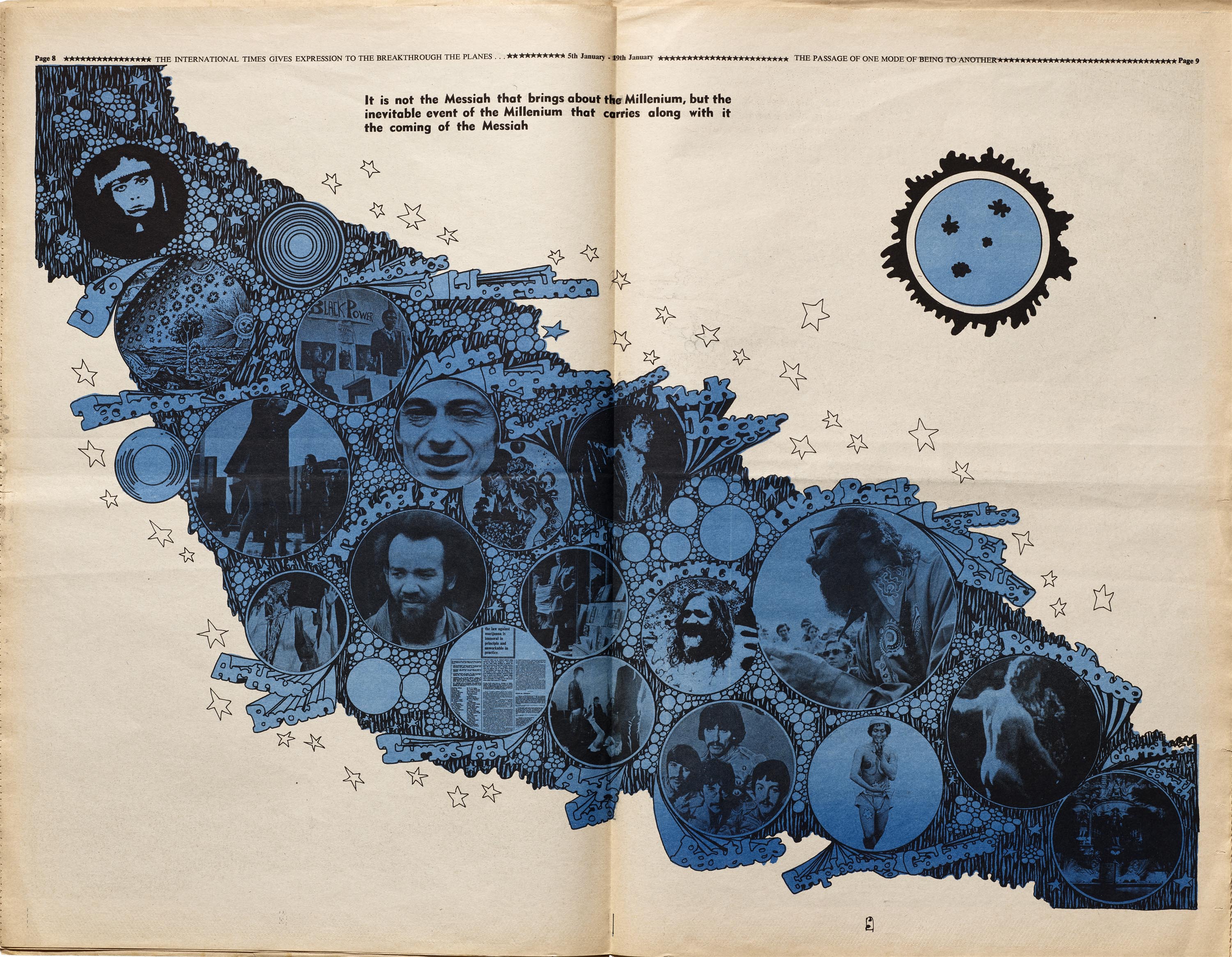
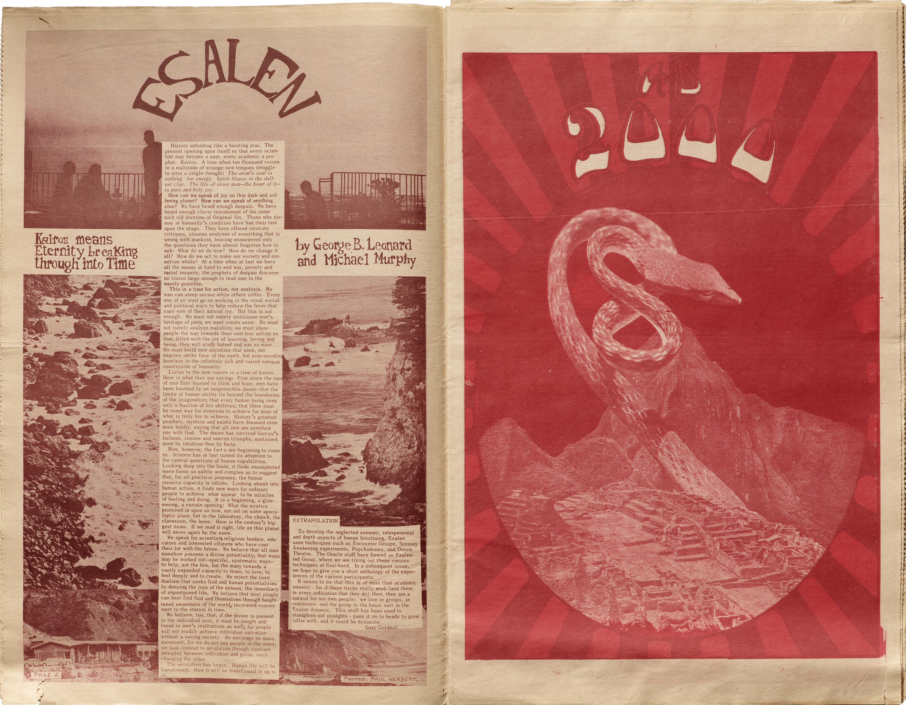
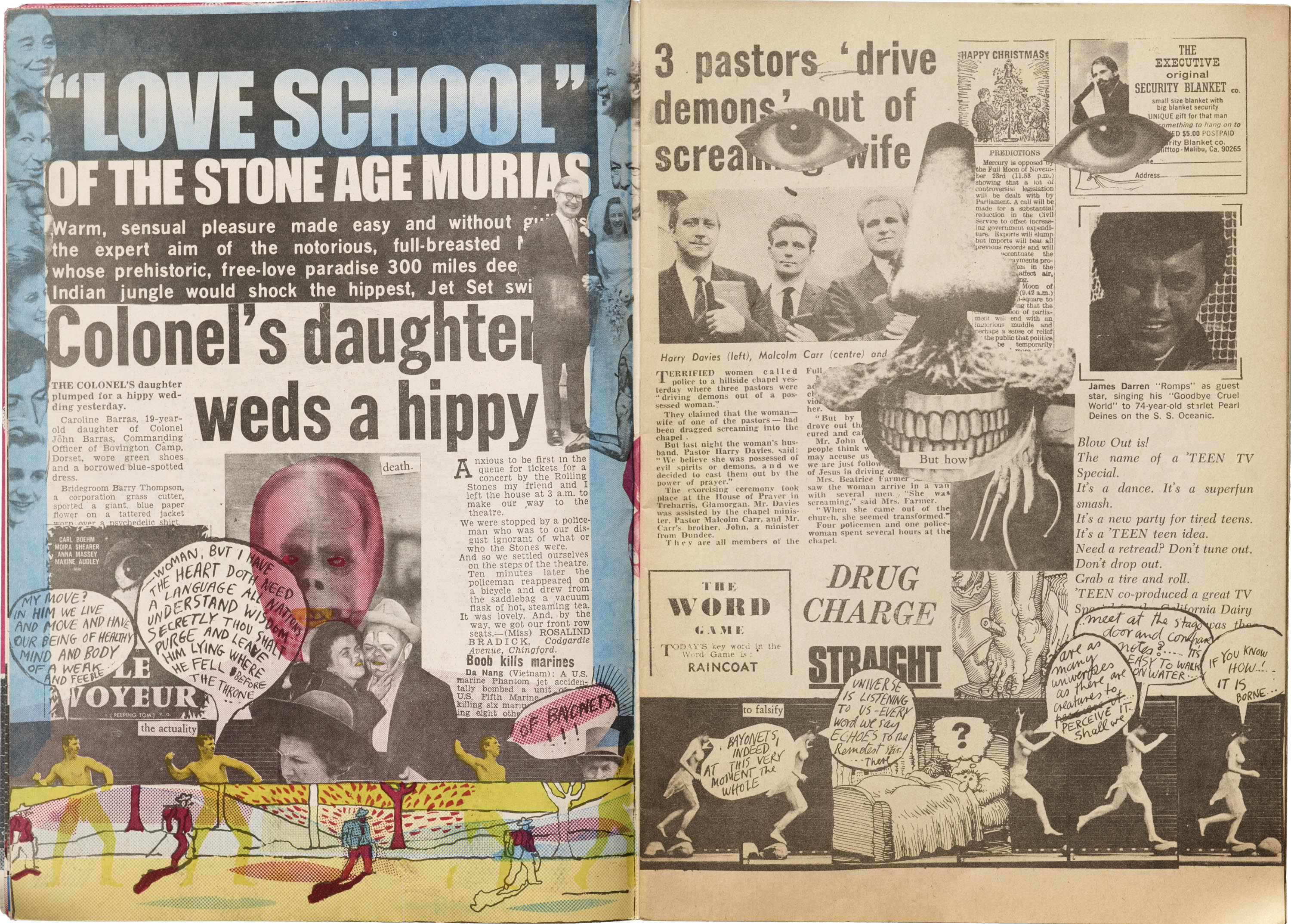
Perhaps more characteristic of these counterculture publications, emerging as they did out of the twin phenomena of hippie culture and rock-and-roll, is their focus on social and cultural subjects. These tend to fall into a handful of broad categories: drugs, sex, (new age) spirituality, and free expression (personal as well as artistic). To be sure, these concerns had their own political dimensions of decriminalization or censorship, but they were prominently about new ways of living and being, free from the taboos and hang-ups of the previous generation. For this reason, underground newspapers of the ’60s are full of frank depictions of sexuality and drug use, and many feature raunchy comic strips, beatnik poetry, and reviews of rock-and-roll albums and concerts.
As with their forebears in the early 20th-century avant-garde, the successes and failures of the political and cultural revolutions of the 1960s were mixed. But for a time, the network of their newspapers and magazines constituted a robust, lively underground system of distributing and circulating information, years before the first Macintosh sparked a revolution in “desktop publishing”, and before the internet made sharing instantaneous. Their ambitious, experimental publications remain a testament to what can be accomplished with scissors, glue, and a typewriter.
— Hank Smith, Collections Assistant
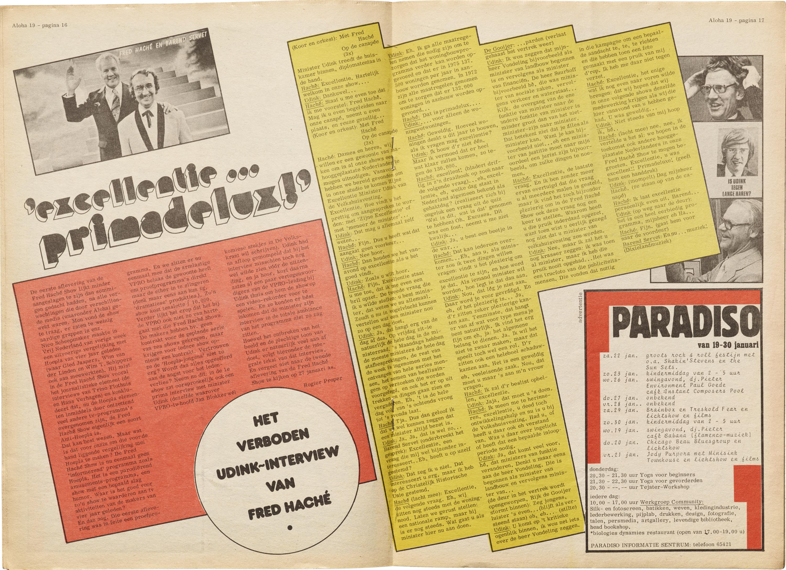
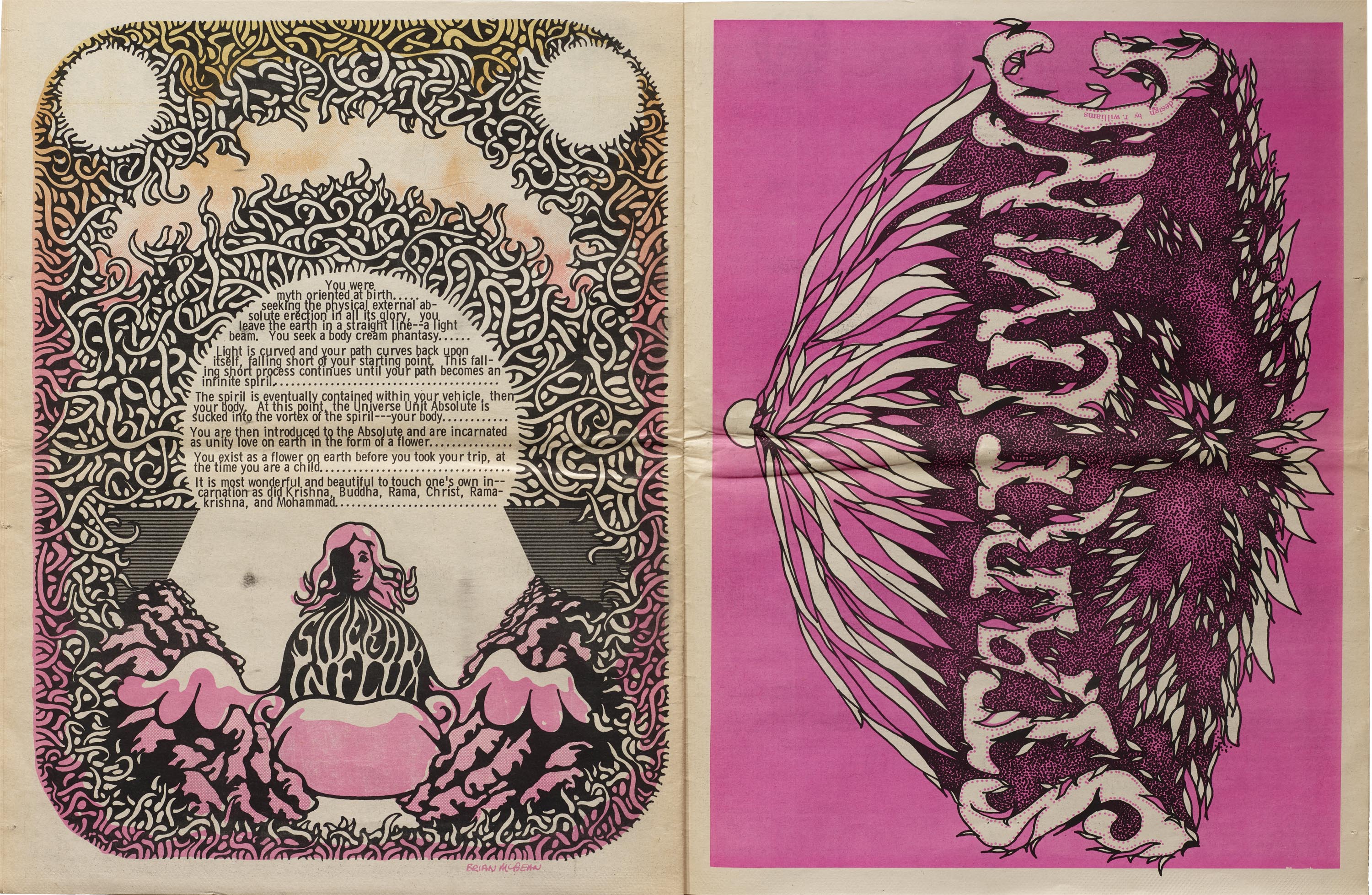
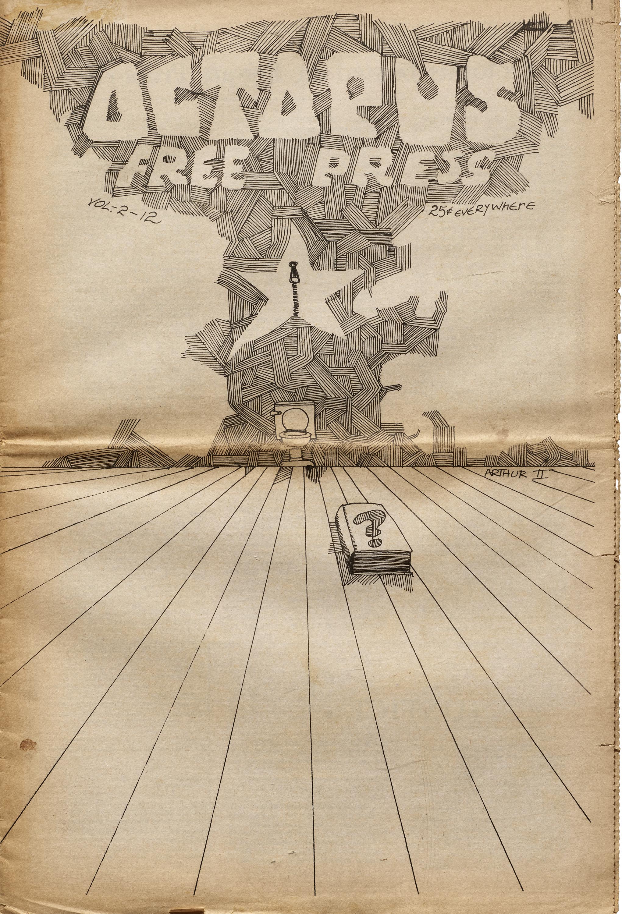
Selections from Letterform Archive’s Collection of Counterculture Newspapers
All images in this gallery are hi-fi captures. Click an image to enter fullscreen view, then pinch or use browser zoom to enlarge.


See more in the Online Archive
- Take a deeper dive into this collection: Join us for a virtual salon on June 25, 2020.
Periodicals as Collections
- No. 1: Het Overzicht and Wendingen
- No. 2: bauhaus
- No. 3: Information and ulm
- No. 4: Counterculture Newspapers