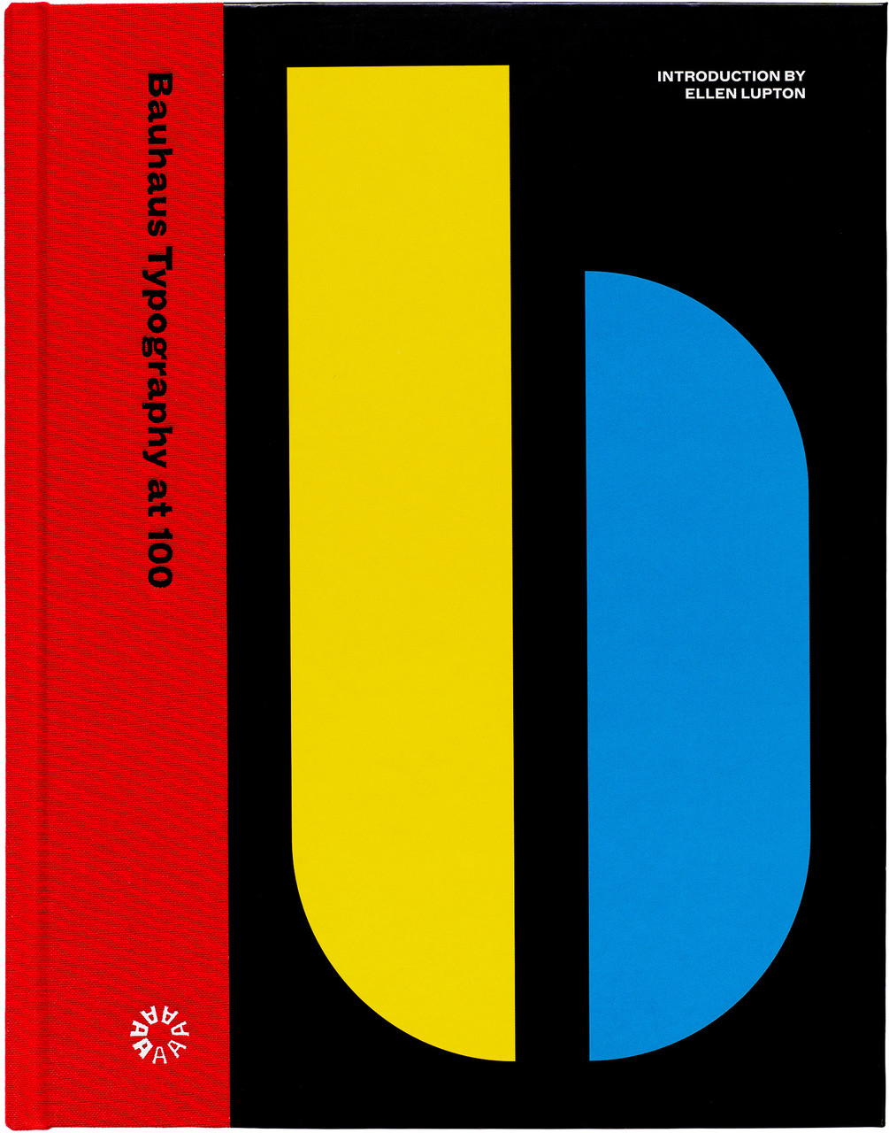
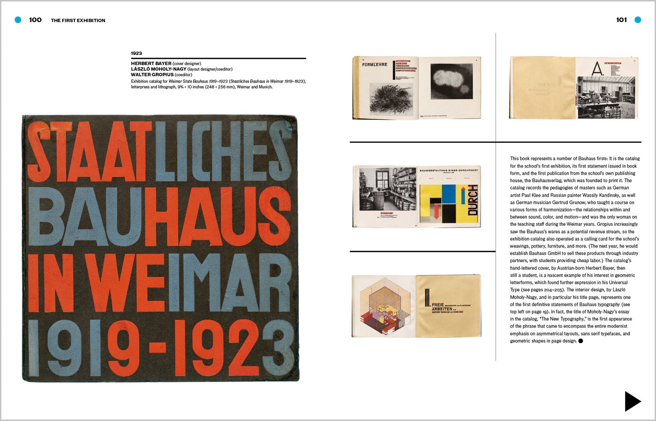
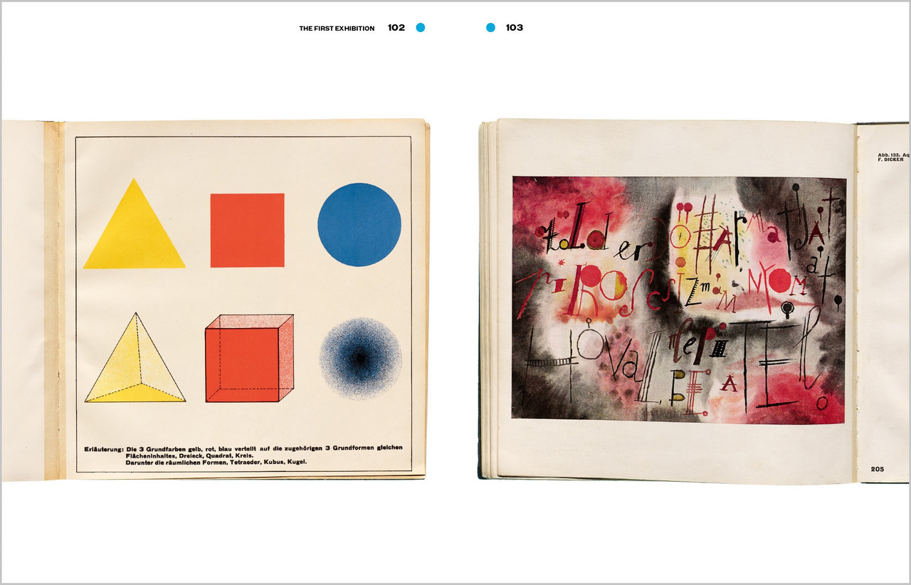
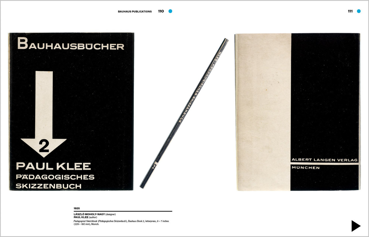
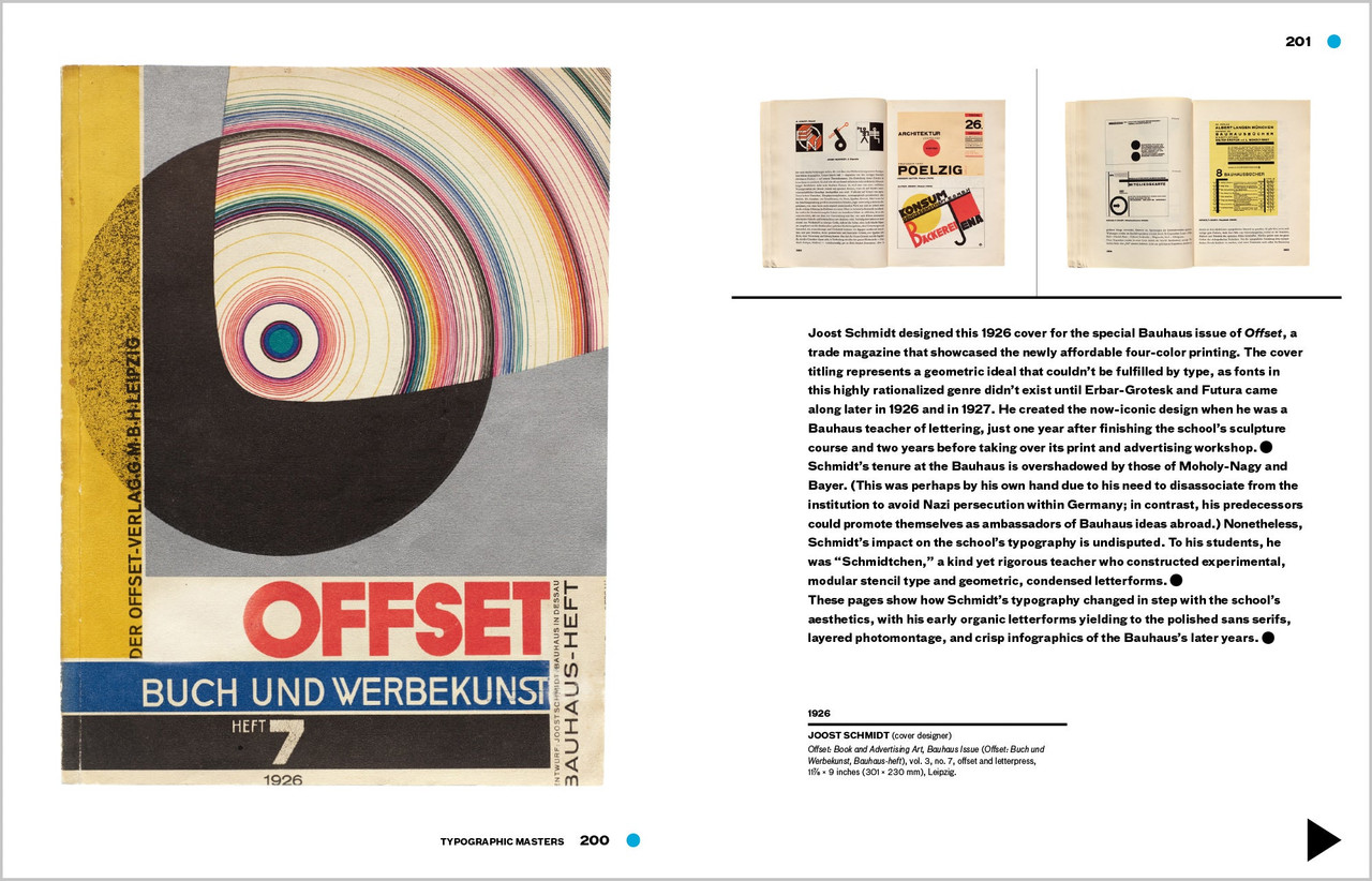
An unprecedented look at the school’s typography and print design, from its early expressive tendencies to the functional modernism for which it is famed today
Known for its bold sans-serif typefaces, crisp asymmetrical grids and clean use of negative space, the Bauhaus emerged as the forebearer of a new look—one that seized the tools of mass production in the creation of a radical new art. Today, just over 100 years after the Bauhaus’s opening in 1919, the school’s visual hallmarks have come to define modernity as it appears on the printed page.
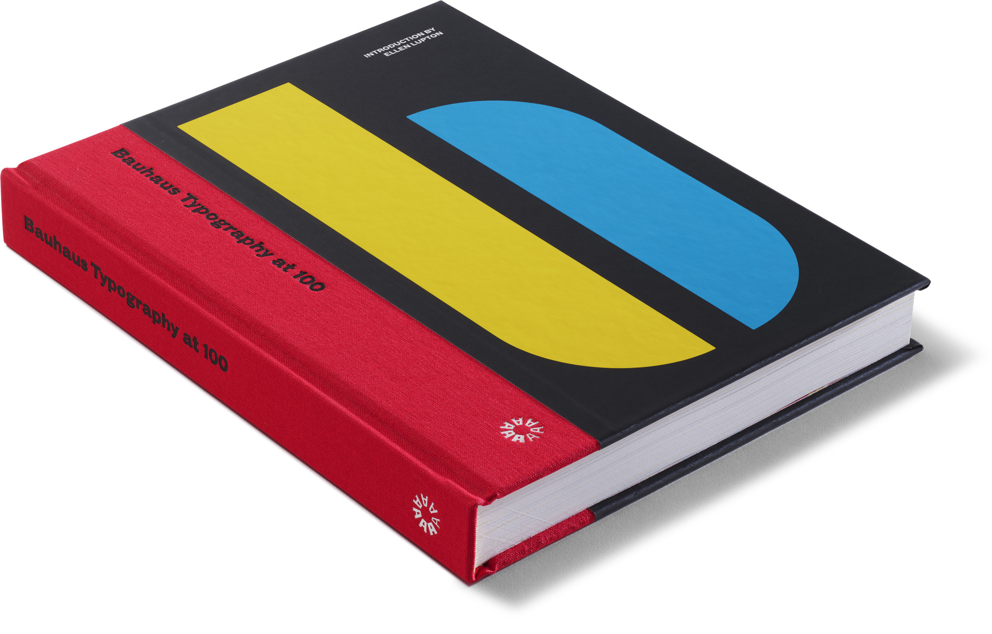
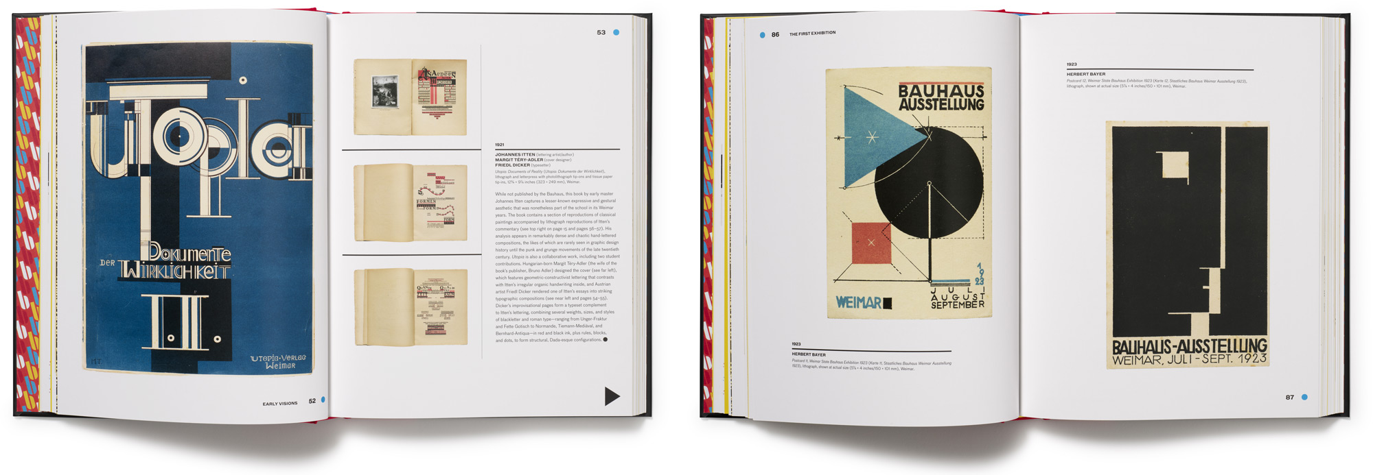
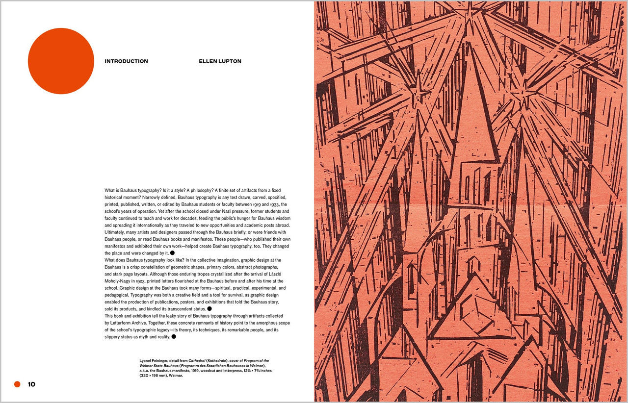
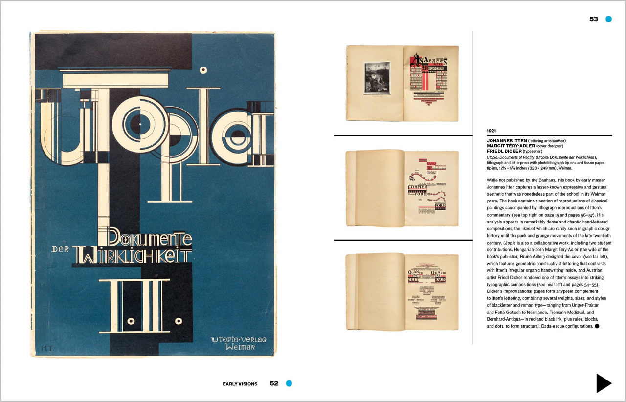
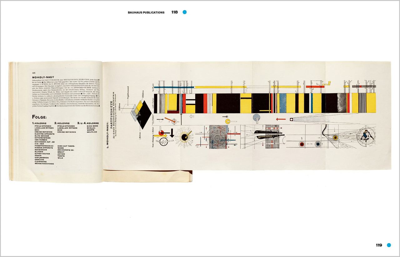
The official catalog for Letterform Archive’s inaugural gallery exhibition, Bauhaus Typography at 100 explores the school’s legacy in graphic and typographic design through artifacts of its own making—its books, magazines, course materials, product catalogs, stationery, promotional fliers and other ephemera.
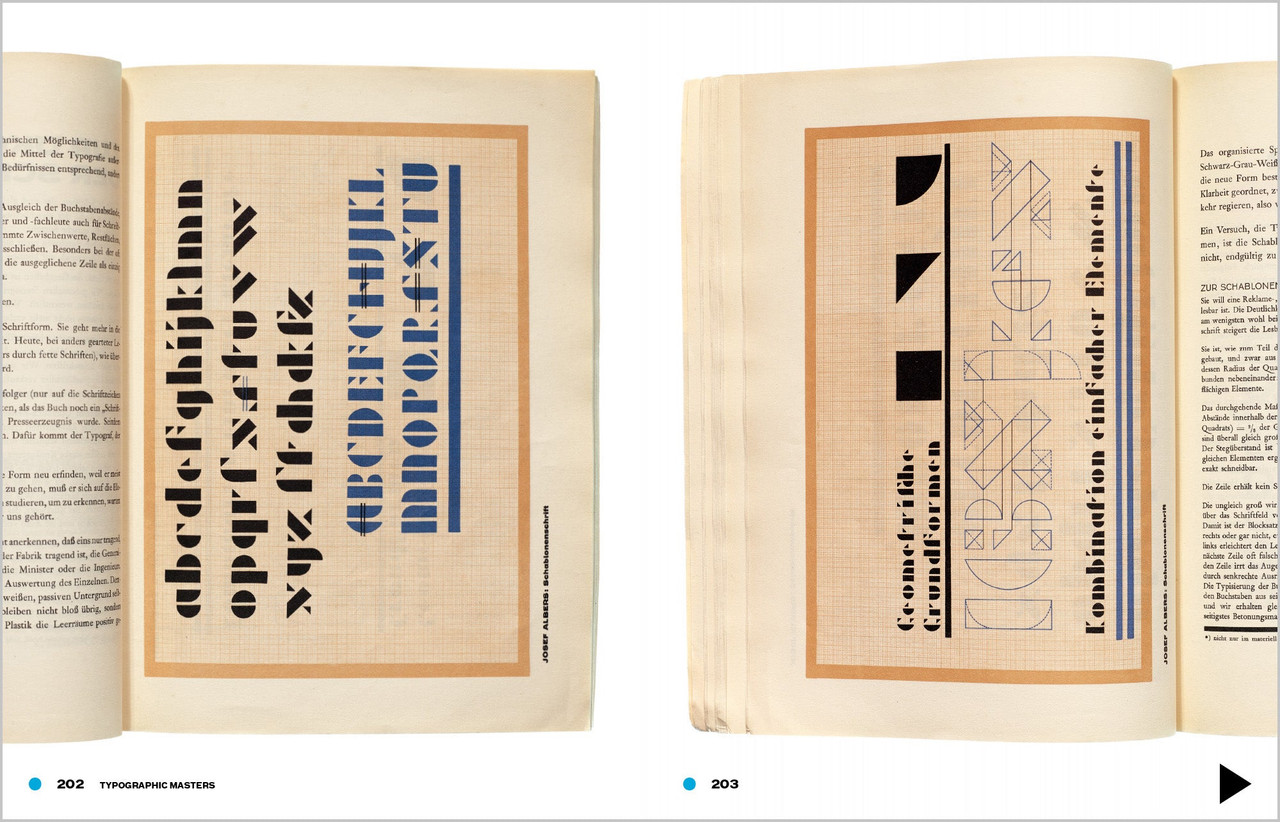
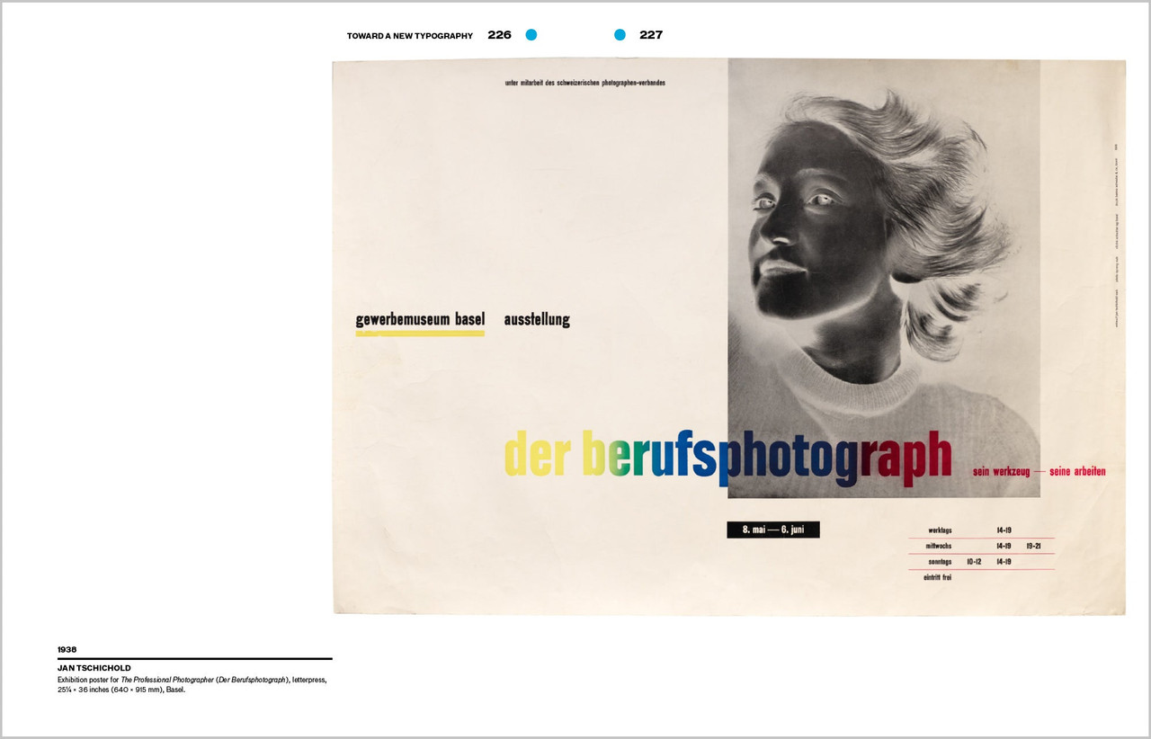
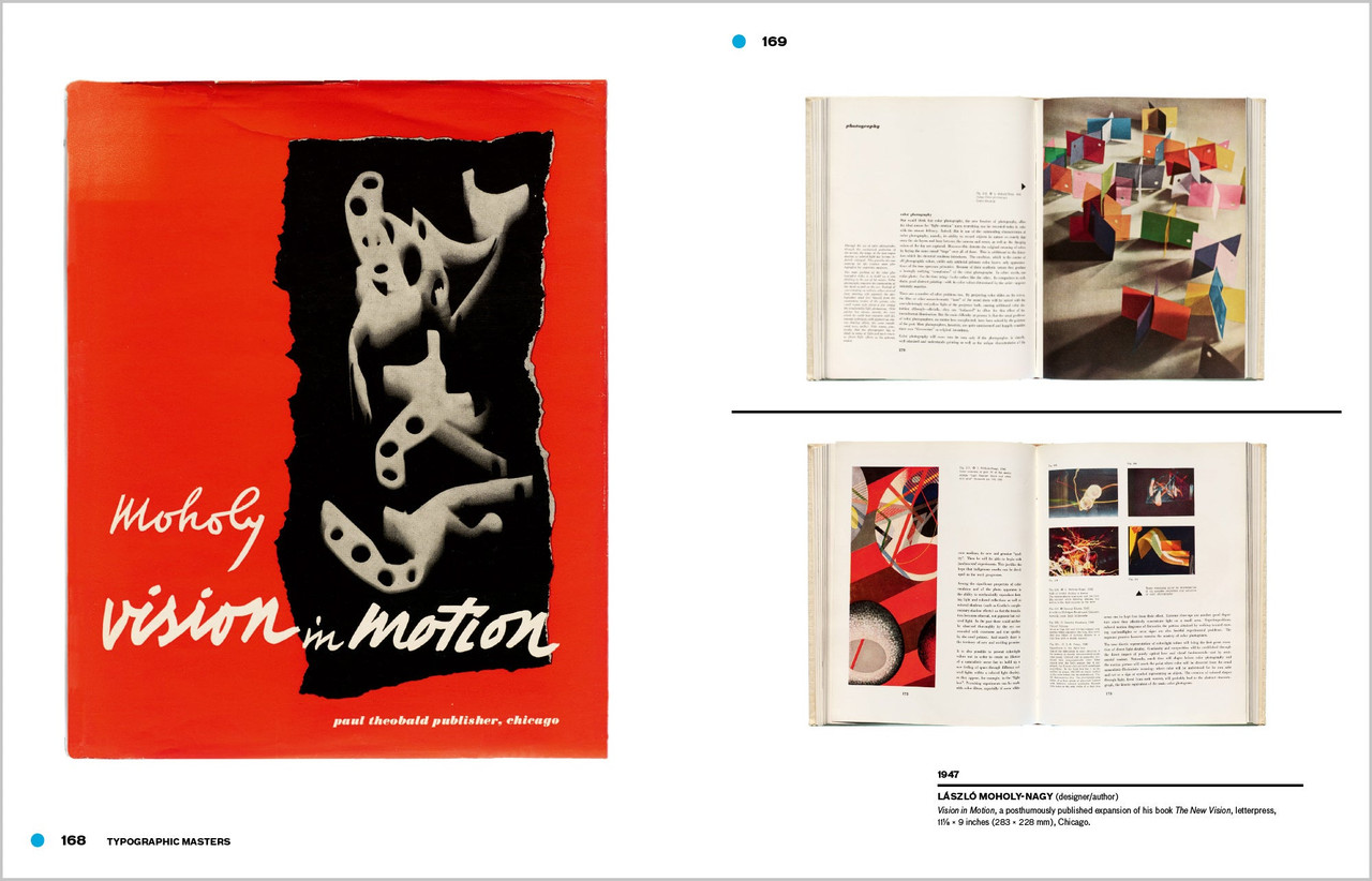
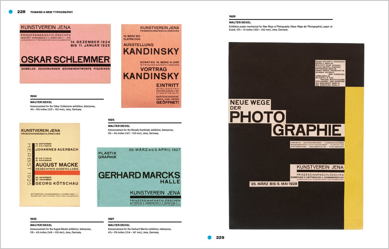
From the book’s beautifully designed pages, readers learn of typographic masters László Moholy-Nagy, Herbert Bayer and Joost Schmidt, who channeled Constructivism’s geometric forms and optimism for industry into printed vehicles for the school’s teachings. Here is where Bauhaus typography—its rejection of serifs and capitals, embrace of experimental alphabets, insistence on universal clarity, and innovation in layering and hierarchy—took its distinctive shape.
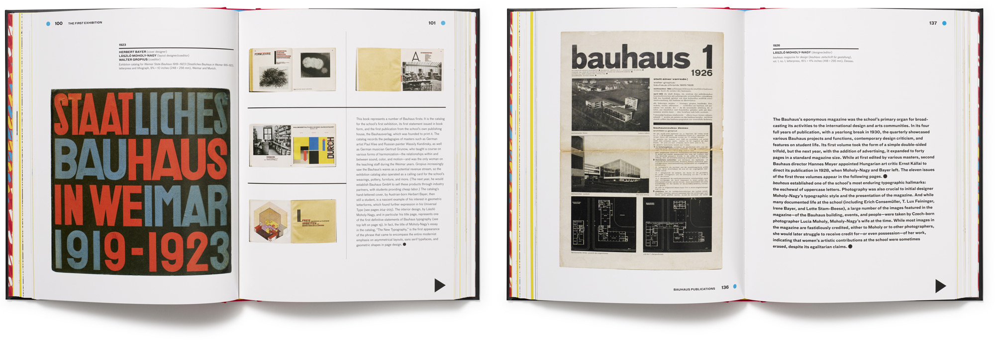
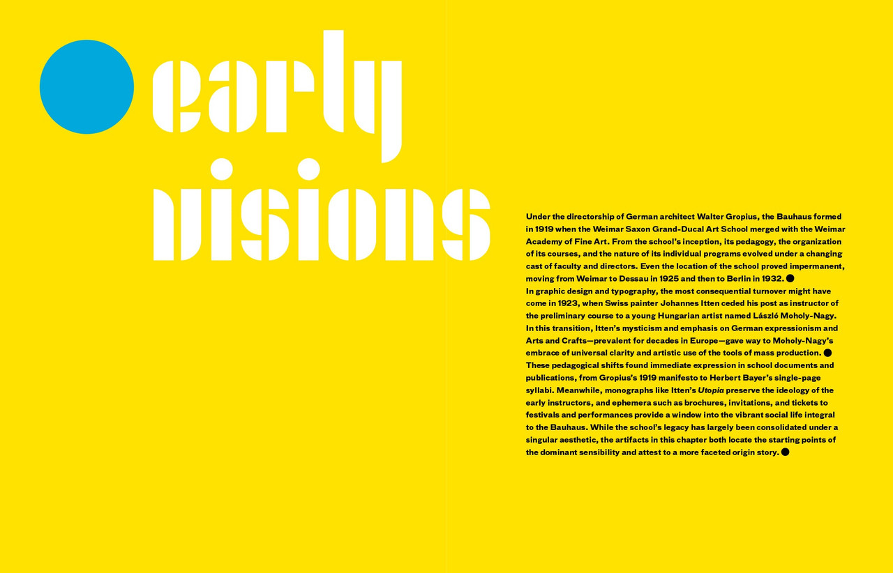
The catalog also shines light on the Bauhaus’s lesser-known early forays into expressive lettering and illustration, also tracing the school’s immediate impact on seminal design movements such as the New Typography and, of course, on design practitioners working today. Lavishly illustrated, carefully researched and written, and accompanied by an in-depth introduction from noted Bauhaus expert, author and curator Ellen Lupton, Bauhaus Typography at 100 is a must-have for any fan of modern design.
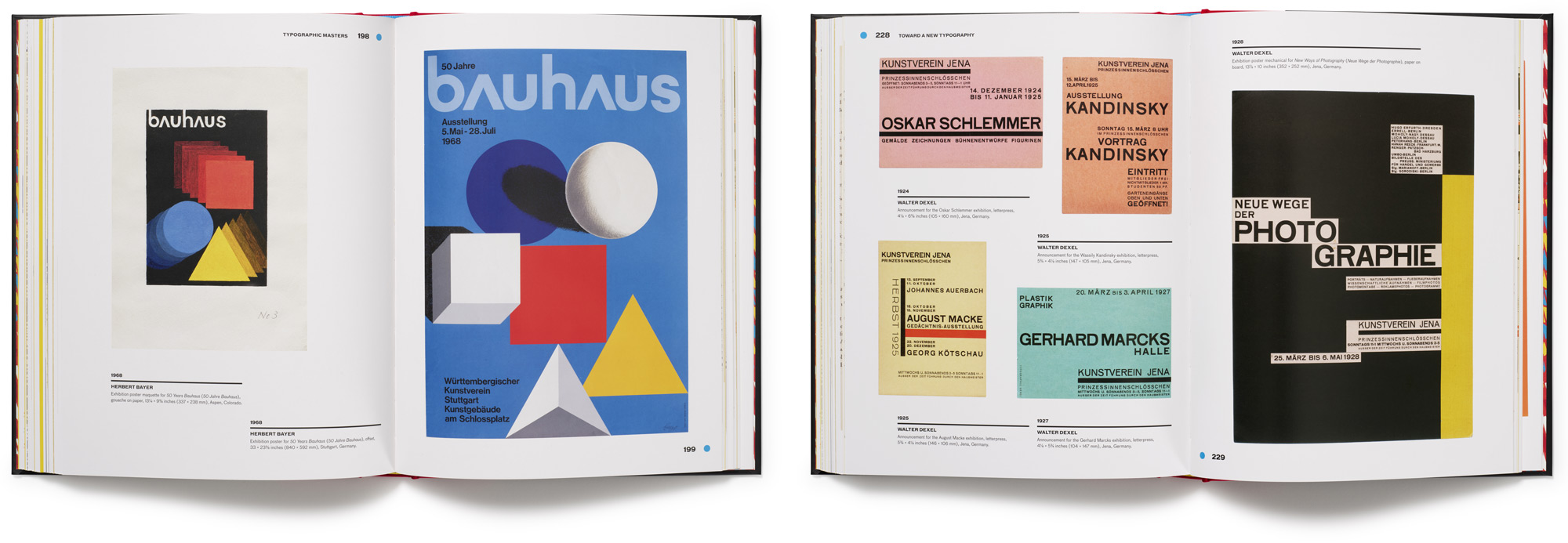
Pagethrough
Praise for Bauhaus Typography at 100
“Featuring a splendid introduction by Ellen Lupton, Bauhaus Typography at 100 is arguably the most complete Bauhaus resource I’ve seen, and I have been collecting related volumes for decades.”
— Steven Heller, PRINT magazine
“While the Bauhaus is often remembered for large-scale modernist architecture, Bauhaus Typography at 100 tells the movement’s history through its smallest increment: the letters and type created by its myriad members across its fourteen-year span. This book is a testament to Bauhaus typography’s outsized role in disseminating the school’s shifting ideals of modernity.... Chronicling Bauhaus letterforms from the school’s founding manifesto through its many influential publications and the later work of the school’s members, this beautiful book reveals a startling diversity that will delight and inspire designers and all readers of today.”
— Elizabeth Otto, author of Haunted Bauhaus and coeditor of Bauhaus Women: A Global Perspective
Details
Publication date
December 2021
ISBN
978-0-9983180-9-7
Size
9.5 × 7.5 inches
Page count
280 total pages
Image count
500
Printing
4 colors throughout
Binding
Hardcover

