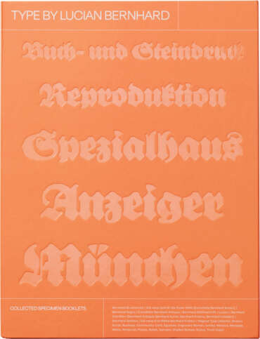
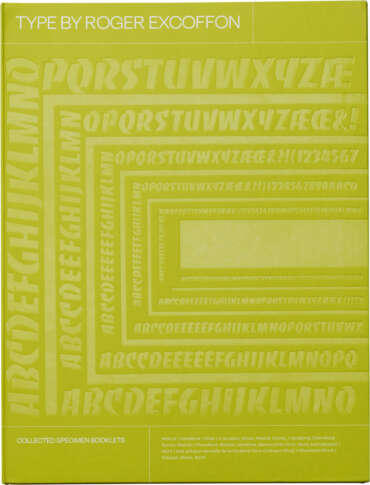
Also available in the Type By bundle with volumes on Lucian Bernhard and Roger Excoffon. Get all three and save!
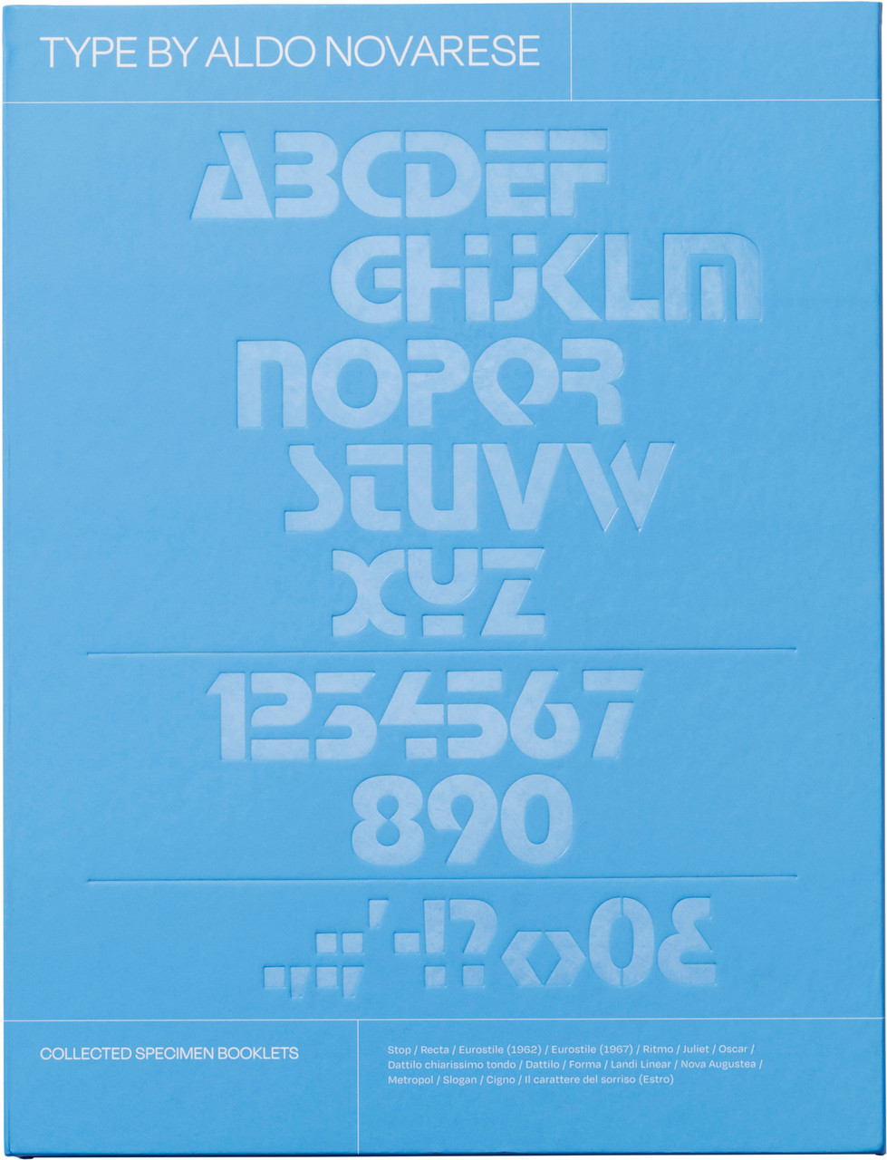
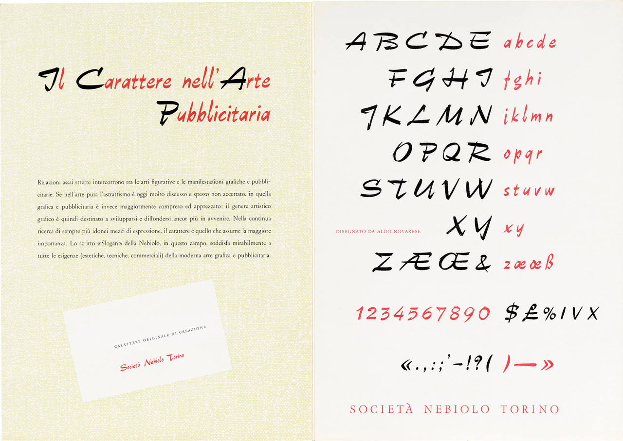
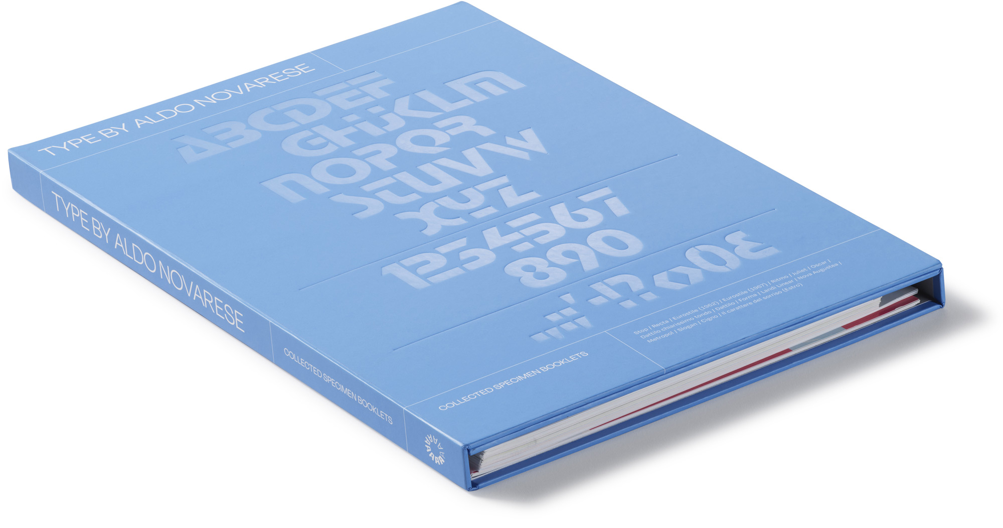
Stylish, expressive, and unique typefaces from an Italian design legend, presented in sixteen facsimiles of Società Nebiolo specimens from the 1930s, ’50s, and ’60s
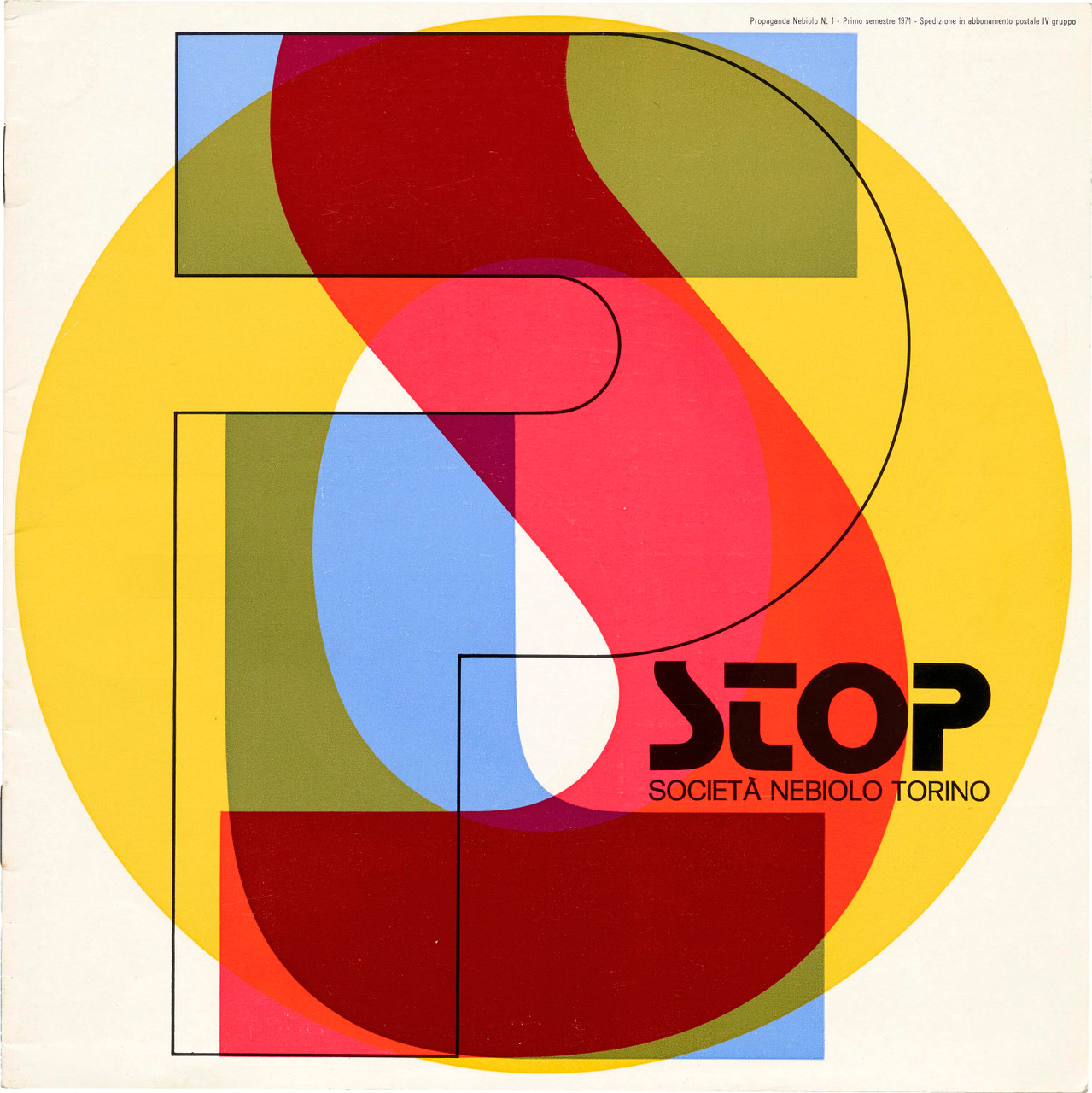
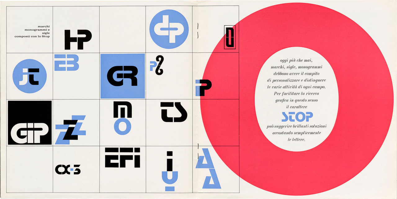
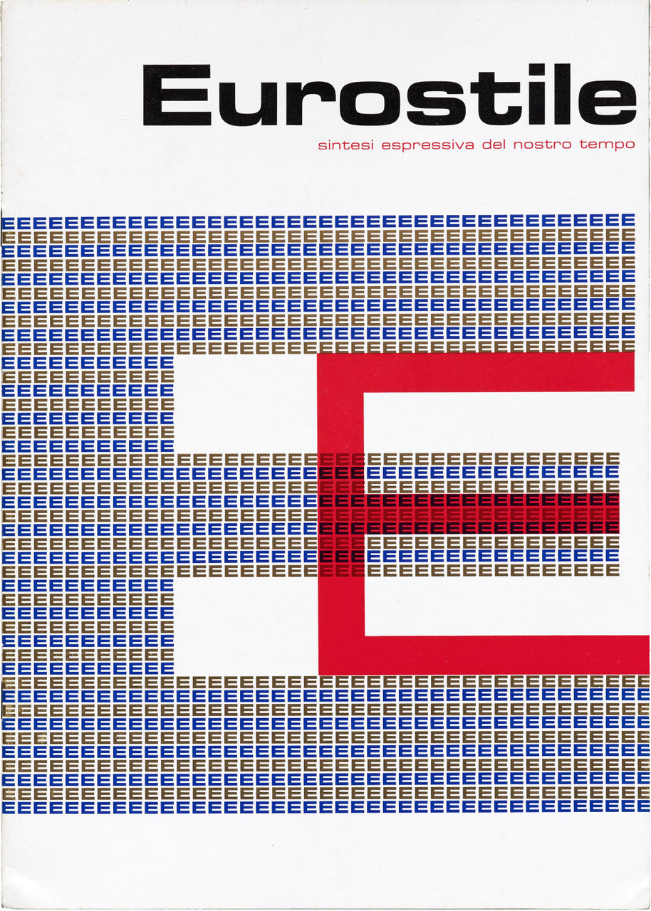
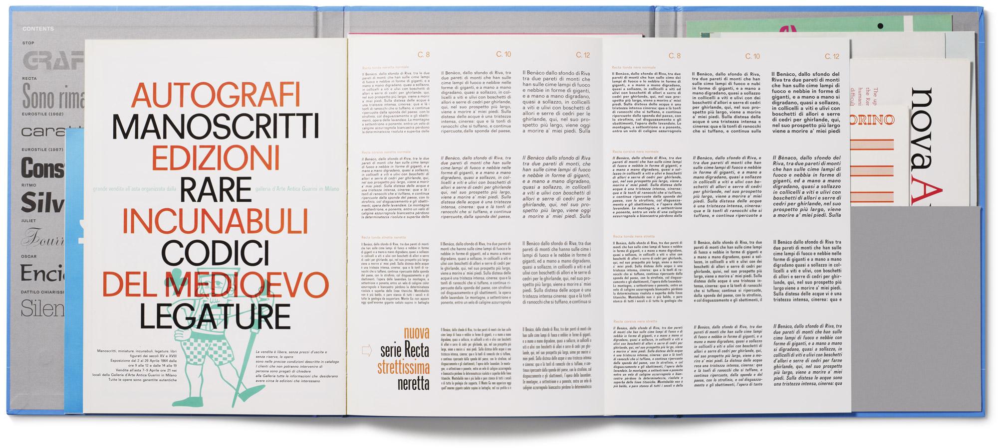
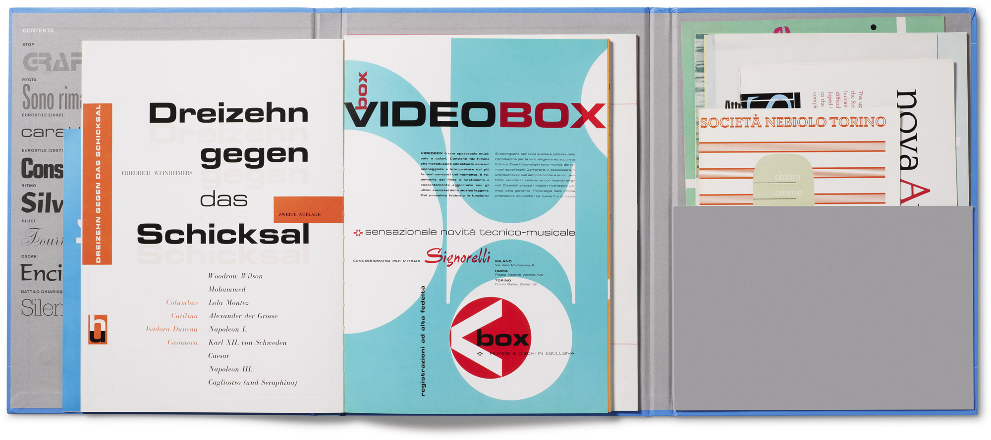
Small masterpieces from the age of metal type, foundry specimen booklets introduced new typefaces to the world with exquisitely arranged showings and a variety of original in-use examples. Distributed as ephemeral marketing, many are bold visual essays, statements of typographic craft, and prized keepsakes containing essential information about type as it was meant to be seen.
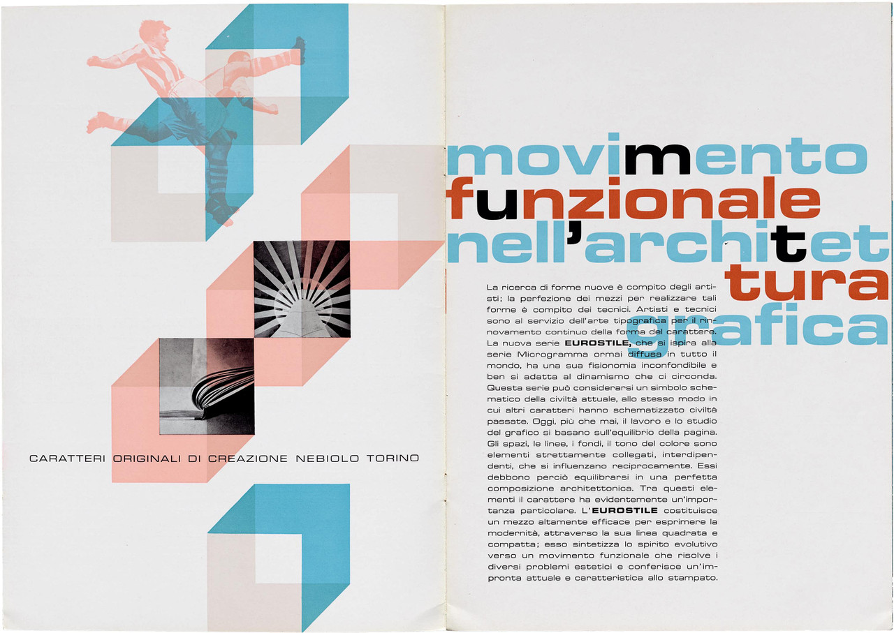
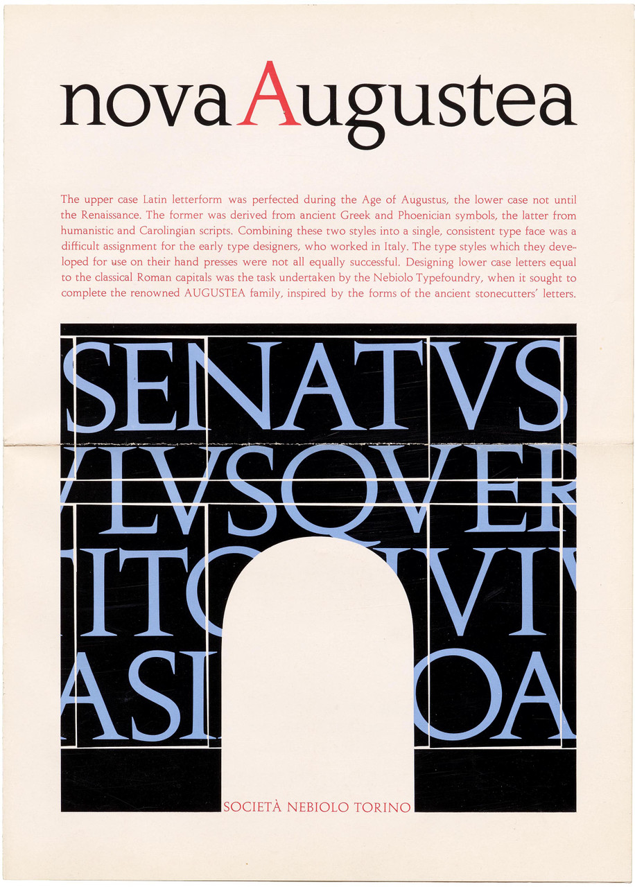
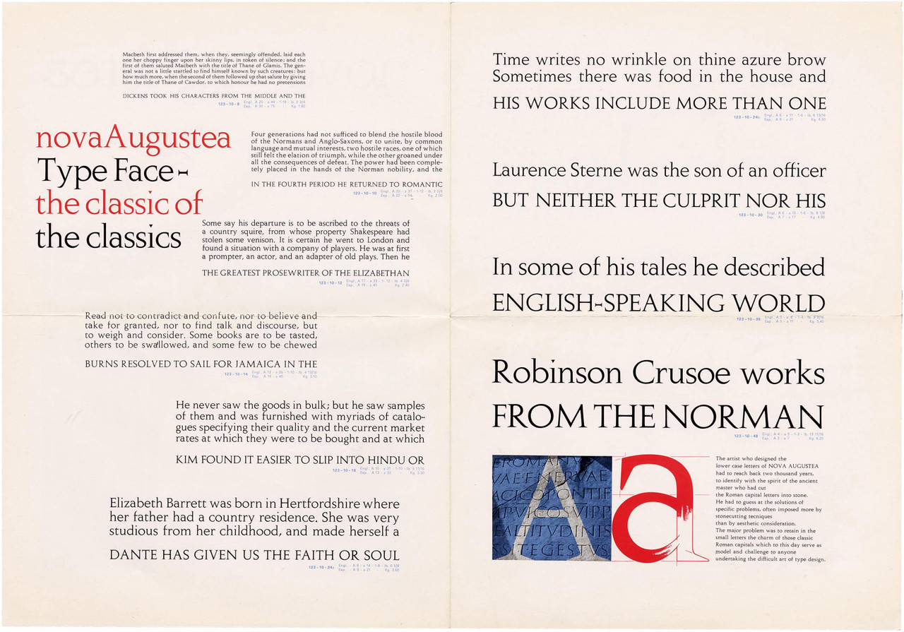
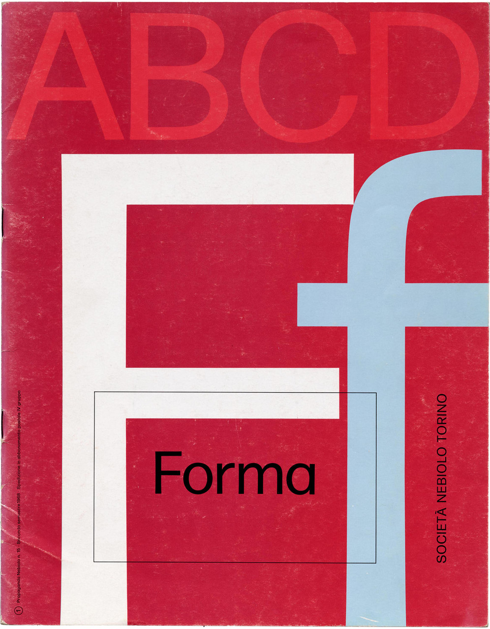
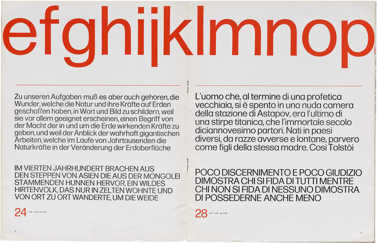
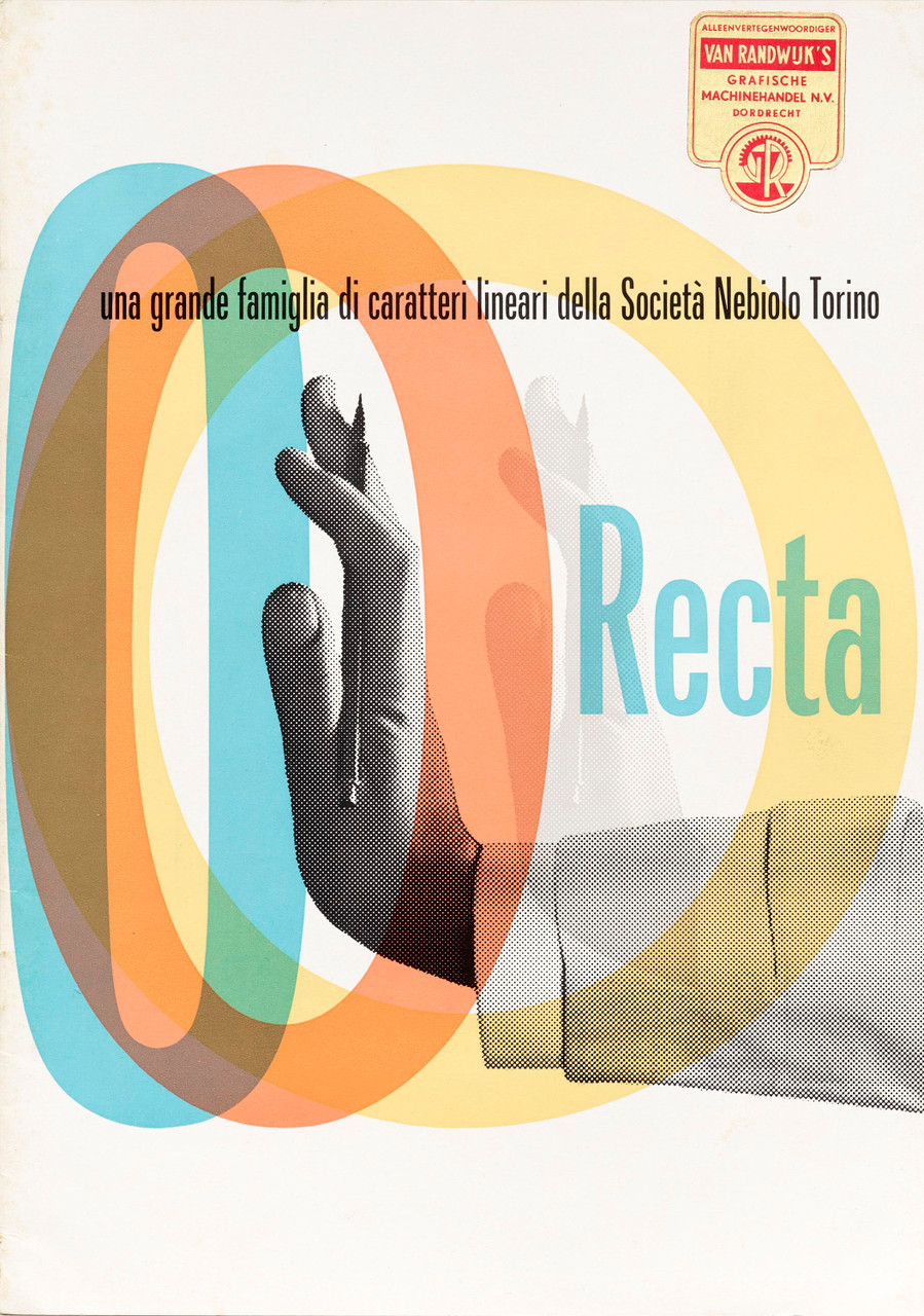
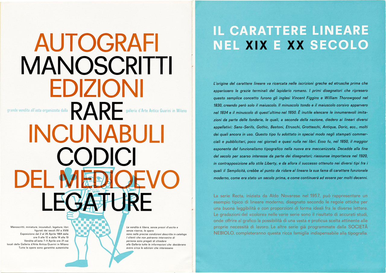
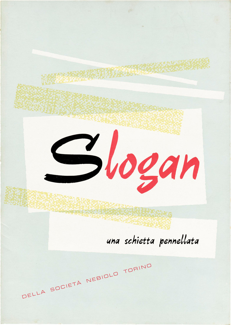
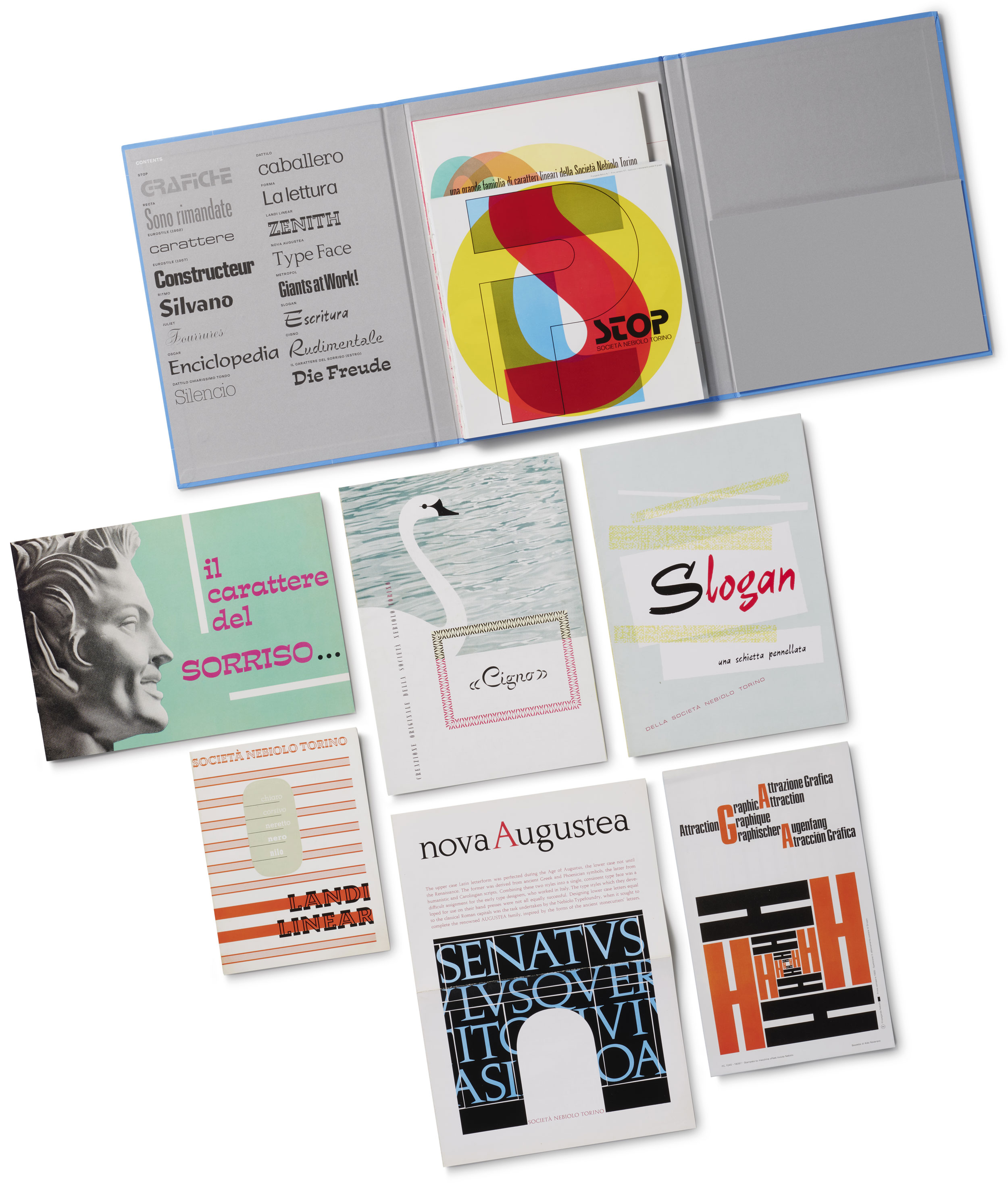
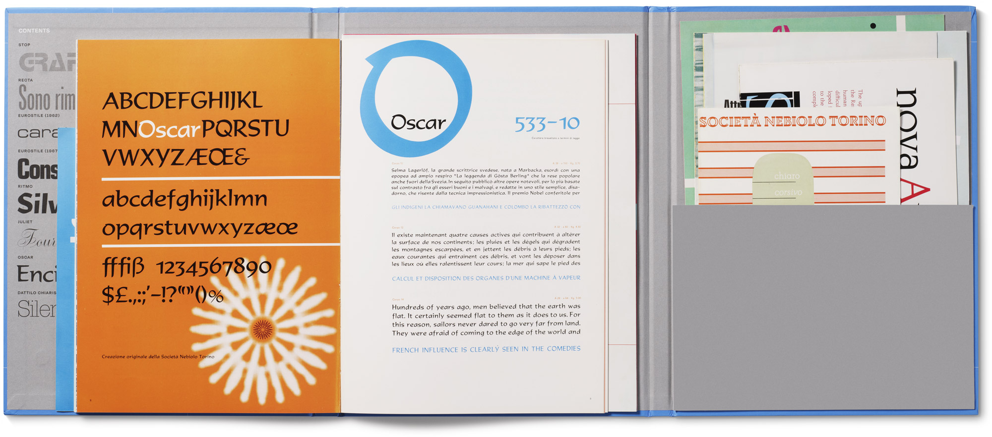
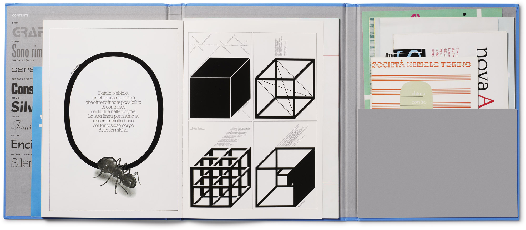
This volume reproduces specimens of typefaces by quintessential Italian type designer Aldo Novarese. Spanning a career of almost four decades with Nebiolo, the leading metal type foundry in Italy, the selection features many remarkable specimens designed by Novarese himself and includes a wide sampling of roman, script, sans serif, and display type. Preserved in their original trims and brought together in book form (with an inside pocket containing additional booklets), they offer a rich document of Novarese’s best work.
About Aldo Novarese
Aldo Novarese (1920–1995) was one of the most influential and prolific Italian type designers of the twentieth century. At age sixteen, he joined the in-house design team of the Turin-based type foundry Società Nebiolo. From 1952 through the early 1970s, he served as the company’s artistic director. In addition to designing many of Nebiolo’s most popular typefaces, Novarese authored important studies on type design, including Alfa-Beta (1964), and later originated dozens of typefaces for use in phototypesetting and dry-transfer lettering. Found everywhere from movie titles to computer advertisements, many of Novarese’s typefaces for Nebiolo remain in widespread use today.
The sixteen specimens feature well-known typefaces such as Landi Linear (1938), Cigno (1954), Ritmo (1955), Juliet (1956), Slogan (1957), Recta (1958), Estro (1961), Eurostile (1962), Nova Augustea (1964), Oscar (1965), Metropol (1967), Forma (1968), Stop (1971), and Dattilo (1972).
Praise
“The choicest pieces by leading typeface designers, collected in ingeniously designed portfolios.”
— Steven Heller, PRINT magazine
Details
| Publisher | Letterform Archive |
| Publication date | Fall 2024 |
| Dimensions | 9.5 × 12.5 inches |
| Printing | 4 colors throughout |
| Pages | 242 |
| Format | Hardcover with actual-size complete facsimiles and an inside pocket containing additional booklets |
| ISBN | 9798989142354 |

