अक्षरों के इतिहास और डिज़ाइन की कहानियाँ, अब हिन्दी में। / An introduction in Hindi to Letterform Archive’s collection.
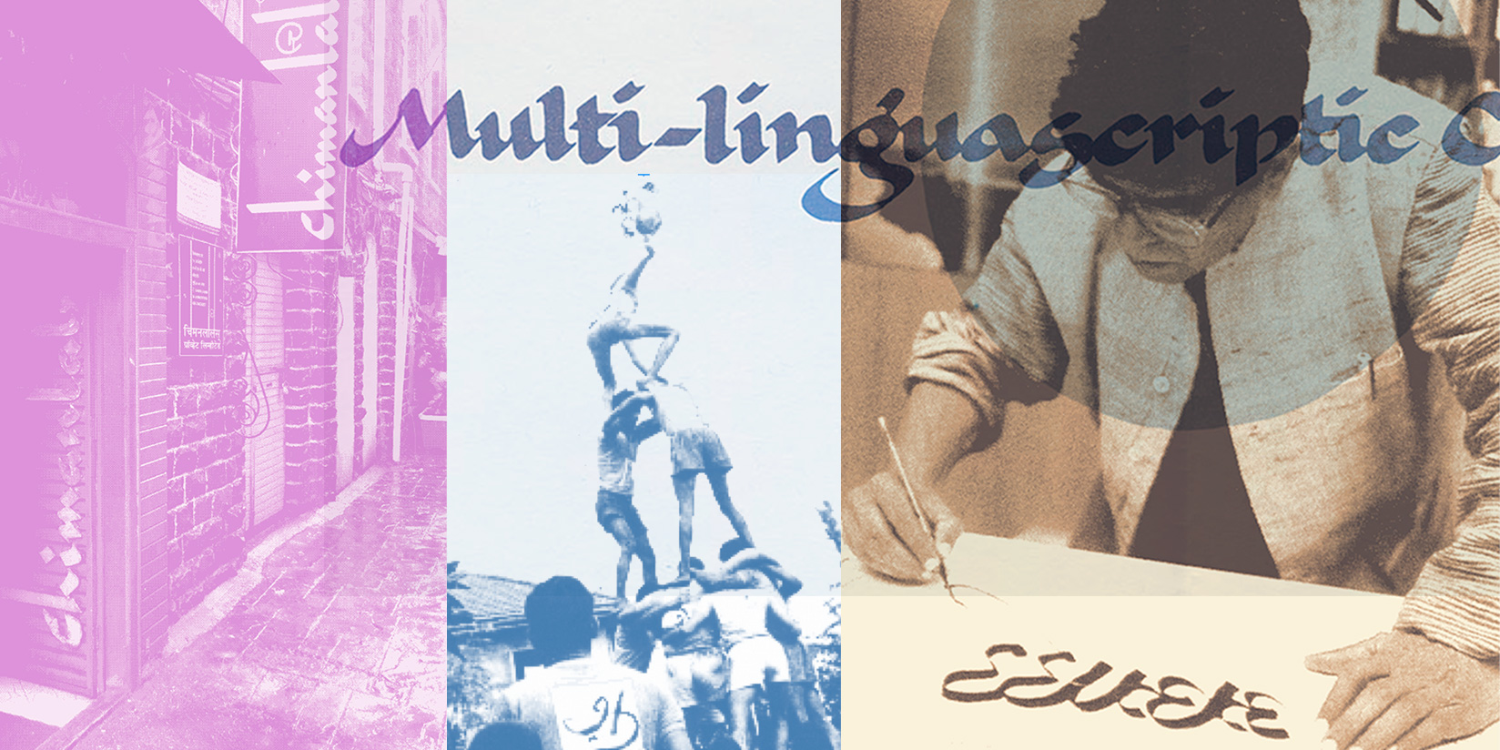
यह लेटरफॉर्म आर्काइव पर प्रकाशित होने वाला पहला हिंदी लेख है। इसमें दुनिया भर से आई वस्तुएँ शामिल हैं, और यह लेख उनके कुछ चुने हुए उदाहरण प्रस्तुत करता है। इसे लिखने का उद्देश्य सिर्फ़ नए पाठकों तक पहुँचना नहीं है, बल्कि रॉडिकल एक्सेस के विचार को आगे बढ़ाना है, जिस पर लेटरफॉर्म आर्काइव की नींव रखी गई है।
Meet the Czech designer who shaped how generations of readers encountered poetry.
Sylvie Vodáková occupies a distinctive, yet largely unheralded, place in Czech design. Over several decades, beginning in the late 1950s and continuing well into the 2000s, she developed a visual language marked by restraint, clarity, and a deeply human touch. Her long-running involvement with the Květy Poezie (“Flowers of Poetry”) series made her not just a designer of books, but a quiet custodian of Czech literary culture.
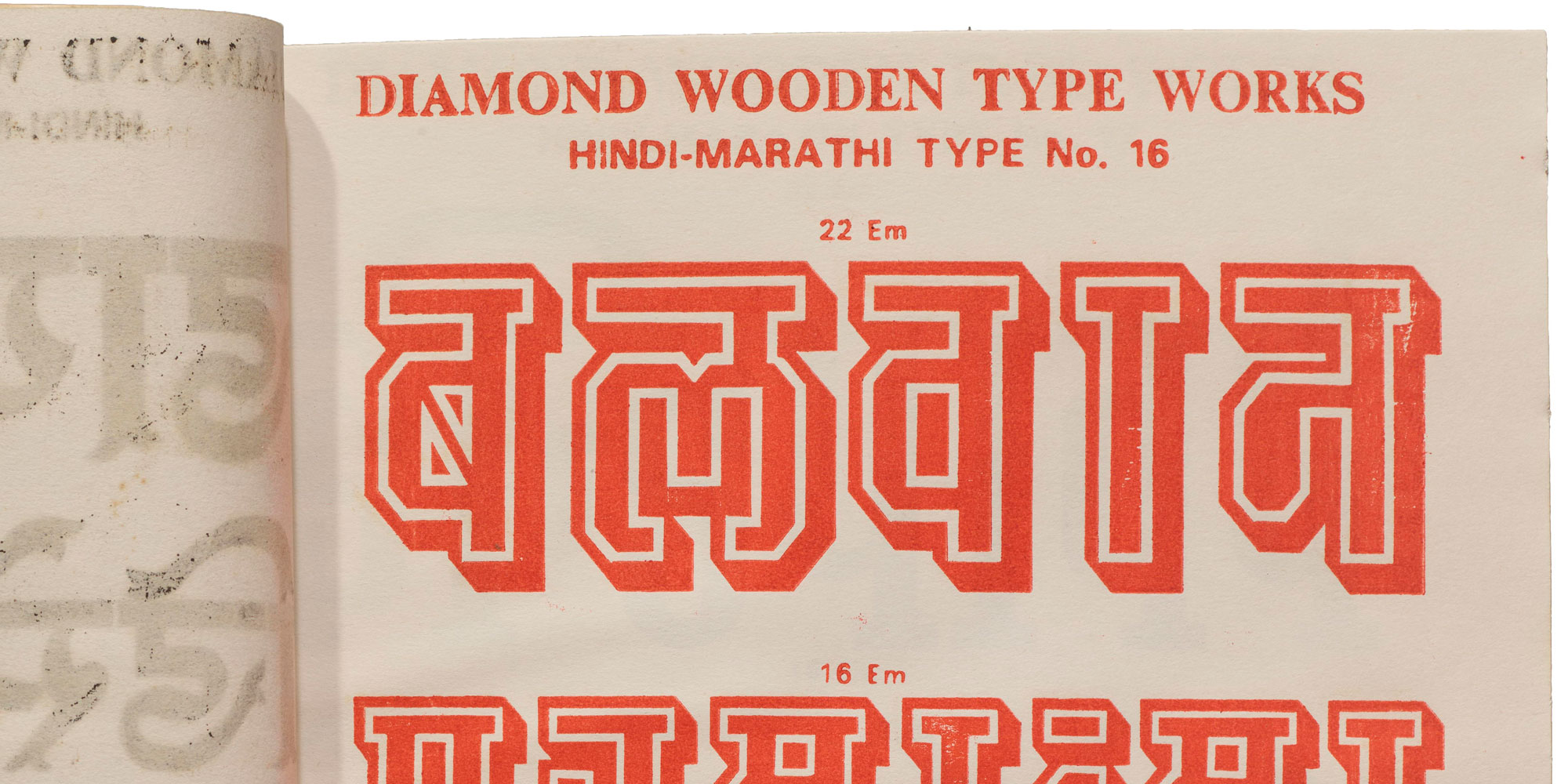
An untitled catalog and some tiny wood blocks from India invite us to rewrite type history.
In the North Indian city of Meerut, not far from the national capital of New Delhi, there was once a thriving wood type manufacturing scene. The industry there continued to operate much later than in other parts of the world, churning out letter blocks until the turn of the millennium, and contributing significantly to letterpress printing in the region and beyond.
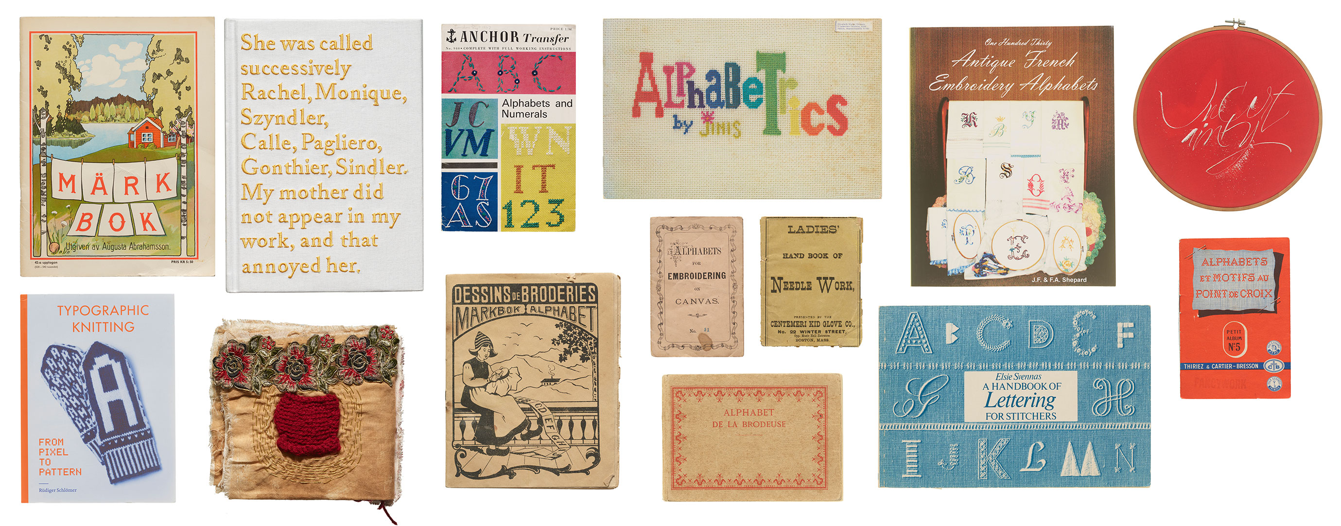
From embroidery to weaving, there is a long history incorporating letterforms into fabric. In this visit to the Archive’s stacks, we’re pulling multiple threads on items that tie text to textiles.
The word “text” originated from the Latin word “textus,” which means “a weaving” or “a fabric.” In ancient times, textus referred specifically to the process of weaving fabric. Over time, the meaning of the word expanded to include written or printed material, reflecting the idea of words being woven together to create a coherent written work. This metaphorical extension continues today with words and phrases such as seamless, threadbare, unraveled, looming, frayed, tangled, and spinning a yarn, highlighting the connection between the physical act of weaving fabric and the intellectual act of composing written language, both of which involve the interlacing of individual elements to create a unified whole. In this installment of For Your Reference, we revisit the Archive’s stacks for books and other items that build a tangible connection between threads and letterforms.
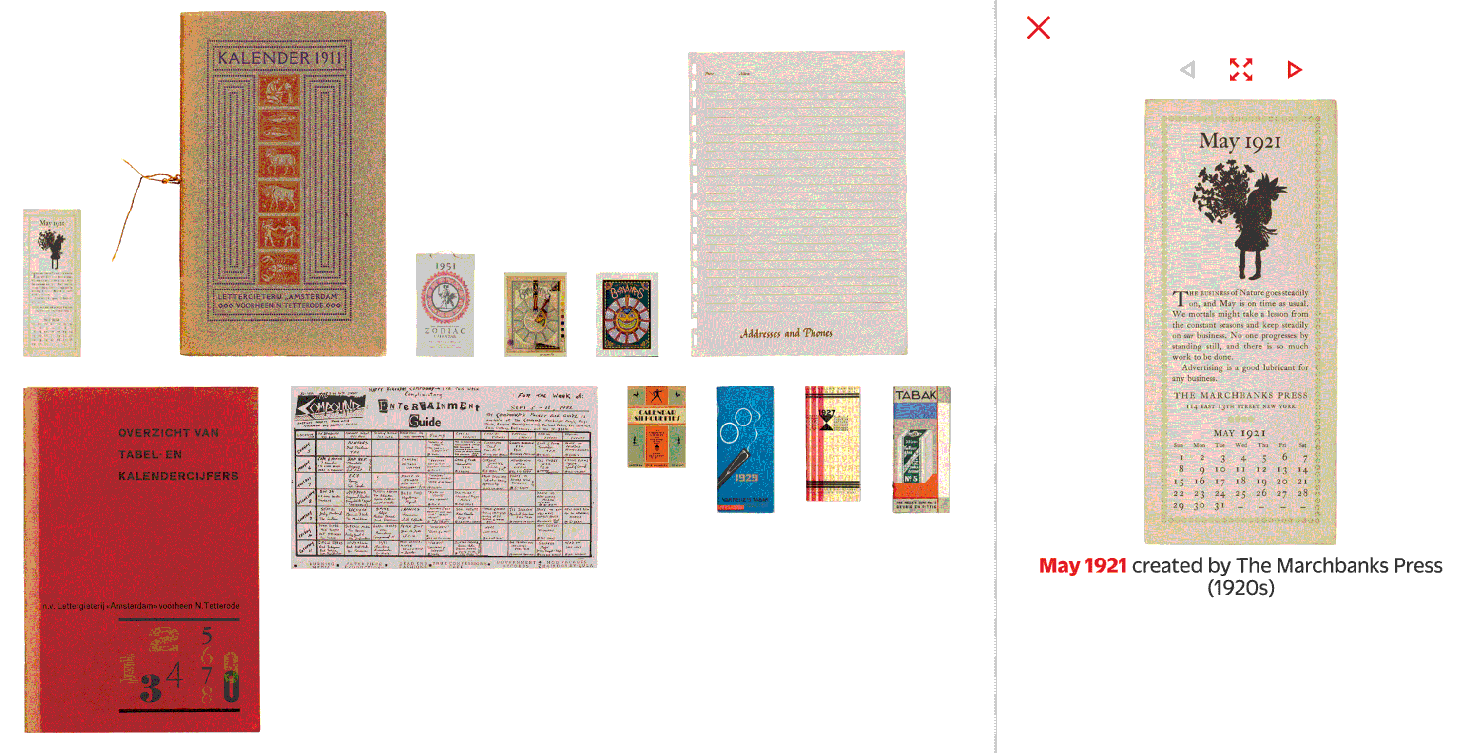
A variety of planners, event guides, and type specimens offer over a dozen ways to represent the year through lettering and typography.
We’re starting 2024 with a selection of objects in the Online Archive that chart Gregorian timekeeping across the twentieth century. This compilation includes traditional calendars, fonts crafted explicitly for typesetting calendars, branded promotional calendars, and material that reveals the process of making a very unusual calendar. We hope these ideas inspire you throughout the year.
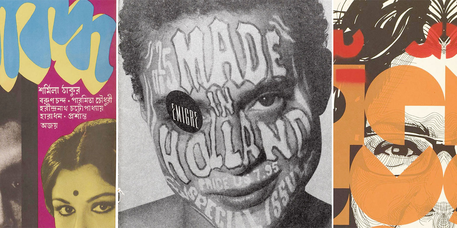
From calligraphy, to concrete poetry, to digital type, Raghunath Krishna Joshi’s influence on Indian letters is boundless. Meet the man who used writing to unite the subcontinent.
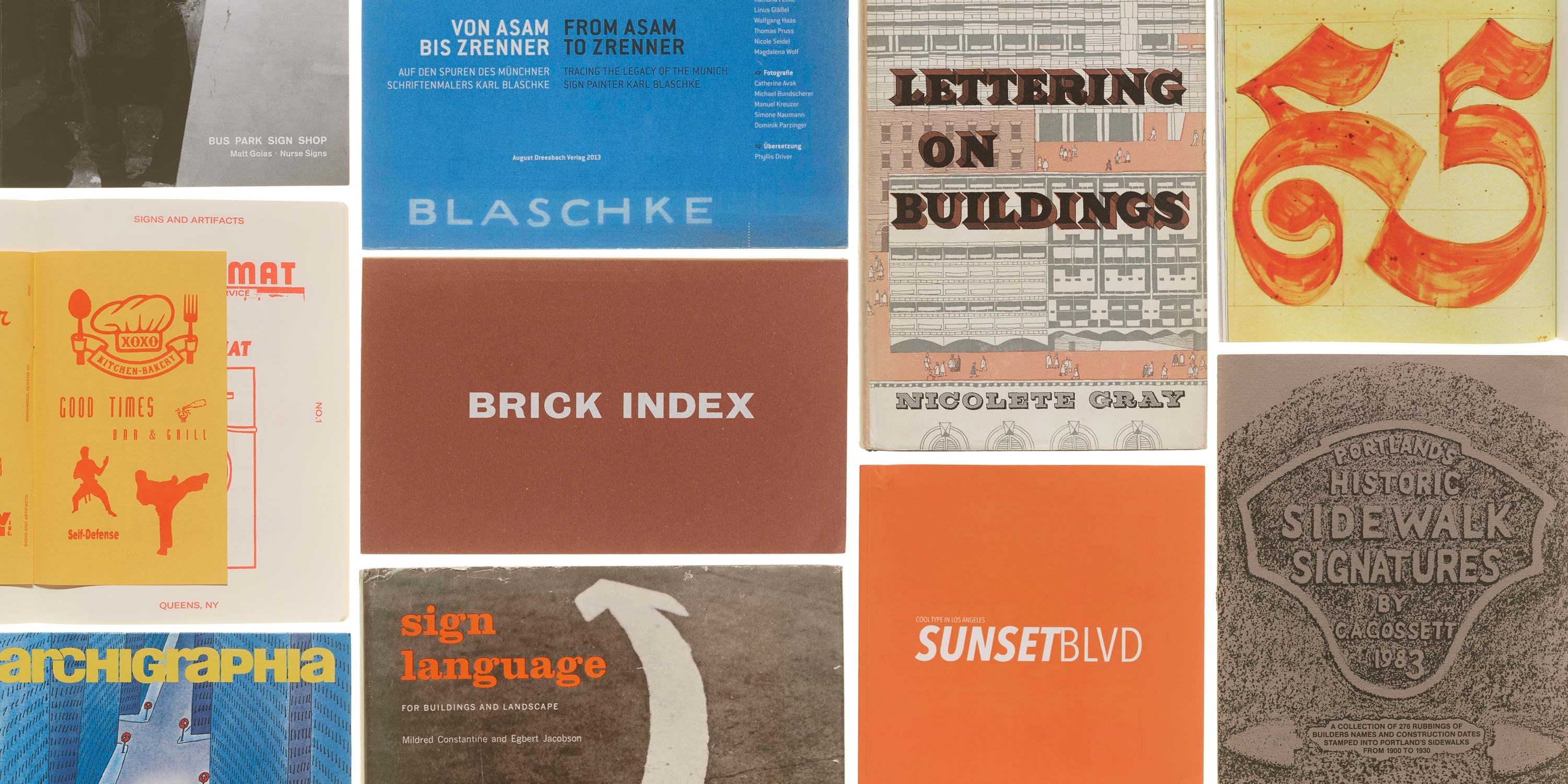
From retail branding to wayfinding, sign letters shape our urban landscape. Get a peek at the Archive’s stacks in this first stop on our reference library tour.
As an omnipresent artifact of design, signs have a universal ability to both impart information and evoke a feeling. Sign documentation — whether online or in a book — can be a portal into a place’s cultural history. It captures a typographic snapshot of a city. It tells a story about evolving reproduction technologies and how they affect design choices, how commercial dynamics affect cityscapes, and how typography can communicate the intangibles of a business and its clientele.
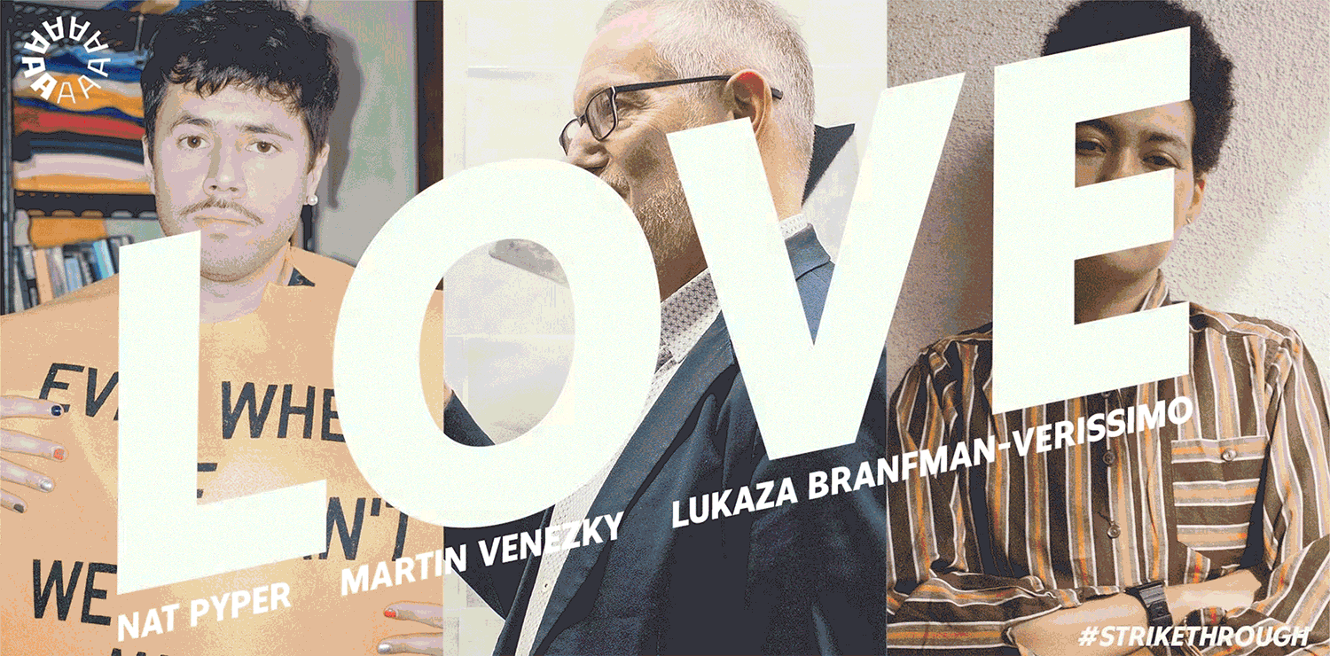
Last year Letterform Archive hosted 24 virtual events exploring typography from around the world. You can still watch them all.
2022 was another busy year for online public programming at the Archive. Over the year we recorded two dozen visually rich presentations on typography, graphic design, and their connection with our culture at large. These events include Letterform Lectures, a companion to the Type West certificate program in type design; our Salon Series, featuring staff or guest experts taking a deep dive into a specific theme within the Archive; and a special event with Ellen Lupton celebrating the culmination of the Bauhaus Typography at 100 exhibition.