2022 Design Lectures: Ten Videos to Revisit at the New Year
Last year Letterform Archive hosted 24 virtual events exploring typography from around the world. You can still watch them all.
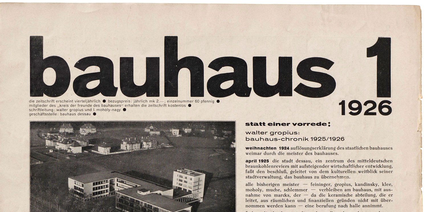
2022 was another busy year for online public programming at the Archive. Over the year we recorded two dozen visually rich presentations on typography, graphic design, and their connection with our culture at large. These events include Letterform Lectures, a companion to the Type West certificate program in type design; our Salon Series, featuring staff or guest experts taking a deep dive into a specific theme within the Archive; and a special event with Ellen Lupton celebrating the culmination of the Bauhaus Typography at 100 exhibition.