News
Calendar Design in the Online Archive
A variety of planners, event guides, and type specimens offer over a dozen ways to represent the year through lettering and typography.
We’re starting 2024 with a selection of objects in the Online Archive that chart Gregorian timekeeping across the twentieth century. This compilation includes traditional calendars, fonts crafted explicitly for typesetting calendars, branded promotional calendars, and material that reveals the process of making a very unusual calendar. We hope these ideas inspire you throughout the year.
Kalender 1911
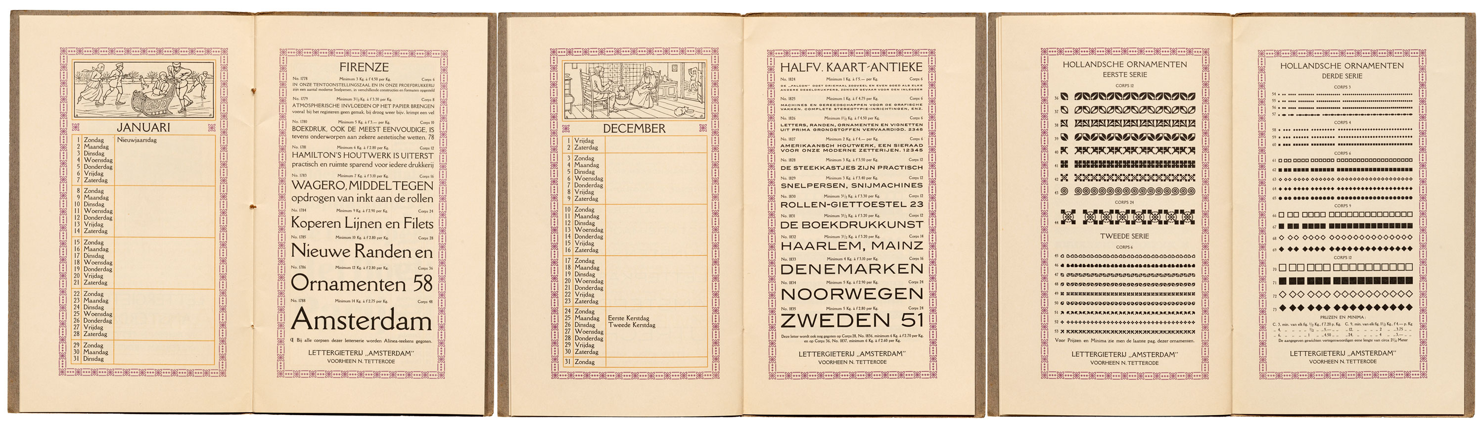
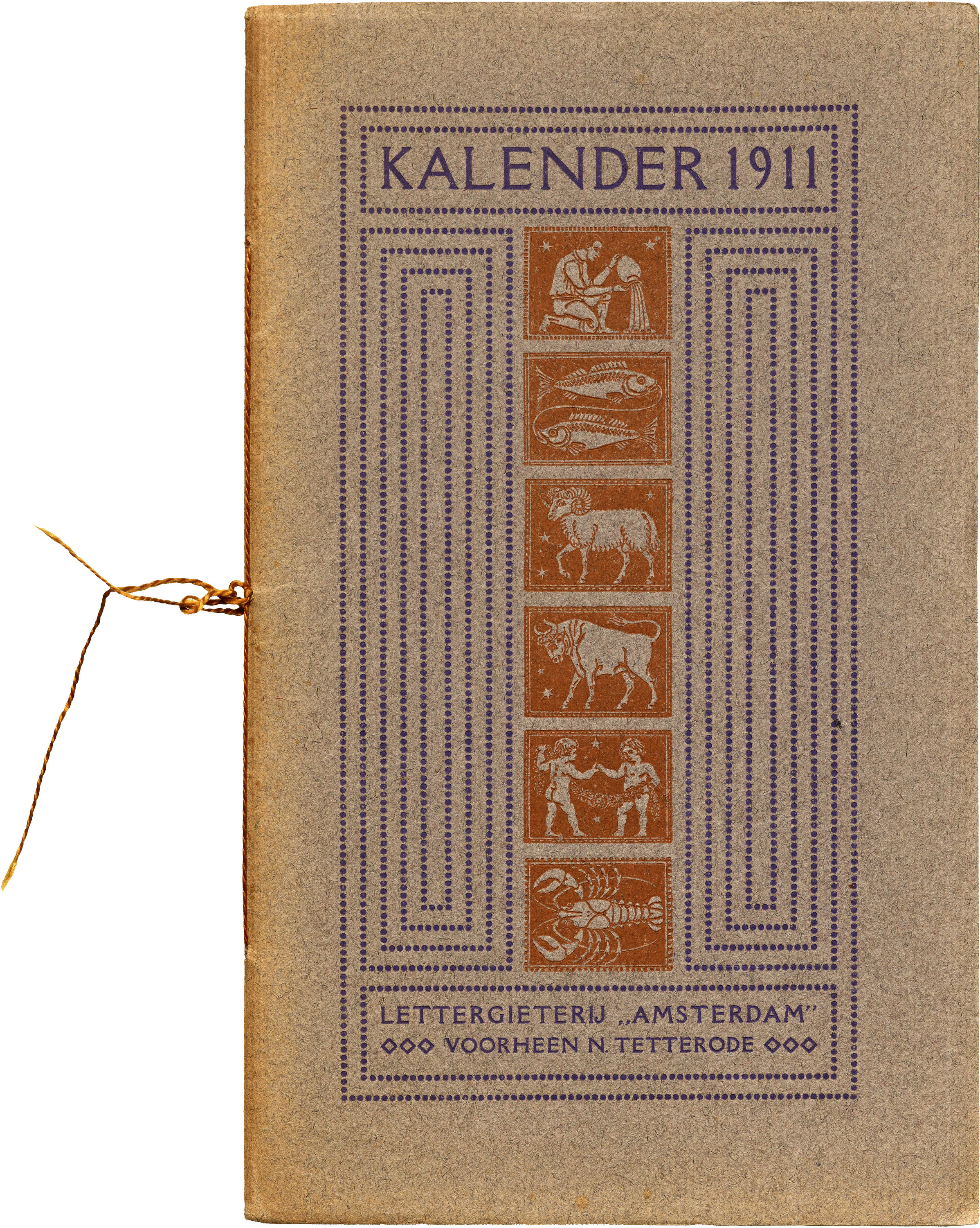
Published by the Amsterdam Type Foundry in 1911, this booklet serves as both calendar and type specimen, featuring a distinctive sans-serif, serif, or blackletter style for each month. In addition to providing blank space for notes, the planner also marks significant days throughout the year. The end pages showcase an array of metal ornaments and borders, available in diverse designs and sizes. These elements could be chosen and combined with alphabetic fonts, offering a way to craft visually interesting layouts. The calendar/specimen encompasses a variety of designs.
Another type foundry who invested even more into the pocket calendar format is Germany’s Klingspor, who published annual chapbooks for over thiry years, from 1910 to 1941. The Archive has a full run of this series and hopes to add it to the Online Archive someday.
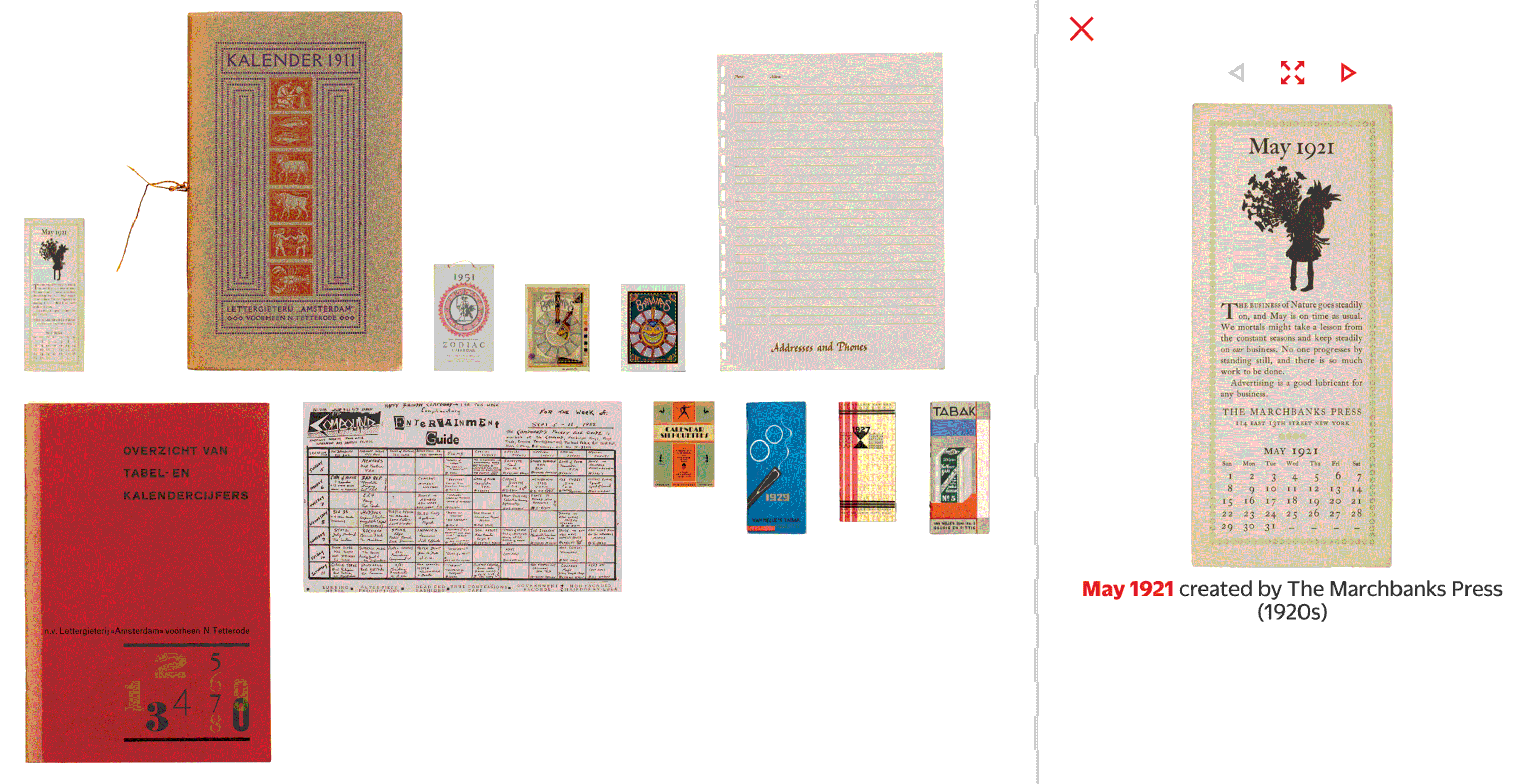
The Marchbanks Press, 1915–1921
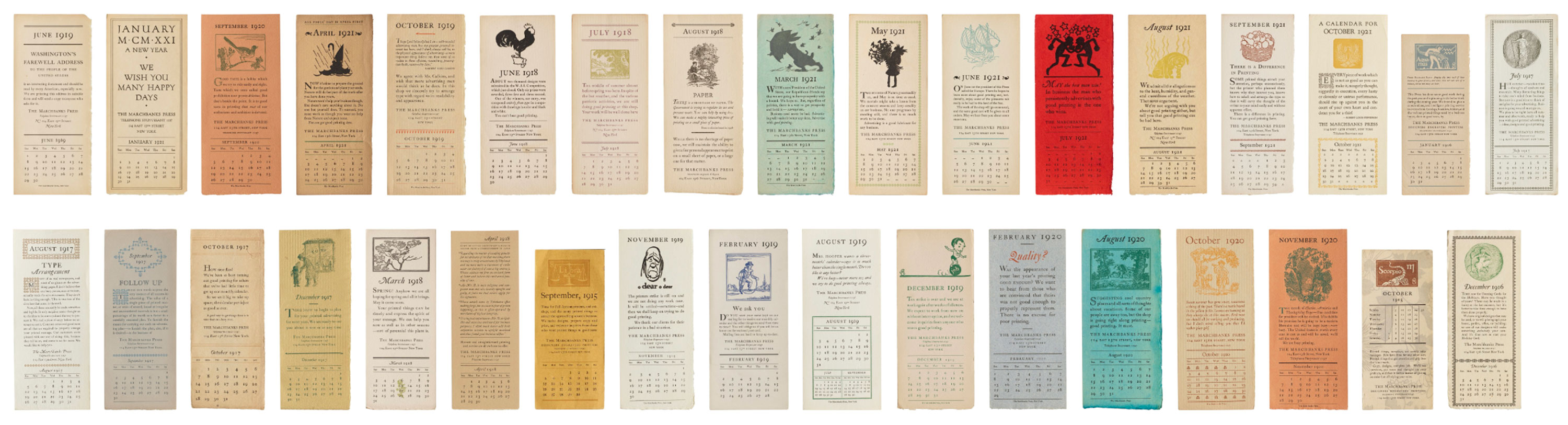
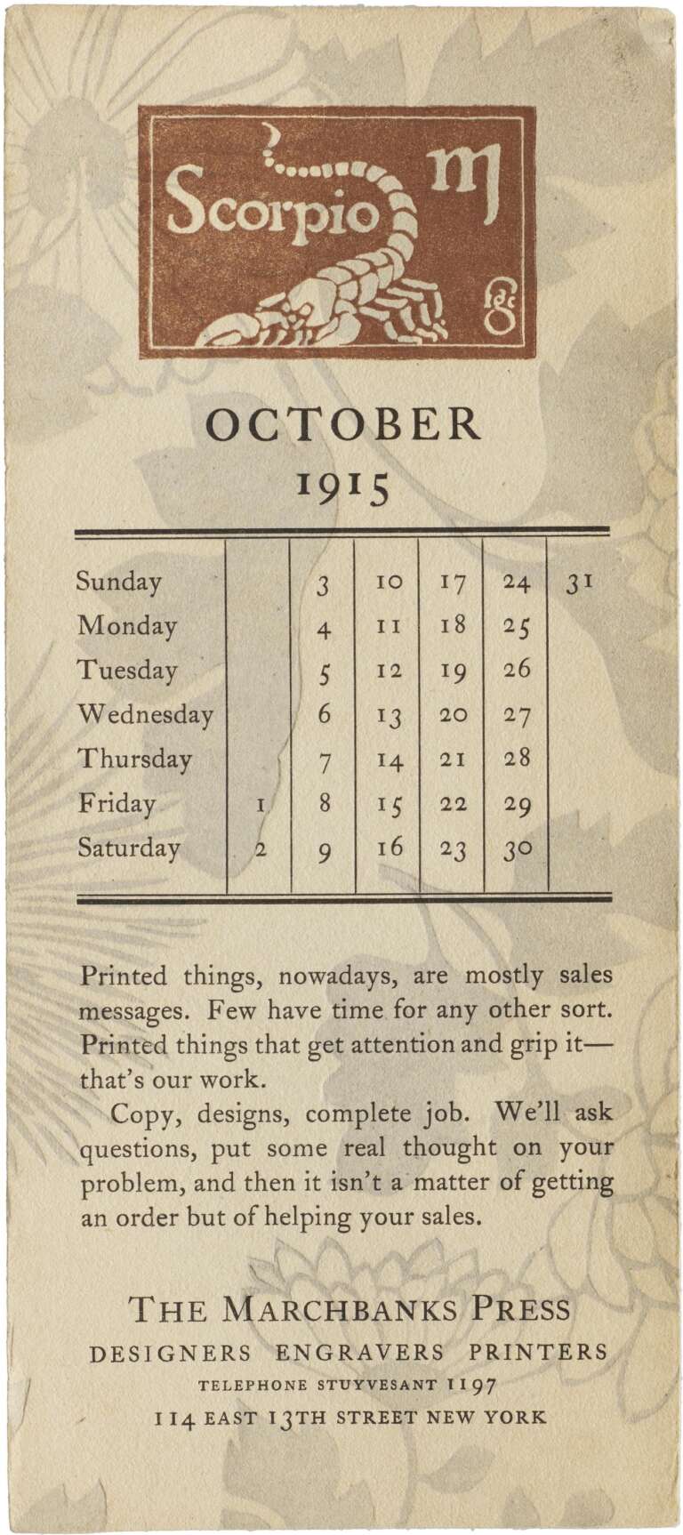
The Marchbanks Press, a prominent early-twentieth-century job printer in New York City, distributed monthly calendars showcasing various printing techniques and styles available for their clients. The tradition began in the 1910s and continued into the 1930s, with each single strip typically including an illustration accompanied by text emphasizing the exemplary printing services offered by Marchbanks. Contributing designers and illustrators include big names in printing and typography, including Thomas Maitland Cleland, Fred G. Cooper, W. A. Dwiggins, Charles B. Falls, and Rudolph Ruzicka. The calendars, topped with metal type ornaments, woodcuts, and engraved illustrations, also touch on news at Marchbanks— even a printer’s strike in November 1919.
Read more about the Marchbanks calendars in this deeply researched article by Paul Shaw.
Calendar Silhouettes, 1928
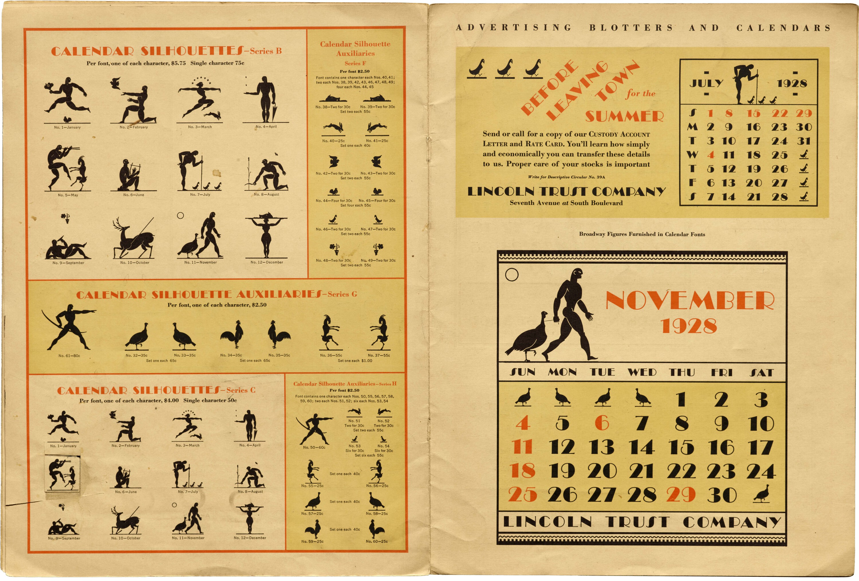
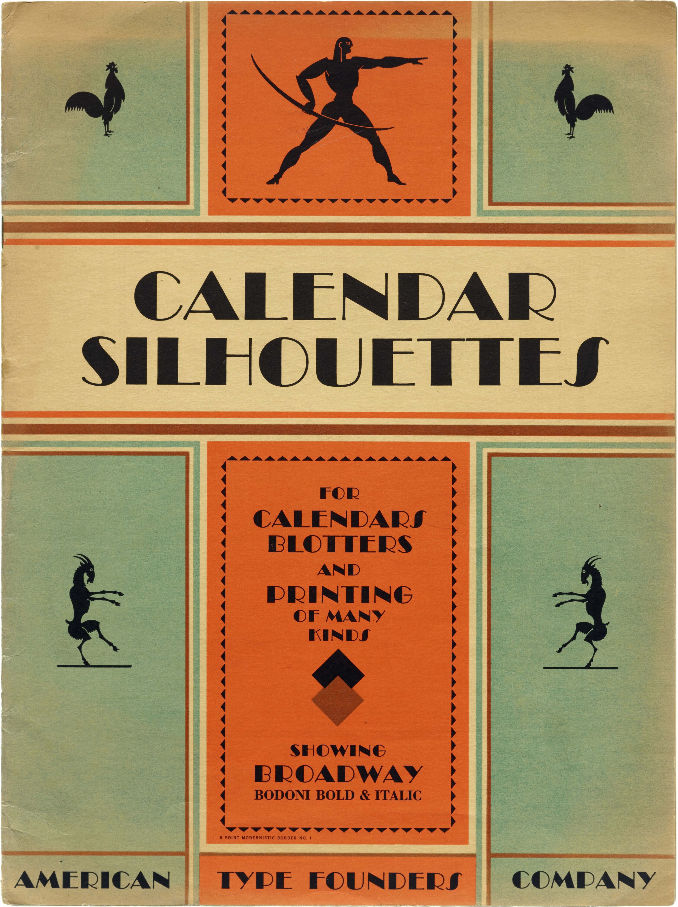
In this 1928 specimen, American Type Founders showcased two typefaces, Bodoni and Broadway, and ornaments suitable for designing logos, borders, ornamentation, and standalone illustrations. The set of ingredients serves as a versatile tool for creating prints of all kinds, but especially blotters. Blotters served as promotional devices, with printed calendars or other useful information on one side, leaving the other side blank to absorb excess ink after using a fountain pen. The idea was that customers would keep blotters on their desk throughout the month, functioning as a practical reference while also subtly embedding the brand name in the viewer's mind.
Speaking of blotters, the Archive holds a collection of over 100 designed between 1927 and 1966 by Piet Zwart for the Brunzeel lumber company. Again, another collection that in line for digitization with your help.
Van Nelle’s Promotional Pocket Calendars, 1927–1929
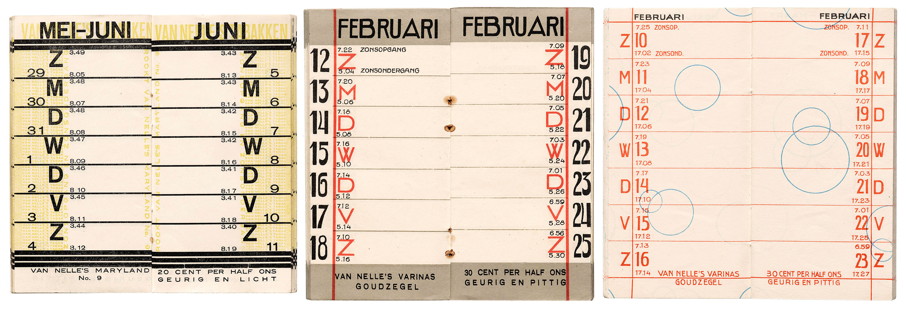
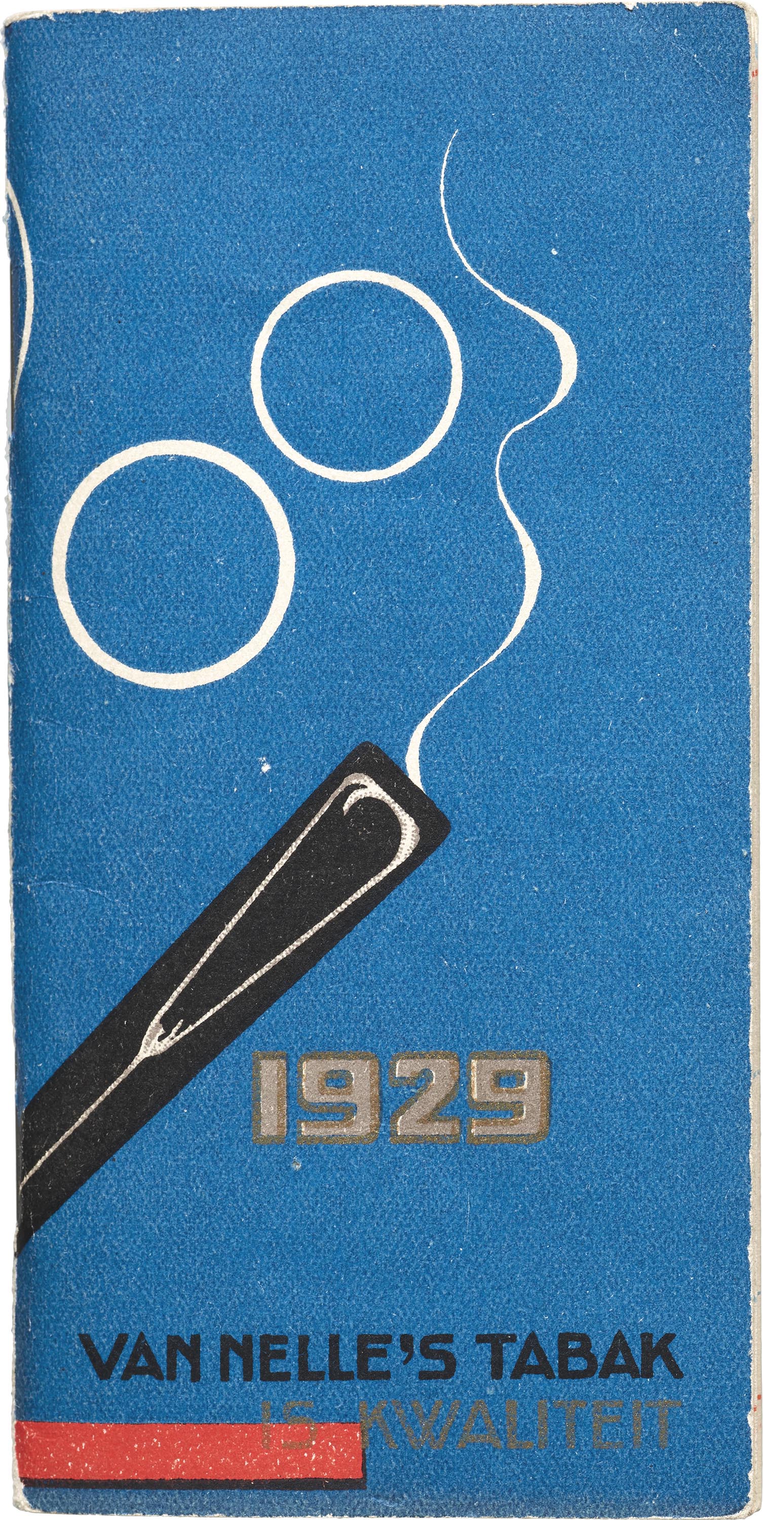
The Archive holds a collection of several hundred objects designed by Jacob Jongert, often signed as "Jac.," during the 1920s and ’30s for Van Nelle, a Rotterdam-based manufacturer of coffee, tea, and tobacco products. In the Online Archive you can find three delightful promotional calendars from 1927, 1928, and 1929. The compact promotional booklets advertised Van Nelle's tobacco. Jongert's distinctive design system for Van Nelle is characterized by expansive swaths of primary colors, geometric shapes, and a minimalist approach to illustration, which you can read about at length in this blog post. This aesthetic is seamlessly tied together by hand-drawn lettering, a hallmark feature seen in the calendars as well.
The 1929 calendar cover features circular smoke rings which bubble up throughout the booklet. Also within its pages are tide and postal information aloong with vibrant advertisements. The hand-drawn style for months, weekdays, and numbers reflects Jongert’s signature way of branding through lettering.
The Feather-Vender Zodiac Calendar, 1951
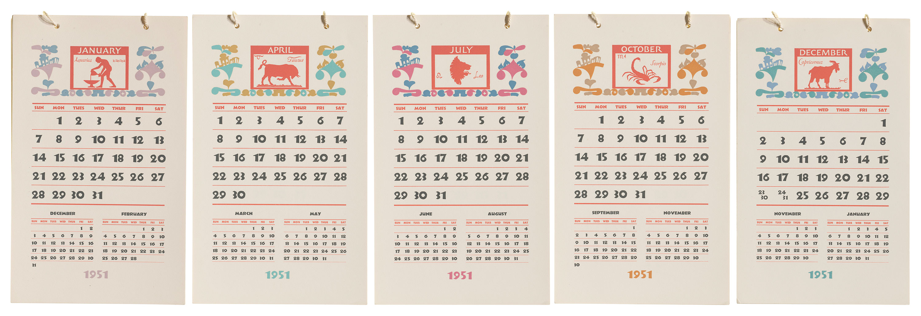
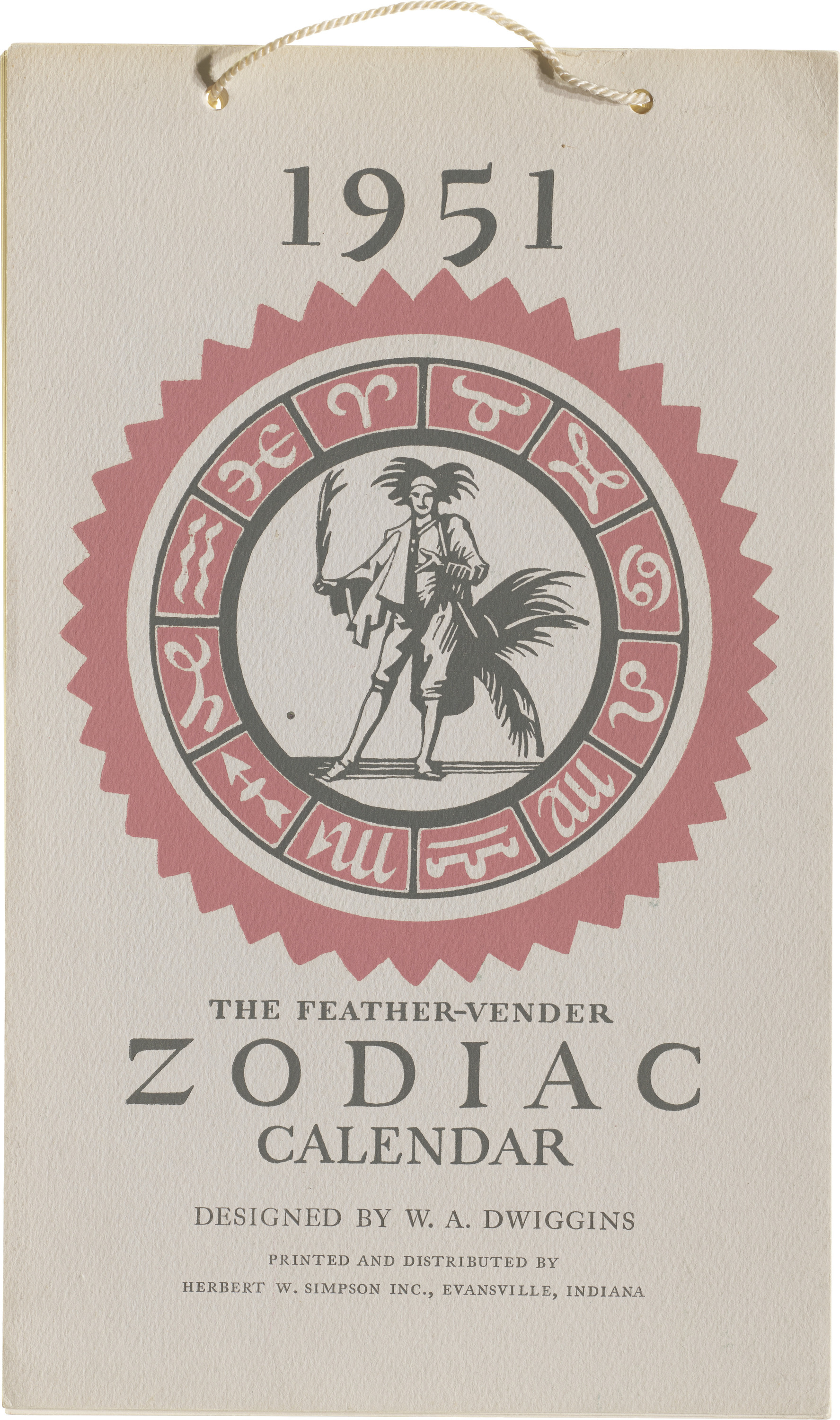
Published by Herbert W. Simpson, Inc. in 1951, The Feather-Vender Zodiac Calendar showcases illustrations, ornaments, lettering, and design by W.A. Dwiggins. The calendar, bound with string at the top, presents colorful illustrations of zodiac signs on each page. While the ornamental borders and typographic layouts (set in Rudolf Koch’s Neuland) maintain a consistent design, the colors — all classic Dwiggins combinations — vary from month to month.
Overzicht van Tabel-en Kalendercijfers, 1959
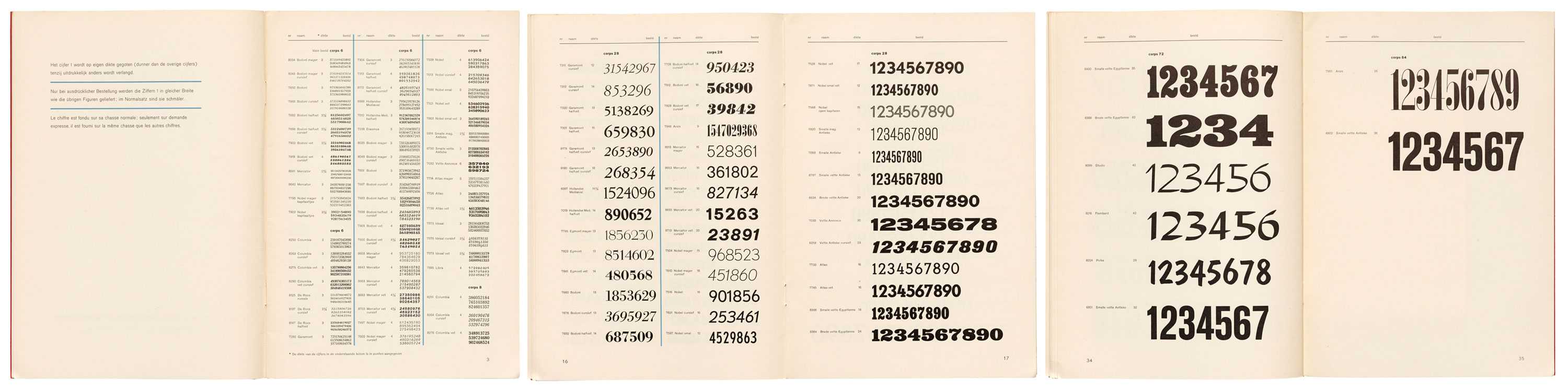
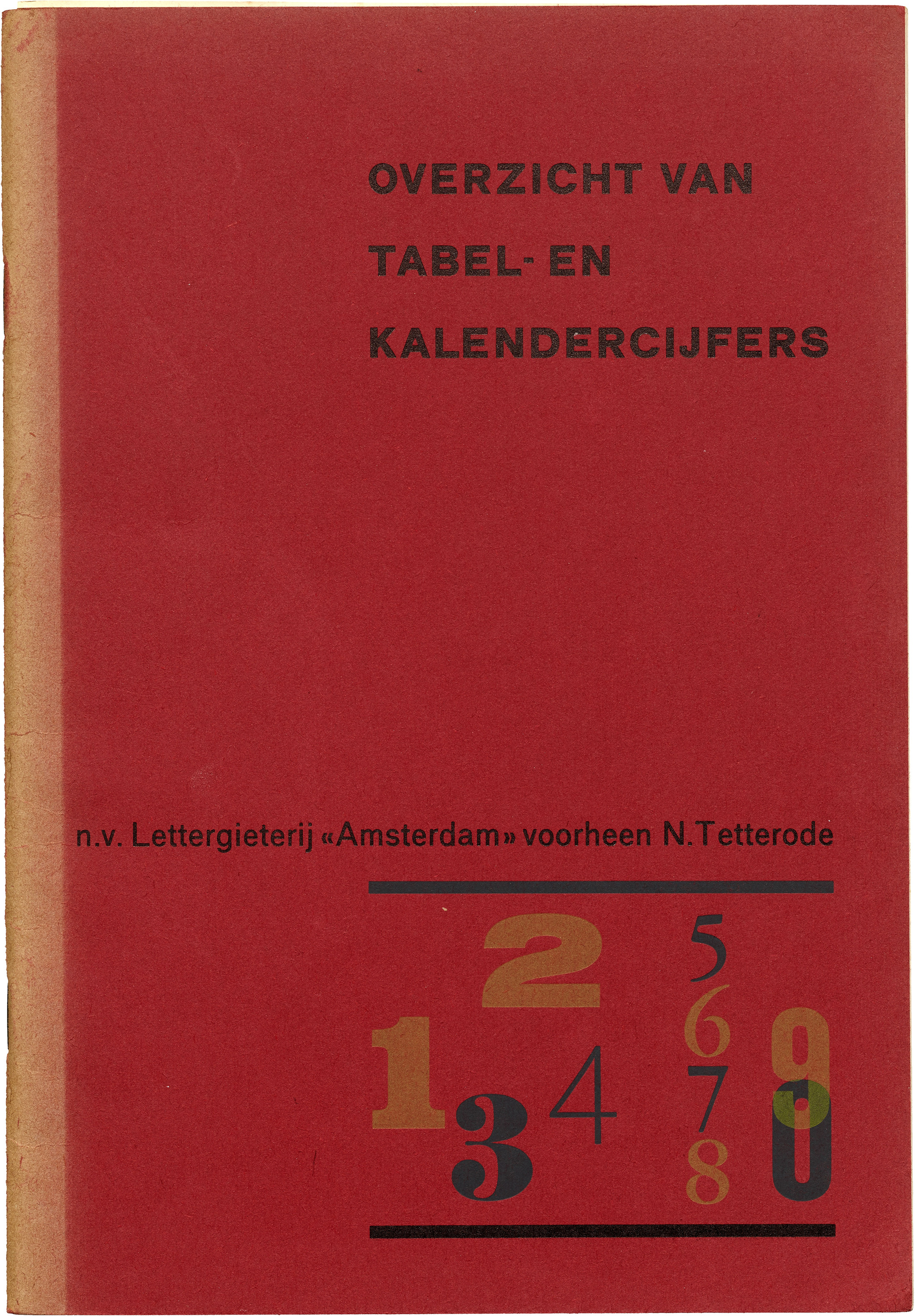
In July 1959, the Amsterdam Type Foundry assembled this pamphlet of numbers meant for tabular and calendar alignment. This compilation was released in response to numerous customer requests, aiming to provide a comprehensive overview of the figures produced by the company. The specimen includes all available sizes of numbers for common typefaces, accompanied by information on the respective typeface family, casting width, and order numbers.
The introductory text specifies that while delivery was feasible in nearly any desired quantity and that customers could order figures in sets, particularly suitable for setting calendars. These sets were offered in sizes 24 and larger for all common typefaces, enabling the setting of days from 1 to 31 with a single font of sorts.
Isn’t It Time You Went Bananas!?" Calendar, 1977
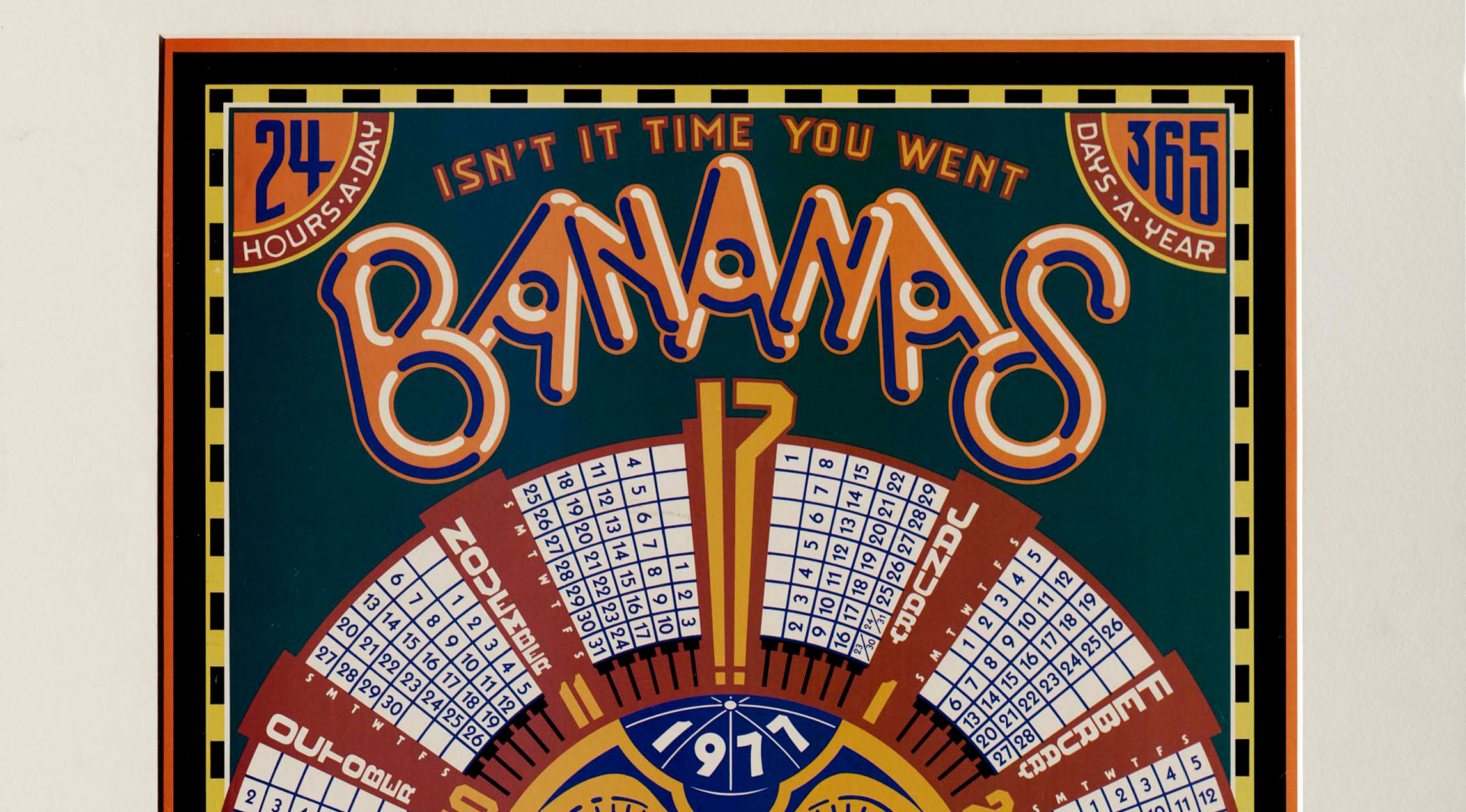
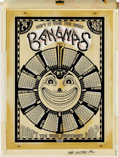
Michael Doret’s 1977 calendar showcases his logo for the children’s magazine Bananas along with his signature lettering and illustration style. The unusual circular layout plays with the fact that a calendar and clock are both divided by 12. The phrasing — "Isn’t It Time You Went Bananas!?" at the top and "Don’t You Wish Everybody Did?" at the bottom —are derived from a ubiquitous advertising slogan for soap (“Aren’t you glad you use Dial?”). It’s a silly design for a silly magazine, the kind of calendar that a kid would actually use.
Beyond its whimsical content, this piece also reveals and preserves the pre-digital process of custom lettering and production. The Archive is honored to hold many of Doret’s progressions, from initial pencil sketch and color sample to printer’s mechanical, ultimately culminating in the final art. Stay tuned for more Doret news as the Archive nears publication of a monograph about his work!
- This Just In: Michael Doret’s Disney and Pixar Title Treatments
- Growing Up in Alphabet City: The Unexpected Letterform Art of Michael Doret
Indian Calligraphy Diary, 1980

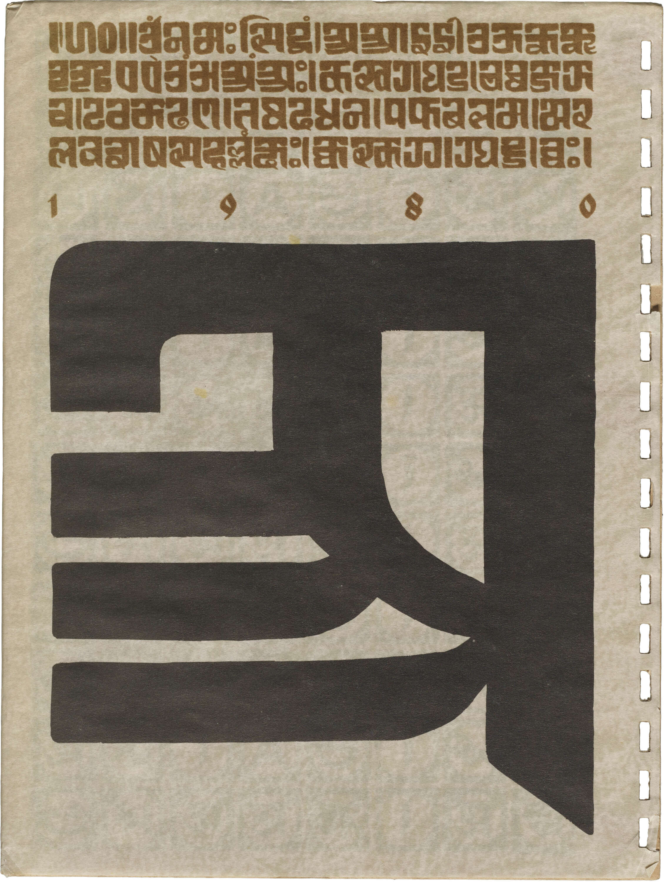
Indian Calligraphy Diary from Chimanlals was a part of the company's diverse stationery products. Crafted during R.K. Joshi's decade-long tenure as the creative director at the outfit. While the diary explicitly credits Joshi for his calligraphic mastery, it becomes evident that the entire publication, from concept to execution, mirrors his experimental design approach, respect for the history of writing, and appreciation for linguistic diversity—a consistent pattern that permeates his more than 30-year career. Get into the details of the diary and Joshi’s life in our recent blog post.
The Compound Entertainment Guide, 1982
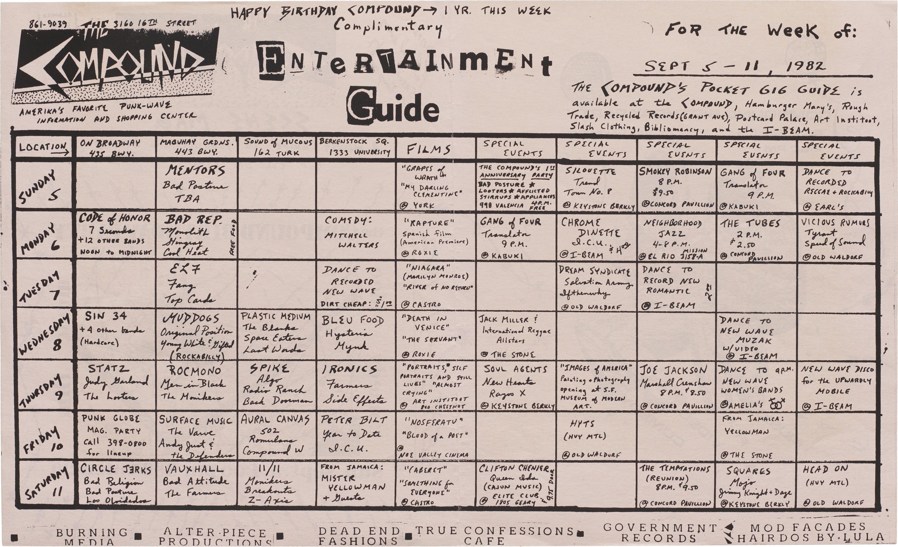
The Compound, self-proclaimed as “America's favorite punk-wave information and shopping center”, published a complimentary gig guide to celebrate its first anniversary in September 1982. The Compound Entertainment Guide provided coverage of music, film, video, and comedy events in the San Francisco Bay Area on a weekly basis.
Tezzo Suzuki Calendar, 2024
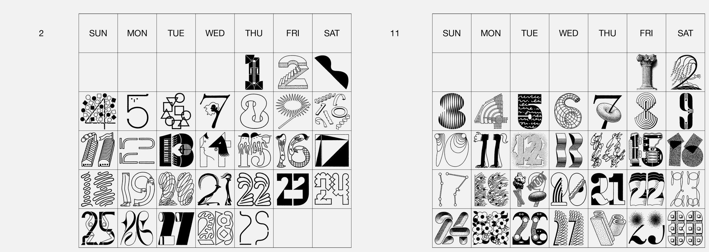
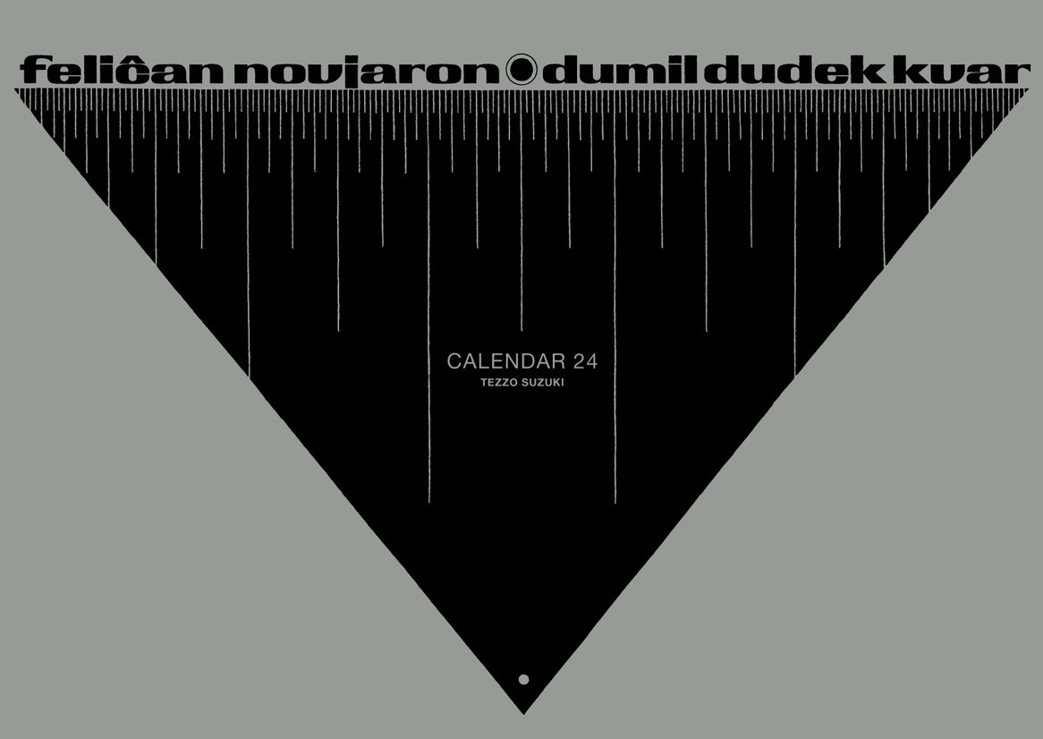
Since 2012, Japanese designer Tezzo Suzuki has designed a calendar featuring beautifully hand-drawn numbers for each day of the year. The numerals —ranging from abstract and minimal and ornate and figurative — are inspired by myriad sources, from fine art to typographic models to amusing situations. Now entering its 12th year, Suzuki introduces new drawings, replacing the 101 numbers from the previous edition. The calendar is presented in A3 format, comprising six sheets printed on both sides, accompanied by a cover page, all neatly enclosed in a vinyl envelope.
While they are sold out online. a limited supply of Suzuki’s 2024 calendars are available for purchase in Letterform Archive’s shop, in-person only. Pick one up at the opening for our next exhibition, Typographic Jazz, or during gallery open hours.
— Tanya George, Editorial Correspondent
Help us bring more calendars and other numeral-typographic delights to the Online Archive: become a member.