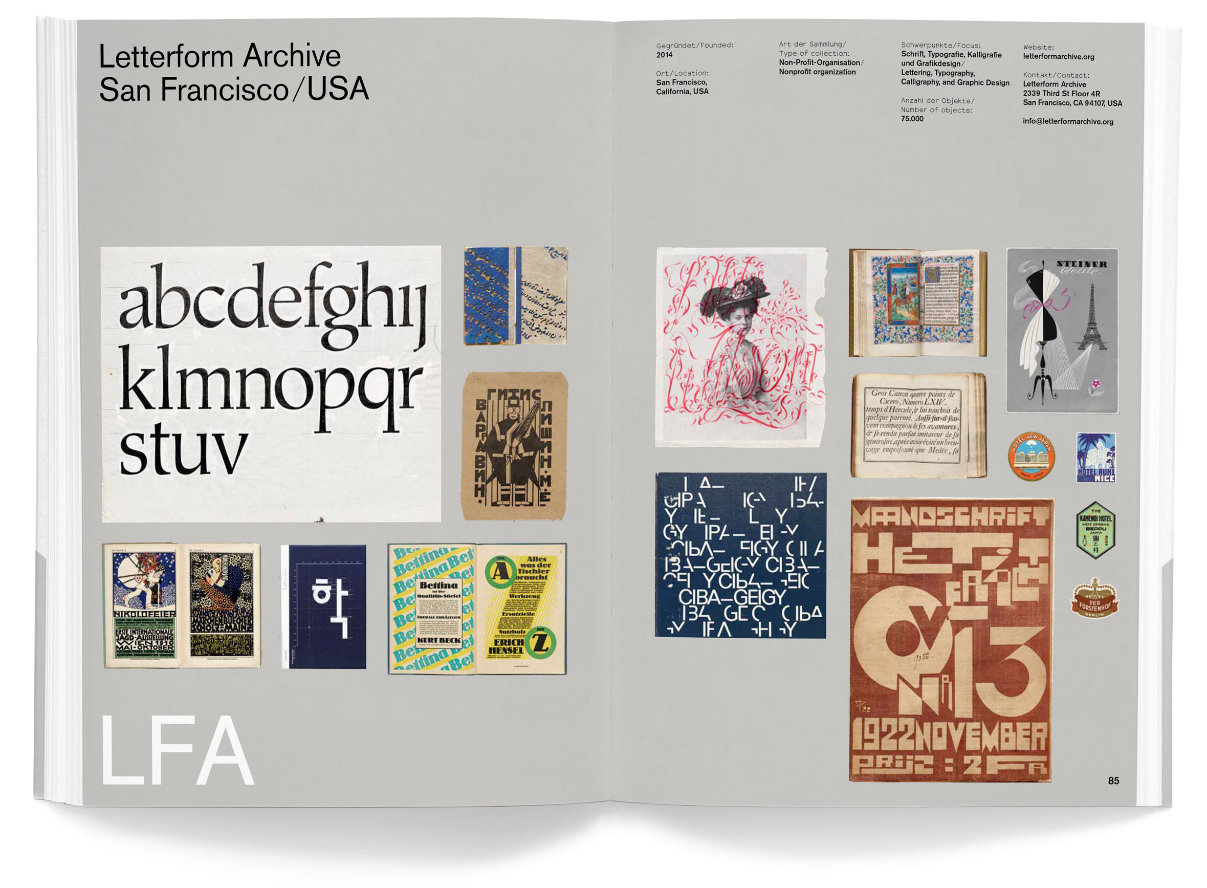
Skip to main menu Skip to main content Skip to footer content

Author: Stephen Coles

This Just In: Milwaukee Transit Passes

In the 1930s–60s, Milwaukee Electric Railway & Light Company offered trolley and bus riders a weekly burst of color and hand lettering. About 300 of these tickets are now in our collection.

A Milwaukee streetcar, 1955. Photo courtesy Barry Lennon.

Milwaukee claims to be the inventor of the weekly transit pass, and for several decades they could also boast to have some of the most beautiful ones. On August 18, 1919, Milwaukee Electric Railway & Light Company (TMER&L) launched a weekly pass experiment for its extensive streetcar service. It was an overnight success and went into full operation in 1921. The design of the passes was utilitarian and banal until the 1930s when they brought the production in-house and added color, public-service announcements, information about local events, and illustrated depictions of civic history.

For design and letterform lovers, the passes issued between 1937 and 1972 stand out as particularly colorful and cohesive. They follow a fairly consistent design program of large hand-drawn numbers for the week of the year, lettering for the valid range of dates, and small-print information set in type, all functionally decorated with jaunty banners, frames, and rules. Thanks in part to a donation from type designer Tobias Frere-Jones, the Archive now holds about 300 tickets between 1932 and 1969.

Read More

This Just In: Trajan Rubbing and Recutting

A 1970 rubbing by Father Edward Catich and a 2021 recutting by Paul Herrera bring the classical Roman capitals to life at the Archive.

Trajan column site photo by Carl Rohrs
Trajan’s Forum and Column in Rome, Italy. Photos by Carl Rohrs, September 2017.

The letters found at the base of Trajan’s Column, a second-century celebration of the Roman emperor, are widely considered the archetype of Roman capitals. Their shapes and proportions have inspired calligraphy, lettering, and type design for centuries. While we can’t transport the 100-foot, 700-ton marble monument to San Francisco, two recently acquired works offer some of the most true-to-life representations of the inscription.

Read More

Letterform Archive Featured in New Book: Collecting Graphic Design

The Optik Books title highlights 10 collections around the world which specialize in a discipline that is traditionally overlooked by art and design institutions.

Letterform Archive in Collecting Graphic Design

Archives are more than just warehouses; they are greenhouses for the nurturing of narratives. Out of archival seeds, mighty stories grow. — Steven Heller on Collecting Graphic Design

A5/10: Collecting Graphic Design — The Archiving of the Visual
A5/10: Collecting Graphic Design — The Archiving of the Visual, Optik Books, 2021

Based in Düsseldorf, Jens Müller has authored, edited, and published dozens of books on design. The A5 series — under his own Optik Books imprint — offers affordable and beautifully documented snapshots of design history at a digestible length and (you guessed it) A5 size. The 10th volume in this series, Collecting Graphic Design, calls attention to the few institutions and private collectors who concentrate on preserving and sharing objects of graphic design, such as posters, logos, book covers, design manuals, and ephemera.

Read More

Bauhaus Typography at 100 Opens Nov. 13, 2021

The wait is over. Letterform Archive welcomes you to our new home to experience the inaugural exhibition of our first-ever gallery.

Bauhaus Typography at 100 banner

We’re thrilled to announce the opening of our first gallery with an exhibition of more than 150 pieces from our permanent collection.

Read More

Now Online: Landmarks of Early Western Typography

From Gutenberg to Granjon, new additions to the Online Archive represent major developments in letterpress printing.

Christophe Plantin, Senatus Populique Genvensis…, 1579

In her recent update, librarian Kate Long mentioned the ways we use the Archive as a teaching tool, especially in our Survey of Type History for the MFA Design program at the California College of the Arts. Now in its third year, the course tells the story of design firsthand through a curated selection of artifacts from our collection. This year, of course, the pandemic is forcing us to meet remotely, which means we’re prioritizing key historical objects for digitization and virtual presentation. The beauty of this pivot is that everyone benefits – even those who aren’t master’s students – because the Online Archive is open to all. As a taste, here are a few recent additions to the site that represent typographic milestones over the first 150 years of letterpress printing.

Read More

Now Online: Guest-Curated Tables

We love to set tables for guests. Now we invited them to set their own. Custom collections by Levit, Levée, Morla, Sandhaus, and Weefur weave threads of design history, style, and meaning.

A sampling of artifacts from the guest tables featured in this article.

Last fall, when we introduced Tables, a tool for creating sets of typographic artifacts from our Online Archive, we asked a few friends, board members, and staff to put the tool to use. The results demonstrate the myriad ways members can use Tables to build collections of inspiration, research, and resources for use in the studio or classroom.

Read More