From the Collection: Portuguese Type Specimens
Guest expert António Fonseca surveys our collection of metal type catalogs from the foundries of Portugal.
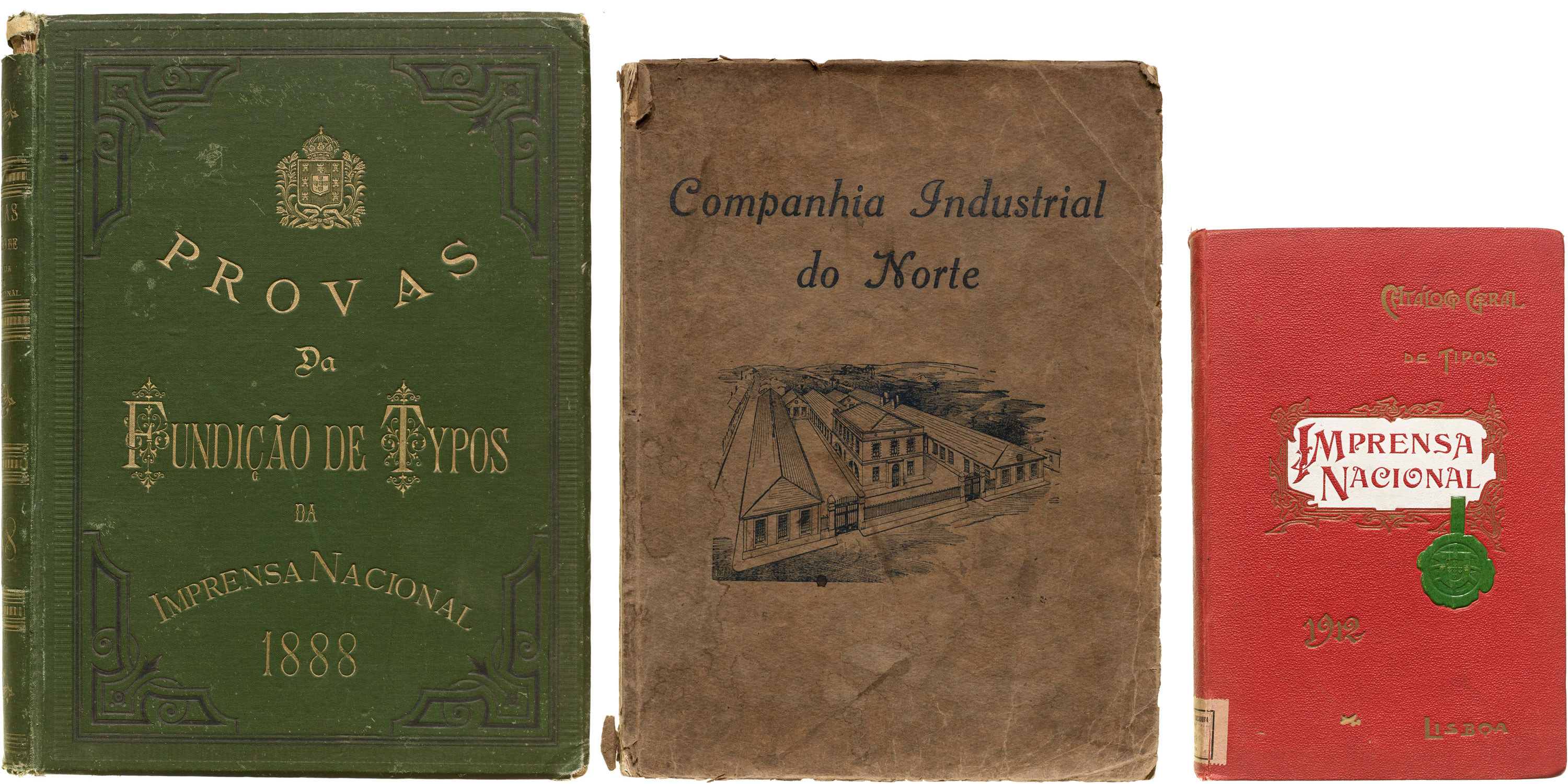
Guest expert António Fonseca surveys our collection of metal type catalogs from the foundries of Portugal.

A remarkable sculptural installation of 26 letters and 10 numbers will grace the walls of our new home.
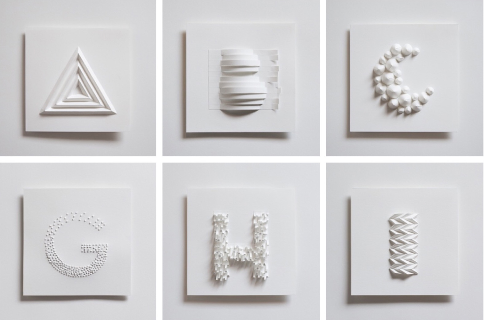
In 2019, San Francisco paper artist Zai Divecha (she/her) created 36 letters and numbers for the 36 Days of Type challenge. Letterform Archive is proud to announce our acquisition of Quiet Type, which will be on permanent display in our new location. Collections Programming Manager sair goetz interviewed Zai.
Bring a rare piece of the Archive into your own home or office while supporting our mission: join our first-ever auction on May 12, 2021.
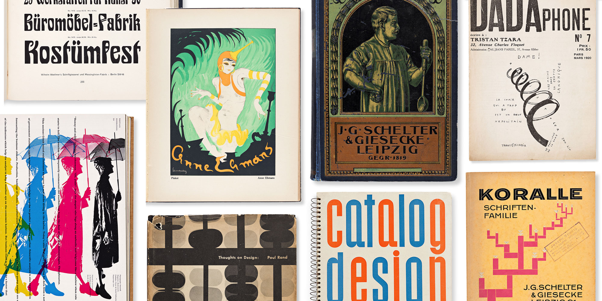
Letterform Archive has one of the world’s best collections of typographic history. We house over 60,000 objects aggregated from various sources and donors with overlapping interests. This often yields multiple copies of a book or print, and there are now hundreds of duplicates to be deaccessioned. Over the last five years we held several small sales, particularly of reference books and type foundry ephemera, but we reserved the rarest gems for a moment when we could offer them all together in a globally accessible auction.
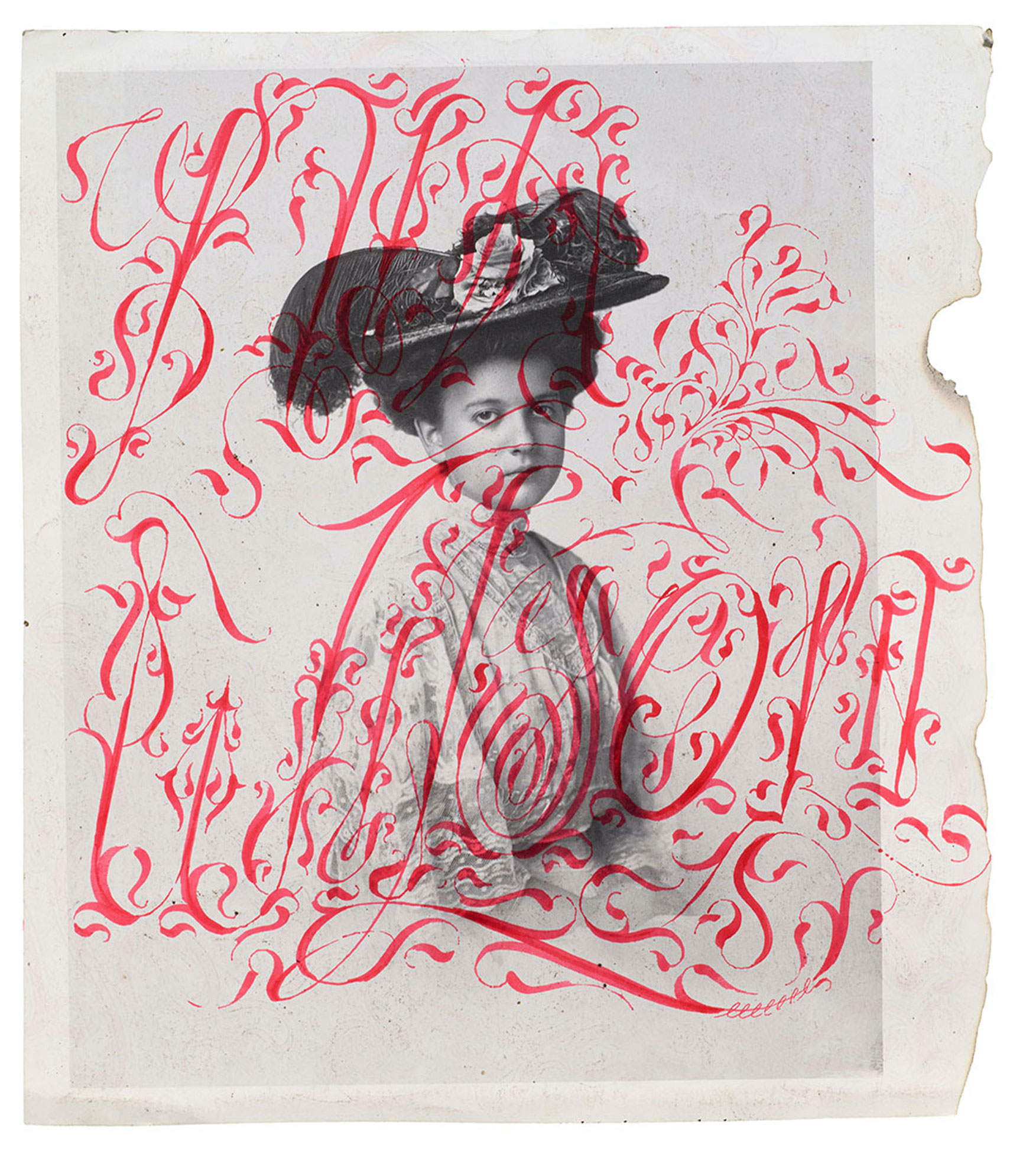
“The Last Black Calligrapher in San Francisco” combines traditional calligraphic virtuosity with vintage photography to speak to contemporary issues.
At 4,000 years old, our cuneiform tablet is the collection’s oldest object. Now we know more about the messages it contains.
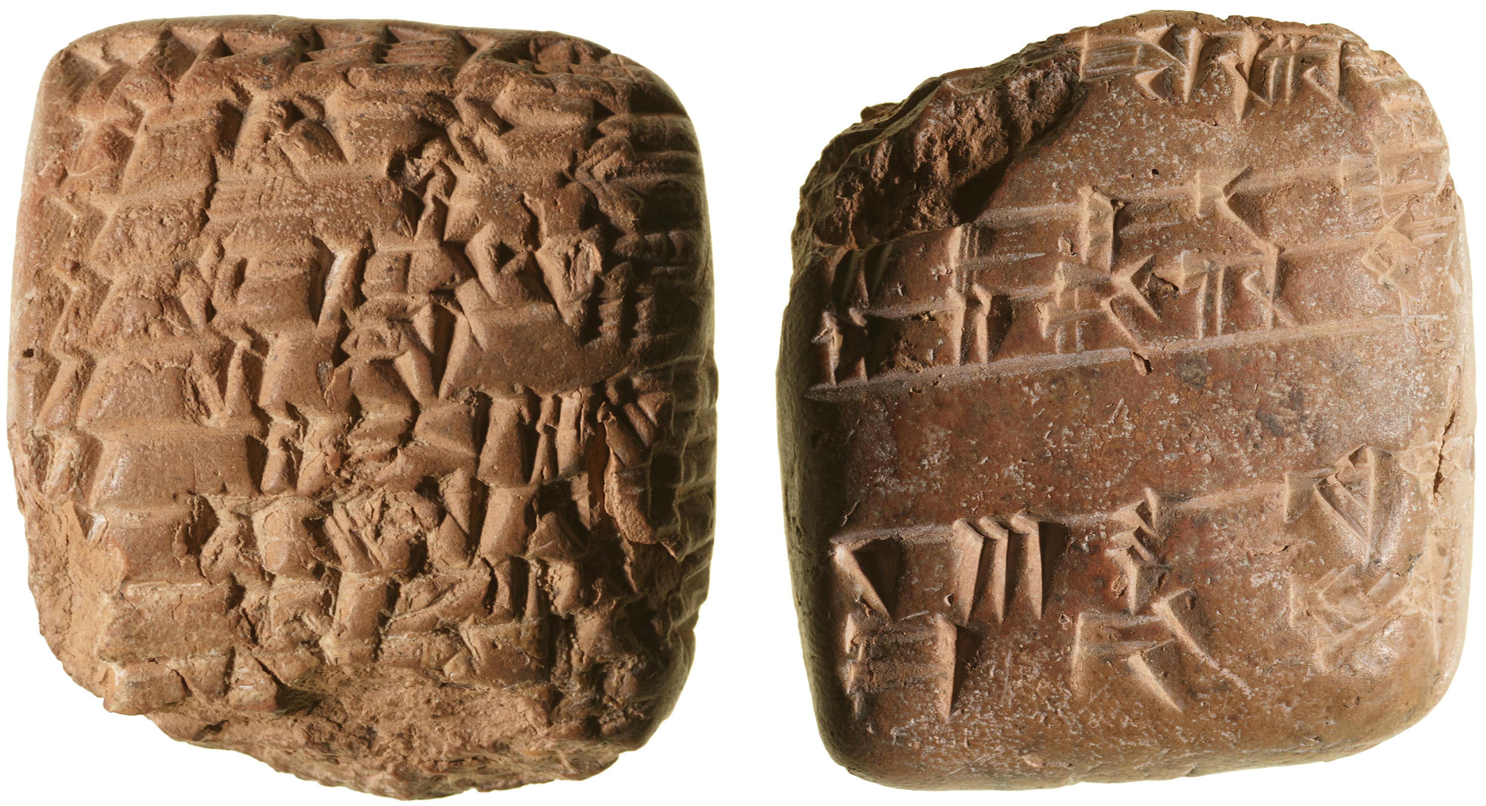
We like to change things up when setting tables for introductory visits, but most tours begin with an unassuming object that’s by far the Archive’s most ancient. Created in Mesopotamia around the second millennium BCE, our cuneiform tablet looks like a rough lump of hard clay, just big enough to rest in your palm. Closer inspection reveals a surface covered with sharp impressions — marks of what many consider the world’s first full writing system.
From Gutenberg to Granjon, new additions to the Online Archive represent major developments in letterpress printing.
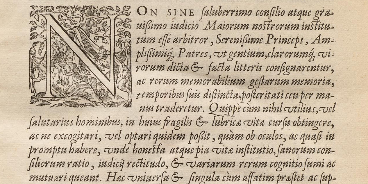
In her recent update, librarian Kate Long mentioned the ways we use the Archive as a teaching tool, especially in our Survey of Type History for the MFA Design program at the California College of the Arts. Now in its third year, the course tells the story of design firsthand through a curated selection of artifacts from our collection. This year, of course, the pandemic is forcing us to meet remotely, which means we’re prioritizing key historical objects for digitization and virtual presentation. The beauty of this pivot is that everyone benefits – even those who aren’t master’s students – because the Online Archive is open to all. As a taste, here are a few recent additions to the site that represent typographic milestones over the first 150 years of letterpress printing.
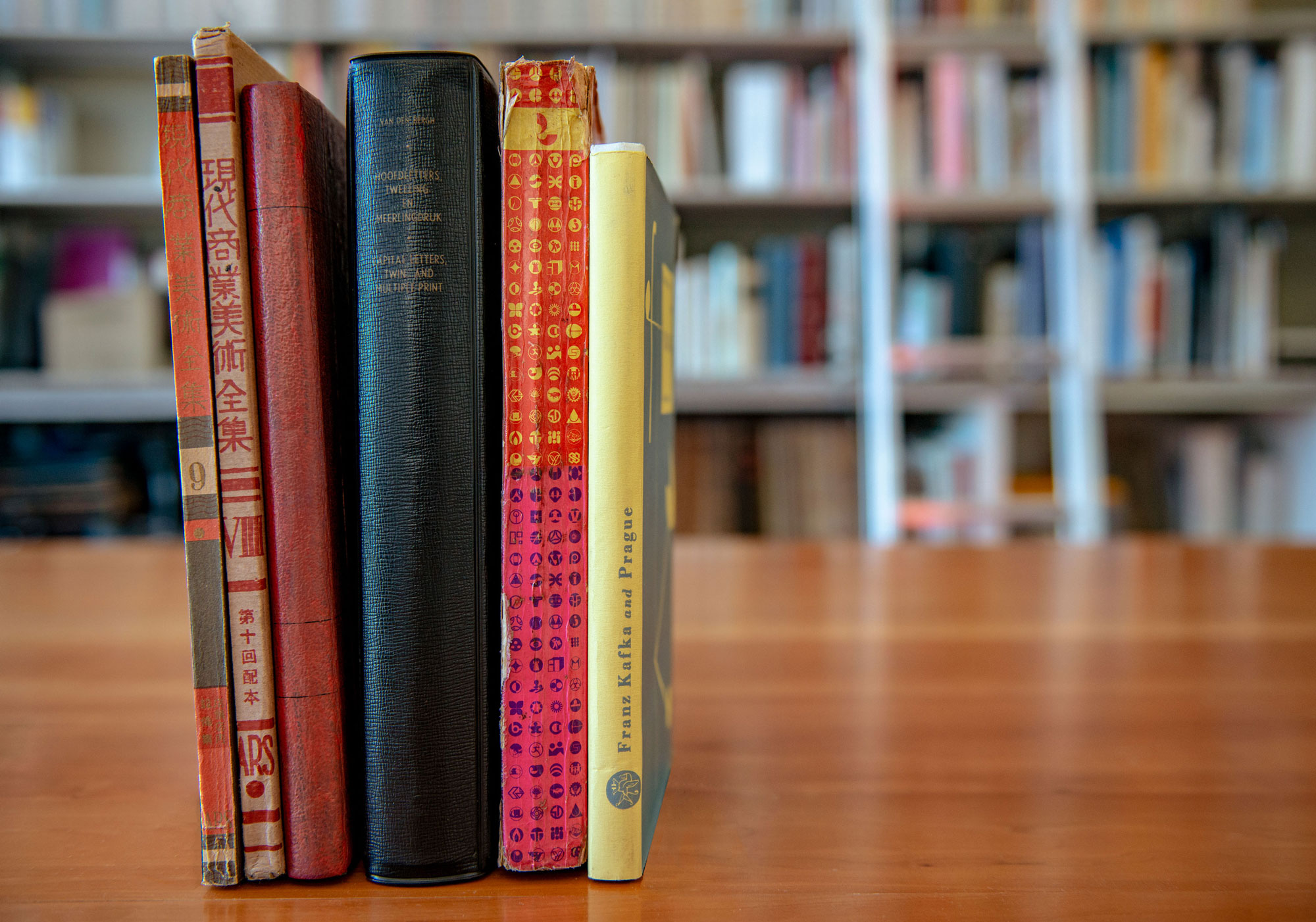
A while back, the design publication It’s Nice That invited us to share some of our favorite books for their “Bookshelf” series. It was a nice way to introduce an international audience to a few of the unusual and delightful objects we regularly show in our on-site tours. As we continue to be closed to visitors during the pandemic it’s a good time to reprise that piece, along with more images of the books, and a new selection from Florence Fu, which is not a book at all.
Librarian Kate Long recounts the many ways we use the Emigre collection, and Jon Sueda introduces a new series for experiencing Emigre magazine in the Online Archive.
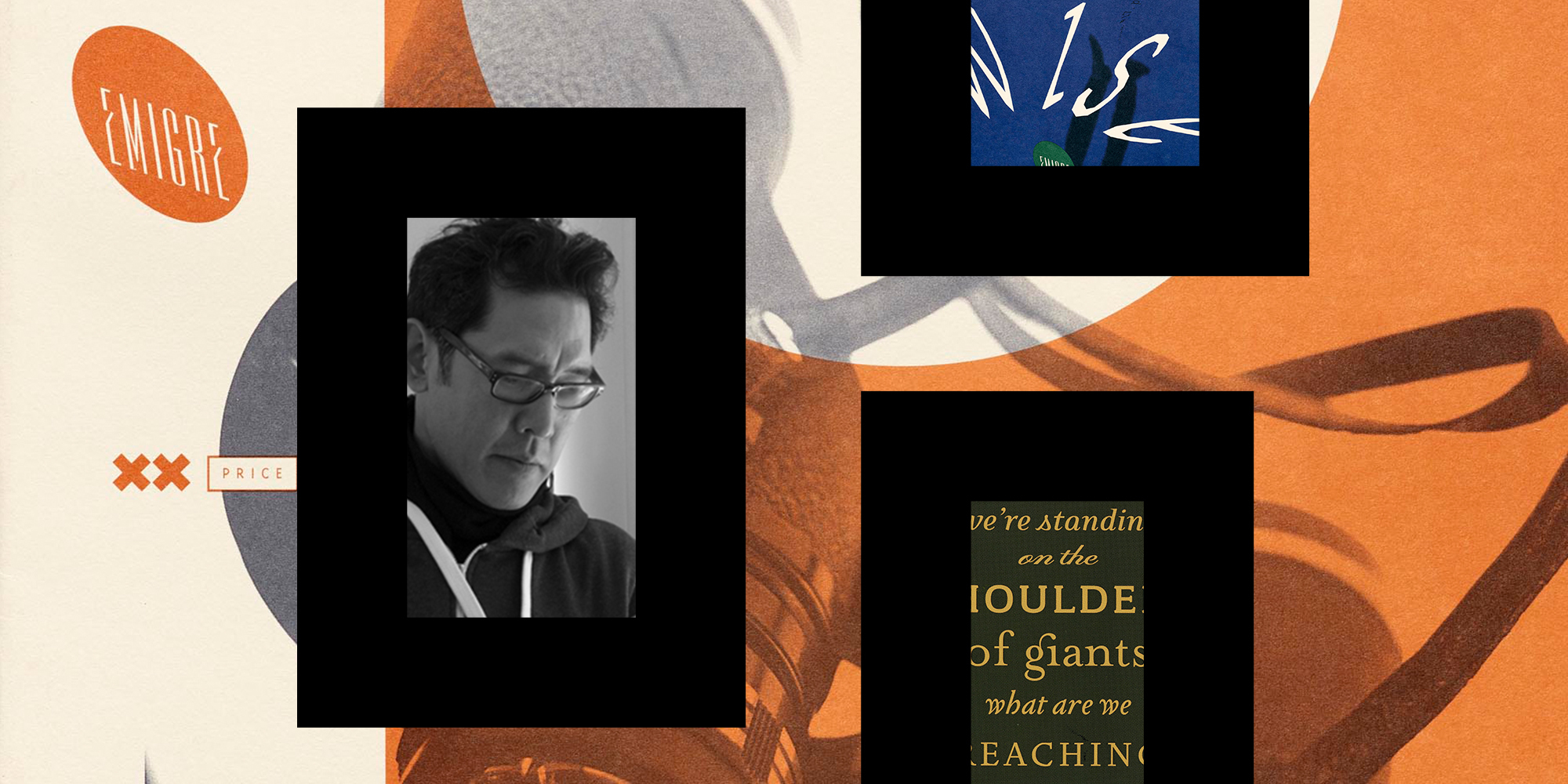
It takes a long time to do most things well. When I started volunteering at Letterform Archive, the organization had just received its first major donation. Rudy VanderLans and Zuzana Licko of Emigre had gifted their archives containing thousands of objects: books they printed, books they referenced, type development files, type specimens, every issue of Emigre magazine, process work and proofs, and binders holding a few decades’ worth of communication.