Skip to main menu Skip to main content Skip to footer content

News / Collections

Inside Michael Doret’s Alphabet City

Our latest book gives designers a seldom-seen peek into the studio of a lettering master, where logos, posters, and signs are drawn by hand.
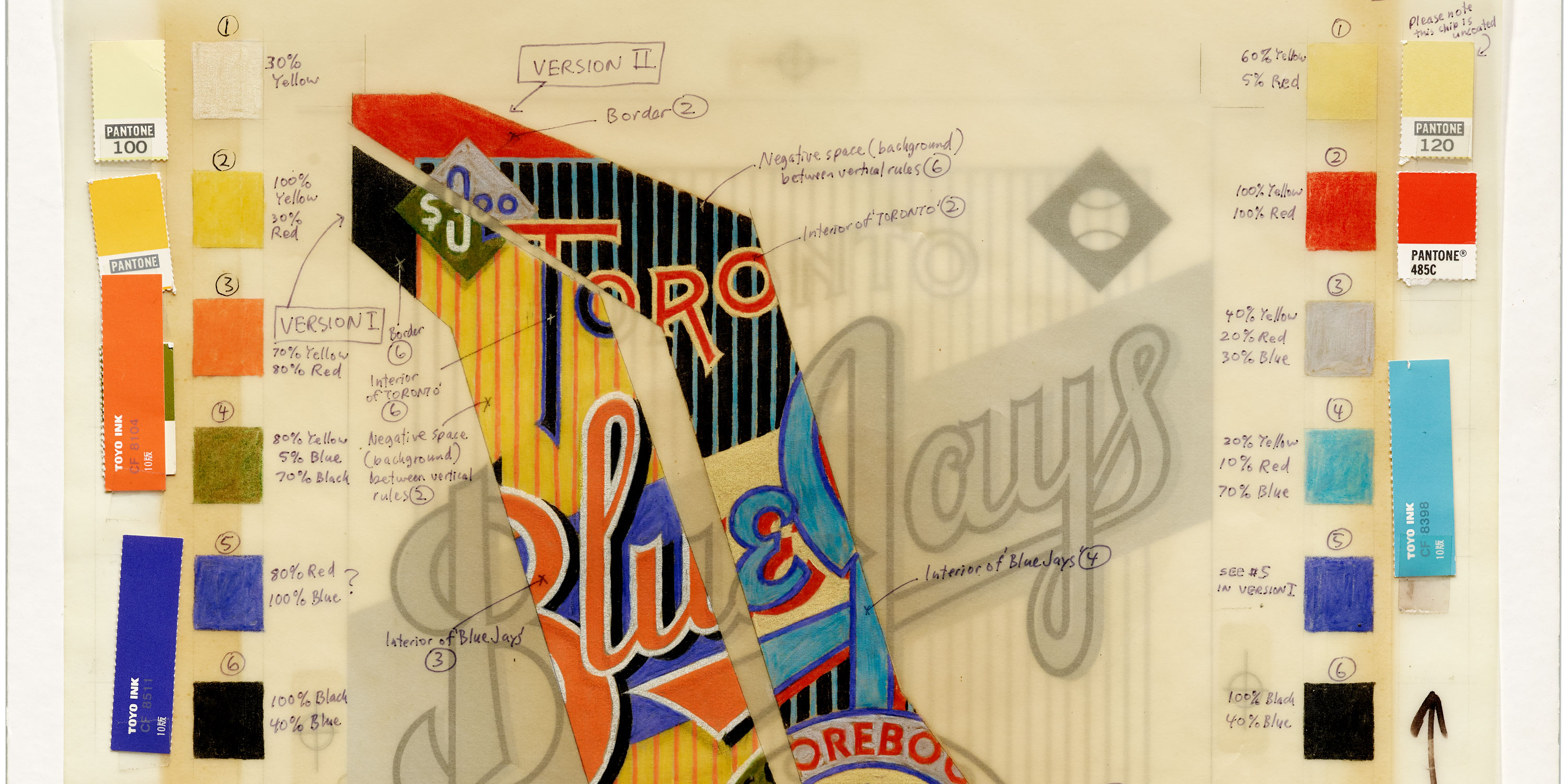
Mechanical for Toronto Blue Jays Scorebook Magazine, 1987. See more.

At Letterform Archive we’re always looking for stuff that shows the way a designer thinks, and reveals how their work was made. People visit us not just to see final works on paper — books, ephemera, posters — but also to see all the other artifacts produced along the way to the final piece, including  sketches, proofs, and variations that never made it to print. That’s why we were so thrilled in 2018 to accept a donation from Michael Doret that includes about half of his working archive. (The other half went to the Herb Lubalin Study Center at The Cooper Union in New York where he got his start.)

Read More

This Just In: Diamond Wooden Type Works

An untitled catalog and some tiny wood blocks from India invite us to rewrite type history.

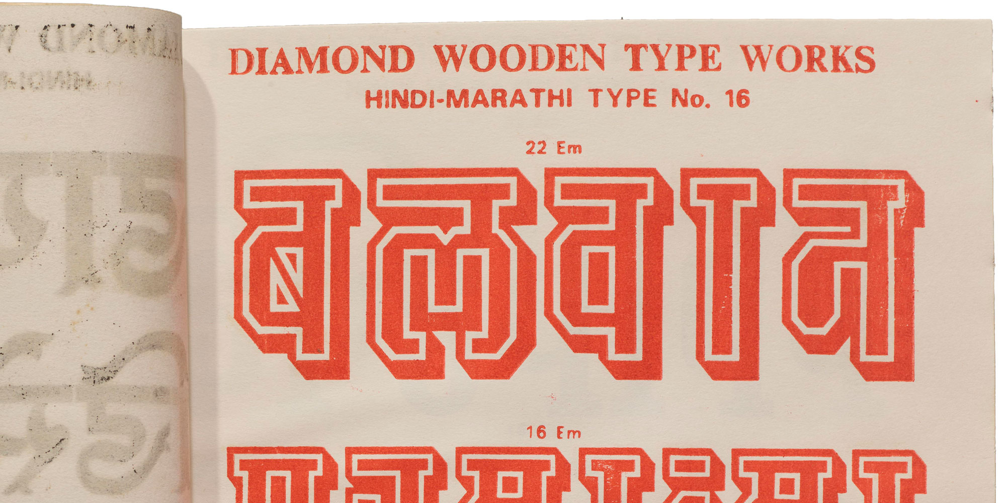
Cropped image from Diamond Wooden Type Works catalog, ca. 1975, showing red Devanagari letters on a cream page.

In the North Indian city of Meerut, not far from the national capital of New Delhi, there was once a thriving wood type manufacturing scene. The industry there continued to operate much later than in other parts of the world, churning out letter blocks until the turn of the millennium, and contributing significantly to letterpress printing in the region and beyond.

Read More

Women in Graphic Design

We’re dedicated to preserving and celebrating typographic design from underrepresented groups, including women.

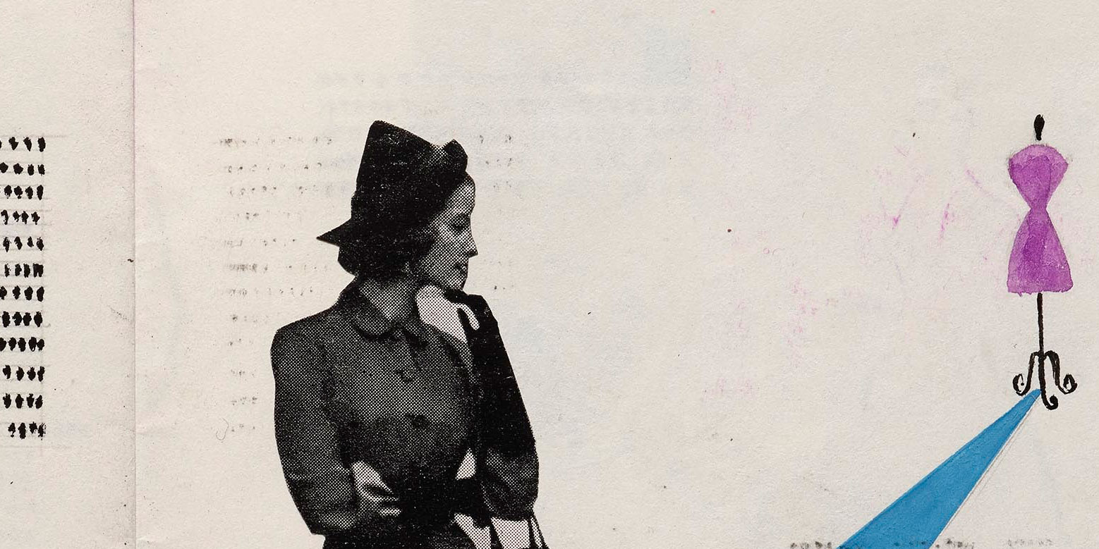
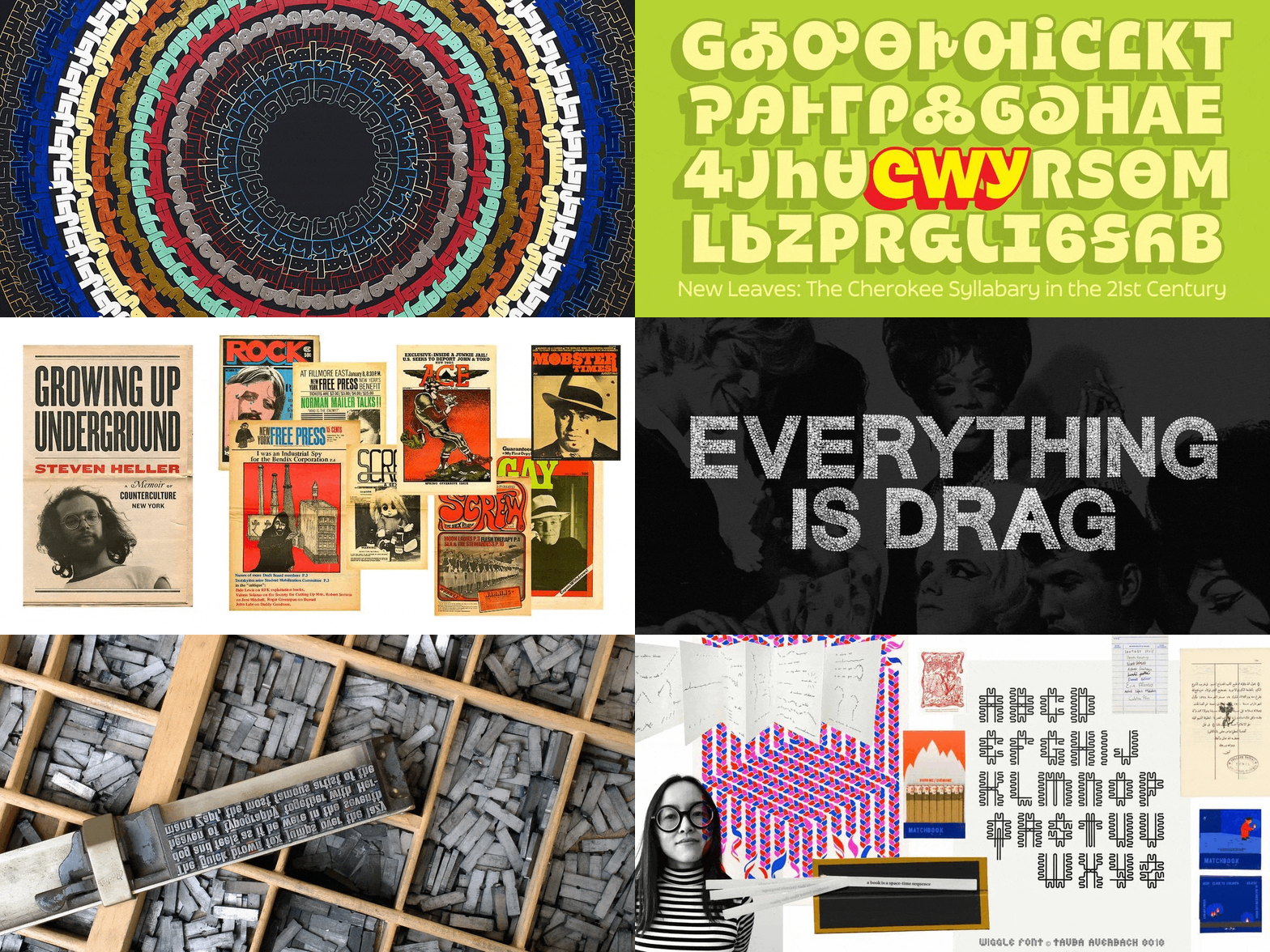
Like nearly every professional field, women have been systematically omitted from graphic design history. Fortunately, many recent efforts, such as Alphabettes, Hall of Femmes, and the People’s Graphic Design Archive are pushing to rectify the situation. We’re doing our part by collecting and sharing the work of women, both past and living. Here are some highlights.

Read More

For Your Reference: Threading Letters

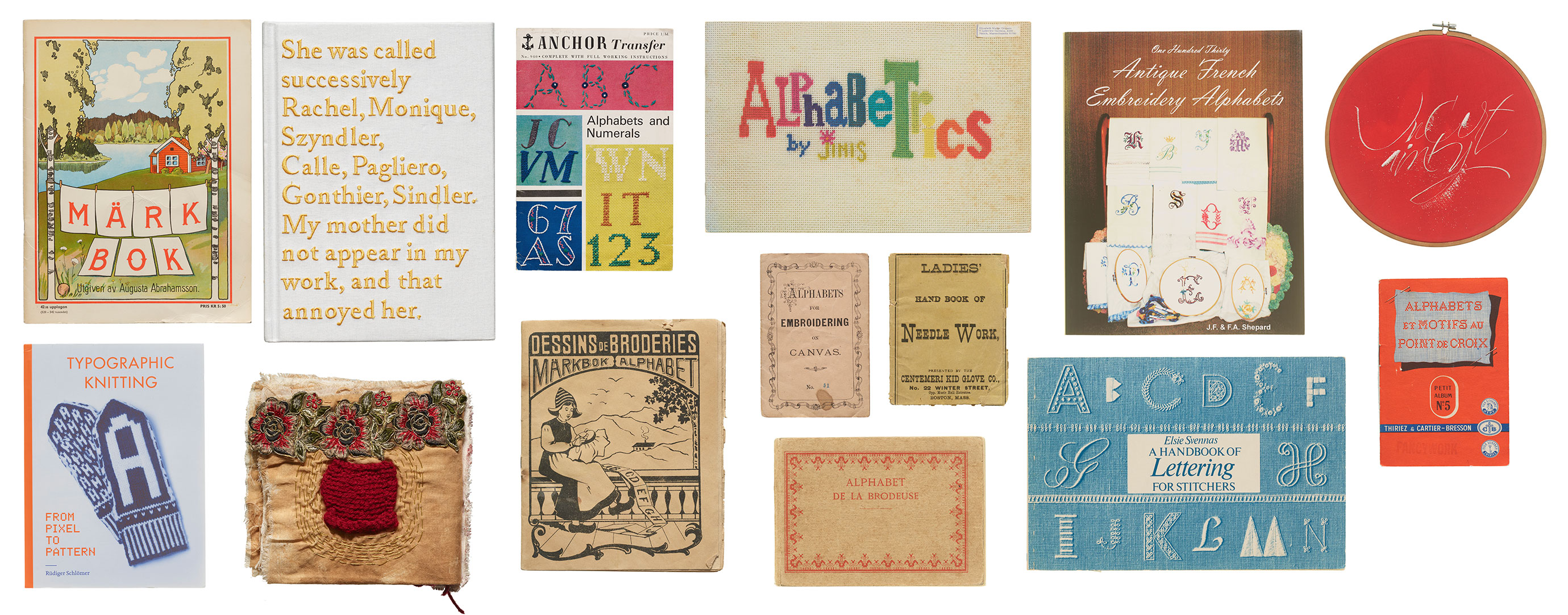
From embroidery to weaving, there is a long history incorporating letterforms into fabric. In this visit to the Archive’s stacks, we’re pulling multiple threads on items that tie text to textiles.

Cover for Alphabet de la Brodeuse.

The word “text” originated from the Latin word “textus,” which means “a weaving” or “a fabric.” In ancient times, textus referred specifically to the process of weaving fabric. Over time, the meaning of the word expanded to include written or printed material, reflecting the idea of words being woven together to create a coherent written work. This metaphorical extension continues today with words and phrases such as seamless, threadbare, unraveled, looming, frayed, tangled, and spinning a yarn, highlighting the connection between the physical act of weaving fabric and the intellectual act of composing written language, both of which involve the interlacing of individual elements to create a unified whole. In this installment of For Your Reference, we revisit the Archive’s stacks for books and other items that build a tangible connection between threads and letterforms.

Read More

This Just In: The Darden Type Design Archive

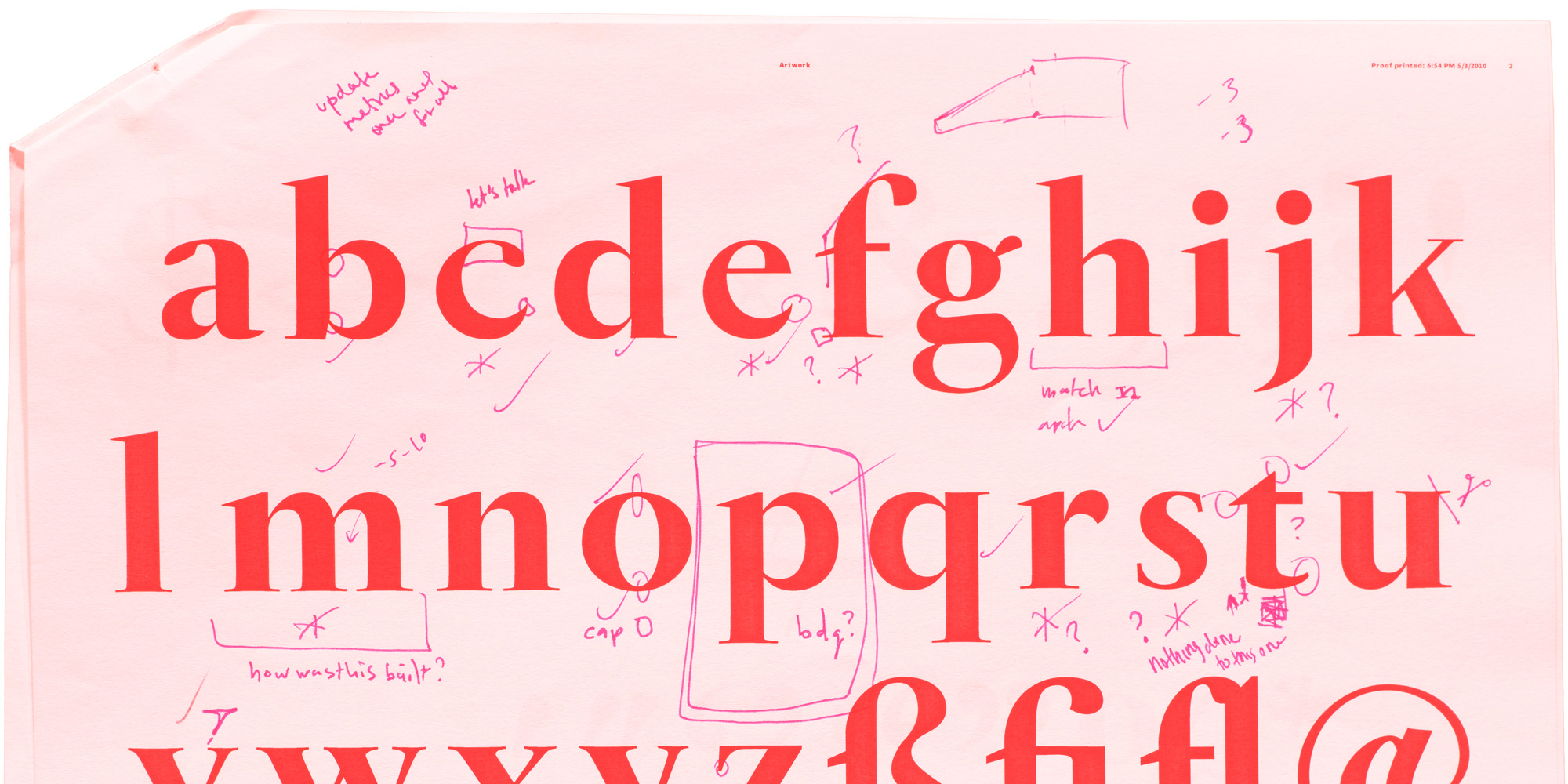
Hundreds of annotated font proofs from Joshua Darden document and illuminate the process of making typefaces.

Joshua Darden at ATypI in Prague, 2004. Photo: Jean François Porchez.

Joshua Darden, born 1979 in Los Angeles, California, published his first typeface in 1995 at the age of 15, becoming the first known African-American typeface designer. For the next ten years he honed his skills as an independent type foundry, and then as a staff designer at the renowned Hoefler Type Foundry under the direction of Jonathan Hoefler and Tobias Frere-Jones. He struck out on his own again in 2005, opening a new foundry, Darden Studio, and releasing his most ambitious and recognized design, Freight.

Read More

Calendar Design in the Online Archive

A variety of planners, event guides, and type specimens offer over a dozen ways to represent the year through lettering and typography.

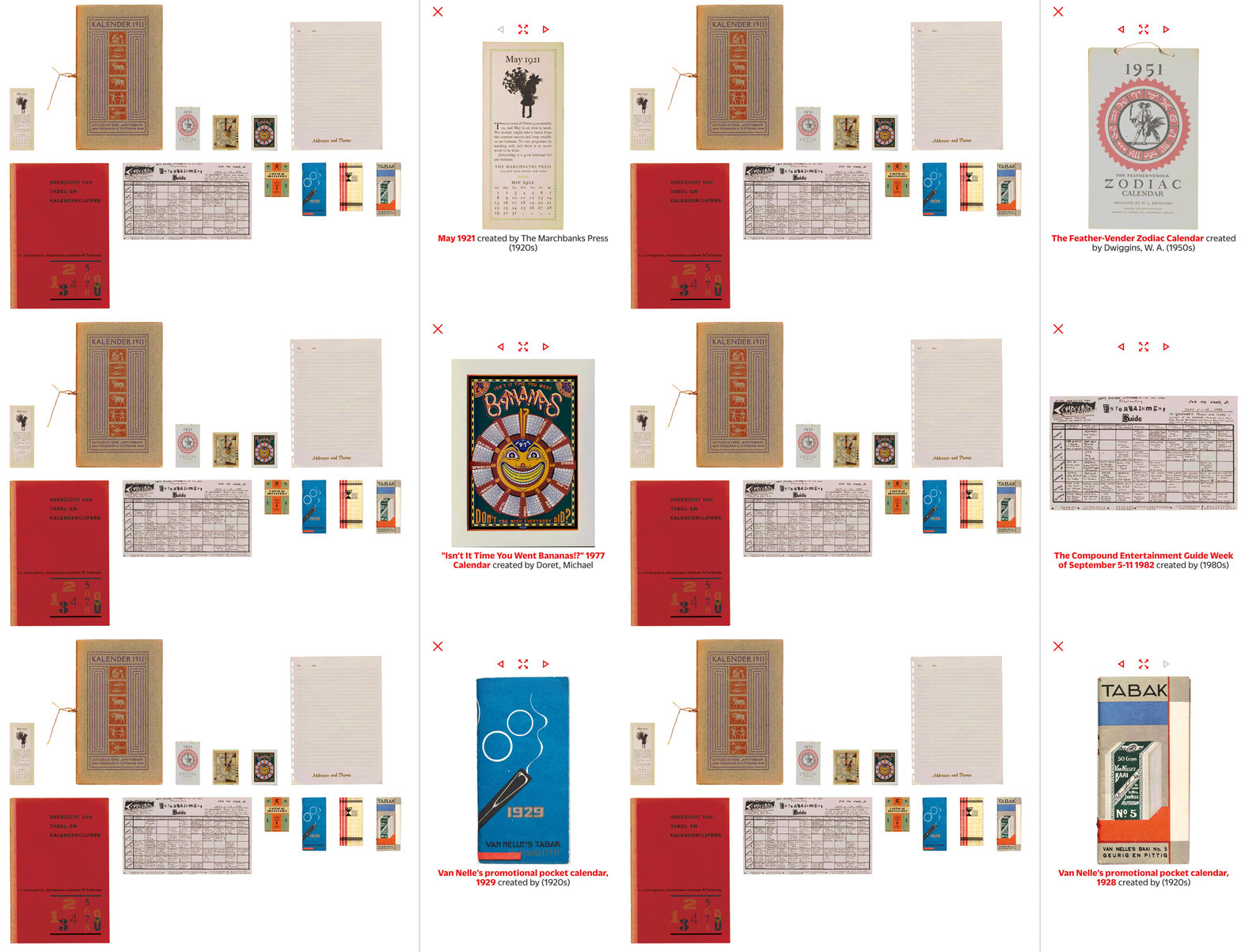
We’re starting 2024 with a selection of objects in the Online Archive that chart Gregorian timekeeping across the twentieth century. This compilation includes traditional calendars, fonts crafted explicitly for typesetting calendars, branded promotional calendars, and material that reveals the process of making a very unusual calendar. We hope these ideas inspire you throughout the year.

Read More

Join the Letterform Archive Mailing List

Learn more about our collection, including additions to the Online Archive, and get news of upcoming events, workshops, and publications.

Join the list