Now Online: Landmarks of Early Western Typography
From Gutenberg to Granjon, new additions to the Online Archive represent major developments in letterpress printing.
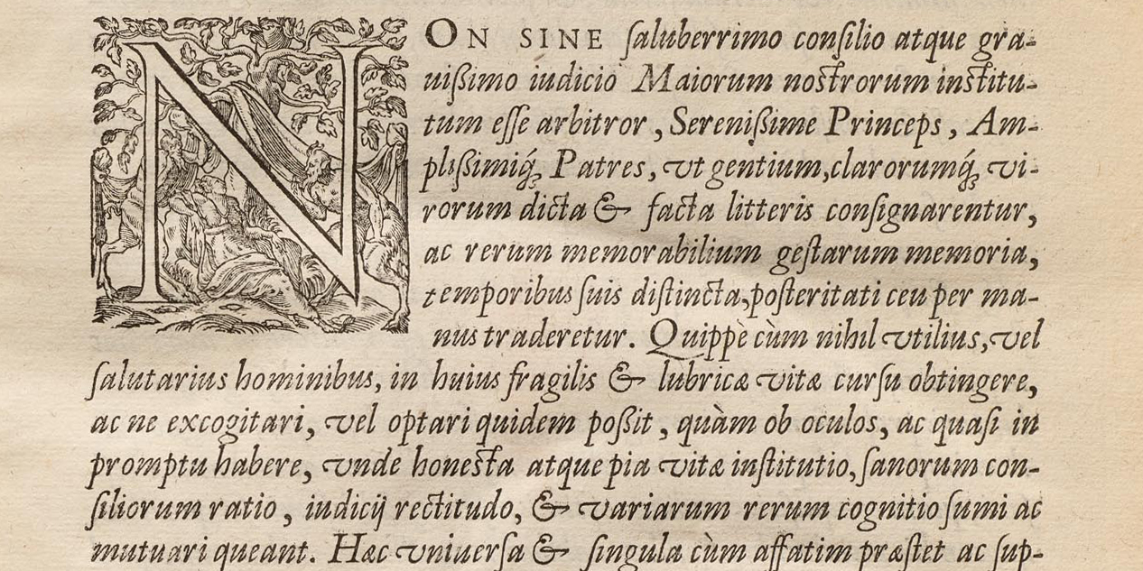
In her recent update, librarian Kate Long mentioned the ways we use the Archive as a teaching tool, especially in our Survey of Type History for the MFA Design program at the California College of the Arts. Now in its third year, the course tells the story of design firsthand through a curated selection of artifacts from our collection. This year, of course, the pandemic is forcing us to meet remotely, which means we’re prioritizing key historical objects for digitization and virtual presentation. The beauty of this pivot is that everyone benefits – even those who aren’t master’s students – because the Online Archive is open to all. As a taste, here are a few recent additions to the site that represent typographic milestones over the first 150 years of letterpress printing.