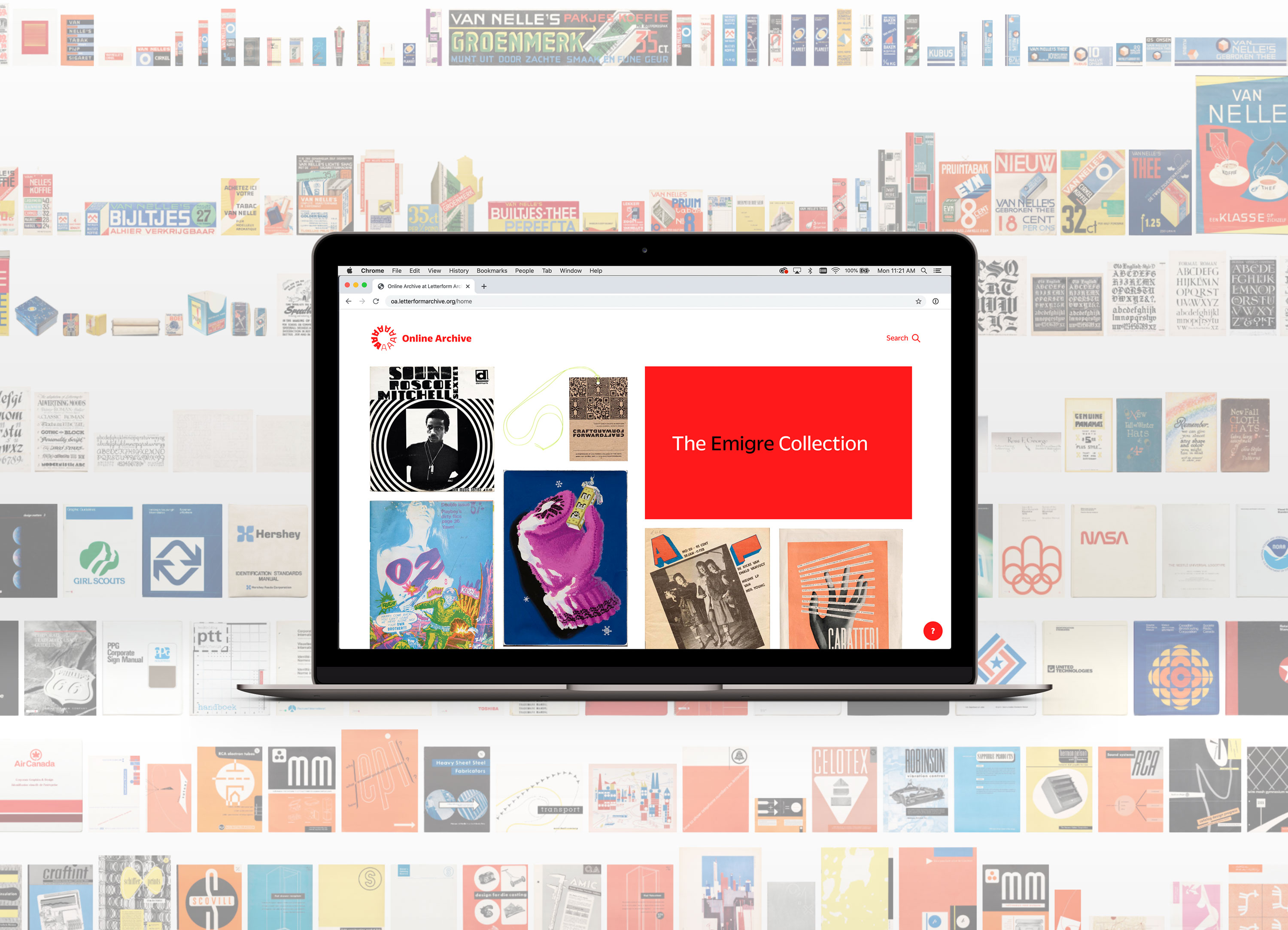
Emigre Archives Continue to Provoke and Enlighten
Librarian Kate Long recounts the many ways we use the Emigre collection, and Jon Sueda introduces a new series for experiencing Emigre magazine in the Online Archive.
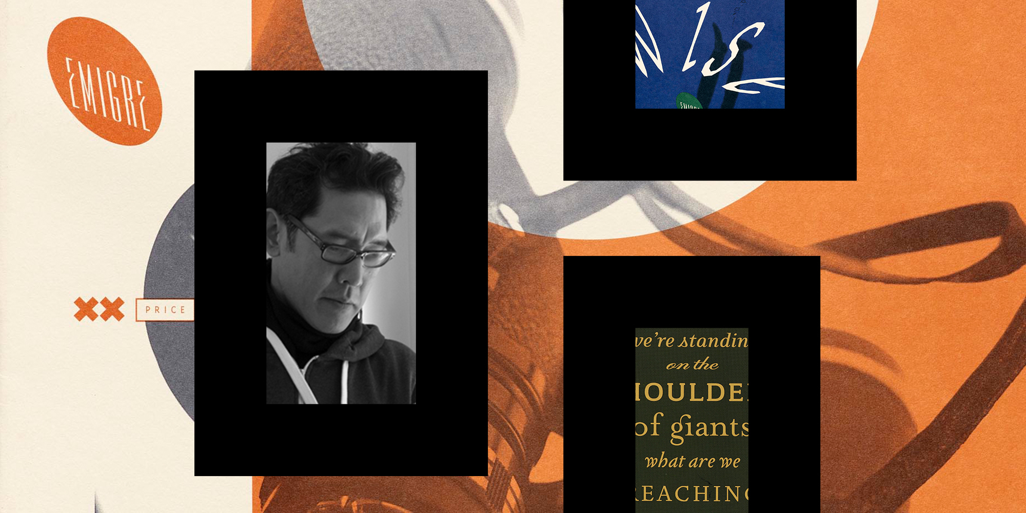
It takes a long time to do most things well. When I started volunteering at Letterform Archive, the organization had just received its first major donation. Rudy VanderLans and Zuzana Licko of Emigre had gifted their archives containing thousands of objects: books they printed, books they referenced, type development files, type specimens, every issue of Emigre magazine, process work and proofs, and binders holding a few decades’ worth of communication.