News
Inside Boutiques Magnifiques
Our new suite of postcards combines old-world Parisian charm with modern flourishes from illustrator and lettering artist Laura Serra. Join us for a behind-the-scenes look at this delightful collaboration.
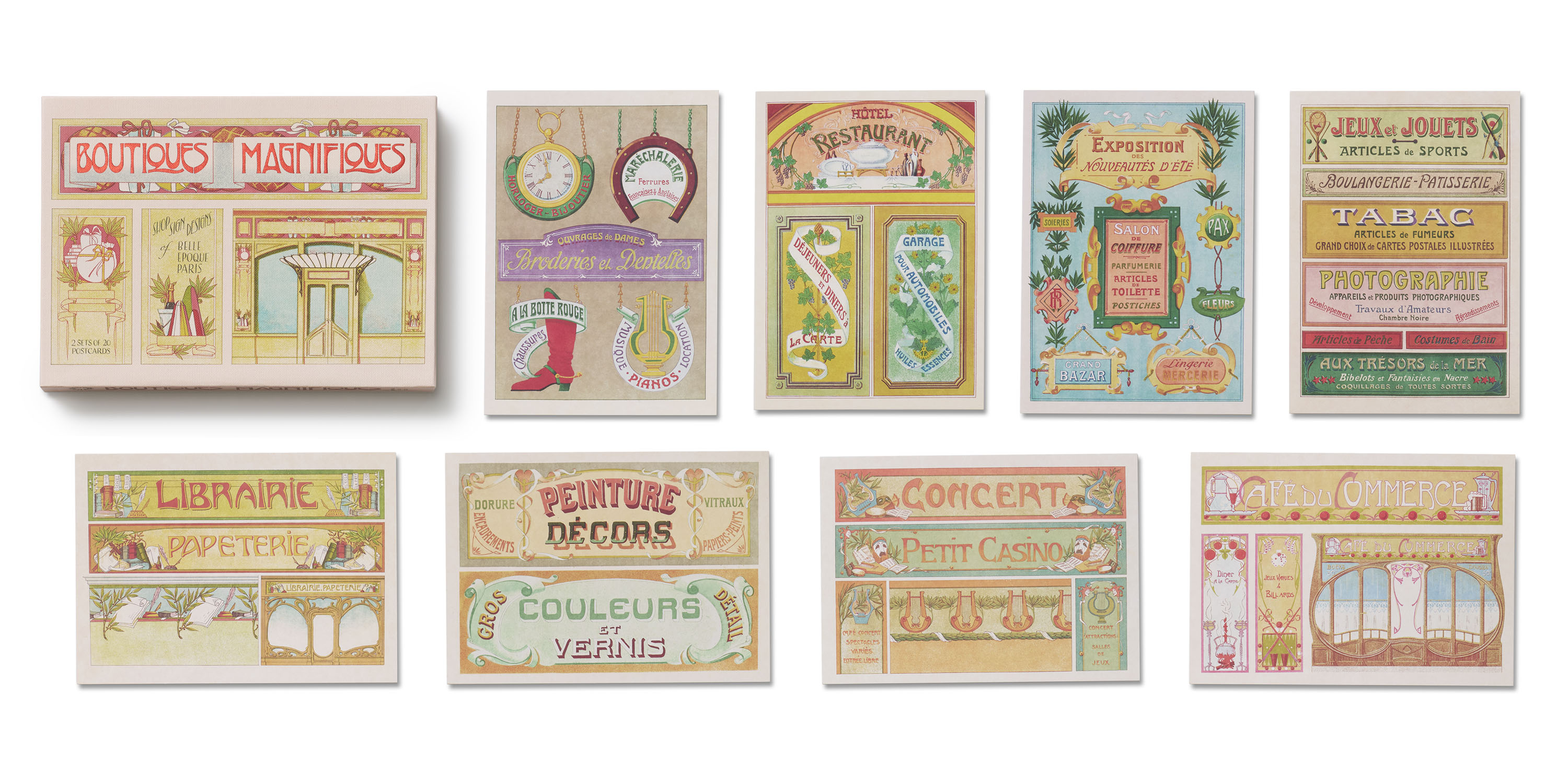
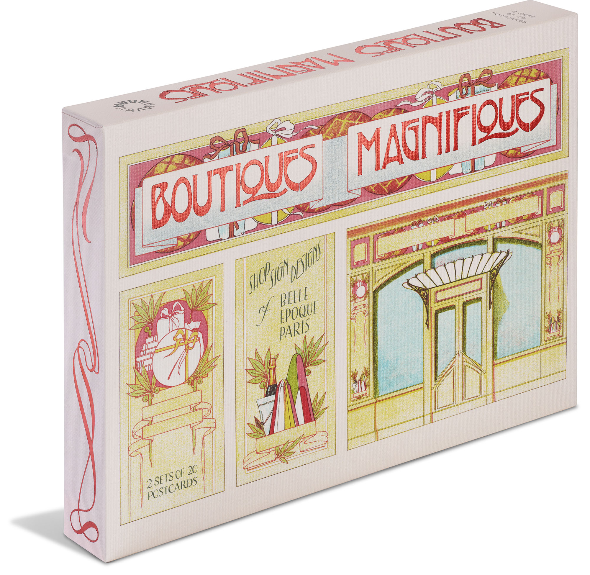
40 postcards in a keepsake box with red foil lettering and ornamental motifs
At Letterform Archive Books, where we publish titles based on rare and resplendent items in our collection, we always aim to give our projects a contemporary look and feel. How better to demonstrate that these historical materials continue to inspire a new generation than to commission fresh artwork informed by them?
So for one of our latest publications, Boutiques Magnifiques: Shop Sign Designs from Belle Époque Paris, we were excited to collaborate with Laura Serra, an immensely talented illustrator and lettering artist and longtime volunteer and friend of the Archive.
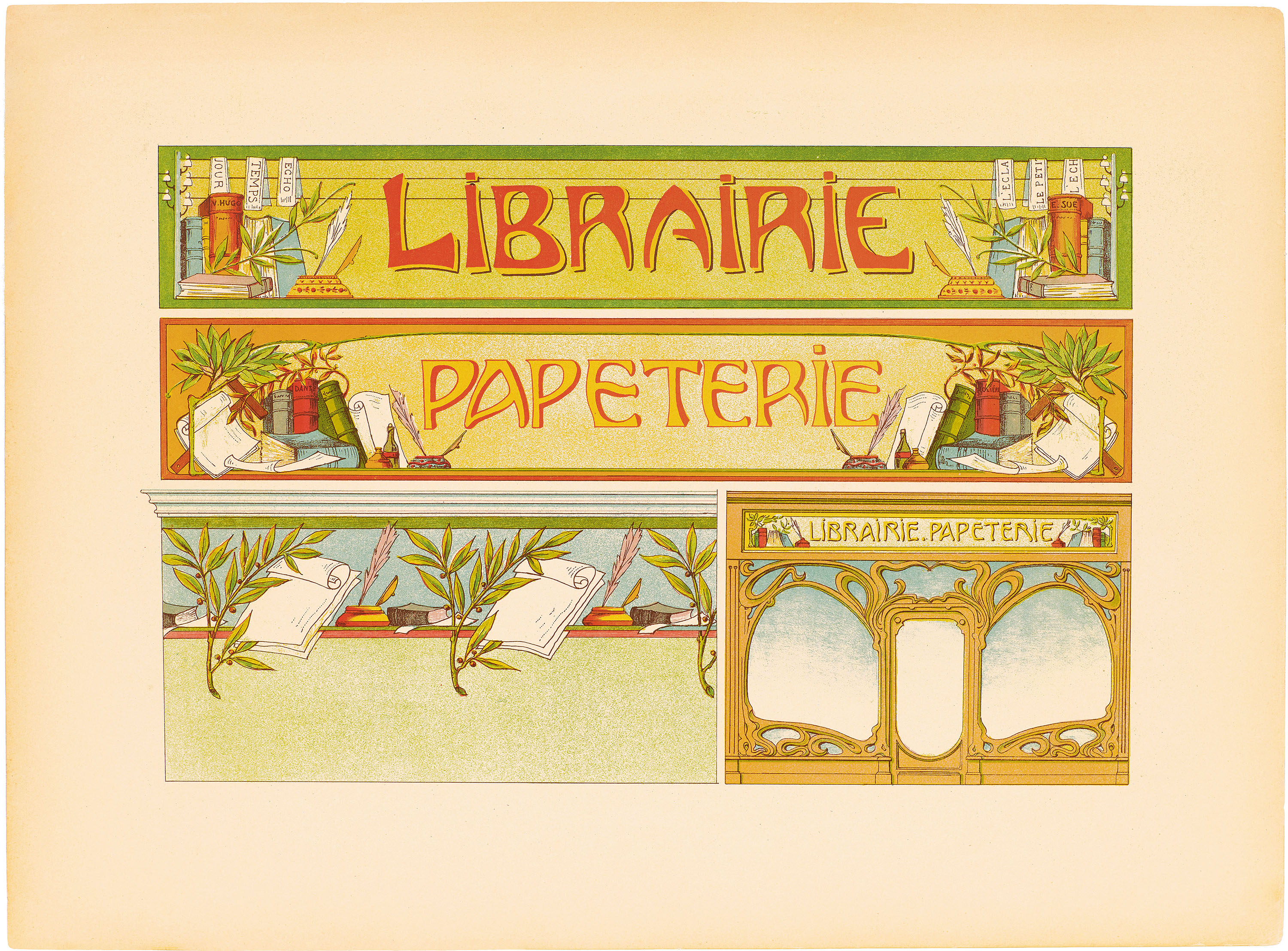
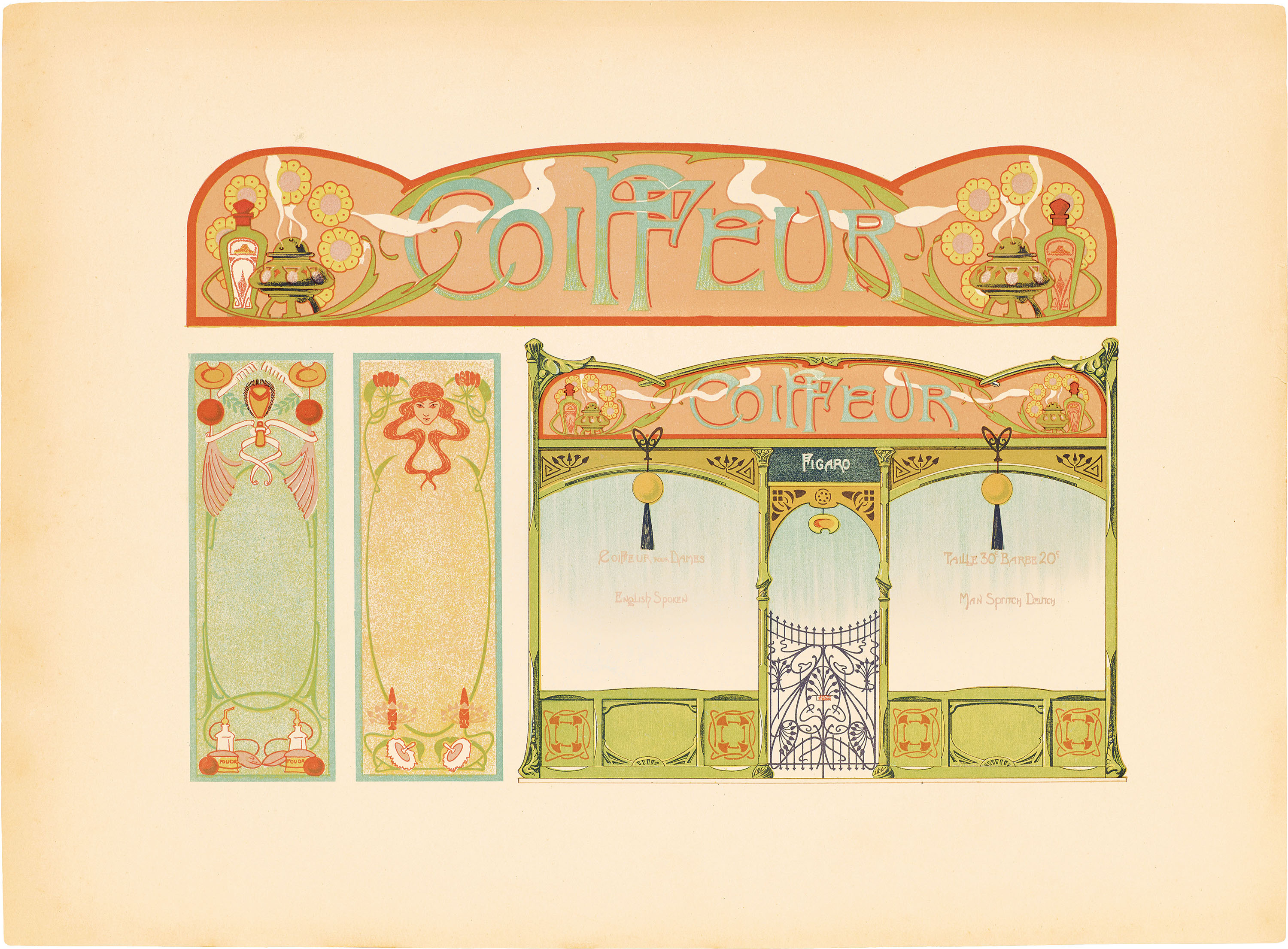
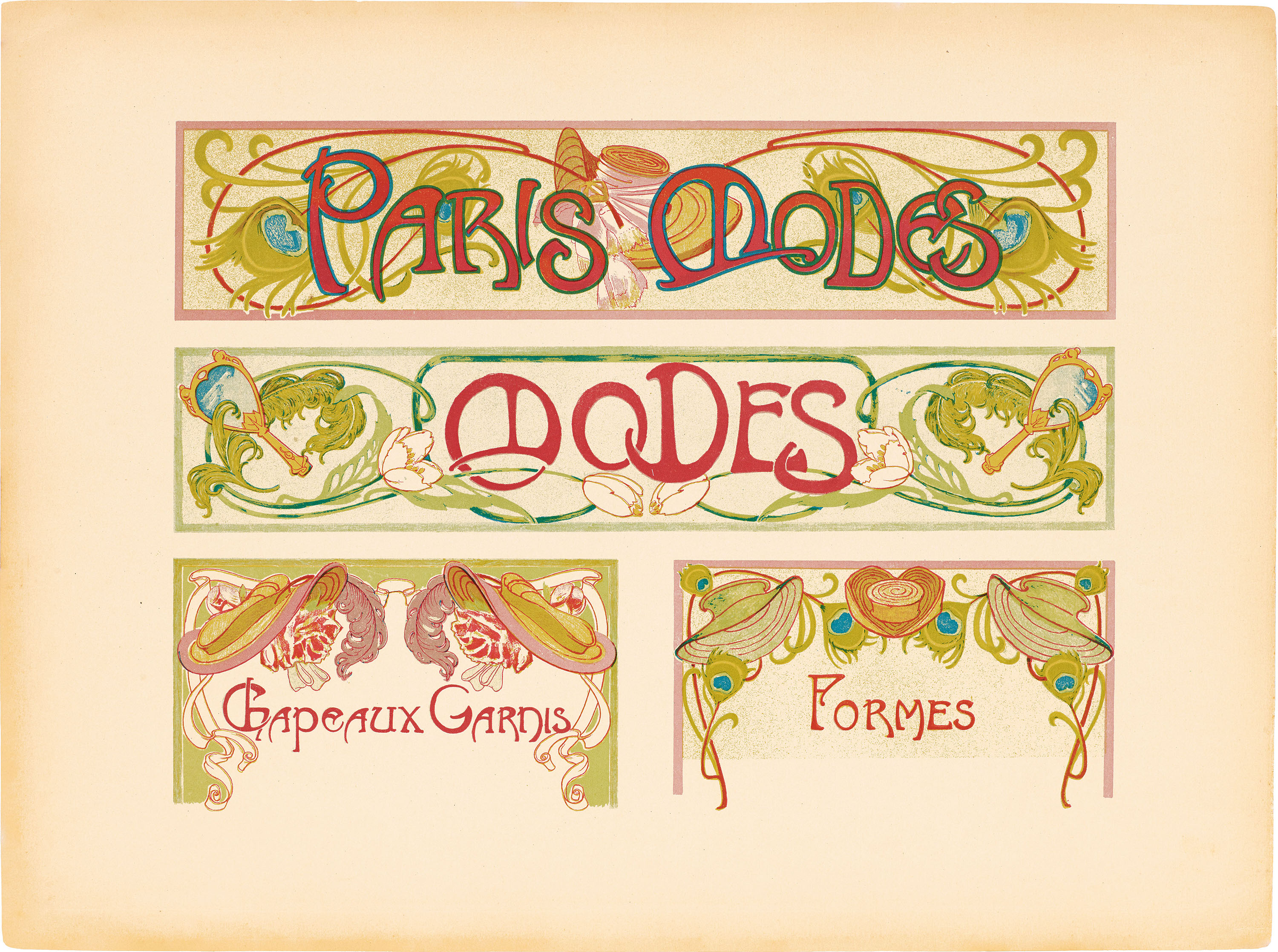
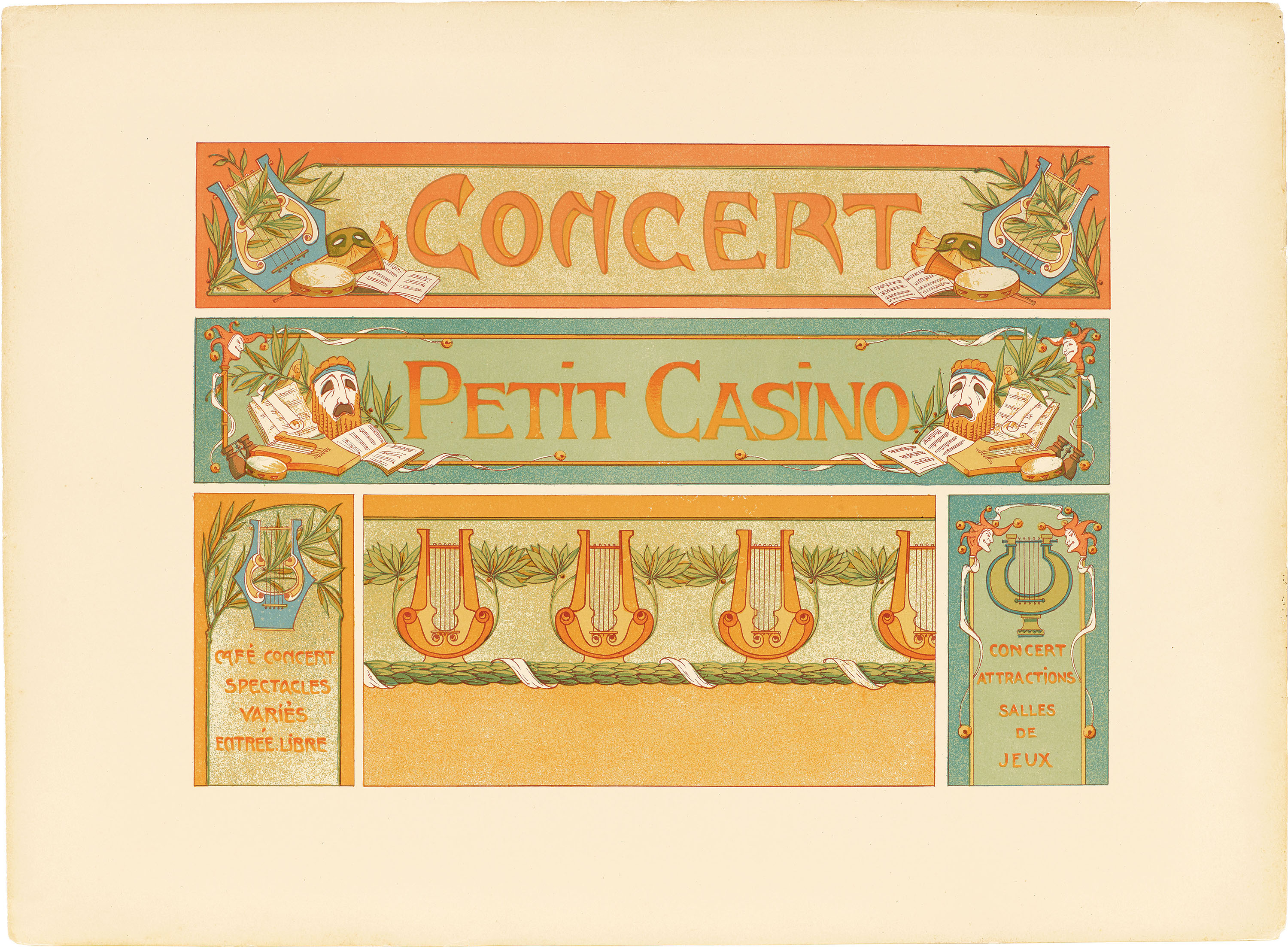
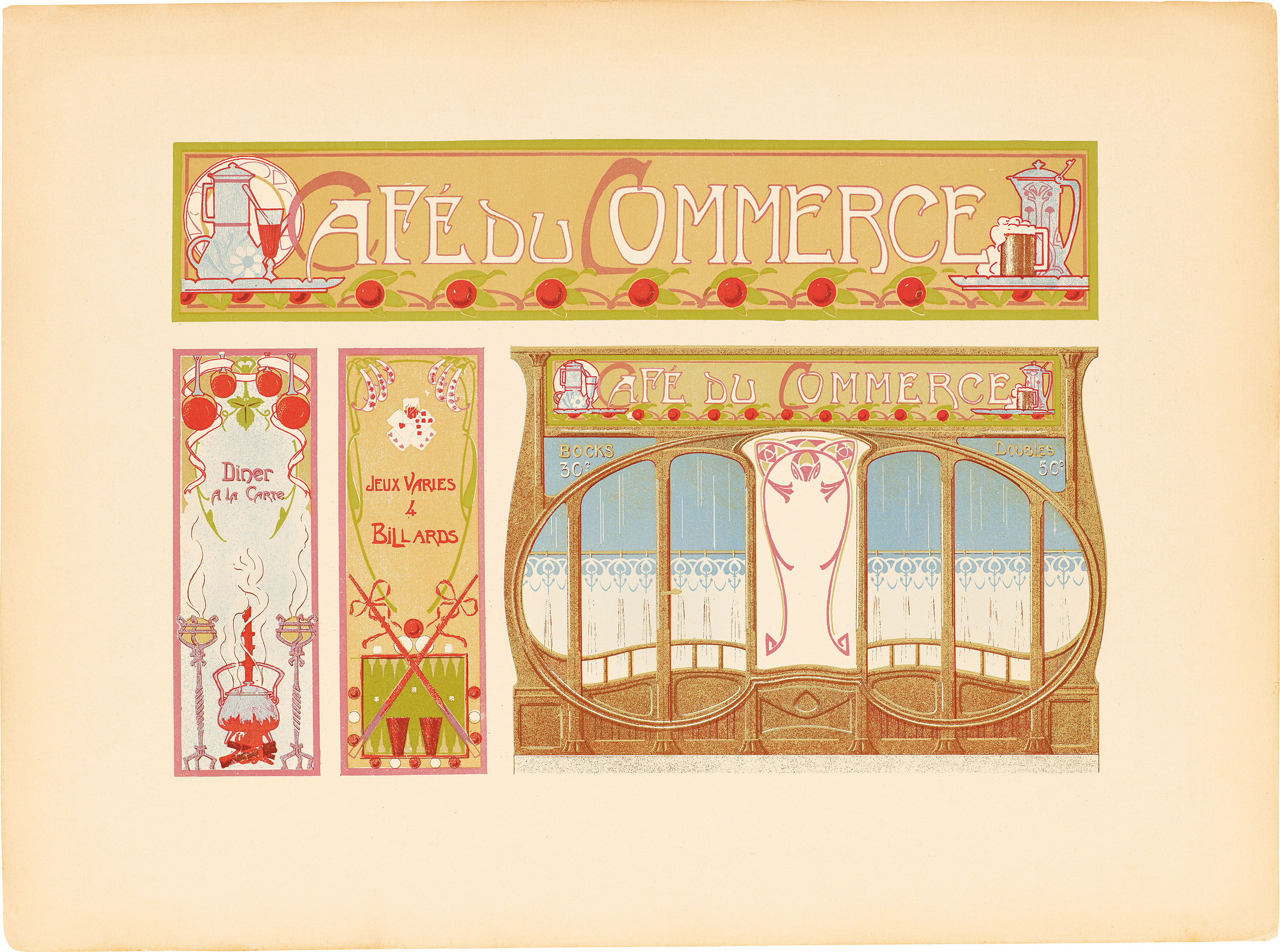
This postcard deck features charming lettering and illustrated signage from three French sign painting portfolios, all created in the late 1800s and early 1900s as outstanding examples of the craft. The artwork is a selection from our bestselling book, Lettres Décoratives: A Century of French Sign Painters’ Alphabets.
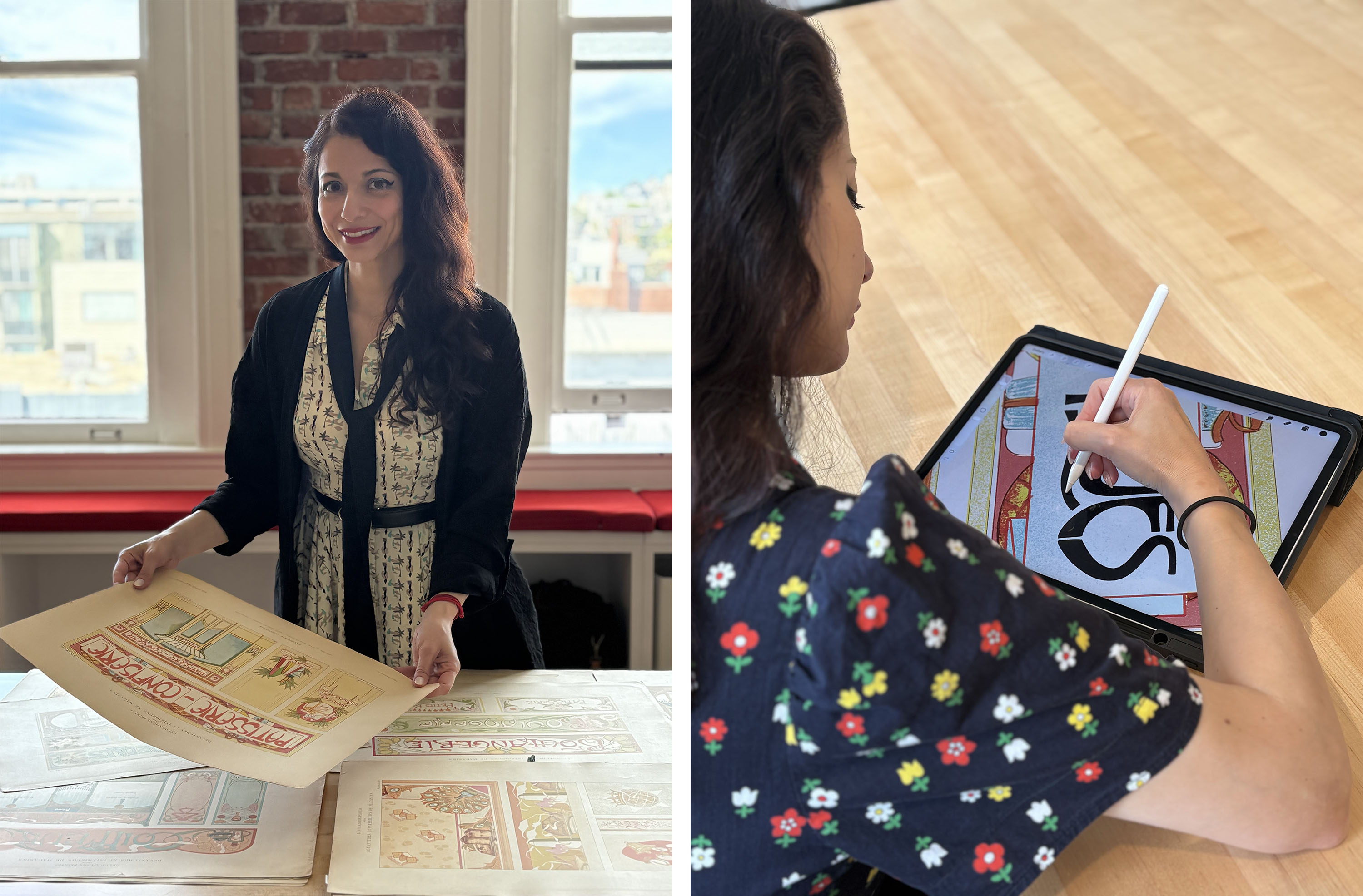
We approached Laura to create original title lettering and decorative swashes for the postcard box of Boutiques Magnifiques, as well as backs for the postcards and illustrative patterns for the inside of the box. The brief was to be inspired by the source material, creating letterforms and ornamentation that echoes the signage and architectural detail seen in the portfolios, many of which include nods to art nouveau.
We recently got a chance to talk with Laura about the project and her larger artistic practice.
All images in the gallery below are hi-fi captures. Click an image to enter fullscreen view, then click or pinch to enlarge.
Before we discuss Boutiques Magnifiques, could you briefly introduce yourself and tell us a little about your work as a lettering artist and illustrator?
Sure, hi! I’m a freelance illustrator, lettering artist, and occasional translator living in Oakland! I was born to Sardinian parents living in Germany, but my mother spent her childhood in France, so I grew up hearing and speaking multiple languages. My family was very creative: My father was a writer for the Sardinian newspaper L’Ortobene; my mother made paintings in the style of Vincent van Gogh and Hans-Werner Sahm; and my older sister drew cartoons and crafted figurines in polymer clay. Without their examples, I likely never would have taken up creative work.
I started out as a graphic designer, typesetting menus for my parents’ Italian restaurant and illustrating lettering for school. I then did a three-year apprenticeship as a production designer and then another three years post grad at a design college. But during my last year of school, I lost faith in the design industry and instead went on to work as a calligrapher, an illustrator, and a lettering artist.
Since then, I have built a freelance career making illustrations and portraits for a variety of clients, including type foundries, publishers of limited editions, lifestyle magazines, and the Frankfurter Allgemeine Sonntagszeitung, the Sunday edition of a major German newspaper. [Editor’s note: Laura also creates Letterform Archive’s beautiful team portraits, viewable here.] I also have a personal artistic practice, which includes ambigrams (calligraphic designs in which a single word can be read from multiple directions) and mandalas (radial repeating patterns, often using letterforms).
I started drawing when I was eighteen months old, my mom has always said. So to me, drawing is how I reset my nervous system. I am always drawing something—sometimes on paper, sometimes on my iPad.
Letterform Archive Books approached you to do custom lettering and illustration for the Boutiques Magnifiques box and postcard backs, with inspiration borrowed from the historical artwork. What excited you most about this creative brief?
Ever since I first saw a reproduction of Alphonse Mucha’s 1898 painting Dance when I was twenty, I have been in love with the art nouveau movement. But when I say “movement,” I also mean the movement of the stroke of the pen in the era’s illustration and lettering, as well as the movement in art history.
During my early years growing up in Southern Germany, I saw many charming medieval structures in my hometown (which dates back to 1150 CE) get replaced with the cold concrete of twentieth-century buildings. So as a reaction, I became drawn to more decorative work, including Jugendstil. Translated as Youth Style, Jugendstil is the variant of French art nouveau that became popular in Germany and Austria. I felt at home in this art style, which seemed more in touch with femininity and nature, but for a long time, I couldn’t get myself to draw it. More of an admirer, I’d just look and collect as many art pieces and elements featuring art nouveau and Jugendstil as I could find.
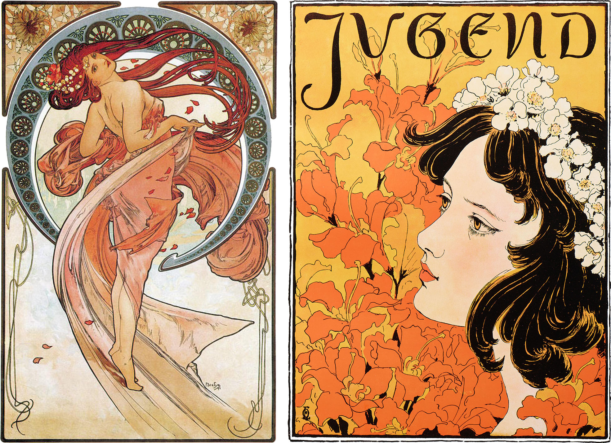
Right: Otto Eckmann, cover of Jugend, vol. 1, no. 14, 1896
So what excited me most about the creative brief for Boutiques Magnifiques was the opportunity to reflect (hopefully respectfully) my decades of admiration for art nouveau and Jungendstil in the box design. Working with art director Alice Chau and you, Lucie, has been a great honor and joy, as I have long perused all your books and postcard sets and know that you choose great living artists to celebrate the (almost) forgotten artists who made many beautiful works in the Archive’s collection.
I love seeing graphic designers and other artists closely honor old masters with precision, so getting to create something following my old love of Jugendstil almost made me burst.
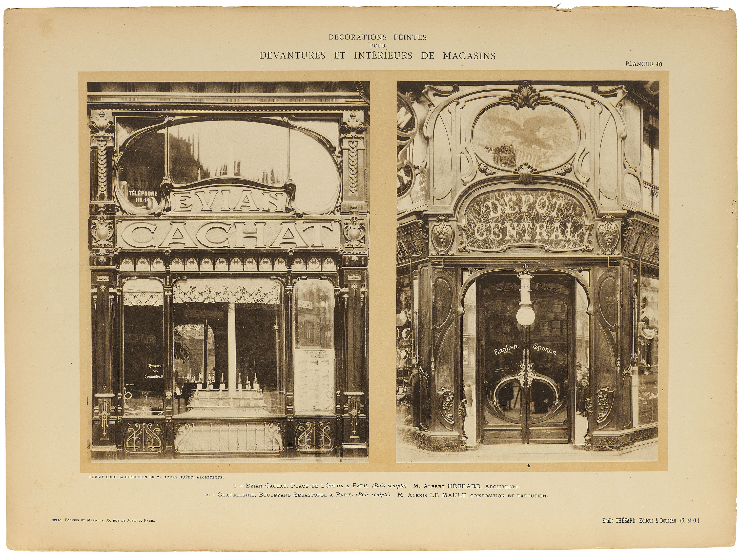
When developing the lettering and ornament to complement these historical materials, what about the original artworks stood out to you the most? Did you reference anything else from the Archive’s collection or any outside sources of inspiration?
Seeing the original French sign painting portfolios in person made me appreciate how much artistry went into these storefronts. Studying the alphabets as well as type specimens from this period up close helped me feel close to the era. In addition to the letterforms and illustrations, I love the albums’ colors: their cream-colored paper and the trendy pastels that harmonize so nicely, and the vibrancy of the original printings. (Also, the storefronts and windows of that time were so fun! Can we bring this style back in today’s shop designs? Please?)
Since I volunteer regularly at the Archive, I was able to draw from the many, many reference photos that I have taken of various books and posters. When I am working on a commission, I need to immerse myself completely in the source material to really understand and feel the stroke movement so I can execute the exact intent and leave a lot less to chance. That is just how I prefer working—even for a little postcard box.
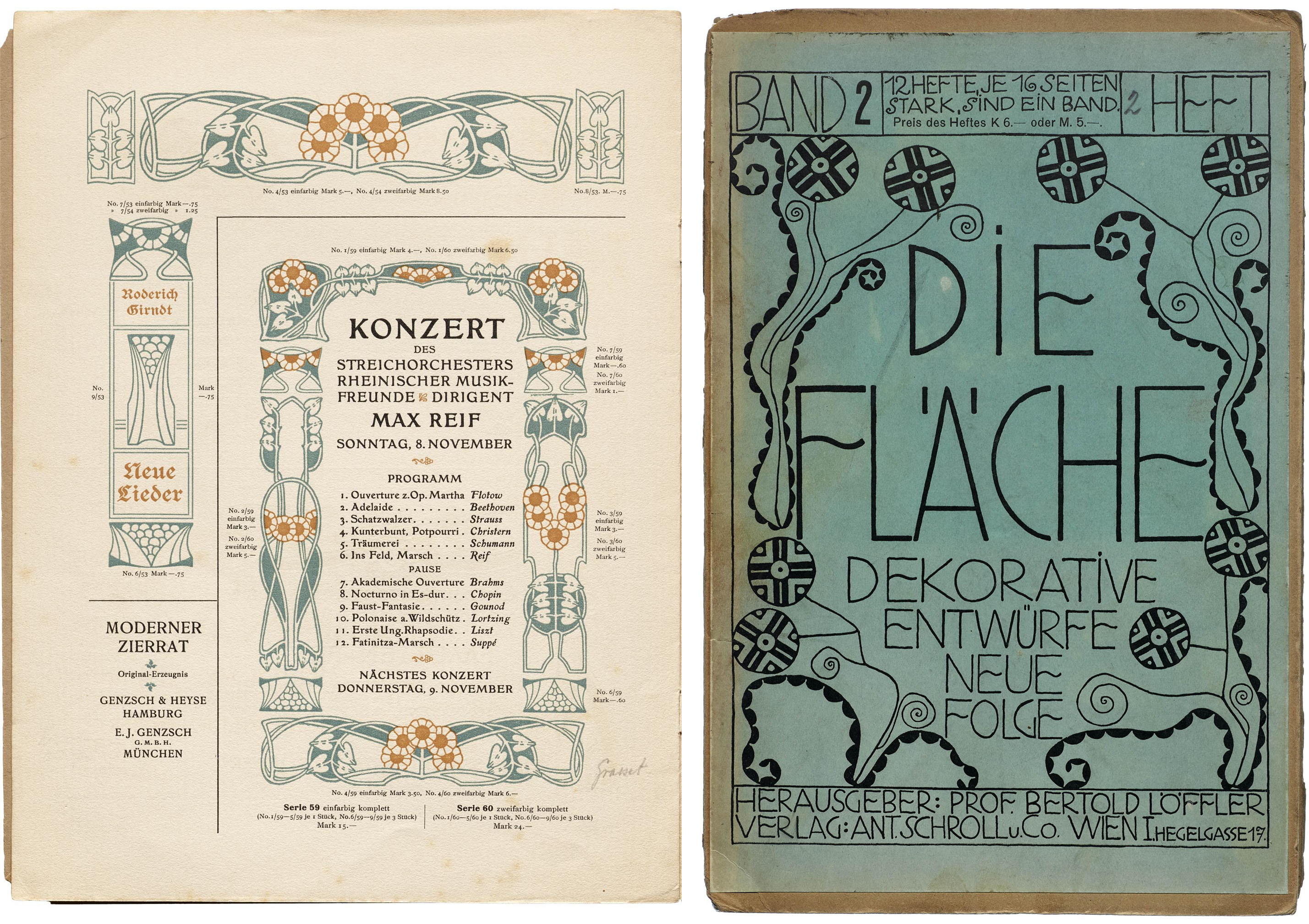
Right: Cover of Die Fläche, no. 2, 1910
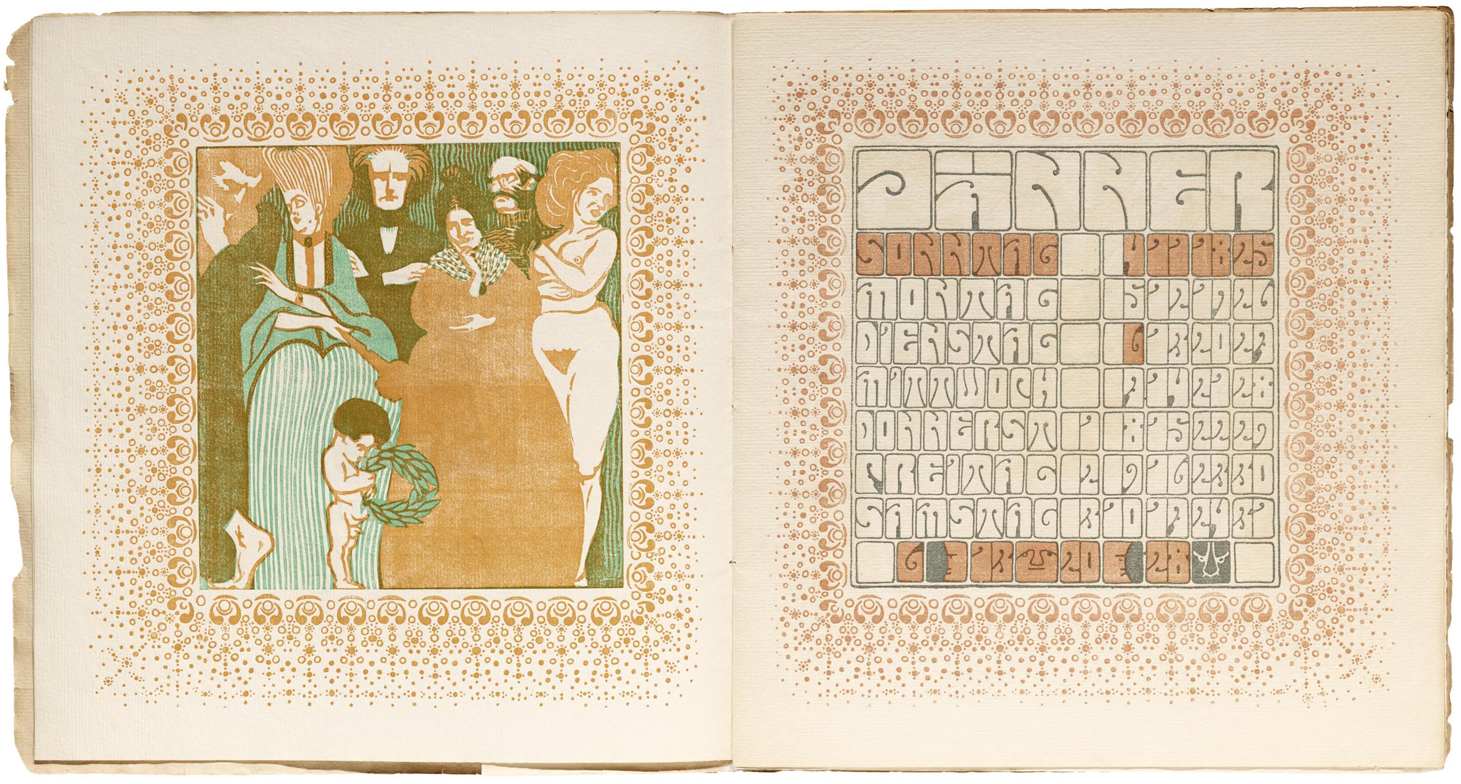
My inspiration photos include Alfred Roller’s 1903 calendar for Ver Sacrum (the official magazine of art nouveau), many issues from the Berlin-based magazine Die Zeitgemäße Schrift (The Contemporary Typeface), the 1904 art nouveau type specimen Neuheit Moderner Zierrat (Novelty Modern Ornamentation) from the Genzsch & Heyse foundry, and pretty much every page in any issue of Die Fläche (The Surface), a Vienna Secession periodical, to name just a very few.
But the requested style was Belle Époque with a touch of French art nouveau, so I looked closer at the posters of Paris-based artists Théophile Steinlen and Henri de Toulose-Lautrec to adapt my hand movements some more.
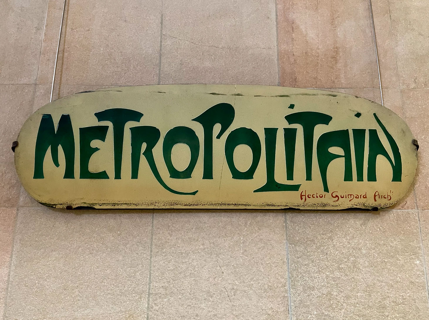
As for sources of outside inspiration, a couple of years ago I went to Paris and Prague and took a lot of photos of the buildings and metal works. Paris is known for the art nouveau Métropolitain (metro) entrance signs designed by Hector Guimard in the early 1900s (which is the same era as some of the artwork in Boutiques Magnifiques), so of course those and his buildings are in my Jugendstil inspiration folder. But Prague also has innumerable entrances, buildings, and windows in that style in really great condition—they may even have just as many as Paris, but they don’t get the same recognition. So I was happy to have collected many wonderful references for this project there, too.
Could you share more about your method? What media do you work in, and what does your creative process entail?
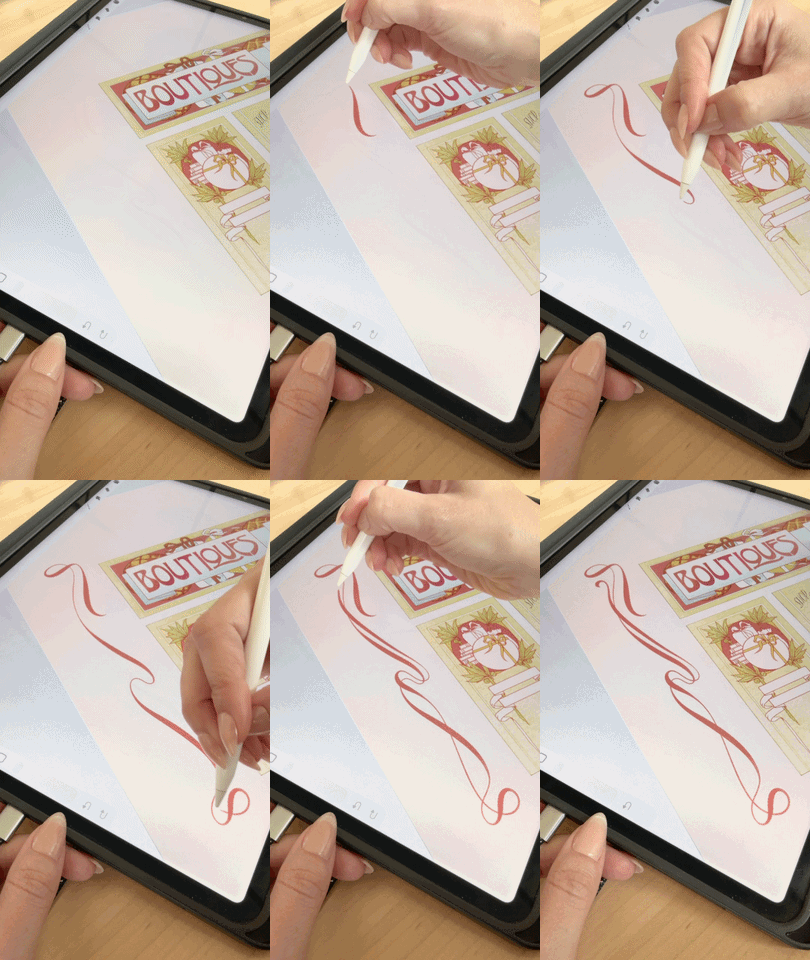
I used to do everything on cotton paper using brushes and pencils. For a few clients I still do watercolor ink splatters, collages, and inked illustrations. But for this project I was in a little bit of a time crunch, so my iPad Pro and Apple Pencil were just right. Using these tools definitely saved me time, as I didn’t have to scan any physical drawings and then clean up the many options—which was good, because I could just go on drawing idea after idea and swash after swash. I always first draw a lot to get out a feeling, then I whittle it down to what I think matters the most and best fits the project.
Very important to the process was printing out the files and folding a mockup box, which helped me see the difference between the artwork in 2D and 3D. What works as a flat drawing often does not as a 3D object.
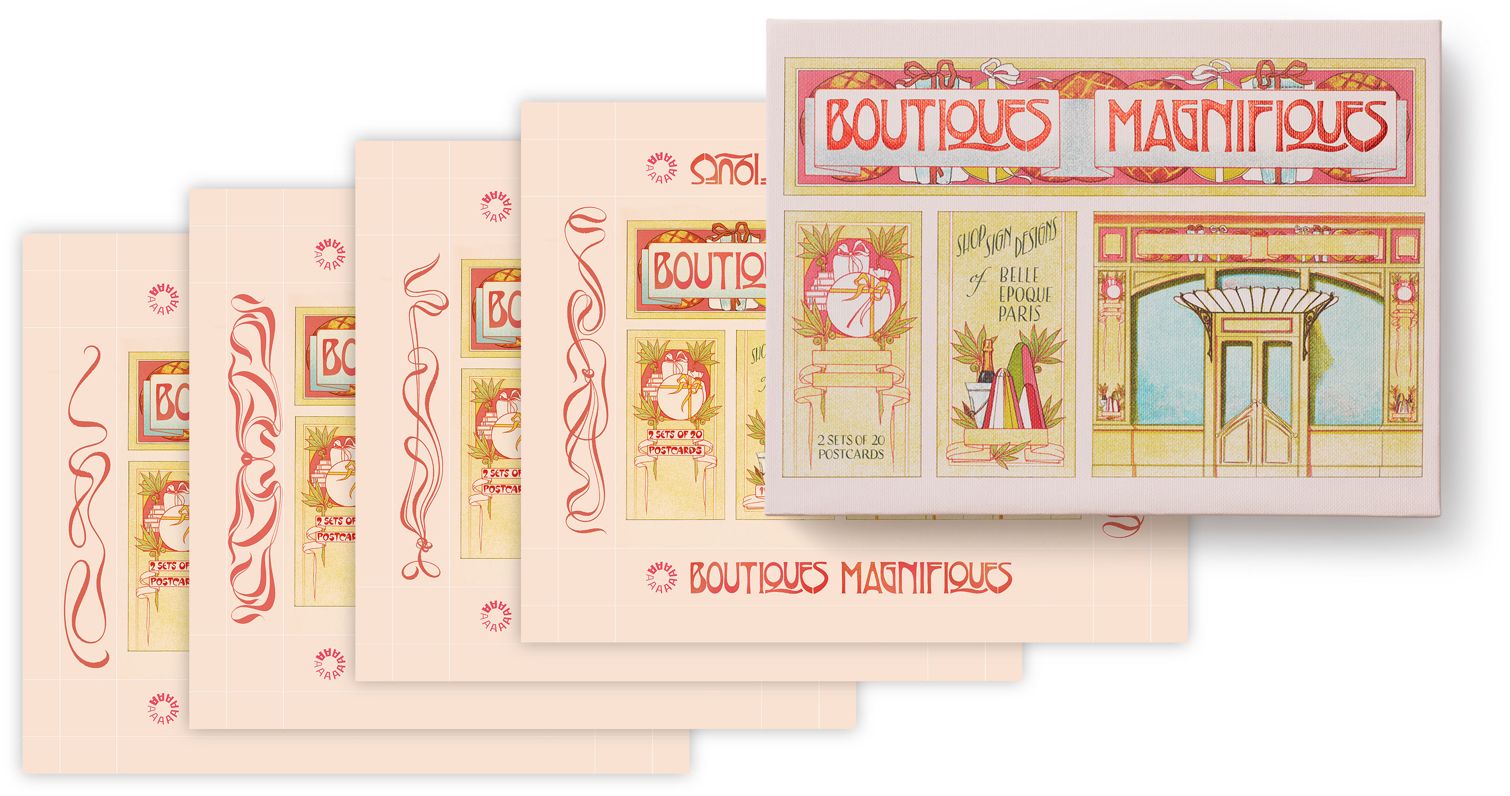
For example, when I saw an early draft’s longer and more complicated swashes so close to the mockup box’s edges, I realized those swashes made it look too busy. I ultimately felt a simple swash would better mirror the pink ribbons in the artwork on the front cover. I wouldn’t have seen that if I hadn’t folded a mockup box.
Are there any in-process drafts that you would like to share to demonstrate how the finished designs came about? Were there any early iterations that especially resonated with you, or that marked a significant milestone in arriving at the finished product?
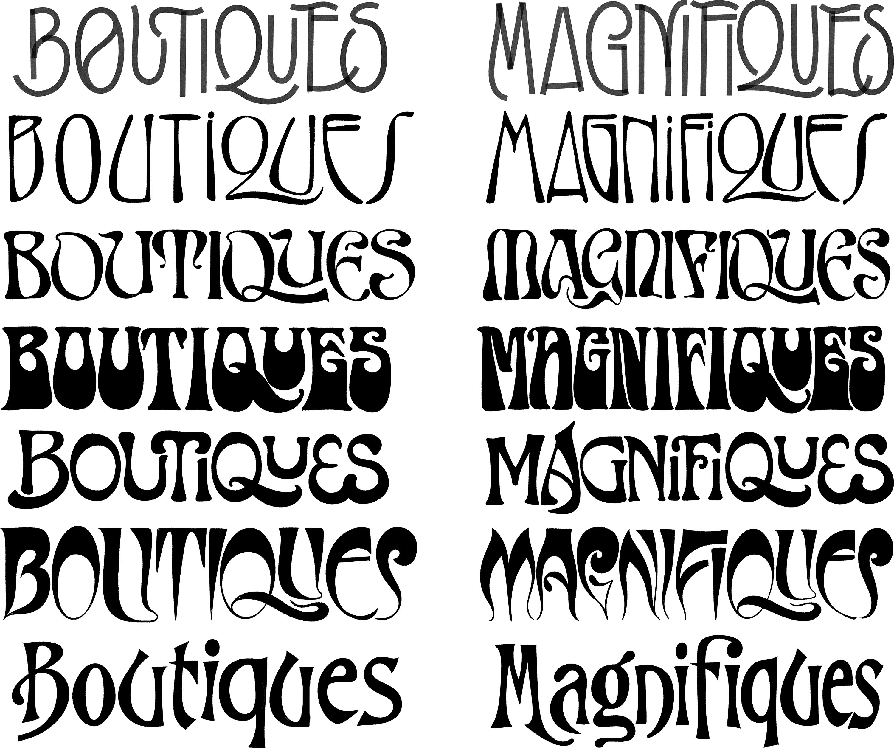
For the title lettering, I did dozens of drafts exploring Belle Époque lettering styles. At first, I wanted to go flowy and slightly strange, as I’ve seen on so many Belle Époque posters. After I got all the strange out of my system, I also tried a few clearer art nouveau styles.
Several of my early drafts included very thin flourishes, and the production team gave feedback that those may be hard to re-create using foil stamping. So that became a consideration, too.
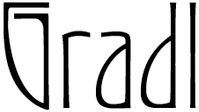
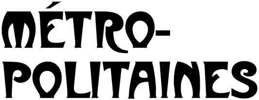
In the end, we really needed the lettering to celebrate the Belle Époque but also be easily readable and recognizable on the cover, even when viewed as a small thumbnail image on product pages. So I looked at a lot of existing Époque typefaces, like Métropolitaines and Gradl, and created my own version.
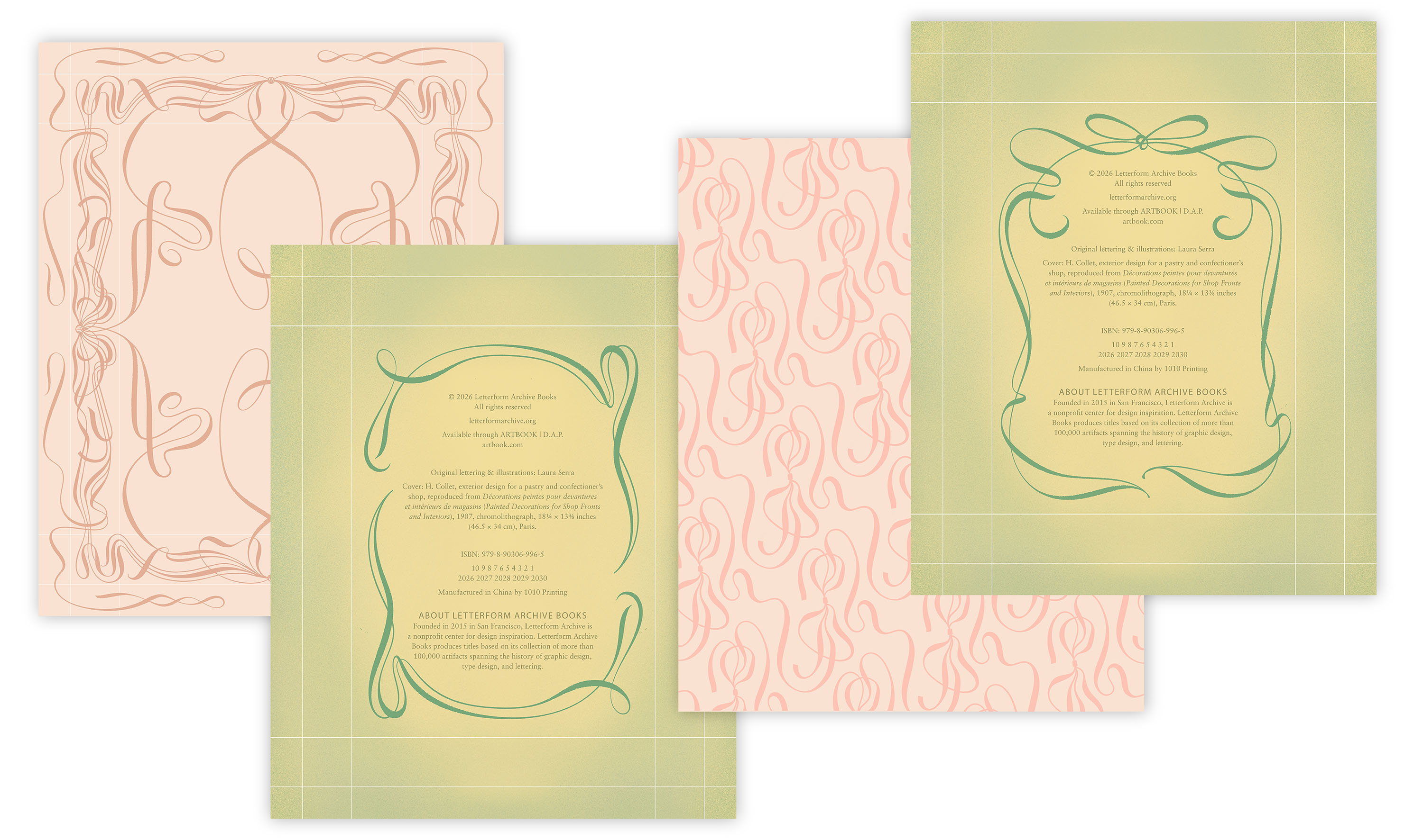
While drawing a decorative border and pattern for the box interior, I played with symmetry settings, trying designs mirrored across the horizontal or vertical axis as well as some with radial symmetry. I drew about twenty different versions just for the fun of it. Looking at these, I found that the mirrored symmetry was just too perfect for the more organic art nouveau style. But once I turned off symmetry or switched to radial symmetry, I could see the more relaxed flow, and the right border and bow pattern were born.
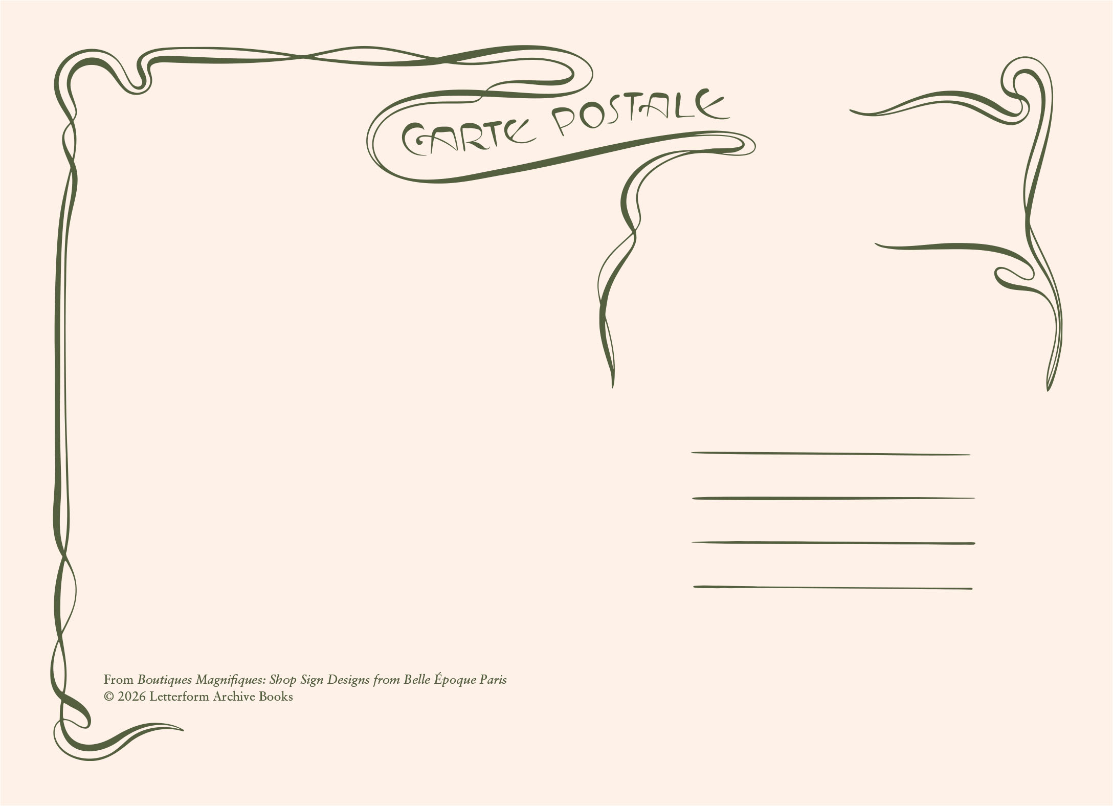
For the postcard backs, I wanted to sneak in the phrase “carte postale,” which you always see on vintage French postcards. This gave me another opportunity for charming old world lettering! The asymmetry of art nouveau again ended up working in our favor, as it turns out the post office discourages you from including illustrations underneath the address line so they can add their own printing.
Thank you so much, Laura, for bringing your talent to this project!
—Lucie Parker, Publisher, Letterform Archive Books