News
“Typographic Jazz: The Monoprints of Jack Stauffacher” Runs January 27 – June 9, 2024
An exhibition of rarely seen work explores the iconic Bay Area printer’s playful and improvisational process.
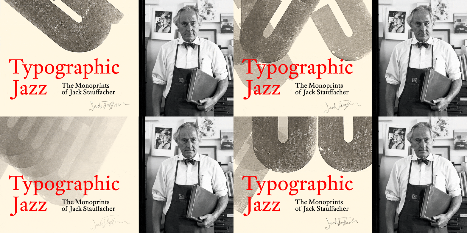
See Typographic Jazz
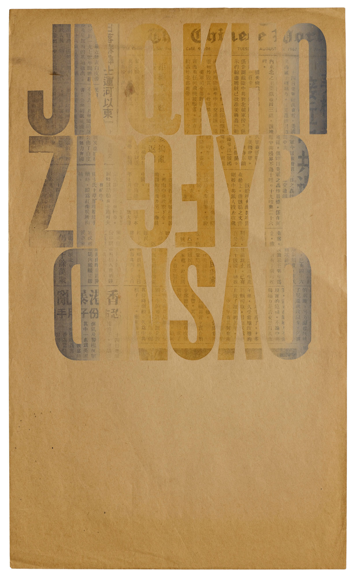
Letterform Archive has a long and close relationship with the work of Jack Stauffacher. We hold a significant run of his Greenwood Press books; we published a book on his wood type prints; and we are the home of his studio archive. This last collection — rich in private experiments — sparked the idea for an exhibition of the artist’s work that has yet to be shown in public. Curated by Rob Saunders, the show explores Stauffacher’s playful and improvisational typography and features more than 100 prints, sketches, iterative proofs, and other explorations of his creative process.
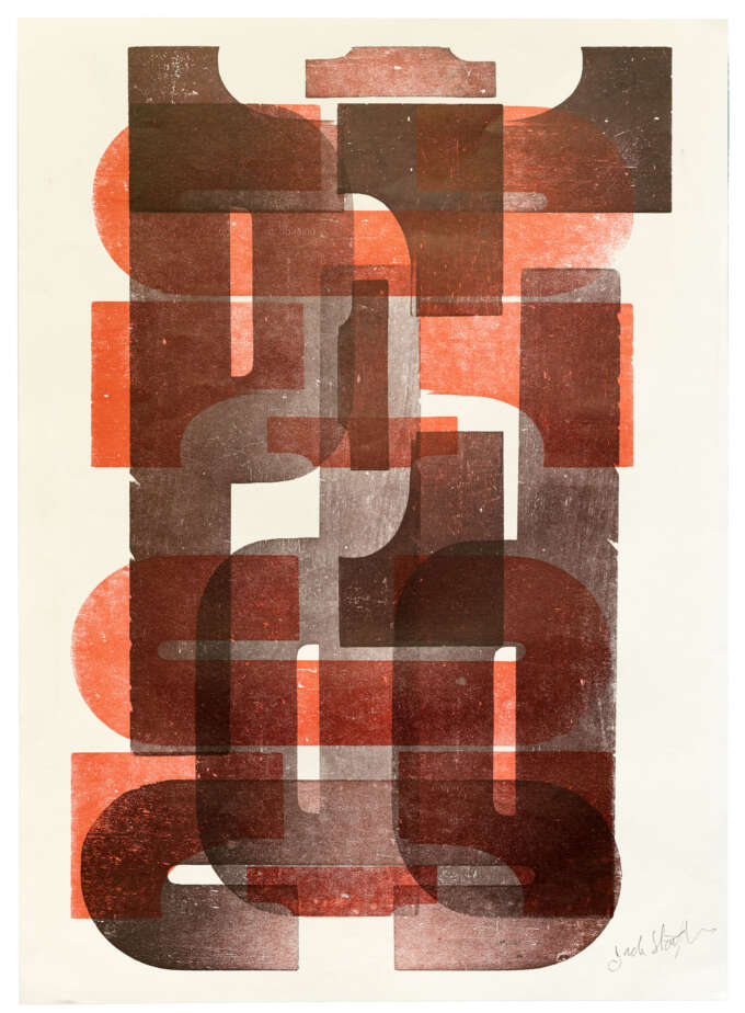
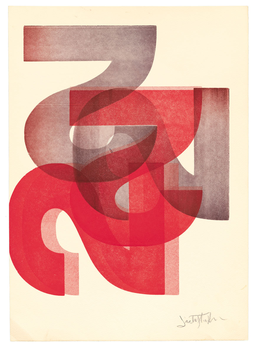
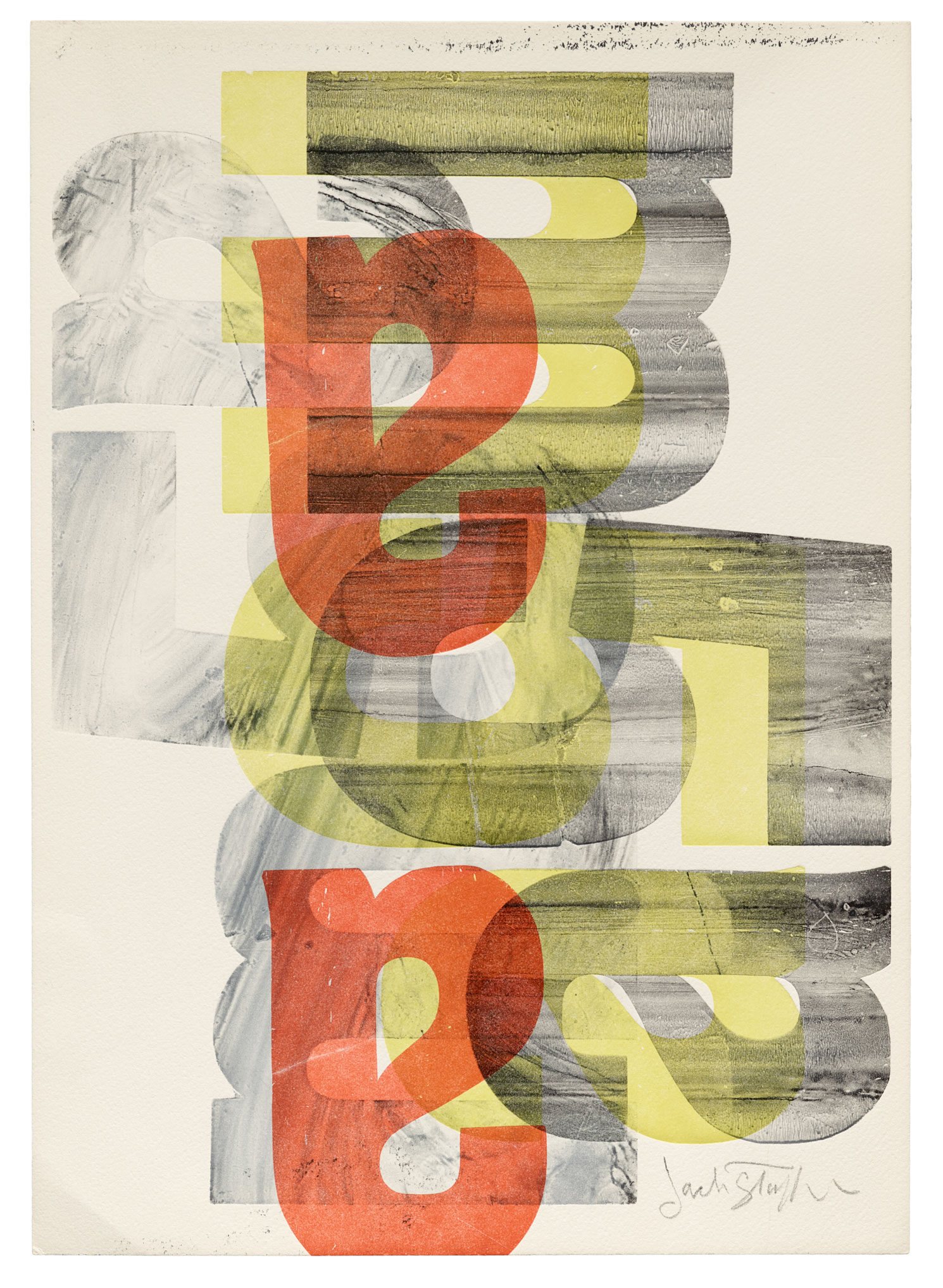
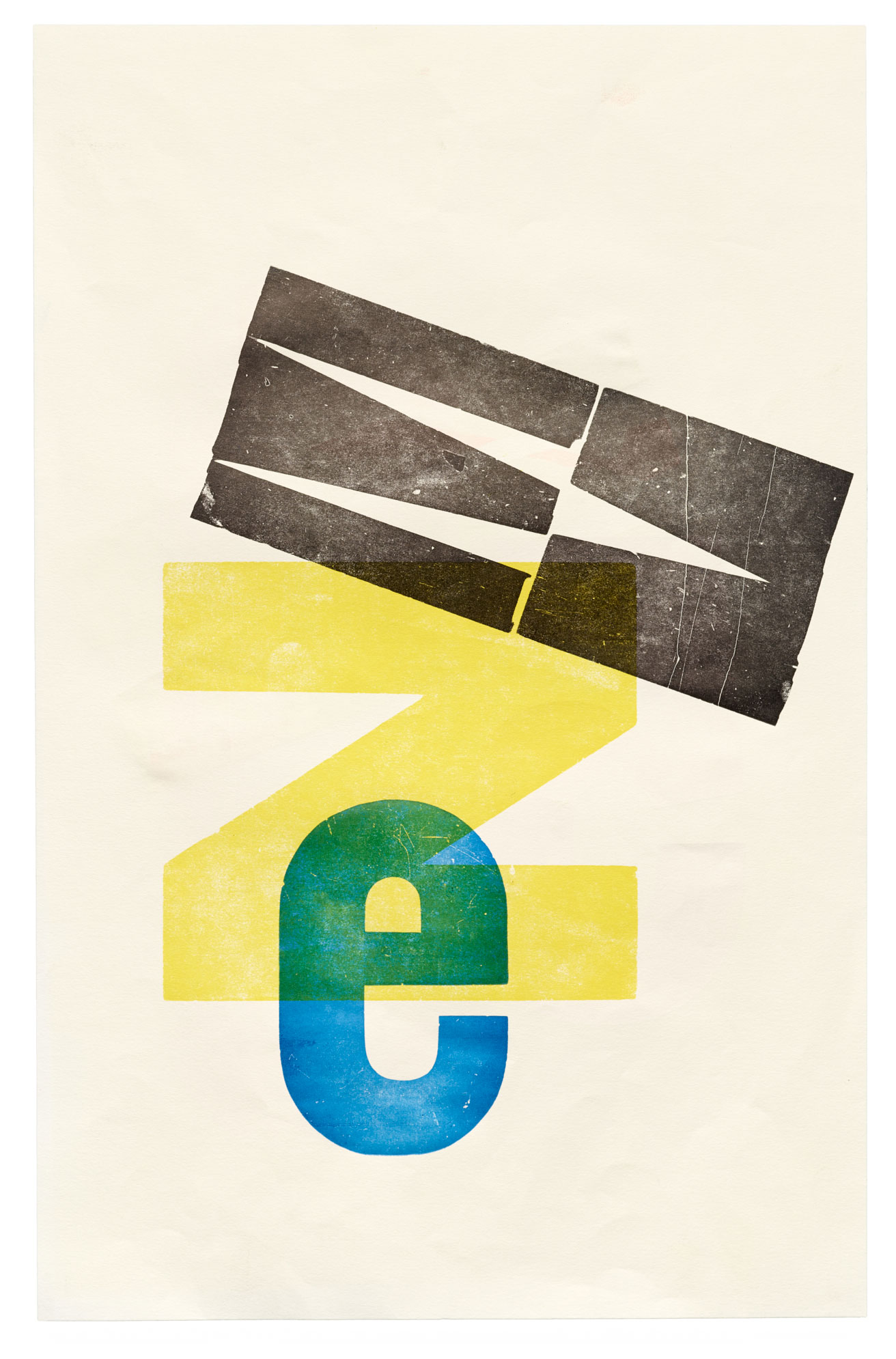
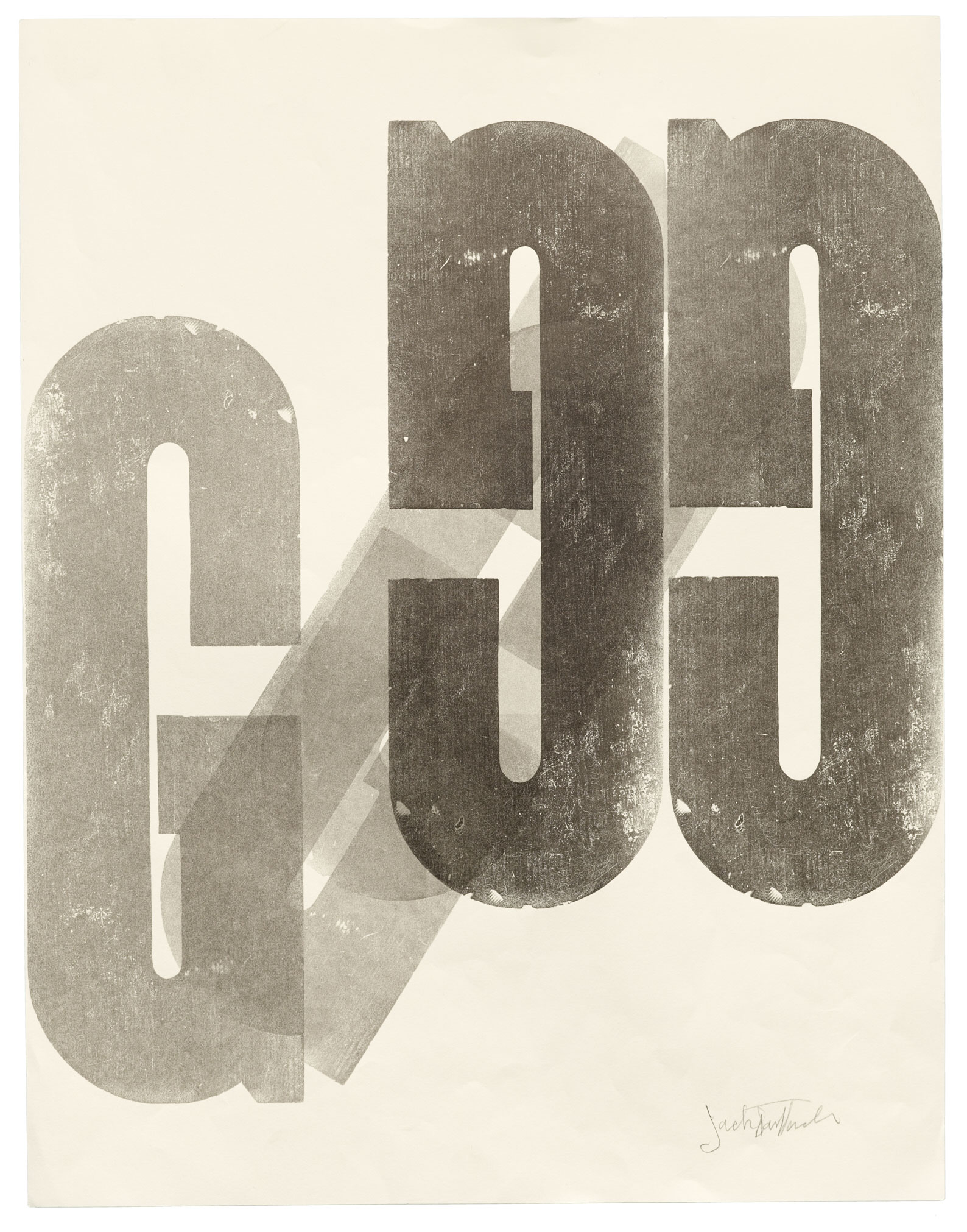
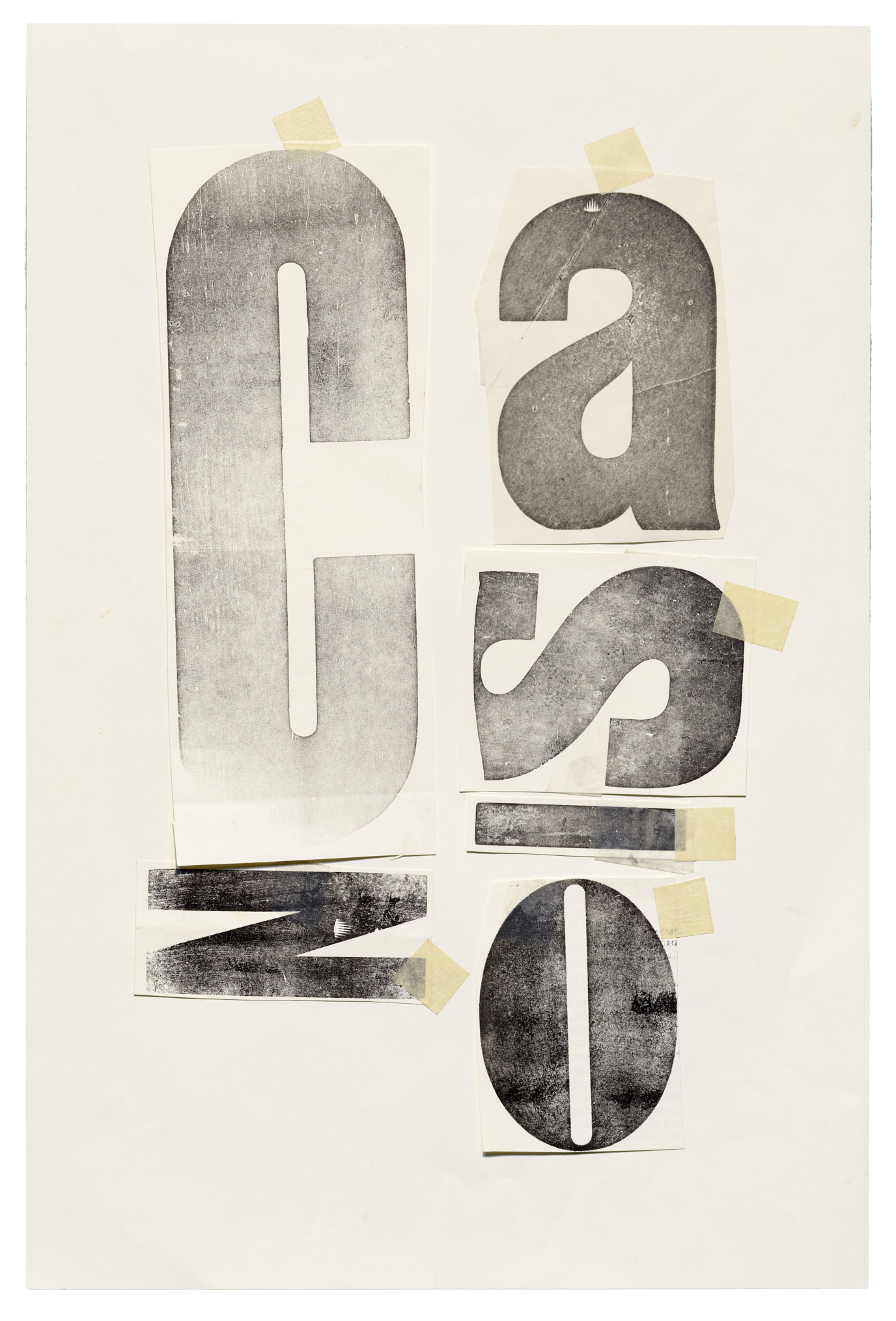
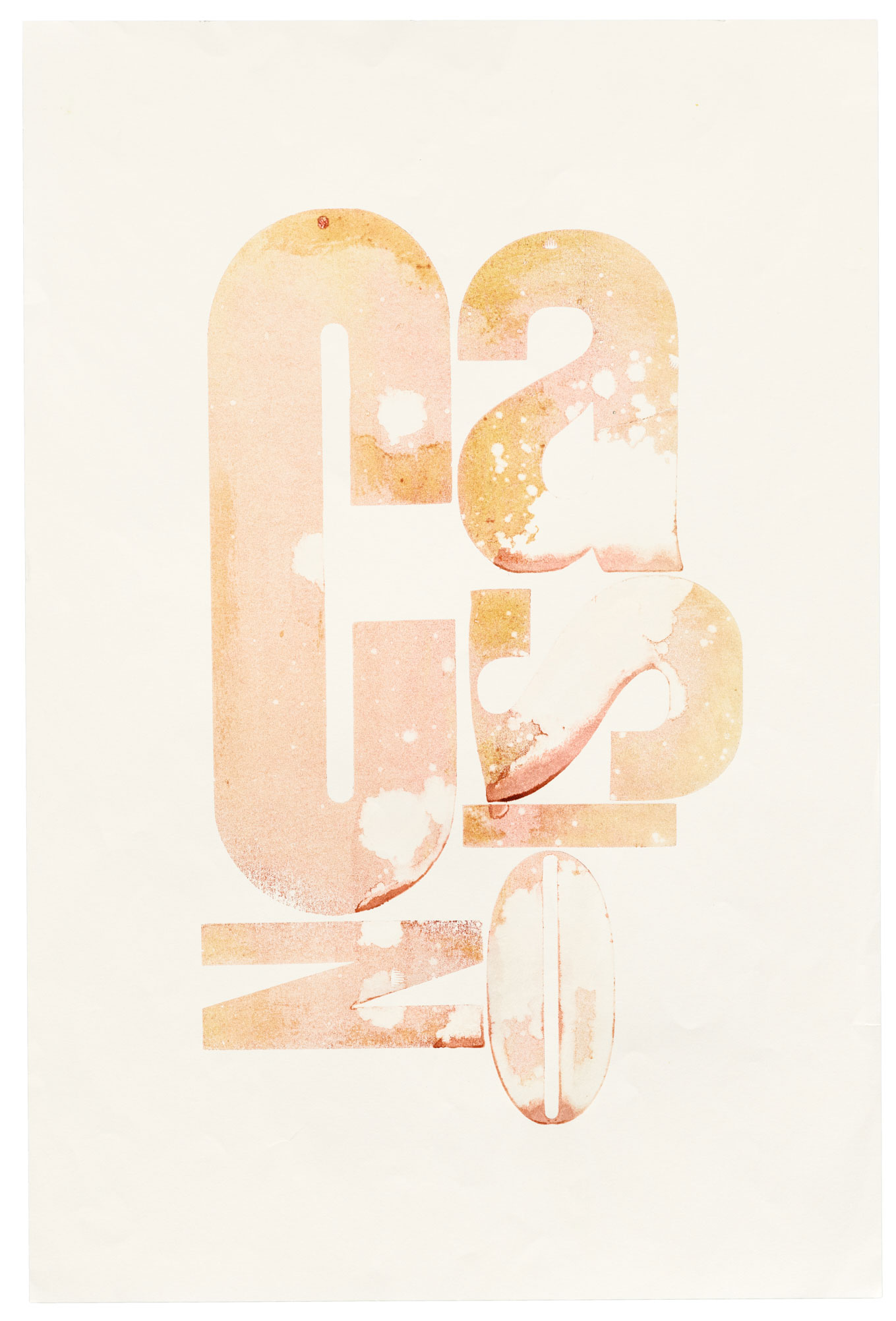
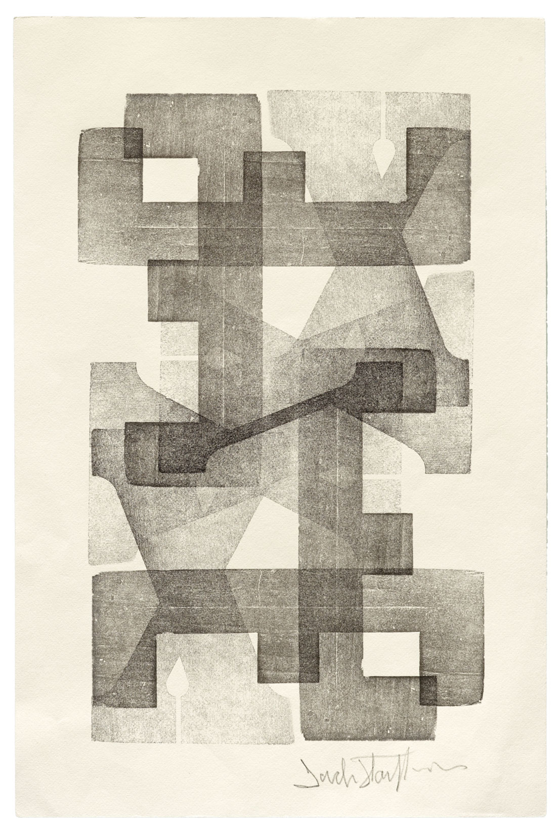
Using a mismatched set of 19th-century wood block letters, Stauffacher reimagined type as abstract form. His experiments in inking and layering led to an extraordinary body of monoprints, each one-of-a-kind. Through unfinished work, viewers get to peek into Stauffacher’s mind and observe his use of abstraction, color, form, rotation, overprinting, ink manipulation, and transparency.
Selected objects from Typographic Jazz
Letterpress prints by Jack Stauffacher. Click or tap to see larger images and captions.“For these monoprints, Stauffacher used letters as simple geometric shapes to create abstract compositions. It took careful planning and precision, but also spontaneity. That’s what makes them so exciting, because it takes them out of the world of graphic design and into the world of modern art.” — Rob Saunders
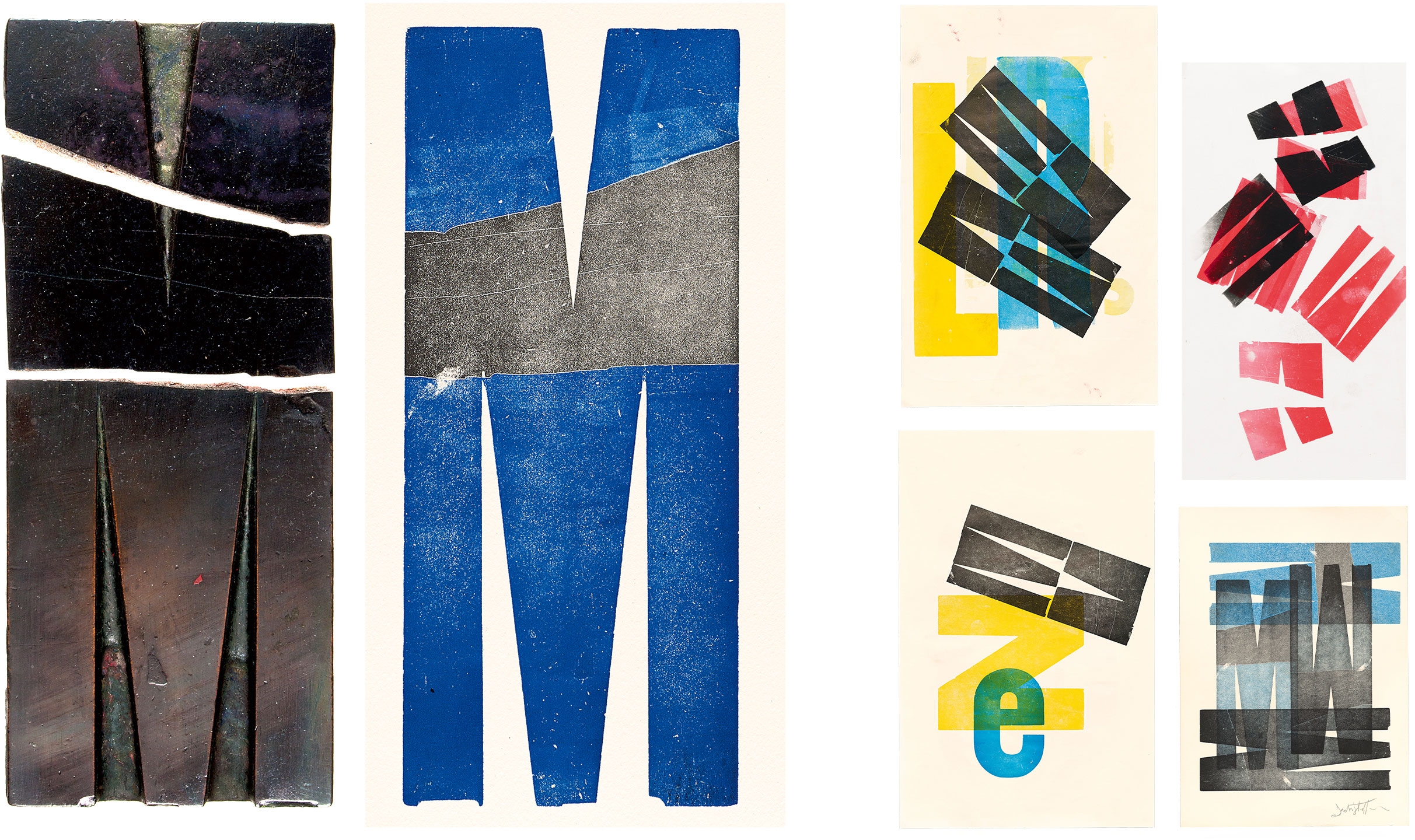
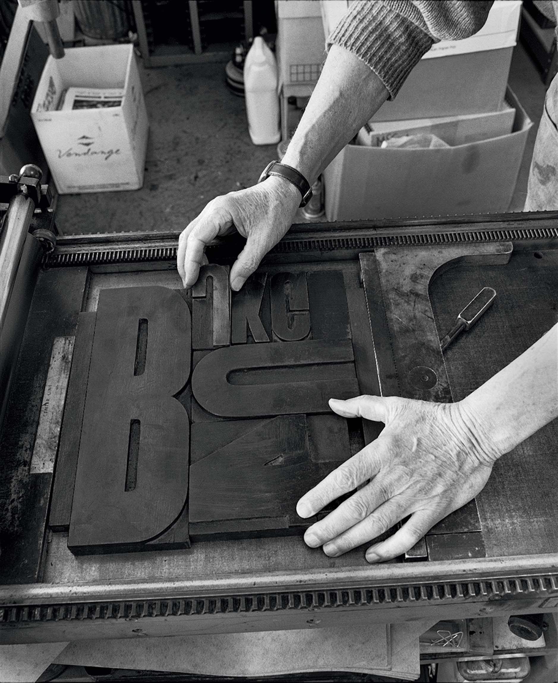
The wood blocks Stauffacher used to create his prints will also be on display in the exhibition. The way he acquired the type was as spontaneous as the prints themselves. In 1966, a retiring printer of political and advertising posters located in the same building, offered up their supply. The blocks Stauffacher chose — plain, worn, and sometimes broken — became the ingredients for decades of personal experimentation. In a video for LACMA he explained how type has a mutable personality that serves each printer and project in a new way:
They radiate their own life, and it’s pleasantly connected with another letter that also has its life. And each one has its own identity, yet they can all be integrated into one image…. They have a heartbeat. They are not just dead, wooden letters. They are waiting to be used again, by people with passion. — Jack Stauffacher
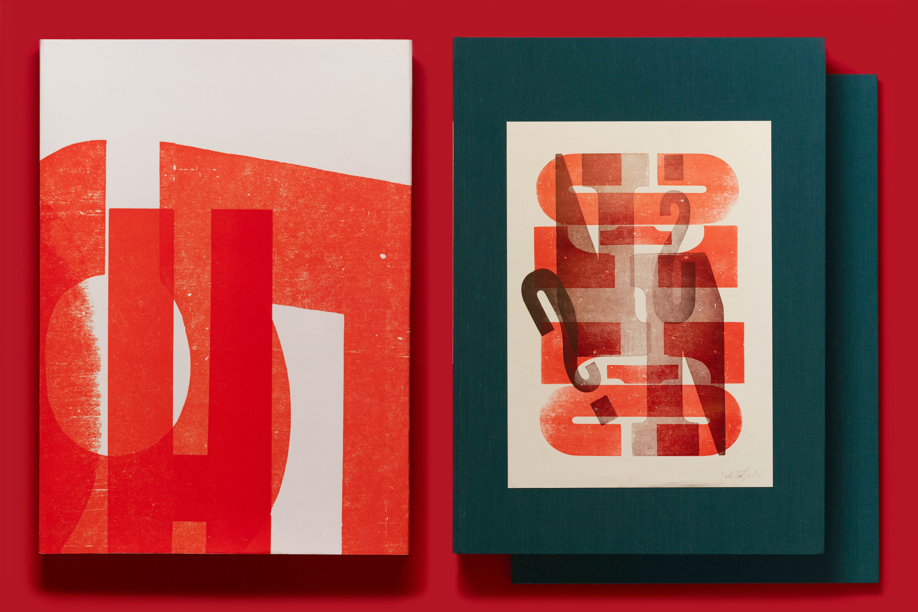
Available alongside the exhibition will be Only on Saturday: The Wood Type Prints of Jack Stauffacher, the first book dedicated to Stauffacher’s wood type prints, and limited advance copies of The Art of Wood Type: 20 Unique Notecards & Envelopes, an elegant set of reproductions in a keepsake box.

