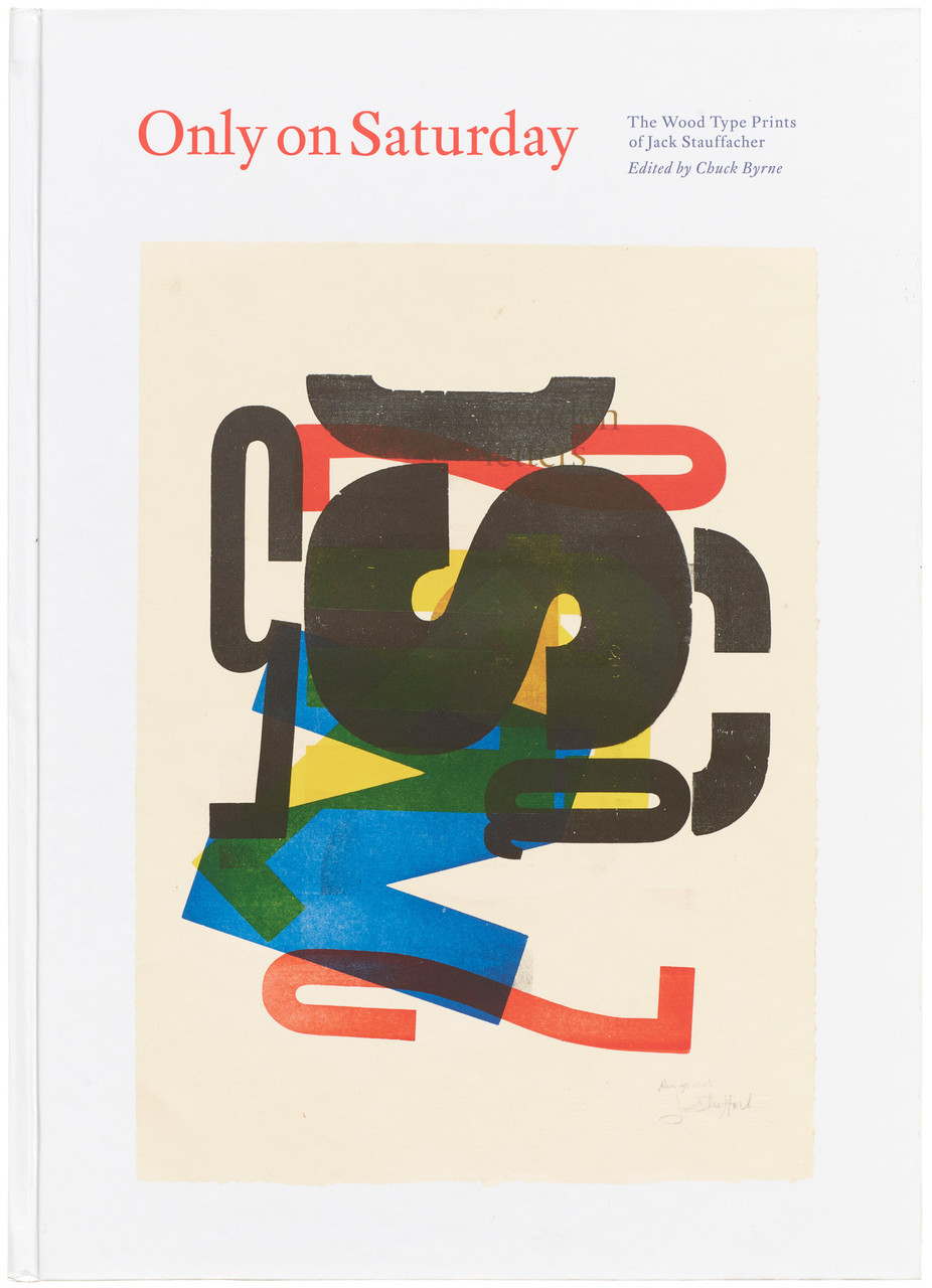
The first comprehensive look at Stauffacher’s striking typographic experiments, in which he used a box of worn, mismatched wood type to transform letters from legibility workhorses into expressive studies of surface, color, and form
Created in his off-hours on the weekend and in part inspired by the modern artists of his day, Jack Stauffacher’s exquisite prints demonstrate what wood type can do when released from its role in traditional communication and instead used to explore letters as pure form. In the resulting abstract, dynamically composed, often lushly layered prints, Stauffacher reclaims typography as a subject fit for the gallery wall.
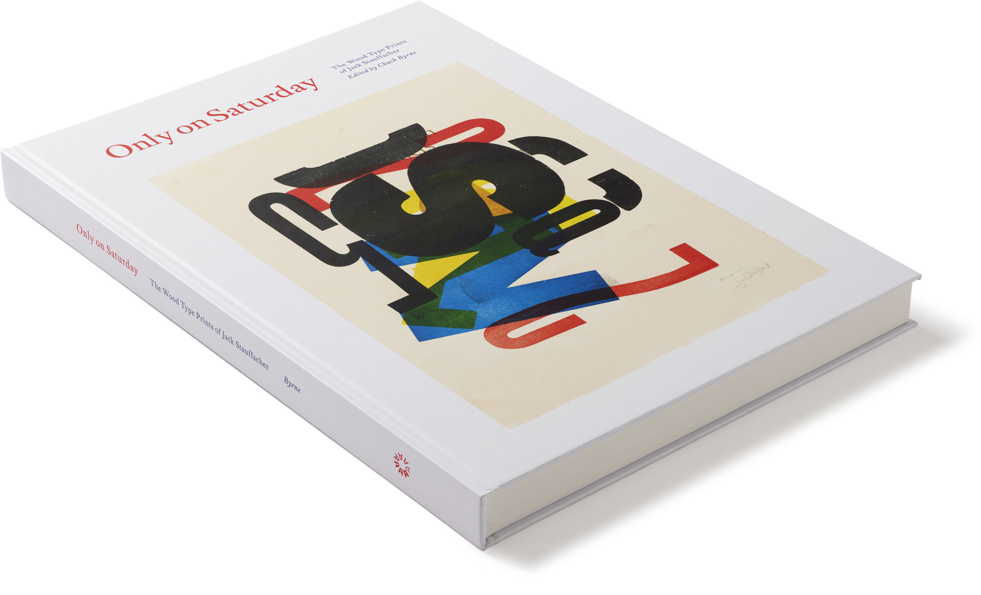
Featuring 500 images (most of which have never appeared in a publication before) and essays by collaborators from the worlds of art and typography, Only on Saturday is the first trade book to document the work of one of the past century’s great typographers and printers―and offer the compelling backstory behind its creation.
These prized compositions — some patterned with letters in different sizes, typefaces, and inks; some layered with multiple presses of a single letter; others awash in solvent — morphed from exploratory pieces made during his off hours into formal studies of what was possible between the positive and negative spaces on a page. Toward the end of his life, Stauffacher expressed that these prints were “experimental up to a point”: a series of investigations that, once complete, yielded a deliberate statement of design. Today, they are in the permanent collections of many major museums.
About Jack Stauffacher
Born in 1920 in San Mateo, California, Jack Stauffacher was a printer, typographer and fine-book publisher whose delicate yet graphic sensibility landed his work first in library rare book collections and then in museums such as SFMOMA and LACMA, who sought out his typographic prints. A printer of exceptional skill who began his apprenticeship at the age of 16, Stauffacher created books for his Greenwood Press off and on for eight decades. He taught typography at Carnegie Mellon and the San Francisco Art Institute, and served as typographic director at Stanford University Press. But it was his later wood type prints that ushered his career into the realm of fine art. Stauffacher created these innovative and elegant prints from 1966 until his death in 2017 at the age of 96. In recognition of his contributions to typography and design, he was awarded an AIGA Medal in 2004.
“The last of San Francisco’s traditional bohemians of the 1930s, Stauffacher became known as an articulate participant in the local literary and artistic avant-garde, as well as an inspiring mentor for young people and newcomers to the Bay Area. . . . [He was] the dean of San Francisco printers.” San Francisco Chronicle
“As typographers, designers, and printers, we translate words into written communication. Jack had done that all his life, making words visible. Then, after he had designed pretty much everything worth designing for a purpose, he started doing the opposite: he picked random wood letters from a case he had stumbled upon and made images with them. We aren’t supposed to read those letters as words but to go back to where they came from: pictures of those things. A large red B can be a sail, a blue A on its side is the sea, and the little black letters are birds or stones or ripples. . . . When I asked Jack about the prints, he said that those letters had become such intimate friends over time that he could behold them just as beautiful objects; they didn’t have to work for a living anymore.” Erik Spiekermann
“Jack was a very special person: easy to meet, hard to fathom, fun to be with, stimulating to listen to, effortless to learn from, and difficult to forget. . . . His cheerful and gentlemanly demeanor masked a determination to think and work at the highest level. His modern old-fashionedness found its way into everything he did and provided me with yet another model of how to live a fulfilling life in design.” Chris Pullman, Design Observer
“Jack Stauffacher . . . spent his long career in an intimate relationship with typographic form, content, and the craft of assembling letters — one at a time — to create beautiful and meaningful communications that will be relevant five-hundred years from now.” Terry Irwin
Praise
“Editor and designer Chuck Byrne captures the energy of Stauffacher’s prints within the book’s spacious ten-by-fourteen-inch format. By adding small studies and details on individual pieces, he further illuminates the complex printing process. Only on Saturday is also a biography, and a dozen contributors take readers inside their ambitious projects with the master printer. Their essays confirm his character: his love of literature, philosophy, art, and conversation especially.” Communication Arts
“A stunning tribute to Jack Stauffacher, a letterpress printer, typographer, and designer whose elegant and innovative type treatments cemented his reputation as one of the best printers of the twentieth century.” The San Francisco Egoist
“This sumptuous book from Letterform Archive is a testament and monument to [Stauffacher’s] work. Photographs by his longtime collaborator Dennis Letbetter show glimpses of Stauffacher’s studio and the printer at work on his press.... His friends and acolytes have honored his memory in this publication.” Printing History
Pagethrough
Details
| ISBN | 978-0-9983180-6-6 |
| Publisher | Letterform Archive |
| Publication date | June 2023 |
| Size | 14 × 10 inches |
| Printing | 4 colors throughout |
| Edition | Trade Hardcover |
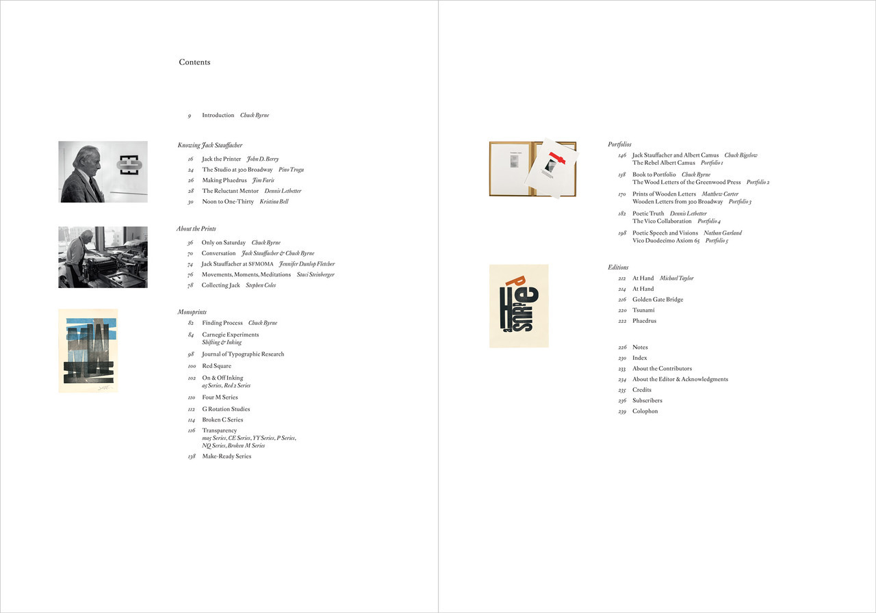
Contents
9 Introduction – Chuck Byrne
Knowing Jack Stauffacher

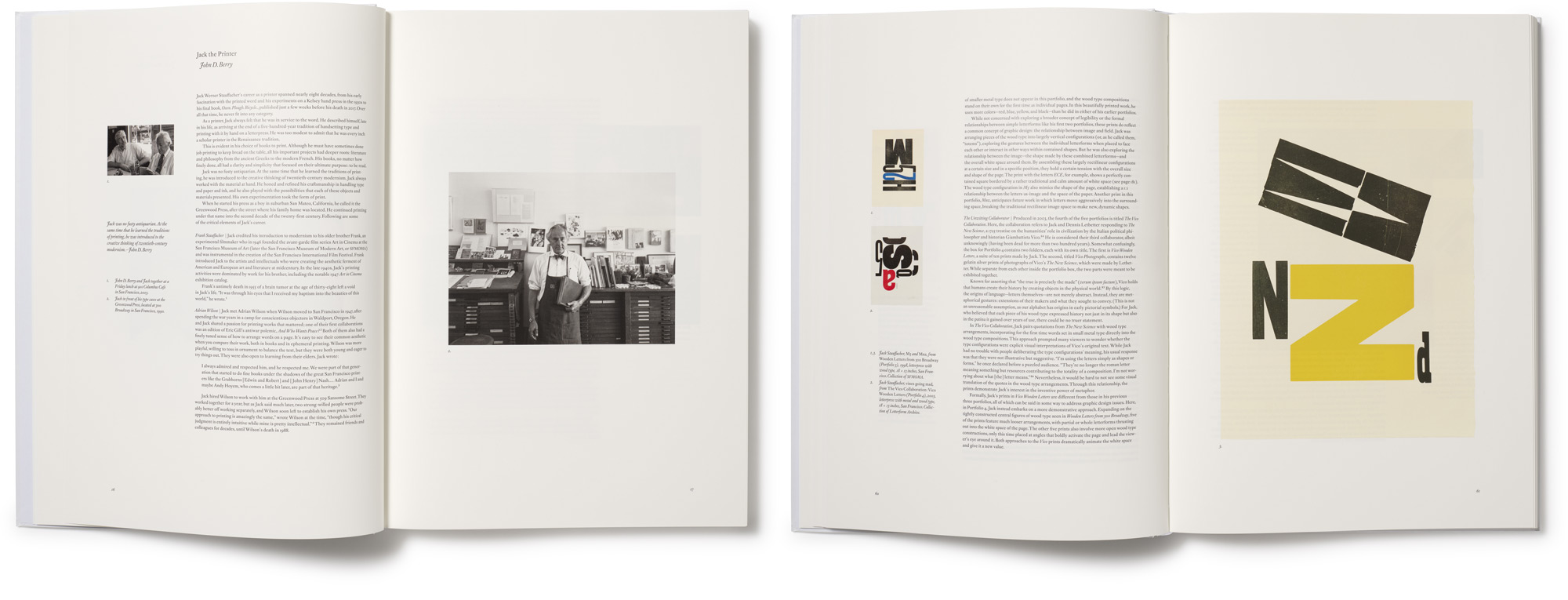
16 Jack the Printer – John D. Berry
24 The Studio at 300 Broadway – Pino Trogu
26 Making Phaedrus – Jim Faris
28 The Reluctant Mentor – Dennis Letbetter
30 Noon to One-Thirty – Kristina Bell
About the Prints
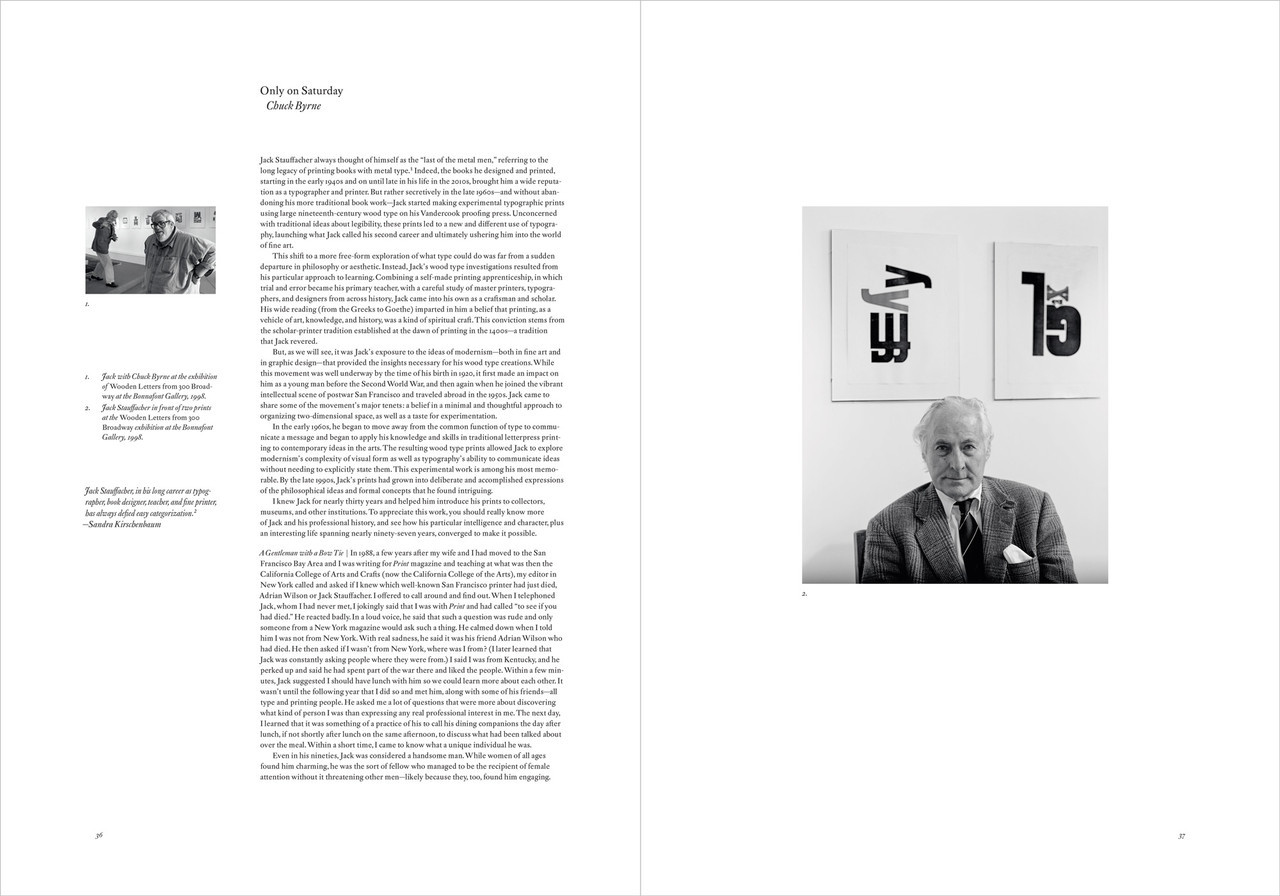
36 Only on Saturday – Chuck Byrne
70 Conversation – Jack Stauffacher and Chuck Byrne
74 Jack Stauffacher at SFMOMA – Jennifer Dunlop Fletcher
76 Movements, Moments, Meditations – Staci Steinberger
78 Collecting Jack – Stephen Coles
Monoprints
82 Finding Process – Chuck Byrne
84 Carnegie Experiments: Shifting and Inking
98 Journal of Typographic Research
100 Red Square
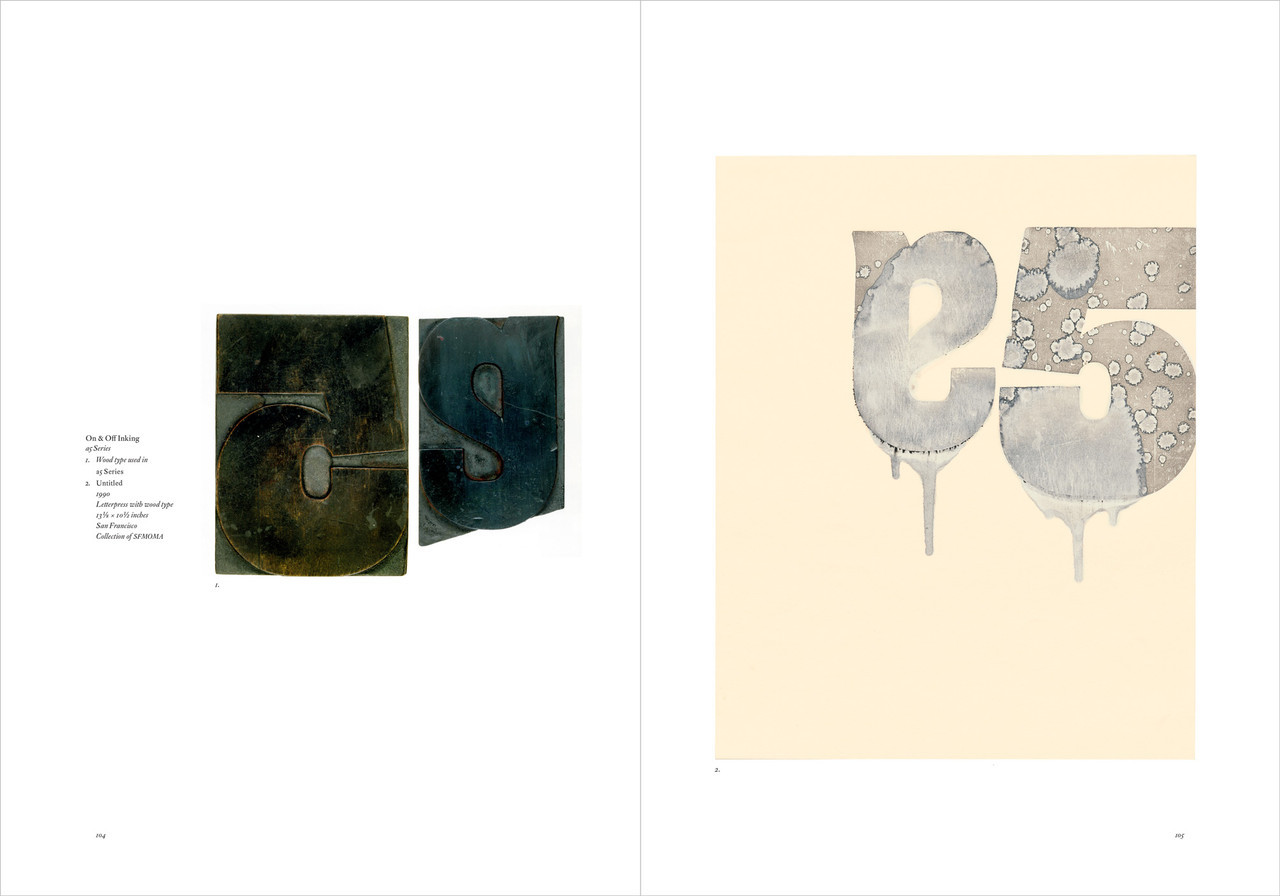
102 On and Off Inking: a5 Series, Red 2 Series
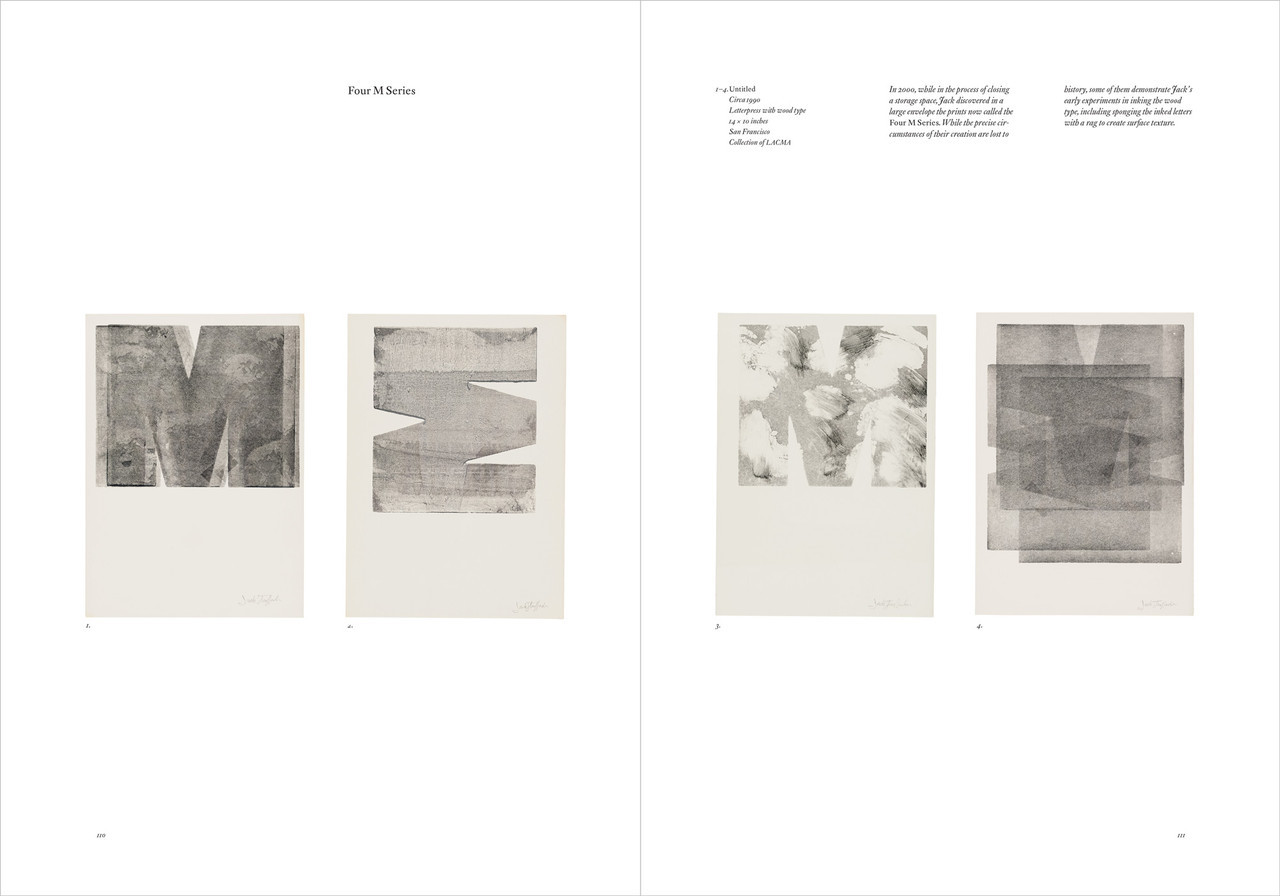
110 Four M Series
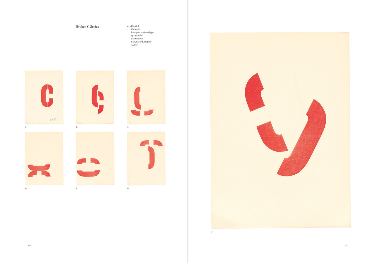
112 Broken C Series
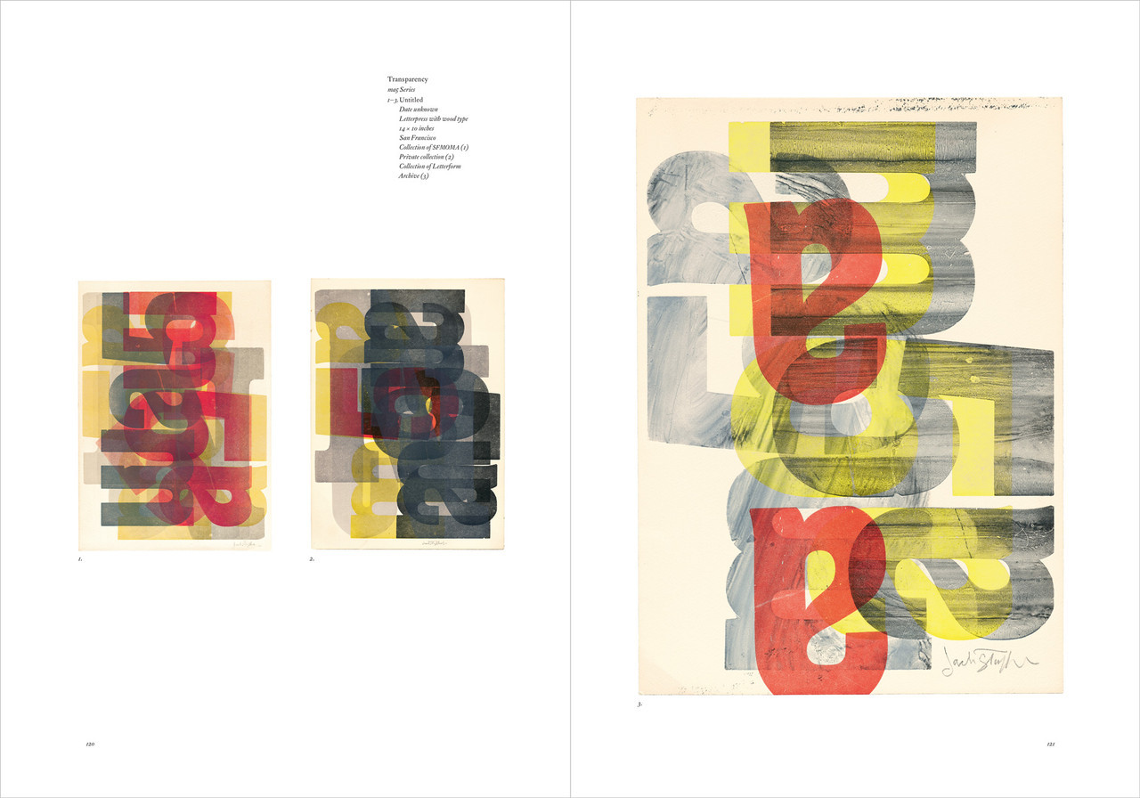
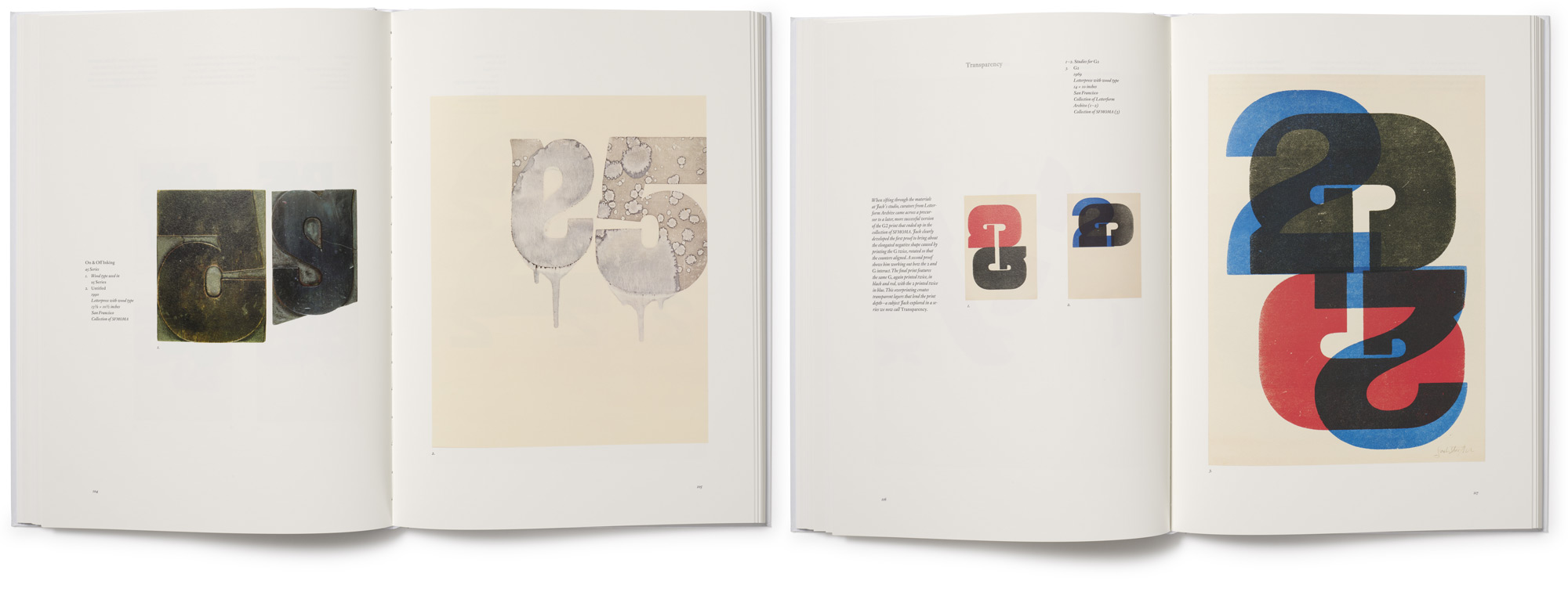
116 Transparency: m5a Series, CE Series, YY Series, P Series, NQ Series, Broken M
138 Make-Ready Series
Portfolios
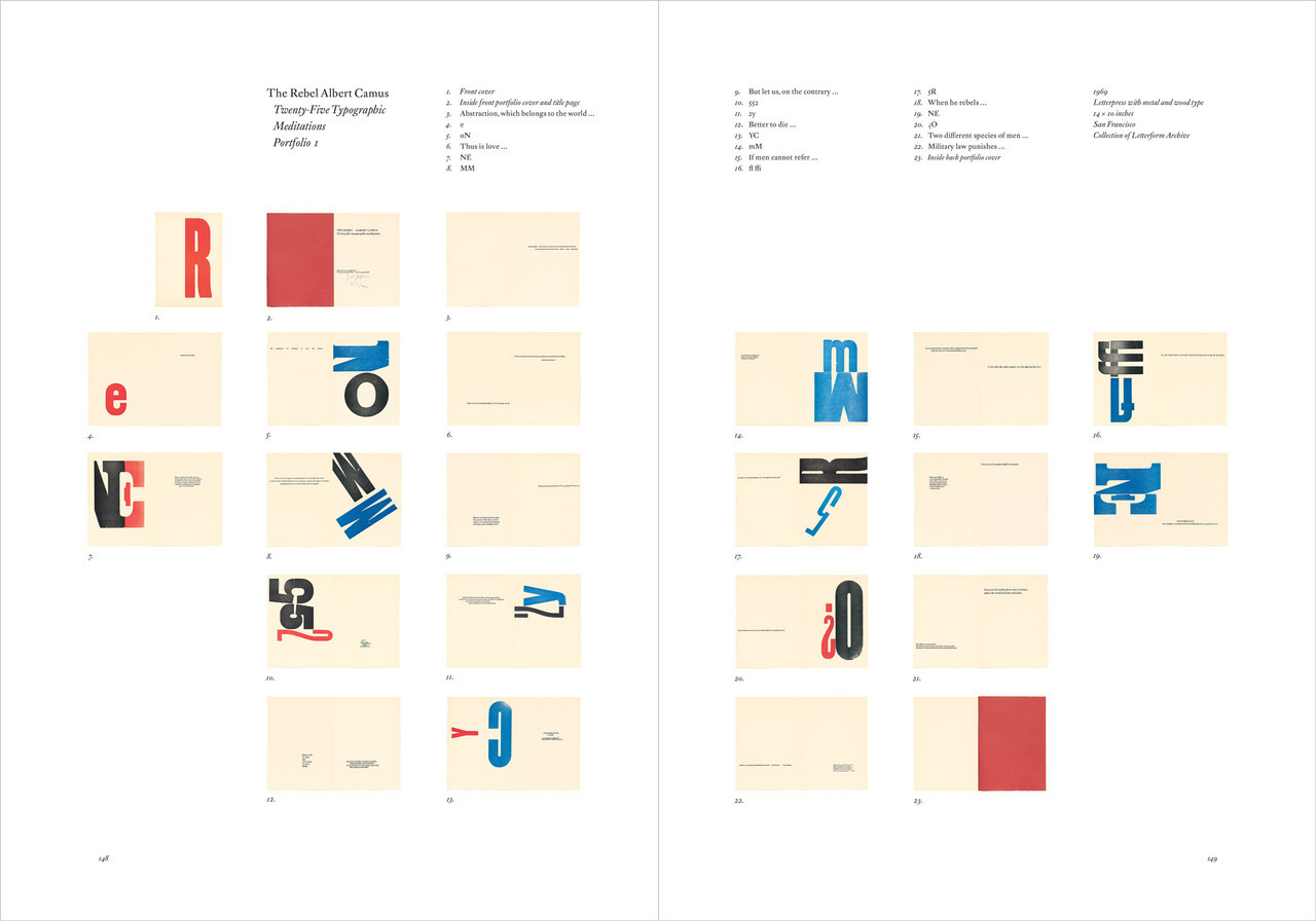
146 Jack Stauffacher and Albert Camus – Chuck Bigelow
The Rebel Albert Camus Portfolio 1
158 Book to Portfolio – Chuck Byrne
The Wood Letters of the Greenwood Press Portfolio 2
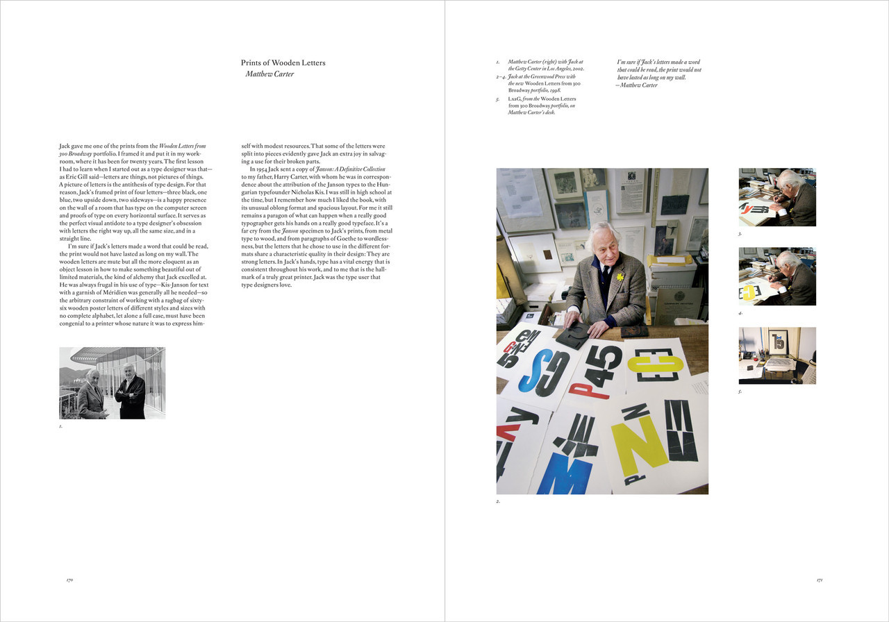
170 Prints of Wooden Letters – Matthew Carter
Wooden Letters from 300 Broadway Portfolio 3
182 Poetic Truth – Dennis Letbetter
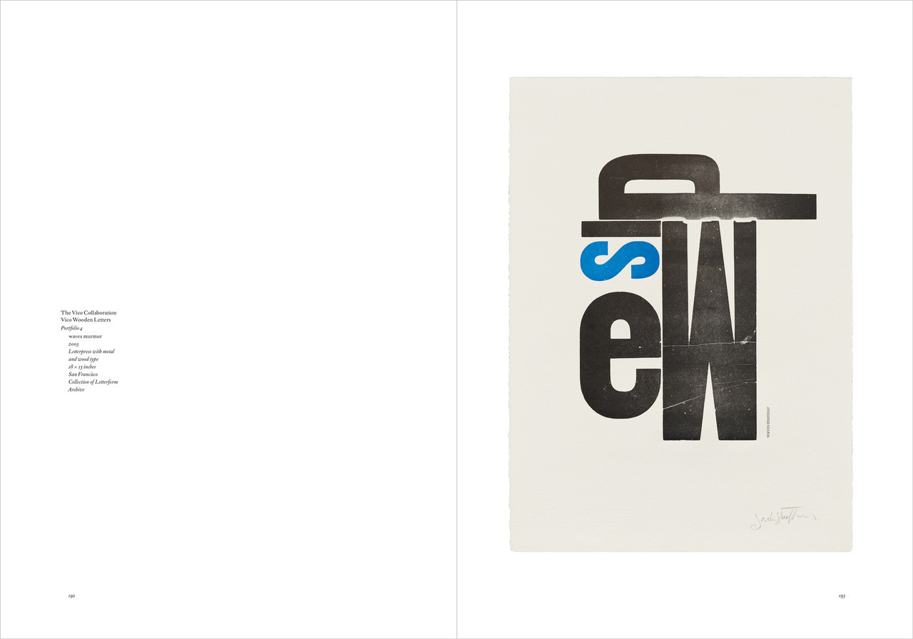
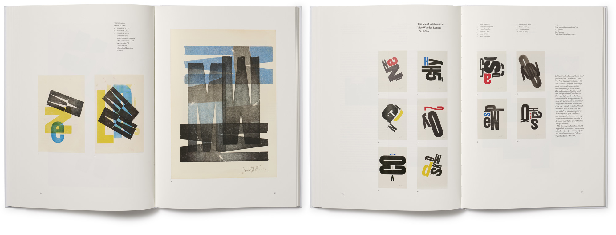
The Vico Collaboration Portfolio 4
198 Poetic Speech and Visions – Nathan Garland
Vico Duodecimo Axiom 65 Portfolio 5
Editions
212 At Hand – Michael Taylor
214 At Hand
216 Golden Gate Bridge
220 Tsunami
222 Phaedrus
226 Notes
230 Index
233 About the Contributors
234 About the Editor and Acknowledgements
235 Credits
236 Subscribers
239 Colophon
Related Posts
Jack Stauffacher on Working with Type
Type as Modern Art: The Influences Behind Stauffacher’s Wood Type Prints
Write A Review
Related Products