From the Collection: Legacies of Swiss Style, Part 1—Typografische Monatsblätter
An influential trade journal reveals the origins of Swiss typographic style and provokes conversation between objects at Letterform Archive.
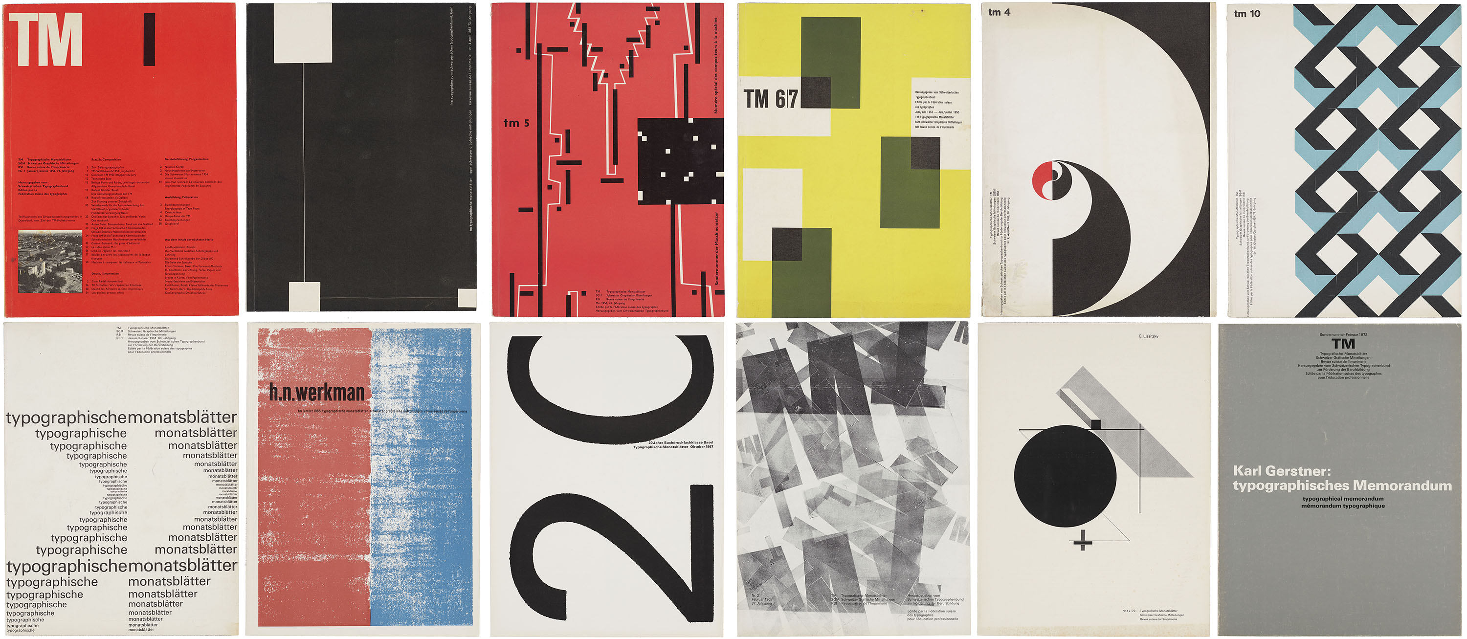
In 1952, the competing Swiss trade journals Schweizer Graphische Mitteilungen and Revue suisse de l’imprimerie merged with Typografische Monatsblätter (TM), a monthly periodical advertised as the leading publication of the Swiss graphic design industry. Tailored to a diverse audience of design professionals, the magazine published articles in German, French, and English under the editorial direction of Rudolf Hostettler (1919–81), with Robert Büchler (1914–2005) overseeing its initial art direction. Unlike many contemporary trade publications that focus primarily on showcasing finished work, TM combined writing on professional practice with long-form essays devoted to design theory and criticism. From the early ’50s through the ’60s, both the journal’s editorial content and visual approach were strongly influenced by contributing editor Emil Ruder (1914–70), whose tenure at the Allgemeine Gewerbeschule Basel helped to establish the foundational principles of Swiss Style.