This Just In: Chopstick Sleeves as Emissaries of Japanese Typography and Culture
Designer and educator Angie Wang deciphers a collection of over 500 sleeves recently donated to the Archive.
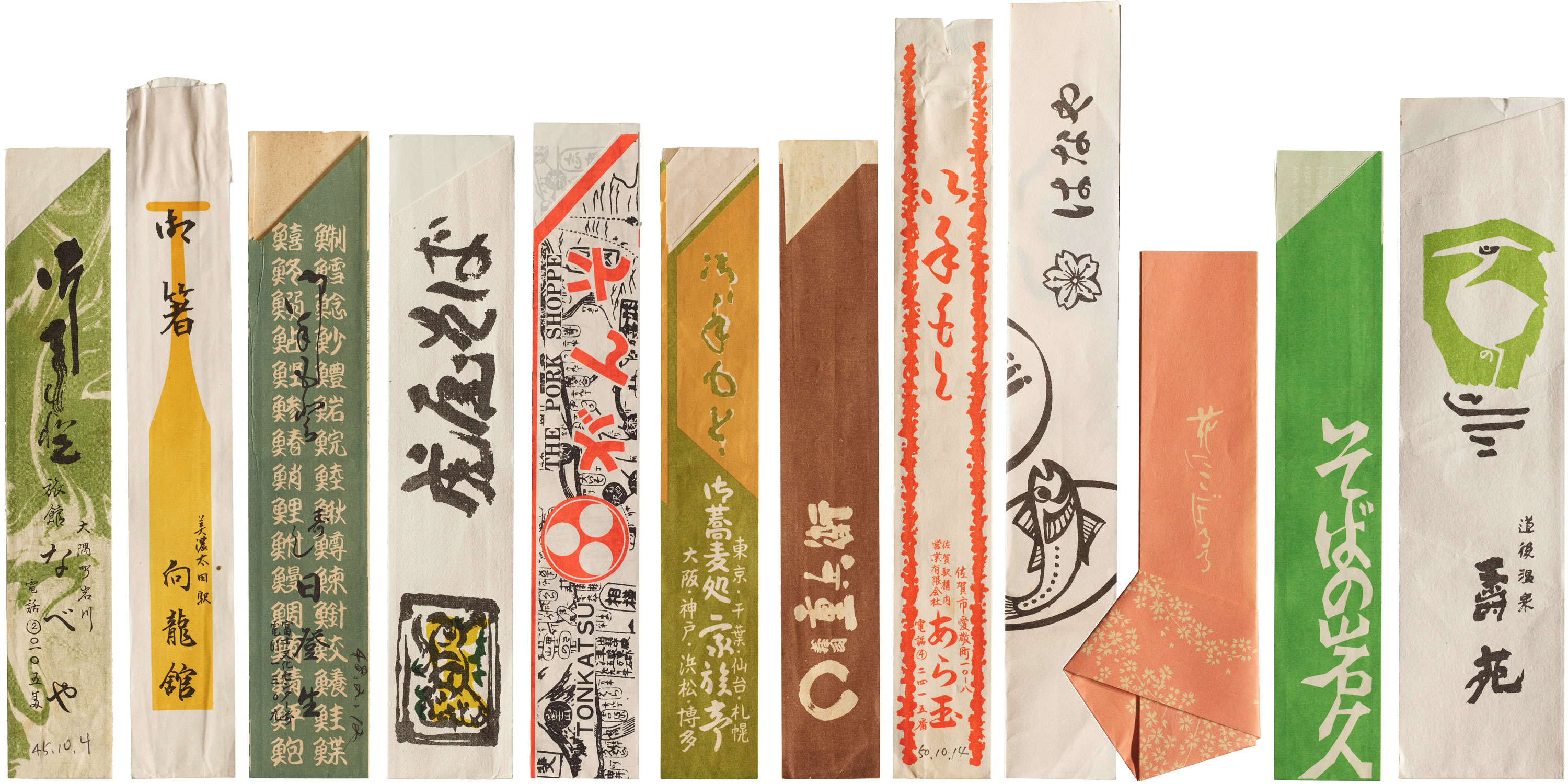
From Rarified to Commonplace: A Brief History of Hashibukuro
The chopstick sleeve originated in the Imperial Court of Japan sometime during the Heian period (8th–12th century). Ladies-in-waiting are thought to have wrapped chopsticks in scraps of silk or other fine fabrics as it was considered impolite to pass unwrapped objects from one hand to another. Hundreds of years later, hashibukuro (“chopstick envelopes”) graced the banquet tables of shoguns, and by the Edo period (17th–19th century), establishments in the Yoshiwara red light district furnished hashibukuro to their regulars.