This Just In: Chinese Lettering Manuals, 1930–1971
Our new meishuzi collection reflects a period of significant cultural change in China, and provides an uncommon source of inspiration for contemporary lettering artists and type designers.
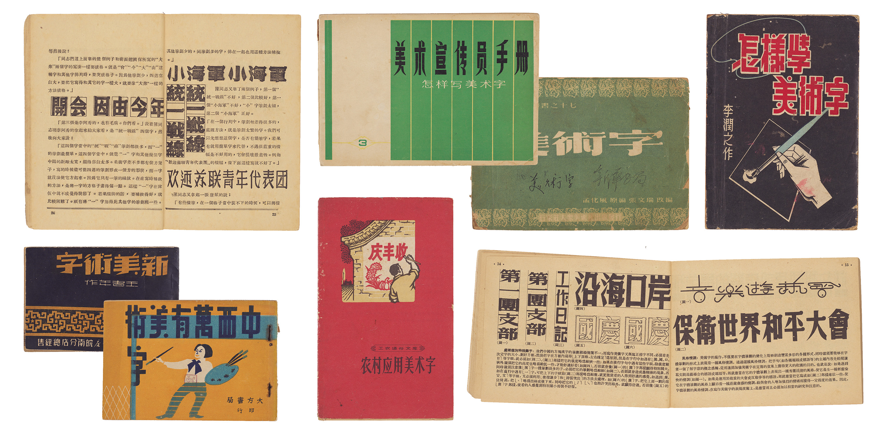
In our ongoing effort to expand the story of graphic design beyond the Western canon, Letterform Archive continues to collect objects that illustrate the development of the world’s writing systems. This means consulting with experts in those scripts, as we recently did with Synoptic Office, a design firm working internationally with a focus on cultural heritage and archival collections. Their research into the landscape of Chinese typography appears in The Bloomsbury Handbook of Global Typography. We asked their team to source Chinese lettering manuals that are otherwise inaccessible in the West. The resulting collection, gathered from bookshops and flea markets in China, is unusual for an American institution — and one that we were unlikely to acquire any other way. In this guest post, Caspar Lam and YuJune Park of Synoptic Office tell us what they discovered.