

News
Inside Super-Veloz: Joan Trochut’s Modular Modernism and the Dream of Typographic Abundance in Spain, 1930–1955
Celebrating the system of shapes for daydreaming printers, our new book presents seven design albums that help tell the story of Spain’s greatest adventure in type.
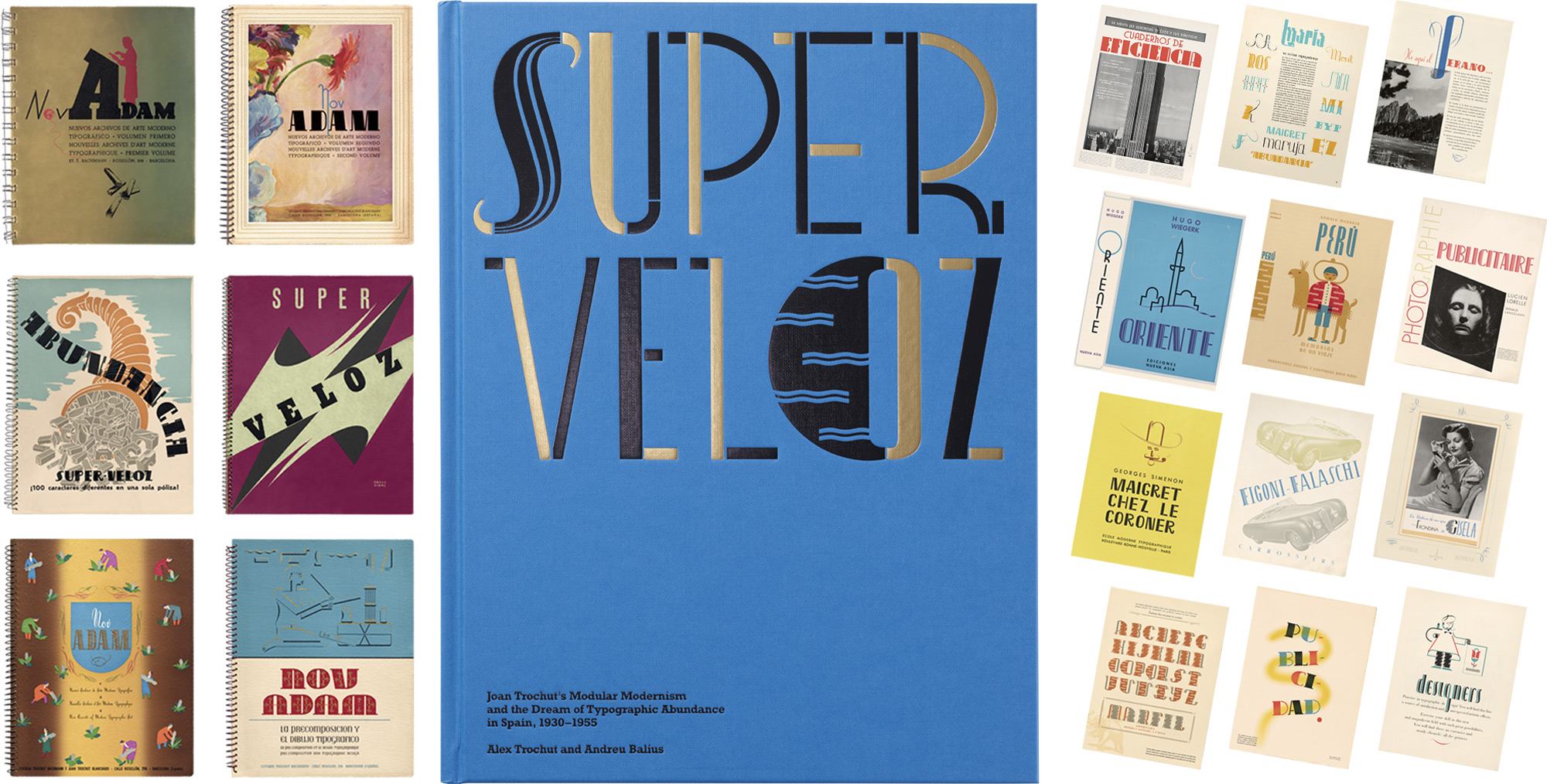
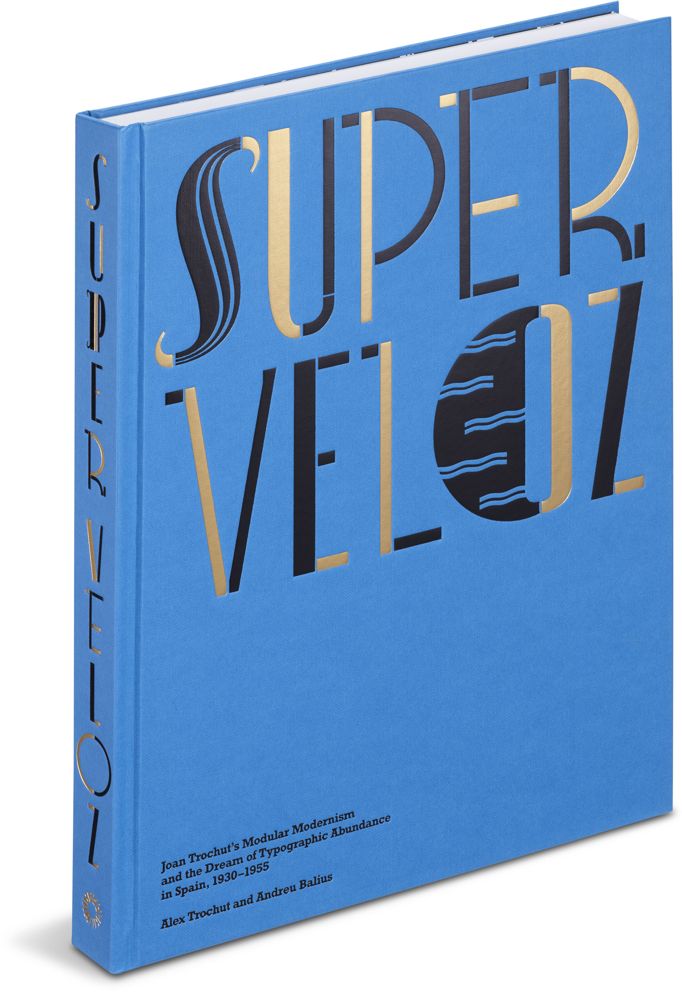
by Alex Trochut and Andreu Balius
Hardcover, 9½ × 12½ inches, 256 pages
Nothing looks quite like it, so all kinds of analogies spring up around Super-Veloz. Its modular pieces recall children’s construction toys, such as LEGOs or the earlier Meccano and Erector sets. Yet its printed results — often extravagant and asymmetrical, with gesticulative curls sprouting from lopsided letters and quirky illustrations — invite other references: the rubber-hose logic of early animation, perhaps, or the organic fantasies of Catalan architect Antoni Gaudí.
Its creator, Joan Trochut-Blanchard, had his own favorite metaphors. For Super-Veloz ads of the early 1940s, he called his system el tipo que vive (the living type), linking its fluid forms to the movements of sea creatures. (A seahorse swims in its early logo.) Later, he variously likened the system to a costume closet, a musical instrument, and even an illuminated manuscript made modern.
In Super-Veloz: Joan Trochut’s Modular Modernism and the Dream of Typographic Abundance in Spain, 1930–1955, authors Alex Trochut and Andreu Balius take readers past analogy, exploring both the history and the heart behind this eccentric wonder. An inspiring trip through the archives, their book gathers seven of the rare and remarkable albums that put Super-Veloz on the map, recovering in the process a singular moment in Spanish graphic design — one that resonates in striking ways with the present.
Today’s post introduces the subject of our latest book and offers an inside look at its creation.
Spanish Vanguards
In accounts of the modernist movements that shook graphic design in the 1920s and ’30s, Spain rarely receives more than a footnote. The Bauhaus in Germany, New Typography luminaries such as Piet Zwart, and designs in the United States, Great Britain, and France usually claim the spotlight, although the scale of change was truly global.
So, it’s remarkable to discover how energetically designers in Spain embraced and advanced a vision of typographic modernity at the time. In the years surrounding 1930, when Spain’s dictatorship gave way to what became the Second Spanish Republic, countless innovators including Pere Català Pic and Ricard Giralt Miracle reoriented the graphic arts in their country.
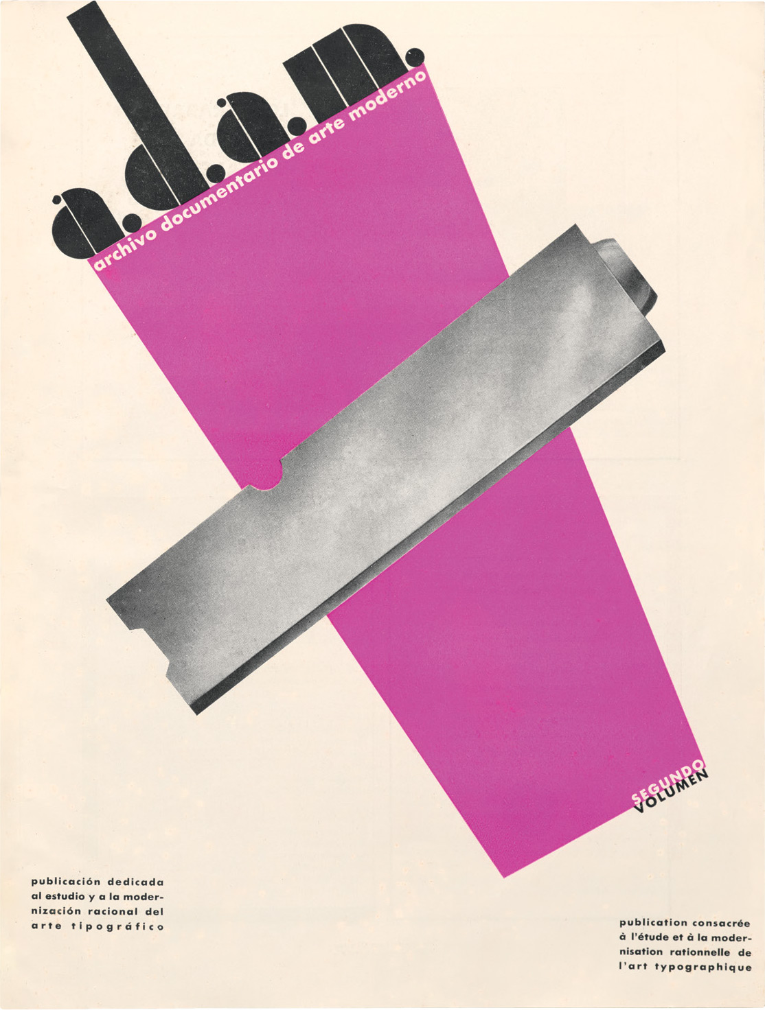
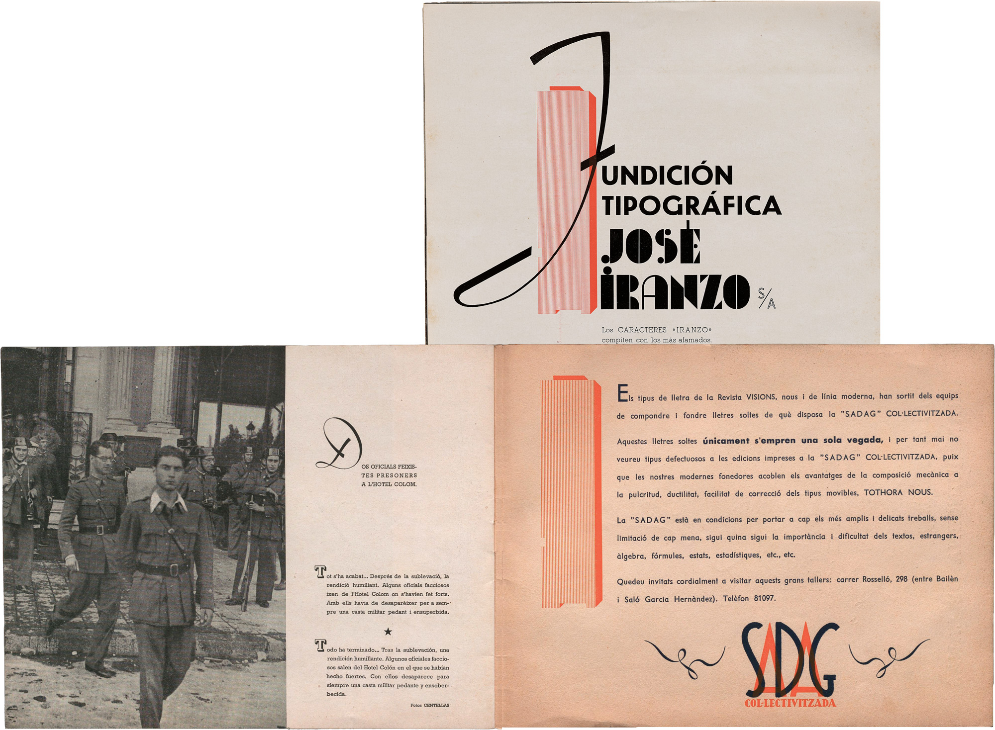
One of Catalonia’s leading voices was Barcelona printer Etienne Trochut-Bachmann. Through a series of elaborately crafted design albums called ADAM (short for Archivos Documentarios de Arte Moderno), he brought new typographic ideas into circulation and sought to inspire fellow printers with fresh compositions using the latest type, including a set of geometric ornaments from Barcelona’s José Iranzo foundry called Figuras Geométricas.
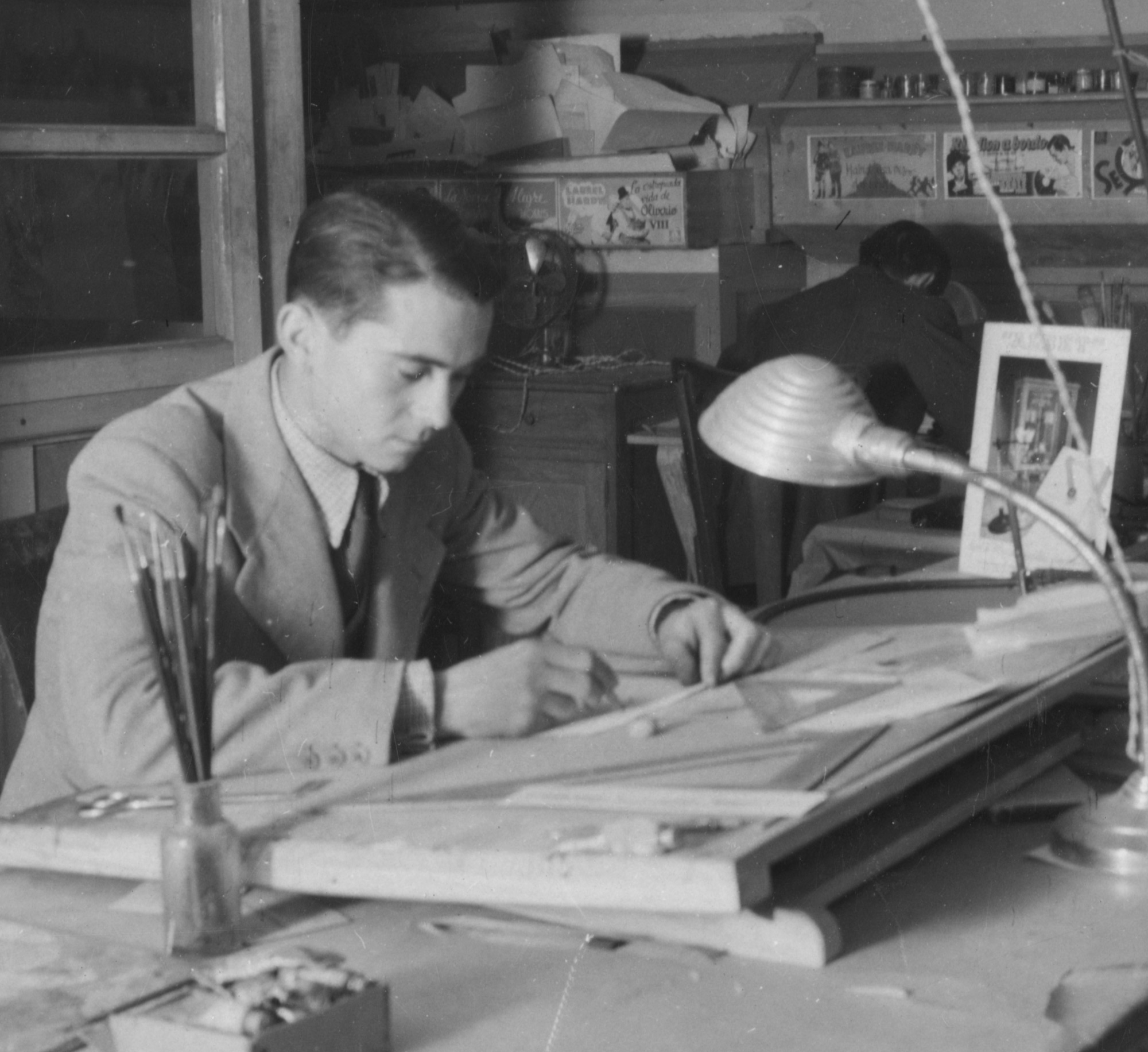
The ADAM albums traveled widely, reaching printers from South America to Central Europe, but their greatest impact would be felt close to home, where Etienne’s son, Joan, absorbed their lessons and soon embarked on a typographic career of his own.
In 1935, Etienne co-founded an ambitious new printshop and set to work on a new series of albums called NOVADAM, assembling even more ambitious experiments and original artwork by Joan. The first 70-page volume couldn’t contain their creativity, and a sequel promised to be on the way. But before any of the type could be set, war and revolution broke out.
A 1936 reactionary attempt against the Republic threw Spain into turmoil and sparked a revolutionary movement that collectivized many Barcelona businesses, including the Trochuts’ printshop. Type and ornaments once used in NOVADAM now graced vanguardist books and pamphlets. For a few desperate years, amid resistance to Franco’s nationalist forces, scarcity stalked the city and fates hung in the balance. So, too, did the future of artistic modernism. Joan, whose youth and circumstances kept him out of the fighting, quietly tended its fires during these years of upheaval, pursuing a new project born of the moment — a dream of freedom and abundance in type.
Stem, Stroke, Swash

Joan’s ideas developed in response to the modernist idioms that flowed from the Bauhaus and the New Typography, which had promoted unadorned functionalism and the use of elemental shapes: circle, triangle, and square. Sympathetic to their constructive spirit, Joan nevertheless felt they had too severely restricted typography’s range of expression, and he found their geometric forms to be at odds with the essential structure of letterforms , the basic material of print design.
Joan’s answer was to start, instead, from the familiar forms of letters, carving these into detachable elements printers could use to build compositions. The first published draft of his concept, a registration filed only months after Barcelona’s fall to Franco, shows this work still in process, with fragmented Es, Gs, and As visible among myriad simple shapes and decorative flourishes.
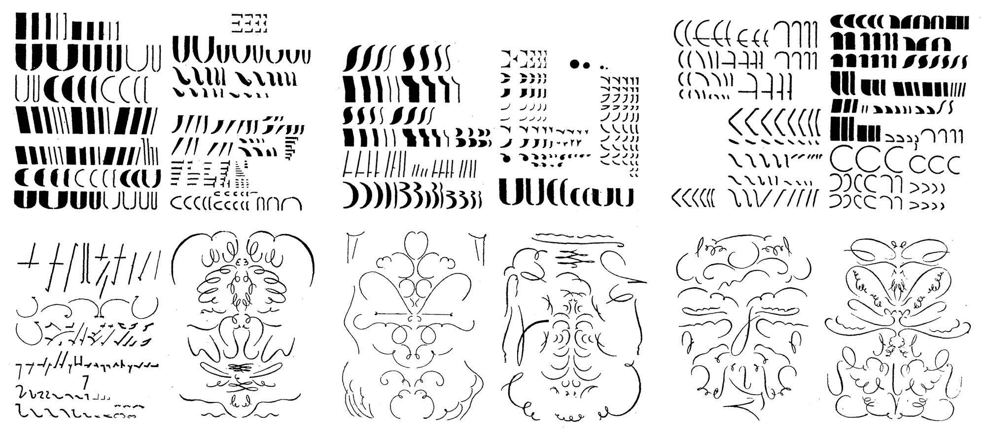
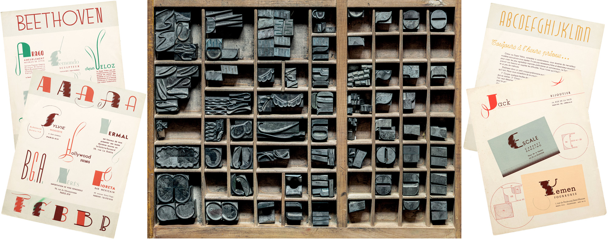
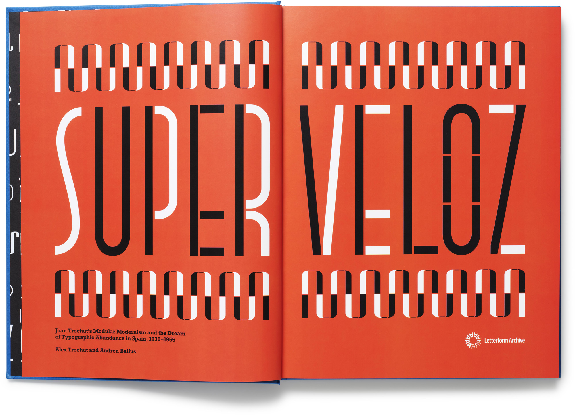
In collaboration with the Iranzo foundry, Joan refined the system that they ultimately released as a collection of around 200 metal type pieces in 1942. With 14 base shapes or stems, a range of secondary stroke-like elements, and a variety of calligraphic swashes, SuperTipo Veloz (literally, Fast SuperType; later called simply Super-Veloz) was a unique generative toolkit for constructing letters to fit almost any purpose, mood, or idea.
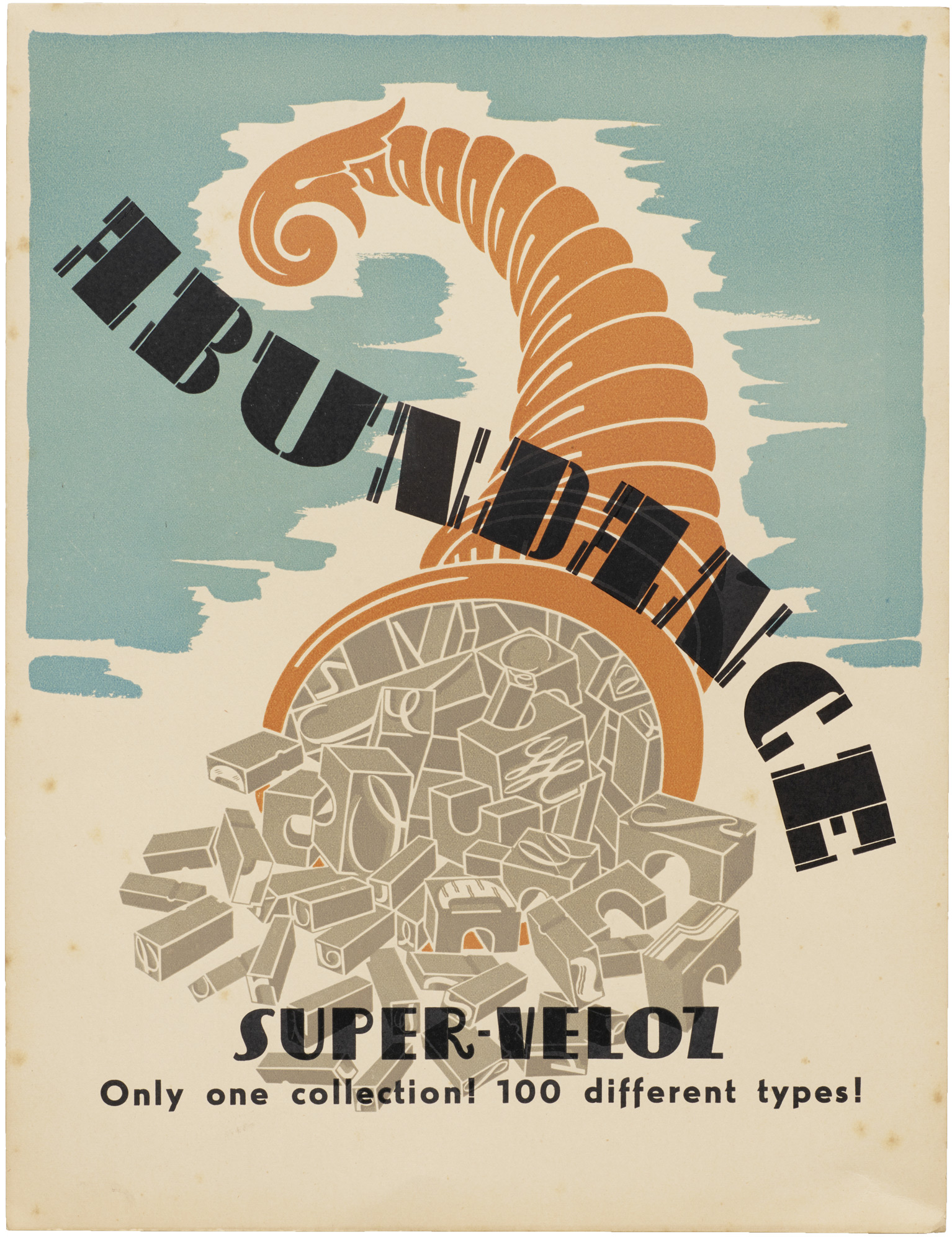
The system contained elements for building simplified geometric sans serifs, but it also had pieces for making high-contrast serifed Didones and the elegant scripts beloved by Spanish designers since the days of calligrapher Ramón Stirling. Promising the equivalent of 100 typefaces in a single font, as well as unprecedented creative freedom for its users, it was an audacious product. It was also a significant financial risk. If Joan and the foundry wanted working printers to adopt this complex creative tool, he would need to show them all it could do.
“Make Your Letters Yourself”
The NOVADAM series, put in 1936, now became a primary vehicle for showing Super-Veloz in action. A second volume, launched just as the type hit the market, set the pattern for a string of new publications that often blurred the boundaries between type specimen, artist’s book, and design manifesto. One series of movie flyers in this album pairs Super-Veloz titling with copy set in the latest typefaces of the day, offering a subtle masterclass in harmonizing layouts. A surviving handmade draft shows the extent of the planning behind each of its pages.
All images in the gallery below are hi-fi captures. Click an image to enter fullscreen view, then click or pinch to enlarge.
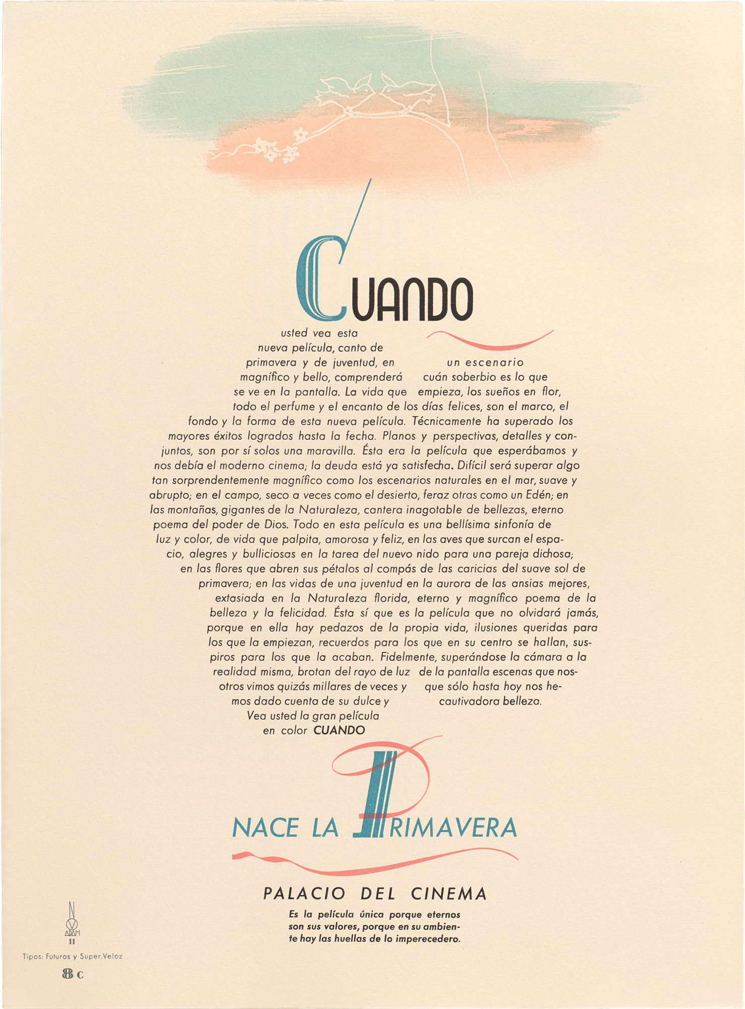
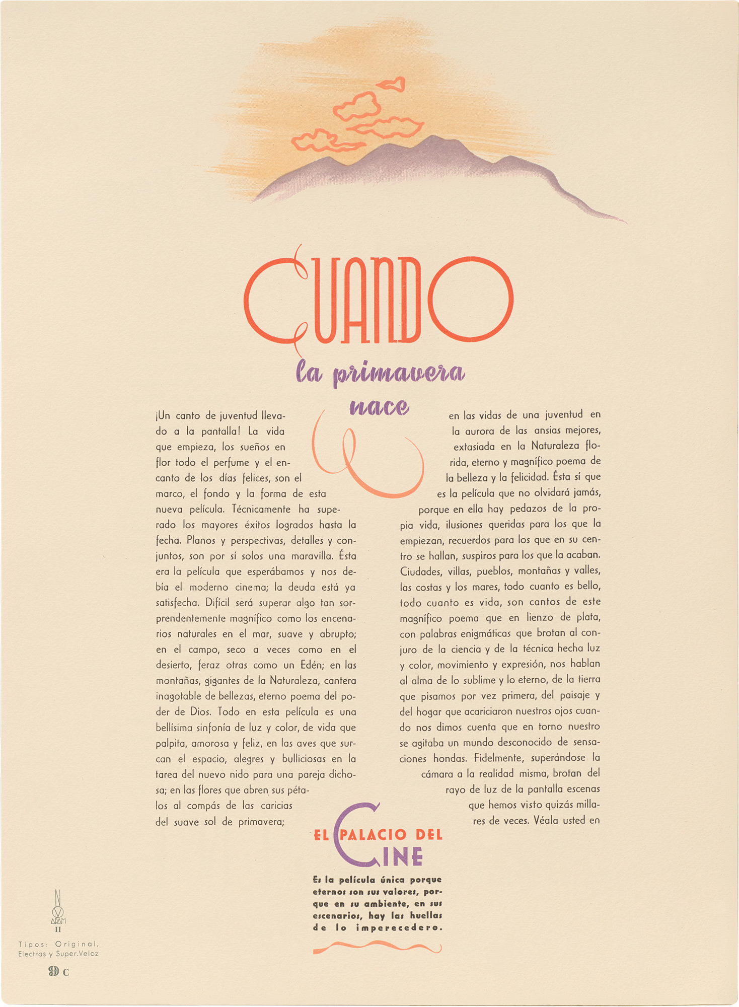
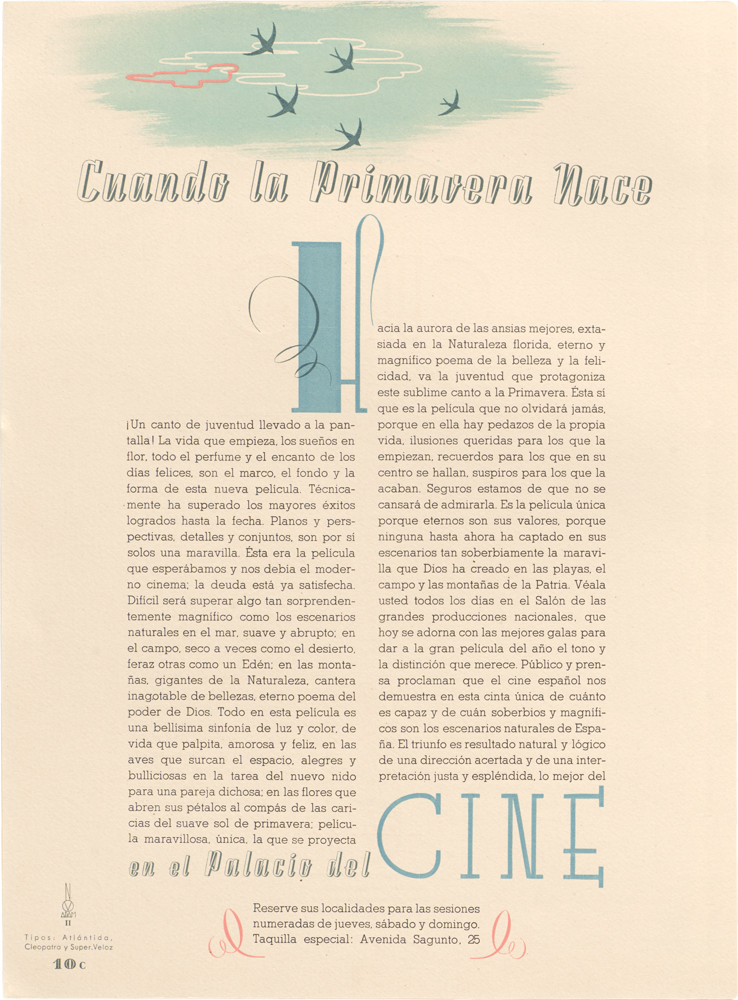
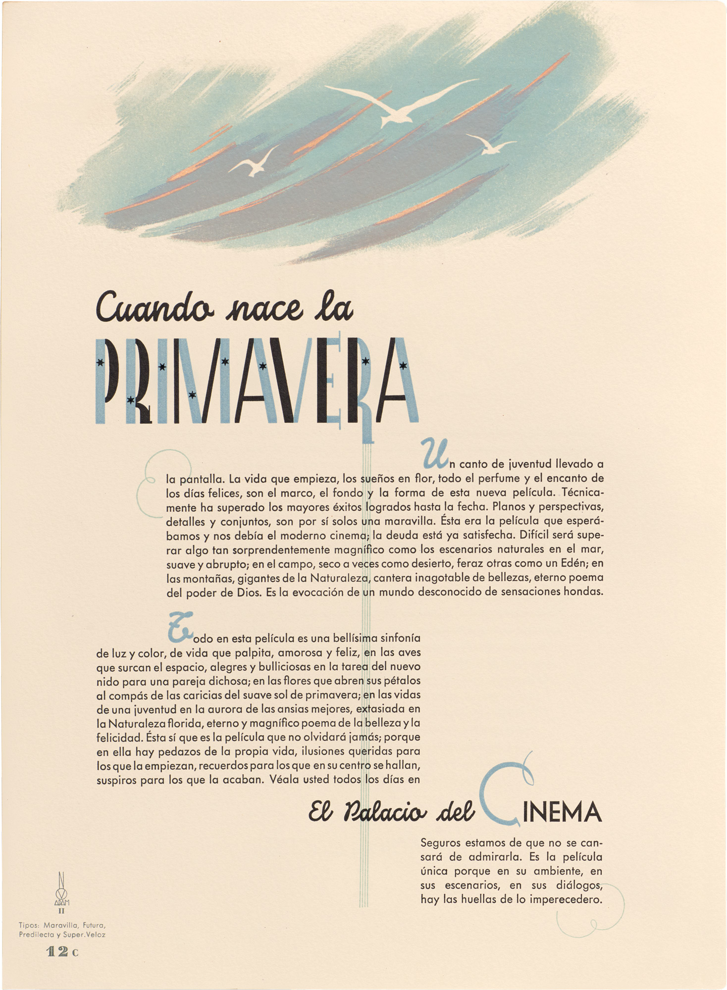
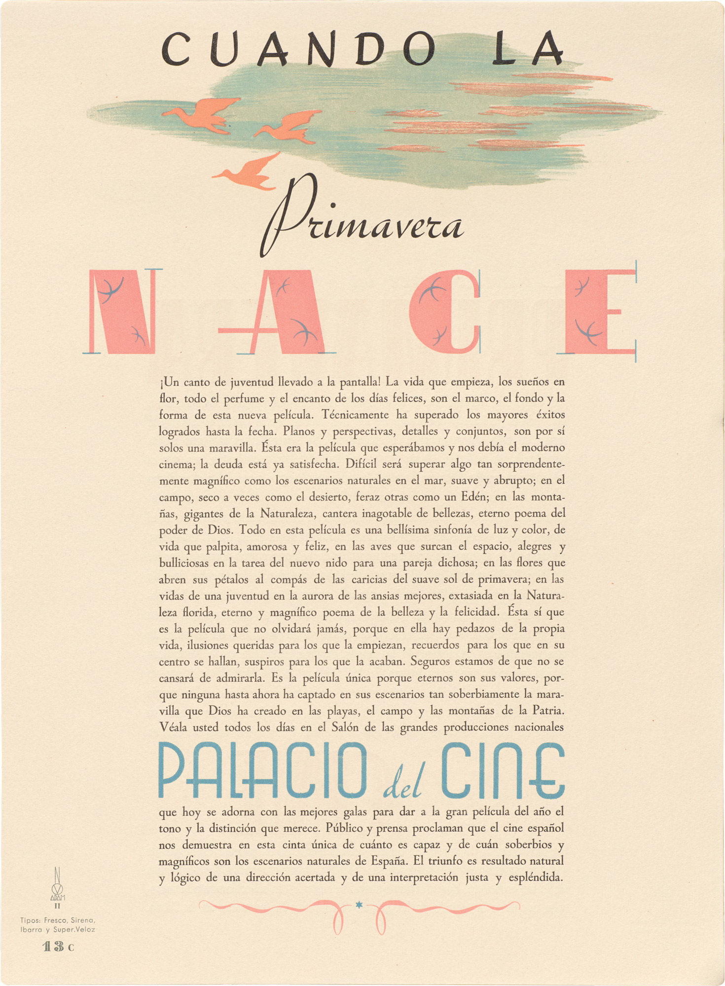
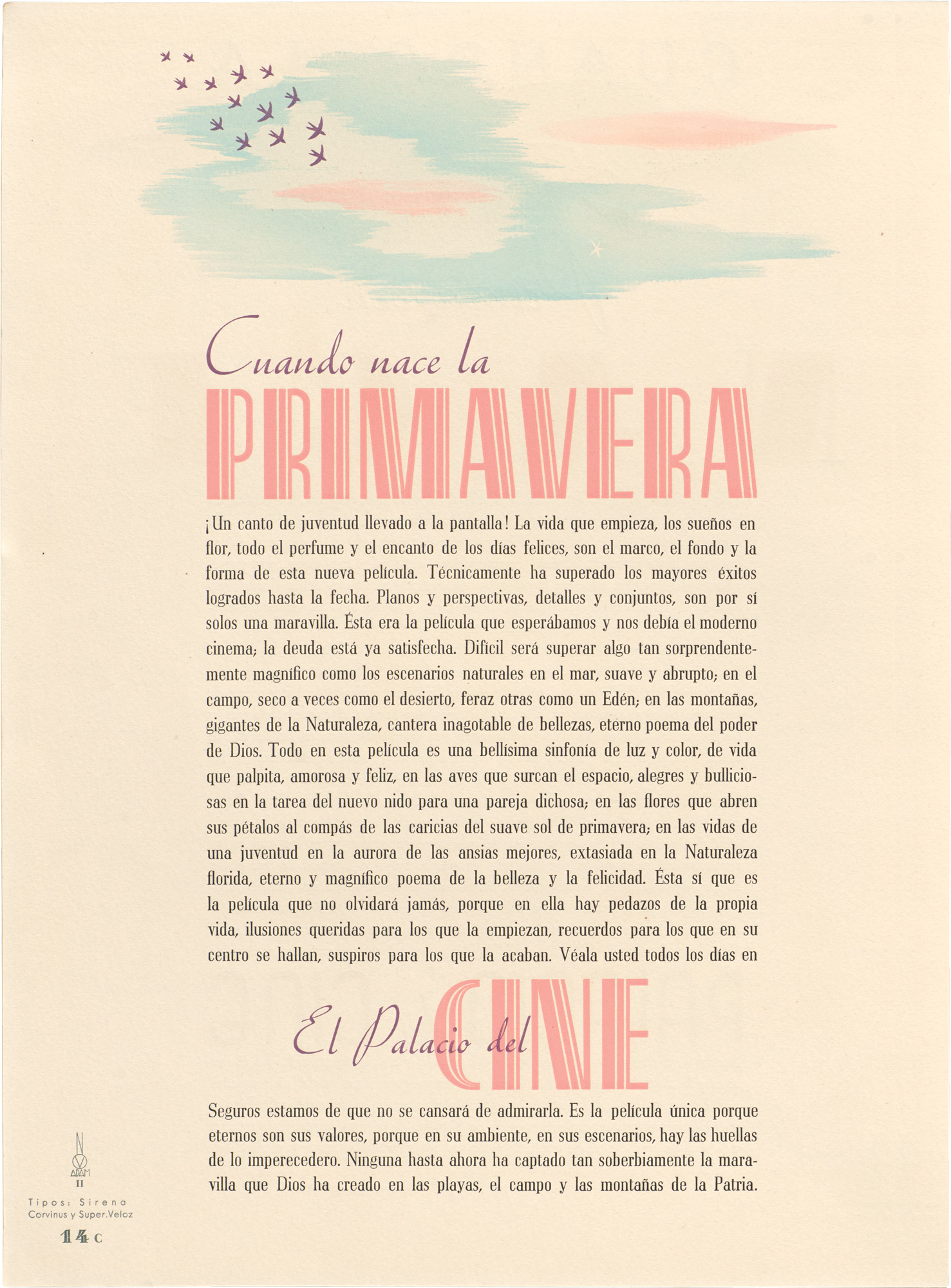
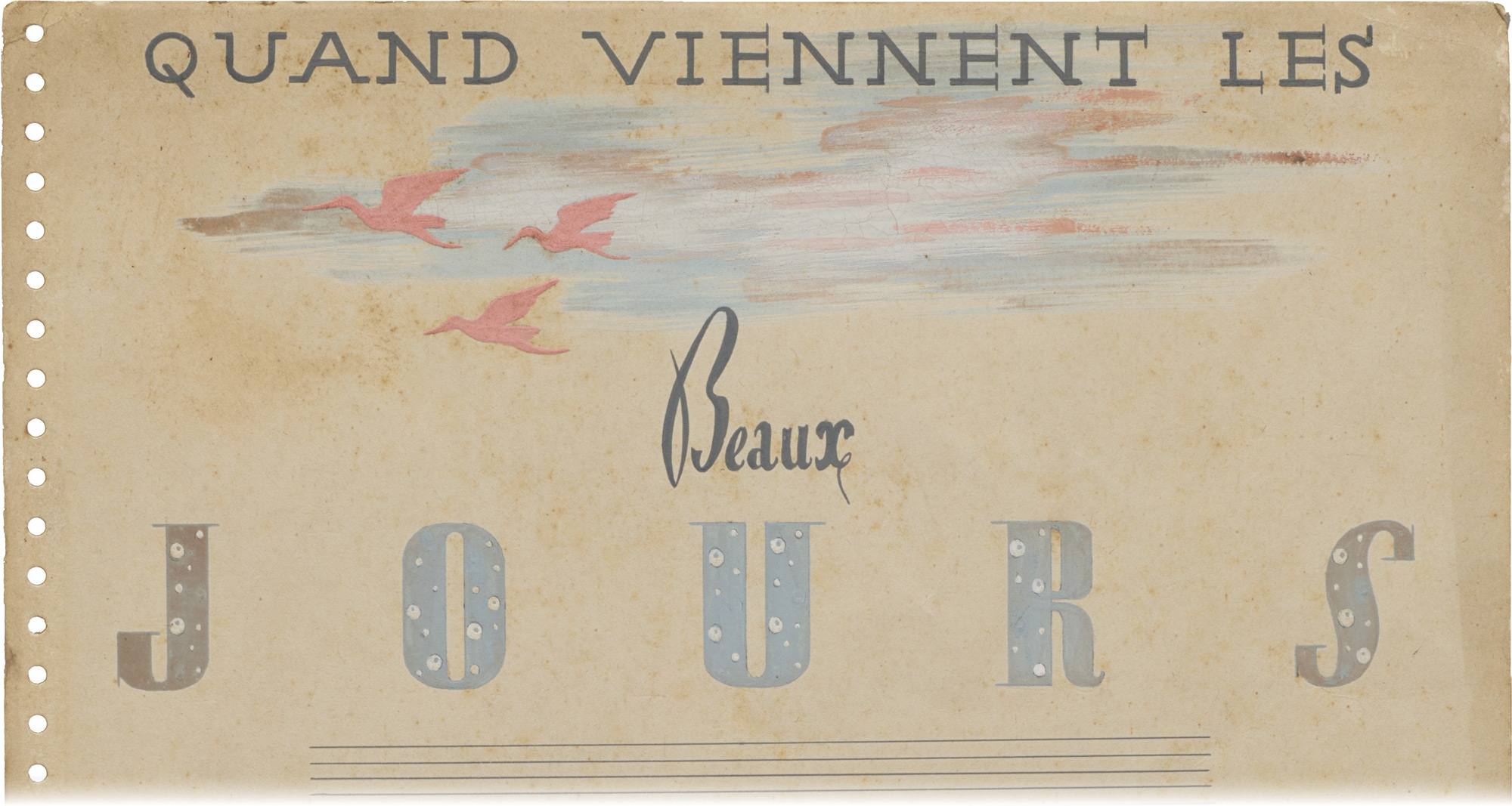
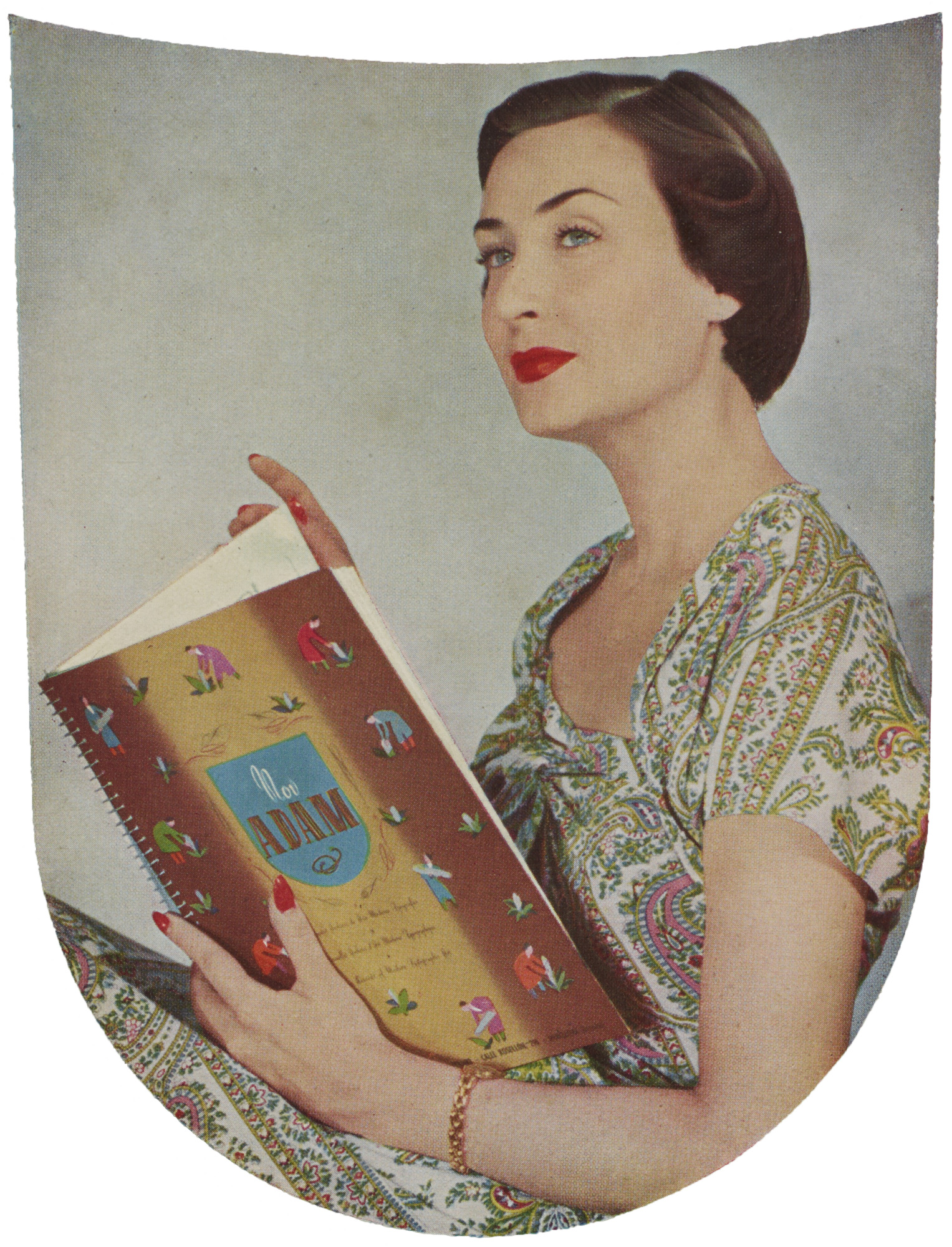
Later volumes took things even further. NOVADAM 3 (1948), for instance, turns Super-Veloz into a tool for illustration (not just lettering) and brings a crop of newly released elements into play. Published at the height of the type’s success, as it made its way into France and surrounding countries, the album presented itself as a road map for a new typographic moment.
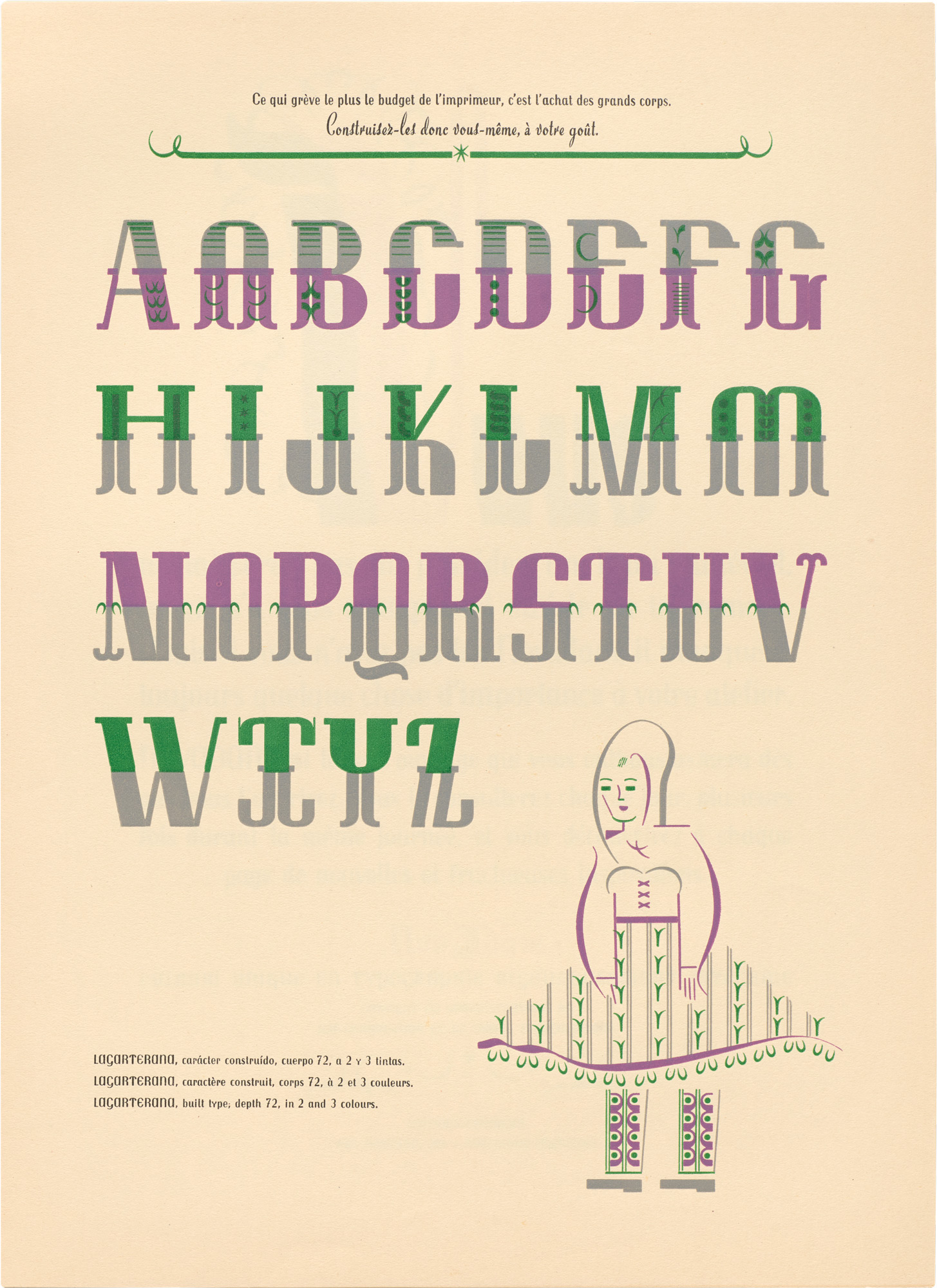
Pages of veritable Super-Veloz typefaces with names such as Fauno (Spanish for faun) and Marfil (Spanish for ivory) guide printers’ use of the type while delighting in the potential for variation. Here, Joan freely stretches and compresses letters, modulates x-heights, swaps angles for curves, moves heft around, remixes patterns and serifs, switches colors, or drops in dramatic loop-the-loops. Anticipating the variable fonts of today’s digital platforms by decades, each one of these pages encourages readers in Spanish, French, and English to “make your letters yourself.”
All images in the gallery below are hi-fi captures. Click an image to enter fullscreen view, then click or pinch to enlarge.
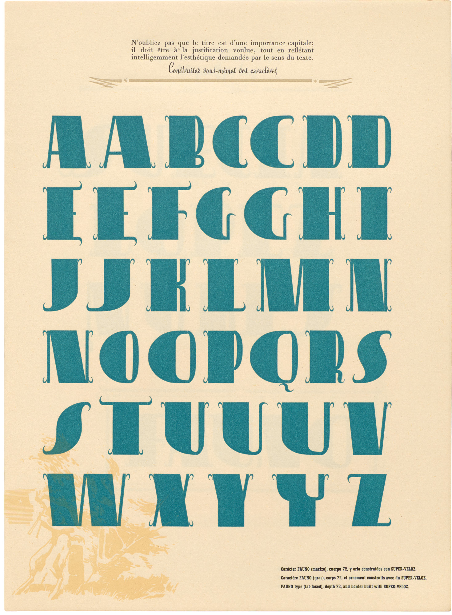
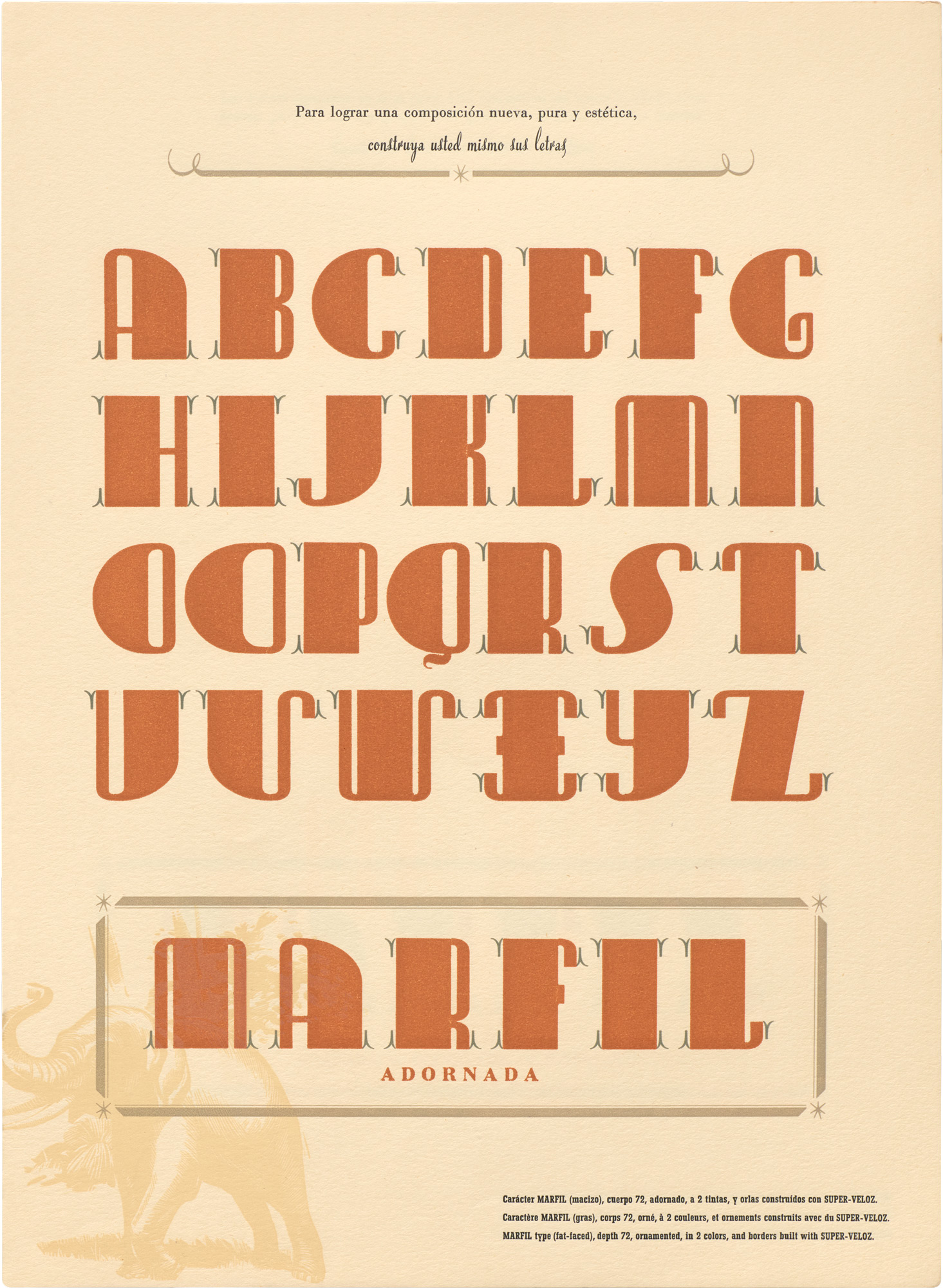
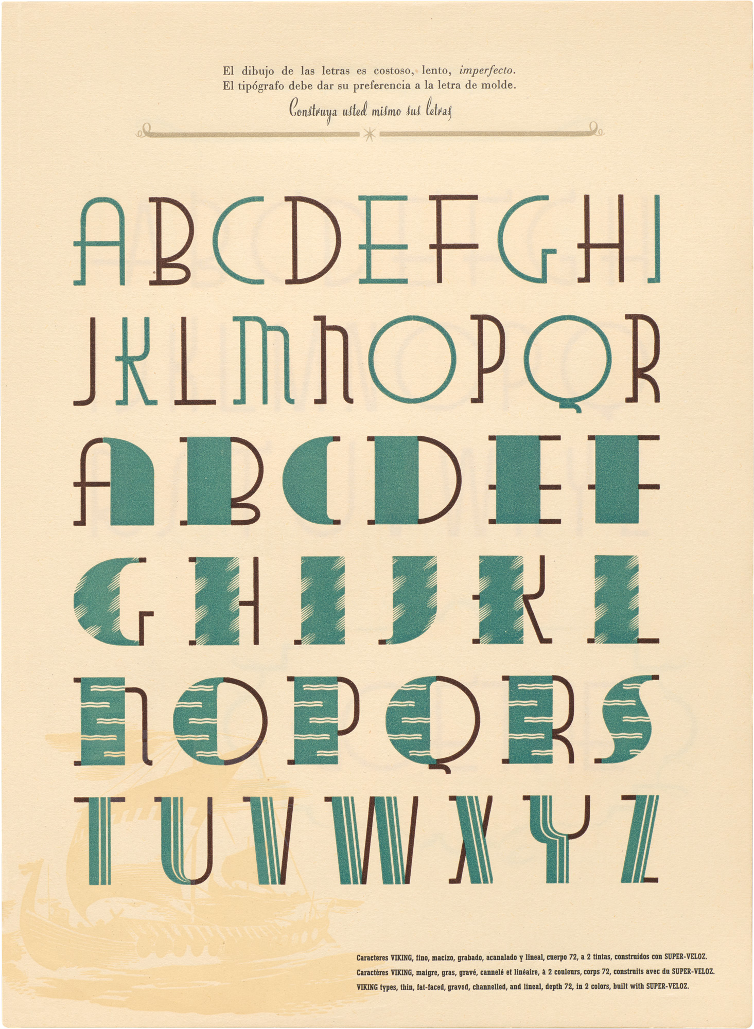
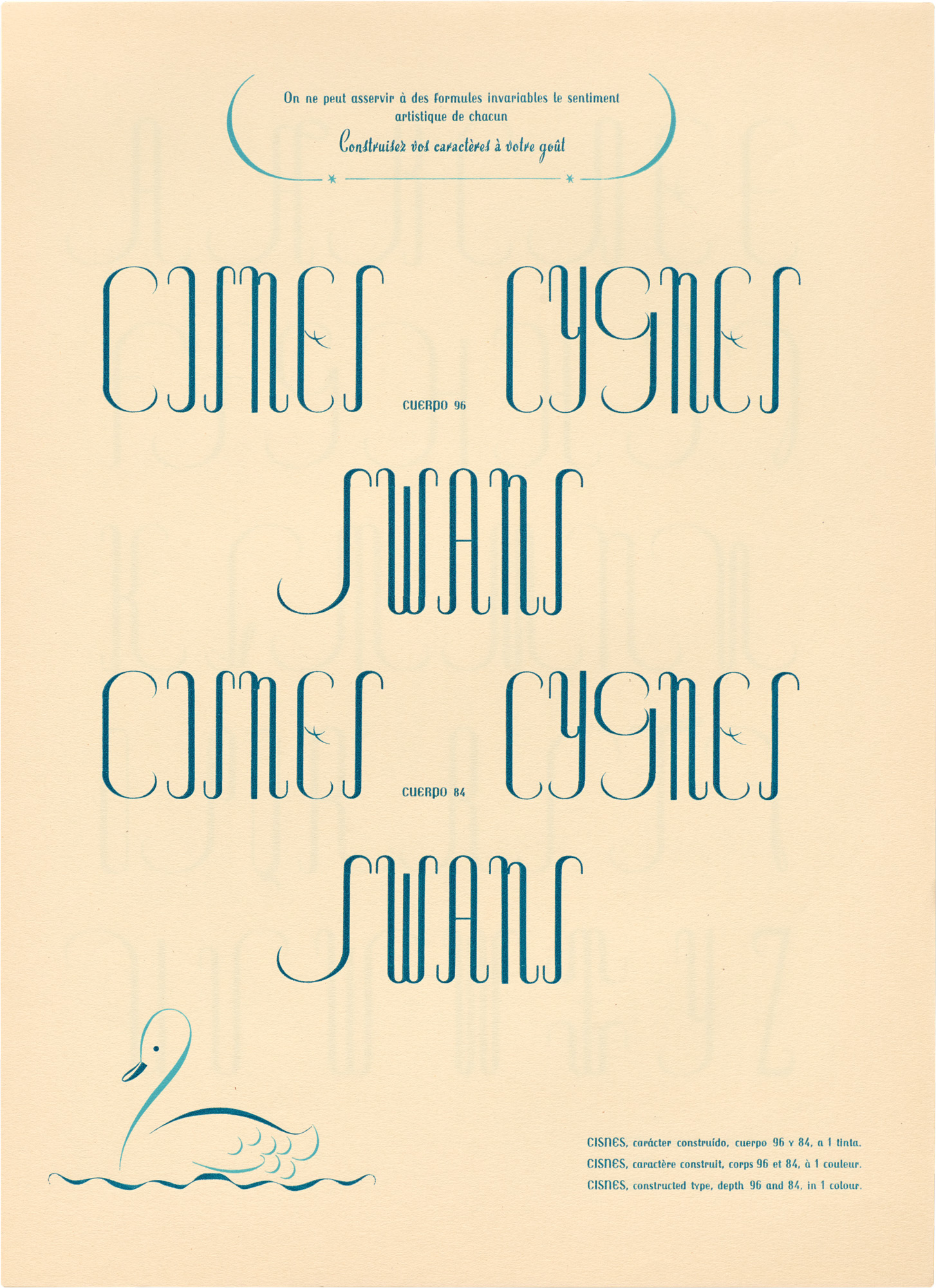
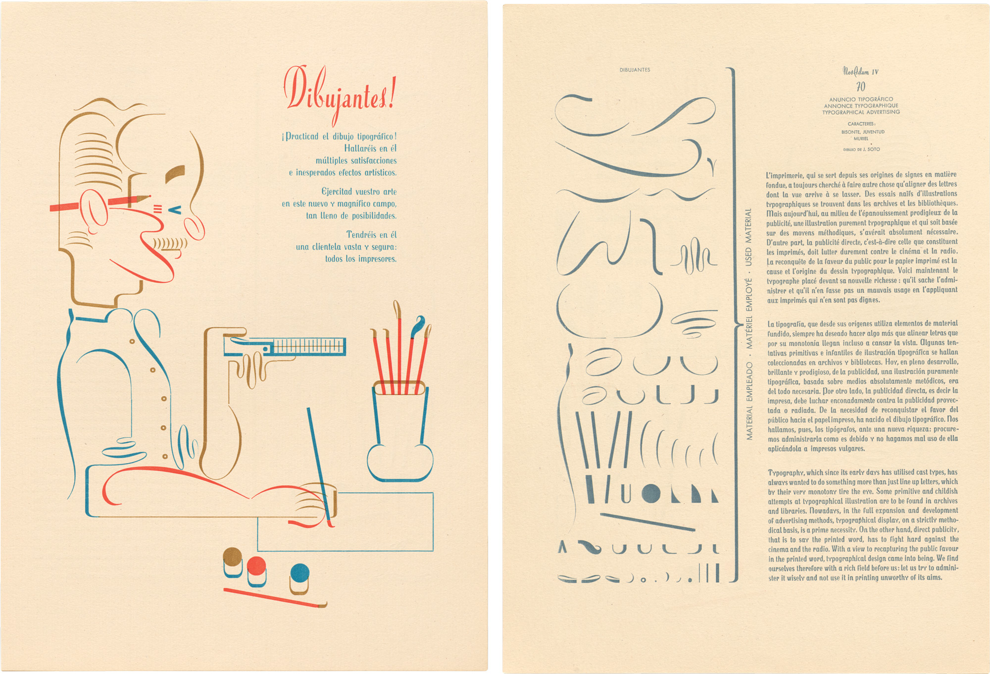
The skill and perfection of the Trochuts’ design albums did, however, leave an aura of mystery around how they were made. Only the fourth and final NOVADAM, a 1952 masterpiece with more than 200 purely typographic compositions, finally lifts the curtain on the design process, showing the exact pieces used for each of its charming constructions.
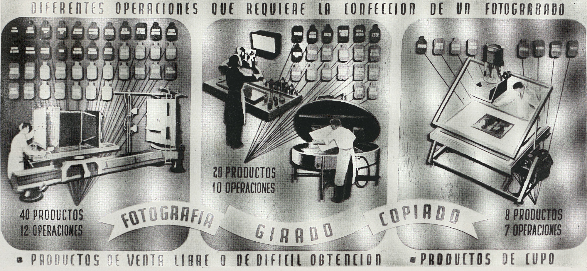
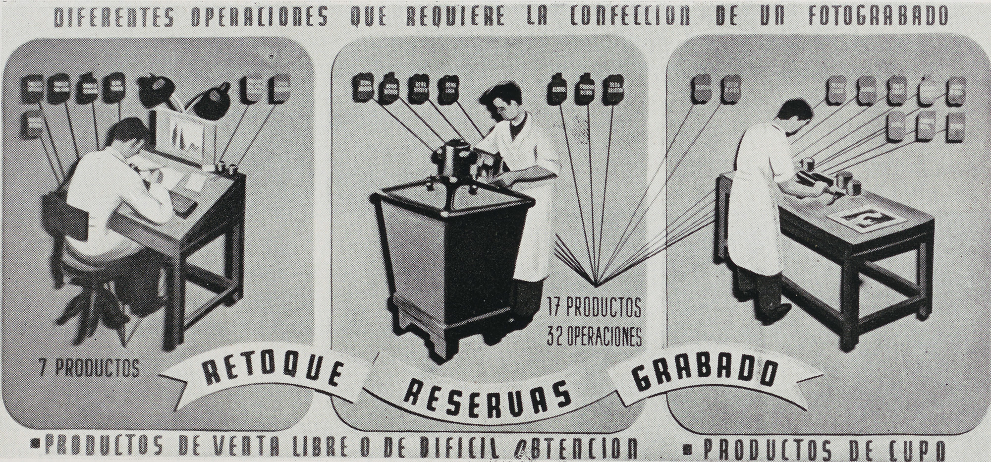
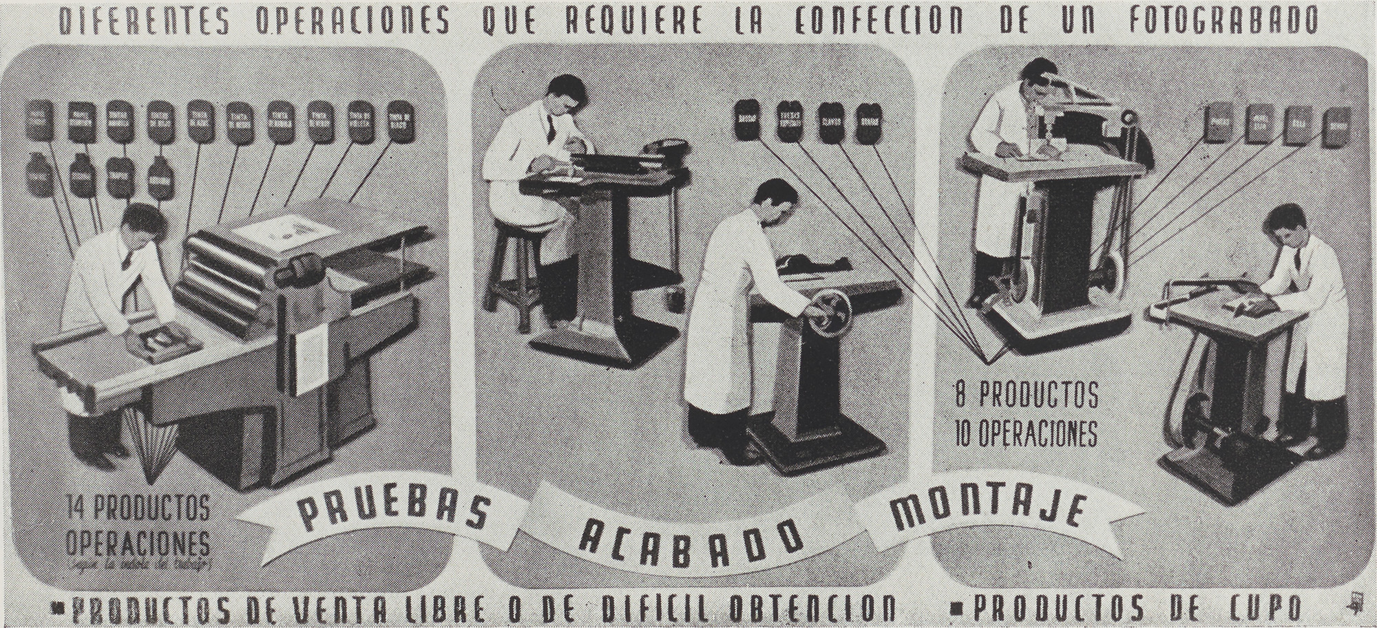
If nothing about this modular typesetting practice seems particularly veloz (fast), it’s important to remember its moment. Through the first half of the twentieth century, commercial letterpress still dominated the industry, and custom lettering and illustrations usually made their way into print only through labor- and capital-intensive processes such as photoengraving. A series of diagrams from a Spanish trade journal shows the immense arsenal of materials, machines, and skills this process required — all after an artist completed a design by hand.
The diagrams below show the steps involved in making and printing with a photoengraved plate. Click an image to enter fullscreen view, then click or pinch to enlarge.
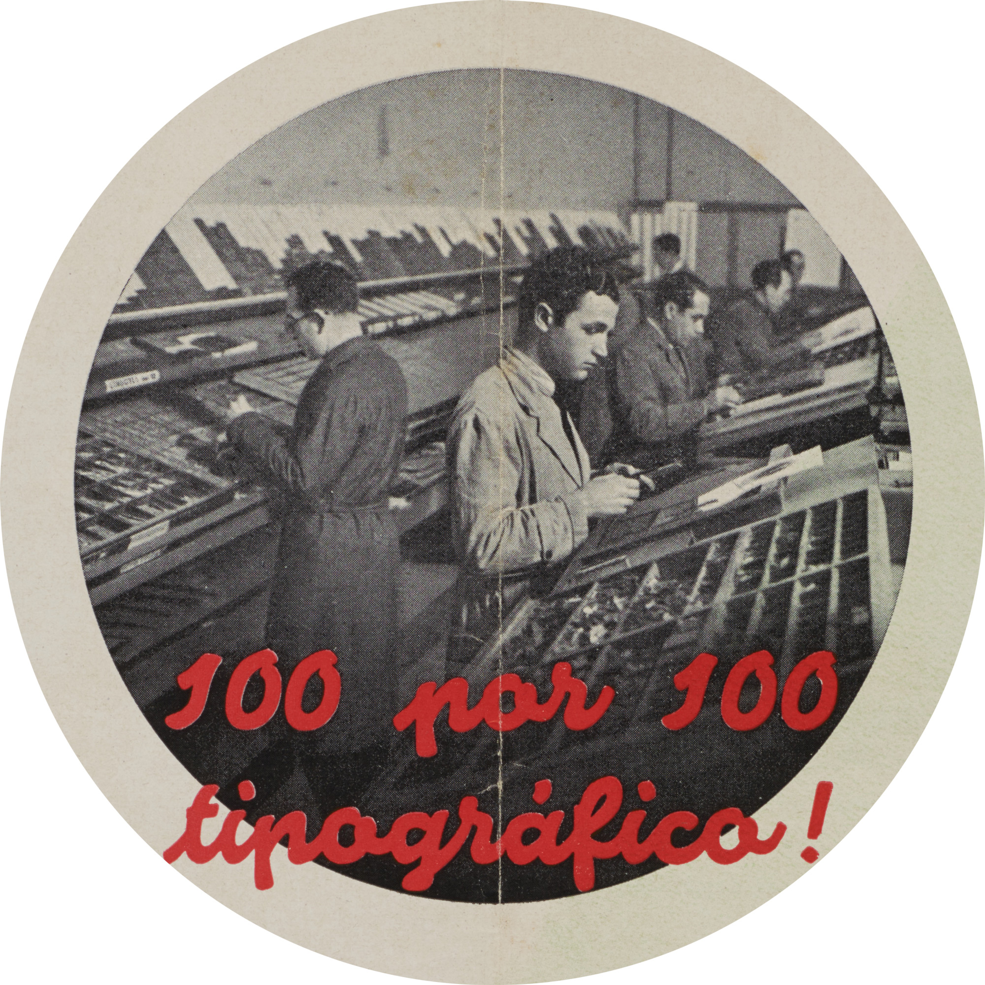
Super-Veloz, by contrast, needed only paper and ink, a press, and the kind of elbow grease printers had known since Gutenberg. In post-Civil War Spain, when hundreds of small letterpress printers still served local clients and industrial resources often proved scarce, this “100% typographic” design system could reasonably claim not only an aesthetic edge, but a practical one as well.
The swift rise of offset printing and phototypesetting from the 1950s, and the subsequent shift to digital, changed all that. In one sense, the technologies that replaced letterpress printing realized Joan’s dreams in new ways, offering more direct control to creatives and making type more malleable than ever before.
Still, looking back on the story of Super-Veloz, something important was lost with the type’s disappearance. Thanks to a renewed interest in modular and generative type — see, for instance, Misha Ivanov’s Void or the Tangent Superfamily by Deborah Khodanovich and Saachi Mehta — many are now rediscovering that there’s something special about finite formal design systems with flexible combination rules. In the ways Super-Veloz intrinsically balances stylistic consistency with limitless invention, for example, we can discover valuable lessons for working in pixels, prompts, and Bézier curves today.
Since the type’s digital revival in the early 2000s, designers have been able to experience the magic of Super-Veloz for themselves — something everyone can now do via an online composer at super-veloz.com. Yet much of its history has remained unknown, and few have seen the landmark albums where it found its voice. Now, with the publication of Super-Veloz, we at last have its story.
Sharing Super-Veloz
Authors Alex Trochut and Andreu Balius have been stewards of this story for more than twenty years. When the two designers first collaborated on the digital revival of Super-Veloz, they visited print archives and solicited personal memories to begin reconstructing the lost legacies of the type. Their new book is the culmination of this research, offering both an intimate portrait of the talent behind the type and a sweeping study of its origins and significance. More than a comprehensive study of a typeface, Super-Veloz uncovers many of the key ideas and unique circumstances that shaped graphic modernism in Spain.
“Joan’s Legacy”
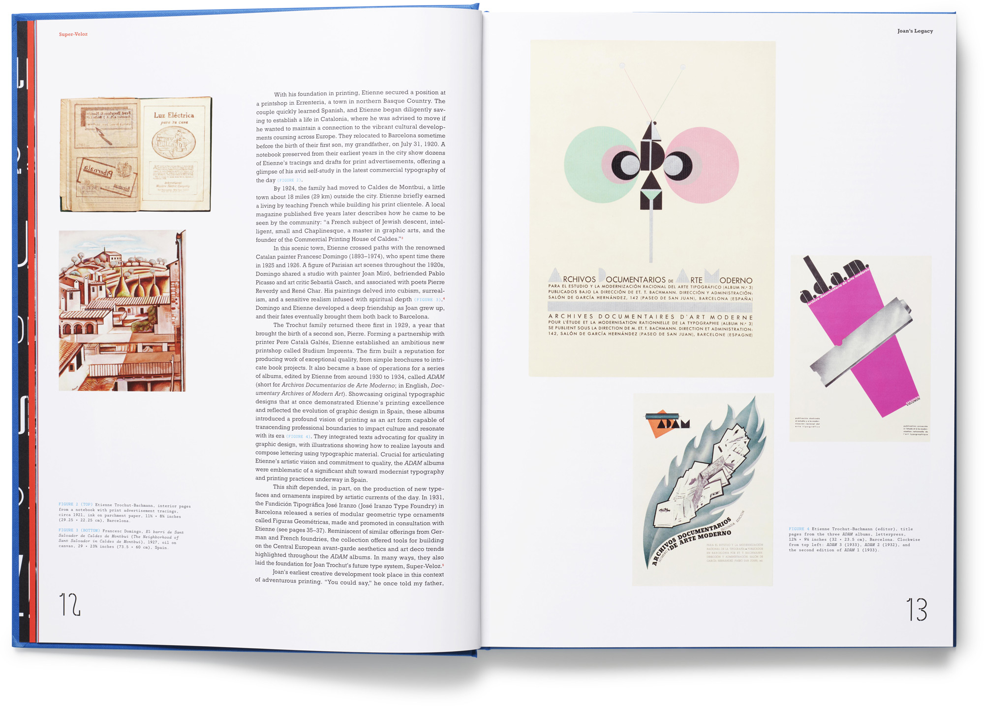
Alex Trochut’s contribution explores the life of his grandfather, Super-Veloz creator Joan Trochut, through facts gleaned from family interviews, private papers, and original process work. Following Joan’s career from his earliest years in his father’s printshop, he evokes the warm spirit of a playful yet modest master of his craft, touching on Joan’s varied influences (including artistic mentor, Catalan painter Francesc Domingo) and revealing how personal passions and historical events shaped his achievements. Preserved drawings for Super-Veloz pieces, sketches for alphabets, and work for other projects enrich this biographical study of a twentieth-century design legend.
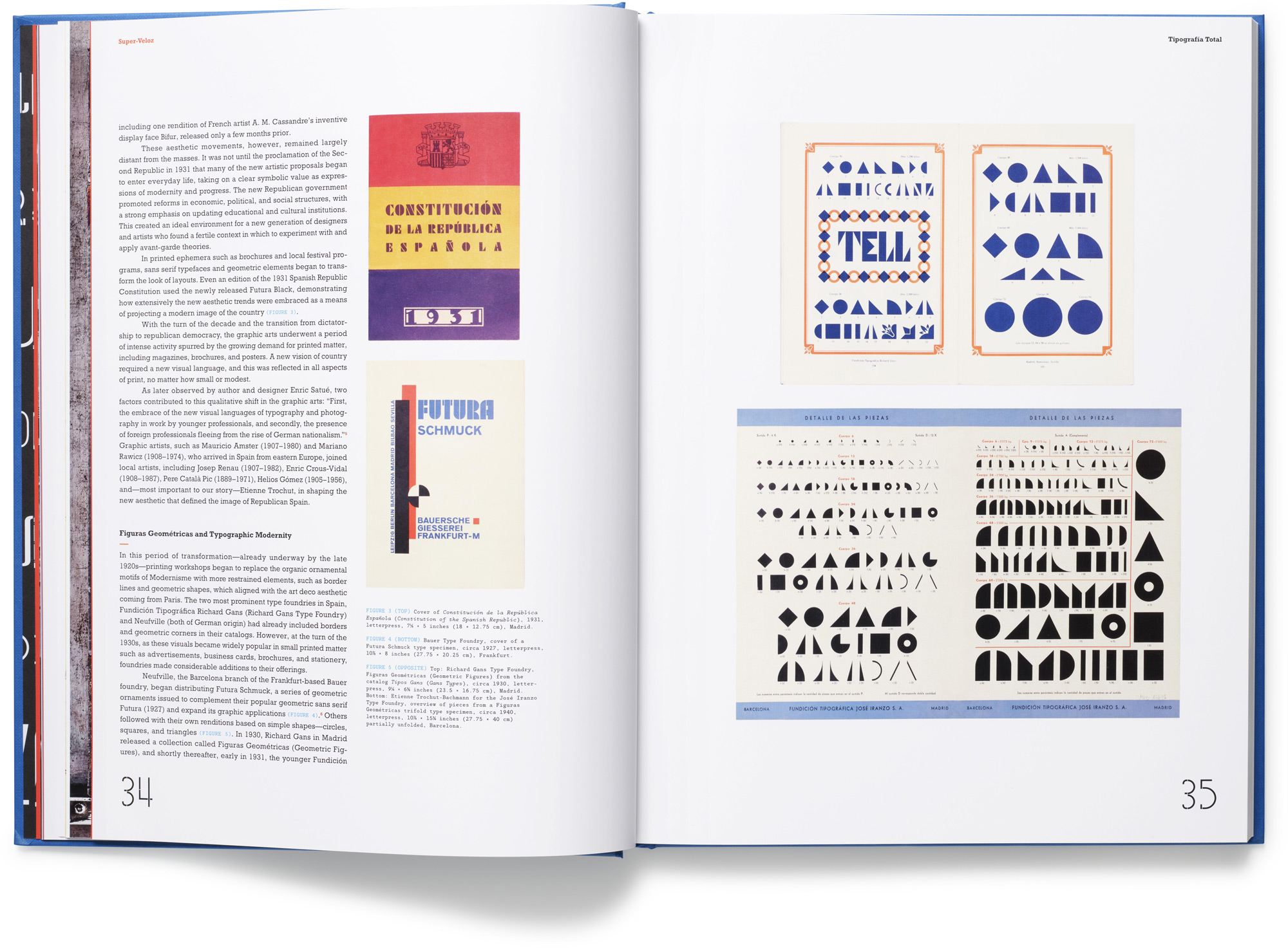
“Tipografía Total: Super-Veloz and its Contexts”
Andreu Balius’s far-reaching study of the Super-Veloz system sheds light on its inner workings, explores its animating ideals, and considers its singular importance for artistic modernism in Spain. Tracing the type to its avant-garde roots, Balius demonstrates how it put radical design ideas into practice while addressing a series of material challenges faced by Spanish printers. Through close readings of the ADAM and NOVADAM albums, Balius reconstructs Joan and Etienne’s shared vision for a tipografía total (total typography) — a unique modernism aimed at transcending the New Typography through a synthesis of craft traditions and playful expression.
A comprehensive anatomy of Super-Veloz, details about its development, and an overview of the novel techniques it encouraged provide a clear picture of exactly how it was used, while insights into its reception help make sense of its momentary success in Spain and abroad. Relating the type’s rise and fall to broad changes in type and technology, Balius finally explores the rediscovery and renewal of Super-Veloz in recent decades.
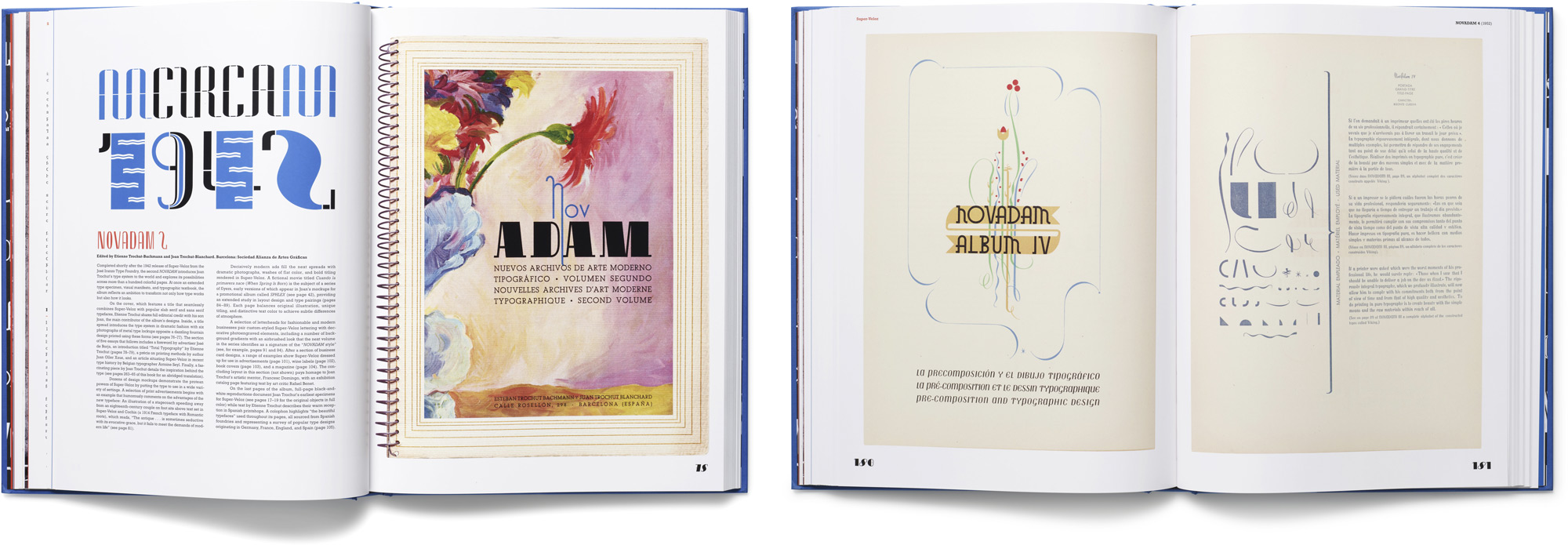
The Albums
Following the essays, 200 pages of brilliantly reproduced selections take readers inside some of the most ambitious works ever produced on letterpress. The book traverses all four volumes of the NOVADAM series and multiple catalog specimens dating from the 1930s, ’40s, and ’50s. Dozens of designs for logos, letterheads, book covers, and layouts showcase a medium taken to its limits using multiple inks, dramatic print effects, and period typefaces. Hundreds of Super-Veloz constructions run the gamut from modernist abstraction to sinewy elegance and gawkish fun, while a broad sampling of Super-Veloz alphabets and NOVADAM 4’s how-tos offer a comprehensive look at Joan’s artistry.
Translations, Foreword, and More
Four extended artistic statements penned by Joan and Etienne Trochut appear in translation for the first time. Voicing an unrestrained modernism aimed at maximizing type’s expressivity, these texts challenge dominant views of the era and reveal the theoretical underpinnings of their work. A foreword by Herb Lubalin Study Center Director Alexander Tochilovsky, whose 2018 Letterform Lecture introduced many to Super-Veloz for the first time, plus a series of album introductions offering valuable context and commentary, round out this definitive work.
Honoring a Lost Icon
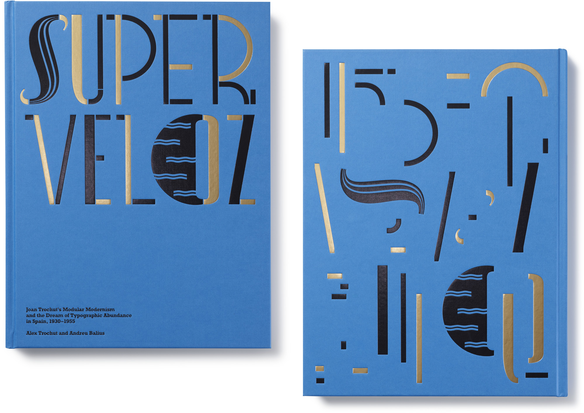
To help realize Super-Veloz, we enlisted the talents of Spanish–American designer and visual artist Pablo Delcan, whose cover and interior concepts show the type’s contemporary side. An elegant foil-stamped and debossed case features Super-Veloz pieces assembled into title lettering, then dissembled into an abstract composition on the back. Dynamic section openers, chapter titles, endpapers, and page numbers carry Super-Veloz inside the book, where it joins geometric slab serif text in a nod to the NOVADAM albums.
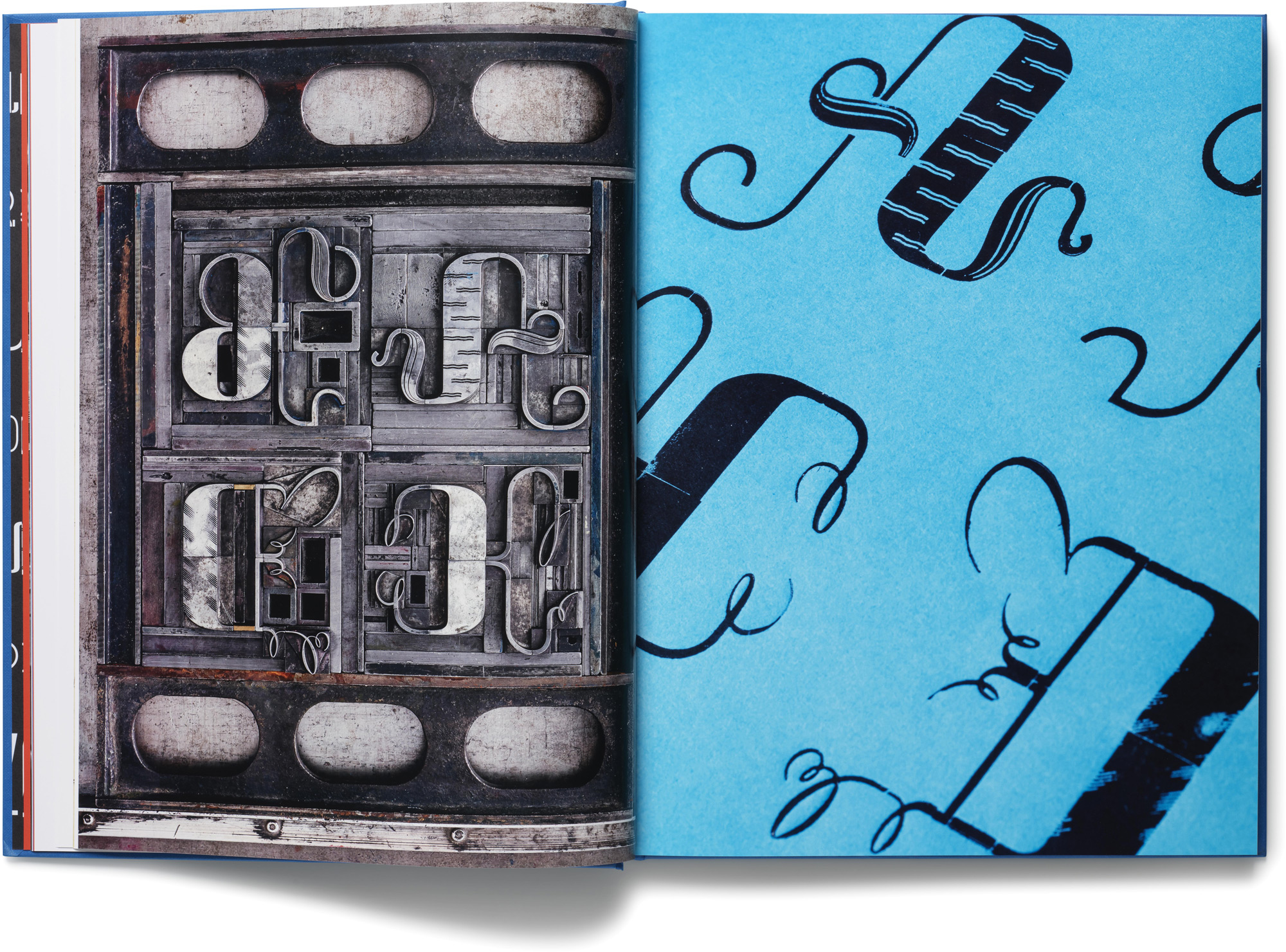
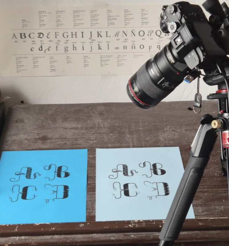
Alongside the digital revival, original photography by Luis Marino Cigüenza offers closeup views of the metal sorts in action. Precious few collections of Super-Veloz survive today, so we were incredibly fortunate to work with Roberto Gamonal and Juanjo López of the Familia Plómez workshop in Madrid to demonstrate alphabetic lockups and finished prints made with rare 70-year-old pieces of type.
The finished book presents a complete visual history in a joyful hardcover inspired by Joan Trochut’s work. Made for the Letterform Archive community, whose support helps preserve lost and significant design stories, Super-Veloz brings one of our longtime favorites out of the collection and into your libraries and homes.
To learn more about Super-Veloz, explore the book’s preview site, read an author Q&A, and visit our shop at the link below. Members receive 10% off all Letterform Archive titles.
— Chris Westcott, Editor, Letterform Archive Books