What’s New in the Online Archive, Nov. 2019
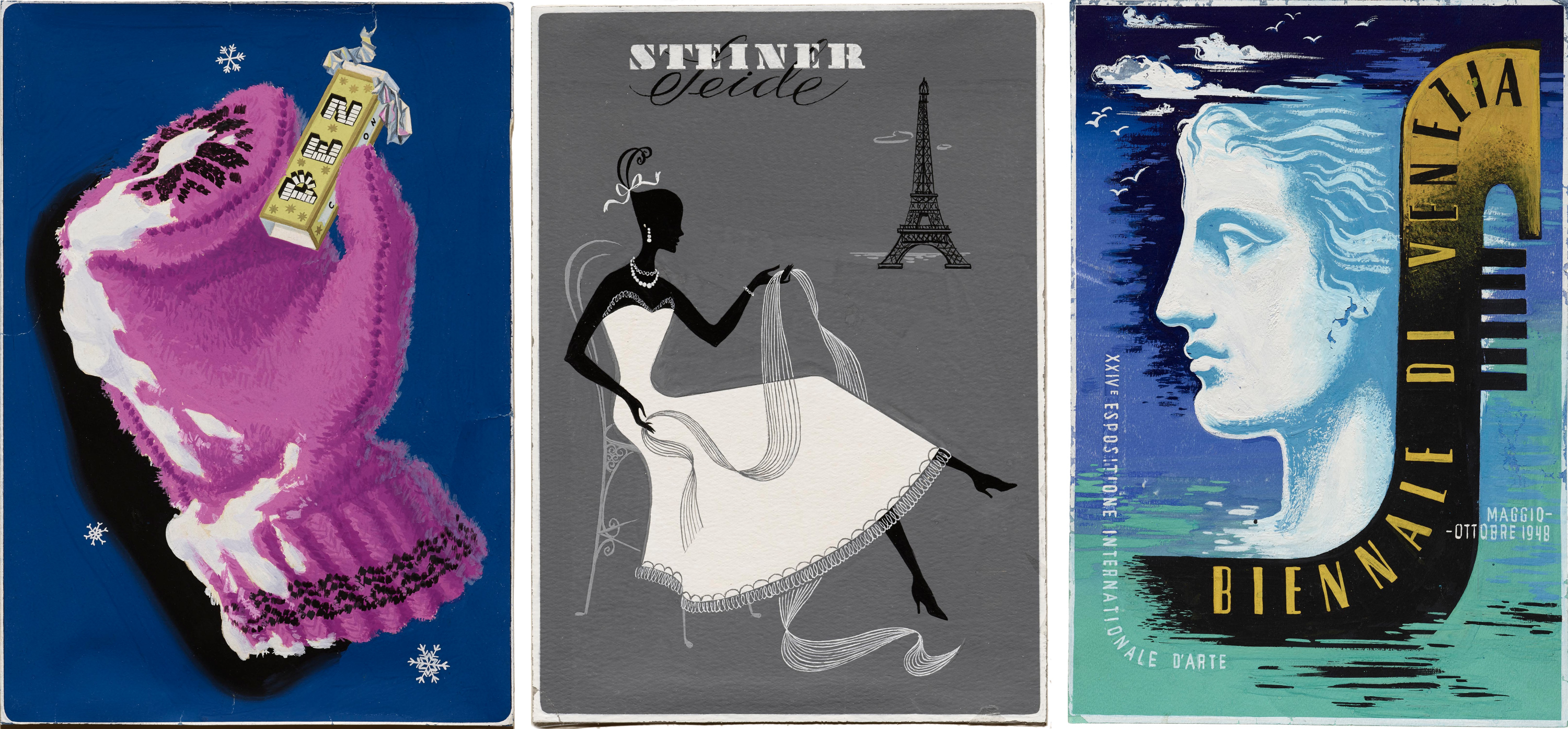
The Online Archive continues to grow. The latest additions include hand-painted advertising comps and type specimens old and new. Become a member to get access now, while the site is in beta.
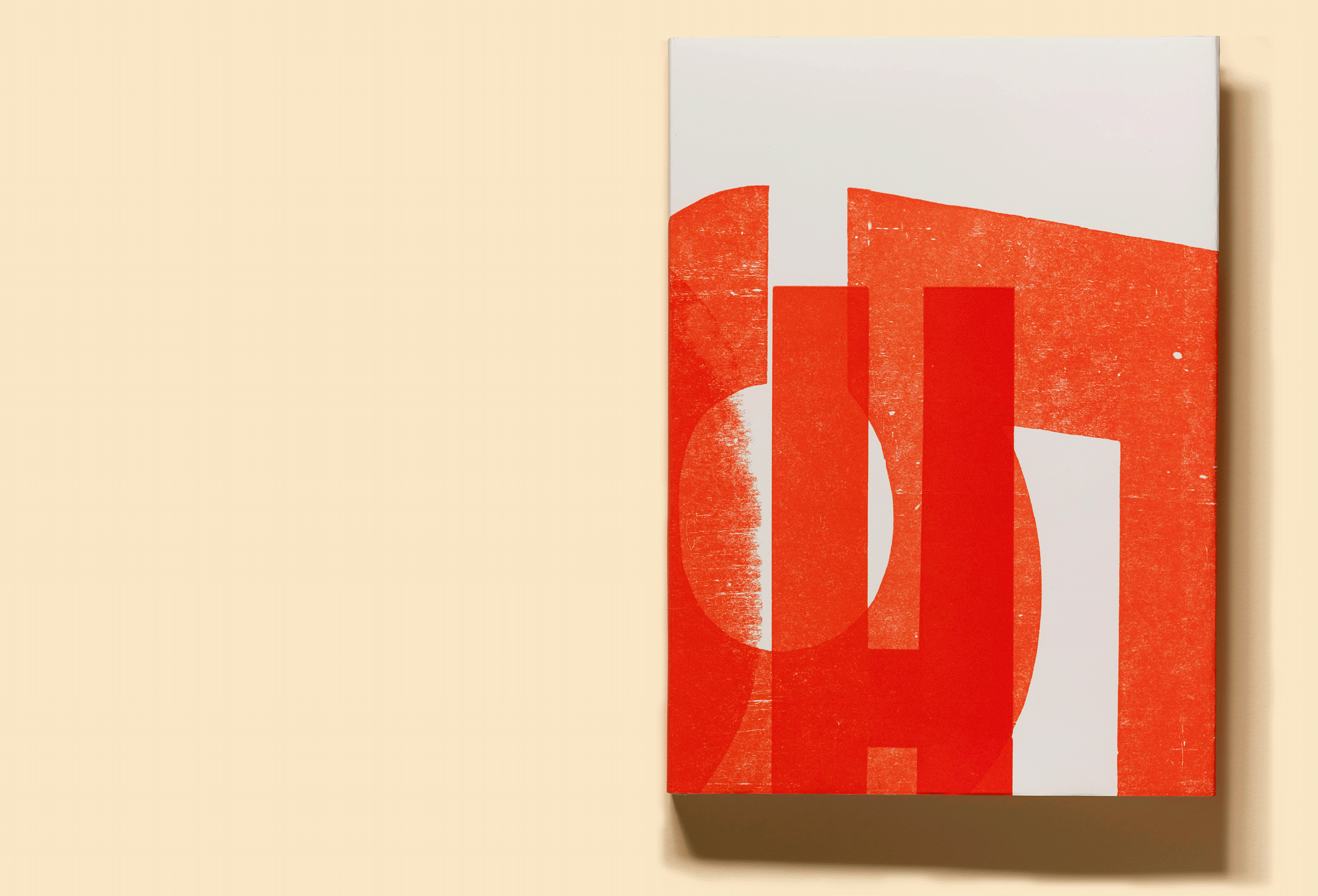
Long before Jack Stauffacher picked up a piece of wood type and used it to create one of his typographic abstractions, the printer and designer had collected lessons in his craft from across time.
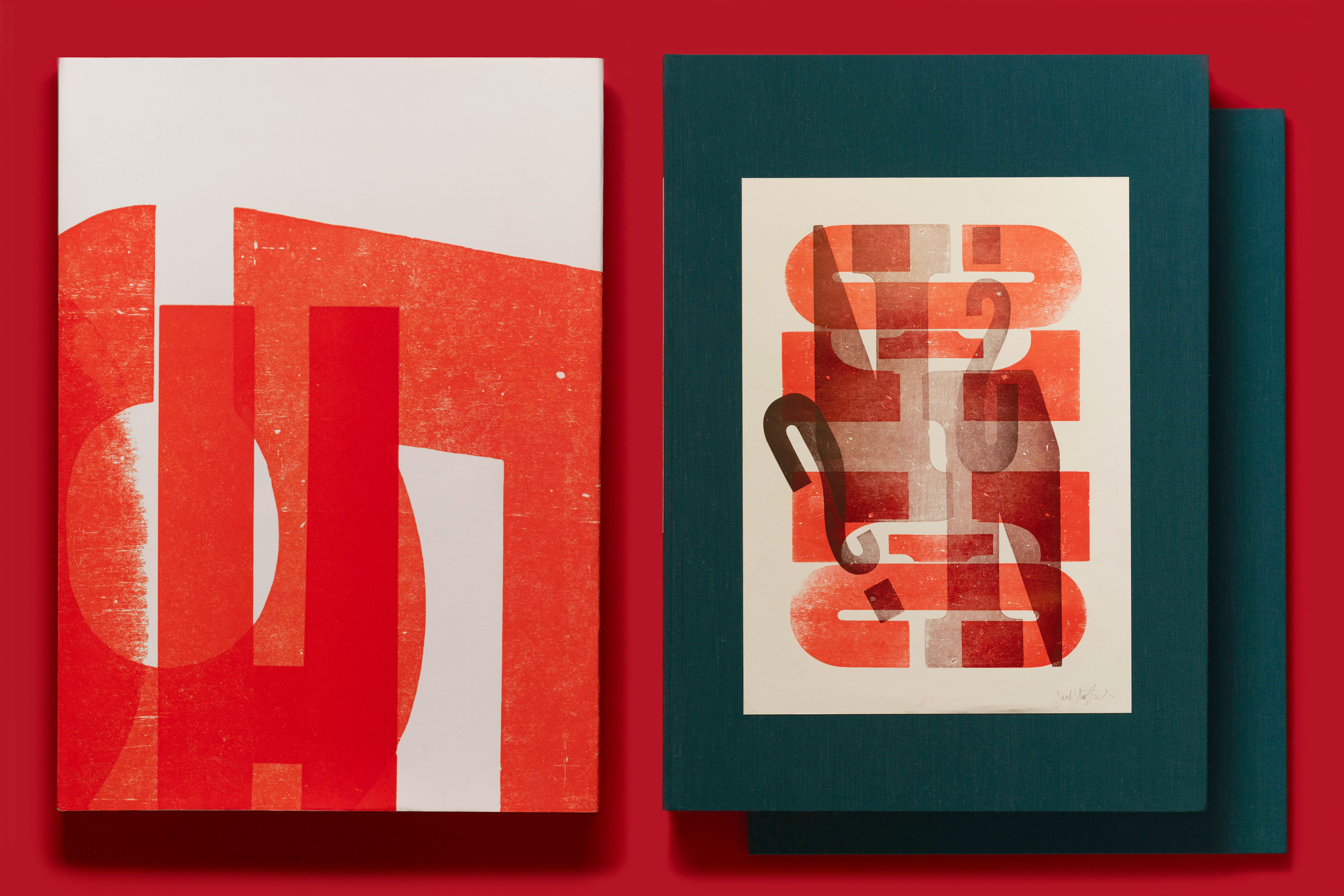
Read on to learn about just a few of the many influences that informed his wood type work, which is the subject of our third book, Only on Saturday: The Wood Type Prints of Jack Stauffacher, now live on Kickstarter.
At an early age, Jack Stauffacher was practically anointed as a printer. Paging through an issue of Popular Mechanics when he was fourteen, his eye fell on a mail-order advertisement for a 3-by-5-inch letterpress, and his curiosity was permanently piqued. By the time he graduated from high school, he and his father had built a modest studio in the backyard of their home in San Mateo, California, and the tiny mail-order press had given way to a more stately Chandler & Price model. Named the Greenwood Press after the street adjacent to their home, young Stauffacher’s enterprise began to take on small commercial jobs.
For over 50 years, Stauffacher lived a singular life at the heart of San Francisco’s creative community. Now, his legacy lives on at the Archive, and his prints are the subject of our third book.
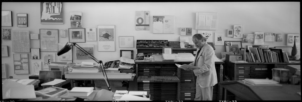
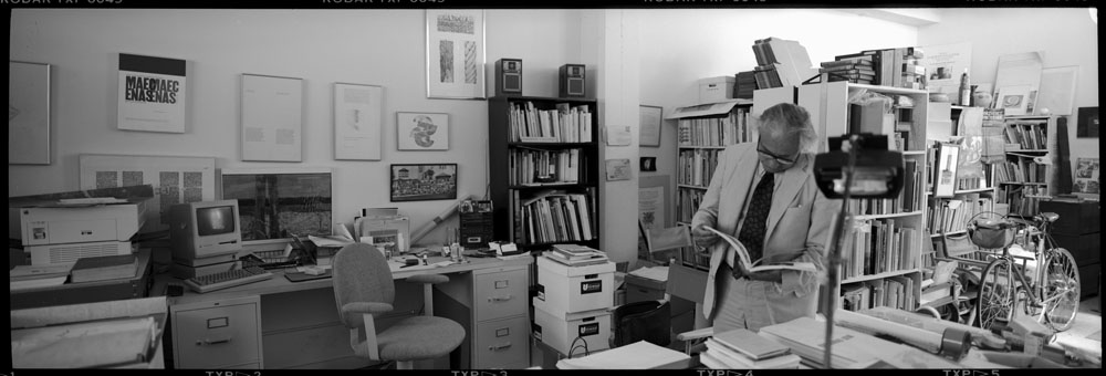
Some rooms convey history all by themselves. They tell stories about the people who live in them before those occupants even utter a word. Jack Stauffacher’s studio in San Francisco was such a place.
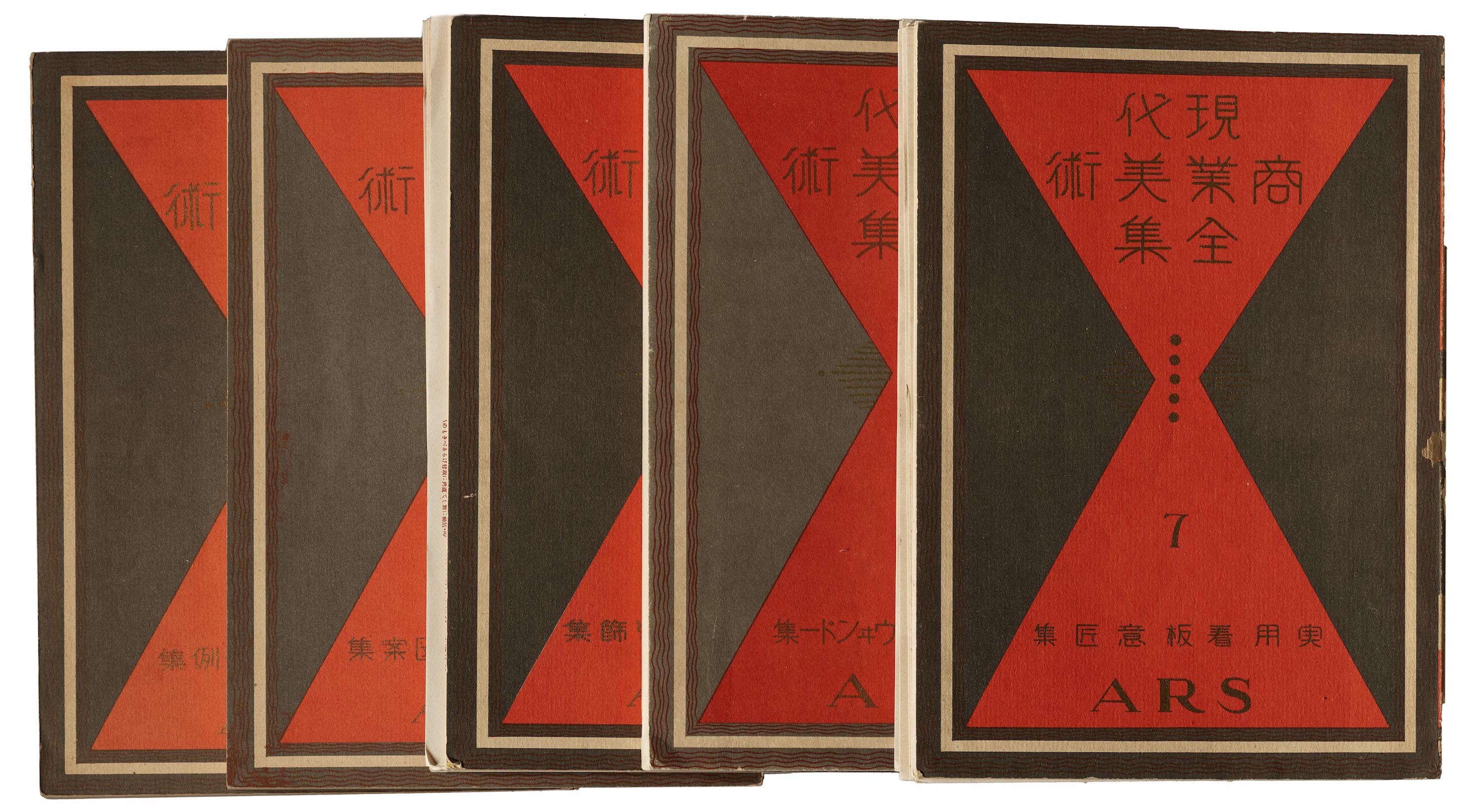
The early 20th century in Japan witnessed a collision of emerging and residual forces. Tensions between past, present, and future shaped typography, lettering, and other areas of design. Leading up to the Shōwa period (1926–89), as a result of the nation’s modernization and growth of commerce, businesses recognized the value of advertising to consumers in a visually appealing way.
The budding interest in creative advertising and the rise of commercial retail led to a 1920s–30s boom in design trade publishing to satisfy the growing demand for rich reference materials. In 1926, Hamada Masuji (濱田 増治) and a group of colleagues, including Sugiura Hisui, Watanabe Soshu, Nakada Sadanouke, and Miyashita Takao formed the Association of Commercial Artists. Together, with Hamada serving as the Editor-in-Chief, they published The Complete Commercial Artist, a 24-volume collection of trade publications on commercial design.
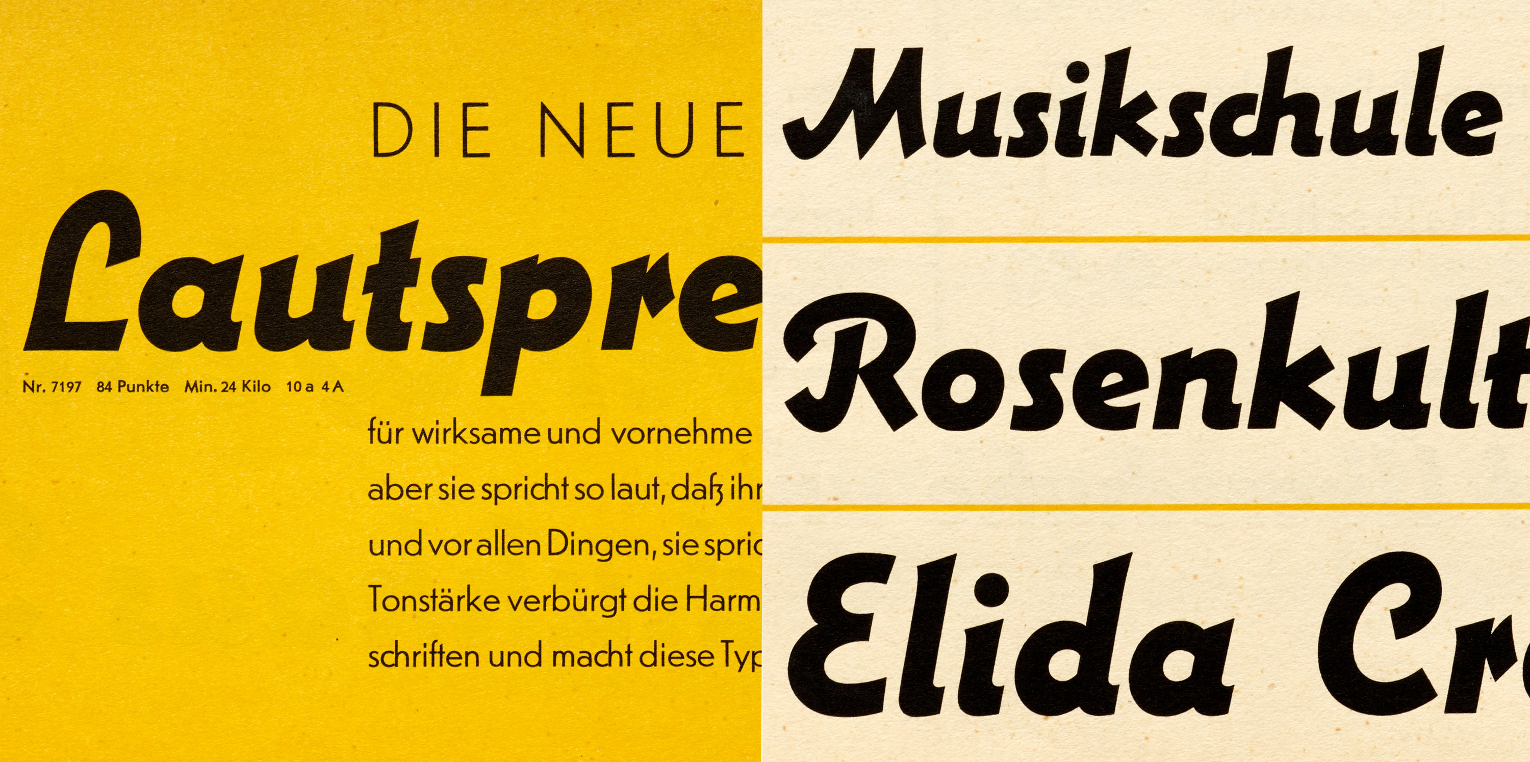
One look at the web or our phones these days and it’s obvious that a certain style of typeface dominates contemporary design: the geometric sans serif. It feels like nearly every company, from tech startup to multinational corporation, is finding safety and clarity in the genre’s circular rounds, sharp corners, and clean finish. Meanwhile, there’s also a growing hunger for things that are handmade and handwritten, authentic and imperfect. These universal desires for mechanical order and human warmth are pulling in opposite directions.
Lautsprecher (German for “loudspeaker”) is a virtually unknown metal typeface from 1931 that somehow hits tones both geometric and calligraphic, right at a time when we’re tuned into those very frequencies.
Dozens of title treatment sketches by the renowned lettering artist and designer have found a home at the Archive.
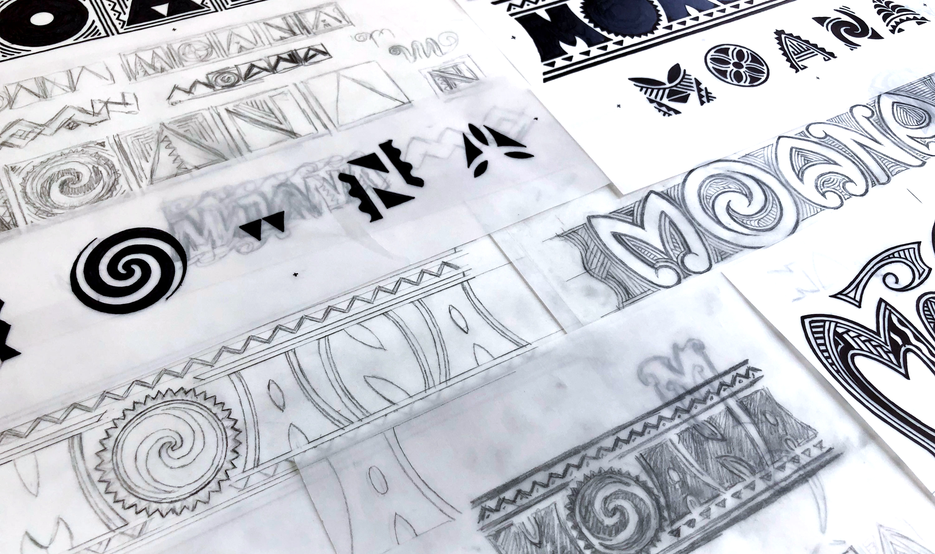
There are designers who choose to master their craft for a specific industry. And then there are designers, like Michael Doret, who refuse to stay in one lane. Doret brings his lettering talent to a range of clients: designing logos for sports teams, fast food chains, titles for comic books, children’s animations, drama movies, and typefaces. He sees each project as a unique design challenge: embracing the differences and running with them to come up with the most exciting solution possible. To put it simply, nothing is out of Doret’s reach. In 2018, Doret donated half of his working archive to Letterform Archive and the other half to the Herb Lubalin Center in New York. We are honored that Doret’s final proofs for early movies, as well as developmental sketches and inked comps for Disney and Pixar animated features, have found a home in our growing collection of process material.