We’re dedicated to preserving and celebrating typographic design from underrepresented groups, including women.
Like nearly every professional field, women have been systematically omitted from graphic design history. Fortunately, many recent efforts, such as Alphabettes, Hall of Femmes, and the People’s Graphic Design Archive are pushing to rectify the situation. We’re doing our part by collecting and sharing the work of women, both past and living. Here are some highlights.
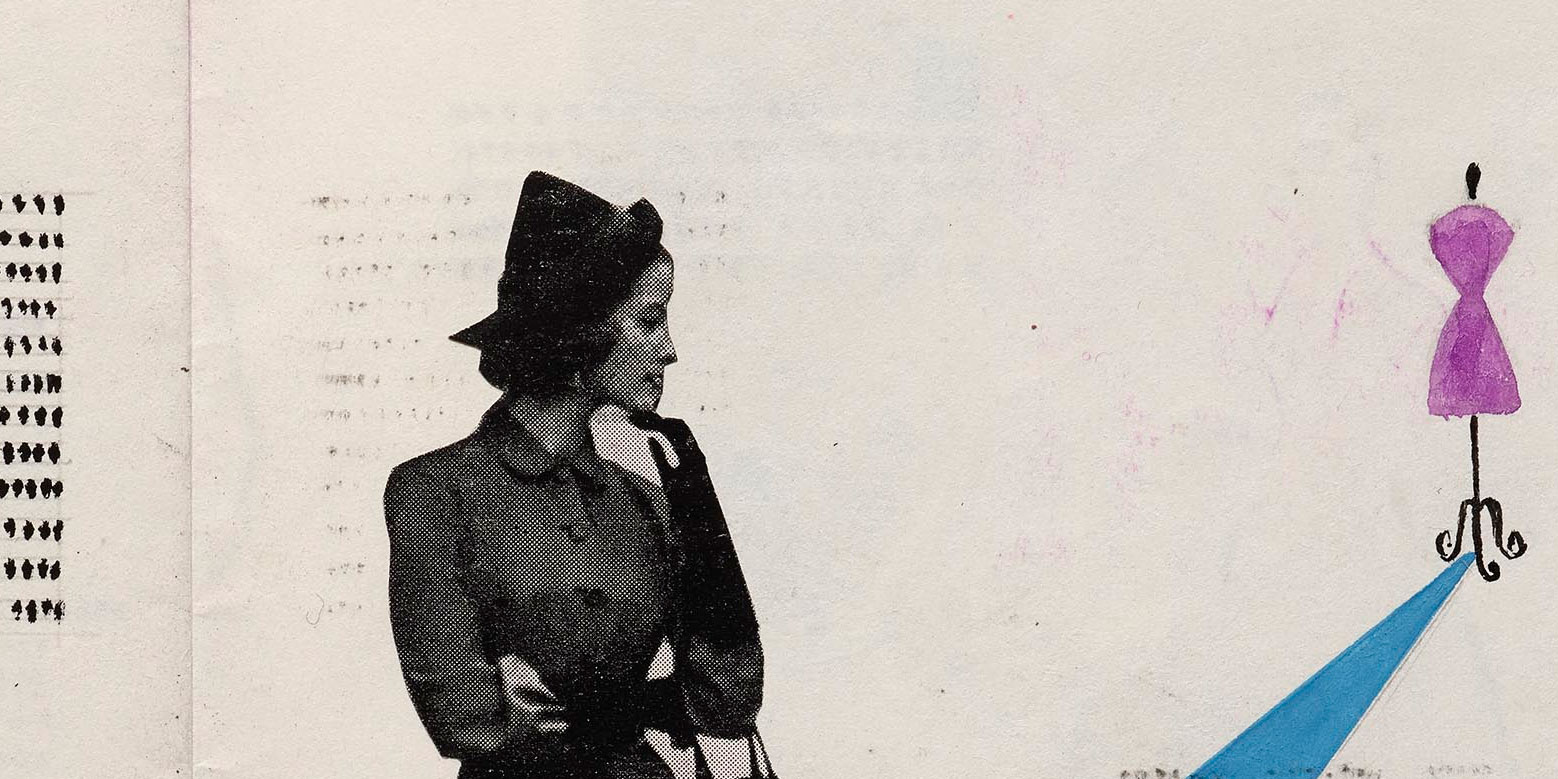
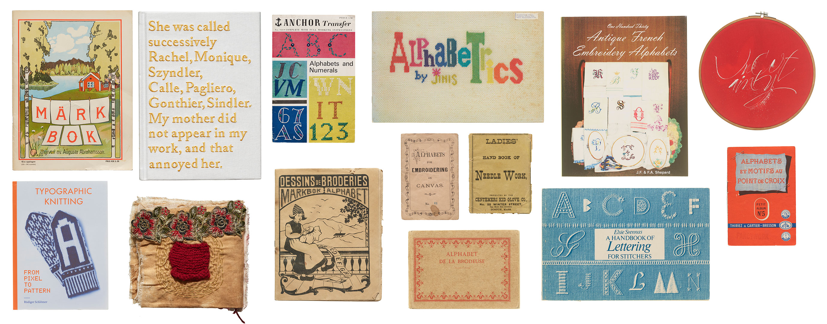
From embroidery to weaving, there is a long history incorporating letterforms into fabric. In this visit to the Archive’s stacks, we’re pulling multiple threads on items that tie text to textiles.
The word “text” originated from the Latin word “textus,” which means “a weaving” or “a fabric.” In ancient times, textus referred specifically to the process of weaving fabric. Over time, the meaning of the word expanded to include written or printed material, reflecting the idea of words being woven together to create a coherent written work. This metaphorical extension continues today with words and phrases such as seamless, threadbare, unraveled, looming, frayed, tangled, and spinning a yarn, highlighting the connection between the physical act of weaving fabric and the intellectual act of composing written language, both of which involve the interlacing of individual elements to create a unified whole. In this installment of For Your Reference, we revisit the Archive’s stacks for books and other items that build a tangible connection between threads and letterforms.
Joshua Darden, born 1979 in Los Angeles, California, published his first typeface in 1995 at the age of 15, becoming the first known African-American typeface designer. For the next ten years he honed his skills as an independent type foundry, and then as a staff designer at the renowned Hoefler Type Foundry under the direction of Jonathan Hoefler and Tobias Frere-Jones. He struck out on his own again in 2005, opening a new foundry, Darden Studio, and releasing his most ambitious and recognized design, Freight.
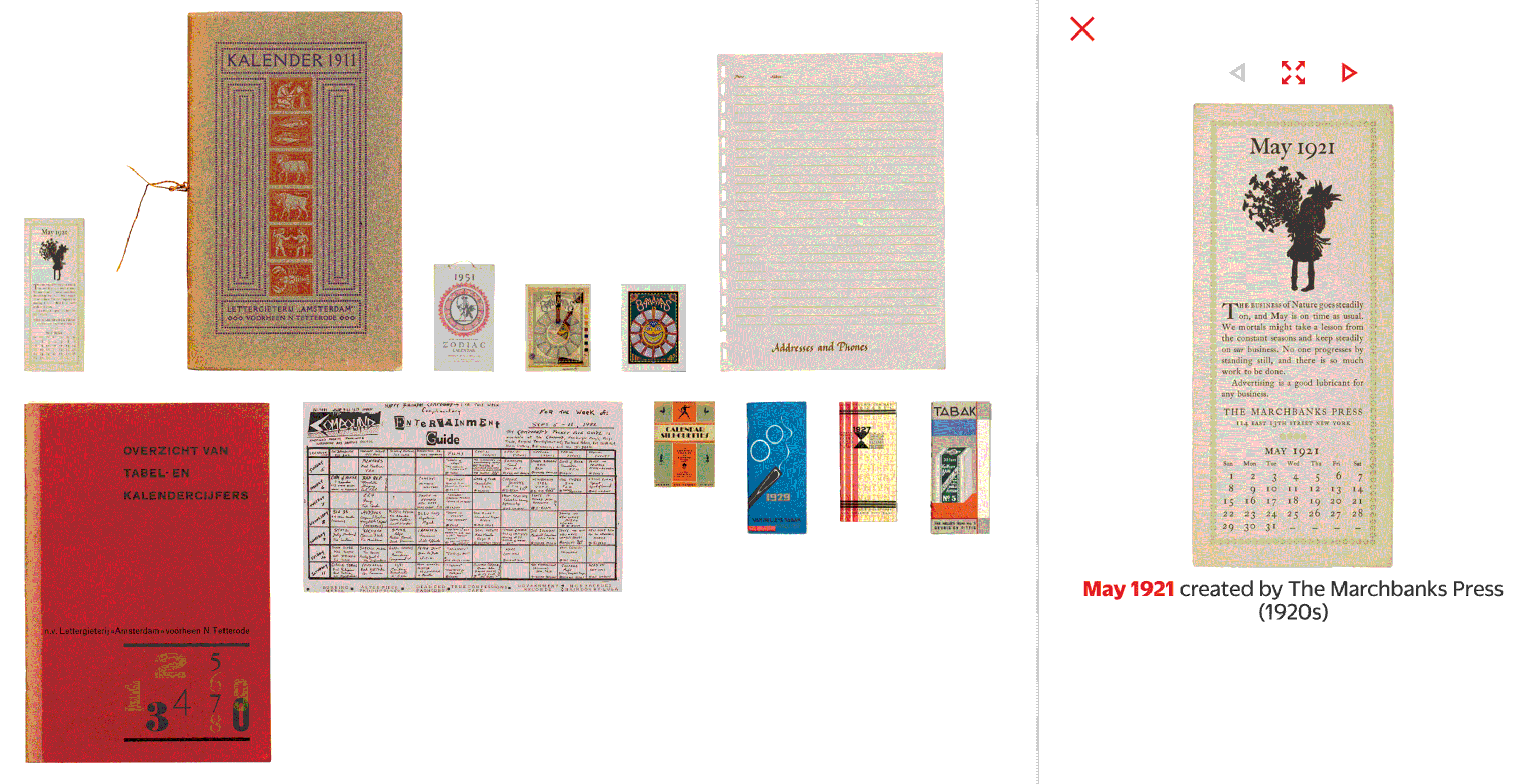
A variety of planners, event guides, and type specimens offer over a dozen ways to represent the year through lettering and typography.
We’re starting 2024 with a selection of objects in the Online Archive that chart Gregorian timekeeping across the twentieth century. This compilation includes traditional calendars, fonts crafted explicitly for typesetting calendars, branded promotional calendars, and material that reveals the process of making a very unusual calendar. We hope these ideas inspire you throughout the year.
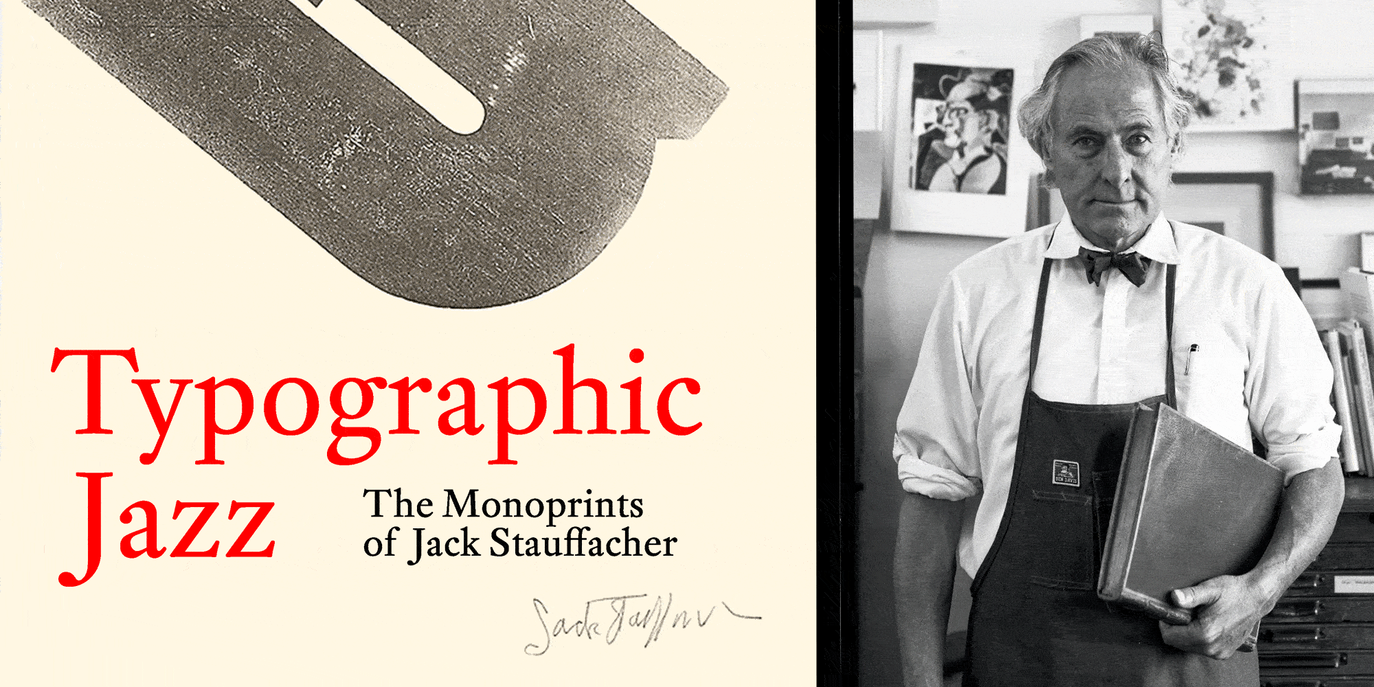
Letterform Archive has a long and close relationship with the work of Jack Stauffacher. We hold a significant run of his Greenwood Press books; we published a book on his wood type prints; and we are the home of his studio archive. This last collection — rich in private experiments — sparked the idea for an exhibition of the artist’s work that has yet to be shown in public. Curated by Rob Saunders, the show explores Stauffacher’s playful and improvisational typography and features more than 100 prints, sketches, iterative proofs, and other explorations of his creative process.
We’re celebrating Type West alumni and 125+ original typefaces since Letterform Archive opened the first yearlong type design program on the West Coast.
As we embark on a new year of Type West, our certificate program in type design, we’d like to share some major milestones.
Our video collections let you catch up on every Letterform Lecture, and — for the first time — all Salon Series recordings back to 2019.
In 2023 Letterform Archive hosted dozens of online and onsite events exploring typographic history and contemporary design, and covering a wide range of writing systems and locales, from Arabic to Cherokee, Buenos Aires to Vienna.
We just added over 500 objects and nearly 6,000 images to our Online Archive, the largest expansion since the site launched.
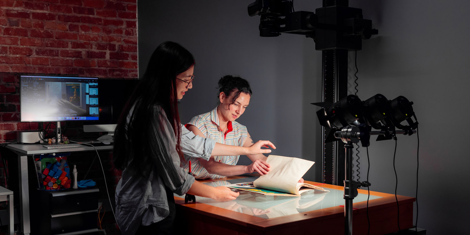
Collections Assistant Eve Scarborough and Digitization Librarian April Harper prepare a book for photography.
Letterform Archive strives for radical access to our collection of lettering, typography, and graphic design. That ethos demands that we digitally preserve as much material as we can and make it available to our international community. To that end, we’re continually expanding the Online Archive, a free repository of visual inspiration. The latest batch of additions is the largest since the site launched, and includes work by Jack Stauffacher, Amos Kennedy Jr., Camp Books, Hunter Saxony III, hundreds of typeface specimens, the first taste of the Sheaff Ephemera Collection, and much more.