News
Now Online: Artists’ Books, Broadsides, Calligraphy, Ephemera, and Type Specimens
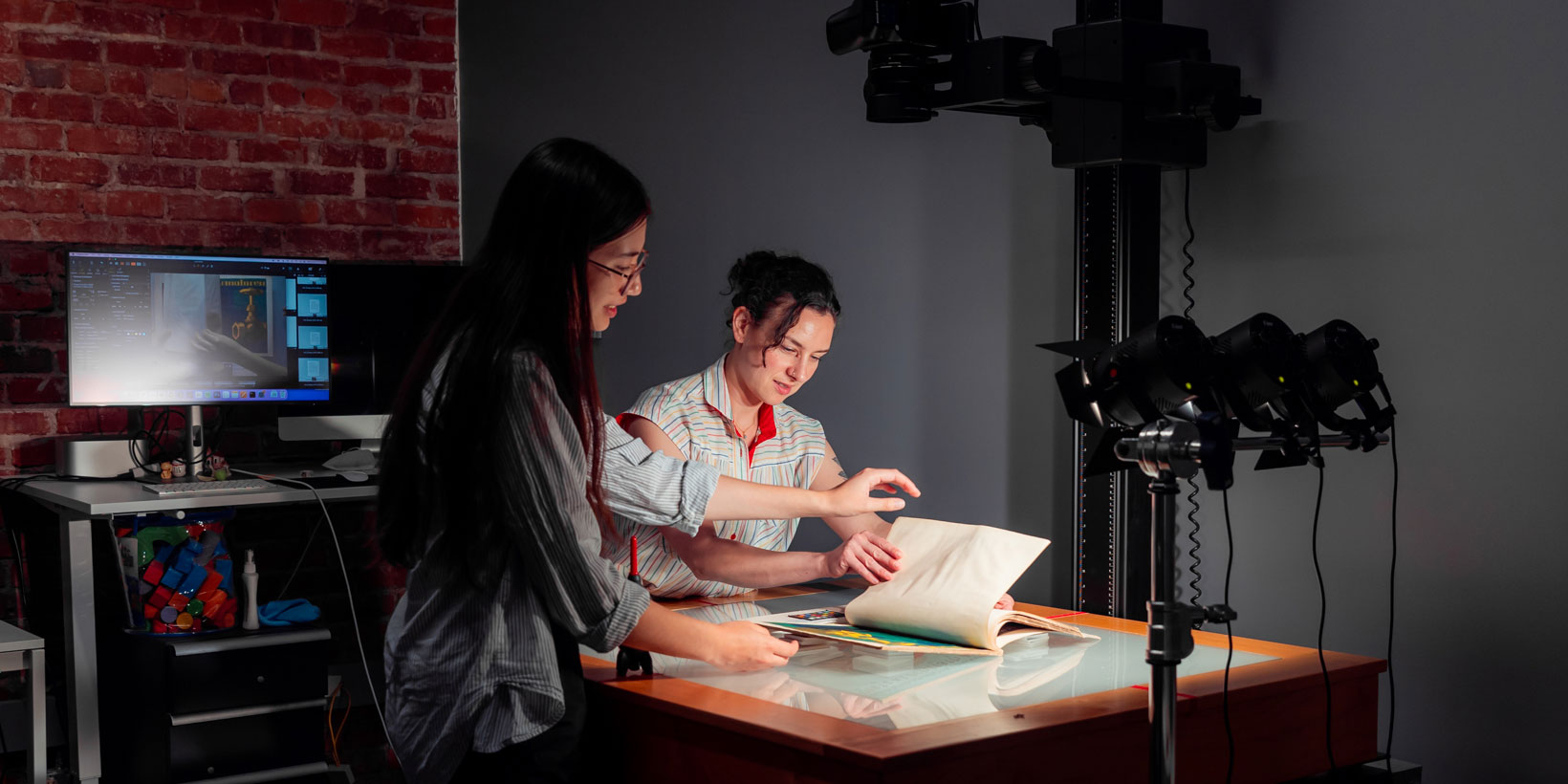
We just added over 500 objects and nearly 6,000 images to our Online Archive, the largest expansion since the site launched.
Letterform Archive strives for radical access to our collection of lettering, typography, and graphic design. That ethos demands that we digitally preserve as much material as we can and make it available to our international community. To that end, we’re continually expanding the Online Archive, a free repository of visual inspiration. The latest batch of additions is the largest since the site launched, and includes work by Jack Stauffacher, Amos Kennedy Jr., Camp Books, Hunter Saxony III, hundreds of typeface specimens, the first taste of the Sheaff Ephemera Collection, and much more.
The Online Archive now contains 3,606 items represented by 27,485 images — all accessible to anyone for free.
This digital snapshot of the collection is available to anyone who teaches, learns, or gets inspired by design. The site is also the main tool used by our docents who lead virtual tours for classes and other remote groups. Each item has been meticulously captured with our high-fidelity imaging standards, providing a virtual experience that serves as the best substitute (or preparation) for an in-person visit to the Archive.
2023 was big for the Online Archive. We added more than 1,000 items and 10,000 images over the course of the year. And, with your help, we have even bigger plans for next year. The growth of the site — which requires thousands of hours of preservation, cataloging, and imaging labor — is made possible by members and donors. Become a member to support the ongoing digitization efforts and get access to the Online Archive’s Table feature. Here’s what’s new:
Type Specimens
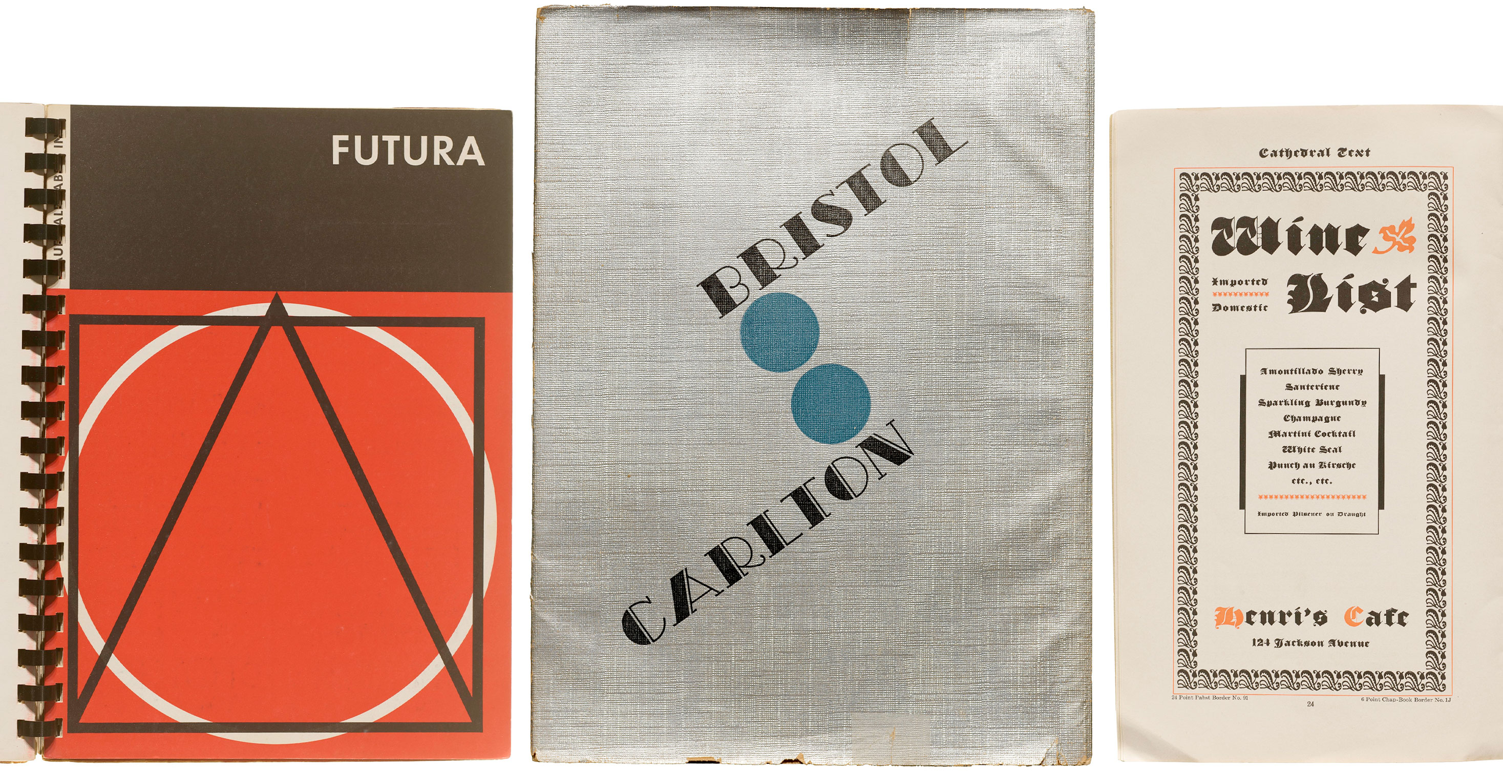
Printed specimens — books and leaflets — showcasing typeface styles, sizes, and use cases — were the primary marketing vehicle for metal type foundries in the twentieth century. And, because they were created for a discerning audience of designers, they often feature eye-catching layouts and printing techniques, offering an inspirational snapshot of typography from the 1890s–1970s. In our year-end update, hundreds of items from the Amsterdam, ATF, and Bauer foundries bring the foundry ephemera count to nearly 1,000 pieces. The new batch of uploads also includes two monumental bound catalogs that mark milestones in metal and phototype: Stempel’s ca. 1927 Hauptprobe and Photo-Lettering's 1971 One Line Manual of Styles. (More about these soon.) We also continue to represent contemporary fonts with the student work of Type West, the Archive’s yearlong certificate program in type design. You can still buy a printed copy of the 2022 specimen booklet in our shop.
Book Artists and Independent Presses
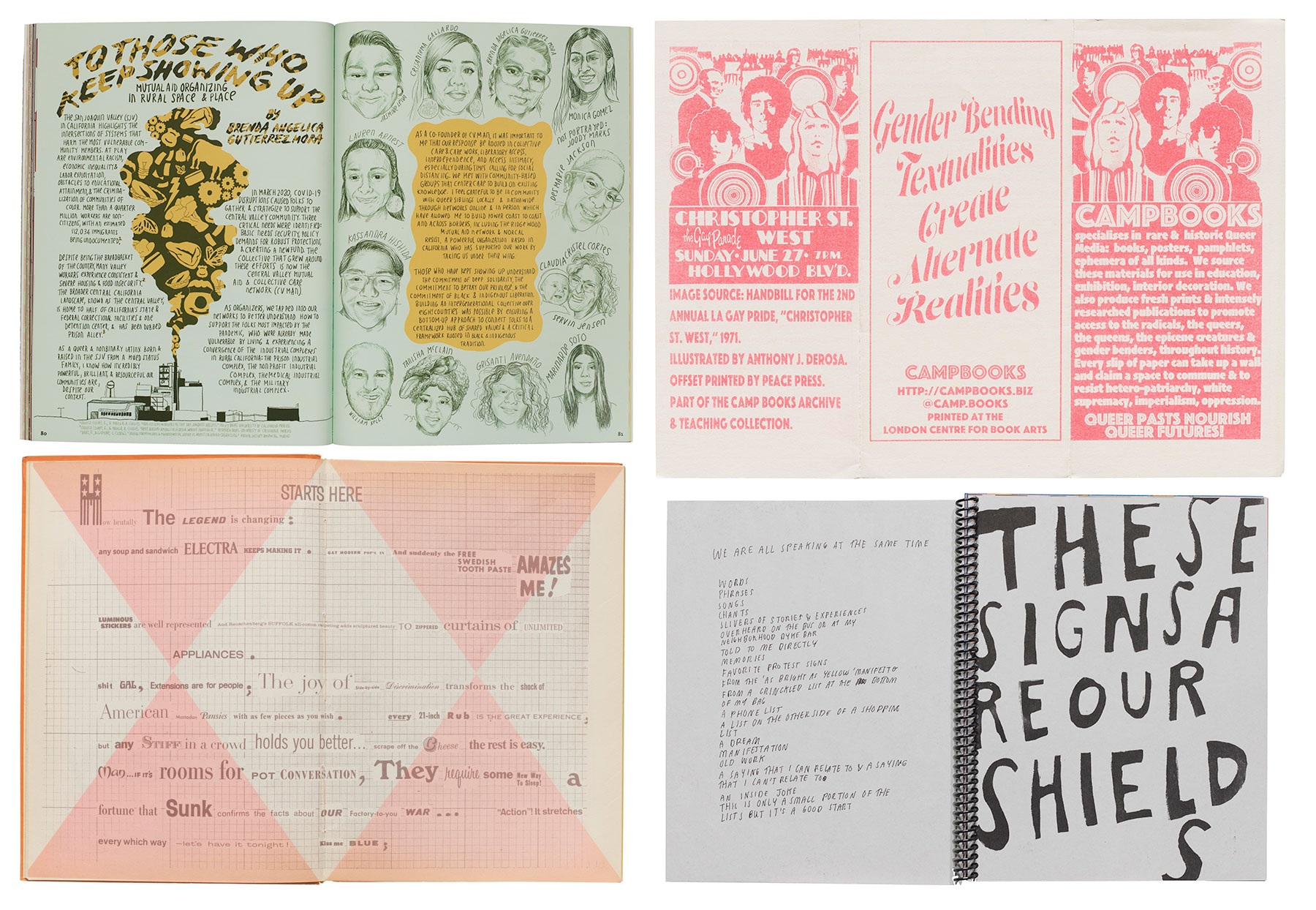
Shelved in the Archive as “Visual Language”, the diverse and innovative publications of book artists and independent presses play a crucial role in shaping the literary landscape. New additions to the Online Archive include excerpts from recent pubs such as Our Work is Everywhere, an illustrated oral history of queer and trans resistance by Arsenal Pulp Press; ephemera from U.K.-based Camp Books, who specialize in rare and historical queer media; and We Are All Speaking at the Same Time by Lukaza Branfman-Verissimo, who participated in a Strikethrough salon last year. You’ll also find an old Archive favorite, Spare Parts, a 1966 collection of Charles Henri Ford’s “poster poems” inspired by pop culture and executed with ransom-note style typography.
Calligraphy
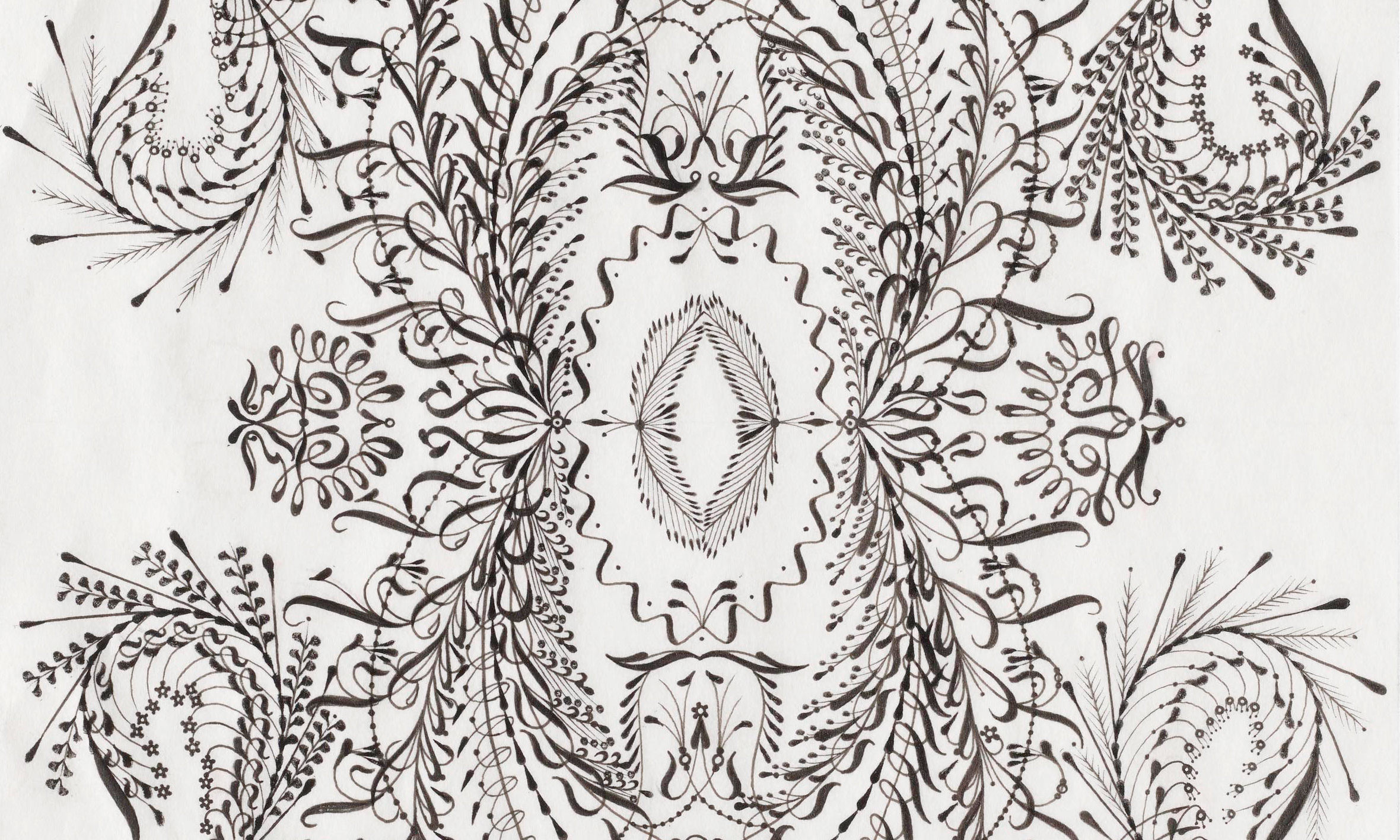
Writing examples from every era serve as invaluable sources for aspiring and seasoned calligraphers alike. Illustrated Lessons and Lectures on Penmanship and Spencerian Key to Practical Penmanship demonstrate an array of nineteenth-century styles and techniques. The First Writing Book: Arrighi's Operina joins Trissino: La Poetica in the Online Archive as a reference for one of the earliest italic typefaces. Meanwhile, Hunter Saxony III wields a classical pen to create contemporary work. Twelve new acquisitions from the “Last Black Calligrapher in San Francisco” accompany the Nia Wilson / Say Her Name / No Silence series that we shared in 2021. The new pieces demonstrate Saxony’s ability to fool the eye into thinking the compositions are perfectly symmetrical, but zooming into the details reveals a skilled hand producing thousands of unique strokes.
Vienna Secession
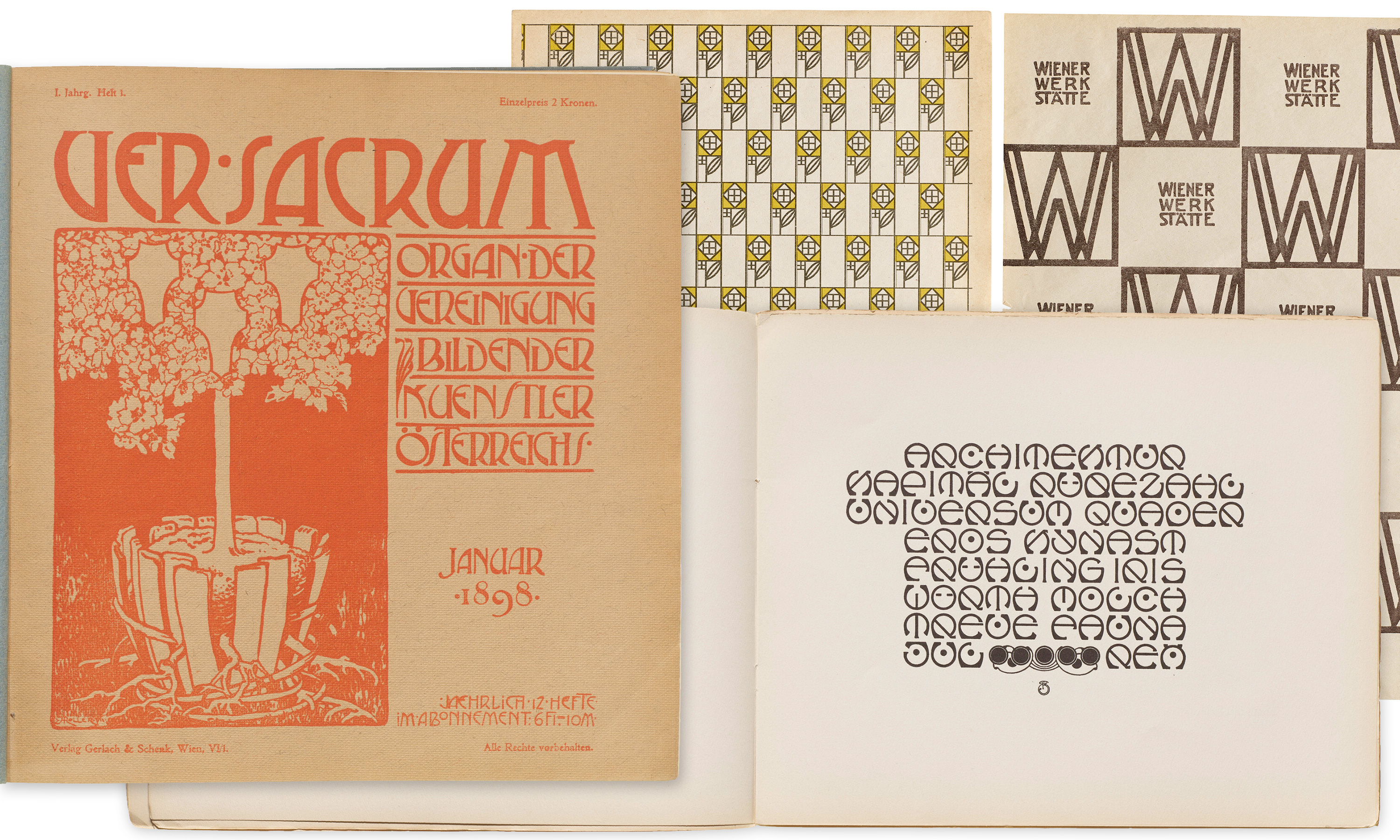
In celebration of our new book on Die Fläche, we added several items associated with the Vienna Secession and Wiener Werkstätte: Ver Sacrum, 1898; branding and patterns by Koloman Moser; lettering manuals and compilations by Rudolf Von Larisch; and Quellstift-Arbeiten, a simple but charming little workbook from the 1920s that illustrates the continued influence of Larisch’s rounded-pen teaching method.
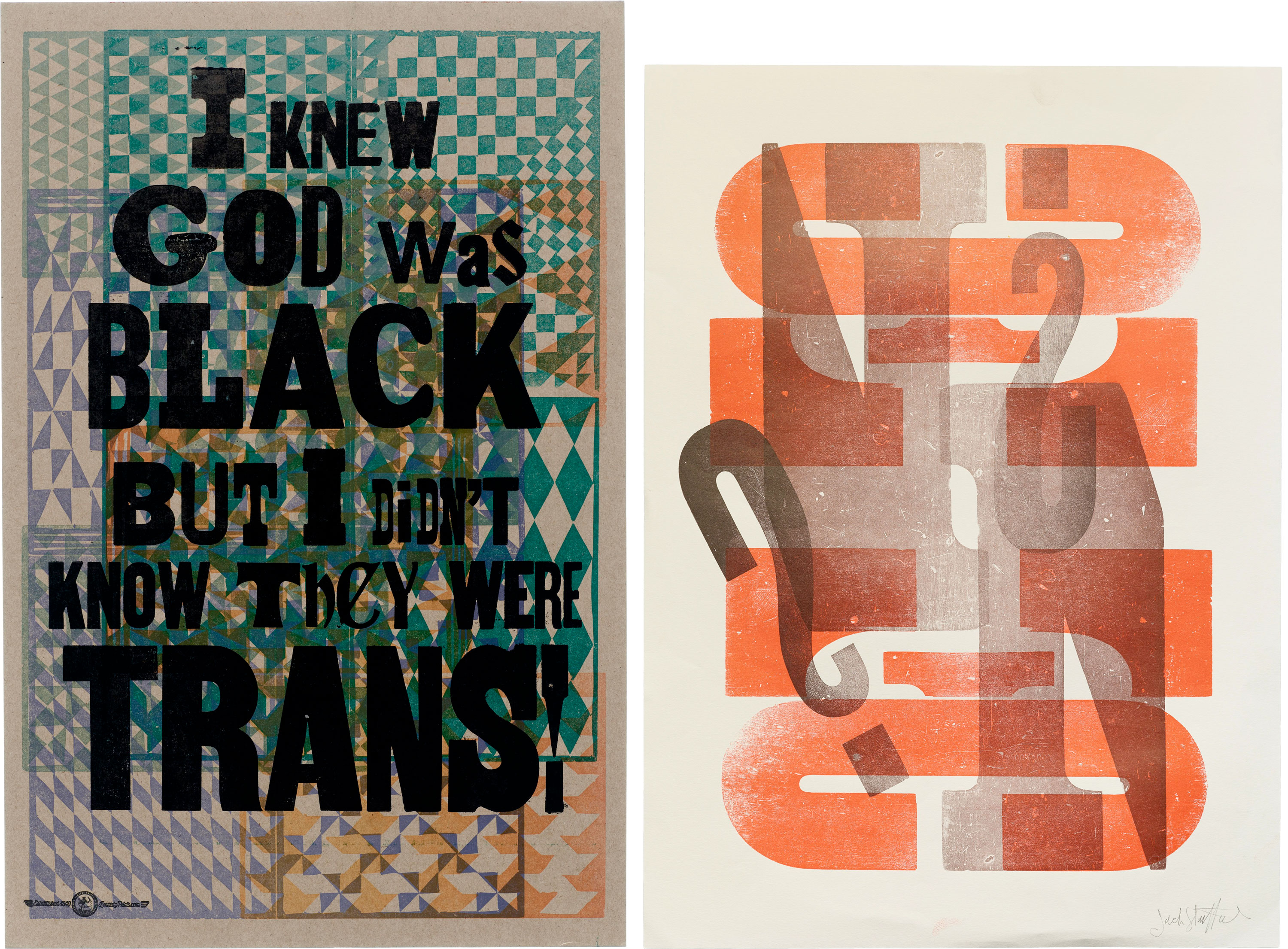
Letterpress Broadsides
In 2024, our gallery in San Francisco will present two exhibitions featuring masters of wood type and letterpress, Jack Stauffacher and Amos Kennedy, Jr. Today, we’re sharing dozens of prints from each artist to whet your appetite.
Japan
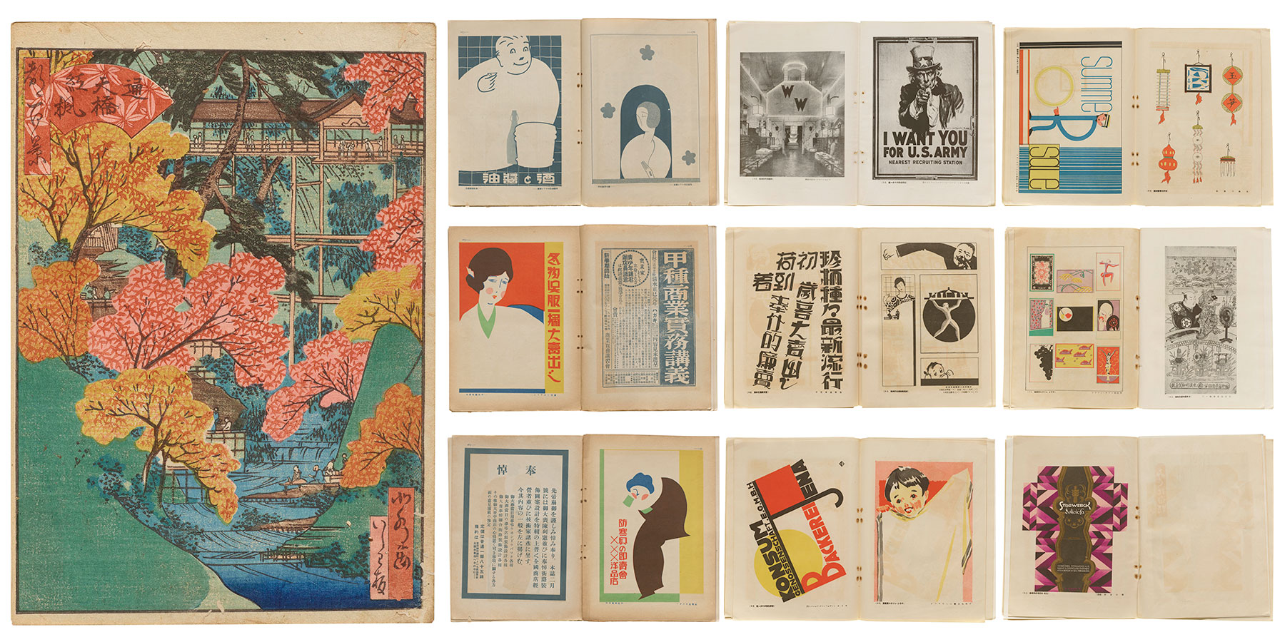
Eastern representation in the Online Archive continues to expand. A new Hokusui woodblock print joins the 14 other examples of nineteenth-century Ukiyo-e in the collection. Plus, get a taste of our newest book, The Complete Commercial Artist, with a 1930 promotional volume summarizing the series, and The Advertising World, another magazine covering Japanese design of the 1920s.
Nineteenth-Century Ephemera
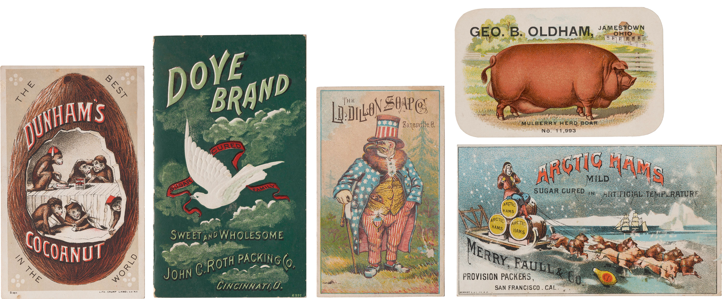
Earlier this year we announced the coming arrival of the Richard Sheaff Collection, and promised to share progress on processing the collection of over 26,000 items. The first batch of 75 trade cards is online, and it’s a zoo of eclectic color, illustration, and typography. Go hog wild!