?uselang=de#/media/File:Kino_Babylon.jpg/2)
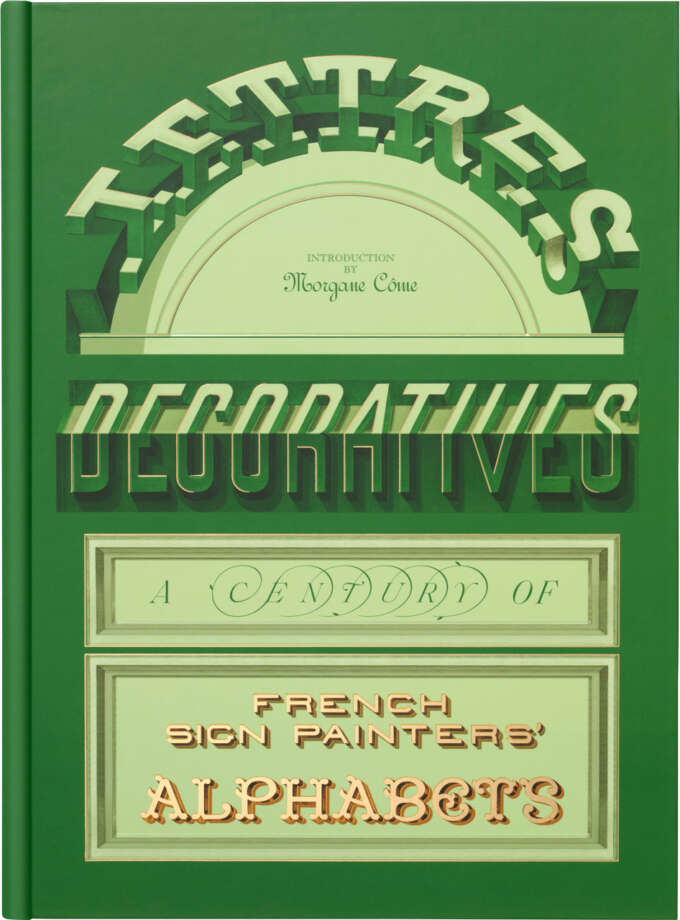
Morgane Côme (introduction)
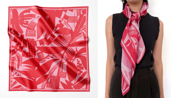
Lettres Décoratives: A Century of French Sign Painters’ Alphabets
$65.00
MSRP:
A guide to Letterform Archive’s collection of moderne and streamline styles of the 1920s and 1930s.
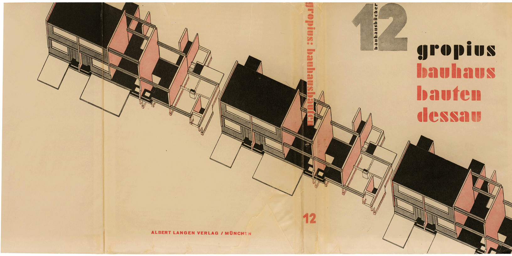
The style that has come to be known as Art Deco emerged during the interwar years, shaped by a fascination with machine-age materials and a variety of cultural sources, including ancient Egyptian and Aztec art. It married sleek modernity with stylized forms, characterized by bold geometry and streamlined aesthetics, and marks a departure from more ornate and organic predecessors, such as Art Nouveau. The style gained prominence following the 1925 Exposition Internationale des Arts Décoratifs et Industriels Modernes in Paris, yet the term “Art Deco” didn’t arrive until the 1960s. In its time, there was no consistent label for the work we now associate with the style. Following the lead of architects and industrial designers, type foundries in Europe and North America used names like “style contemporain”, “modernistic”, and “moderne”, a term often appended with words such as “streamline”.

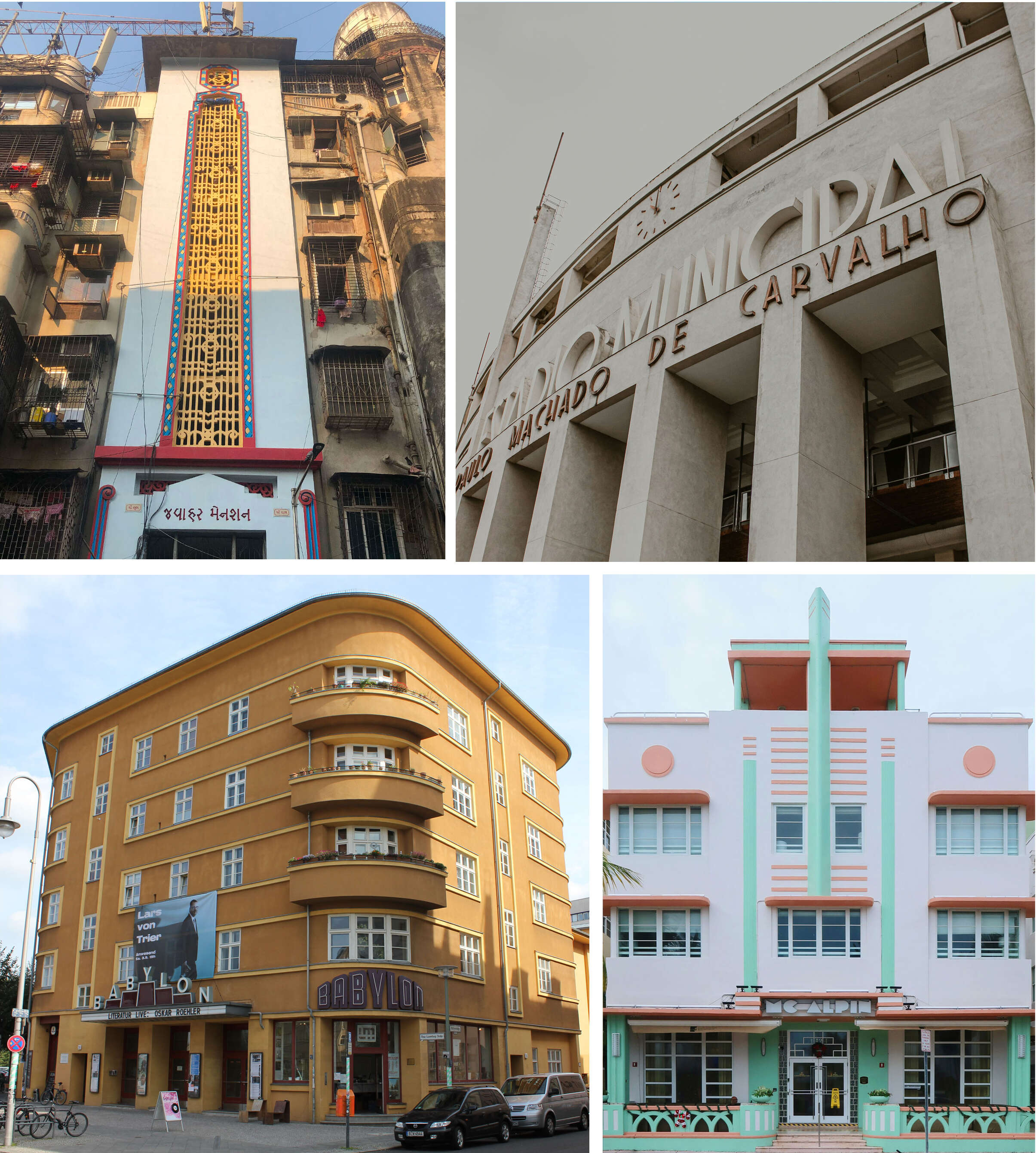
Art Deco quickly became an international movement, adapting to regional tastes while maintaining its core aesthetics. Art Deco lettering followed suit, especially on buildings built on the ideas of modernity where it served as both an aesthetic flourish and a cultural statement. The signage also echoes cosmopolitan ambitions while building regional identity in cities like Mumbai and Sao Paulo. From neon marquees to streamliner posters, typography has continued to carry Art Deco’s aesthetic spirit well beyond its architectural heyday.
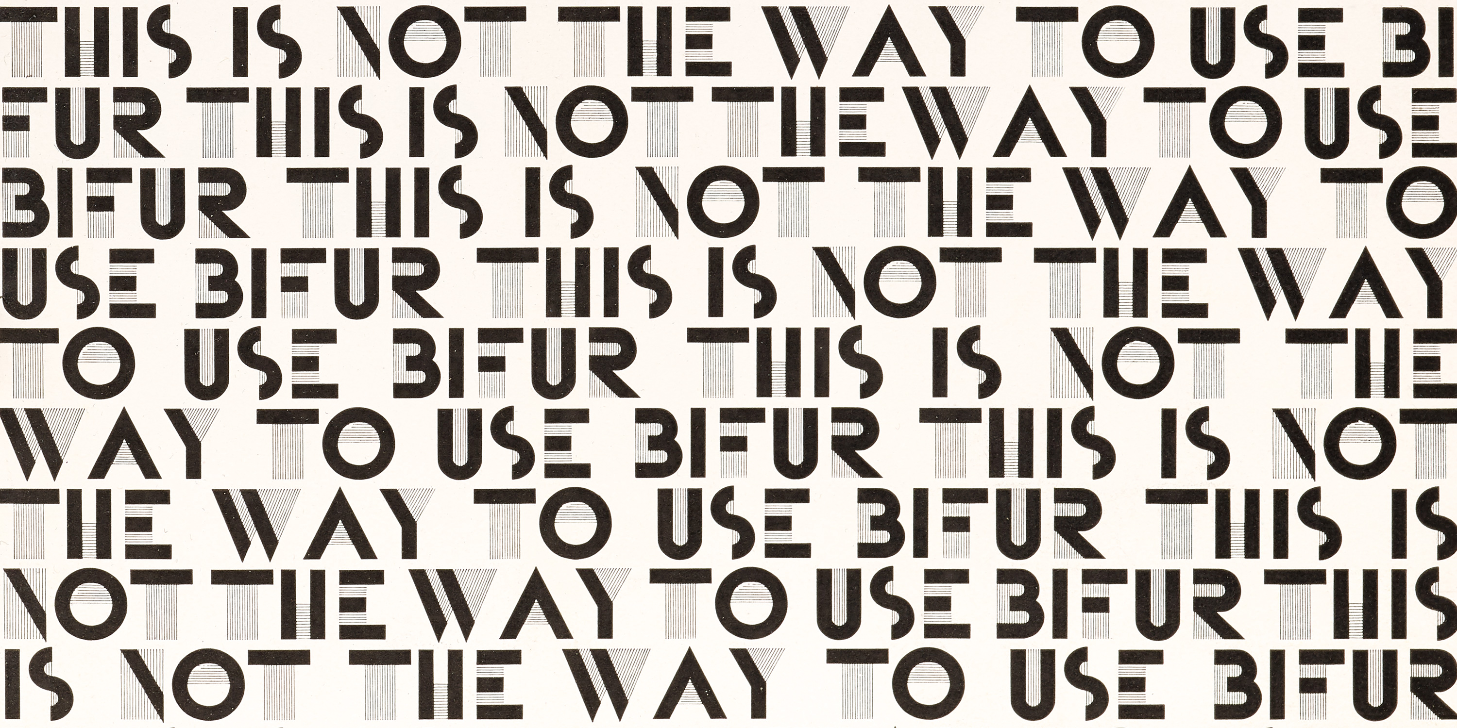
Header image: Detail from A. M. Cassandre, Bifur type specimen.
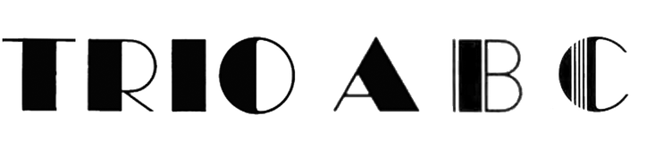
Geometric shapes: The use of straight lines, circular and semicircular curves reflect machinery, architecture, and abstraction.

Elongated letterforms: Narrow proportions emphasize verticality and create a towering, elegant appearance.

Exaggerated waistlines:: Crossbars and legs, which are typically near a letter’s middle, sit unusually high or low, further accentuating verticality.

Contrasting strokes: Heavy (thick) strokes intersect with light (thin) strokes to create a high-contrast look. Stripes complement solid lines.

Each Inspire Me page gathers all the Archive’s content on a specific topic. This is our first of many future installments dedicated to design movements. Subscribe to get notified!
To dive deeper into Art Deco objects, you can request a self-guided research visit or book a guided onsite tour or even a guided online tour of the collection or exhibition for your team or class.
Our lectures, salons, and workshops provide deep dives into language and region specific topics hosted by skilled practitioners and researchers. Reserve your spot online or catch up with recordings of past events.
The best way to support our mission of radical access to Art Deco artifacts is to join the mailing list and become a member. Be part of our worldwide community, attend exclusive events, and get member discounts.
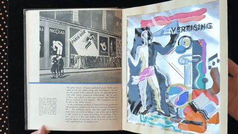
Lavishly illustrated with photomontages, collages, and tip-ins, Mise en page, The Theory and Practice of Layout is a visual feast. Conceived by Parisian printer and advertising innovator Alfred Tolmer, the work stands as a manifesto for modern design. Drawing from art and design history, Tolmer delivers practical instruction through experimental techniques and materials.
W. A. Dwiggins frequently used ornament in his work as a graphic artist, primarily on book spines and title pages. By around 1915 Dwiggins had begun to make repeating patterns of shapes by using two different techniques: wooden stamps and stencils made from celluloid. Many of his geometric illustrations presaged Art Deco.
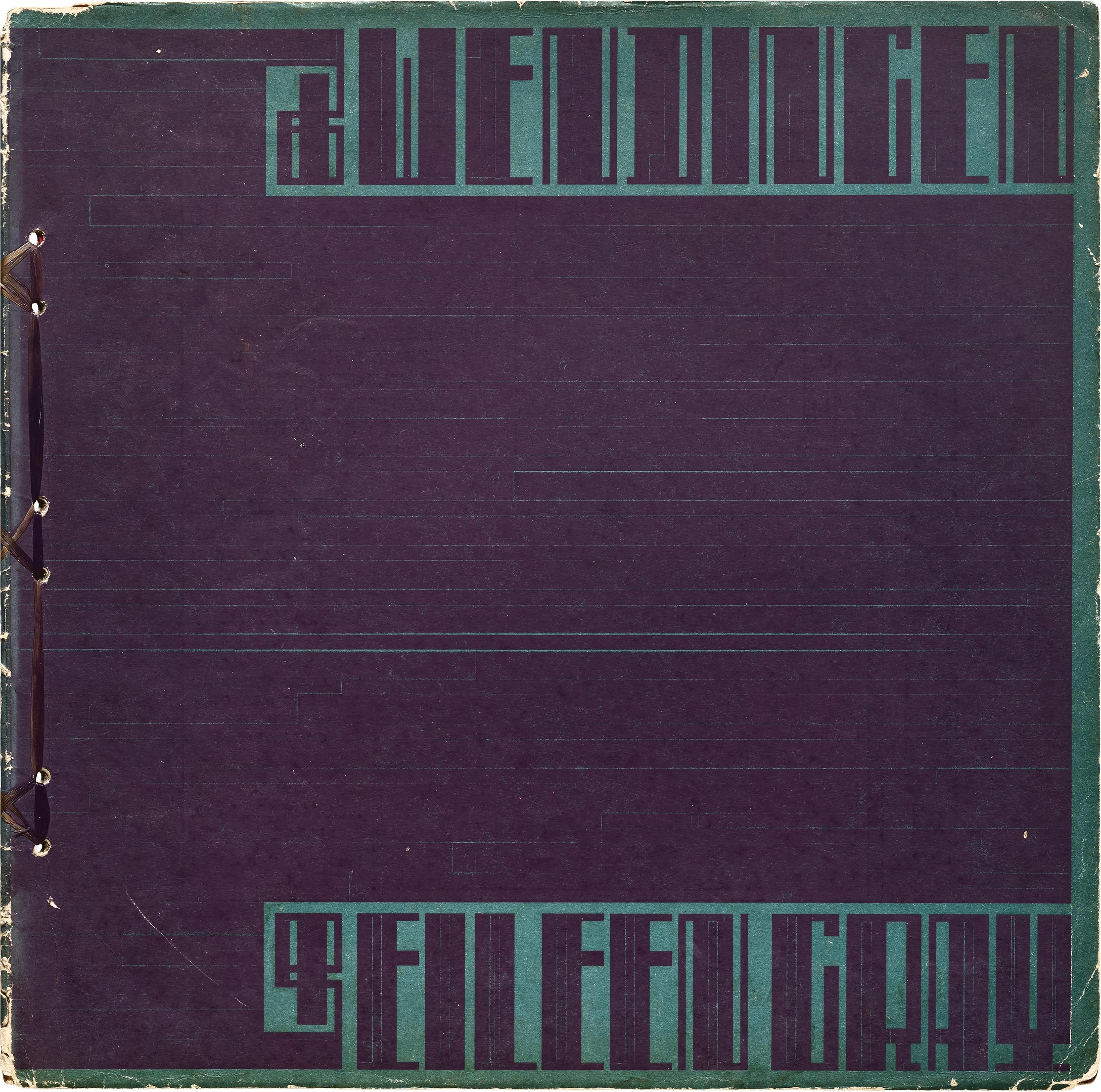
Dutch architect Hendricus Theodorus Wijdeveld was the editor and frequent designer of avant-garde magazine, Wendingen. This 1924 issue precedes the 1925 French expo, but Wijdeveld’s architectural lettering—made with rules (rectangular metal type blocks)—has a lot in common with other Art Deco forms.

Suprapto Sukonto designed these covers in Semarang, Indonesia between 1931 and 1934. He was perhaps influenced by Hendrik Wijdeveld (see above), but with a style all his own.
Joseph Binder was an Austrian-born graphic designer who trained as a lithographer and studied at the Vienna School of Arts and Crafts. Renowned for his poster work, he published the influential book Colour in Advertising in 1934, which articulated his modern approach to commercial graphics and the psychological impact of color in design.
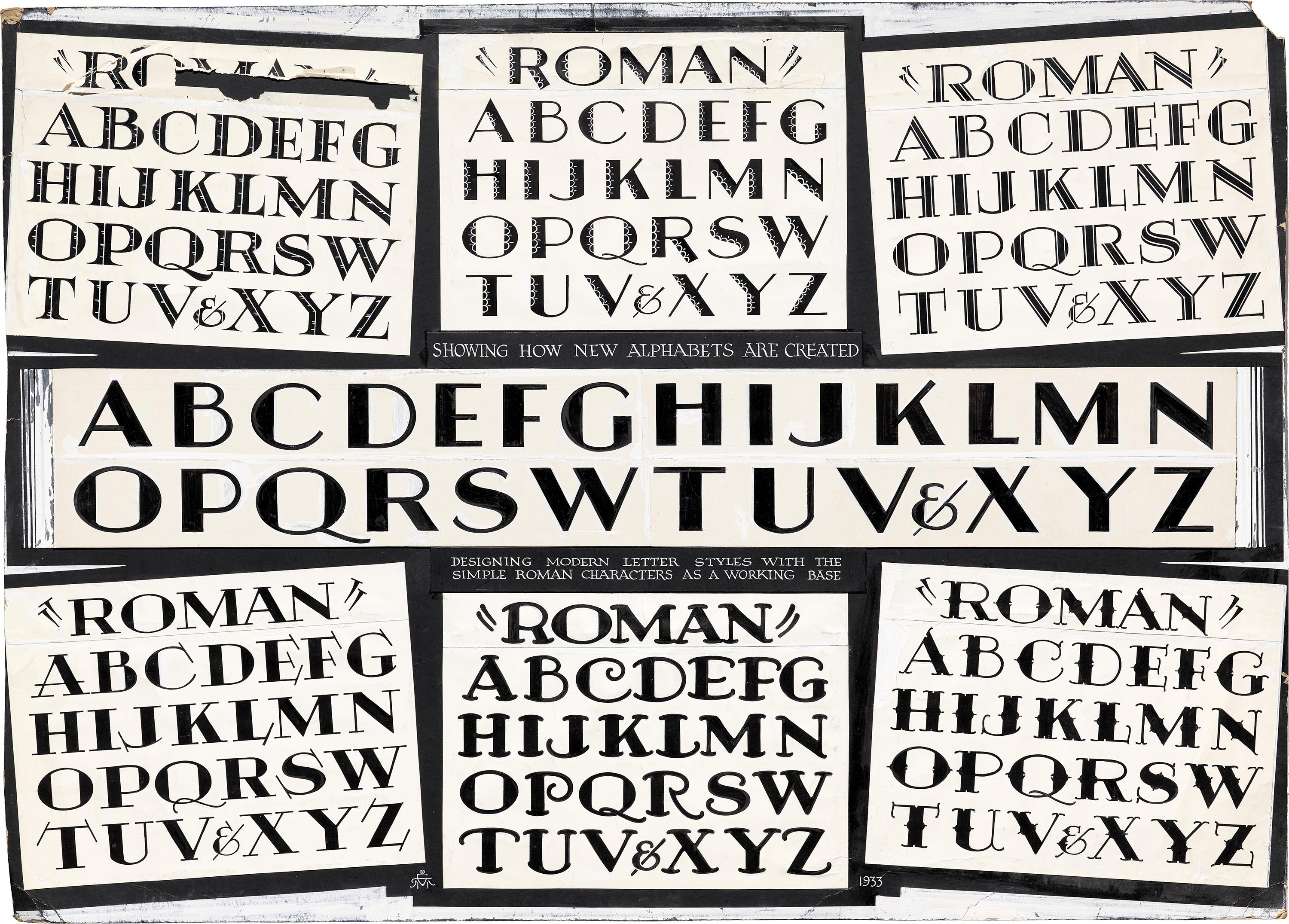
Ross F. George was an American sign painter, lettering artist, and inventor, best known as the inventor of the Speedball pen and original author of the Speedball Text Book, which trained generations in various styles of lettering. Many of his alphabets have Art Deco’s trademark features: low-waisted letters, geometric forms, and high stroke contrast. Letterform Archive holds his personal archive—including original alphabets, prototype pens, showcards, photographs, and manuscripts.
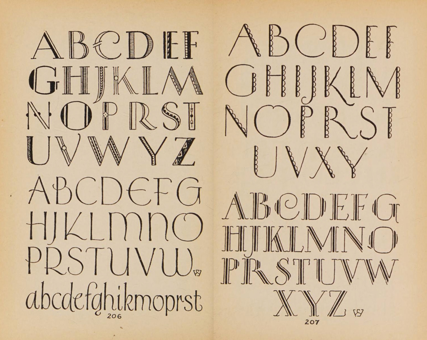
Like George, Samuel Welo aimed to show what artists and designers could achieve through lettering, authoring several manuals in the 1920s and ’30s. The Archive holds several of these books, including 1927’s Studio Handbook which presents over 250 pages of alphabets, including a section of “Modern Alphabets”, many that could be classified as early Art Deco.
Image: Internet Archive
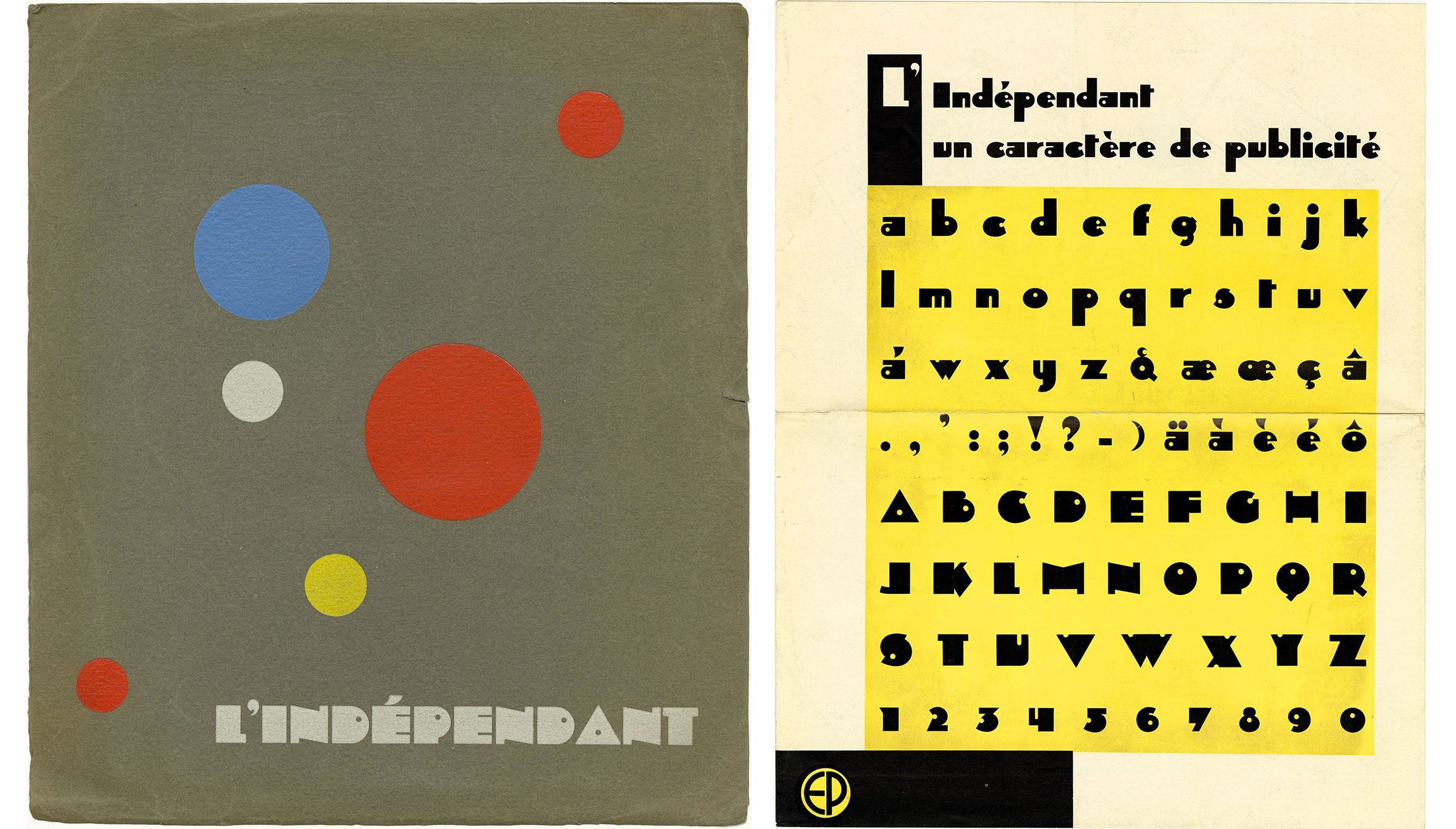
Designed in 1930 by Jos Dufour and Joan Collette for Belgian foundry Etablissements Plantin S.A., Indépendant is an early and successful exemplar of the bold, chunky class of typefaces associated with Art Deco.
Milton Glaser’s Baby Teeth is a 1960s revival of this style. And in 2025 Typozon revisited it for Chosmos. (See it featured in the Archive Salon below.)
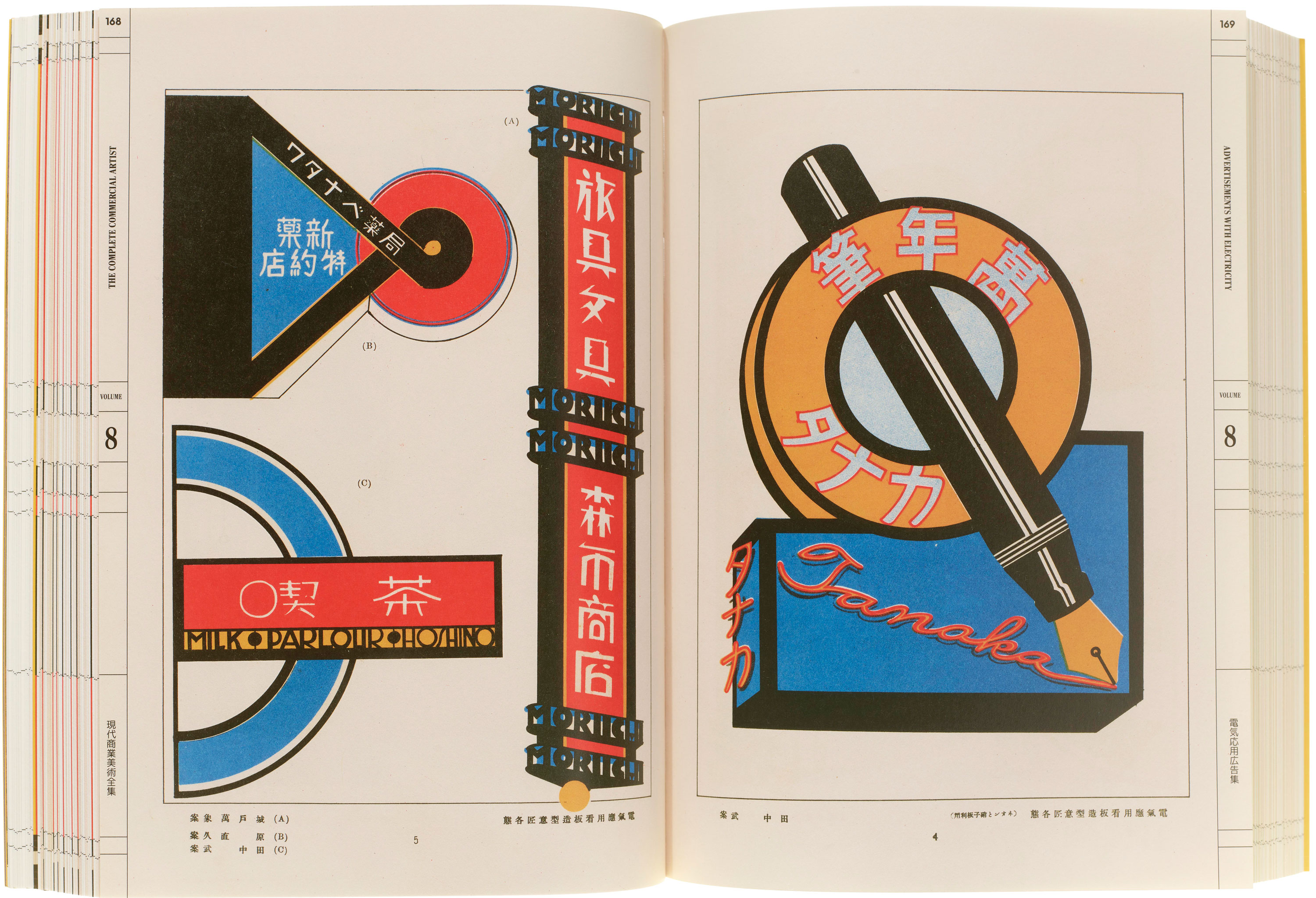
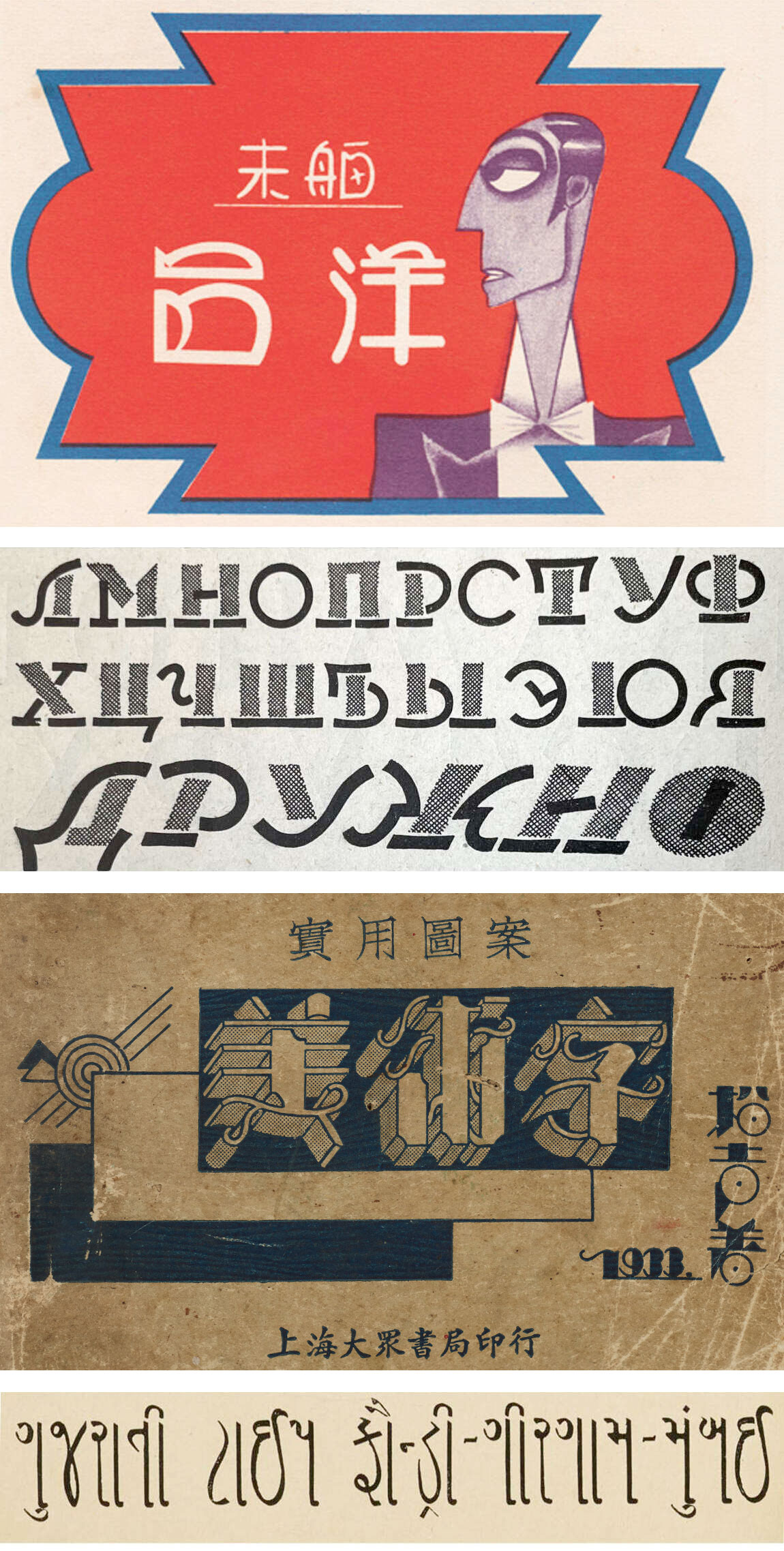
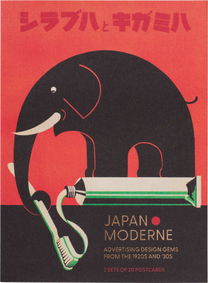
The Complete Commercial Artist is a groundbreaking 24-volume anthology from late‑1920s Japan that spans typography, posters, signage, shop displays, and more. It chronicled traditional letterforms, Japan’s evolving writing system, and the convergence of Eastern and Western modernism.
As a designer in San Francisco, Chicago, and New York, Walter Huxley (1890–1955) was a celebrated proponent of the pared-back streamline style. His 1935 typeface for ATF, Huxley Vertical, became one of the most popular ways to imbue printing with this Deco flavor. We are honored to hold a 1930s sketchbook from Huxley’s archive, including original maquettes for logos and a letterhead design for the U.S. release of Futura.
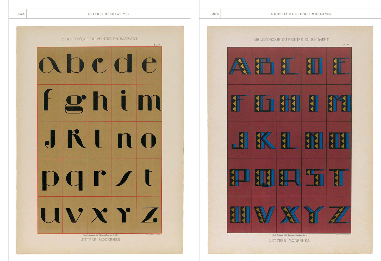
Coming soon from Letterform Archive Books is a splendid overview of French sign painter portfolios. Among the 12 featured titles is Modèles de lettres modernes (Models of Modern Letters), circa 1932. Active in Paris from the mid-1920s, Georges Léculier specialized in interior decoration and illustrated Art Deco interiors.
Another Parisian sourcebook from the 1930s, this catalog of “modern alphabets & numbers” provided sign makers with models of the Art Deco styles du jour. For more French lettering portfolios, see the upcoming book, Lettres Décoratives.
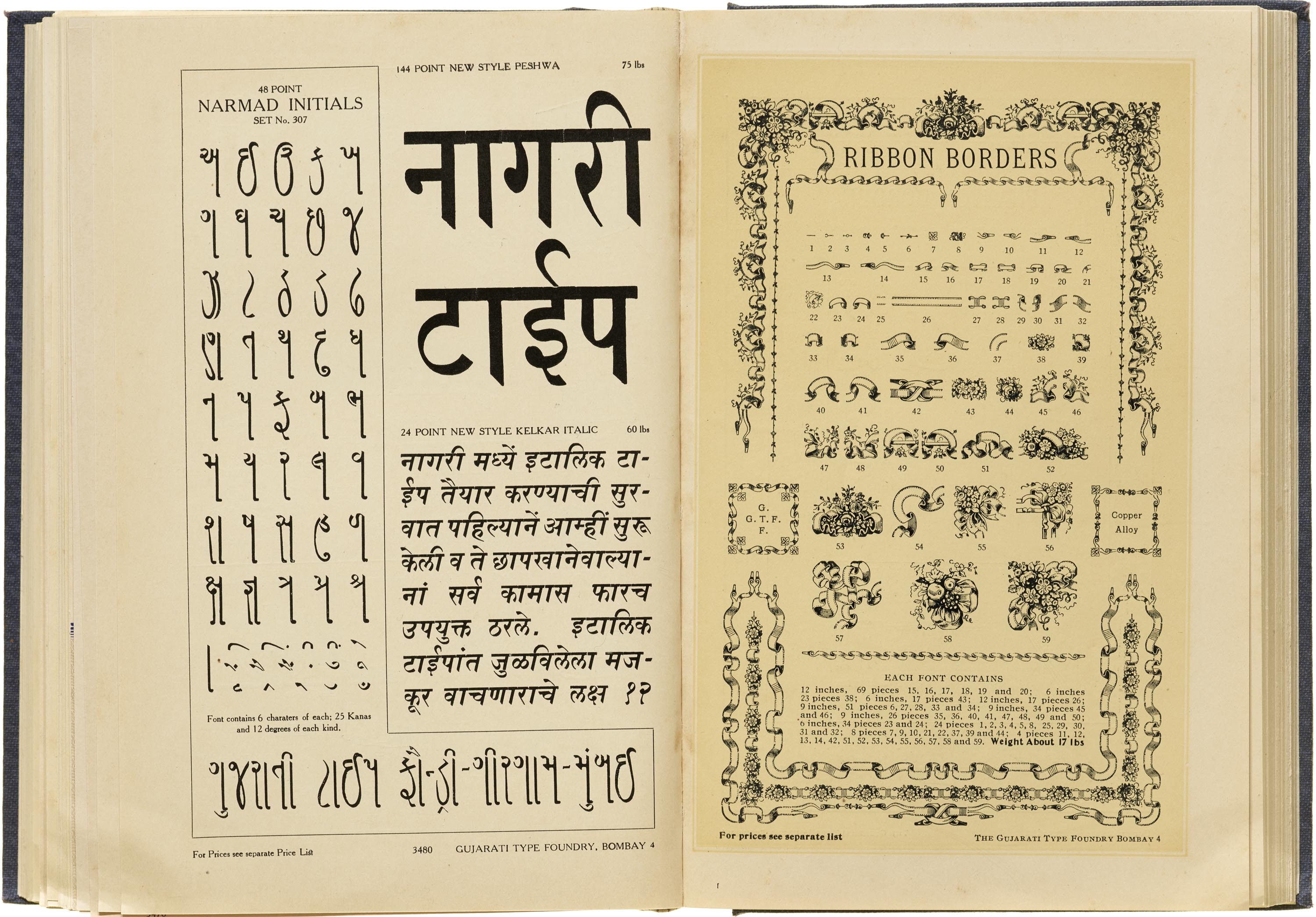
This catalog from the Gujarati Type Foundry offers a comprehensive glimpse into India's rich typographic heritage of the early 20th century. It also includes quite a few typefaces and ornaments that had their origins in Art Deco design.
The Archive is home to thousands of foundry catalogs and specimen booklets that advertise Art Deco fonts. Below are a few typefaces that exemplify the style. Click to see specimens in the Online Archive. (Samples provided by Fonts In Use)


Art Deco’s typographic expression is as varied as its global reach. The objects below were created long after the movement’s peak, but they carry some part of its spirit.
The famous German school’s modern ideals inspired typefaces that share characteristics with Art Deco letters—from geometry to abstraction.

Austrian artist Mila Kavalla studied fashion in school, but became an accomplished illustrator and designer. The Archive’s wide-ranging collection of her original artwork includes lettering and layouts from the 1940s–50s that exude the natural progression of Art Deco into mid-century design.
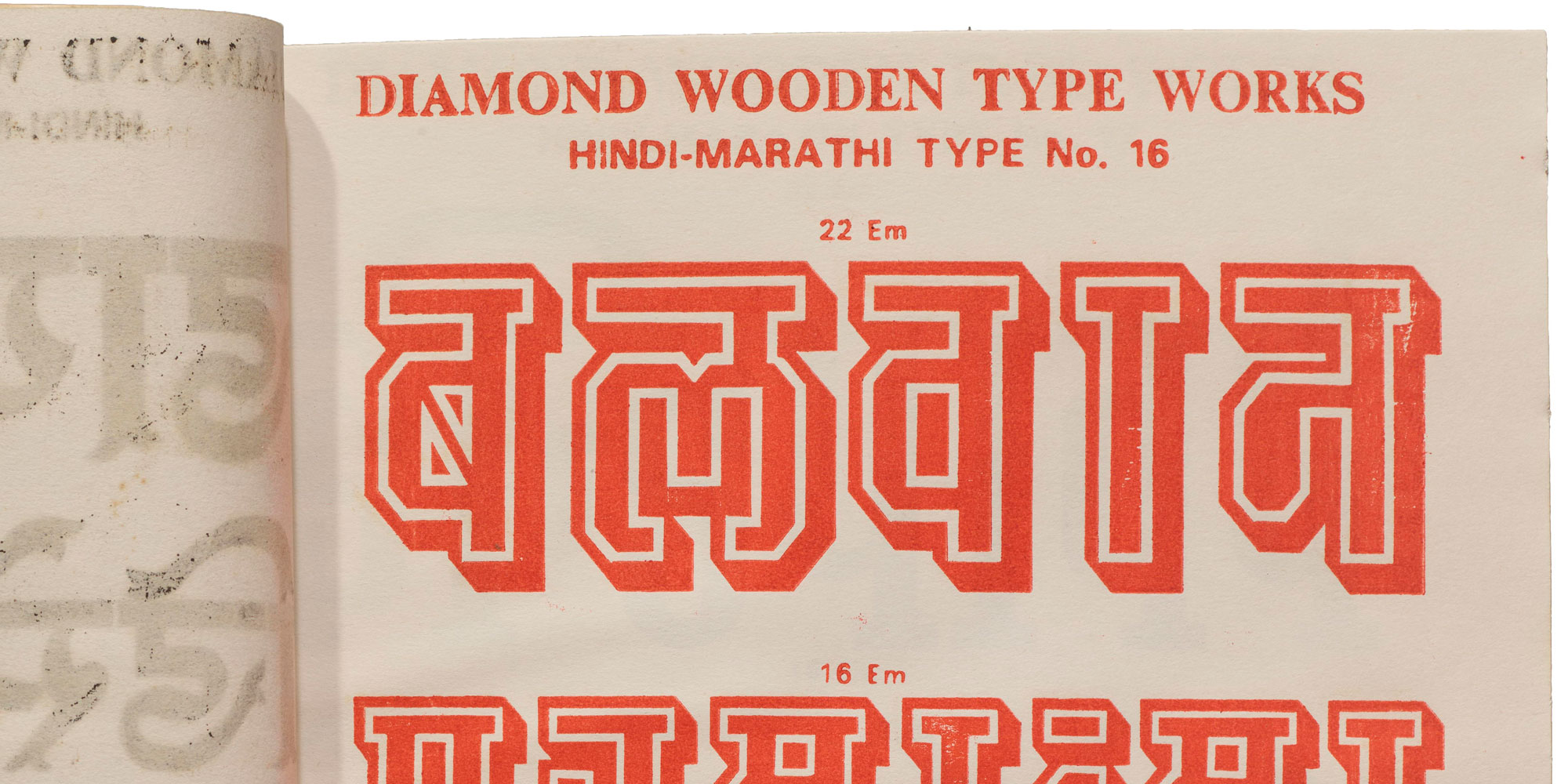
A curious 1975 catalog from Meerut, India, presents type specimens in Latin, Gujarati, Devanagari, Bengali, and Odia scripts, alongside Art Deco inspired geometric letterforms adapted for Indian scripts. It also features wood type designs for Art Deco inspired fonts like Blippo, Baby Fat, and Dubbeldik with a few complementary designs in Indian scripts.
When Letterform Archive launched our membership program in 2019, Angie Wang and Mark Fox designed this beautiful certificate that subtly echoes the Archive’s Art Deco collection, from the Bifur-derived letterforms to the metallic ink.
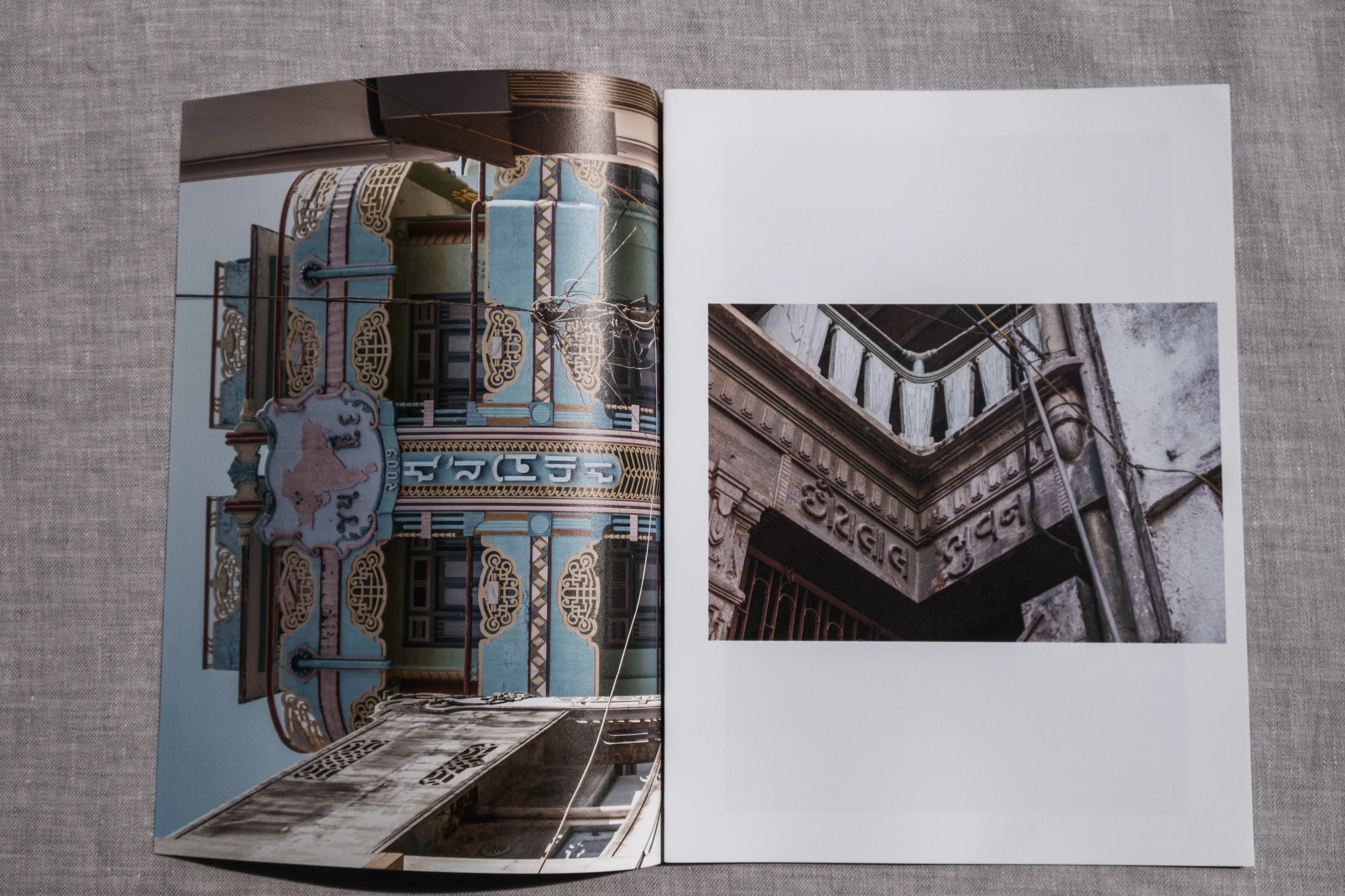
Balasinorosaurus Deco a zine by photographer Aashim Tyagi, spotlights Balasinor, Gujarat’s vivid Indo‑Deco scene, showcasing stunning Art Deco–inspired Gujarati and Devanagari lettering featured on local homes. This charming exploration highlights how the movement’s geometric elegance was uniquely interpreted in Indian vernacular design, revisiting mid-century aesthetics through a regional lens.
Letterform Archive’s Online Archive lets anyone around the world explore its physical collection. This Table showcases a range of specimen books, posters, and other objects that were designed with Art Deco principles in mind or that helped shape the movement. No matter where you live, you can also request an online tour to receive a curated look at our Art Deco collection.

Morgane Côme (introduction)
$65.00
MSRP:
Letterform Archive
$22.95
MSRP:
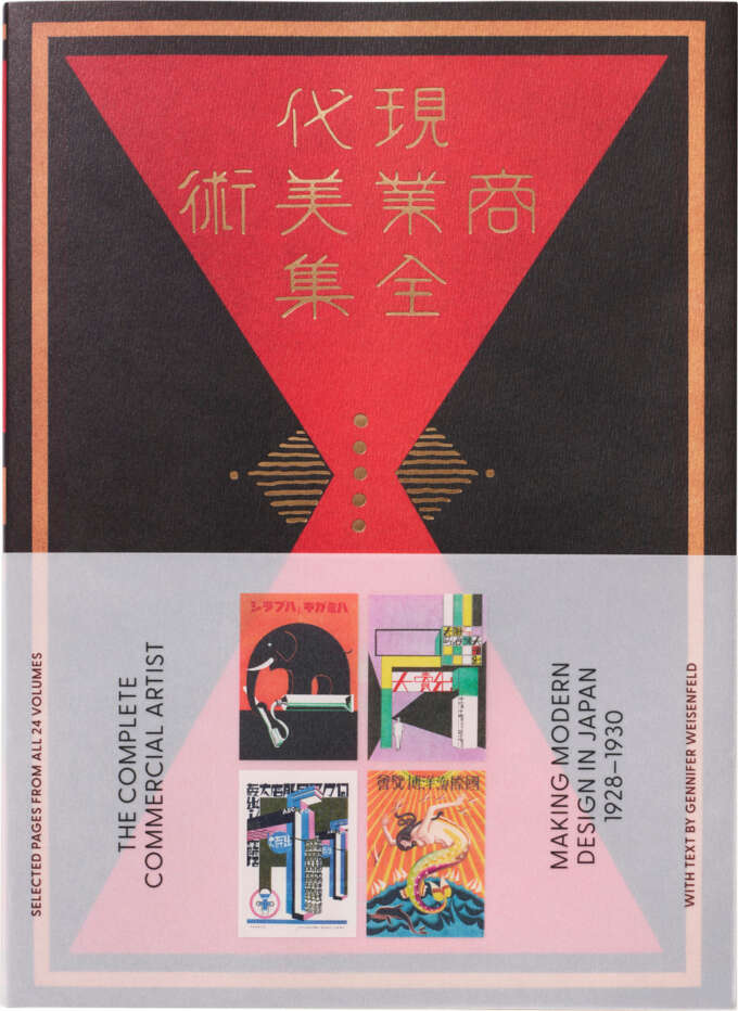
Gennifer Weisenfeld
$60.00
MSRP:
$70.00
MSRP:
Bruce Kennett
$60.00
MSRP: