News
Type History Toolkit, Part 2: De-Centering the Latin Letter in Design Education
Sabiha Basrai recommends globally expansive approaches to studying typography.
Type History Toolkit
- Part 1: A Chronological Approach
- Part 2: De-Centering the Latin Letter
- Part 3: Non-Linear Lenses
 This article by activist and educator Sabiha Basrai is the result of her 2023 research fellowship at Letterform Archive where she studied collections of global scripts and collaborated with staff on curriculum development.
As a student of graphic design, a practitioner, and now an educator, I have been asking myself what formed my assumptions around the meaning of “good design.”
My Muslim Gujarati parents immigrated from India in 1979 to the occupied Ohlone territories also known as Stanford, CA. My mother already had her masters degree in graphic design. It took time for her to find her footing as a young designer in a new country, but she eventually started working at Stanford Publications. I grew up spending time in her office after school exploring the flat files of Letraset* and sneaking into the dark room to check out the photostat machine. The craft of graphic design in the 1980s was a different world, and I was hooked. But my love of lettering came from calligraphy. My parents were sending me to madrasa on the weekends to study the Qur’an, learn how to recite my prayers, and read Arabic. I would come home and practice writing Arabic words using an old calligraphy dip pen — experimenting with the curves and angles — each letter constantly changing shape depending on which letter came next.
Years later, when I left home to pursue a degree in graphic design from Cal Poly San Luis Obispo, I took typography classes that celebrated the elegance of Garamond and the modern simplicity of Helvetica. I built my skills in editorial design — learning about hierarchy and best practices for legibility. I took design history classes about the Arts and Crafts Movement and Bauhaus School — striving to bring those values into my own work. I had forgotten about my initial love of Arabic’s exquisite letterforms.
The attacks of September 11, 2001 took place during my 2nd year of college. I found my political voice as an activist addressing anti-Muslim violence, state repression, and U.S. imperialism. As an art student, I understood that anything “Muslimy” was perceived as backward, dangerous, and “un-American.” My art history professor decided to skip the chapter on Islamic art. It is no wonder that so many of my classmates only saw Muslims as terrorists instead of artistic innovators.
I eventually made my way to Design Action Collective where I could dedicate my design skills to serving social justice movements from anti-war posters to environmental justice reports, to electoral campaign materials. It was here that I learned what language justice* meant. Reports and posters and outreach materials needed to be translated into multiple languages so they were actually useful for communities most impacted by systems of oppression. Design Action members are all involved in social justice campaigns and grassroots organizing efforts outside of the office as well, and we do our best to be accountable to the movements we are serving. I see Design Action’s 20+ years of work as part of a long legacy of graphic designers and culture workers who collaborate on art that wins campaigns and moves us towards collective liberation.
As a member of Design Action Collective, I participate in workshops, political education sessions, and skills sharing with a multigenerational community of activists, artists, historians, and archivists. This collaborative ecosystem has helped me understand the visual vocabulary developed during different chapters of social justice history, and make strategic decisions about how we represent our stories today.
OSPAAAL + multilingual international solidarity
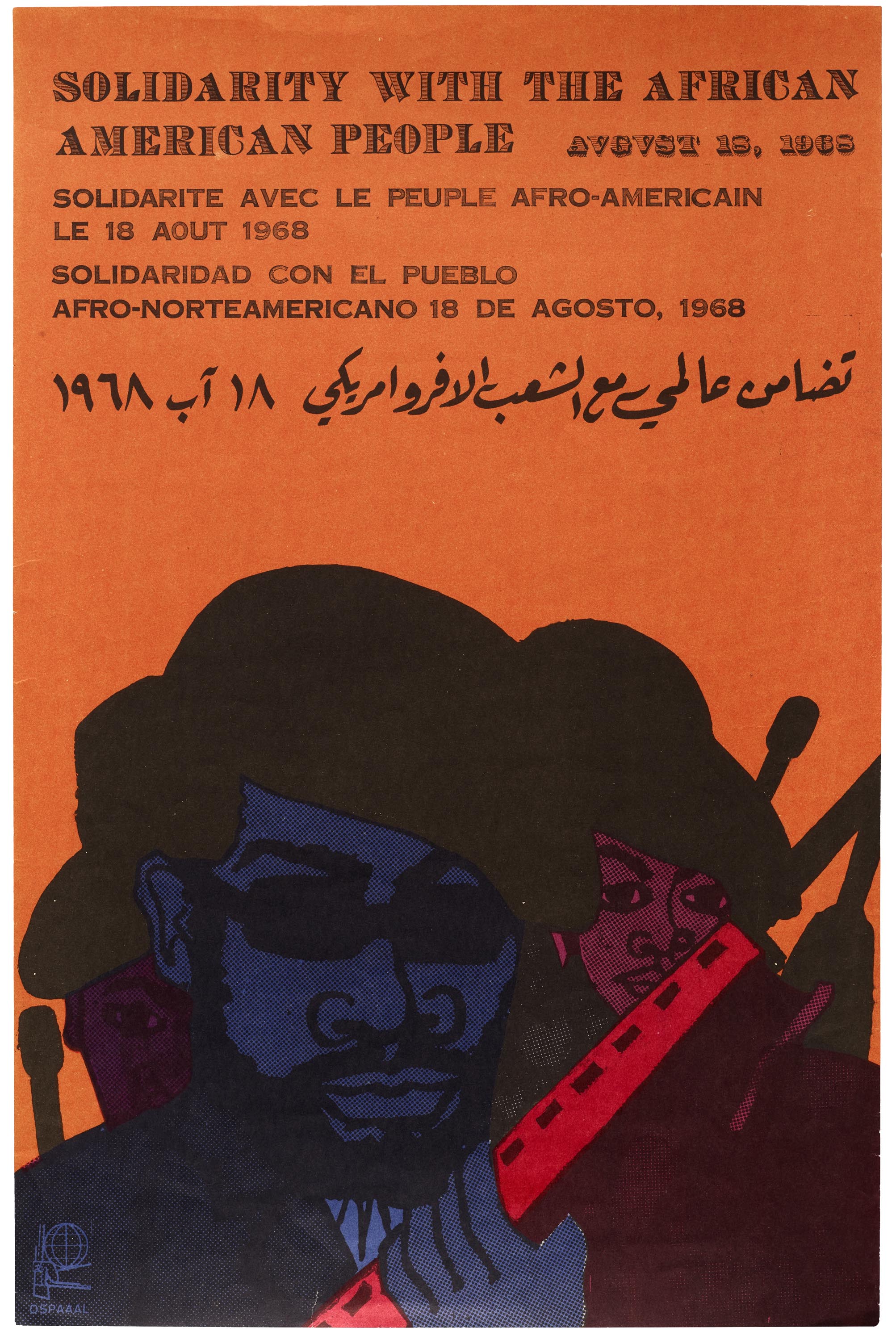
The Organization in Solidarity with the People of Africa, Asia, and Latin America (OSPAAAL) was once the primary source of political posters produced in Cuba which were distributed around the world. The monthly Tricontinental Magazine (1966-1990) was published in four languages (English, Spanish, French and Arabic) reaching tens of thousands of people in over 80 countries—many of which were in the midst of achieving independence from colonial domination through mass uprisings and people’s movements. Each issue included a multilingual poster carrying messages of international solidarity—highlighting how various independence movements and struggles for justice intersected. When asked why educators should include the history of OSPAAAL in their syllabi, author and historian Lincoln Cushing stated:
“The graphics and typography include stunning examples of the best of Cuban graphic design. Some are brilliant depictions of abstract concepts such as “capitalism,” “colonialism,” and “solidarity.” Others elegantly connect indigenous acts of resistance and liberation with contemporary political struggles. Revolutionary heroes and martyrs from all over the world are represented. Activist artists everywhere from that period were influenced by OSPAAAL’s graphics, all produced with basic “old school” pre-Photoshop techniques.”
Some original prints from OSPAAAL are part of Letterform Archive’s collection and an online catalog of OSPAAAL posters can be seen on Lincoln Cushing’s Docs Populi website.
Nisha K. Sethi + Trust Your Struggle Collective
I met Nisha K. Sethi in 2011 through the Alliance of South Asians Taking Action (ASATA). Nisha is a visual artist and graphic designer — she honed her craft as a muralist and street artist with an expertise in lettering in the tradition of Bollywood sign painters and East Bay graffiti writers.
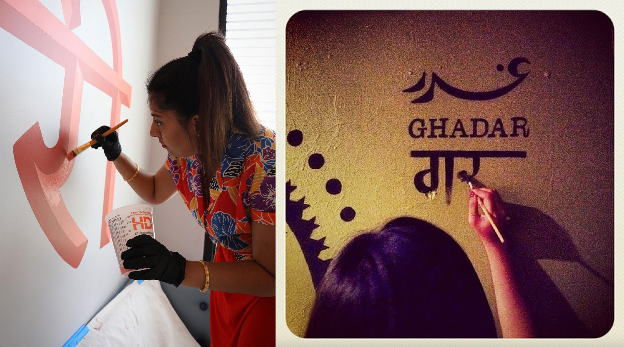
The line quality in Nisha’s work calls in the artistry of mehndi and remixes the cultural roots of being part of a diverse South Asian diaspora. As a member of the Trust your Struggle Collective, she collaborates with other Oakland-based street artists and muralists who create compositions featuring Arabic, Devanagri, Urdu and Gurumukhi.
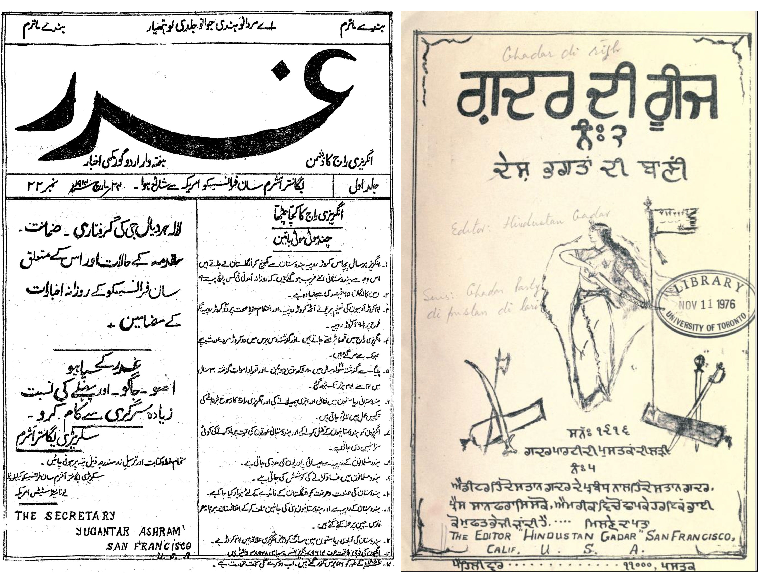
In 2013, Nisha created a mural commemorating the Ghadar Party. She applied her mastery in the technique of sign painting to the letterforms in the upper corner. The word Ghadar, meaning Rebel, appears in Urdu, English and Hindi — reminding the viewer of the international solidarity behind this movement and referencing the multilingual newspapers produced at the Ghadar Party headquarters in San Francisco between 1913–1917.
When we uplift artists like Nisha, we not only support their ability to thrive as artists, but we create pathways for others in diaspora and immigrant communities to find their creative and political voice as designers.
In conjunction with the exhibit Subscription to Mischief: Graffiti Zines of the 1990s, Letterform Archive hosted a salon discussion with Nisha and Trust Your Struggle Collective members Rob Liu-Trujillo and Miguel Bounce Perez on graffiti and its influence on their art practices.
For more information about the art of sign painting in India, read Nisha’s article, “Painter Kafeel: Keeping it Hand-Painted in India.”
Centering Global Scripts in Teaching Typography to Graphic Design Students
Part of my role as an educator is to diversify my sources of information—to seek out creators, case studies, and historical context that were excluded from the curriculum I grew up with.
Letterform Archive’s lecture series has been an invaluable resource for my own journey as designer and educator. If you are an educator looking for content on typography beyond the Latin script, consider incorporating these recorded Letterform Lectures into your syllabus.
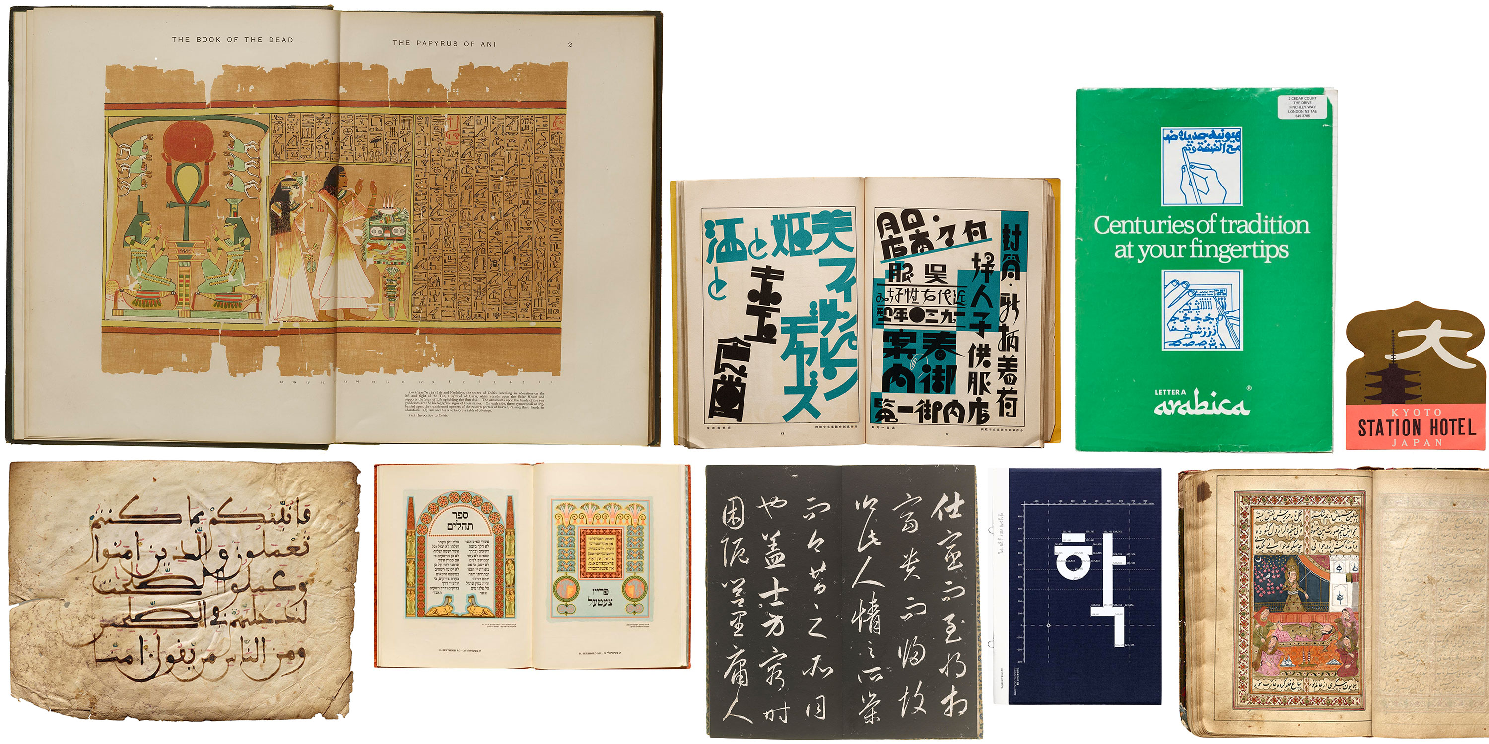
Letterform Archive’s Artifacts
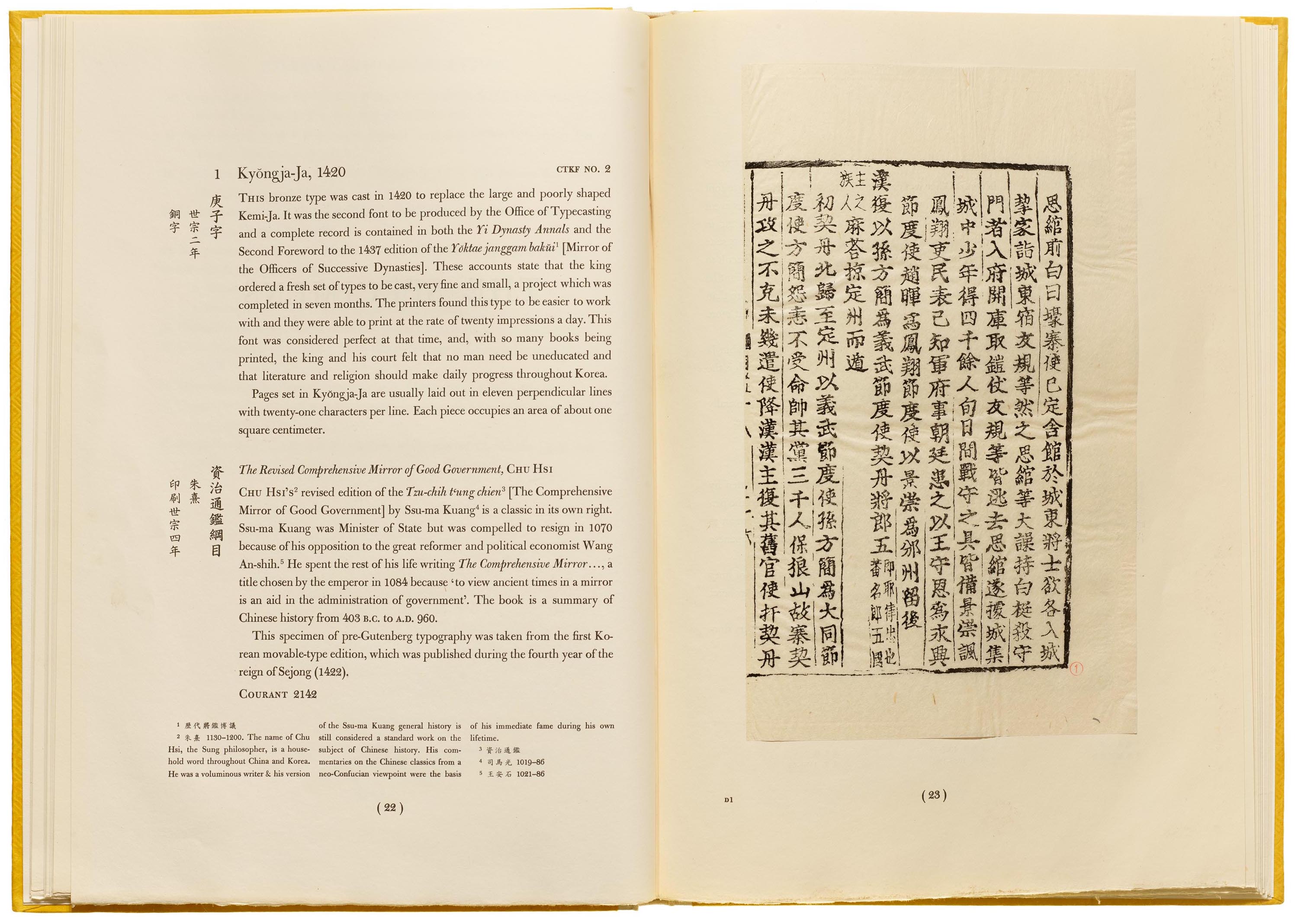
One of the treasures housed at Letterform Archive is the Gujarati Type Foundry Type Book produced in the 1940s. The metal type catalog includes instructions for graphic designers and printers showcasing a range of English, Urdu, and Sanskrit typefaces along with decorative elements. Students reviewing this artifact can see how designers in 1940s India worked creatively with a limited color palette, and appreciate the implementation of clear hierarchy with relatively simple type treatments. An illustrated glossary in the back of the book explains the various tools and printing technologies available to practitioners of the time, along with a comprehensive catalog of books on printing techniques, design, and journalism—demonstrating a holistic approach to the role of the foundry beyond simply selling fonts.
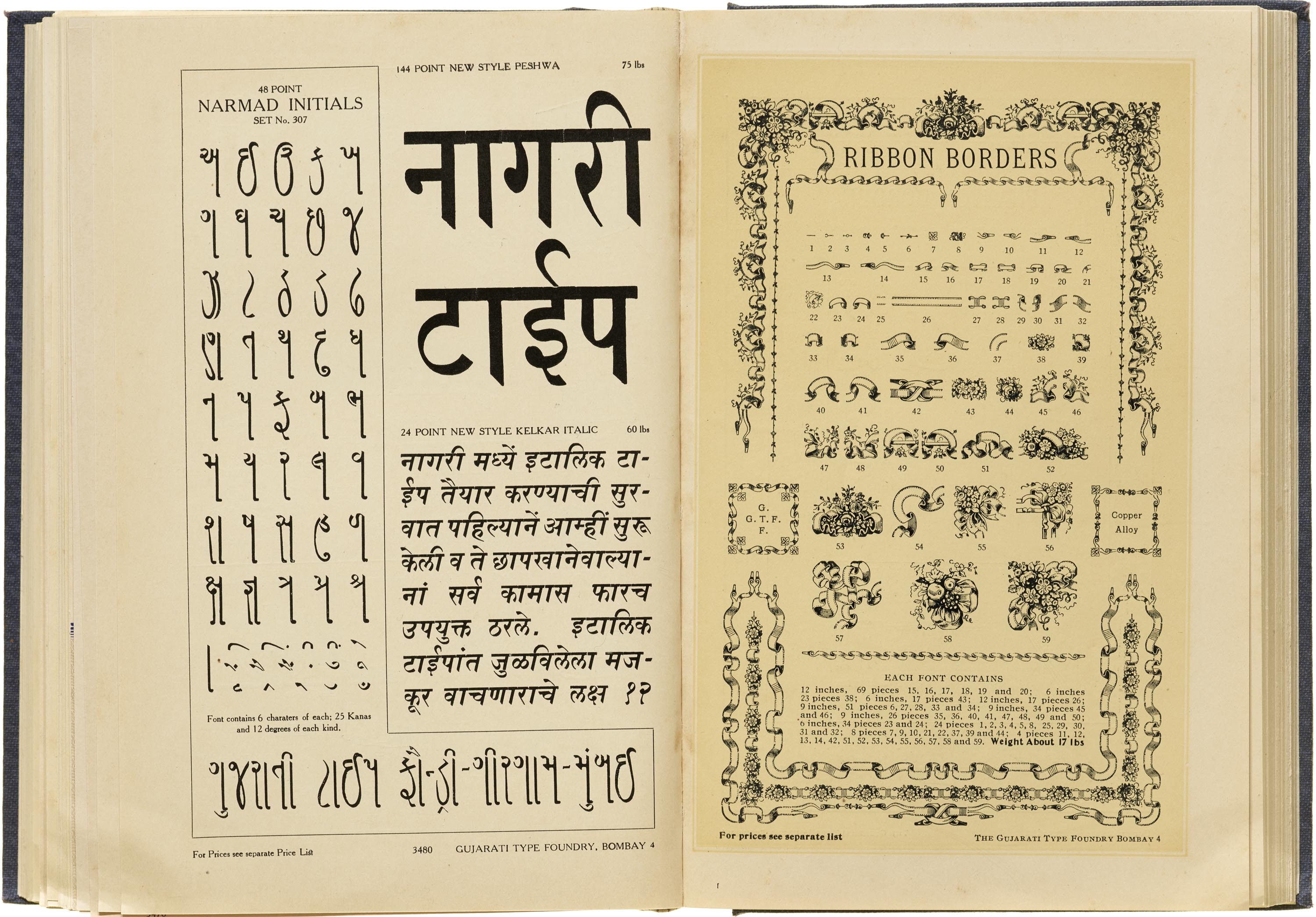
The various typefaces are shown using sample text such as poems, historical texts, and riddles which gives us an insight into the political and cultural context that the foundry was created in. This was a time of de-colonization and Indian society began a new chapter.
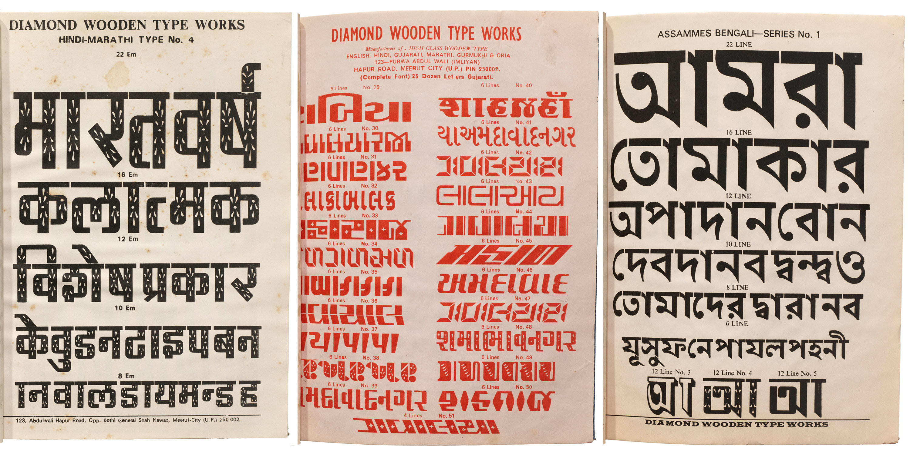
Letterform Archive’s collection also includes type specimen books, lettering manuals, and writing guides featuring calligraphic scripts from around the world, such as Hindi and Marathi, Arabic, Tamil, Javanese, and more. Many of these books date back to the early 20th century and were being produced during a time when information sharing, printing technology, and distribution methods were all rapidly changing while World War II and independence movements drew new borders and reshaped national identities.
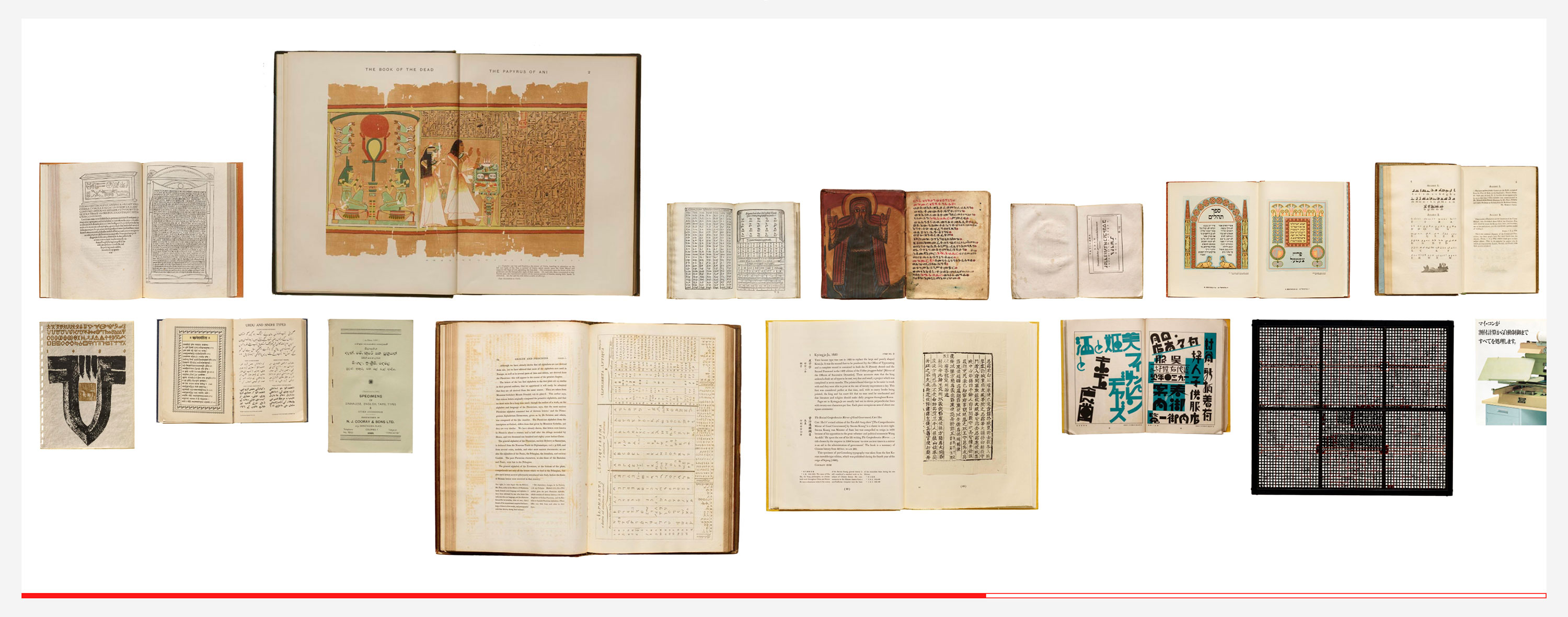
In 2019–2020 the Archive hosted a Type History Seminar for California College of the Arts’ MFA program. A table in the Online Archive features items from the course’s Global Scripts module by the Archive’s associate editor Chris Westcott, and includes a useful list of resources.
Learn more about artifacts at Letterform Archive that feature global scripts in the following presentations and articles:
- A Brief Typographic Trip Around the World, Part 1
- A Brief Typographic Trip Around the World, Part 2
- New in the Online Archive: Global Scripts
- Contemporary Design of South Korea
- The Complete Commercial Artist
- Gujarati Type Foundry Specimen
- How Type Travelled Across Nations and Foundries
- Indian Movie Posters
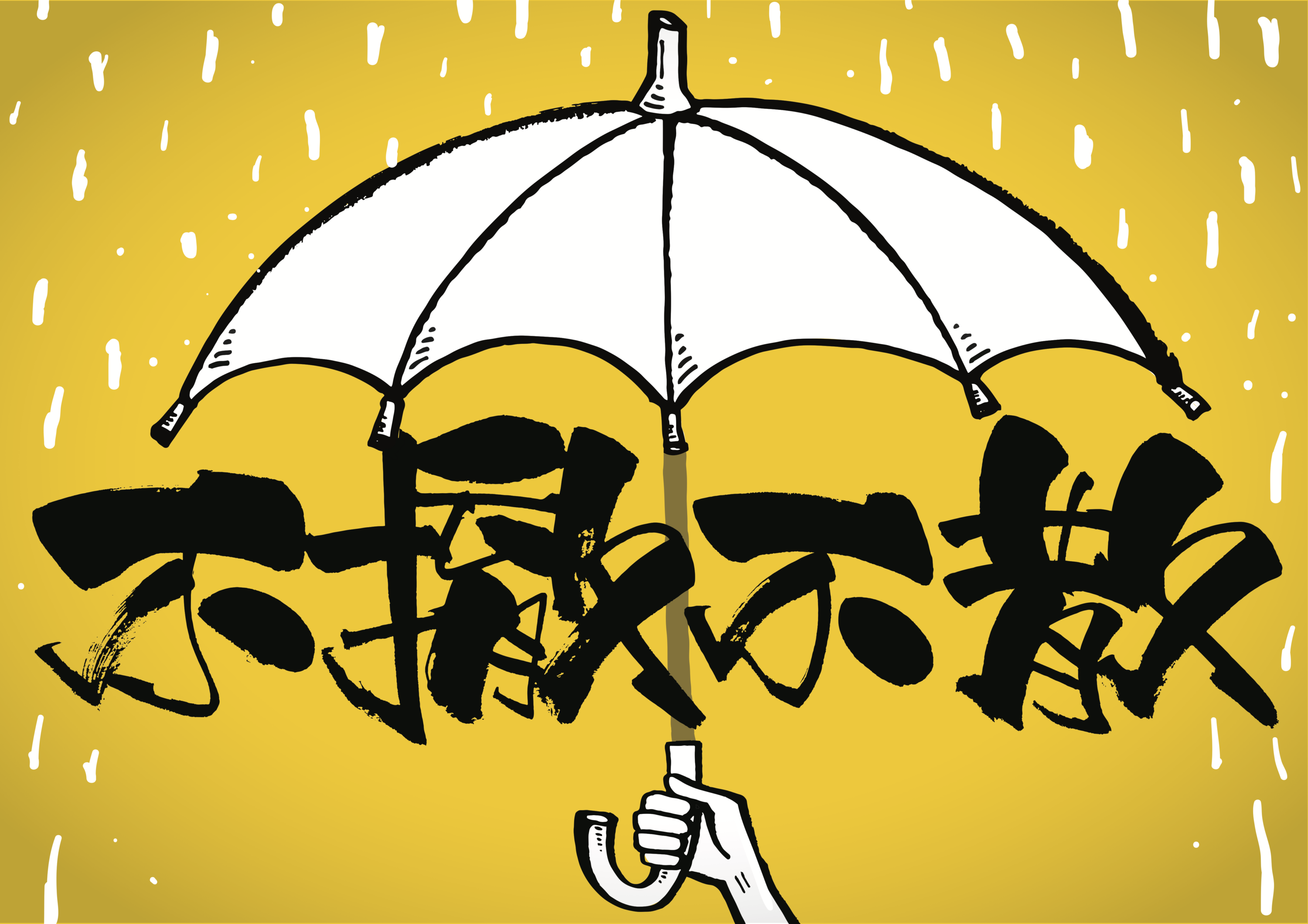
The Archive’s Strikethrough exhibition also included various examples of activist work from around the world, including Islam Aly’s The Square (see video), Ganzeer’s Justice for Mona, Nadine Chahine’s Kafa typeface, and Kit Man’s calligraphy for the Umbrella Movement in Hong Kong.
In addition to examples within Letterform Archive’s collection, their partner The People’s Graphic Design Archive offers a crowd-sourced supplement to traditional institutional collections of design. The site includes tags for languages (e.g., Arabic and Japanese).
Deepening Our Practice as Designers
Those of us who are educators and mentor young designers have an opportunity to expand the way we teach the elements and principles of design. Providing non-Western reference points for concepts of color theory, pattern, contrast, and typography allows our creativity imaginations to grow. This practice helps me unlearn my own assumptions about best practices in design. I try to create space for students to engage in critical conversations about cultural appropriation and the legacy of colonialism as they consider their own roles and responsibilities as designers. With this in mind, I worked with Letterform Archive to develop two typography projects for undergraduate design students.
Project 1: Multilingual Poster
Explore diverse letterforms while creating a layout featuring multiple languages.
Get project guidelinesProject 2: Arabic Composition
Examine the flexibility of the Arabic script by designing a single-word composition.
Get project guidelinesAdditional Resources
A selection of websites, articles, and texts on language and decolonization for educators teaching typography:
- The UC Berkeley Library curated this collection on language and lettering in a time of decolonization.
- A History of Arab Graphic Design by Bahia Shehab and Haytham Nawar
- Meet Khmer type designer Tep Sovichet
- Revolutionary type: Meet the designer decolonizing Chinese fonts
- How to bring a language to the future: For decades, it was nearly impossible to type in Urdu online. Meet the people fighting to digitally preserve its script.
- The Mind Behind Tamil’s First Variable Typeface
- The Ever-Evolving Typographic Life of the Arabic Language
Many writing systems are more complex and less standardized than Latin. Working with a diversity of scripts allows students to pursue a more rigorous study of typography. For example, Anjni Shah is a recent MFA graduate from the California College of Arts who created a new typeface in Gujarati inspired by DIN, the standardized typeface developed in Germany. “Aarambh”—meaning “beginning” or “starting point”—was the result of an intense iterative process that explored the details of the letters, their relationship with one another, and addressed the technical challenges of coding that font to a Roman keyboard. When asked about her experience as a student, Shah explained that her work in Gujarati made her a better designer in other languages.
Knowing that young designers will often encounter projects using multilingual content as they start their careers, it is important that they practice working through those challenges as students.
White supremacy culture is pervasive in the design industry. We did not choose this system, but as designers, it is our responsibility to subvert it in our creative practice. Just as we practice our craft as designers, so too must we practice unlearning those systems of oppression so we can avoid perpetuating them. For more resources on building your anti-racism practice, check out organizations such as Race Forward.
As I reflect on my childhood love of Arabic calligraphy and my subsequent career as a designer, I am reminded of the labor of generations of Arab artists who wrestled with how to translate Arabic calligraphy into usable fonts for magazine and newspaper production in the 19th and 20th centuries. These were also times of decolonization. Decisions on how to simplify complex, artistic letterforms was a technological question as well as a political one. New design schools were established in cultural centers such as Baghdad, Damascus, and Cairo where designers innovated visual styles with global impact. In A History of Arab Graphic Design, authors Bahia Shehab and Haytham Nawar state, “Languages are the extension of the spiritual, social, and historical mind-set of nations.” It is my goal to honor this history as I teach typography to students of design today.
Sabiha Basrai has been working at the intersection of graphic design and social justice activism since the late-1990s. She is currently co-owner of Design Action Collective and a member of the University of San Francisco’s Department of Art + Architecture. She is a volunteer coordinator of the Alliance of South Asians Taking Action and a member of the Center for Political Education’s advisory board.
Special thanks to Mikhail Ganesh and the staff of Letterform Archive for supporting this research and continuing the work of decolonizing design education.