News
Type History Toolkit, Part 1: A Chronological Approach
Curated sets of objects in the Online Archive tell a visual story of typographic design, starting with the Western world.
We love to hear how the Online Archive is enhancing design courses around the world. Teachers are using the Tables feature to create and share design artifacts and inspiration with their students, or present curated sets as slideshows in class. During the pandemic, when we weren’t able to welcome students to the Archive, the staff created our own tables* to help navigate type history and highlight works in the collection that exemplify major movements. Now we’re sharing a few of these tables with you!
Type History Toolkit
- Part 1: A Chronological Approach
- Part 2: De-Centering the Latin Letter
- Part 3: Non-Linear Lenses
Alongside the tables, we’re including a timeline developed by the Archive’s 2021 research fellow Bethany Qualls. Her list of milestones outlines a broader printing and typographic history and marks the developments that enabled the artifacts seen in the collection. Each period is also accompanied by lists of links for further study, including lecture recordings, blog posts, Letterform Archive books, and other resources.
The tables are arranged chronologically, but include various themes, movements, and subcultures for approaching type history in a non-linear way.
ca. 200 CE, China: Woodblock printing on cloth
618–906 CE (Tang Dynasy), China: Woodblock printing on paper perfected
ca. 750 CE, Korea: Mugujeonggwang Great Dharani Sutra, 무구정광대다라니경, oldest surviving book with woodblock printed text
762 CE, China: First commercially printed books sold in Chang’an, the Tang capital
960–1279 CE (Song Dynasty), China: Invention of movable type printing
868 CE, China: The Diamond Sutra, the world’s “earliest dated, printed book,” a woodblock printed scroll
971 CE, China: Monk Zhang Tuxin starts printing the Tripitaka; all 1076 volumes take 12 years to print
960–1368, China: Metal type used for printing banknotes in the Song, Jin, and Yuan dynasties
Western Scripts Before Gutenberg
BCE–1510
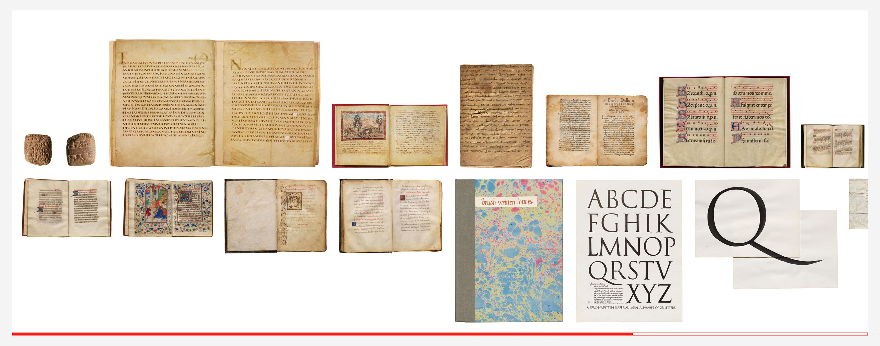
Table by Johnny Avots-Smith and Kate Long Stellar
Johnny and Kate, two of the Archive’s first team members, launch our journey with a review of early Western scripts before the advent of Gutenberg’s movable type. It begins with a Cuneiform tablet, nearly 5,000 years old, which gives a sense of scale to the history of the written form. We fast-forward to look at the evolution of scribal approaches to handwritten texts in Latin. The facsimiles of the Vergilius Augusteus showcase the “square capitals” which evolve into slightly slanted “rustic capitals” seen in the Vergilius Vaticanus, with the eventual introduction of the lowercase in the Carolingian hand. It took a lot of material and labor to create manuscripts with opulent margins and detailed ornamentation, and written texts came to be recognized as a sign of wealth. The evolution of the letterforms shows the blackletter forms popular in Germanic parts of Europe giving way to the Humanist hand created by the Italian scribes during renaissance, which also increased legibility. The evolution of shapes can be attributed to change in tools and stylistic preferences, but also flourishing commerce would have demanded economy and speed over beauty, so we see the Chancery hand also appear in a manuscript by a papal scribe.
Most of the surviving documents from this period tend to be religious in nature, and are thus overrepresented in archives, while a lot of day-to-day writing was lost. A lot of theories are also based on modern-day scholars’ interpretations of older pieces of writing, such as Father Catich’s theory of the calligraphic origin of serifs.
See the table and individual item notes for more details.
- From the Collection: A Cuneiform Tablet
- Trajan Rubbing and Recutting
- The Trajan Inscription in Slate with Paul Herrera
- The English Writing-Masters and their Copybooks
More Resources
ca. 1041–1048, China: Bi Sheng invents moveable type with small clay blocks that are fired, then set in a frame and inked
ca. 1440, Germany: Johannes Gutenberg works in secret on a printing press that uses cast metal type made from an alloy of lead, antimony, and tin
1455, Germany: Gutenberg Bible printed
Scholar Printers I: Gutenberg, Renaissance Printing, & Writing Manuals
1450–1700
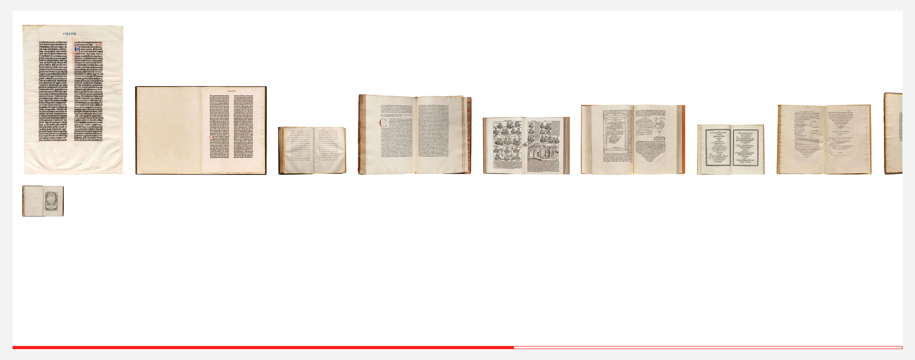
Table by Rob Saunders
The Archive’s founder and curator introduces some of the earliest printed objects in the collection. Responsible for the whole process of printing, “scholar printers” such as Nicholas Jenson, Aldus Manutius, and Robert Granjon, were also publishers, editors, type designers, type founders, and compositors. This allowed them to have total creative control over the final output. The printed text was made to look as close to the scribal hand, and as such pages were still illuminated by hand, with drop capitals and ornamental frames applied after the printing. The first printed books in the West copied both the letterforms and the book design of the manuscripts of the time. In the following two centuries, calligraphy and type design influenced each other in cycles. This table also showcases writing manuals. As the name suggests, they were created to instruct the reader in a variety of scripts; however, they were also flamboyant showcases of the calligrapher’s style. The pages were printed from woodcuts and, eventually, engraved plates that allowed for more elaborate and ornamental designs.
- Landmarks in Early Western Typography
- How Metal Type was Made
More Resources
Scholar Printers II: Transitional and Modern
1700–1820
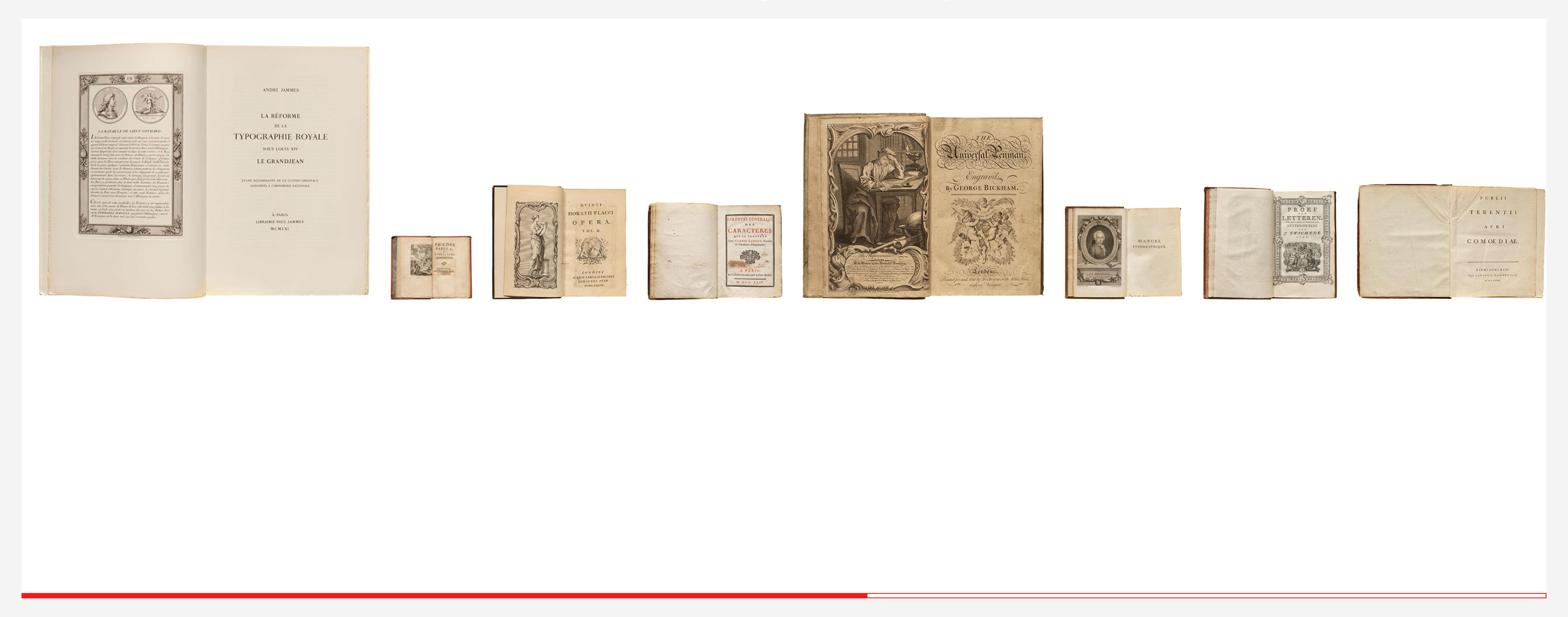
Table by Rob Saunders
Rob continues his showcase of the scholar printer evolution, highlighting the establishment of type foundries as a separate business. By the 18th century it was no longer necessary to cast your own type to become a printer. The typefaces in this period show the evolution away from Humanist styles (derived from the broad pen) to Transitional and Rational (pointed pen). The La Réforme de la Typographie Royale sous Louis XIV is a 1961 facsimile reprint of circa 1700 Romain du Roi, a typeface commissioned by King Louis XIV to be used on official government documents. The drawings for the type rely heavily on geometry, but the final type is far less clinical thanks to the punchcutter who understood the limitations of the grid in designing type. These designs are still printed on a wooden hand press and don’t benefit from the precision that eventually comes with the metal and mechanical press. Pine's Horace is an example of printing with engraved copper plates instead of type. You can tell by the fact the forms for letters keep changing slightly as opposed to the consistent design seen when a font is used to typeset text.
- New Light on Old Types with Stan Knight
More Resources
1828, United States: Darius Wells creates mass-produced wood type using lateral router, publishes his first wood type catalog
1834, United States: William Leavenworth and A. R. Gillmore equip Wells’s lateral router with a pantograph to enable mass mechanical production of wood type
1880s, United States: Linn Boyd Benton creates the Benton Pantograph. Typefaces can now be drawn more accurately on large plan drawings instead of hand-engraved at target size.
1886, United States: Ottmar Mergenthaler creates the first linecasting machine, later named Linotype
1887, United States: Tolbert Lanston files patents for his Monotype machine
1890s–1970s: Linotype and Monotype solidify their hot metal casting methods of typesetting, resulting in dramatically quicker, cheaper, and less labor-intensive printing
The Industrial Revolution
1830–1920
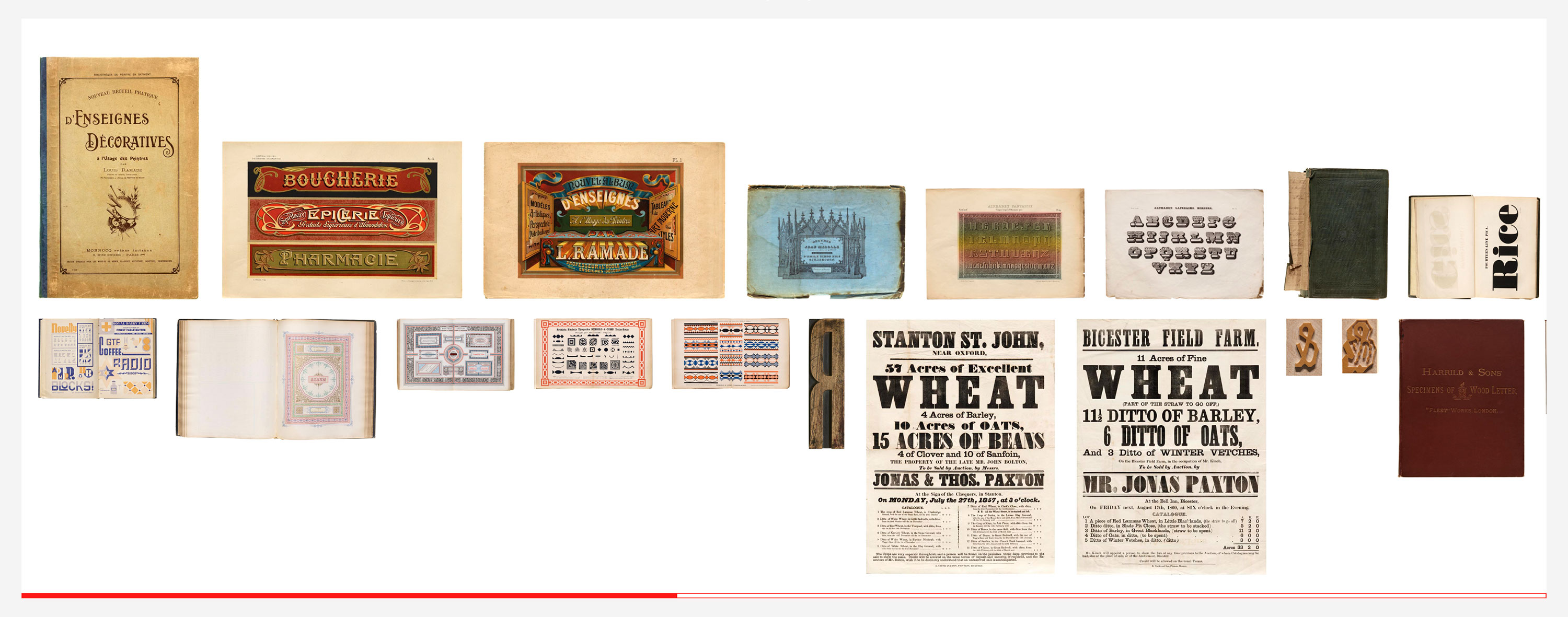
Table by Stephen Coles
Hello, color! This set of eye-grabbing books and prints represent the mid 19th century to early 20th century, with a focus on the technologies and aesthetic diversity of the second industrial revolution. Leaps in electrification, manufacturing, and transportation led to rapid changes in Western economies and societies. Advancements in paper making, printing, typefounding, and typesetting followed suit, resulting in cheaper and more plentiful books, new forms of advertising to meet the demands of expanding commerce, and a burst of color and special effects that were previously impossible or too costly to produce.
See the table and individual item notes for more details.
- Color, Ornament, and Type at the Turn of the 20th Century
- The Alphabet Lithographs of Jean Midolle
- The Richard Sheaff Ephemera Collection
- W. A. Dwiggins: A Life in Design
- Archive Salon: Wood Type
- Linotype: The Film
- Grotesque: The Birth of the Modern Sans Serif
More Resources
Art Nouveau, Jugendstil, Arts and Crafts, & Art Deco
1890–1940
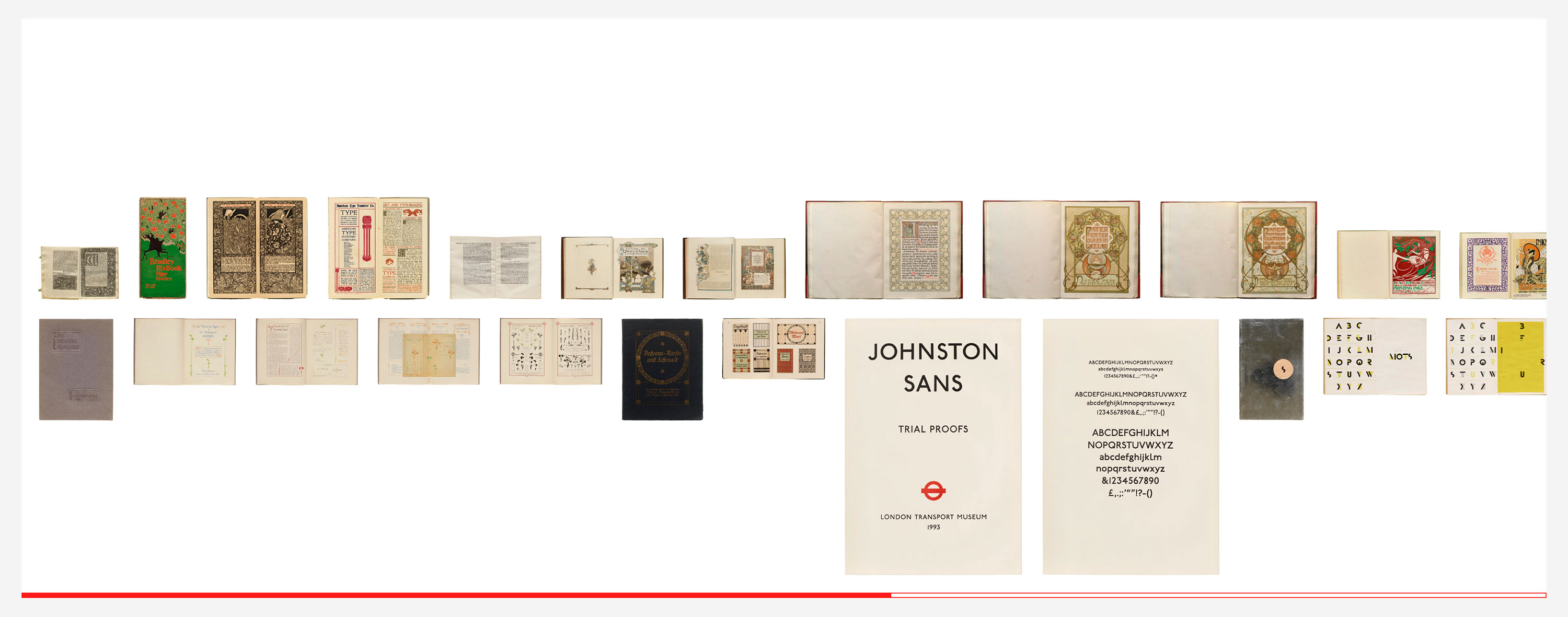
Table by Stephen Coles
Stephen’s second table examines a period at the tail end of the industrial revolution when Western design saw a clash of movements. Some sought a return to the handcrafts of the past, and others wanted to create entirely new modes of making; some found inspiration in the flowing forms of nature, and others embraced the sleek geometry of the machine. These ideals are viscerally expressed in the type and typography of the time.
See the table and individual item notes for more details.
- Die Fläche: Design and Lettering of the Vienna Secession
- Archive Salon: Letterforms of the Viennese Secession
- Gujarati Type Foundry’s 1937 Specimen Book
More Resources
Constructivism, Avant-Garde, “isms,” Dada, Concrete Poetry
1890–1940
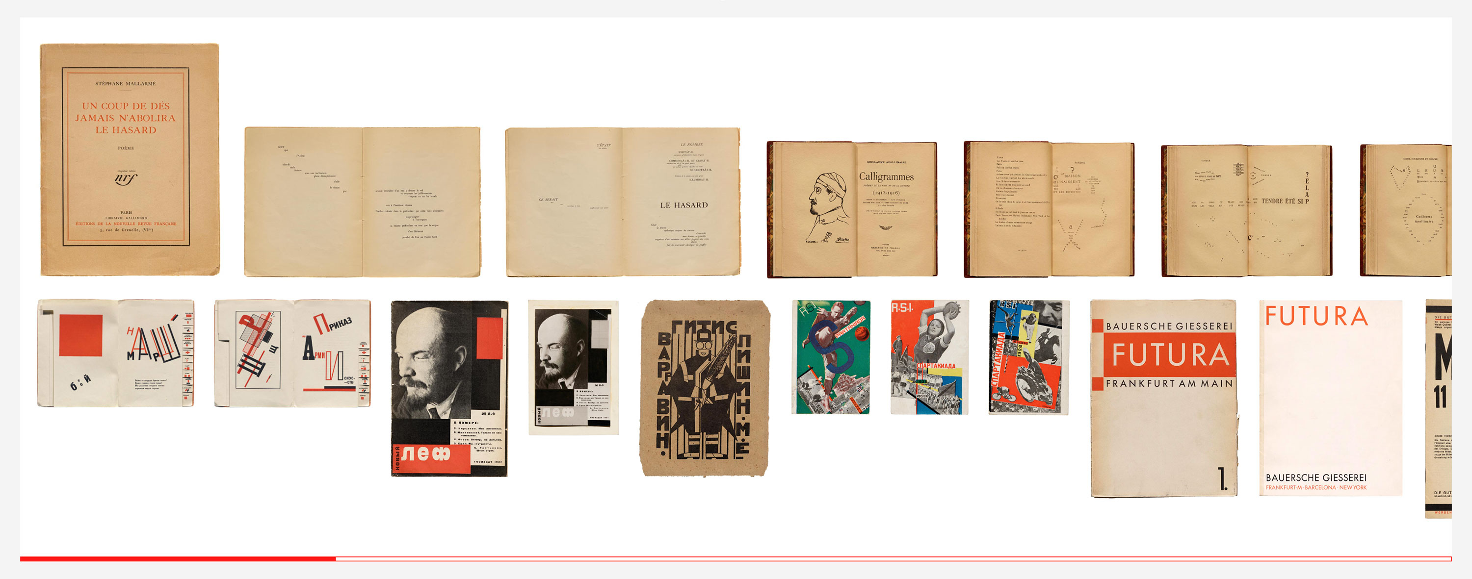
Table by Hank Smith
This grouping highlights the designs and typography of Europe’s avant-garde movements of the early 20th century. We start with a few precursors, and then meet the various "isms": Futurism, Dadaism, Surrealism, Constructivism. Hank Smith, co-curator of the Archive’s 2021 Bauhaus exhibition, explores the ways that the school and the New Typography movement simplified typography for the machine age. The avant-garde typographers rejected classical book design and its traditional forms and techniques, seeking to find new means of visual expression for their art, poetry, and radical ideas, challenging and extending what was considered good typography.
Those who want to dig deeper into the Bauhaus have plenty of material to explore in the Archive’s online exhibition, catalog, and blog series.
- Periodicals as Collections, No. 1: Het Overzicht and Wendingen
- Periodicals as Collections, No. 2: bauhaus
- Periodicals as Collections, No. 3: Information and ulm
- Judaism and the Soviet Avant Garde
- Archive Salon: Dada
- Archive Salon: Bauhaus Typefaces
- Bauhaus Typography at 100 with Ellen Lupton and Cooper Hewitt
- Modern Kinetic Typography
More Resources
International Typographic Style, Mid-century Modernism, Identity Manuals
1930–1970
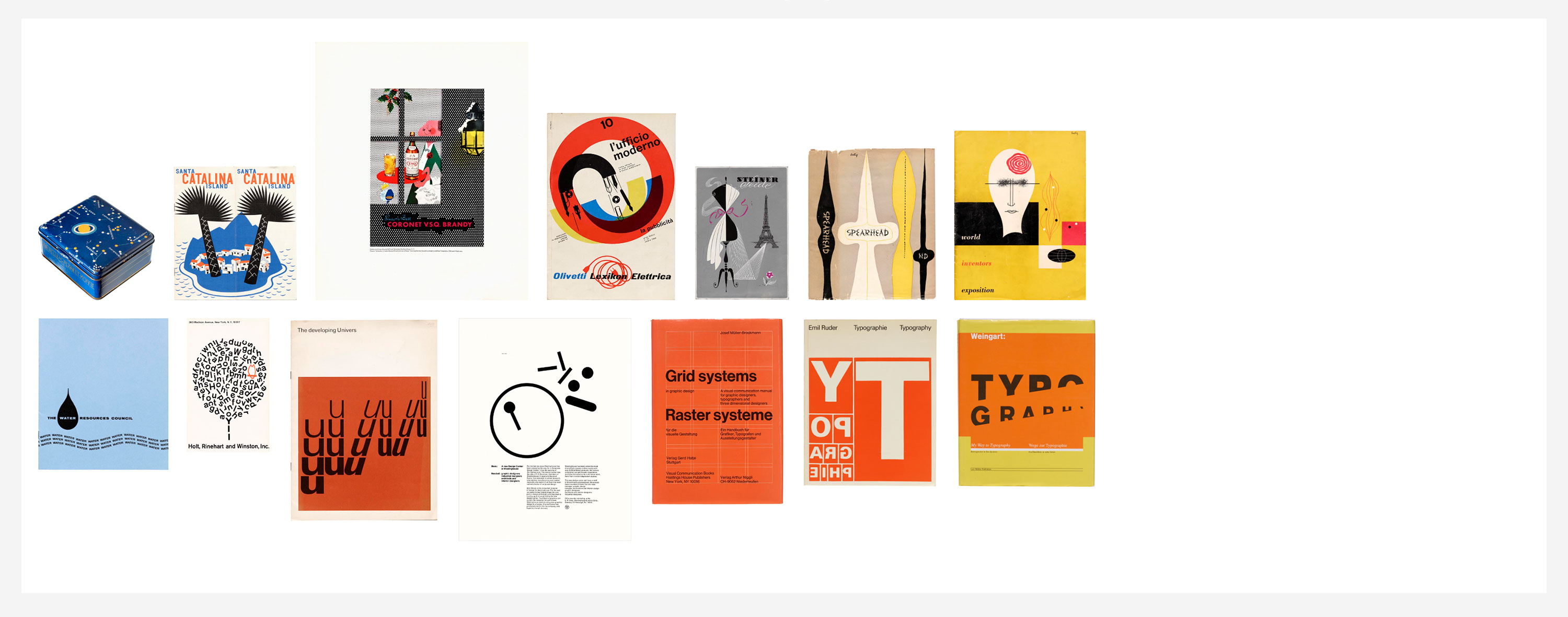
Table by Sally Beale & Elise Carlton
Sally and Elise’s selection introduces the International (or Swiss) Typographic Style epitomized by Josef Müller-Brockman and Emil Ruder, along with other pioneers of mid-20th-century modernism in Western Europe and the U.S., such as Jacob Jongert, Dorothy and Otis Shepard, Giovanni Pintori, and Paul Rand. It also includes a few of the more iconic and comprehensive covers from the Archive’s collection of identity manuals ranging from the 1970s to 1990s.
- Paul Rand’s Work at the Archive
- Learning from Paul Rand
- Giovanni Pintori for Olivetti
- Ichiyama Identity Manual Collection
More Resources
1950s–1980s: Phototypesetting (or photocomposition) introduced, enabling a single film font to be set at virtually any size
1966: ASCII (American Standard Code for Information Interchange) established
1950–1990
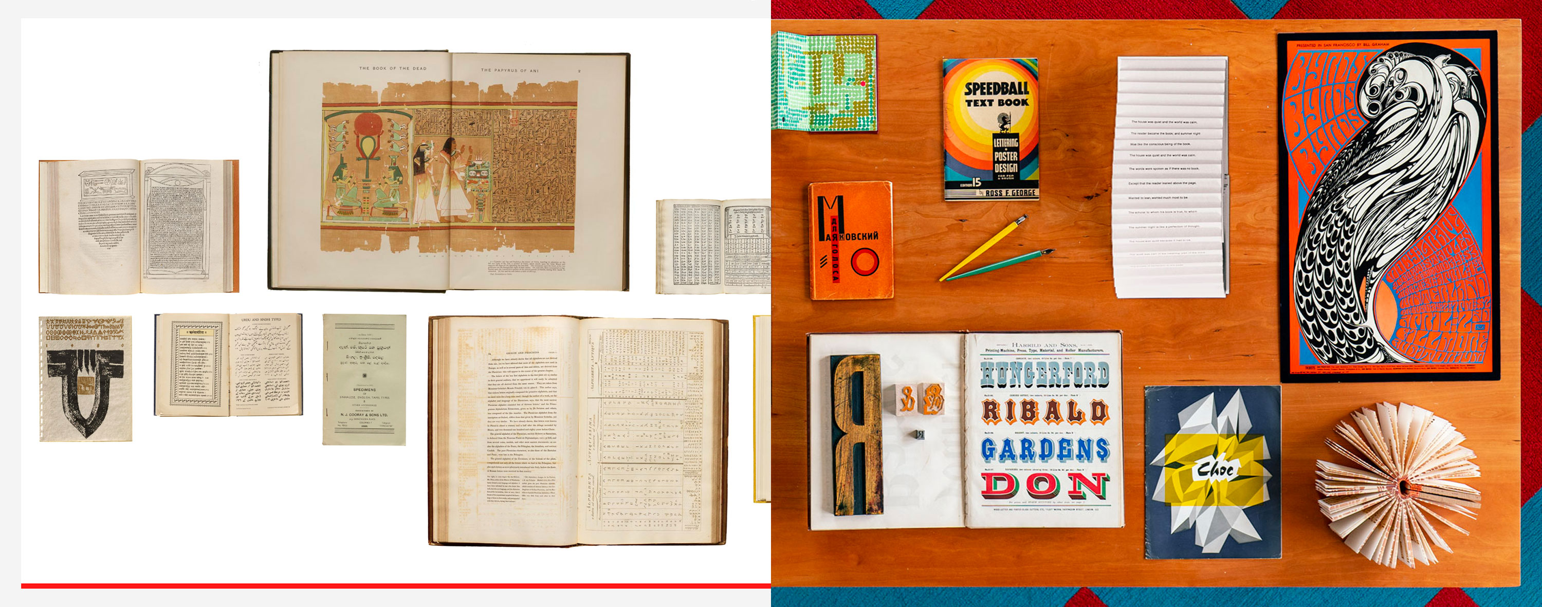
Phototype, Letraset, & the Independent Publishing Revolution
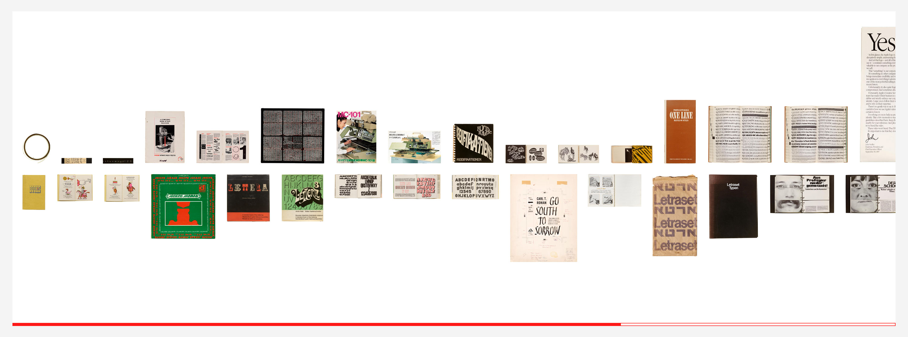
Table by Stephen Coles & Hank Smith
This table highlights technologies in typeface design and reproduction as well as printing technologies. It includes a few highlights from the Archives collection of non-metal-type specimens and fonts from the 1950s–1980s, including phototype, alphabet source books (commonly reproduced photographically), transfer lettering (led by Letraset), and the IBM Selectric can be seen in this table. These relatively affordable and accessible technologies afforded designers, artists, poets, and activists to become independent publishers — to communicate their message in a way that wasn’t possible with previous printing technologies like letterpress and lithography.
- Counterculture Newspapers and Magazines
- Archive Salon: Counterculture Periodicals
- The Women of Photo-Lettering
- Punk Flyers of the Bay Area
More Resources
1984: The digital era begins, as computer software, laser printing, and digital fonts allow for desktop publishing
1983: PostScript introduced
1986: Fontographer, the first publicly available PostScript font editor appears. Its success helps establish the Macintosh as a tool for type designers.
1991: Unicode Consortium was incorporated
1991: TrueType introduced
1996: OpenType introduced, allowing support for more writing systems, characters, and advanced typographic features
2000: First OpenType fonts available
2011: Websites can now serve any font beyond the standard “web-safe” typefaces thanks to @font-face embedding
2016: Variable fonts released with OpenType 1.8. What was a font family becomes a single file, where characters can be adjusted via scales and axes, not just weights.
1970–2020
Post-Modernism, “Grunge” Typography, the Digital Age
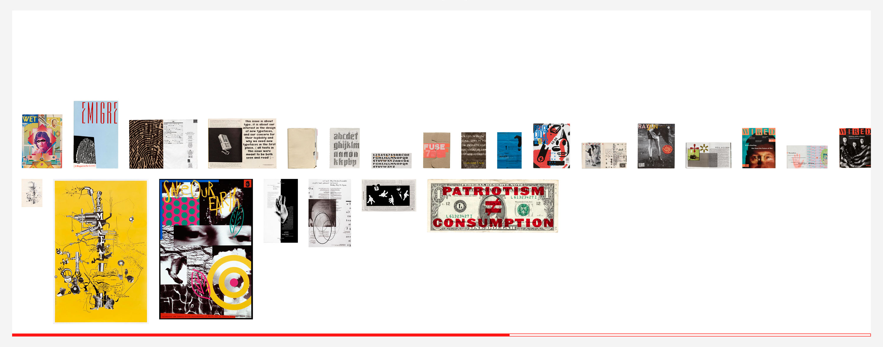
Table by Kate Long Stellar & Sally Beale
Kate and Sally explore the impact of the computer and desktop publishing tools on typography. Their artifacts include periodicals, fonts, and posters. A key collection for telling the story of this move from analog to digital production is Emigre magazine, the full run of which can be seen in the Online Archive. Their archive also includes type development files which illustrate Zuzana Licko’s process for creating early bitmap fonts.
- Notes on Icons and Design with Susan Kare
- Exhibition Overview: Design from the ’90s
- Engaging with the Emigre Archive
- Jennifer Morla on Her Inspiration
- Morla : Design
- Archive Salon: Adventures in Process with Martin Venezky
- History of Computer Typography
More Resources
Other Themes
There is also obviously much more to learn from Eastern typography. That’s why we’re dedicating our next education toolkit to global scripts.
A chronological approach is just one way to engage with type history. The Archive also offers many opportunities to expand the design canon through the lens of other themes within the collection. We share a few of these in part three of the toolkit.