Skip to main menu Skip to main content Skip to footer content

Author: Florence Fu

From the Collection: The Complete Commercial Artist (現代商業美術全集)

A rare set of Japanese trade publications serves a visual feast of modern graphics and lettering, as well as a study of early-20th-century interactions between Japan and the West.

A few covers from The Complete Commercial Artist

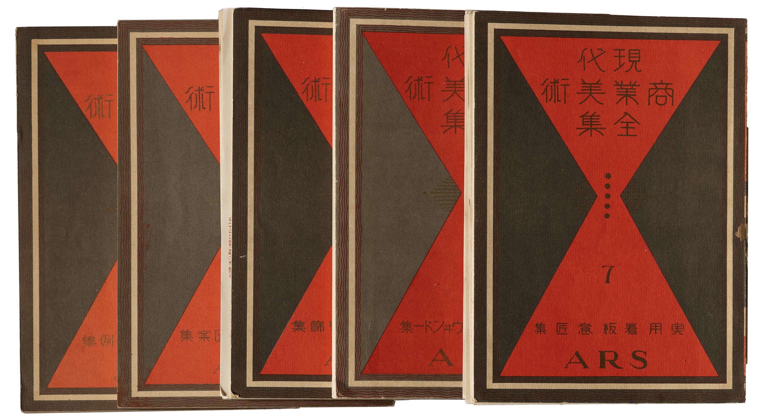
The early 20th century in Japan witnessed a collision of emerging and residual forces. Tensions between past, present, and future shaped typography, lettering, and other areas of design. Leading up to the Shōwa period (1926–89), as a result of the nation’s modernization and growth of commerce, businesses recognized the value of advertising to consumers in a visually appealing way.

The budding interest in creative advertising and the rise of commercial retail led to a 1920s–30s boom in design trade publishing to satisfy the growing demand for rich reference materials. In 1926, Hamada Masuji (濱田 増治) and a group of colleagues, including Sugiura Hisui, Watanabe Soshu, Nakada Sadanouke, and Miyashita Takao formed the Association of Commercial Artists. Together, with Hamada serving as the Editor-in-Chief, they published The Complete Commercial Artist, a 24-volume collection of trade publications on commercial design.

Read More

This Just In: Michael Doret’s Disney and Pixar Title Treatments

Dozens of title treatment sketches by the renowned lettering artist and designer have found a home at the Archive.

Process material for Moana, 2011.

There are designers who choose to master their craft for a specific industry. And then there are designers, like Michael Doret, who refuse to stay in one lane. Doret brings his lettering talent to a range of clients: designing logos for sports teams, fast food chains, titles for comic books, children’s animations, drama movies, and typefaces. He sees each project as a unique design challenge: embracing the differences and running with them to come up with the most exciting solution possible. To put it simply, nothing is out of Doret’s reach. In 2018, Doret donated half of his working archive to Letterform Archive and the other half to the Herb Lubalin Center in New York. We are honored that Doret’s final proofs for early movies, as well as developmental sketches and inked comps for Disney and Pixar animated features, have found a home in our growing collection of process material.

Read More

From the Collection: Design in the ’90s

For the second year in a row, we’re collaborating with Astro Studios on a San Francisco Design Week exhibition. This time, we’re taking you back to the 1990s.

WIRED magazine, premiere issue, 1993. The front of book includes a quote from Marshall McCluhan’s The Medium is the Massage (1964).

The Archive is excited to partner up with Astro Studios for our second SF Design Week exhibition on Thursday, June 27. Digital Revolution: Designing in the ’90s explores the impact of technologies on design created in this transformative period — the decade when Astro Studios got their start. To celebrate Design Week and Astro’s 25th anniversary, we’re doing a special collaboration, featuring some of Astro’s most notable projects from their early years alongside posters, type specimens, magazines, and ephemera from the Archive’s collection.

Read More

From the Collection: The Art of Lettering Instruction, 1716–2016

The diagrams, illustrations, models, and methods used to teach people how to make letters can be as engaging as the resulting letters themselves.

Letterform Archive at LetterWest
Lettering artists play with our instructional diagram cubes at LetterWest on June 7, 2019. Photo by Matt McDowell of So Mighty.

Earlier this month we participated in the LetterWest Conference with a mini exhibition using hi-fi captures from objects in our collection. Historical instructional material can be found throughout the Archive, from the regal copybooks of Baroque writing masters, to informal lettering manuals for mid-century modern advertising. Here are a few highlights spanning the last three centuries.

Read More

This Just In: Paul Rand

Hundreds of items from Rand’s archive, including process material and personal copies of his work, encapsulate a radiant career.

Sketches and final cover for The American Democrat, Vintage Books, 1956.

When visitors make requests for Letterform Archive tours and research visits, we hear one name more than any other: Paul Rand. We’ve always had a few special things to show them: brand guides for IBM and NeXT, packaging for Selectric font elements and Producto cigars, and some key poster and book designs. The latest addition, however, brings us a significant collection from his own archive, giving visitors unprecedented access to his work.

Read More

From the Collection: Ahn Sang Soo and AG Typography Institute

Dating back to 1985, specimens of Ahn’s digital type represent the origins of exploration and play found in Hangul design today.

Specimens covers for Ahnsangsoo, Leesang, Mano, and Myrrh, AG Typography Institiute.

Ahn Sang Soo is often recognized as the father of contemporary Korean type design, and for good reason. His first typeface designed in 1985 broke the molds of Hangul’s traditional design and paved a path of experimentation for the young script. An alumnus and now a professor and Head of the Graphic Design department of Seoul Hongik University, he’s made major typographic contributions in both design and discourse. In 2012, he founded the Paju Typography Institute (PaTI), an alternative design school, as well as AG Typography Institute, an organization that’s dedicated to not only the design of new typefaces, but research, writing, exhibitions, and book design. He’s also published several design books and translated seminal works on typography by Jan Tschichold and Emil Ruder into Korean. Since AG’s founding, Ahn’s original designs have expanded and new faces have been developed. Throughout his career, his typographic lens has also been applied to print magazines, visual arts, photography, poetry, architecture, and more — altogether representing Ahn’s legacy, and his emphasis on the importance of design, research, and play.

Read More

Periodicals as Collections, No. 3: Information and ulm

Our survey of avant-garde periodicals continues with two magazines that represent the enduring influence of the Bauhaus through the 20th century.

Detail from the cover of ulm 8/9, 1963.

Two weeks ago, our “Periodicals as Collections” series featured bauhaus magazine, the quarterly journal of the German art school that was founded 100 years ago this month. Today, we will explore two more magazines that together weave a narrative about the enduring influence of the Bauhaus through the 20th century. It is also the story of how a particular Bauhaus student would have a hand in continuing the school’s legacy.

Read More

From the Collection: Laini (Sylvia Abernathy)

The Chicago-based activist’s dynamic album covers of the 1960s expand our sense of design history.

Roscoe Mitchell Sextet album cover (detail), Delmark, 1966. Design by Sylvia Abernathy, photograph by Billy Abernathy.

In late 1960s Chicago, Sylvia Abernathy was all at once a college student, activist, and graphic designer. Having later changed her name to “Laini”, Abernathy is best known for working on the Wall of Respect, a community mural in the South Side on 43rd and Hayward Streets. The effort was collaborative, a creative orchestration by the Visual Arts Workshop arm of the Organization of Black American Culture (OBAC). During these years, Abernathy was also designing album covers for jazz musicians under Delmark Records. Four of Abernathy’s albums live at the Archive and hold a special place in our collection. They represent a part of her work that has yet to be researched extensively, and they demonstrate a way of combining type, image, and color that sets her apart from her contemporaries.

Read More