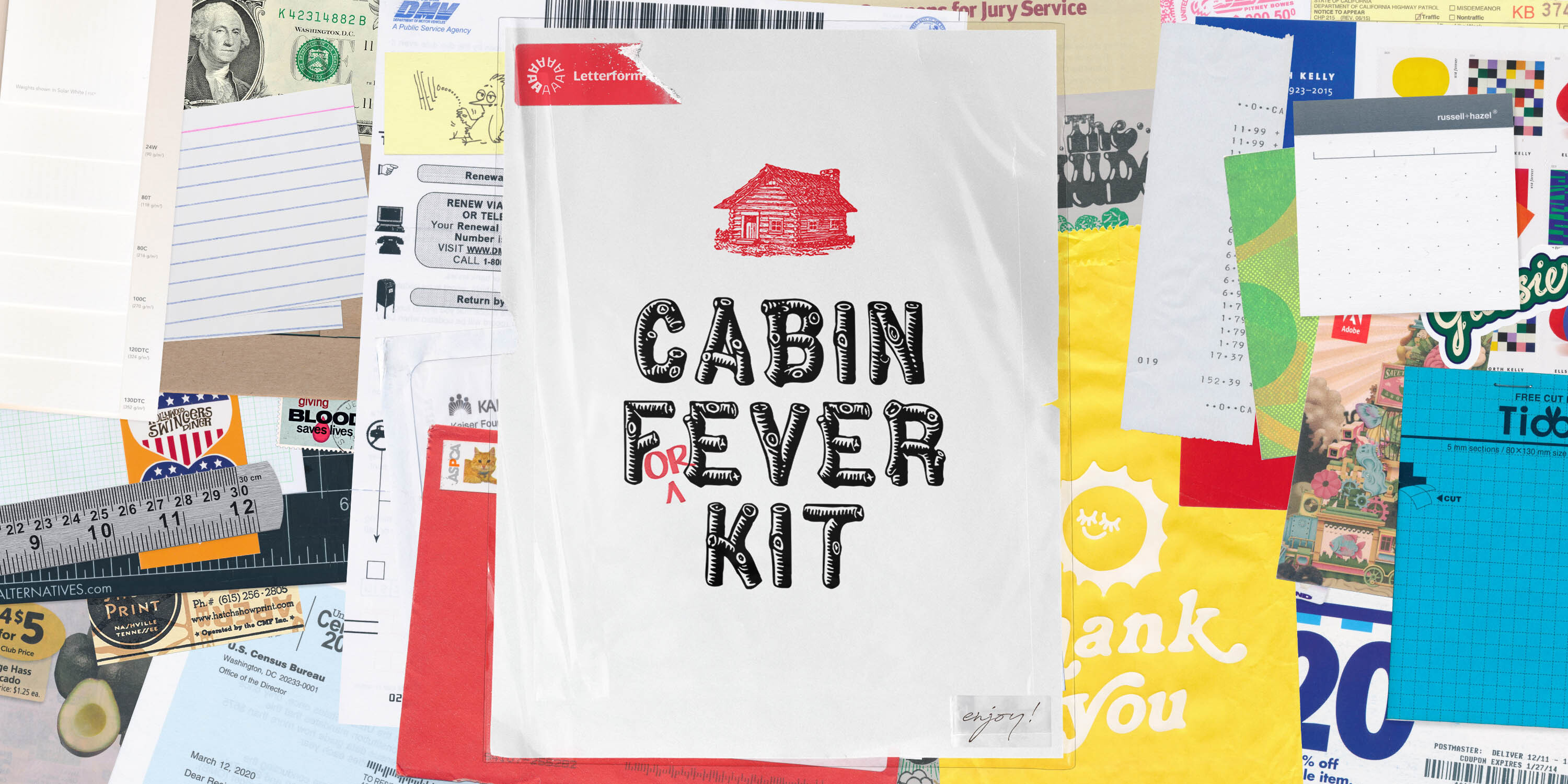
Cabin F(or)ever
A stay-at-home design inspiration kit for letter lovers.
For the first time since its founding in 1984, the full run of the boundary-breaking magazine is now free to access, read, and explore.
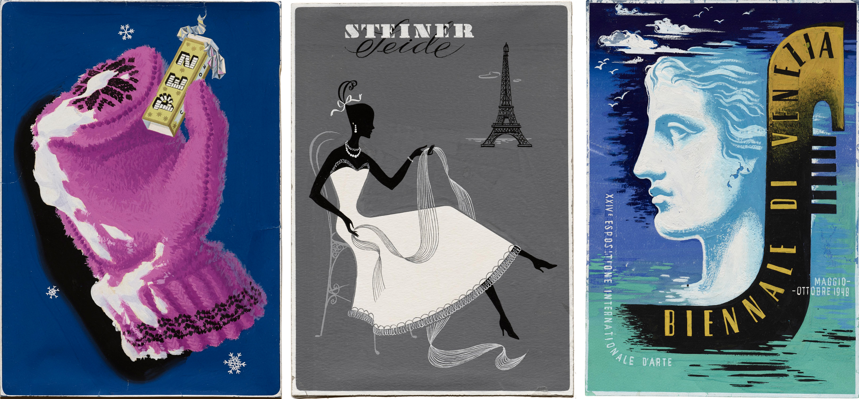
In the 1950s, Pintori revisualized the typewriter, transforming it from esoteric machine to a charming companion of modern office life.

See all this work at our hi-fi web resolution in the Online Archive.
The lifeless, rectangular slabs of metal we type on these days were preceded by tools with personality. Sculptural, colorful, and often weighty, typewriters were transformative machines that shaped modern industry and communication in the 20th century. The Italian brand Olivetti, founded in 1908, was among the many key players in the market and was unique in the way they saw approachable design as core to their identity. Part of Olivetti’s success is owed to Giovanni Pintori, who was the company’s art director from 1950 to 1967. Pintori’s color palettes, shapely abstraction, and smart use of the grid conveyed both the mechanic power of an Olivetti device and the joyful ease one should feel when using it.
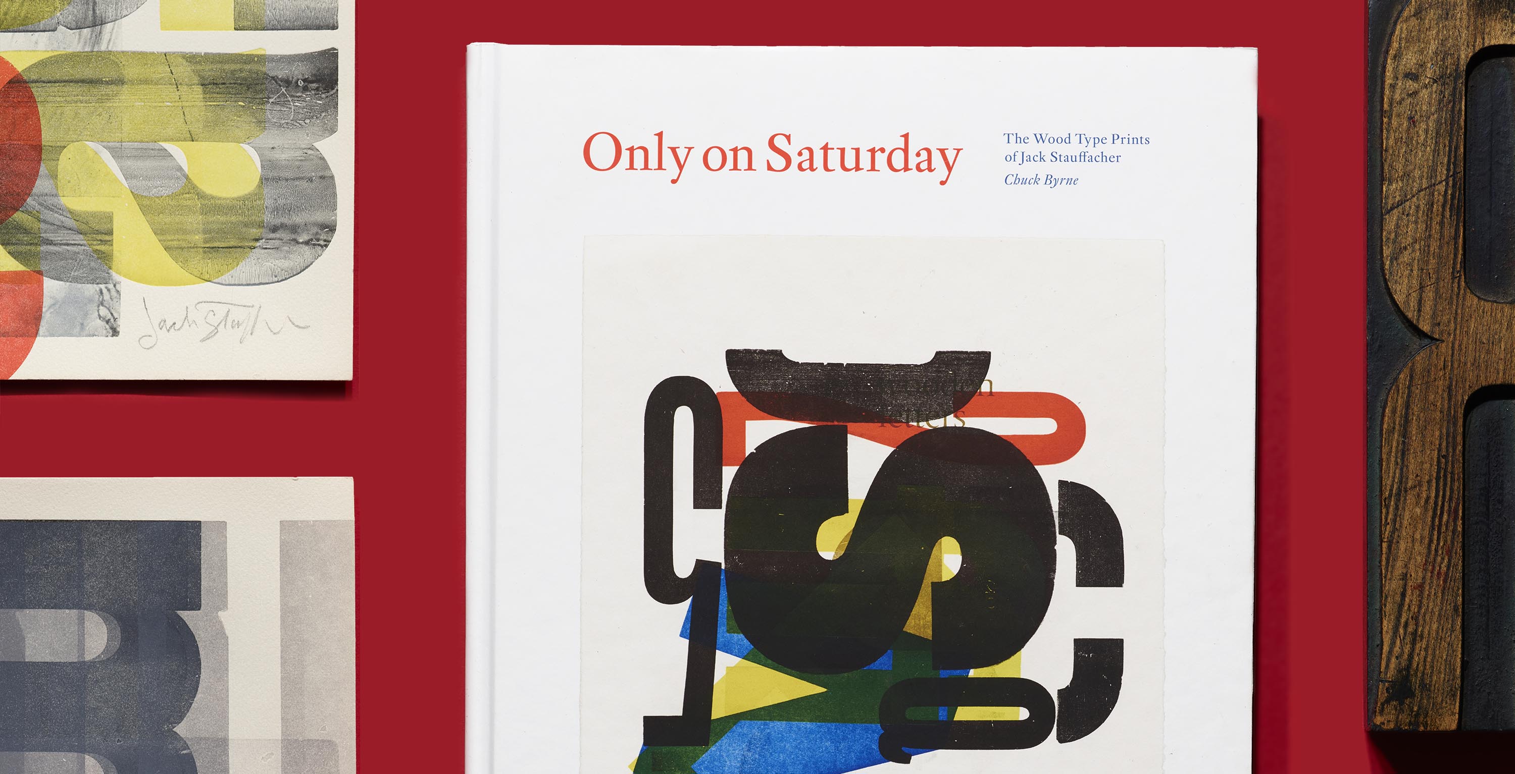
Long before Jack Stauffacher picked up a piece of wood type and used it to create one of his typographic abstractions, the printer and designer had collected lessons in his craft from across time.

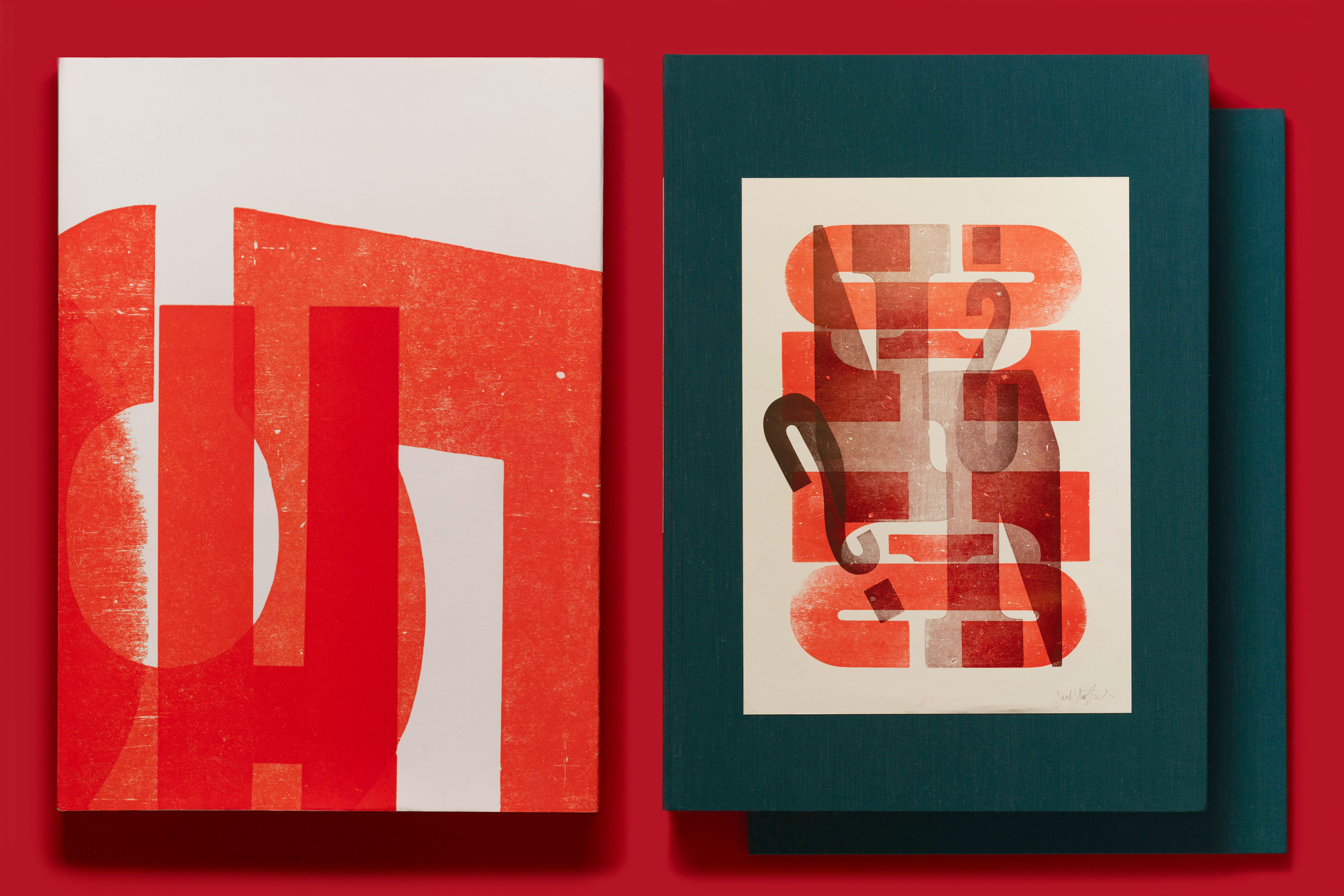
Read on to learn about just a few of the many influences that informed his wood type work, which is the subject of our third book, Only on Saturday: The Wood Type Prints of Jack Stauffacher, now live on Kickstarter.
At an early age, Jack Stauffacher was practically anointed as a printer. Paging through an issue of Popular Mechanics when he was fourteen, his eye fell on a mail-order advertisement for a 3-by-5-inch letterpress, and his curiosity was permanently piqued. By the time he graduated from high school, he and his father had built a modest studio in the backyard of their home in San Mateo, California, and the tiny mail-order press had given way to a more stately Chandler & Price model. Named the Greenwood Press after the street adjacent to their home, young Stauffacher’s enterprise began to take on small commercial jobs.