Author: Stephen Coles
Our New Book Is Now on Kickstarter
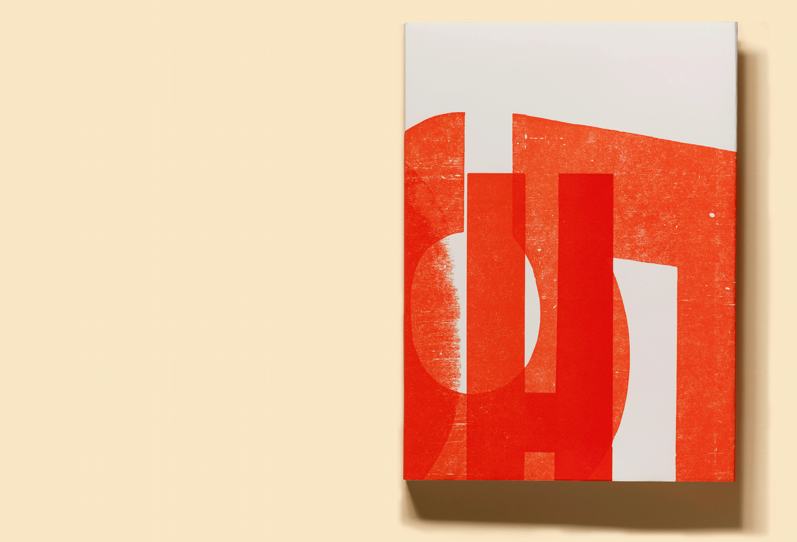
We are pleased to announce the launch of Letterform Archive Book No. 3, Only on Saturday: The Wood Type Prints of Jack Stauffacher.
This Just In: Jack Stauffacher’s Studio
For over 50 years, Stauffacher lived a singular life at the heart of San Francisco’s creative community. Now, his legacy lives on at the Archive, and his prints are the subject of our third book.
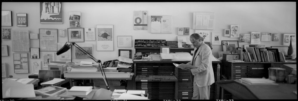
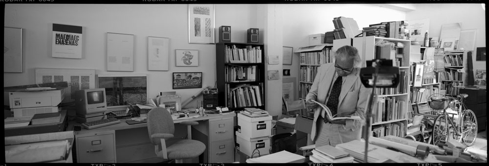
Some rooms convey history all by themselves. They tell stories about the people who live in them before those occupants even utter a word. Jack Stauffacher’s studio in San Francisco was such a place.
Lautsprecher Gets Its Voice Back
Jakob Erbar’s least known typeface went silent in World War II. David Jonathan Ross used a specimen at the Archive to bring it back to life.
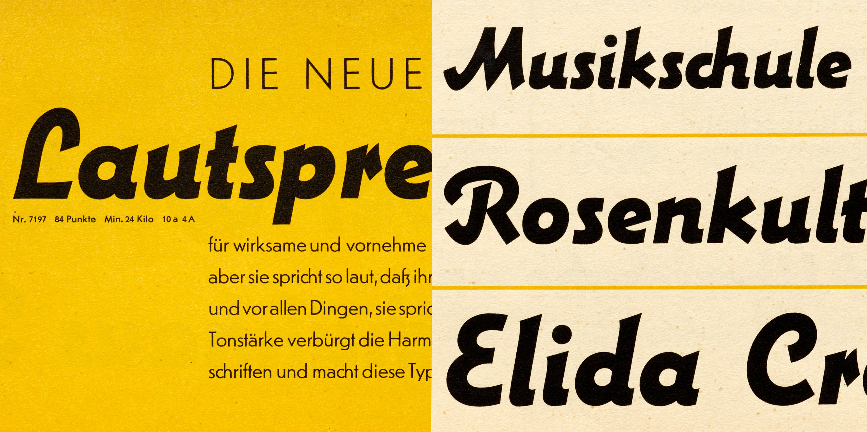
One look at the web or our phones these days and it’s obvious that a certain style of typeface dominates contemporary design: the geometric sans serif. It feels like nearly every company, from tech startup to multinational corporation, is finding safety and clarity in the genre’s circular rounds, sharp corners, and clean finish. Meanwhile, there’s also a growing hunger for things that are handmade and handwritten, authentic and imperfect. These universal desires for mechanical order and human warmth are pulling in opposite directions.
Lautsprecher (German for “loudspeaker”) is a virtually unknown metal typeface from 1931 that somehow hits tones both geometric and calligraphic, right at a time when we’re tuned into those very frequencies.
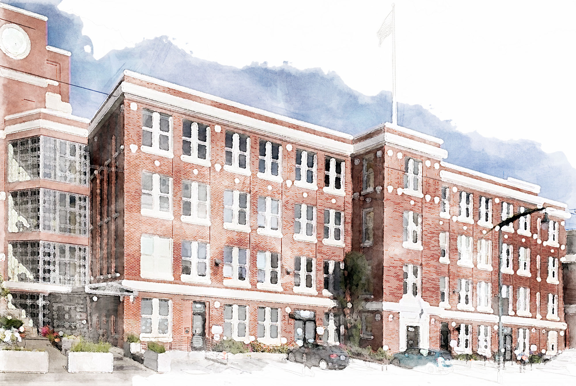
A New Home for Letterform Archive
We urgently need a new home. Luckily, we found the one we always imagined. Now you can make it a reality
- Dec. 5, 2019 — Construction and Floor Plan
- Feb. 3, 2020 — Preparing to Move
- May 4, 2020 — Sponsor a Shelf
- Oct. 13, 2020 — We’ve Moved. Thank you!
- Nov. 10, 2020 — Librarian’s Update on Our New Home
New Home Updates
A few months ago our landlord informed us that they wanted Letterform Archive out of the building.
The shock of this news soon faded as we recognized the drawbacks of our current location. In so many ways, we are near or beyond capacity.
When we imagine the Archive of the future, we imagine a place worthy of the history we hold. We see a purpose-built, contiguous space for classes, tours, collections, and staff. We dream of a larger venue for events, where more of our community can gather. We picture a dedicated gallery for exhibits. We long for accessibility to public transit. Most of all, we need room to grow.
When we imagine the Archive of the future we picture something like this:
From the Collection: The Art of Lettering Instruction, 1716–2016
The diagrams, illustrations, models, and methods used to teach people how to make letters can be as engaging as the resulting letters themselves.

Earlier this month we participated in the LetterWest Conference with a mini exhibition using hi-fi captures from objects in our collection. Historical instructional material can be found throughout the Archive, from the regal copybooks of Baroque writing masters, to informal lettering manuals for mid-century modern advertising. Here are a few highlights spanning the last three centuries.
Introducing The Archive Occasional
Hot off the press: an irregular update from an unusual institution. Get yours now.

The Archive at LetterWest & Typographics
We’re on the road this June, meeting friends and breaking news at conferences in Salt Lake City and New York City.