Skip to main menu Skip to main content Skip to footer content

News / Collections

Interview with Alan Sobrino of Errant Press

“Now is the time to take words from boring codex forms and put them everywhere.” Vivian Sming talks Latin American artists’ books with Alan Sobrino.
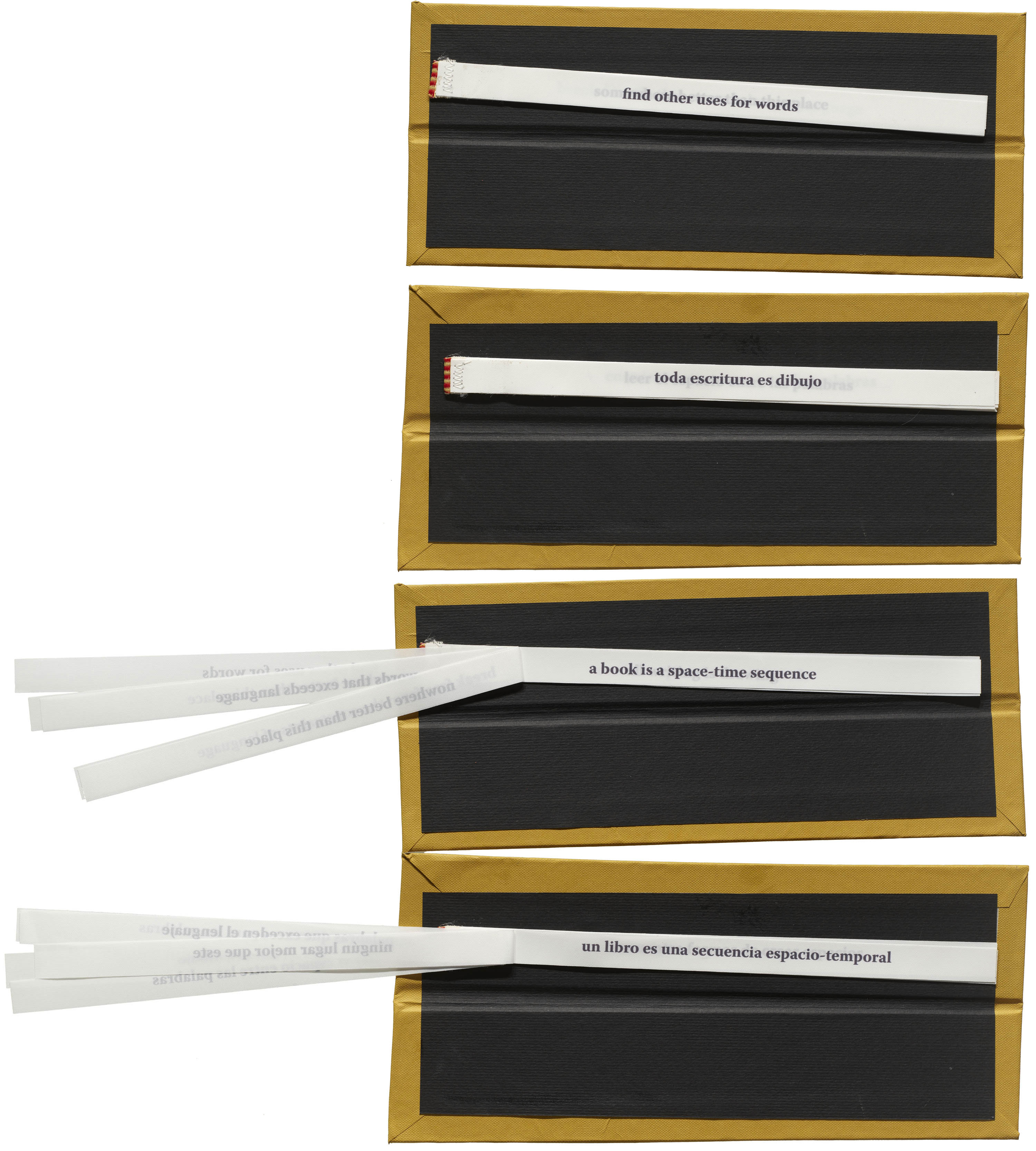
Alfonso Santiago, Bookmarks / Separadores, Piedra Ediciones, 2022.

As part of her curatorial fellowship at Letterform Archive, Vivian Sming has been introducing us to innovative book artists and independent publishers. In this installment, she sits down with Alan Sobrino of Errant Press who distributes and publishes books by Latin American artists, often in bilingual editions. All the books shown here are now part of the Archive’s collection of visual language.

Vivian Sming: Can you introduce yourself and tell us what prompted you to start Errant Press?

Alan Sobrino: My name is Alan Sobrino. I’m from Mexico City originally, but I have lived the last 10 years in a city called Culiacán in Sinaloa, Mexico, one of the most violent cities in the world. It’s the hometown of a lot of drug dealers. While I was living there, I started working on Errant Press. I knew that what I was trying to make and what I was writing was never going to be published in the way I wanted them to. If you go to traditional publishing houses with ideas that are outside of the box, like putting some poems in matchbooks or like playing with the containers, well, obviously, they’re going to react. They liked the texts, but I got rejected all the time trying to put them together as a project. After a while, I decided to start doing it myself. My first books didn’t look like the ones I make now. They started as small projects for friends. I shared them with people who I knew would like them. They eventually started growing and becoming more popular between friends and zinesters in Mexico. I decided to create Errant Press as a gateway for putting all these works I was making already out there, and also to make a little bit of money to keep producing. Because I realized that without money, I couldn’t keep publishing my work. I thought Errant would be a good way to make some cash flow so I could keep producing.

Read More

This Just In: Punk Flyers of the Bay Area

Our new collection offers a visual explosion of the 1970s–80s punk scene in Berkeley, Oakland, and San Francisco.

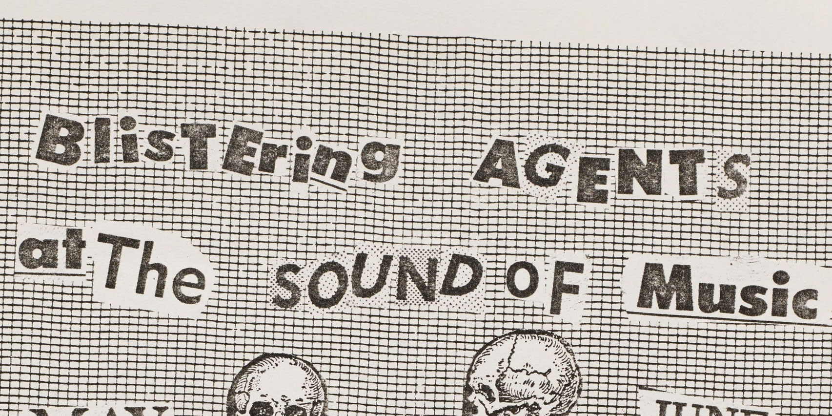
Bob Clark, Flyer (detail) for Blistering Agents at The Sound of Music, ca. 1980. Bassist “Big Bob Clark”, later of the band Agression, died in 2021.

Punk has always been anti-establishment, and that includes the traditional design establishment. Its ethos is DIY; make do with what’s available, and figure it out. Don’t have the necessary supplies? Doesn’t matter; you can make paste from flour and use a public library’s xerox machine. Punk thumbs its nose at the polished. It embraces the messy, the handmade, and the authentic. It is a state of mind reflected both in the sound of its music and the look of its promotional graphics.

Read More

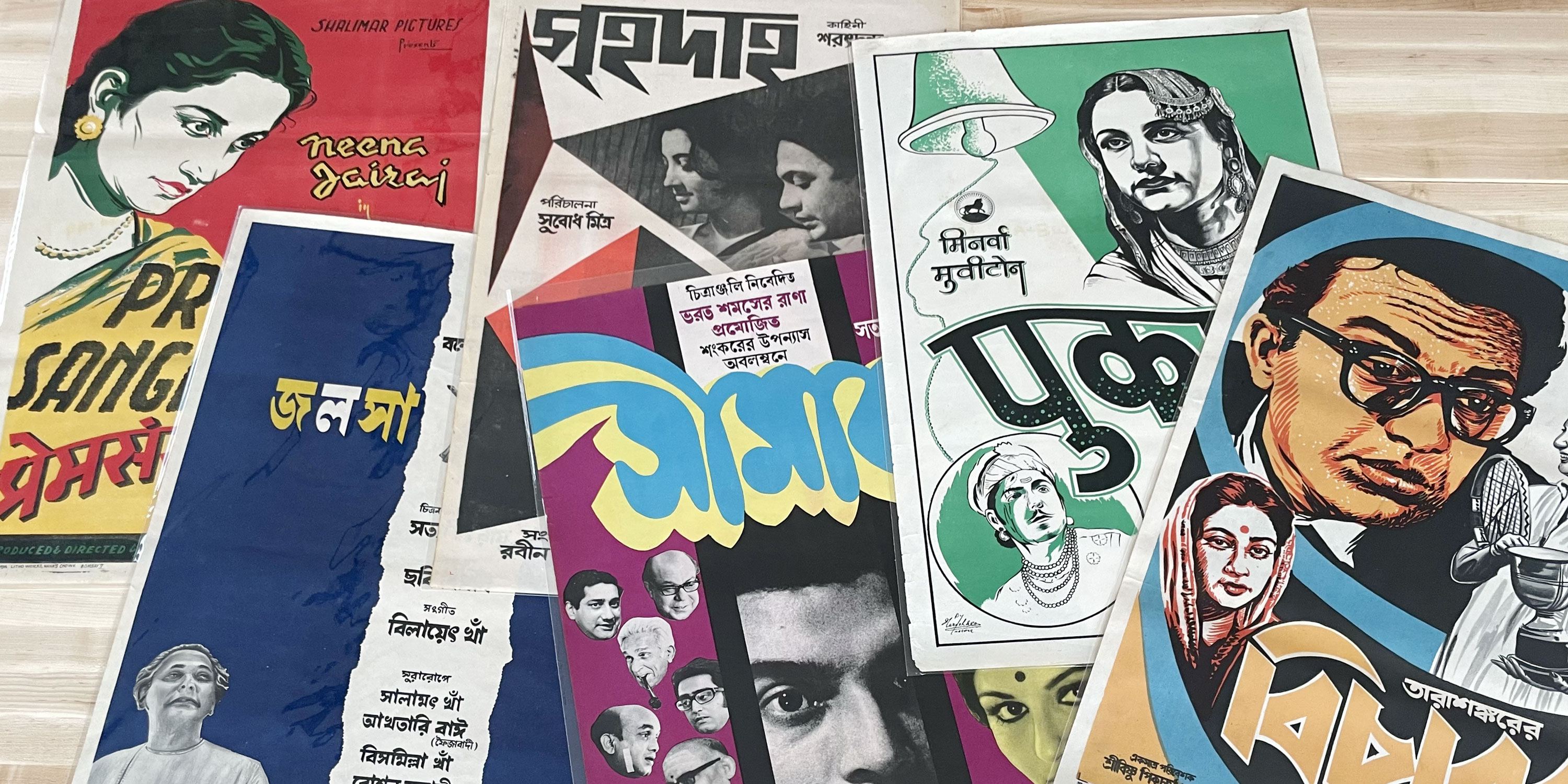
This Just In: Indian Movie Posters

From Bollywood to Tollywood, Tanya George looks at her country’s varied cinematic industries and writing systems through our new collection of film posters.

A few of the 15 posters included in the Archive’s new Indian movie poster collection.

For several years now, Letterform Archive’s curatorial team has focused on expanding its collection to underrepresented parts of the world. One ongoing project under this umbrella includes promotion material from India’s diverse film industries as a way to showcase expressive lettering in multiple scripts, including Bengali, Devanagari, Urdu, and Telugu. In 2021, I was invited to help shortlist from a wider set of posters, designs that represent a wide range of lettering styles.

Read More

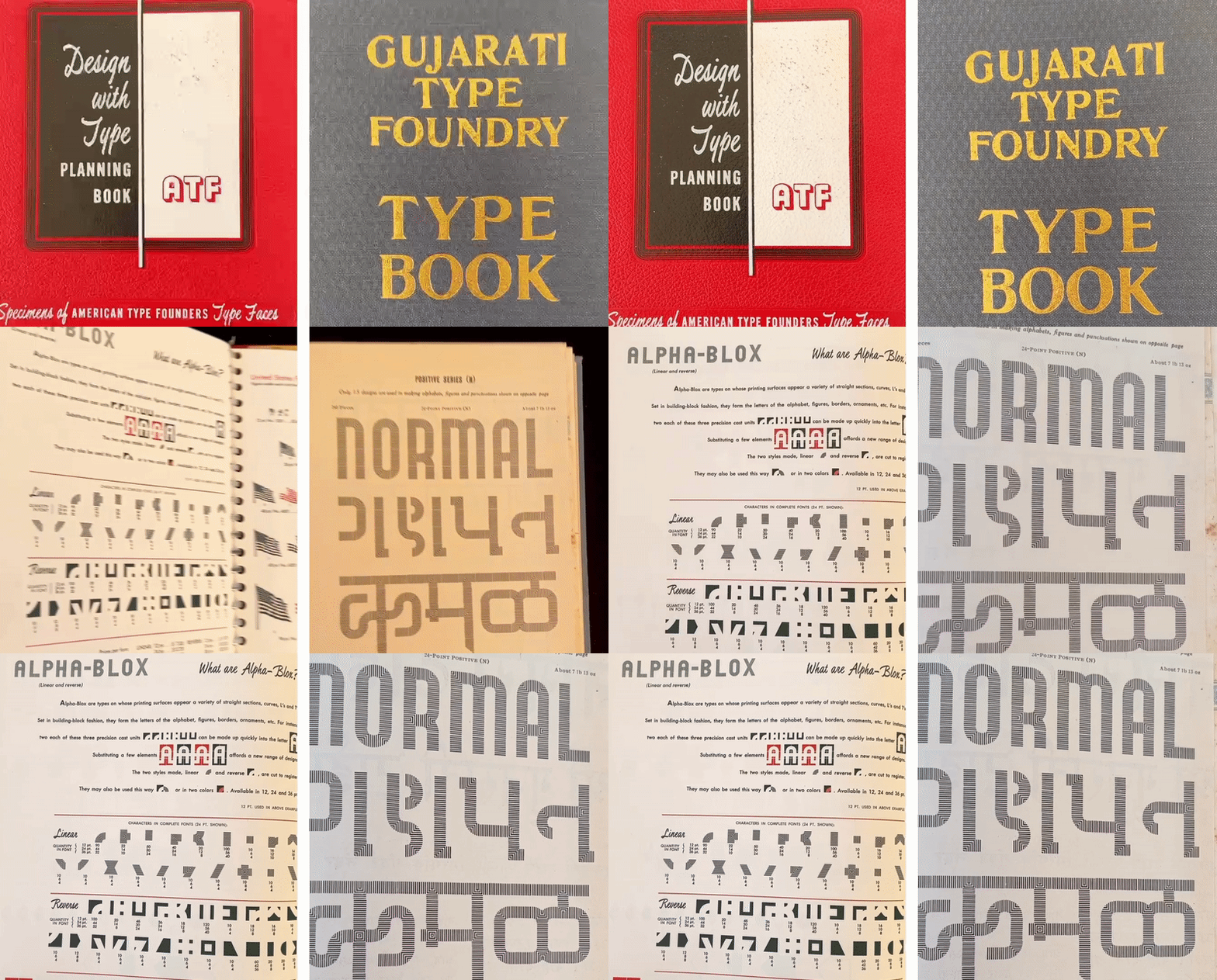
How Type Traveled Across Nations and Foundries

Our correspondent Tanya George dives into the Archive’s type specimen collection to explore the many ways typeface designs changed hands in the metal era.

Catalogs from two different foundries reveal two very similar typefaces. Left: Alpha-Blox, ATF specimen, ca. 1950. Right: Positive, Gujarati Type Foundry specimen, ca. 1940s.

Archives can be intimidating spaces. They’re usually filled with objects and materials that are valuable and relevant to building knowledge but require someone to know what they’re looking for and ask the right questions to the right people. So here is a small gateway into the type specimen collection at Letterform Archive. I ask a question — “Why does the same typeface design reappear in specimens from other foundries?” — and try to answer it by using objects found at the Archive and other accessible resources.

Read More

Books on Text and Textile

Vivian Sming, our new curatorial fellow, pulls on threads within the collection, tying together concepts of weaving and language.

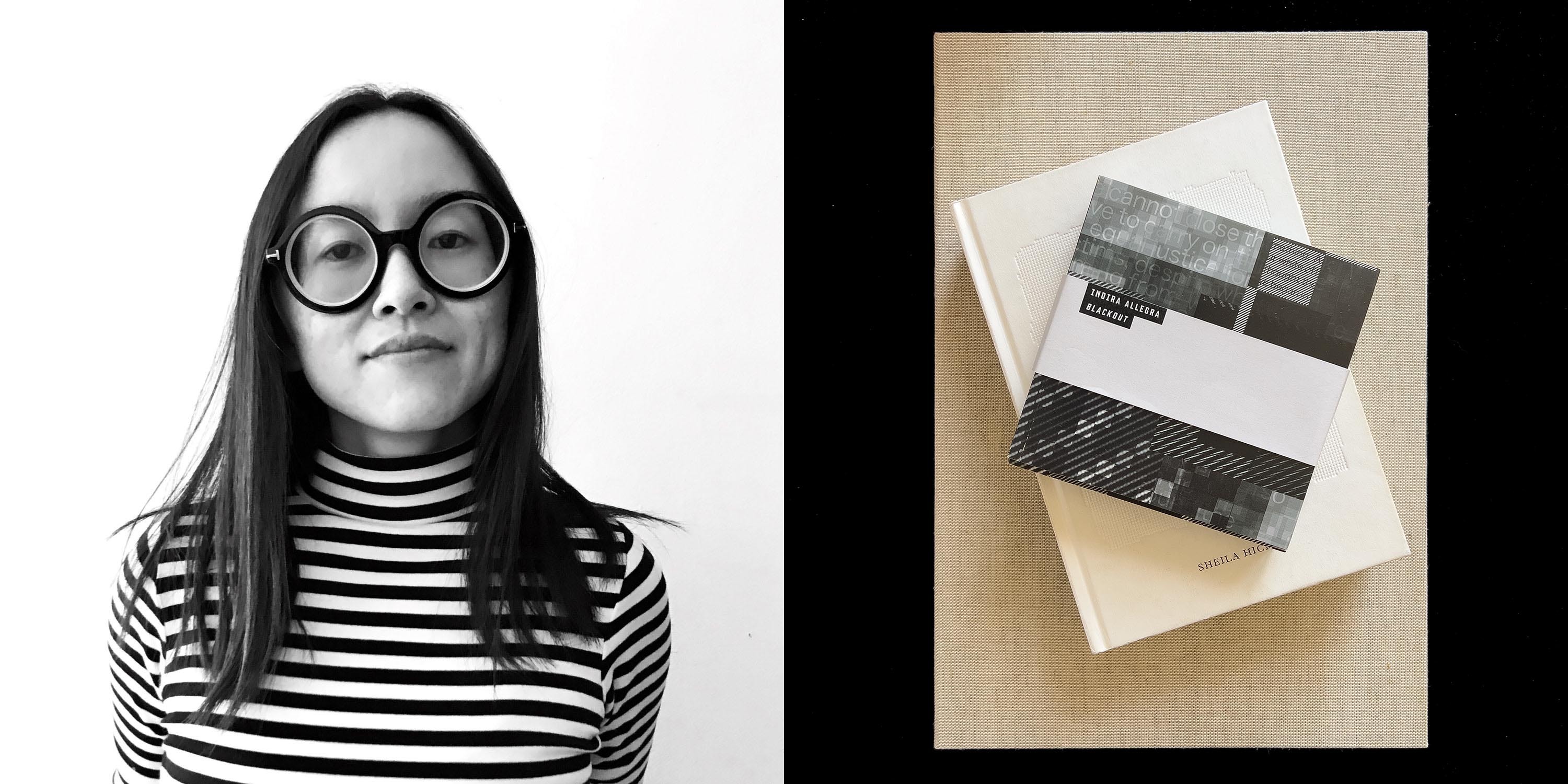
Vivian Sming, 2022 Letterform Archive Curatorial Fellow

We are proud to announce the Letterform Archive Curatorial Fellowship, a new program designed to strengthen and diversify the collection. Rotating annually, the fellow works with our curatorial team to interpret and share material from the Archive, as well as expand the collection through new acquisitions and connections to artists and designers.

The 2022 fellow is Vivian Sming, an artist-publisher based in the Bay Area, who produces a wide range of artists’ books through their publishing studio Sming Sming Books. Sming’s first contribution to our blog highlights four books that combine weaving and language.

Read More

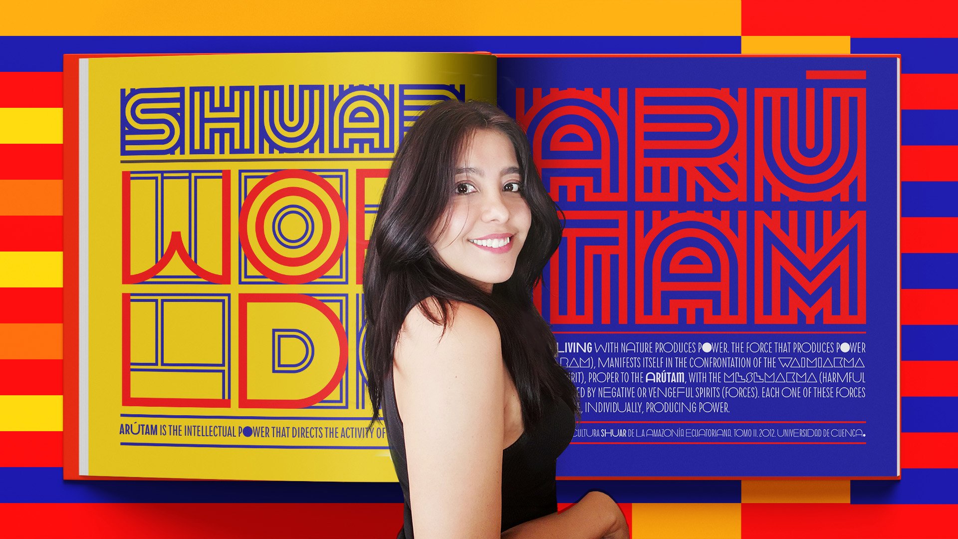
Beyond the Bauhaus: Ecuador, Land of the Shuar

Vanessa Zúñiga Tinizaray refocuses geometric and systematic design principles on a culture far from 20th-century Europe.

Vanessa Zúñiga Tinizaray
This article supplements a Bauhaus Typography at 100 interview with Vanessa Alexandra Zúñiga Tinizaray.
See the interview

Letterform Archive’s current exhibition celebrates, among many things, the centenary of the Bauhaus. Such recognition indicates the significant impact of the school in modern culture. The Bauhaus has become synonymous with minimal and geometric systems of design. This makes it convenient to attribute this school of thought as a source for any graphic work that shares these characteristics, but similar ideas have been around long before the Bauhaus. The Ecuador, the Land of the Shuar poster that is part of the “Beyond the Bauhaus” section of the show is an example of contemporary designers practicing some of the principles associated with the school, and, in this case, principles rooted in a marginalized history.

Read More

Typefaces Inspired by the Bauhaus

From Futura to ITC Bauhaus, our survey of Bauhaus type continues with a look at typefaces that adopted the school’s simplified, geometric ideals.

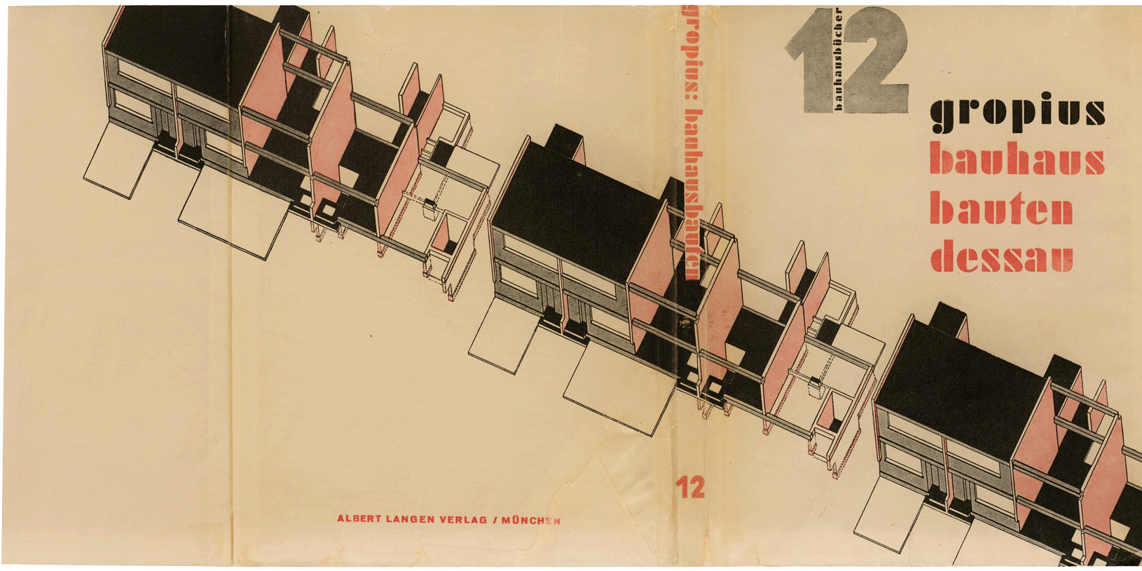
László Moholy-Nagy, cover for Bauhaus Buildings Dessau (Bauhausbauten Dessau), 1930. This late Bauhaus Book may be the only official Bauhaus publication to use a typeface inspired by the school (Futura Black), though it was perhaps lettered by hand with the type as a model.
This article supplements Archive Salon Series 29: Bauhaus Typefaces. Members can access the recording.
Watch the Video

Our first installment of this two-part series showcased the various typefaces found in official publications and other objects by Bauhaus instructors and students. We learned that the type used at the school was primarily utilitarian, readily available to printers at the time. But what about the radical geometric letterforms we connect to Bauhaus principles? Let’s look at minimalist typefaces inspired by the school, many of which live on as commercial successes long after the institution was forced to close down.

Read More

Typefaces Used by the Bauhaus

The school’s main typographic story is not about inventing radical typefaces, but using existing typefaces in a radical way.

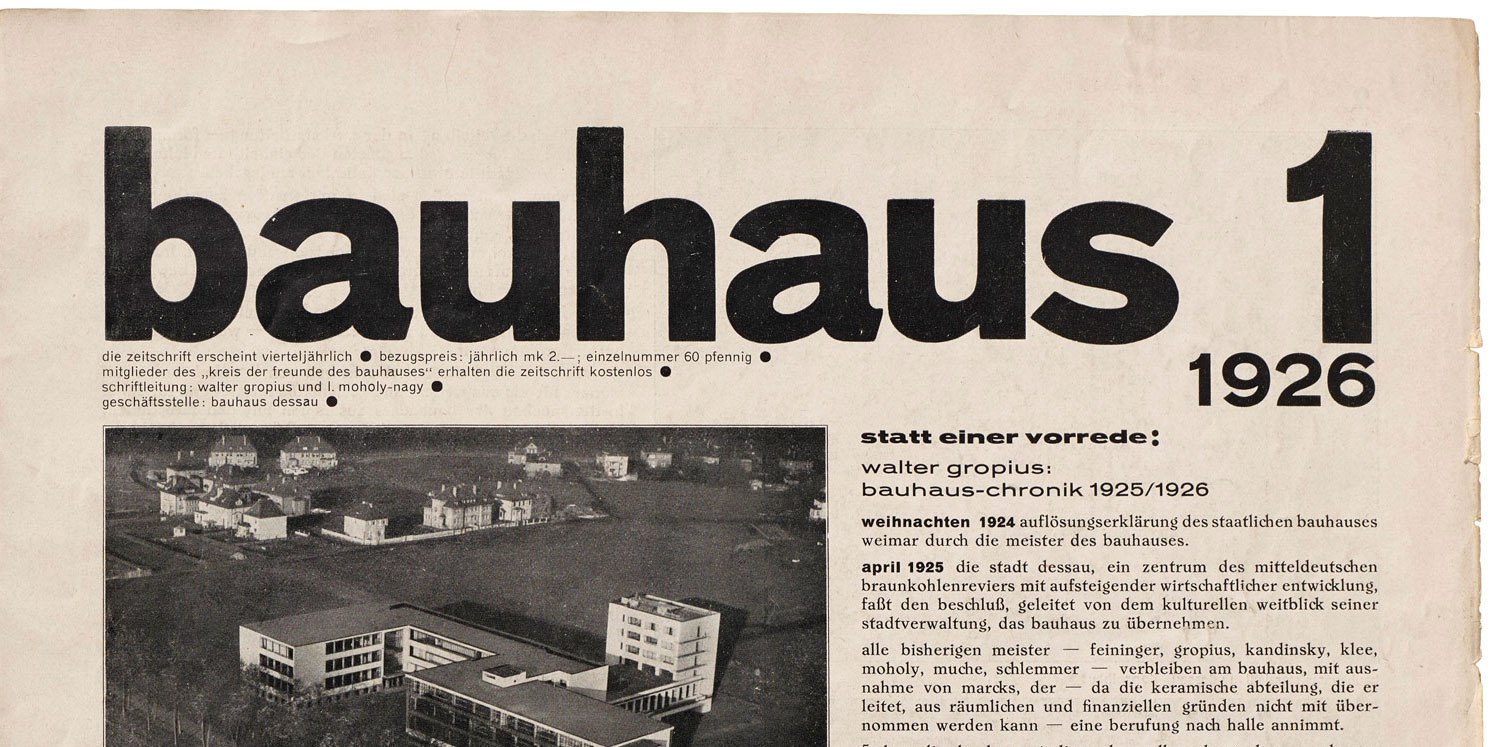
Nameplate for bauhaus magazine, vol. 1, no. 1, 1926.

Letterform Archive’s inaugural exhibition, Bauhaus Typography at 100, displays nearly 200 objects representing the school’s influence on printed design. From its start in 1919, the Bauhaus incorporated mass production techniques in the creation of artworks across various programs offered on campus, from architecture and product design to textiles and graphics. While the school has come to be known for a simplified, geometric approach across all these disciplines, the exhibition narrates an evolution of letterform styles and illuminates the many people who developed what we now recognize as Bauhaus typography. As a companion to December’s Archive Salon, this two-part article series focuses on the core material that shaped Bauhaus typography: the typefaces.

Read More

Join the Letterform Archive Mailing List

Learn more about our collection, including additions to the Online Archive, and get news of upcoming events, workshops, and publications.

Join the list