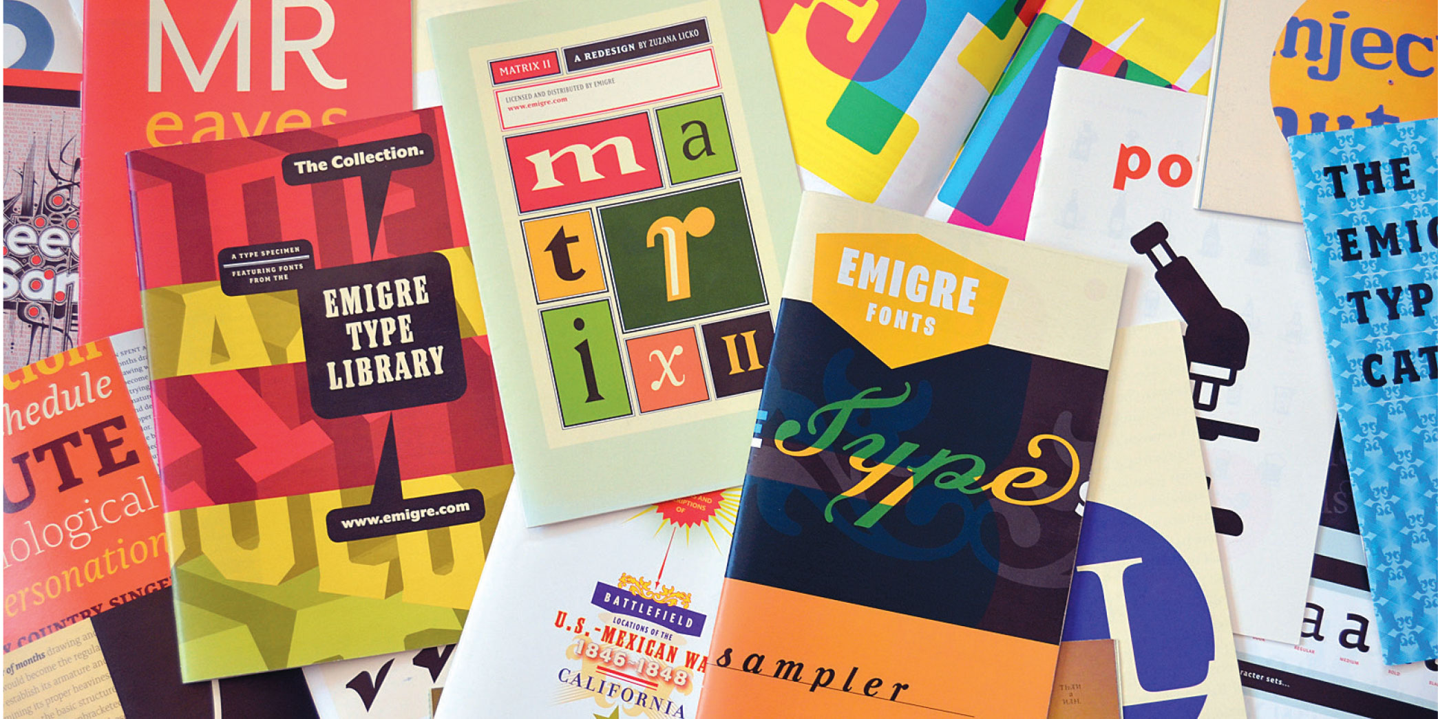
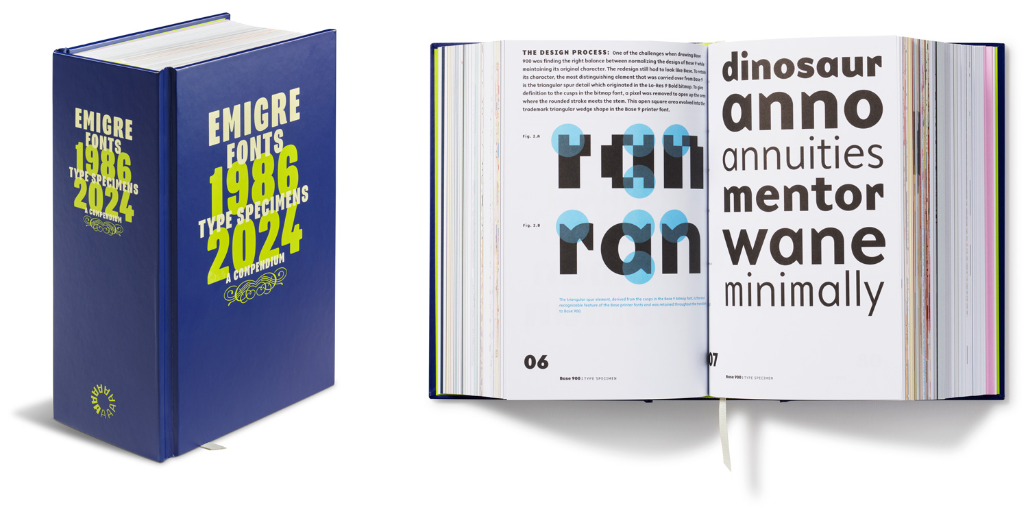
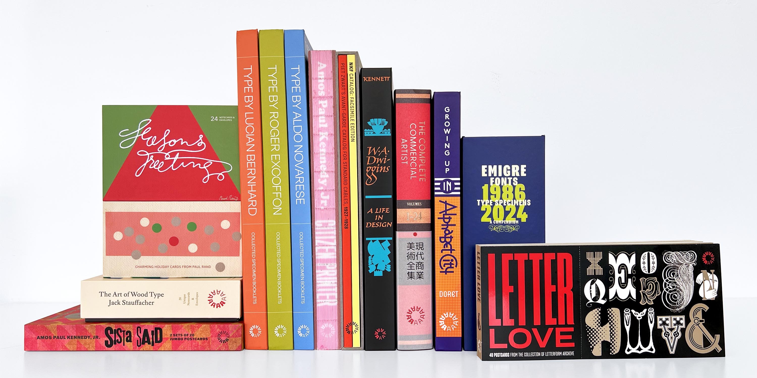
With cutting-edge fonts based on the bitmap as well as digital revivals that transcended the screen, Emigre Fonts pioneered type design in the early days of the pixel. But it was their formidable commitment to print that documented—and helped affirm—their contributions to twentieth-century visual culture.
With 40 complete type specimens packed into 5 pounds, this compendium documents the output of one of the earliest (and most prolific) digital type foundries. Here’s a peek at the book’s foreword.
When Rudy VanderLans and Zuzana Licko donated the Emigre papers to Letterform Archive not long after we opened our doors in 2015, we were spoiled for all collections to follow.
It wasn’t just that their archive was rich with material that defined an important era in design—one in which the new digital tools of the 1980s and ’90s created a surge in independent publishing and type design, with VanderLans and Licko’s innovative Emigre magazine and digital foundry at the forefront.
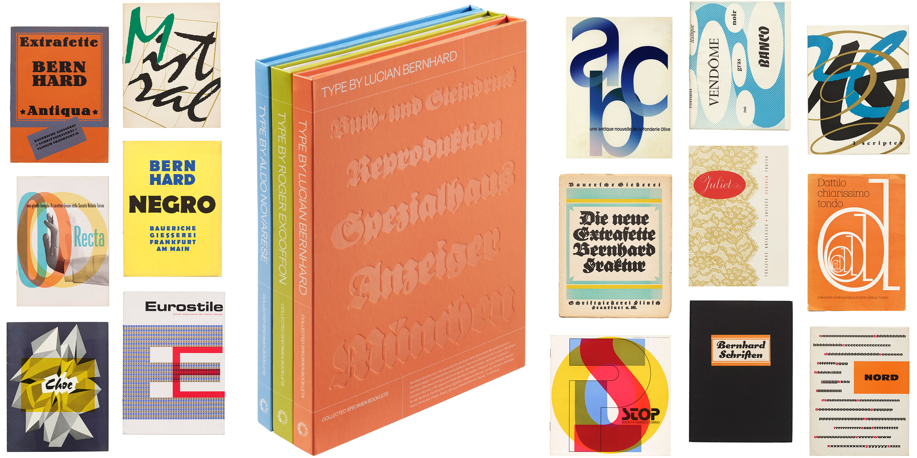
Three volumes of rare specimen facsimiles lift the curtain on twentieth-century type, gathering essential documents of trendsetting faces as they were first meant to be seen.
The first volumes of the Type By series with covers of select specimens reproduced inside.
Got a discerning designer on your shopping list? We asked our team for their favorite gift ideas from the Archive.
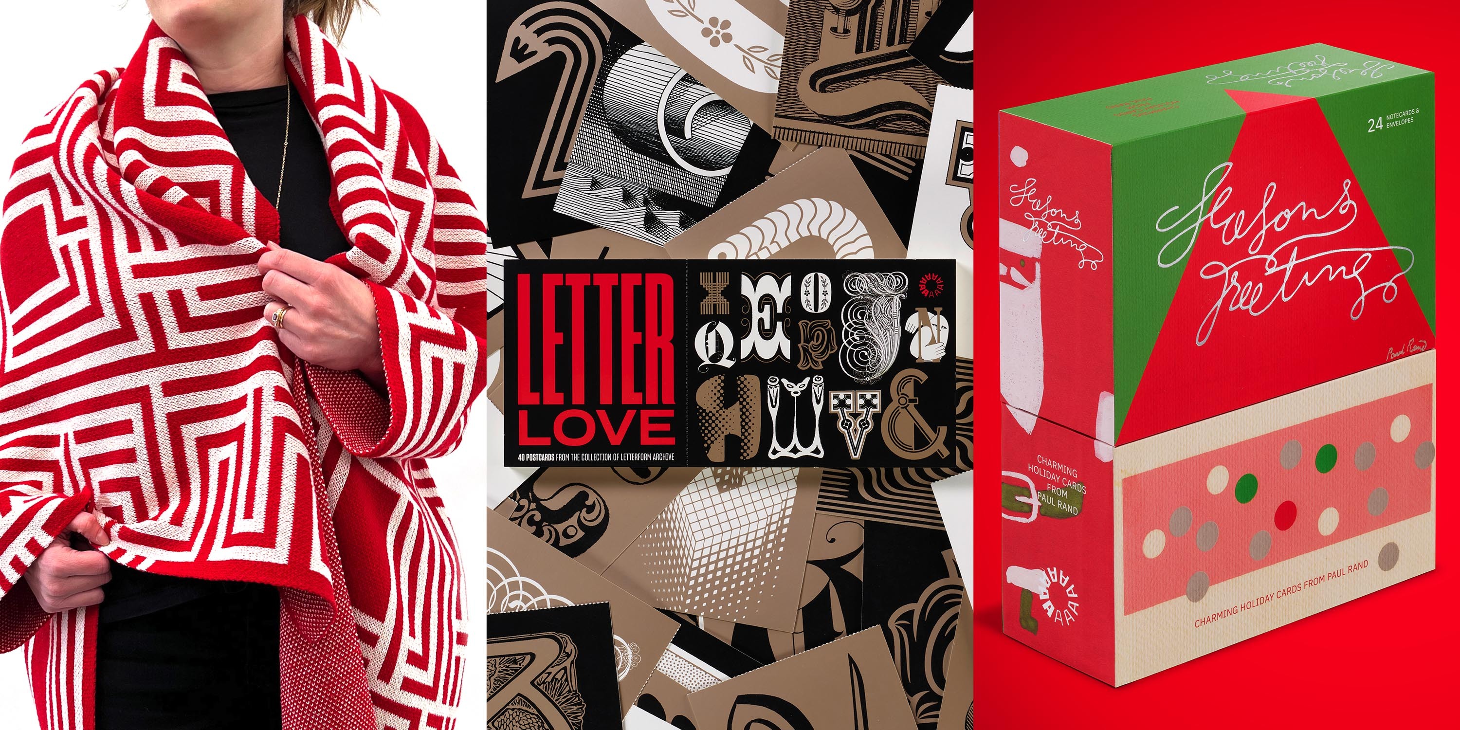
This holiday season, Letterform Archive staff members bring you their favorite gift ideas from our shop. From letterpress postcards printed by hand to colorful design books and cozy, type-forward blankets, we’ve got unique ideas for every type and design lover on your list.
Every purchase you make helps support the Archive’s education, exhibition, and preservation programs. Dive into our favorites and find something for everyone you love.
Order your gifts now! Thursday, December 19 at midnight is the last day for delivery by December 24.
Letterform Archive’s monograph of Amos Paul Kennedy, Jr., packs a lifetime of letterpress achievement into an ecstatic meditation on the power of print.
I do not want to put blackface on so-called “fine printing.” I want to print negro. To use printing to express negro culture. To do to printing what the blues and spirituals did to music.
So begins Amos Paul Kennedy, Jr.’s Citizen Printer, a compendium of works spanning the 35-year career of a storied letterpress printer and righteous maker whose practice demands justice while delivering joy.
In 800 full-color reproductions, divided into chapters on social justice, shared wisdom, and community, Citizen Printer immerses readers in Kennedy’s bold and colorful output. Armed with salvaged ink and type, the self-described “humble negro printer” layers his audacious calls to action over dense typographic or geometric backgrounds. Sourced from civil rights activists across U.S. history, ranging from Frederick Douglass and Sojourner Truth to Malcolm X and Rosa Parks, Kennedy’s chosen messages revive the ongoing fight for abolition and ensure that its lessons still reverberate today.
Our latest book gives designers a seldom-seen peek into the studio of a lettering master, where logos, posters, and signs are drawn by hand.
Mechanical for Toronto Blue Jays Scorebook Magazine, 1987. See more.
At Letterform Archive we’re always looking for stuff that shows the way a designer thinks, and reveals how their work was made. People visit us not just to see final works on paper — books, ephemera, posters — but also to see all the other artifacts produced along the way to the final piece, including sketches, proofs, and variations that never made it to print. That’s why we were so thrilled in 2018 to accept a donation from Michael Doret that includes about half of his working archive. (The other half went to the Herb Lubalin Study Center at The Cooper Union in New York where he got his start.)