Hot off the Press: New Books, Just in Time for the Holidays
Letterform Archive wraps up a banner year in publishing. Here’s the latest on our final releases of 2024 — plus a limited-time deal for members.
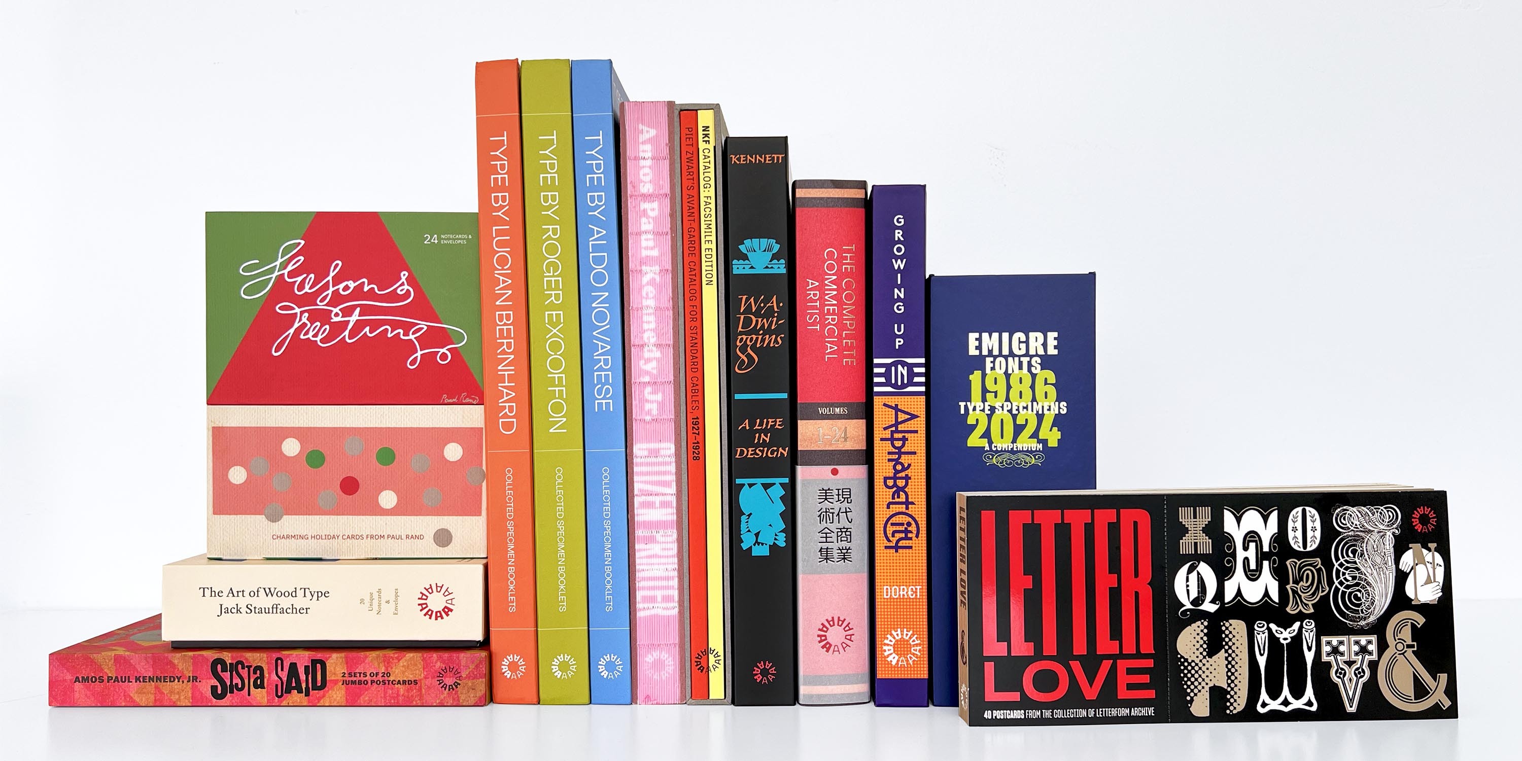
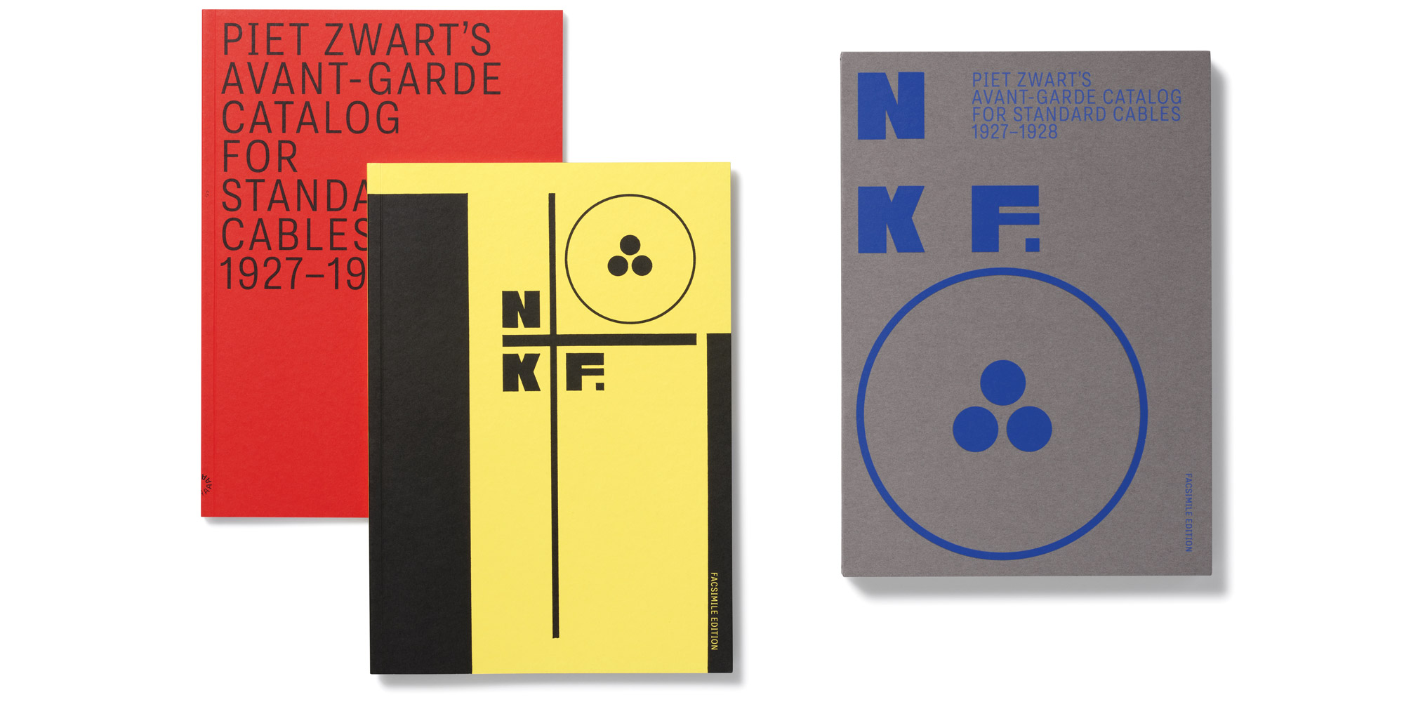
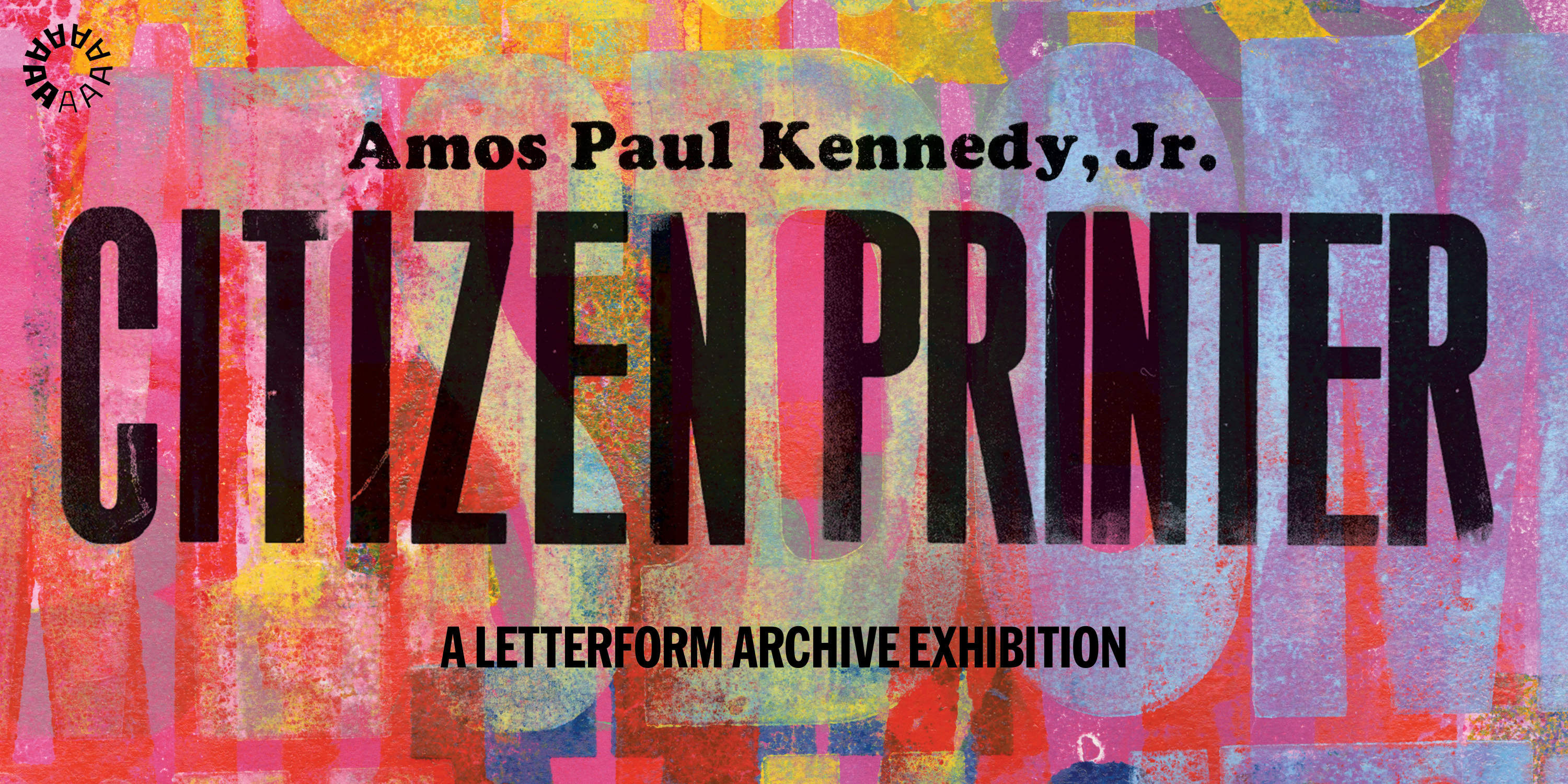
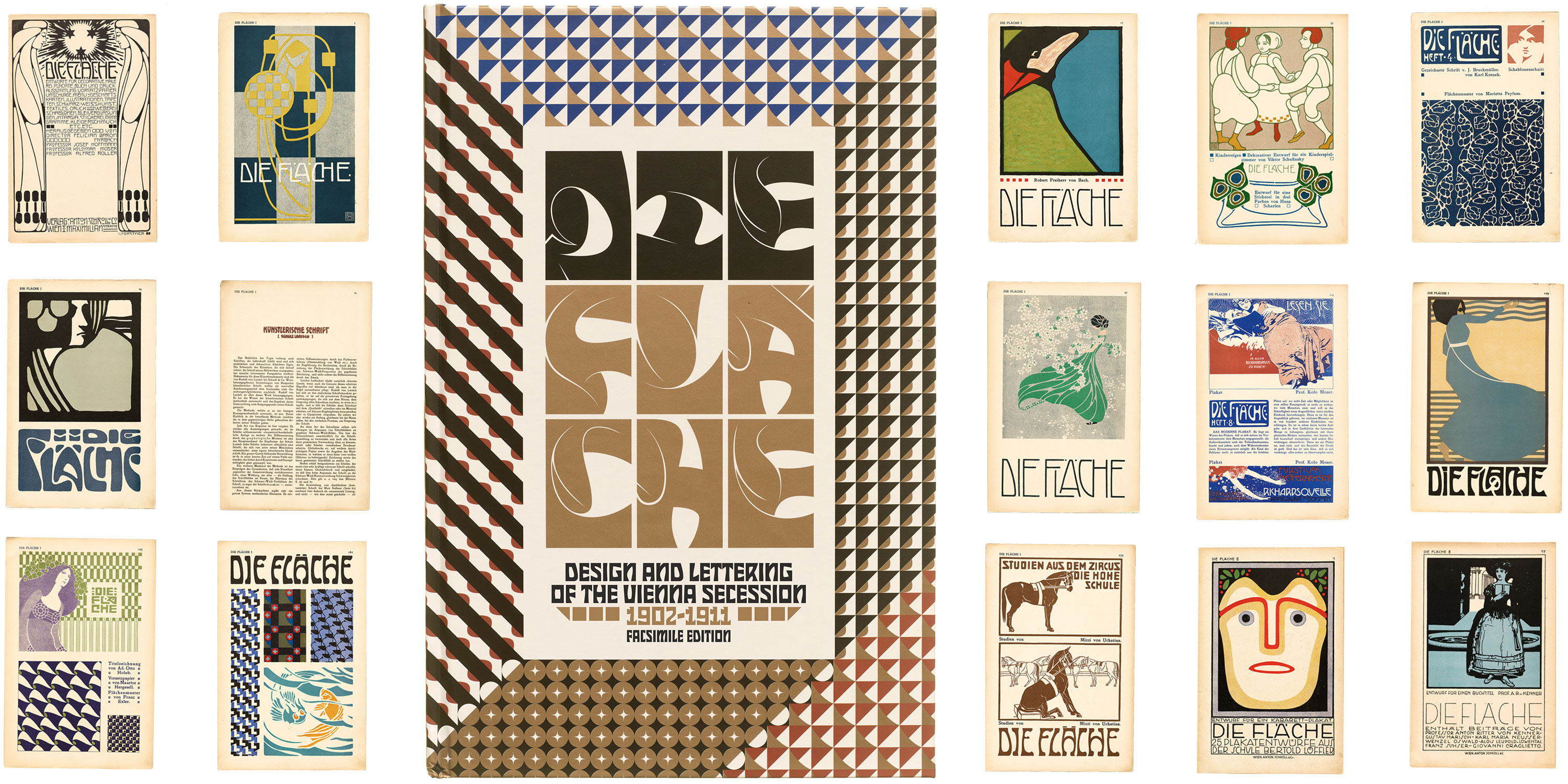
At Letterform Archive Books, the team has the honor and the privilege of crafting books that tell the story of our collection. This year, we have been delighted to deliver up a dozen beautiful titles — ranging from an entertaining and visually splendid autobiography by lettering artist Michael Doret to a dynamic facsimile edition of Piet Zwart’s famed 1928 catalog for a Dutch cable company to Letter Love, a pleasing sampler of letterforms presented in a pint-sized postcard booklet.