Skip to main menu Skip to main content Skip to footer content

News / Publishing

The Metal Squad Behind the Deluxe Dwiggins

Rare type and talent went into the making of the letterpress portfolio for W. A. Dwiggins: A Life in Design.

Dwiggins deluxe letterpress portfolio
Using original Dwiggins typefaces for each piece, Mss. by WAD contains eighteen pages of Dwiggins’s writings (some never before published), printed letterpress from Linotype cast metal slugs, and housed in a handsome portfolio featuring a Dwiggins ornament blind-embossed on the front cover. Twenty-two illustrations, hand-lettered titles, and decorated initials (all made from original Dwiggins pen-and-ink artwork in the files of Boston Public Library) accompany the text, reproduced via high-quality copper photoengravings.

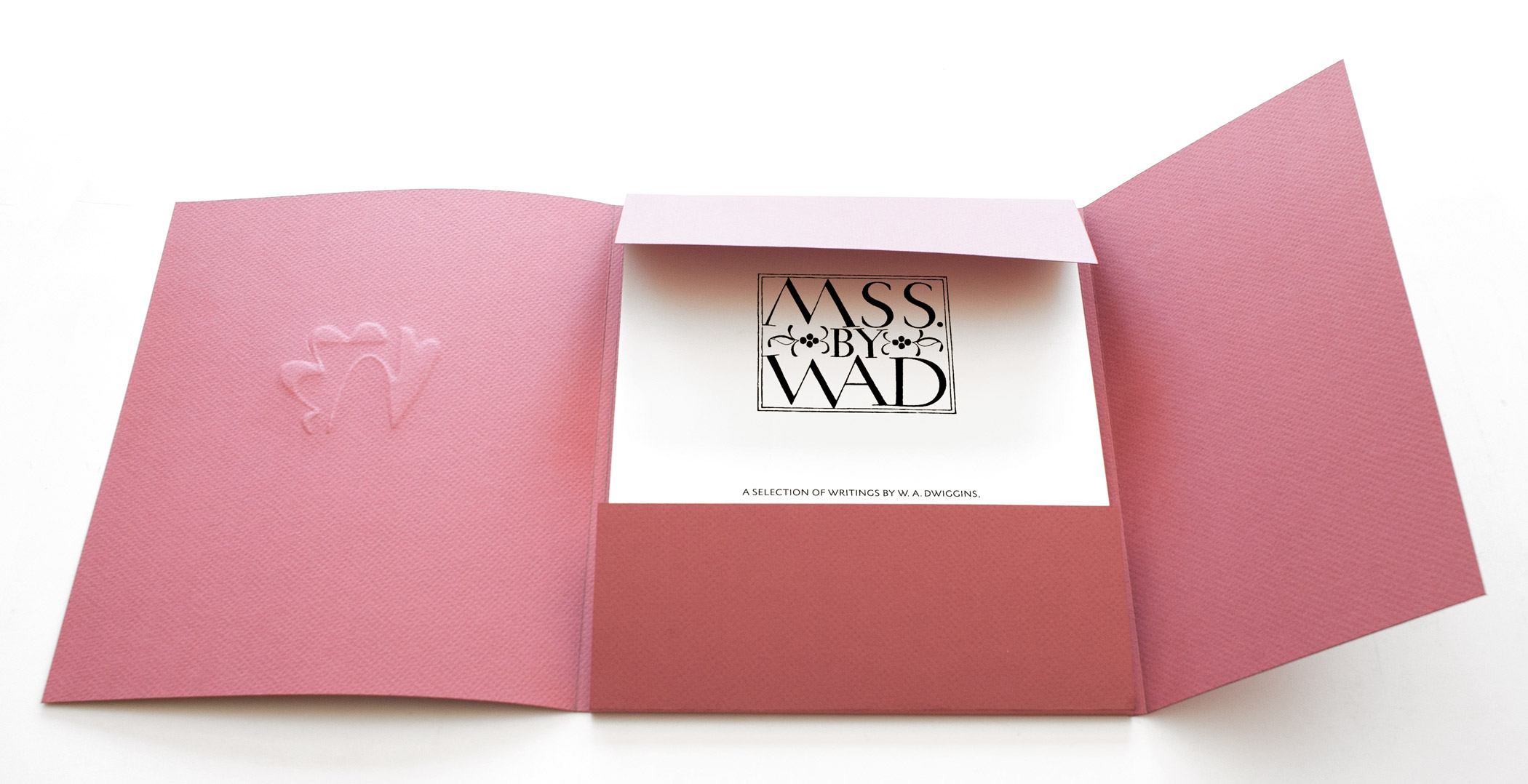
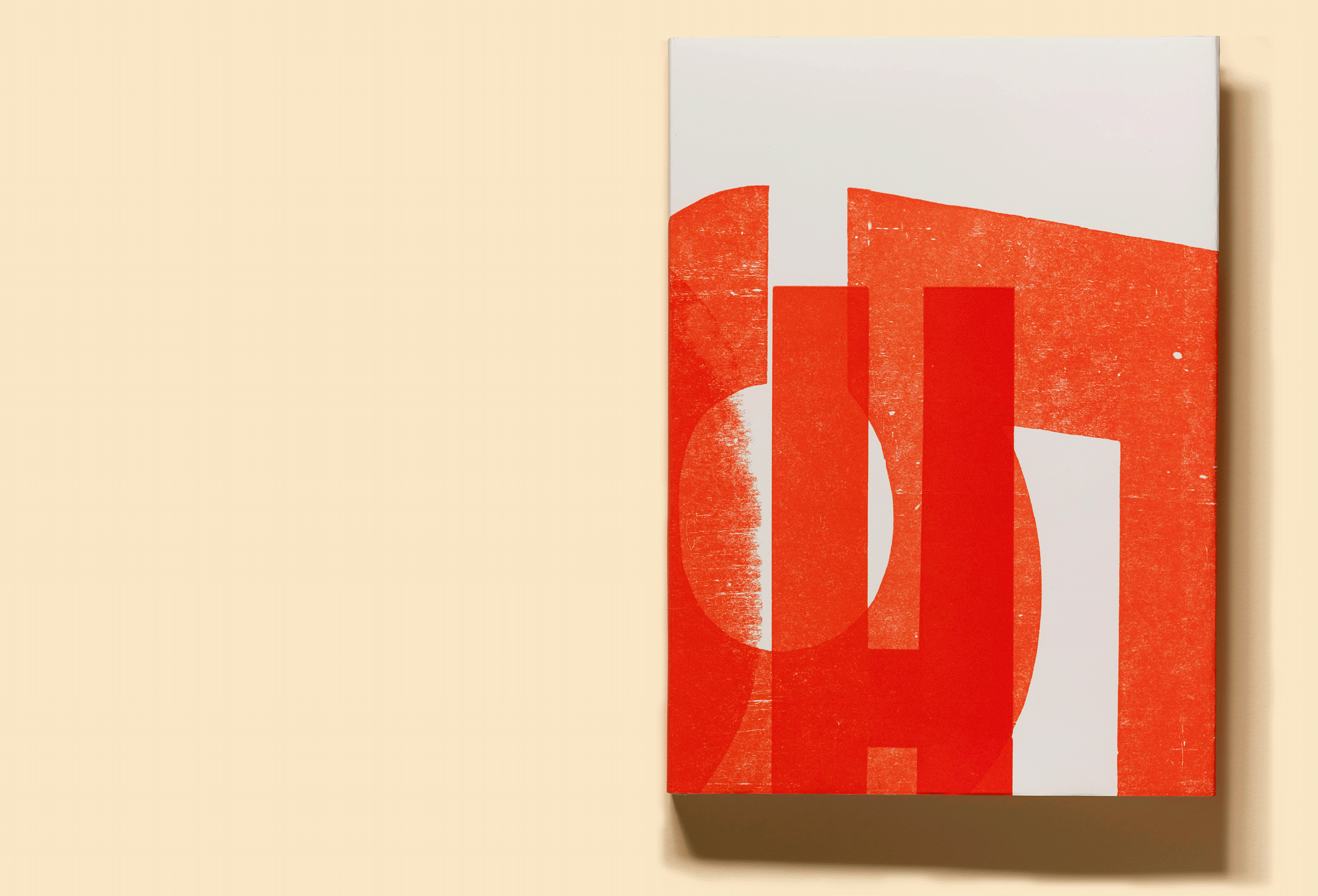
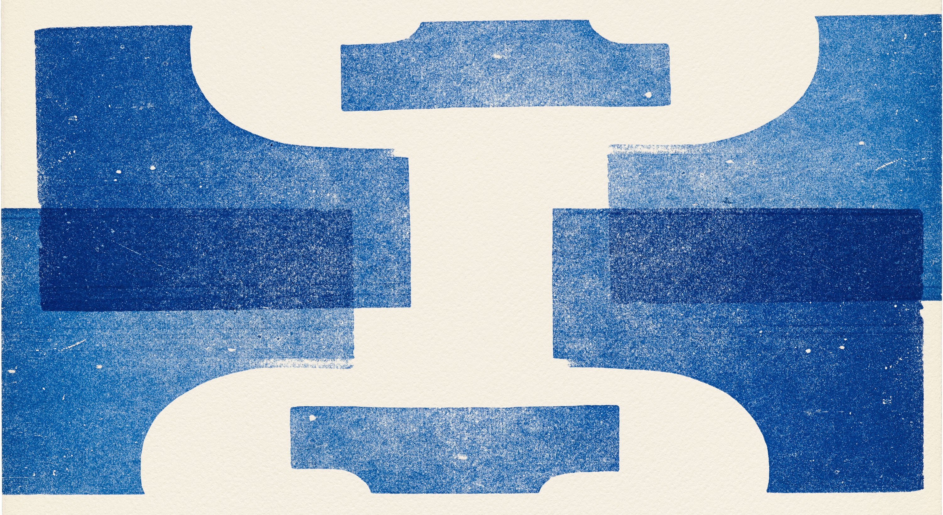
Dwiggins’s visual inventiveness was matched by his verbal wit, and he left behind a number of charming stories and playful but potent essays that helped to define the fields of graphic, advertising, and book design. The deluxe edition of Bruce Kennett’s Dwiggins biography includes a portfolio of Dwiggins’s writings, set in his own typefaces made for the Linotype machine. (The standard edition of the book includes high-fidelity reproductions of these pages.)

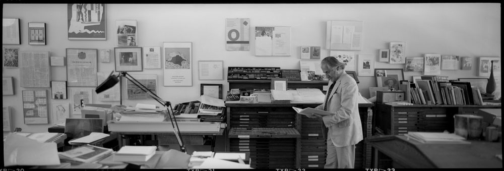
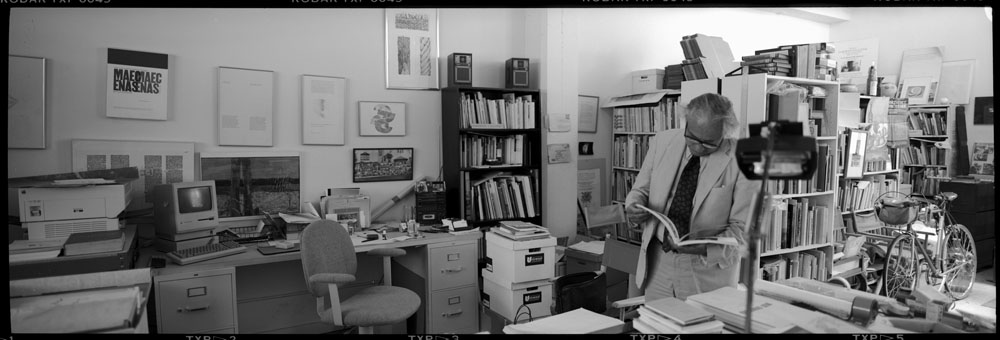
In his book’s acknowledgments, Bruce thanks “the Metal Squad who produced the letterpress portfolio (which also appears in the book as the Writings section): Michael Babcock, Darrell Hyder, John Kristensen, and Andrew Steeves, all of whom brought not only their experience and skills, but also their respect and admiration for Dwiggins.” As the final proofs of A Life in Design head to the printer, we look back at the efforts from this team of craftsmen and the methods, both analog and digital, which made the portfolio possible.

Read More

This Just In: Jennifer Morla

The AIGA Medalist, AGI Member, and National Design Award Recipient donates her archive.

Left to Right: AIGA for SFMOMA Lecture Series; Morla Design Lecture for AIGA Los Angeles (cropped); Environmental Poster for AIGA
Left to Right: AIGA for SFMOMA Lecture Series; Morla Design Lecture for AIGA Los Angeles (cropped); Environmental Poster for AIGA.
Read More

This Just In: Jack Stauffacher’s Studio

For over 50 years, Stauffacher lived a singular life at the heart of San Francisco’s creative community. Now, his legacy lives on at the Archive, and his prints are the subject of our third book.

panoramic photo of Jack Stauffacher at his studio, Greenwood Press, 300 Broadway in San Francisco. Photo: Dennis Letbetter, 1991
panoramic photo of Jack Stauffacher at his studio, Greenwood Press, 300 Broadway in San Francisco. Photos: Dennis Letbetter, 1991
Jack Stauffacher in his studio, Greenwood Press, at 300 Broadway in San Francisco. Photo: Dennis Letbetter, 1991.

Some rooms convey history all by themselves. They tell stories about the people who live in them before those occupants even utter a word. Jack Stauffacher’s studio in San Francisco was such a place.

Read More

Type as Modern Art: The Influences Behind Stauffacher’s Wood Type Prints

Long before Jack Stauffacher picked up a piece of wood type and used it to create one of his typographic abstractions, the printer and designer had collected lessons in his craft from across time.

Jack Stauffacher, Process work (detail) for The Rebel Albert Camus portfolio, 1969. Collection of Letterform Archive.
Only on Saturday. Hardcover, 10 x 14 inches, 208 pages. Regular: Scuff-free velvet-touch matte laminate case wrapped with a jacket. Deluxe: Hardcover with a portfolio of 10 facsimile reproductions and 10 impressions made with Stauffacher’s own wood type, bound and slipcased in dark green silk.
Reserve your copy

Read on to learn about just a few of the many influences that informed his wood type work, which is the subject of our third book, Only on Saturday: The Wood Type Prints of Jack Stauffacher, now live on Kickstarter.

Early Experiments in Printing

At an early age, Jack Stauffacher was practically anointed as a printer. Paging through an issue of Popular Mechanics when he was fourteen, his eye fell on a mail-order advertisement for a 3-by-5-inch letterpress, and his curiosity was permanently piqued. By the time he graduated from high school, he and his father had built a modest studio in the backyard of their home in San Mateo, California, and the tiny mail-order press had given way to a more stately Chandler & Price model. Named the Greenwood Press after the street adjacent to their home, young Stauffacher’s enterprise began to take on small commercial jobs.

Read More

Join the Letterform Archive Mailing List

Learn more about our collection, including additions to the Online Archive, and get news of upcoming events, workshops, and publications.

Join the list