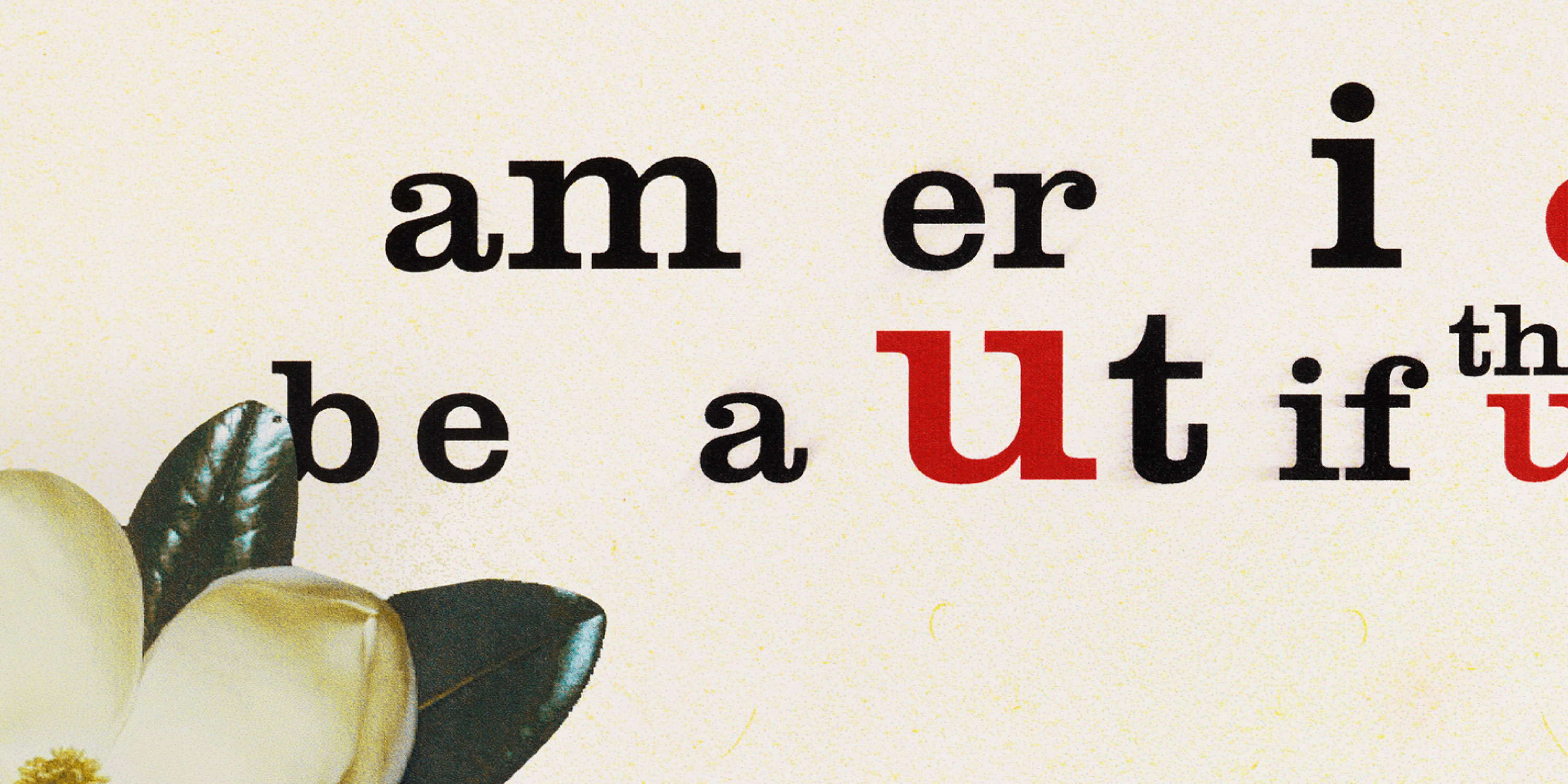
Jack Stauffacher on Working with Type
For the printer and designer whose wood type prints are the subject of Only on Saturday, crafting a perfect page meant getting a feel for the written word, its history — and what it means to be human.
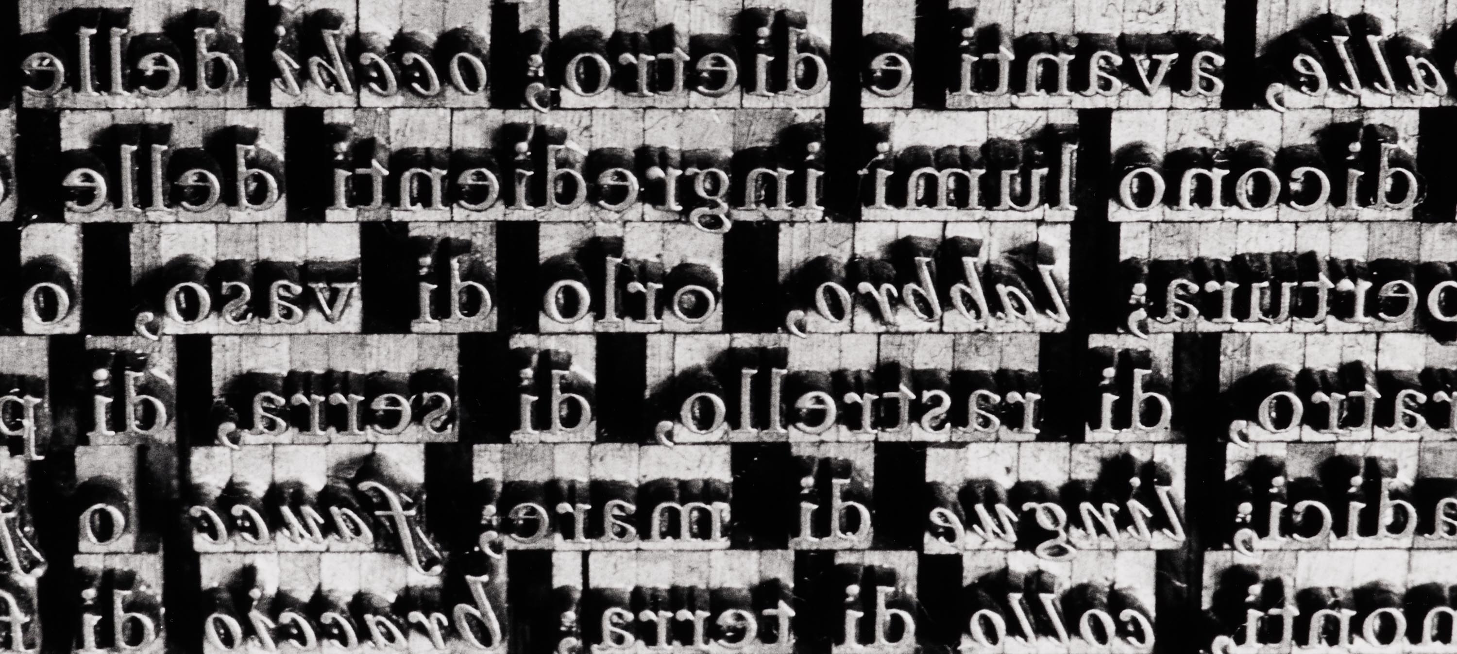
Long before Jack Stauffacher picked up a piece of wood type and used it to create one of his typographic abstractions, the printer and designer had collected lessons in his craft from across time.
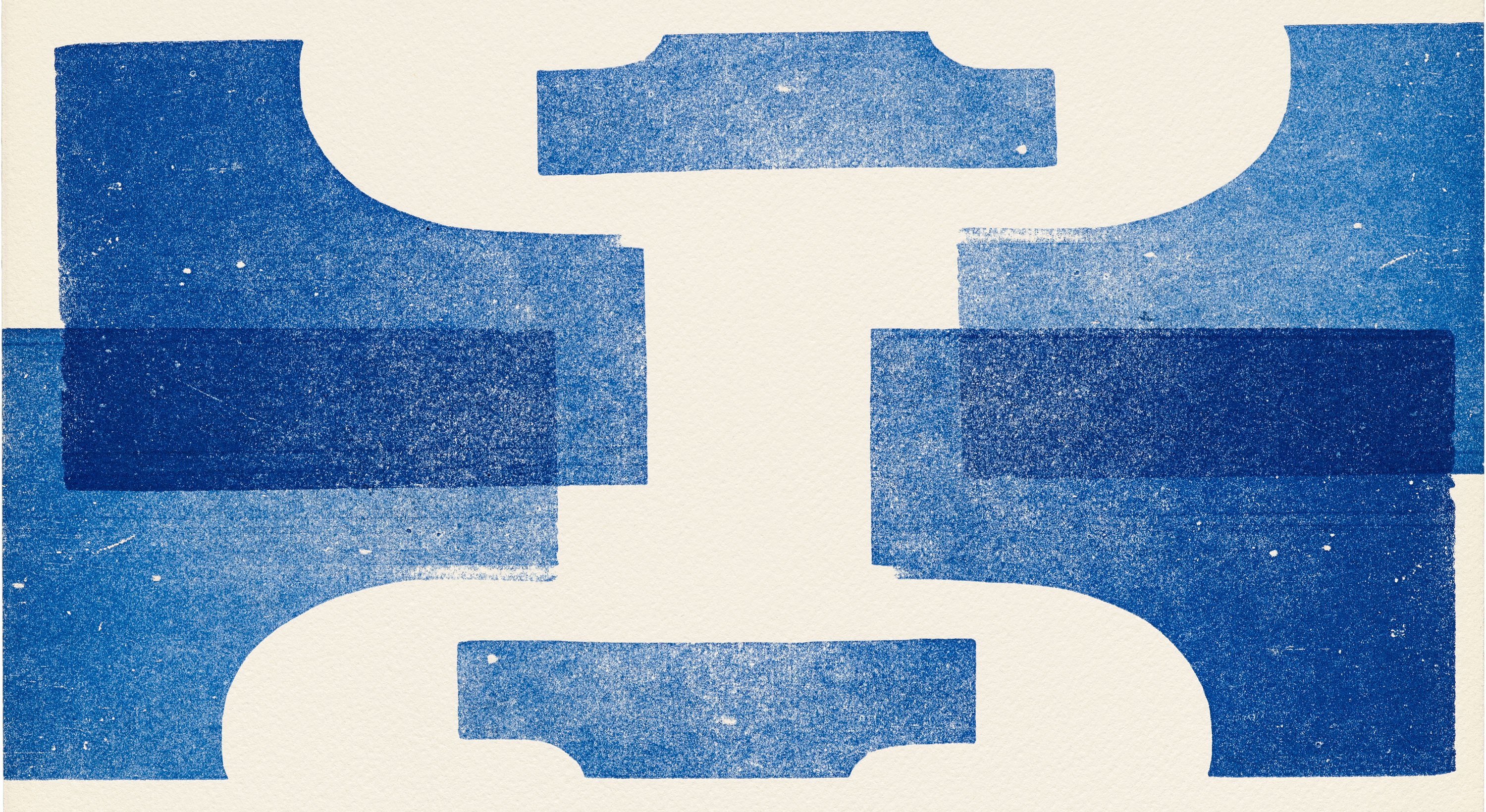
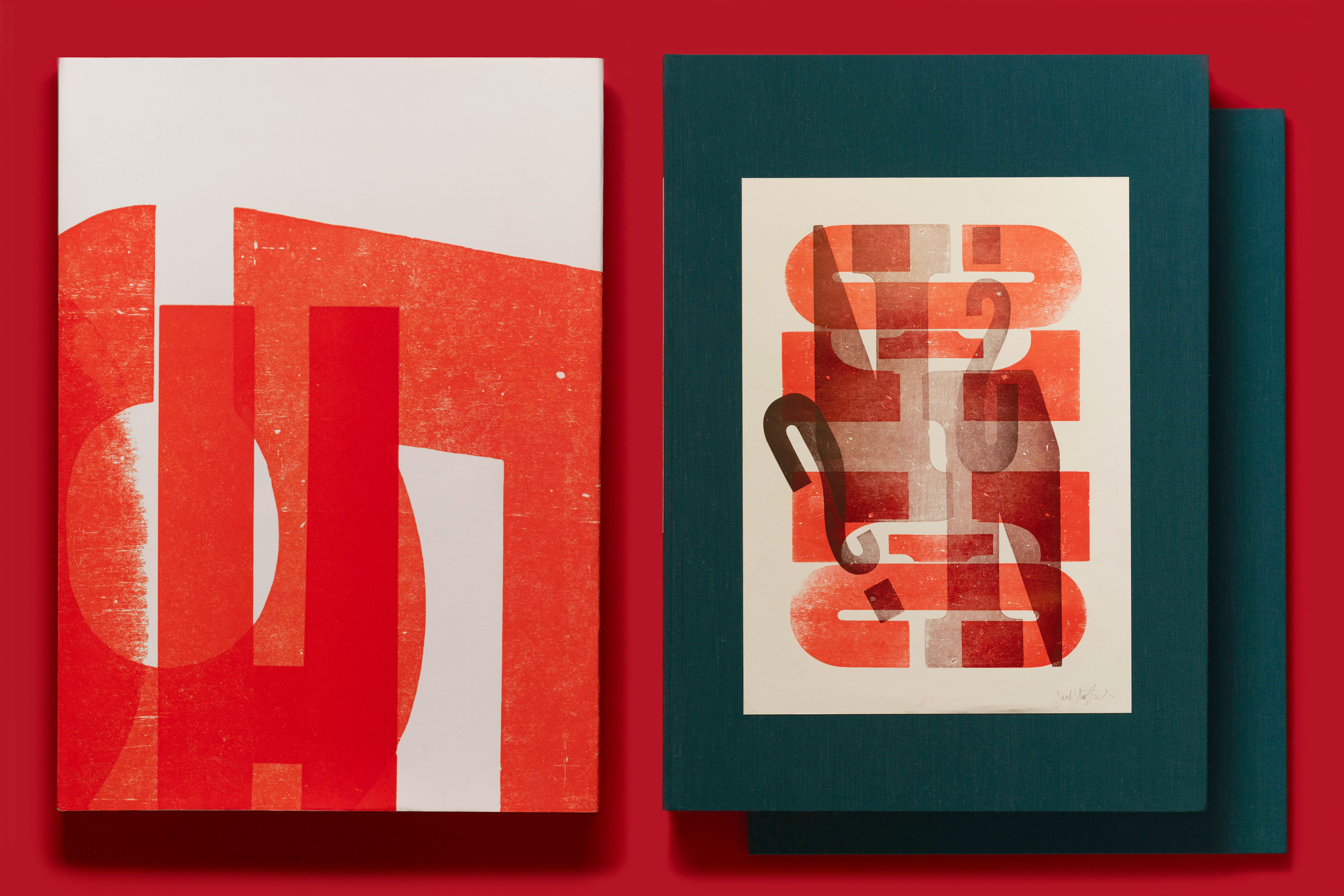
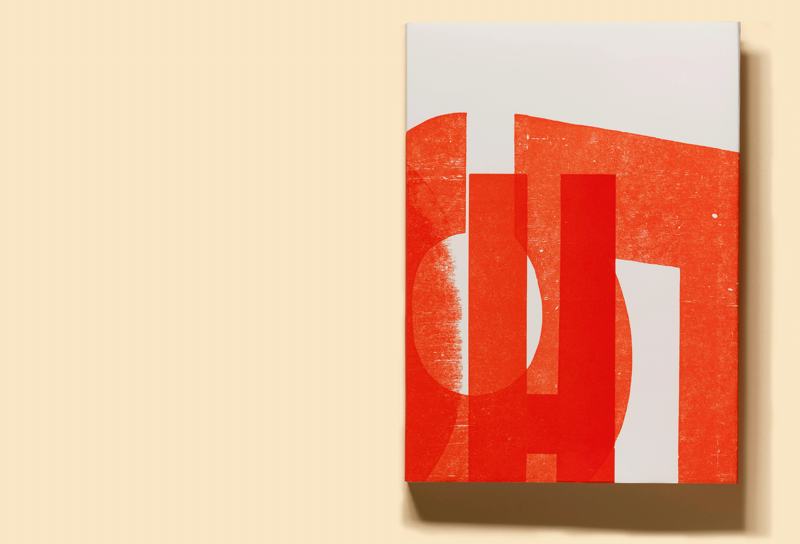
Read on to learn about just a few of the many influences that informed his wood type work, which is the subject of our third book, Only on Saturday: The Wood Type Prints of Jack Stauffacher, now live on Kickstarter.
At an early age, Jack Stauffacher was practically anointed as a printer. Paging through an issue of Popular Mechanics when he was fourteen, his eye fell on a mail-order advertisement for a 3-by-5-inch letterpress, and his curiosity was permanently piqued. By the time he graduated from high school, he and his father had built a modest studio in the backyard of their home in San Mateo, California, and the tiny mail-order press had given way to a more stately Chandler & Price model. Named the Greenwood Press after the street adjacent to their home, young Stauffacher’s enterprise began to take on small commercial jobs.
For over 50 years, Stauffacher lived a singular life at the heart of San Francisco’s creative community. Now, his legacy lives on at the Archive, and his prints are the subject of our third book.
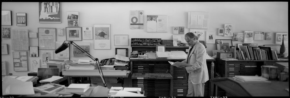
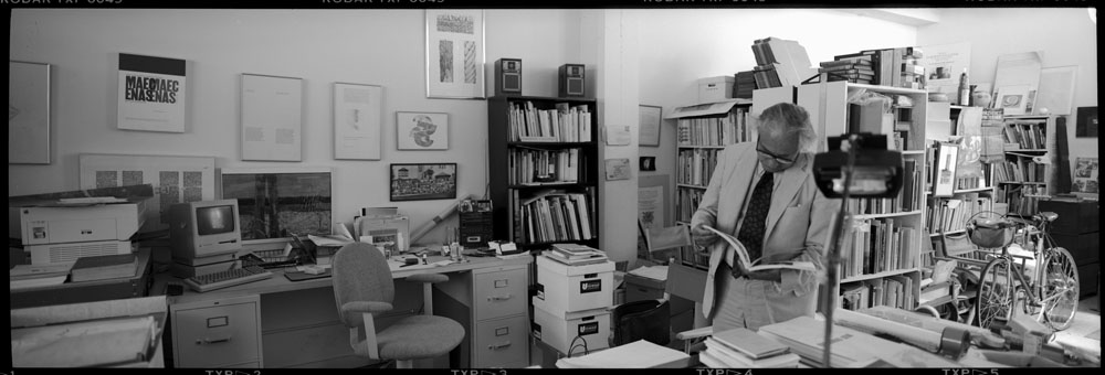
Some rooms convey history all by themselves. They tell stories about the people who live in them before those occupants even utter a word. Jack Stauffacher’s studio in San Francisco was such a place.
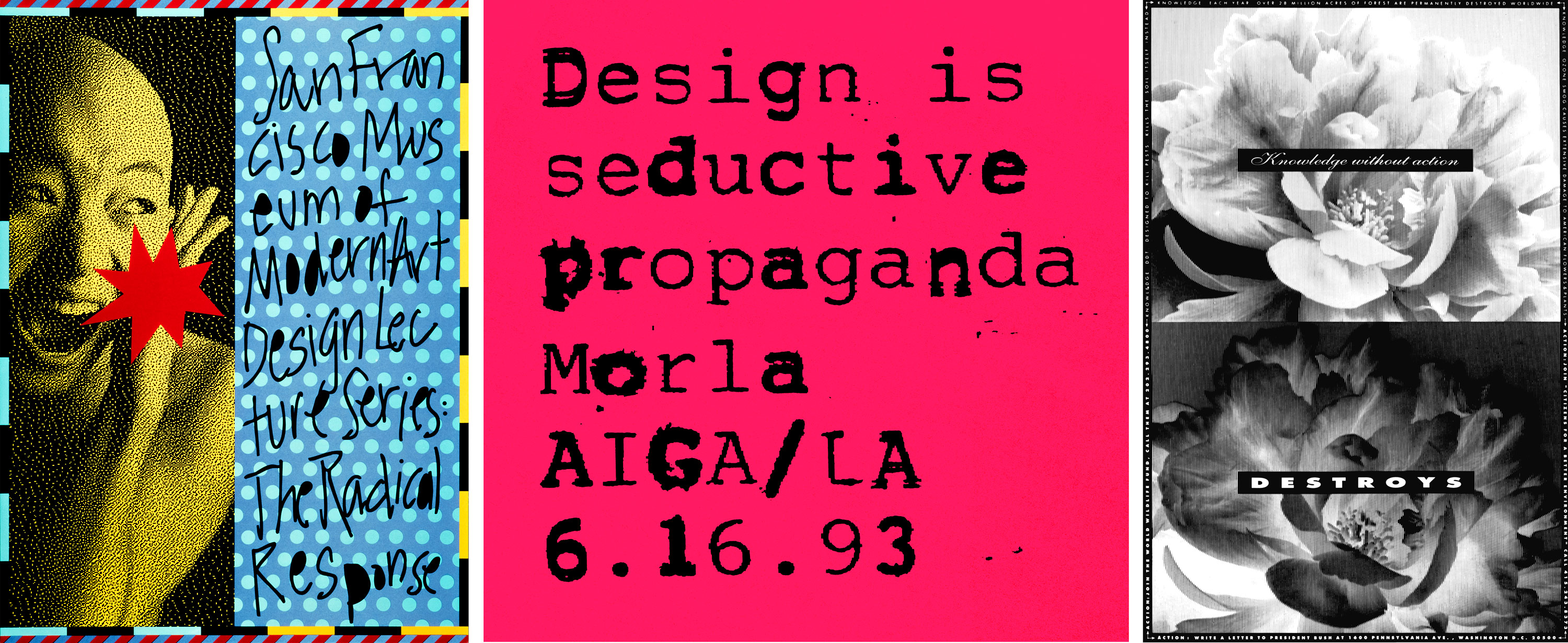
The award-winning author of Morla : Design shares her secrets for choosing the right typeface for the job.
The AIGA Medalist, AGI Member, and National Design Award Recipient donates her archive.