Letterform Archive
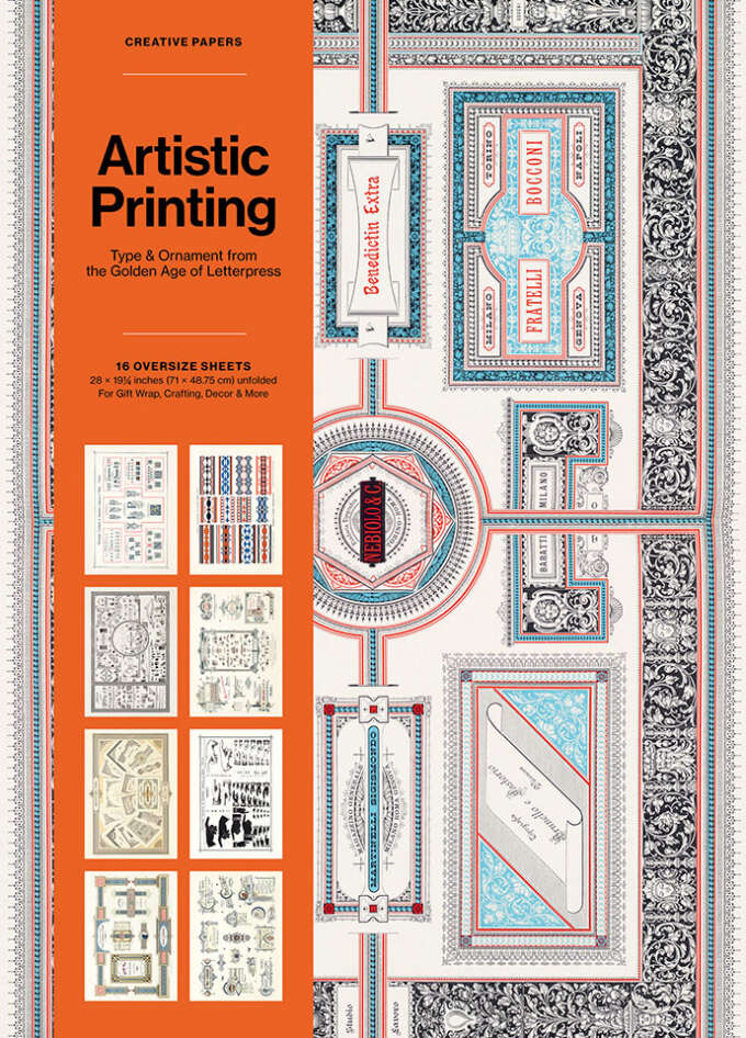
Artistic Printing Creative Papers: Type & Ornament from the Golden Age of Letterpress (For Gift Wrap, Crafting, Decor & more)
$25.00
MSRP:


News
From the golden age of letterpress to the birth of digital type, our new series of gift-wrap and craft-paper books transform beloved objects from our collection for use in wrapping, crafting, framing, and decor.
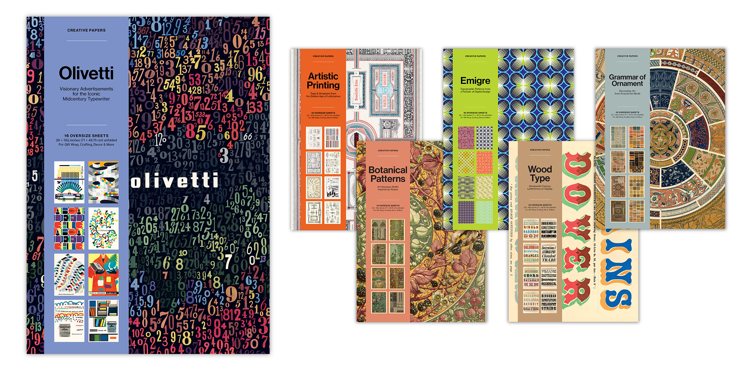
In addition to our beautiful full-length titles, Letterform Archive Books has worked to bring our collection to you with a variety of delightful gift and stationery products created for lovers of great design. For our newest series, we scoured the stacks for objects that deserved to be reinterpreted in a truly special way. Crafted with the same care and rigor as our vibrant facsimile editions, our collection of Creative Papers adapts works by key figures from design history for use in today’s creative endeavors.
Each book in the series presents sixteen designs as oversized sheets, faithfully reproduced from original artifacts in Letterform Archive’s collection. Perforated for easy removal, the sheets are equally suited for use as eye-catching posters, gift wrap and crafting projects—turning historic graphics into something to be used, not just admired.
Letterform Archive
$25.00
MSRP:
Letterform Archive
$25.00
MSRP:
Letterform Archive
$25.00
MSRP:
Letterform Archive
$25.00
MSRP:
Letterform Archive
$25.00
MSRP:
Letterform Archive
$25.00
MSRP:
In what follows, we’ve provided the contents of each volume in perpetuity, including hi-res captures of the artworks on display. Each gallery is paired with a historical discussion of the designers, companies, and publications that inspired each title.
In the nineteenth century, technological innovations allowed for a creative flourishing in print, and letterpress practitioners produced extravagant materials to showcase their craft.
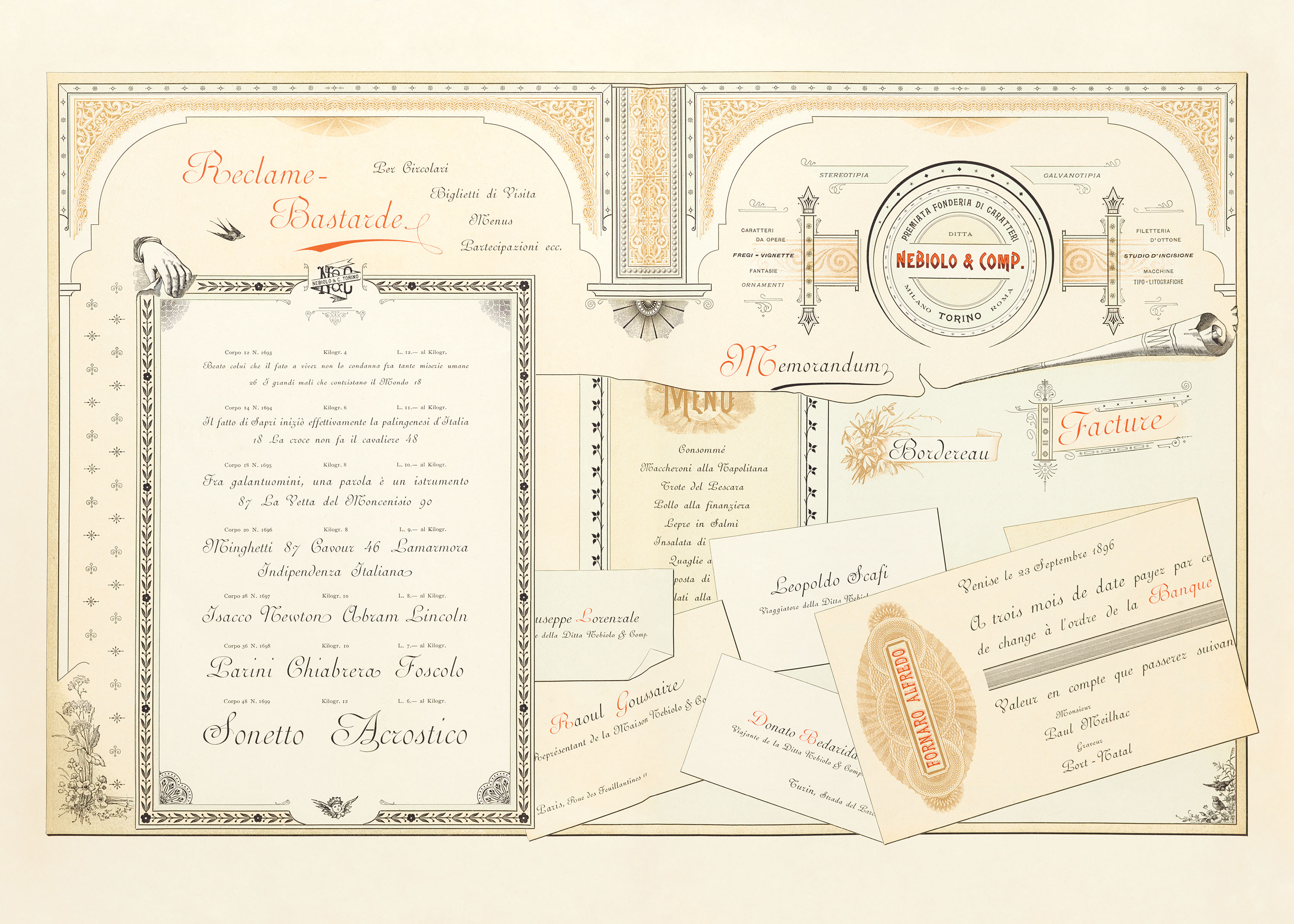
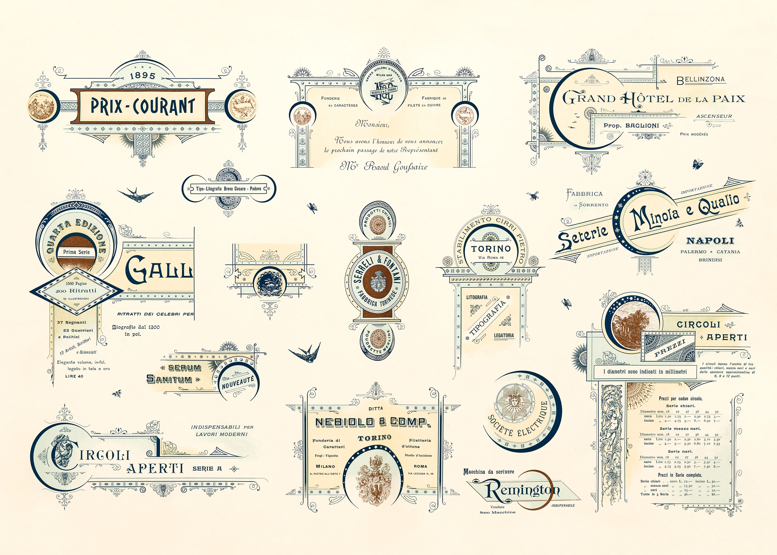
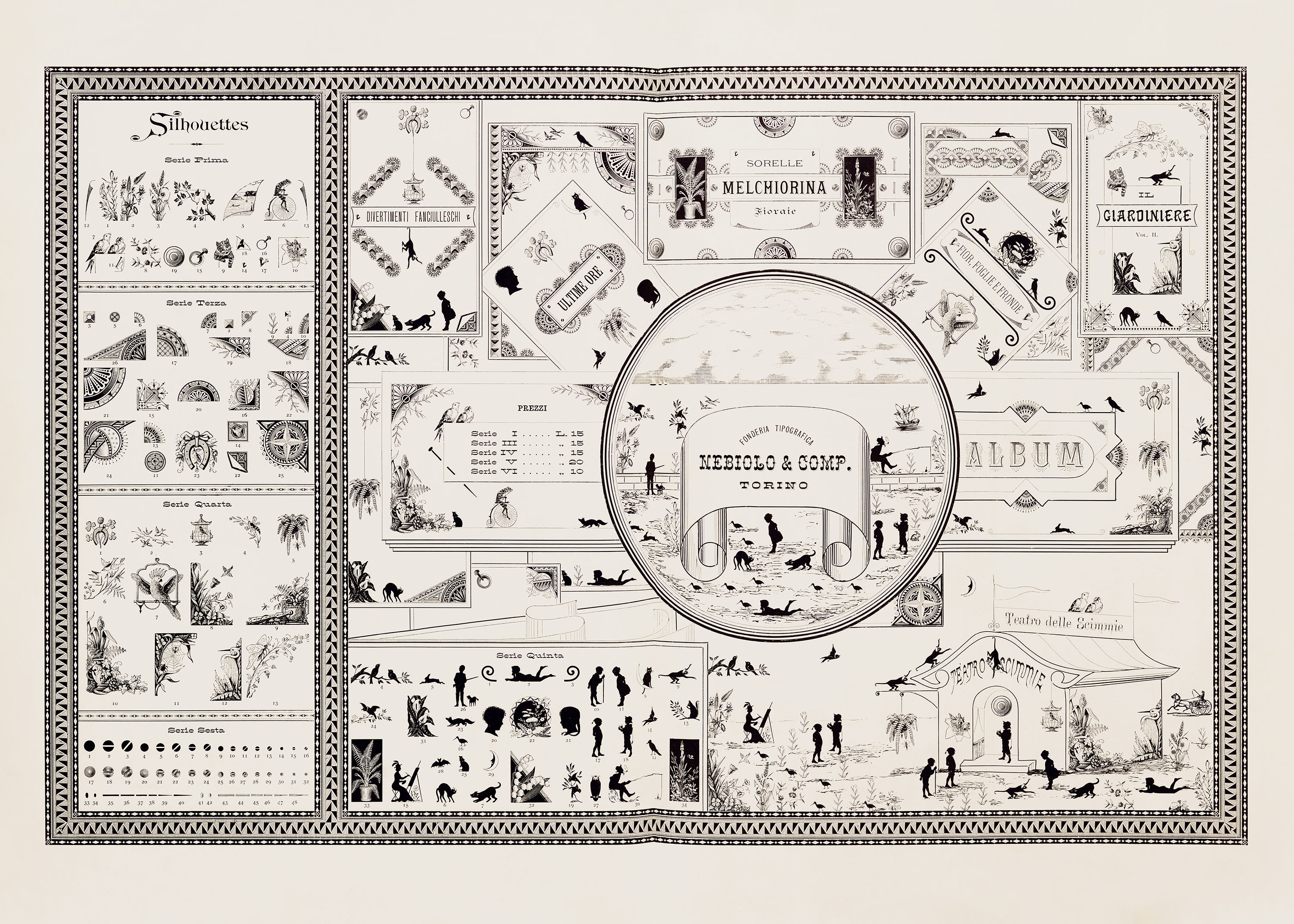
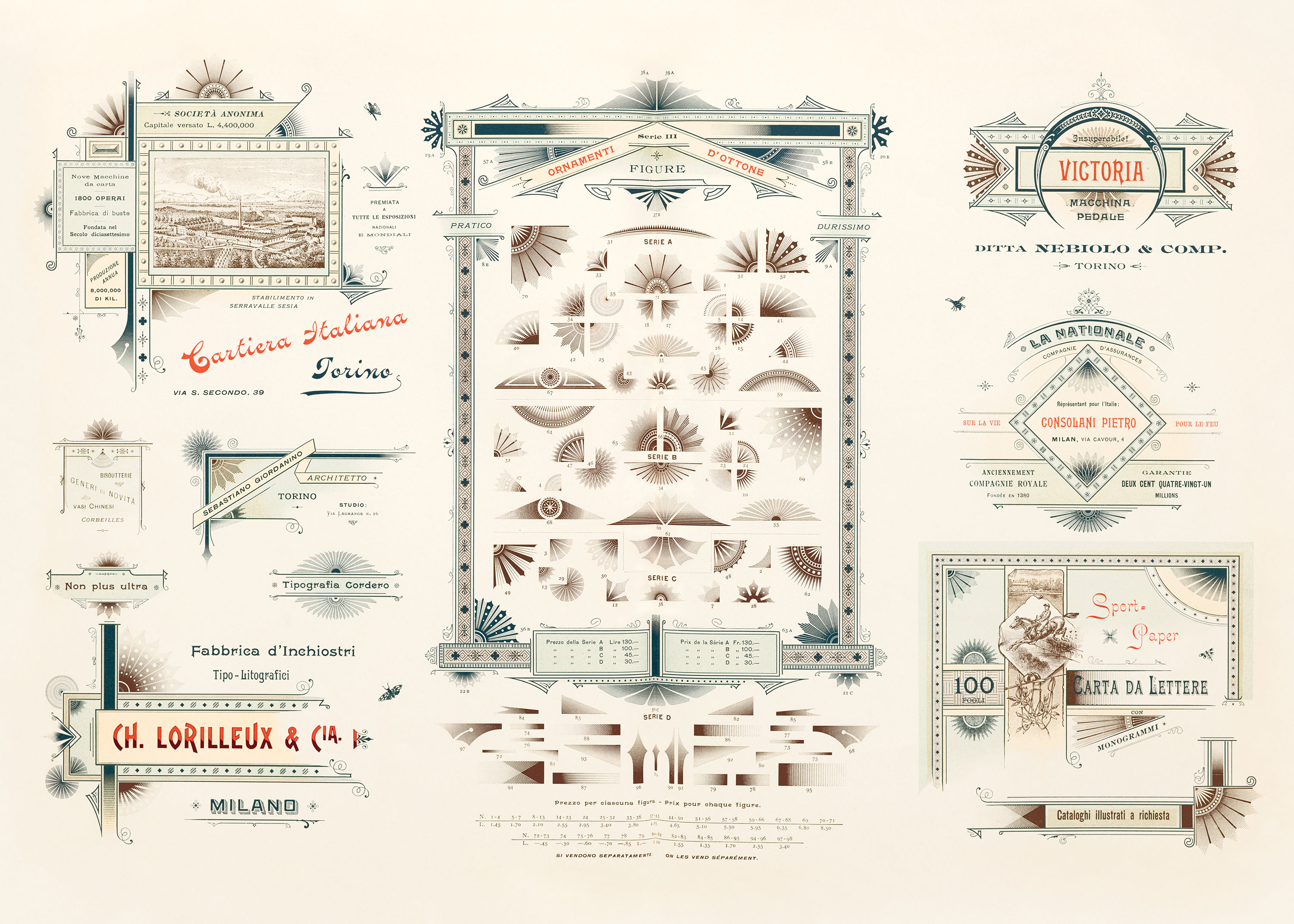
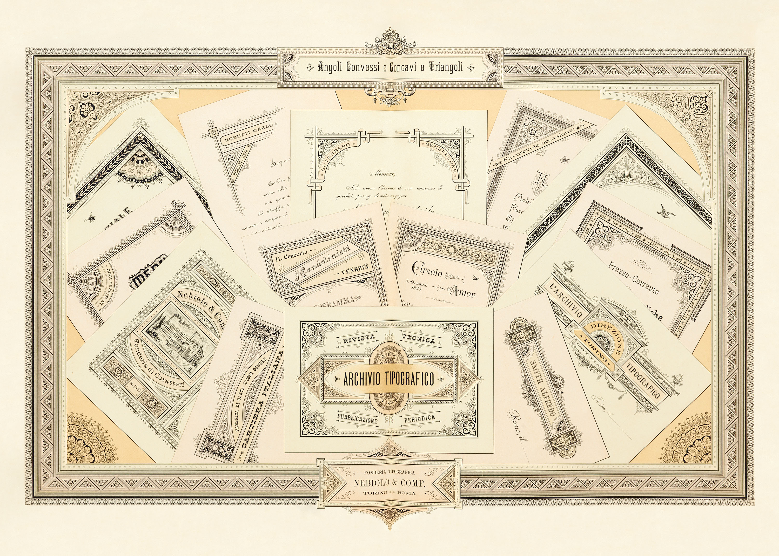
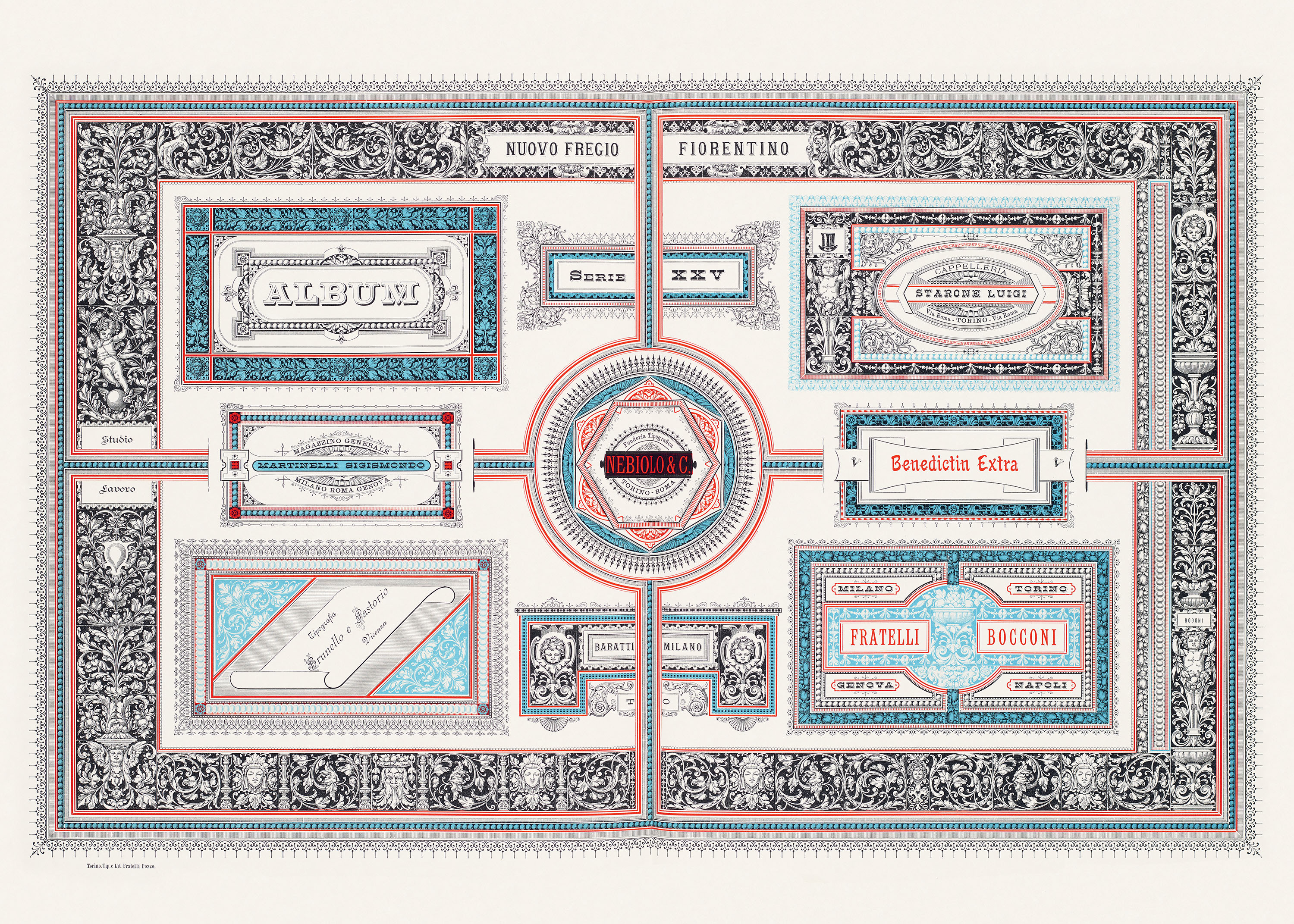
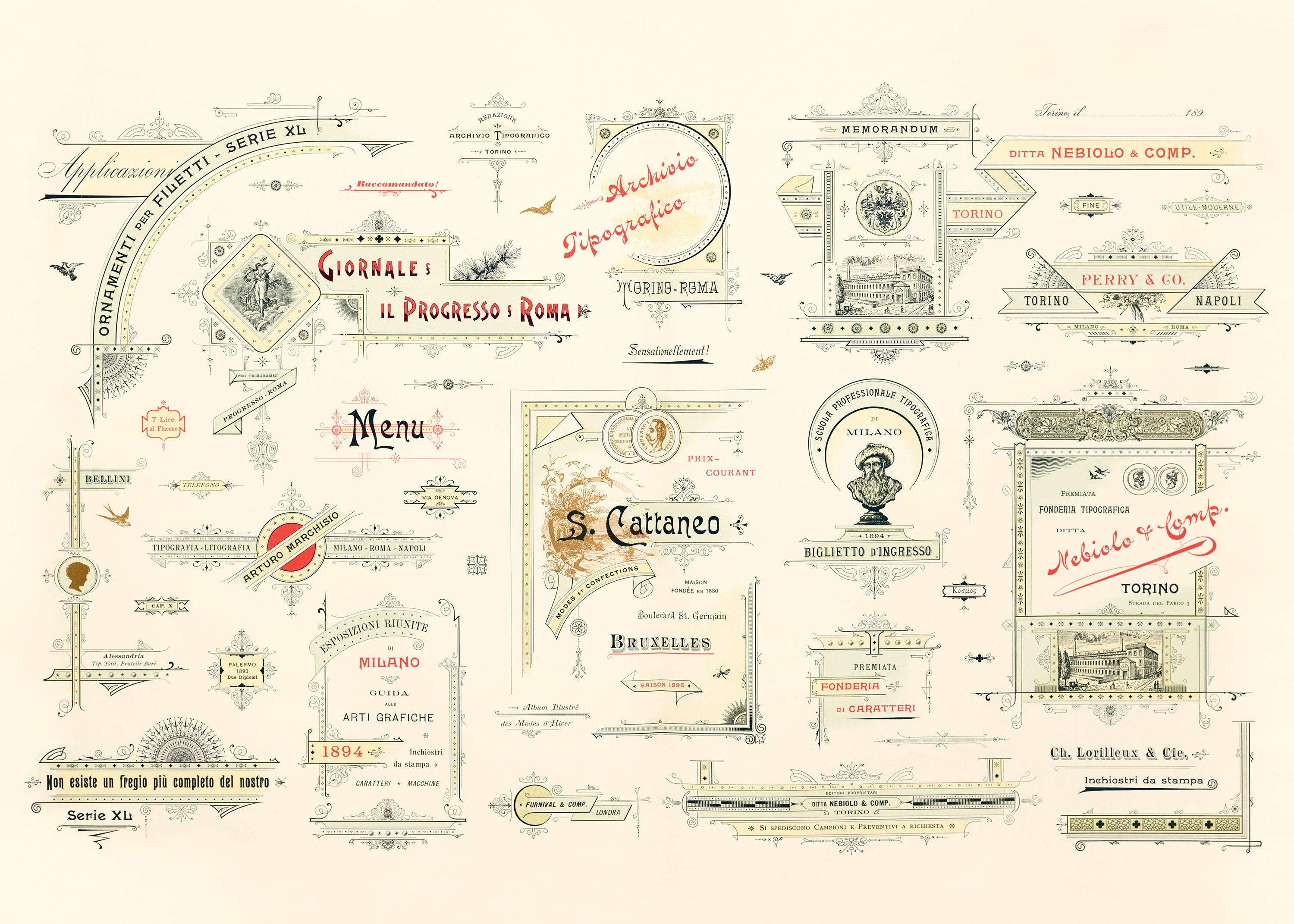
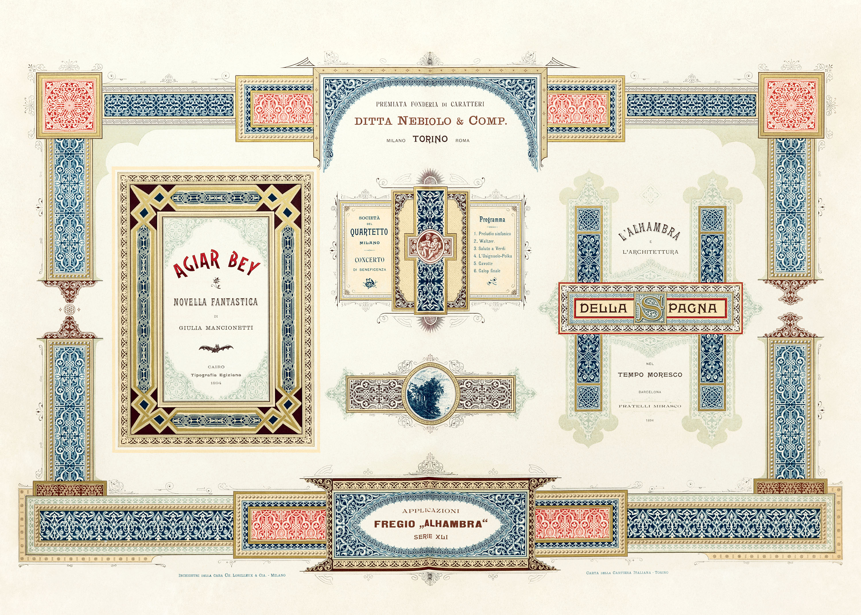
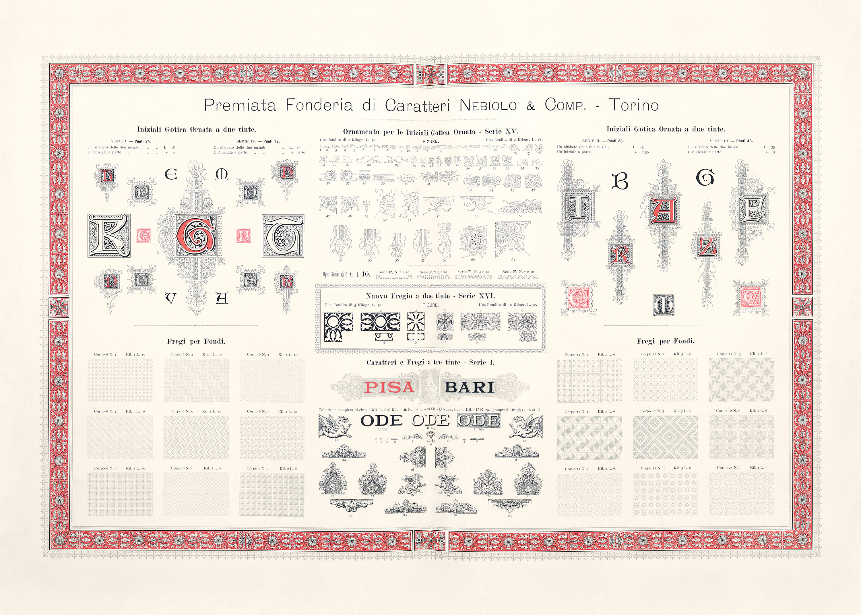
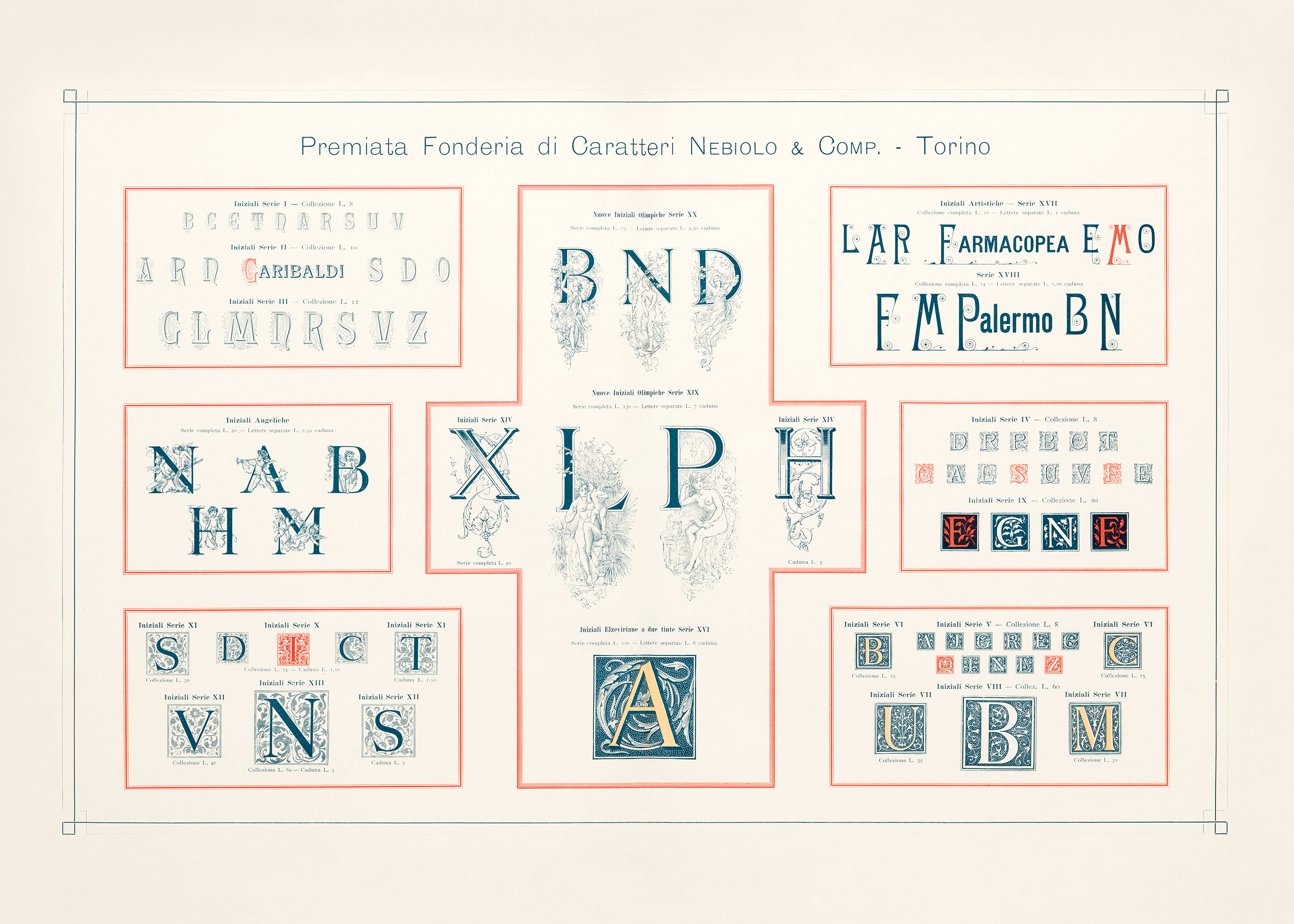
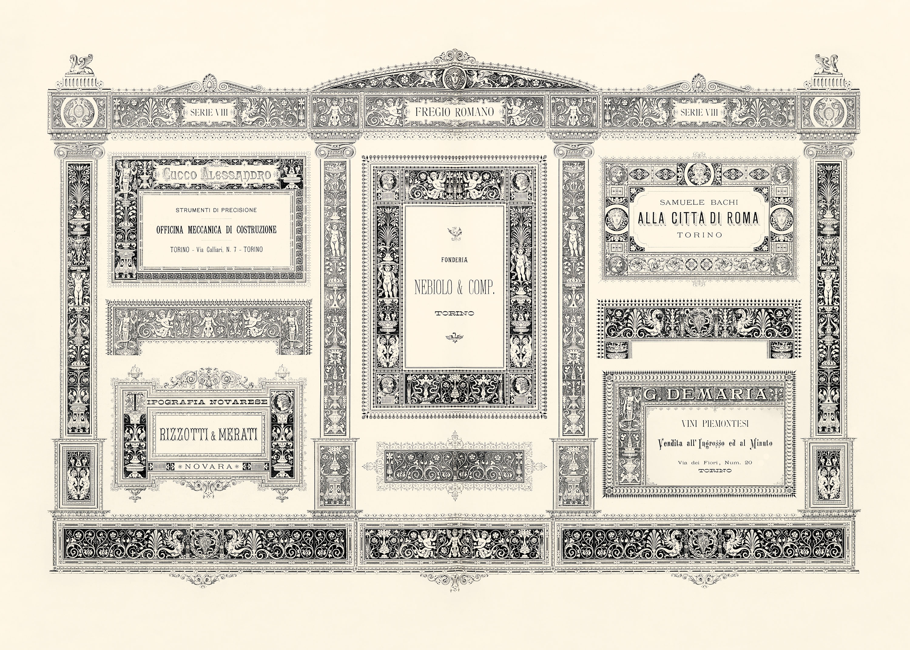
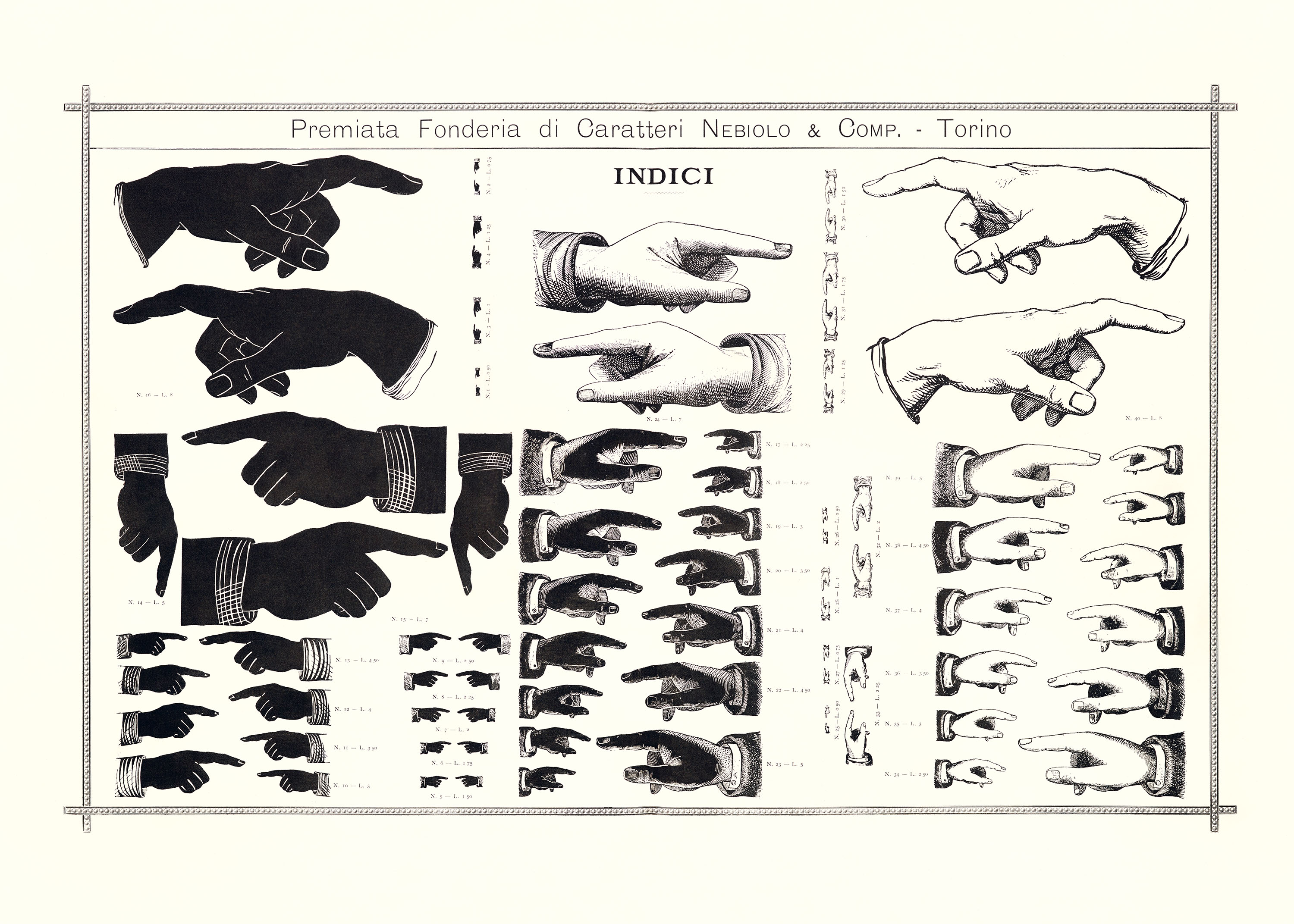
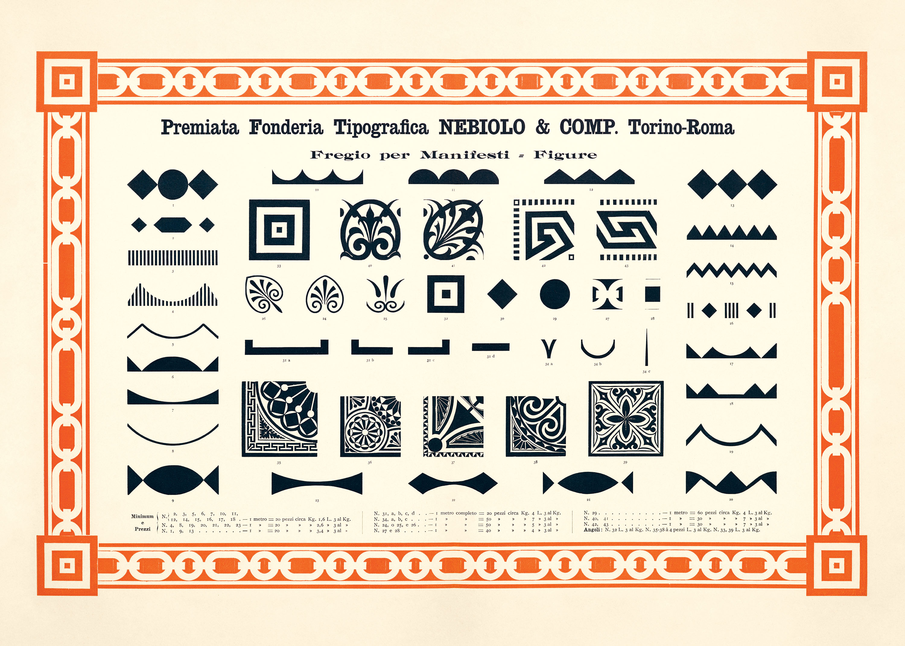
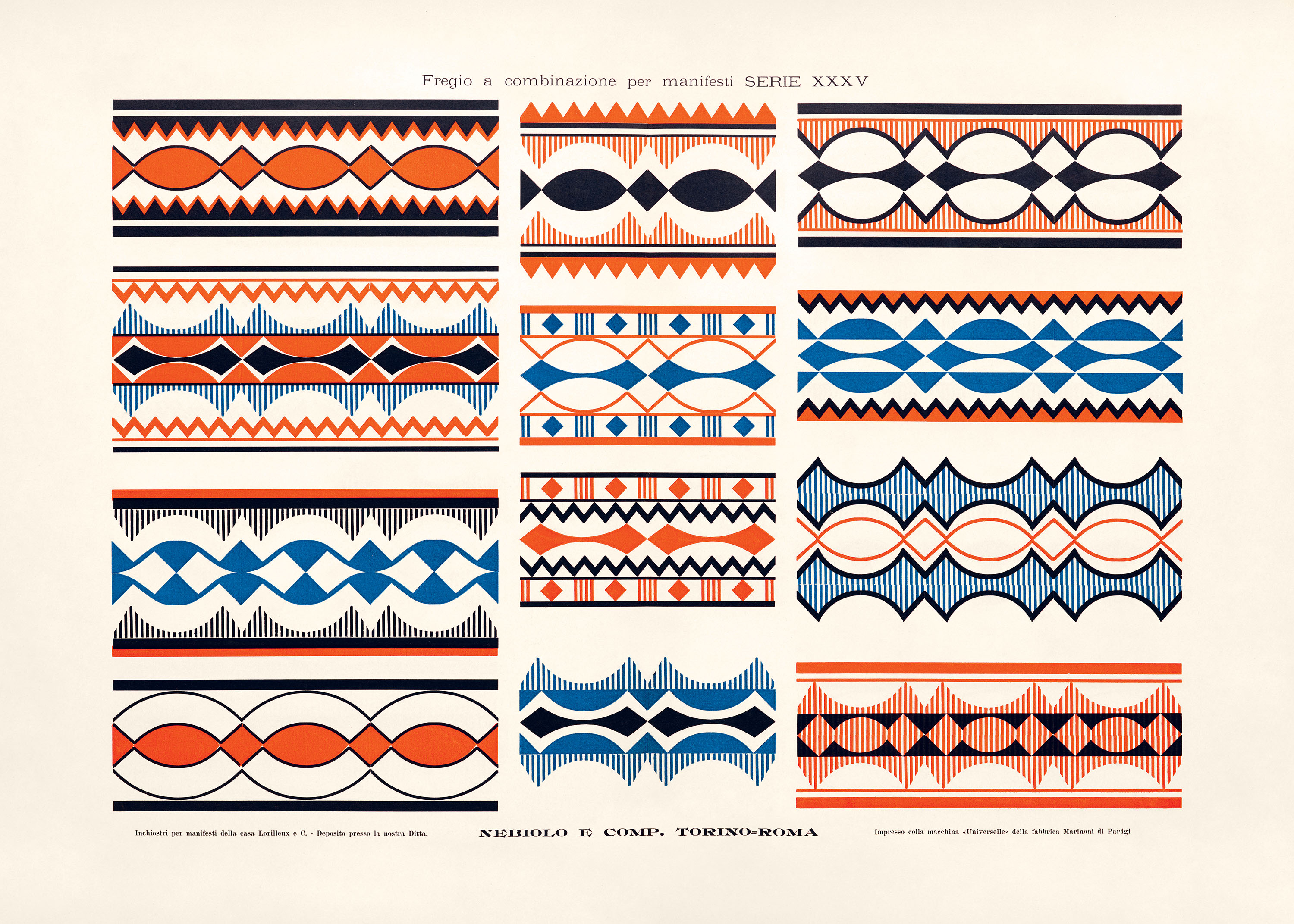
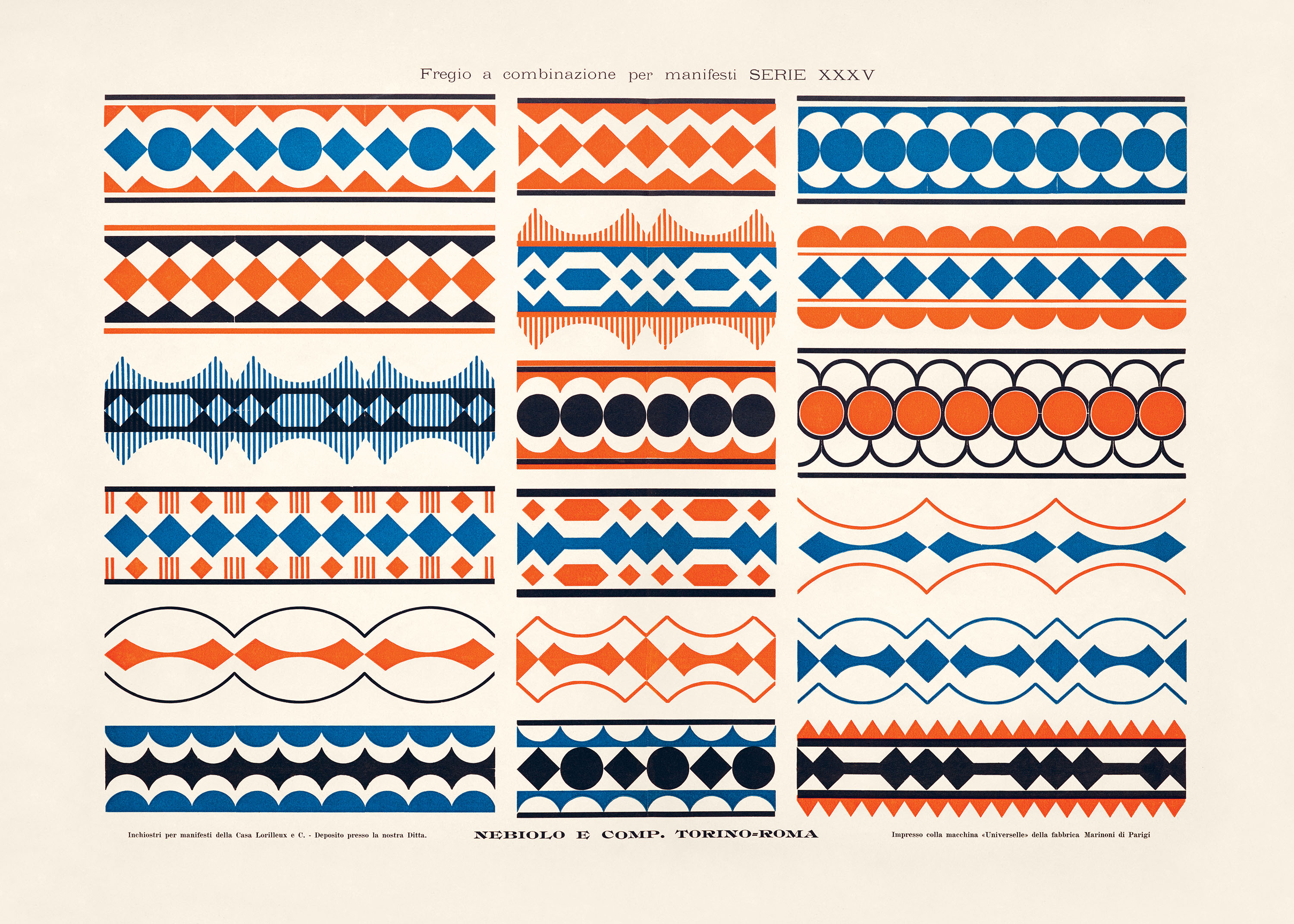
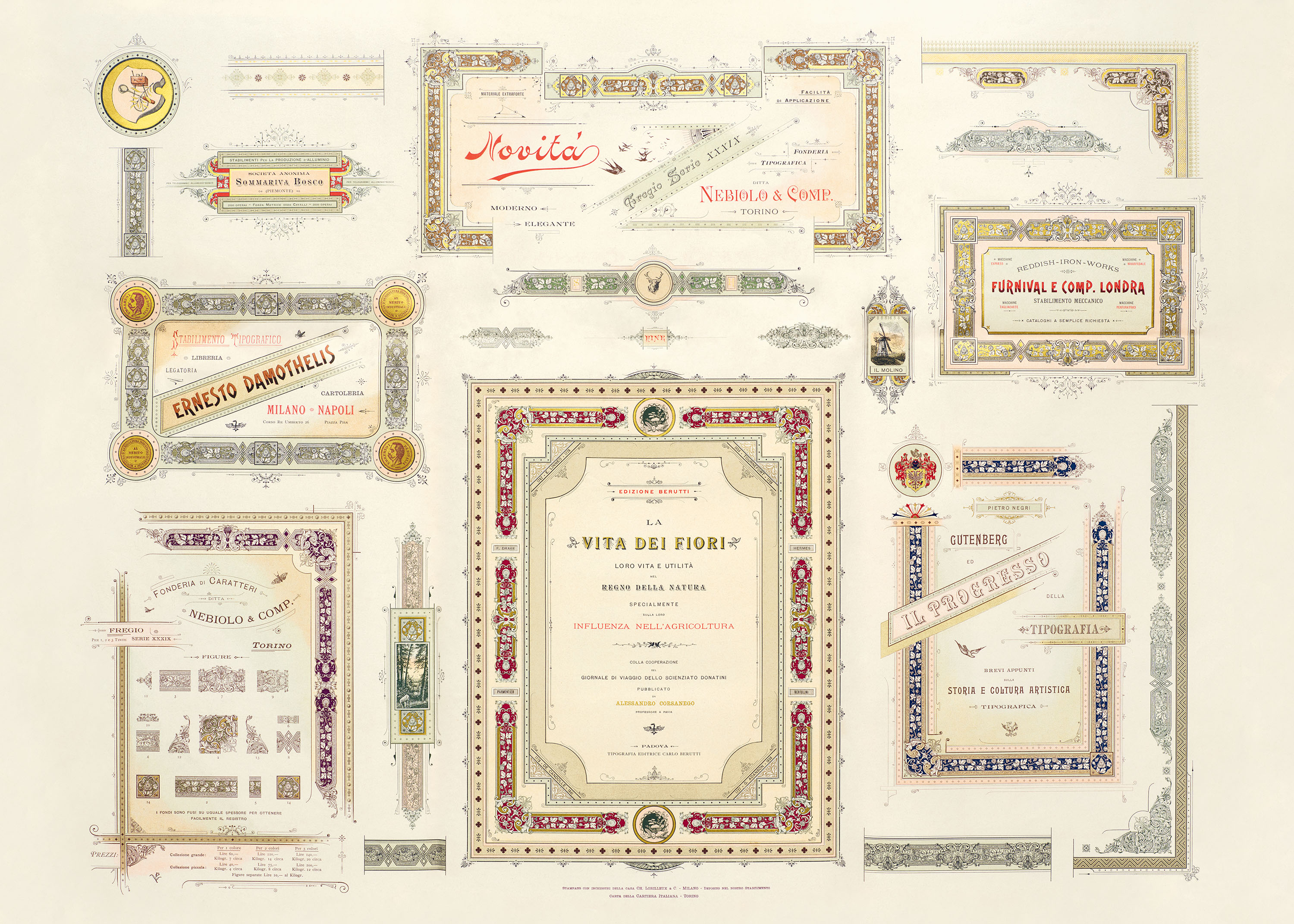
On view in Artistic Printing Creative Papers is a selection from two such dazzling promotions, issued by the famed Italian foundry Nebiolo. Their large-format pages entice with resplendent inks, wide-ranging typefaces, and charming ornaments, such as manicules, silhouettes, fleurons, and ornate borders.
With type rippling across ribbons, stacked in stately friezes, or clustered in decorative vignettes, the sixteen displays here—printed on oversize perforated pages—celebrate the bygone artistry of the industrial era.
Before the twentieth century, the printer and the graphic designer were one and the same: The tasks of type selection, typesetting, and the incorporation of illustrations (known as cuts or clichés) fell to the same individual who inked, ran, and maintained the presses. As commerce grew in the late 1800s, page composition diversified from the straight-forward—simple running text that conveyed the news in a daily or an author’s text in a book—to the marvelous, with glorious full color and dynamic and intricate typesetting. Today, these dazzling efforts, achieved using hand-set metal type and decorative ornaments, are known as artistic printing.
This creative upswell was all to attract the eye of the newly emergent consumer class, who was persuaded by clever print ephemera and advertisements. Sensing economic opportunity, a specialized group of letterpress operators, known as jobbing printers, rapidly expanded their offerings. They were emboldened by the innovations of the Industrial Revolution, such as the standardization of the typographic point system, which enabled greater integration of ornament and type in various sizes; type-casting machines that allowed for more delicate, fine-line designs; fast-drying inks; and the highspeed yet accurate jobbing platen press.
One manufacturer who helped printers access such technologies, and whose own promotional materials are on view in these pages, was Nebiolo of Turin, Italy. The company was established in 1878, when Giovanni Nebiolo acquired a small type foundry and used it as a foundation for what would become an ambitious manufacturer of printing presses (and, much later, the most important Italian type foundry of the twentieth century). From volumes printed in 1887 and 1895, the selections here provide a glimpse at the nascent manufacturer’s marketing efforts as it sought footing in an industry dominated by Germany, France, and the United Kingdom, as well as a newly competitive United States.
Interspersed between single pages of waterfall layouts, several full spreads spare no expense to communicate the wide-ranging utility of Nebiolo’s offerings, carefully tailored to the needs and tastes of the time. Sheets 1 and 5, for instance, feature sample menus, concert programs, invitations, price lists, business cards, banknotes, and invoices—all the provenance of the jobbing printer—laid out in life-size trims in an overlapping style. Others suggest jovial and jaunty vignettes for businesses, elevated by subtle gradients and delicate filigree (see sheets 2, 4, and 7). Others still, called monuments, resemble architecture, with dense borders of ornamental type and illustrative clichés arranged into imposing columns and friezes (sheet 11). Responding to the commercial industry’s desire for affordable artwork, one volume’s creators also included a sheet of whimsical silhouettes, presenting children, plants, and animals in crisp, charming line work (sheet 3). And, leaving no corner of the market unconsidered, a few especially handsome spreads feature large and graphic ornaments printed in contrasting hues (sheets 14–15). Several pages on view here also appeared in Nebiolo’s trade journal, Archivio Tipografico, a chronicle of industry news and a source of further publicity started by foreman Dalmazzo Gianolio (1863–1926) in 1889.
Sadly, the letterforms within these specimens do not presage Nebiolo’s later influence on type design, as most Italian foundries at this time imported or copied matrices of popular German and French faces, as seen in a handful of art nouveau–inspired script styles, or brought in type from as far afield as the United States, as was the case with several flamboyant faces advertised here (see sheets 2, 7, and 16). It was thirty years later, after consolidating many foundries across Italy in the early 1900s, that Nebiolo earned its legacy with original typefaces designed by its in-house creative team, Studio Artistico.
After closure of its letterpress operations in 1978, Nebiolo reenvisioned itself for the printing community in the 1990s—this time as a successful manufacturer of offset presses—more than a hundred years after its founding.
All images in the gallery below are hi-fi captures. Click an image to enter fullscreen view, then click or pinch to enlarge.
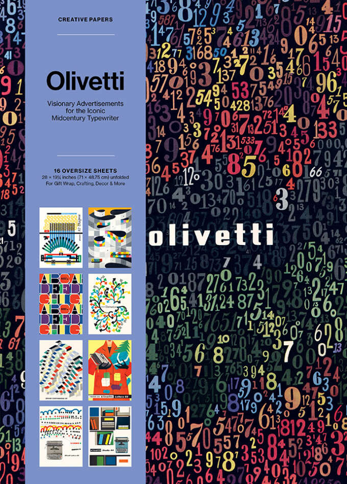
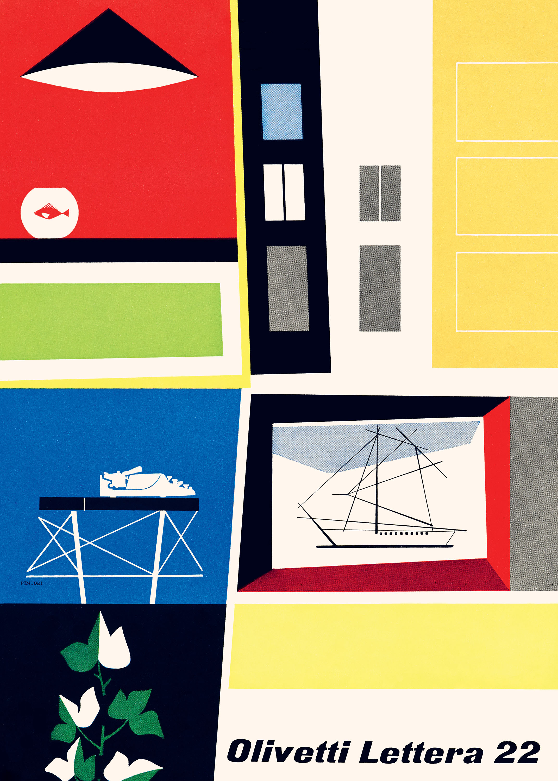
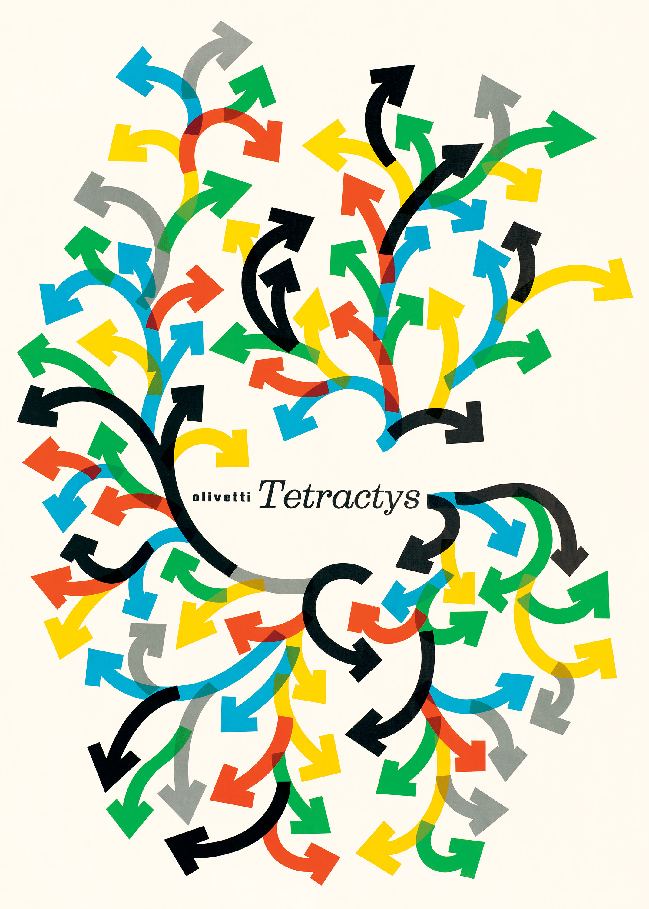
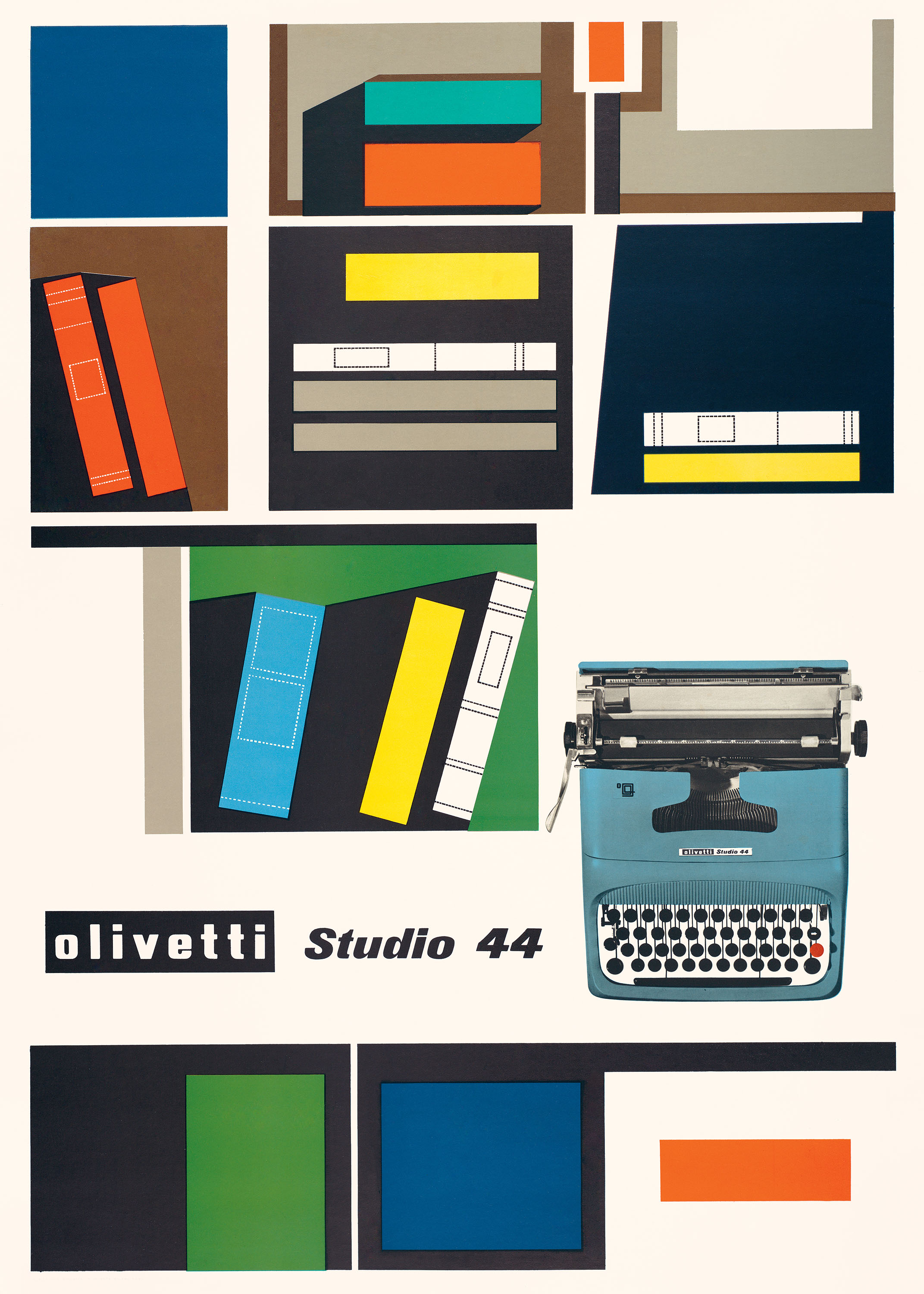
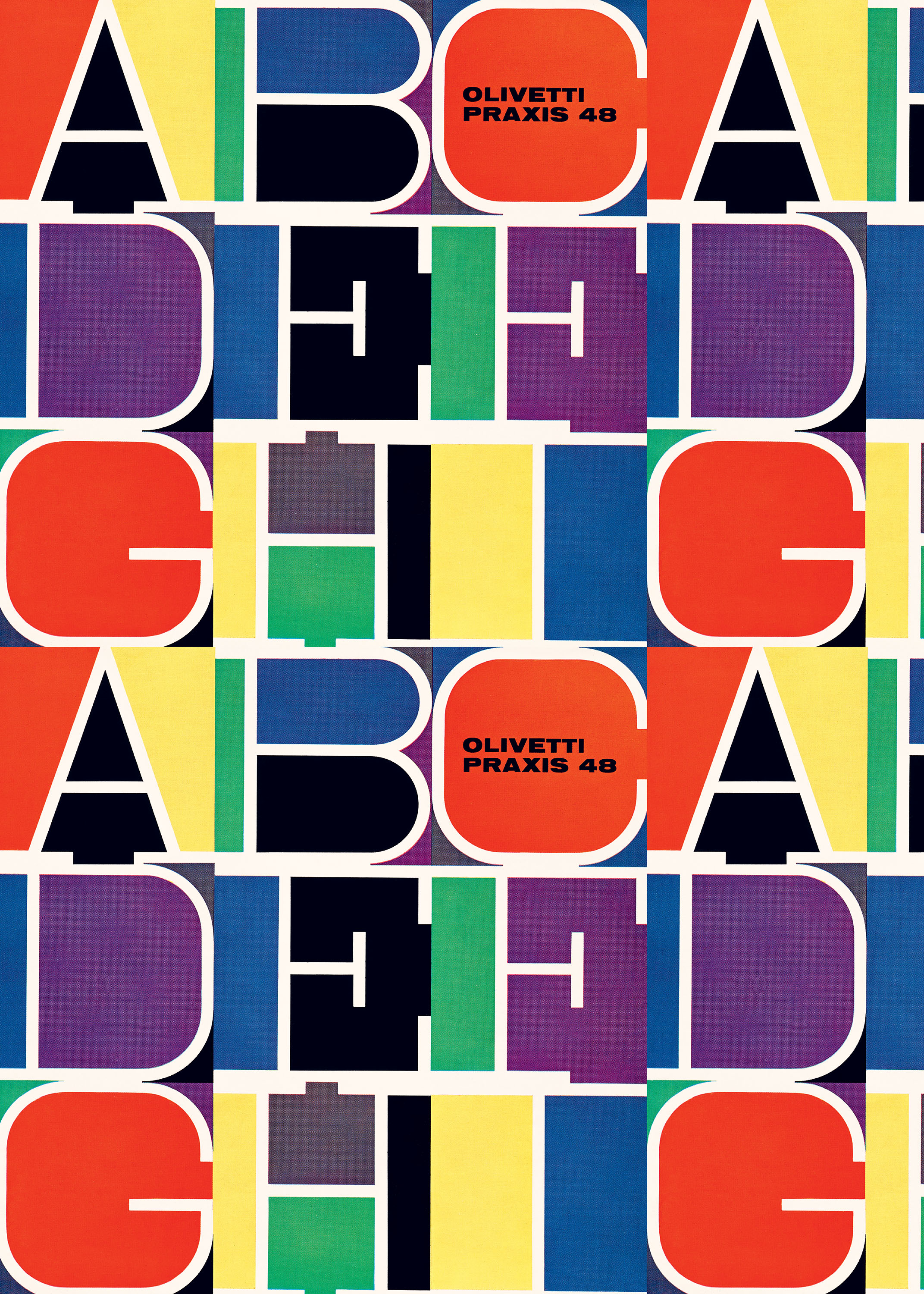
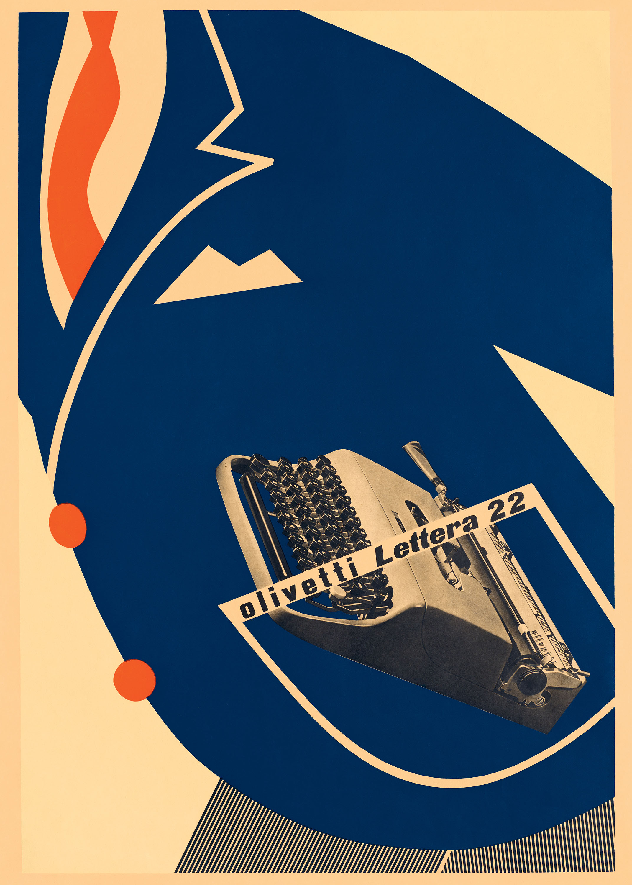
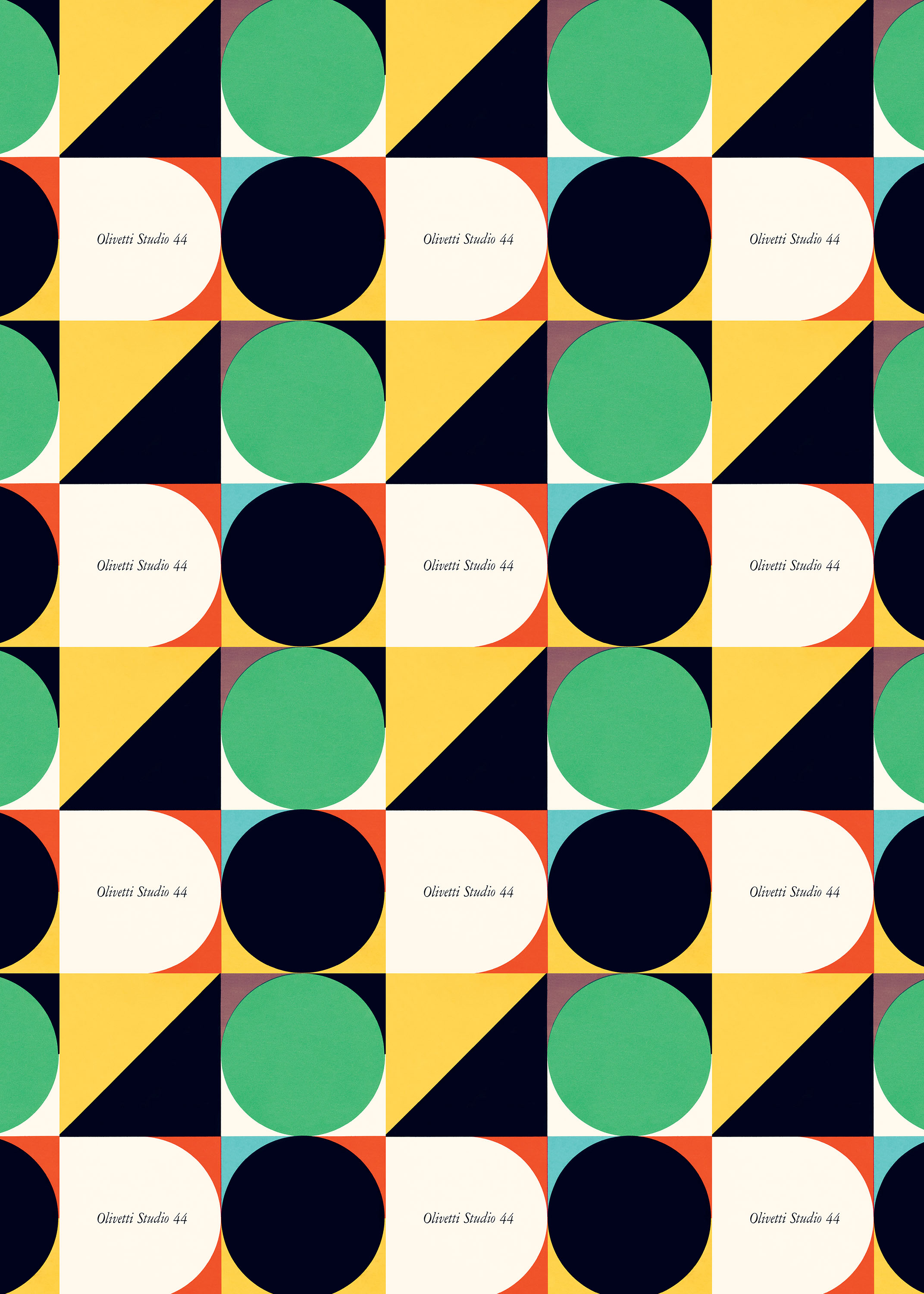
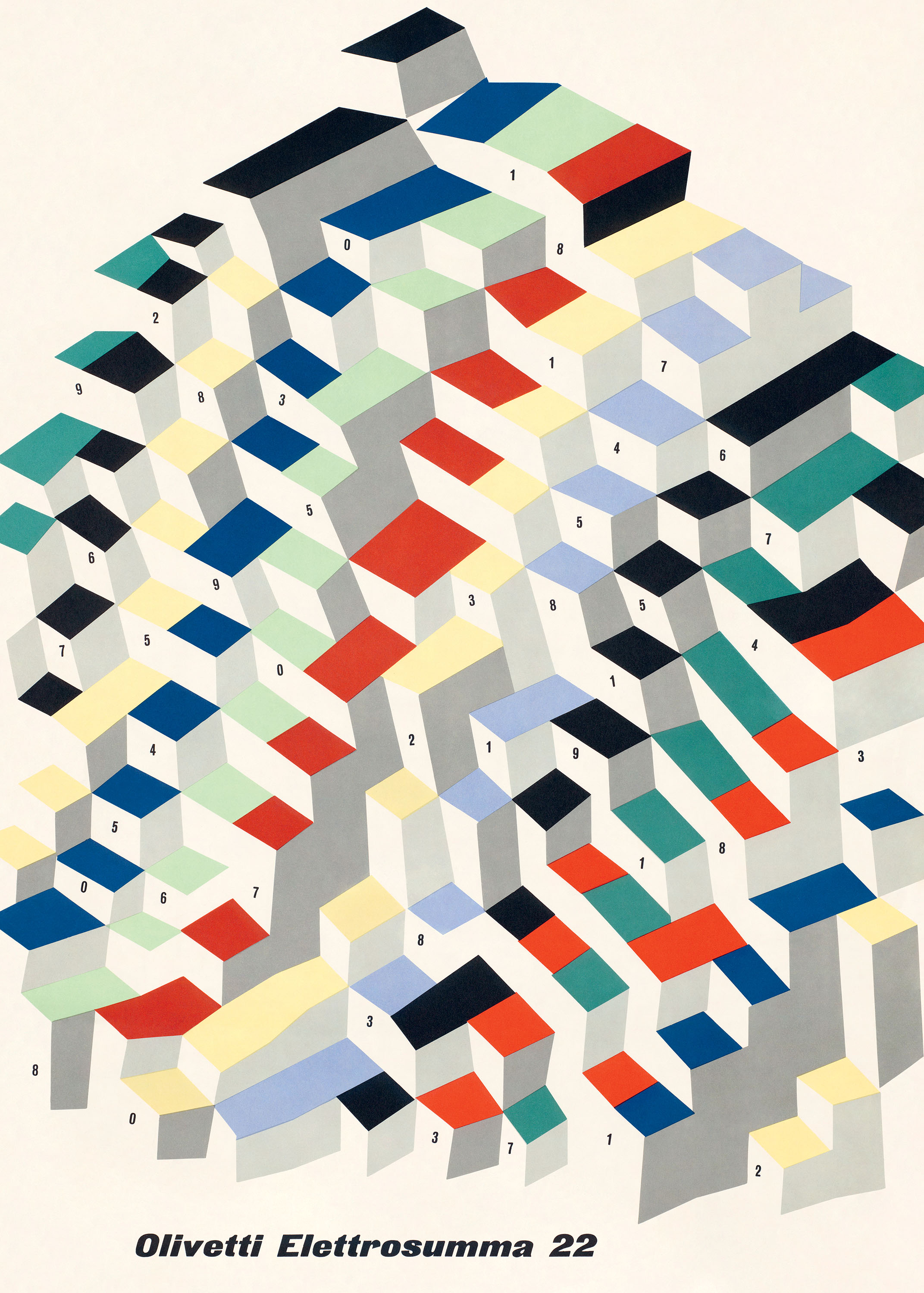
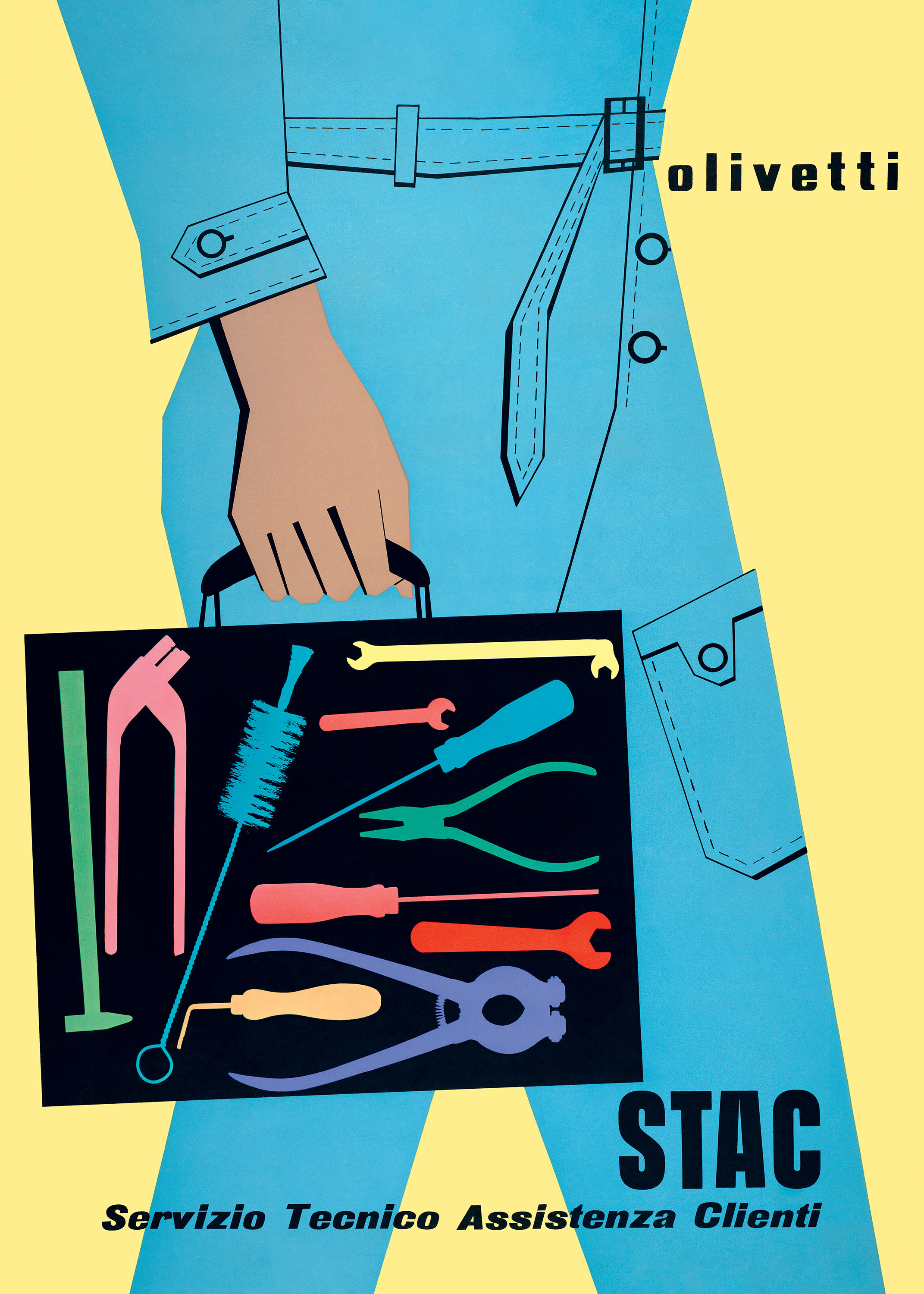
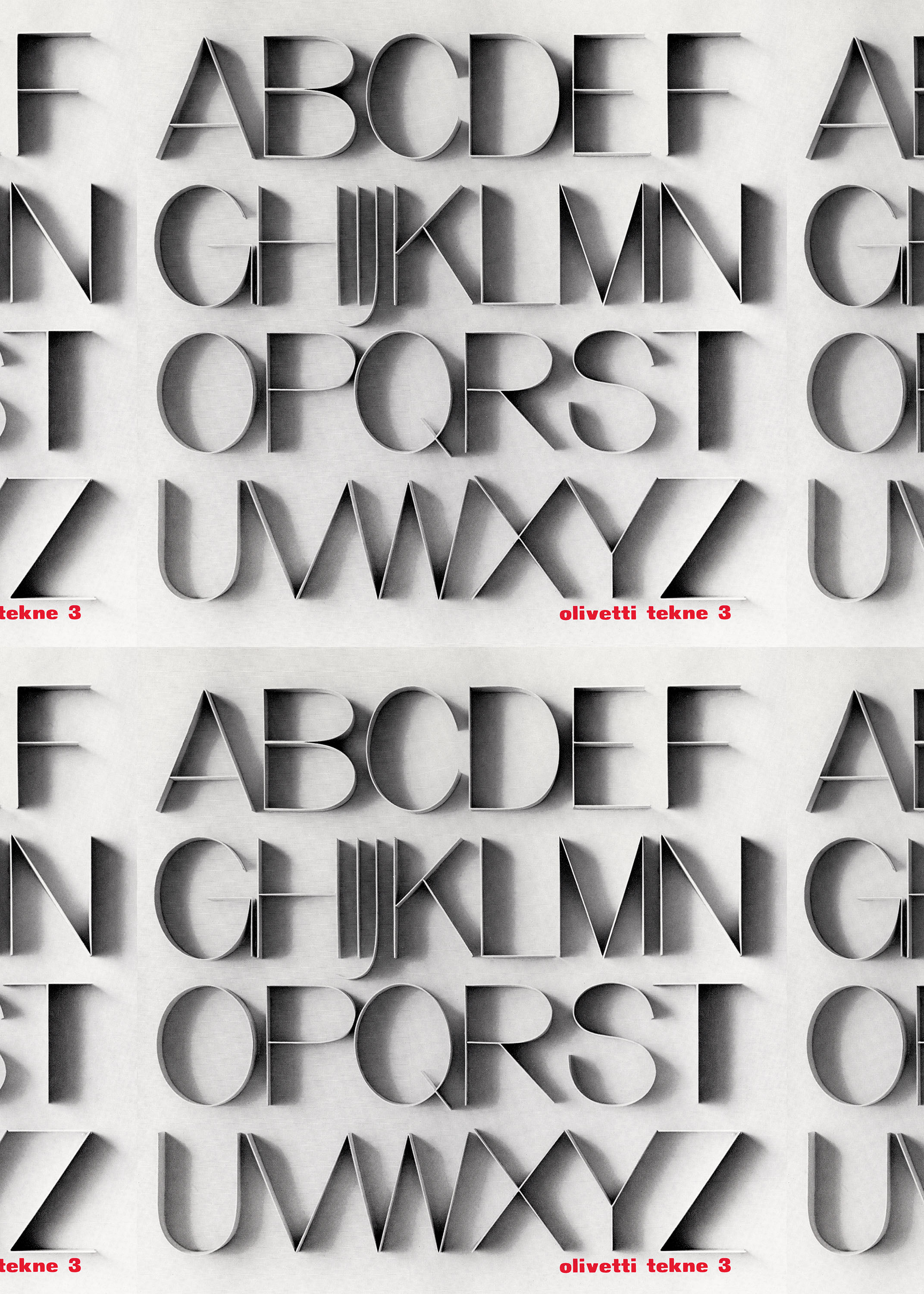
A powerhouse of twentieth-century industrial design, Italian manufacturer Olivetti elevated office life with its stylish and innovative typewriters and calculators. Equally arresting are the company’s print advertisements, which celebrate the devices’ sophisticated mechanics and approachable form factor with smart graphics and vibrant color.
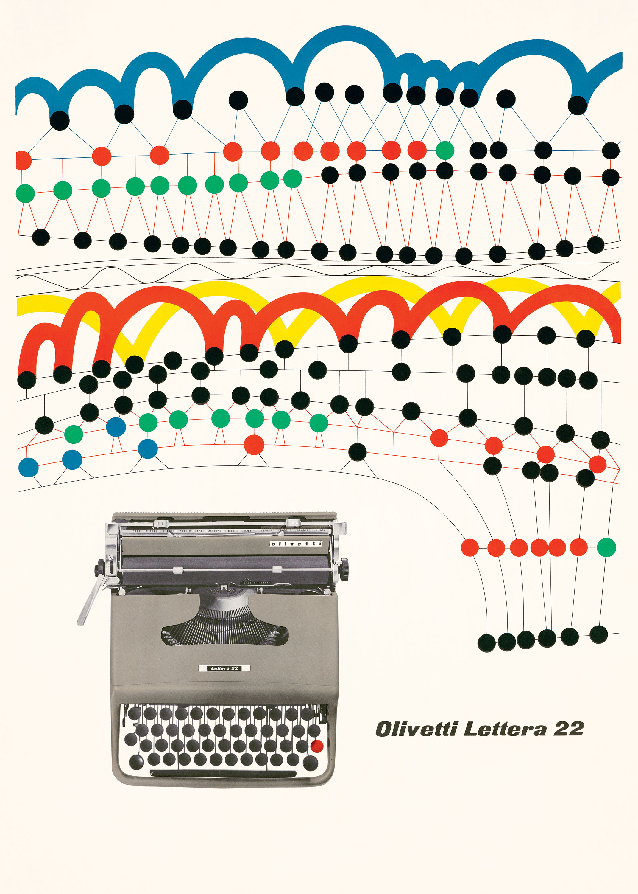
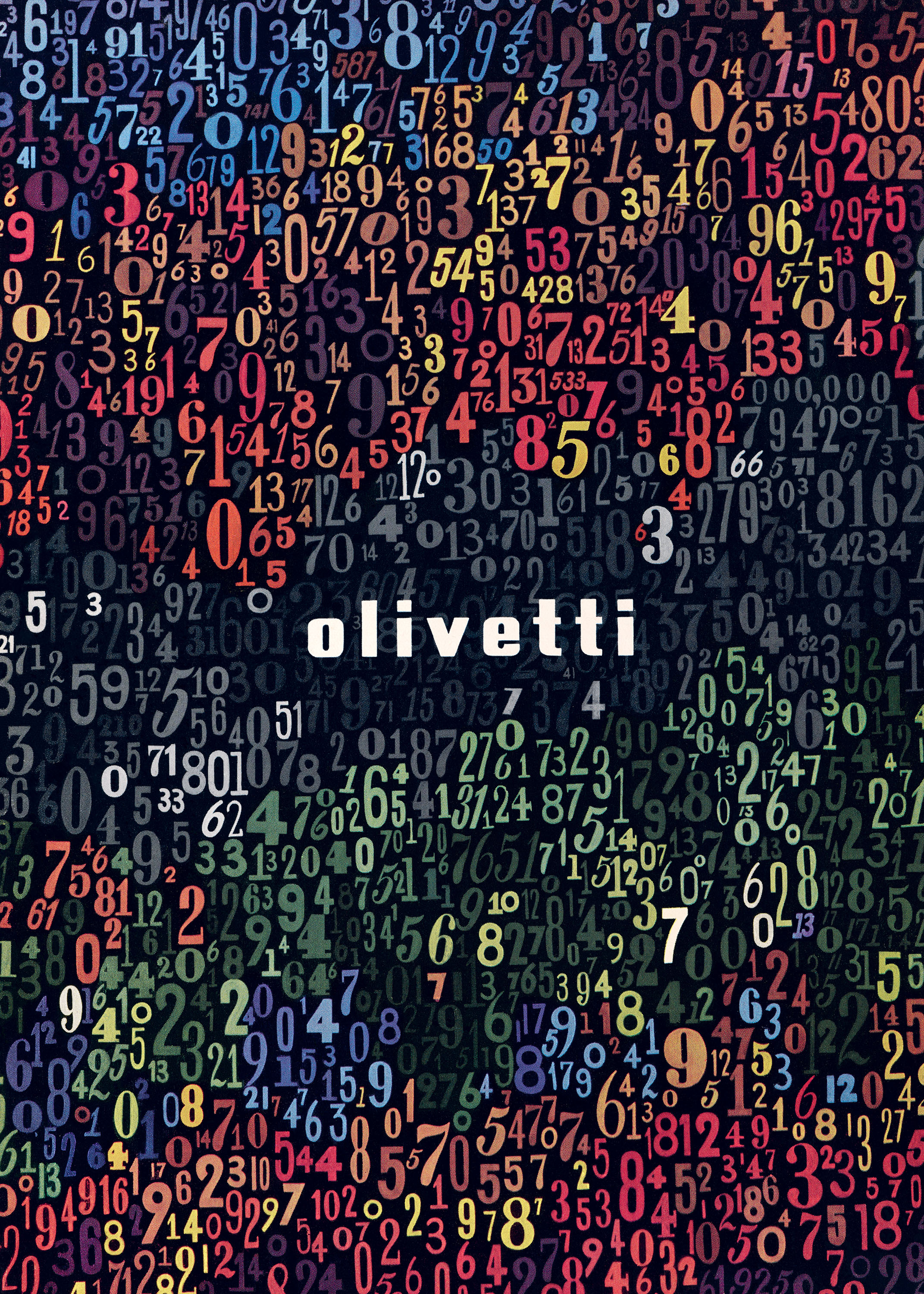
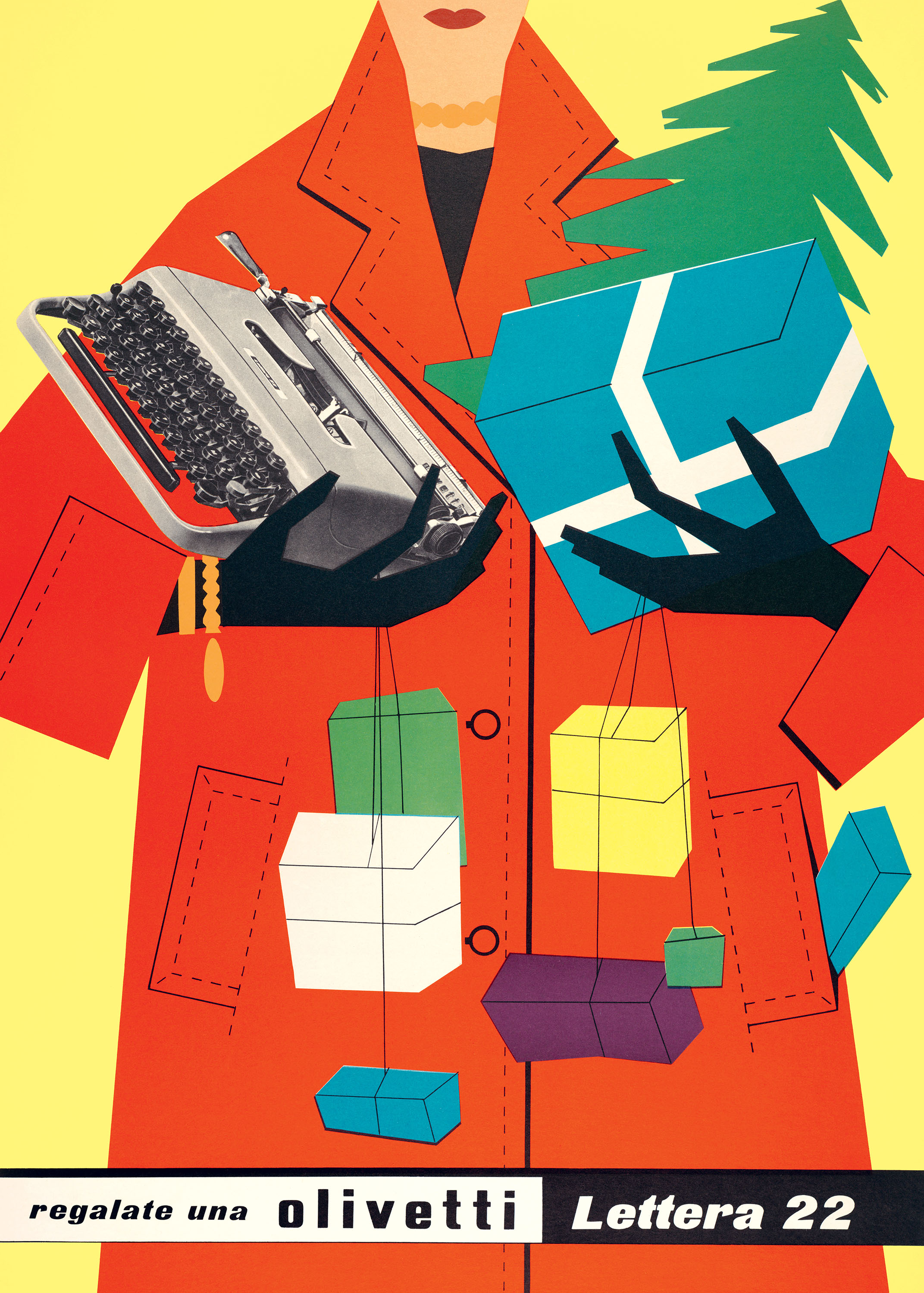
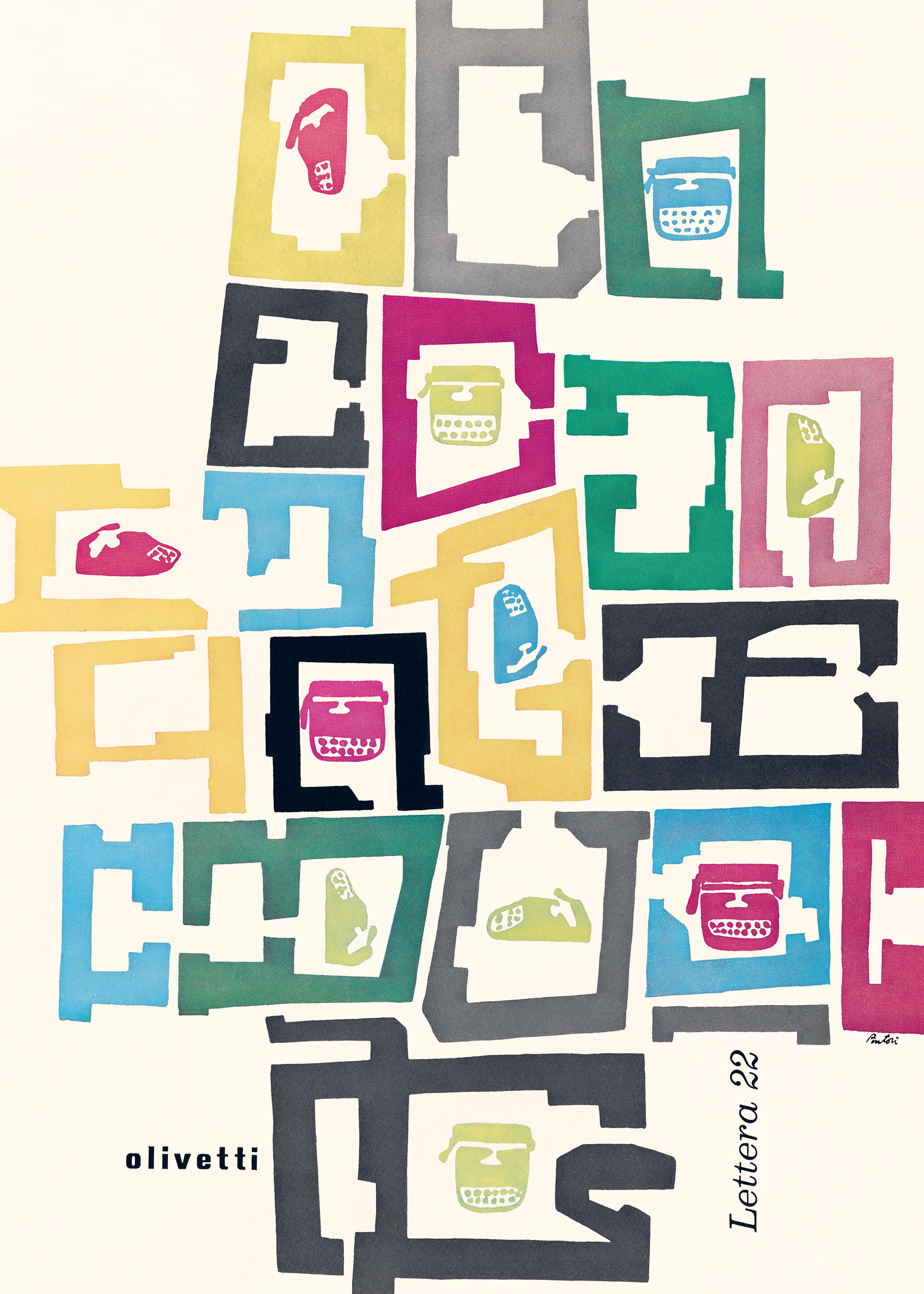
Olivetti Creative Papers collects sixteen of these promotions in oversize perforated sheets, including abstract typographic patterns, eye-pleasing diagrams, and mod midcentury illustrations from esteemed designers like Giovanni Pintori, Egidio Bonfante, and Herbert Bayer.
While considered nostalgic relics today, typewriters were transformative machines that helped shape modern industry and communication in the twentieth century. Olivetti did much to lead the charge: Its state-of-the-art technology tools—like the Lettera 22 typewriter and calculators such as the Divisumma 14—put both compositional and computational power at the fingertips of the newly minted office worker.
But Olivetti’s inventive machines were more than a boon for productivity. With their sculptural heft, friendly ergonomics, and fresh hues, they revolutionized the look of the office and became emblematic of midcentury design.
Electrical engineer Camillo Olivetti (1868–1943) founded the manufacturer in the small town of Ivrea, near Turin, in 1908. His son Adriano (1901–1960) took over in 1938 and quickly embraced visual design, making it the core of Olivetti’s corporate identity. Under his direction, industrial designer Marcello Nizzoli (1887–1969) updated the typewriter from its Victorian origins, creating devices that were architectural yet organic and practical yet playful. This aesthetic ethos garnered immediate recognition, with the Museum of Modern Art devoting an exhibition solely to its typewriters in 1952.
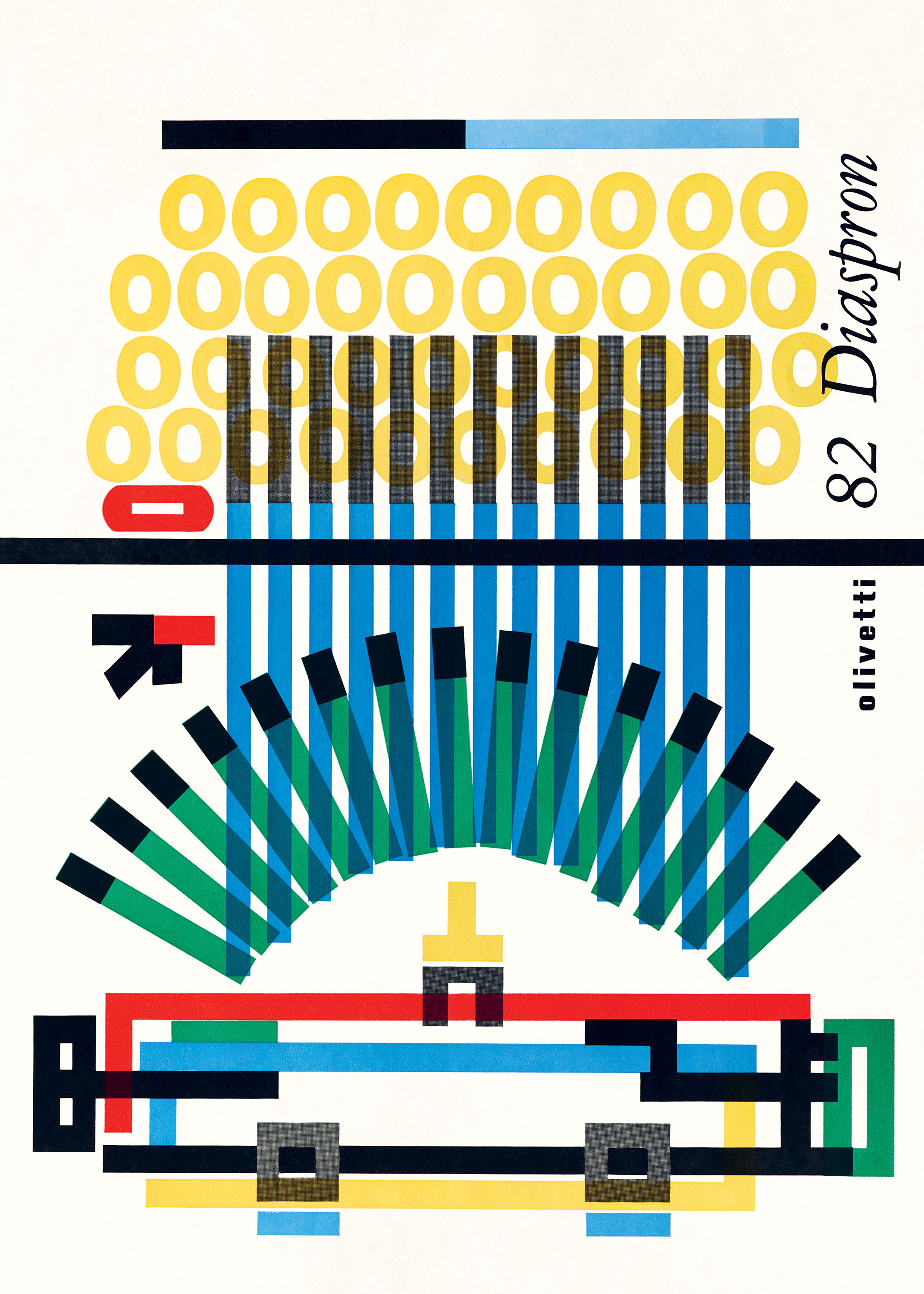
Olivetti’s print promotions match its product line in charm and novelty, in large part due to the vision of art director Giovanni Pintori (1912–1999), who began working in the advertising department in 1936 and served as art director from 1950 to 1967. Pintori’s brochures and posters reflect the brand’s modern whimsy, often while demystifying the machines’ complex inner workings. His 1965 pamphlet for the 82 Diaspron, for instance, presents the typewriter as if x-rayed from a bird’s-eye view, simplifying its main components—keys, type bars, and carriage—into a stylized schematic of geometric forms and thick rules in a bold but limited palette (see sheet 1).
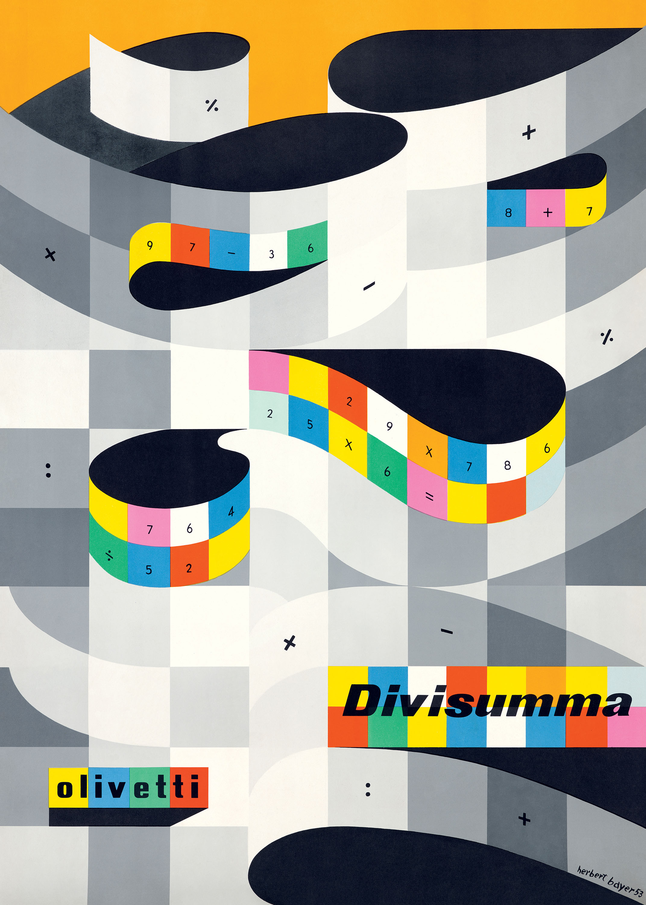
Pintori also cultivated the sense of possibility offered by Olivetti’s technologies. In a 1953 pamphlet for the Divisumma 14 calculator, he uses a dense numerical pattern to conjure the machine’s infinite mathematical outcomes, while for a 1950 poster for the Lettera 22, he drafts a lively, nearly musical notation—with colorful blips connected by handwritten loops—to express energetic typing and free-form ideation (see sheets 4 and 3, respectively).
Several creatives joined the Olivetti staff to help advertise the company’s offerings, including Fortune art director and children’s book illustrator Leo Lionni (1910–1999) and Italian designer and painter Egidio Bonfante (1922–2004). Bonfante in particular humanized the brand by depicting its offerings as lifestyle accessories, as in a 1953 illustration of a fashionable woman bearing Christmas gifts and an Olivetti typewriter (see sheet 6).
By the 1960s, Olivetti had achieved global success, with products sold in more than one hundred countries. Its cult status was thanks in part to collaborations with celebrated designers such as Ettore Sottsass (1917–2007), Bruno Munari (1907–1998), Herbert Bayer (1900–1985), Milton Glaser (1929–2020), and Massimo Vignelli (1931–2014). But its commitment to visuals was more than a symptom of taste: Adriano Olivetti saw design as a social good, and he engineered the worker experience—from assembly lines to housing, from hours to salaries—to promote both performance and well-being.
With precursors to desktop computers like the 1965 Programma 101, Olivetti was also briefly a pioneer in the early digital world. Today, their typewriters are still coveted for their retro appeal, while the company is celebrated for its exemplary design culture and savvy fusion of form and function, which helped give rise to the technology fetishism of the late twentieth century and beyond.
All images in the gallery below are hi-fi captures. Click an image to enter fullscreen view, then click or pinch to enlarge.

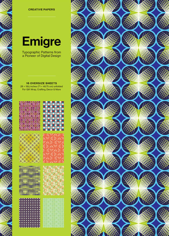
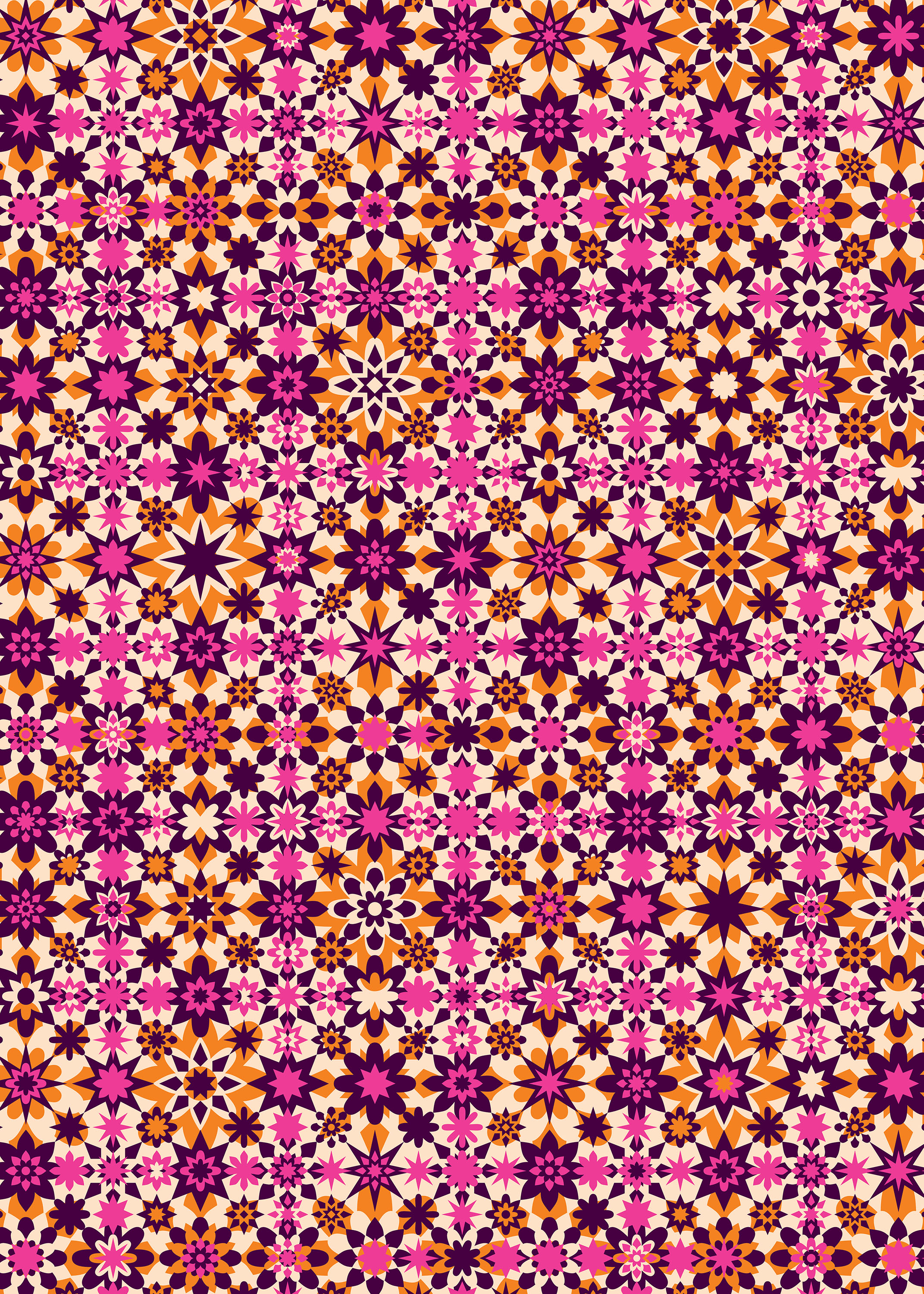
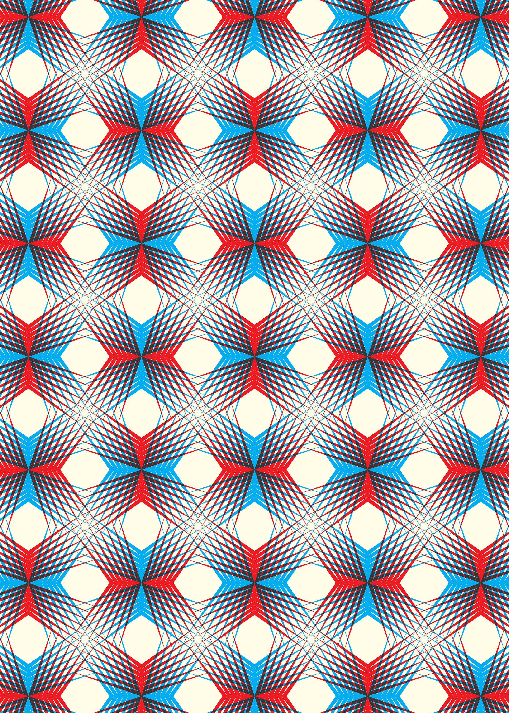
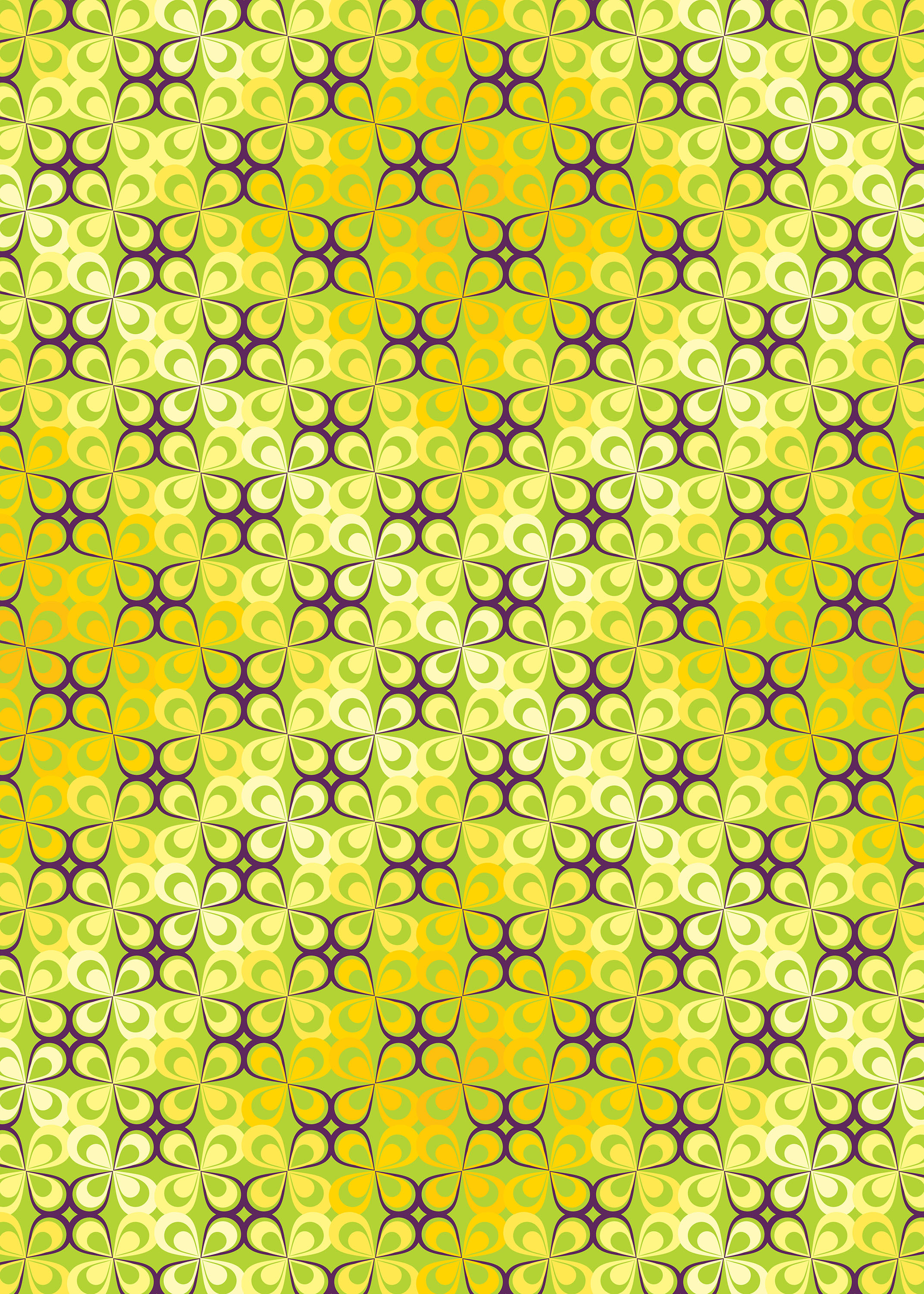
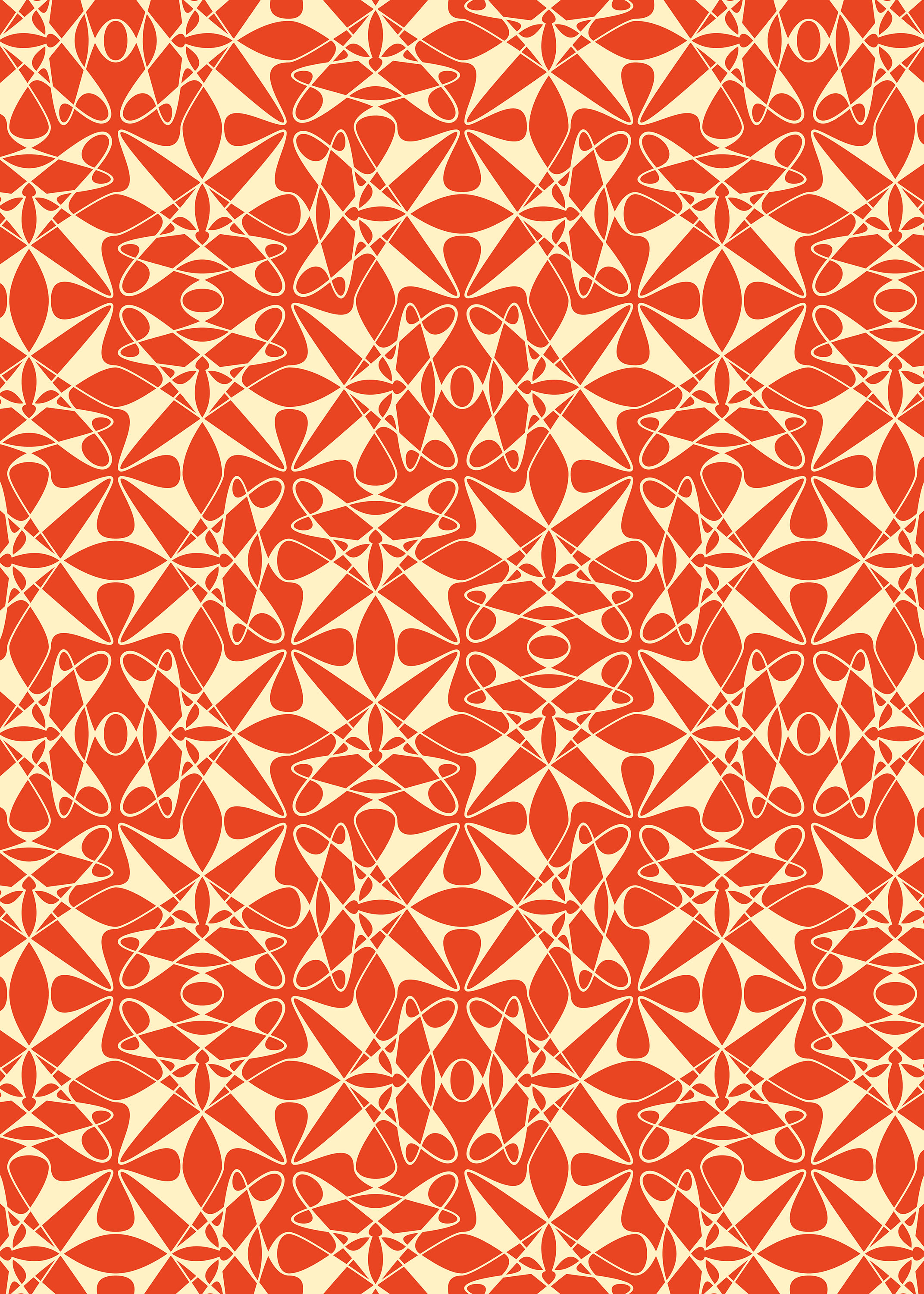
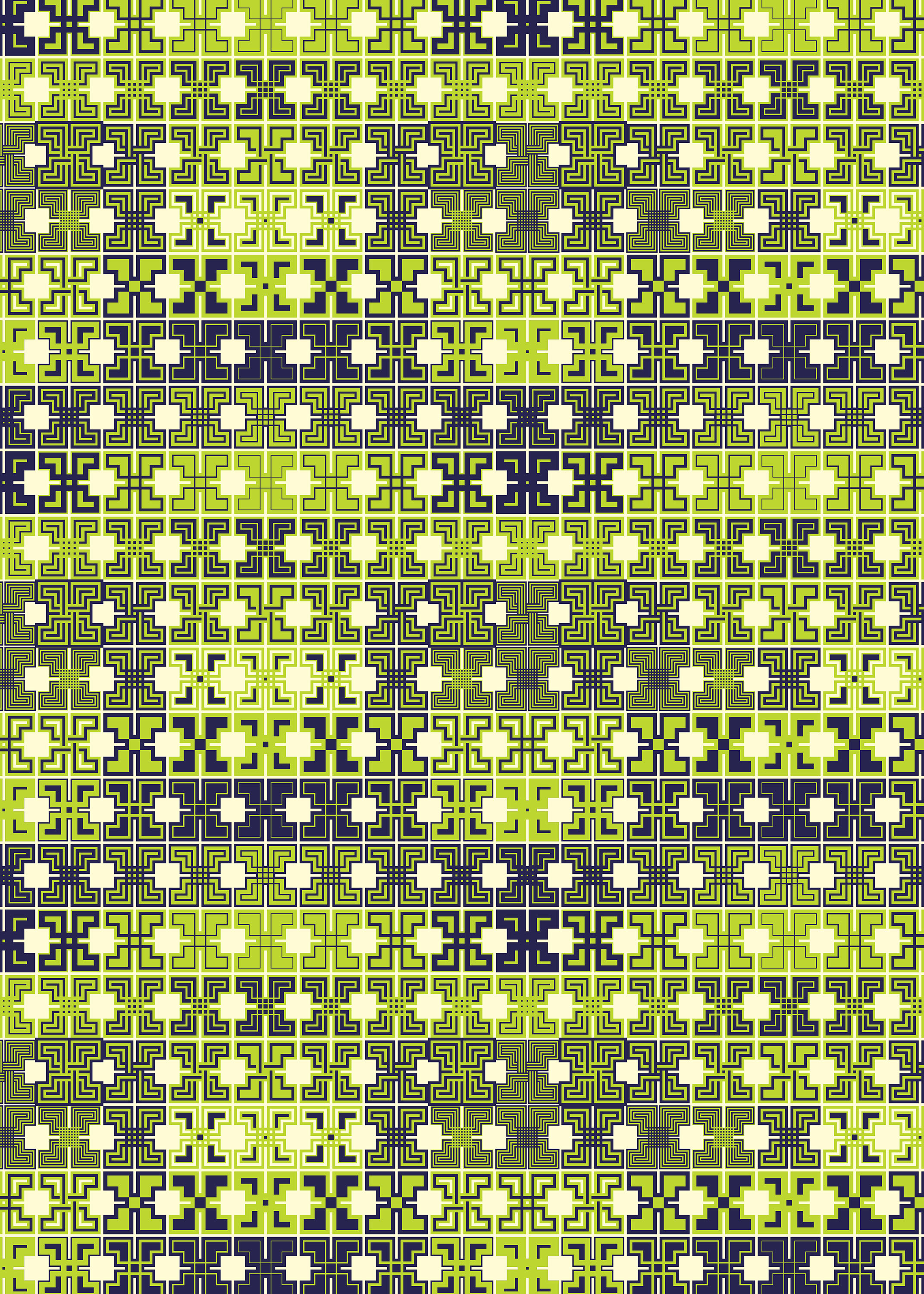
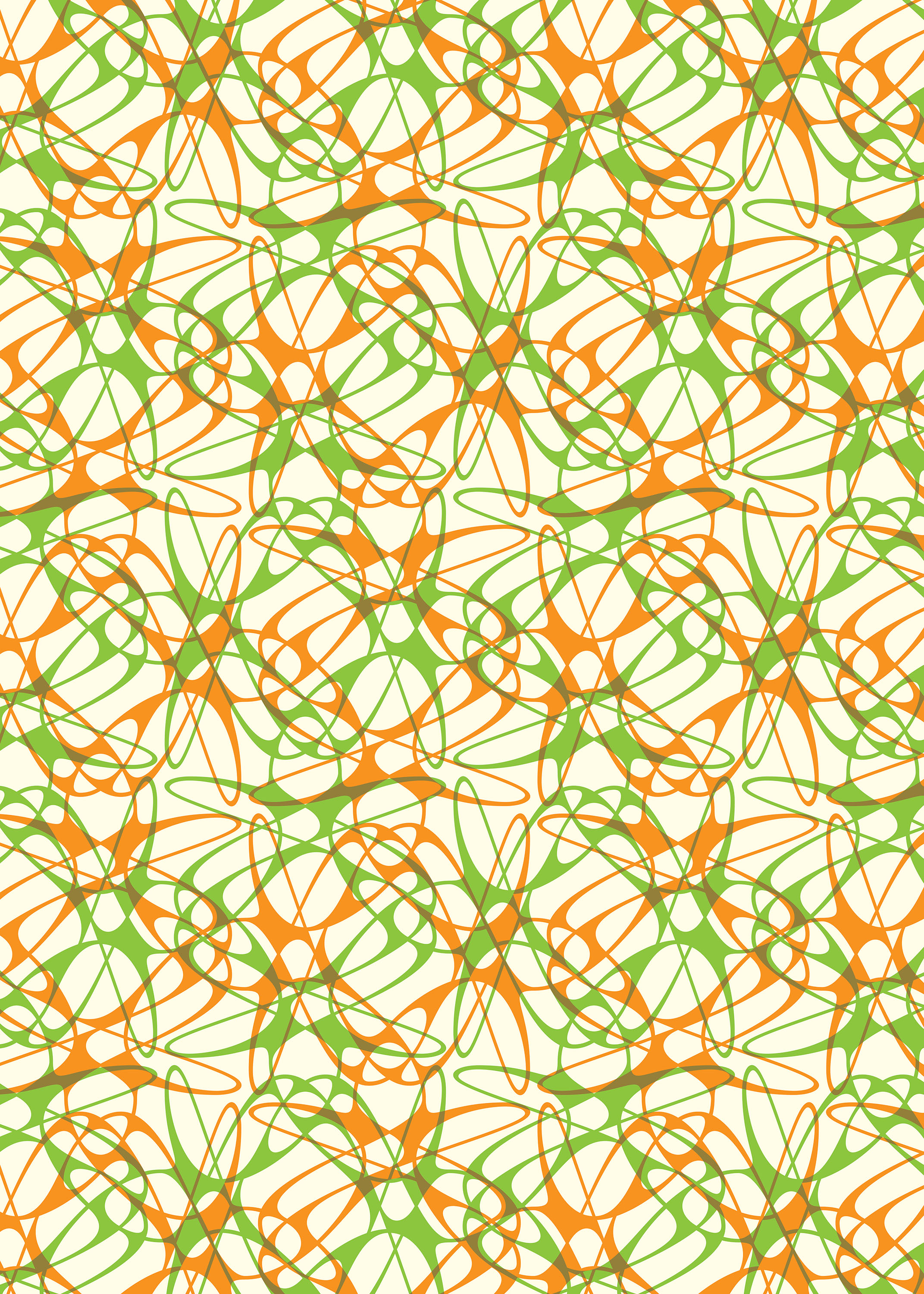
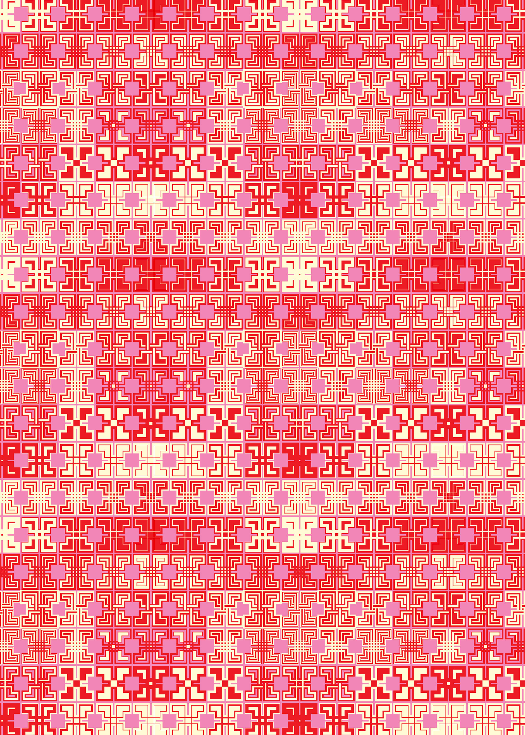
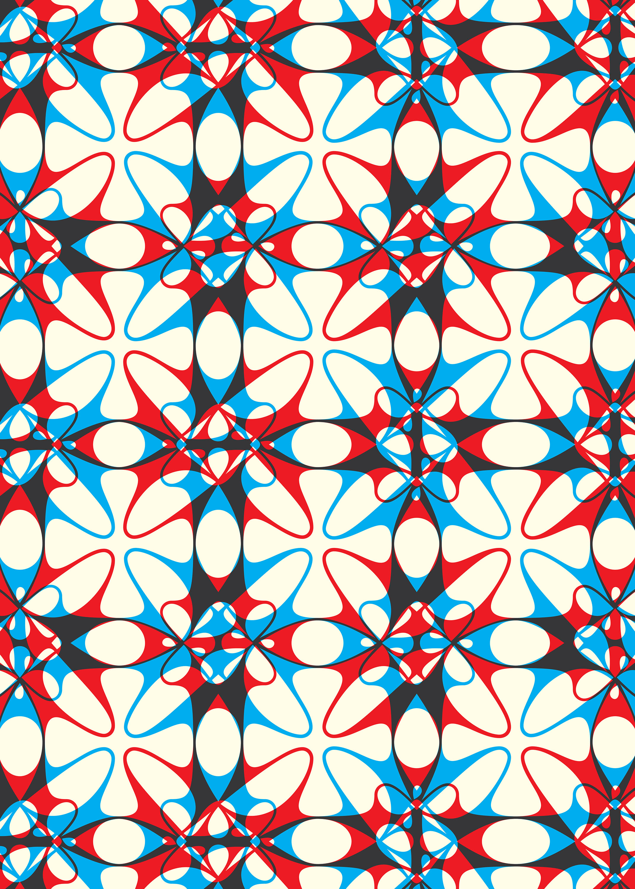
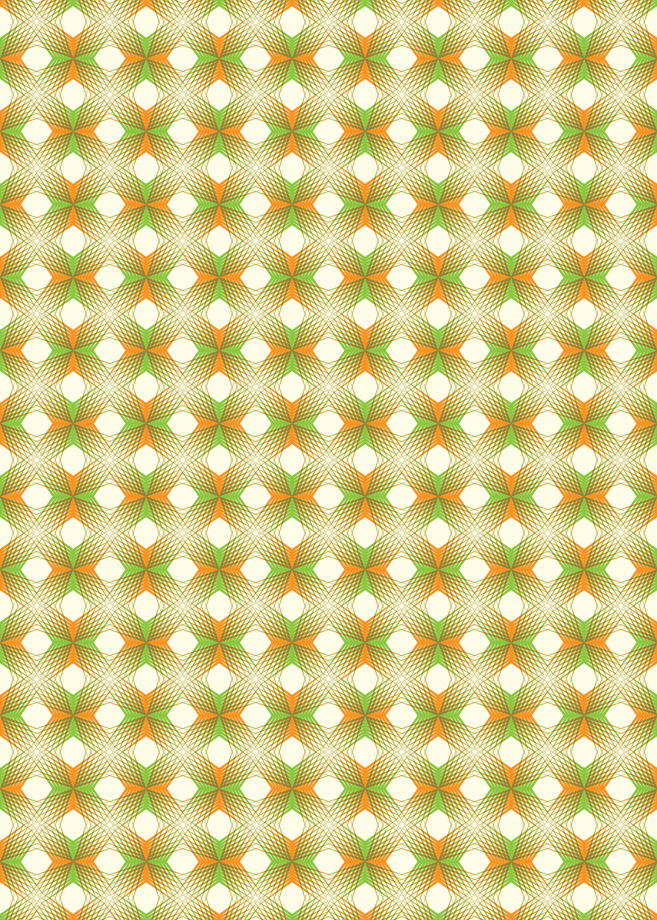
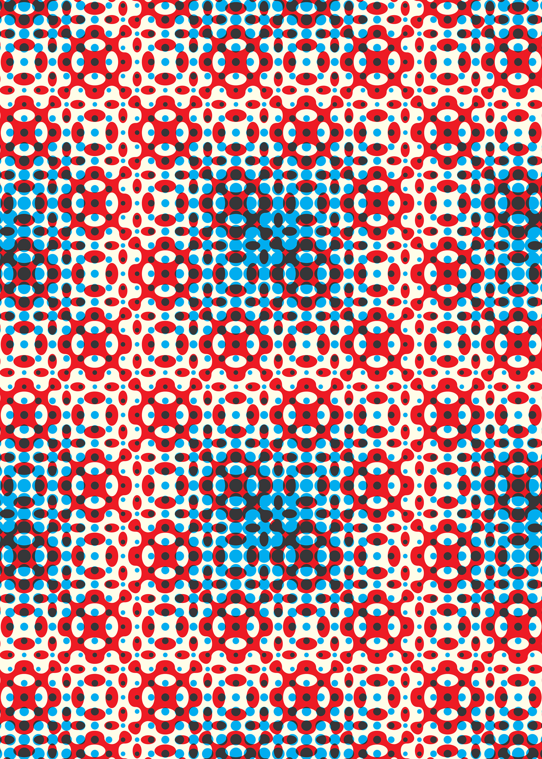
For Emigre Fonts designer Zuzana Licko, type can do more than generate words: It can be a springboard for eye-grabbing motifs—from computational grids to geometric florals to looping finishes.
With sixteen designs conceived by Licko using her groundbreaking typefaces and pattern-composition fonts, Emigre Creative Papers references the vivid colors and graphic experimentation of the 1980s and ’90s, when the leading-edge foundry made its name.
Licko’s creations also explore type as an instrument of digital craft, translated here from the screen to oversize perforated pages for design enthusiasts of the computer age.
Both a legendary twentieth-century design magazine and a renowned digital type foundry, Emigre was founded by Rudy VanderLans and Zuzana Licko in 1984—the same year that Apple released its revolutionary personal computer, the Macintosh.
The pair were immediately drawn to the possibilities of this early desktop publishing tool—or, as others argued, to its deficiencies. Edited and designed by VanderLans, Emigre magazine published some of the very first digital layouts, which won it both worldwide acclaim and vocal criticism, and made its pages a prominent site of design discourse until its last issue in 2005. Simultaneously, Emigre Fonts emerged as one of the first independent foundries to wield personal computer technology in the design and distribution of type. It is still developing and selling typefaces after more than 40 years, with 600-plus original fonts created or commissioned by Licko.
Shaped by low-memory computing and low-resolution screen display and printer output, Licko’s first typefaces debuted in the magazine as bitmap fonts, with each glyph composed within a matrix of pixels—a crude aesthetic now synonymous with the 1980s and ’90s. She expanded these experiments into full typefaces that reclaimed the glitchiness of early computer graphics as hallmarks of intentional and well-crafted styles, like Oakland (1985), Matrix (1986), Base 9 and 12 (1995), and Citizen (1986). Then, in 1996, she surprised those dismissive of digital design with two of the era’s most historically astute and successful revivals: Mrs Eaves, an homage to Baskerville (1757), and Filosofia, a reinterpretation of Bodoni (1798).
Parallel to Licko’s interest in type is her fascination with patterns, informed by an appreciation of textiles. Her first published foray into typographic motifs was Hypnopædia, a 1997 typeface made to protest the lack of intellectual property protection for type designs in the United States. Each of its 140 characters consists of a single letterform from an Emigre typeface, concentrically rotated and repeated four times to make an experimental ornament. Allowing for infinite configurations of these dingbats, either replicated or combined, Hypnopædia demonstrates the formal possibilities of type alone.
Such early exercises opened the door to the full-on typographic inventiveness seen in Emigre Creative Papers. She made several of its designs using Puzzler, a 2005 font family specifically intended to generate patterns, with each element accessed through a character on the keyboard. Inspired by repetition in everyday sights, like florals (see sheets 3 and 8), Licko also explored the visual idioms of print in the Puzzler typefaces, including the dot compositions of halftone imagery and the interference patterns of moiré (sheets 14 and 2, 7, 10, 13, and 16, respectively). In 2018, she issued another font solely for pattern production, Tangly, which functions like a connecting script to generate a web of intersecting calligraphic lines (sheets 4, 6, 12, and 15). And in 2023, she revisited her earlier experimentations with Lo-Res Outlined, a bitmap-style typeface with multiple outlines in various weights. On sheets 5 and 11, she repeats a single character in this face with different effects, making interlocking arrays that evoke digital weavings.
One of the most celebrated design teams of the last fifty years, Emigre has been honored with numerous awards, including the Gold Medal from the American Institute of Graphic Arts (AIGA), an honorary membership of the Society of Typographic Arts (STA), and a medal from the Type Directors Club (TDC). Licko also received an honorary doctorate from the Rhode Island School of Design in 2005. Complete runs of Emigre magazine reside in the permanent collections of major design and modern art museums around the world, and in 2011, the Museum of Modern Art in New York acquired five Emigre typefaces as major milestones of twentieth-century design.
All images in the gallery below are hi-fi captures. Click an image to enter fullscreen view, then click or pinch to enlarge.

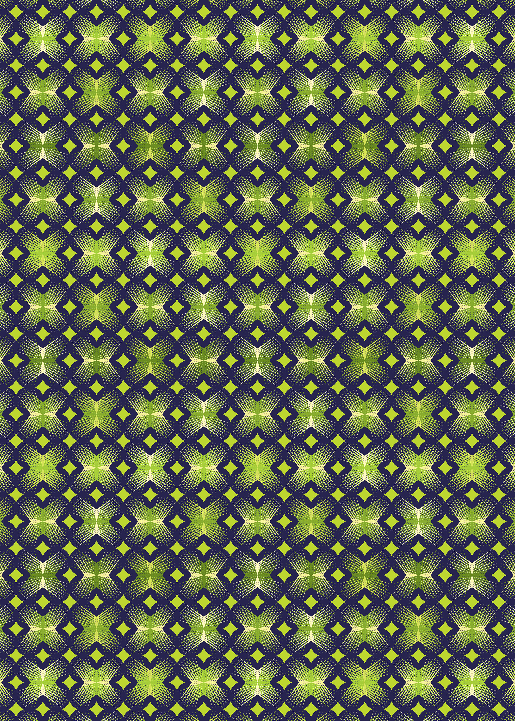
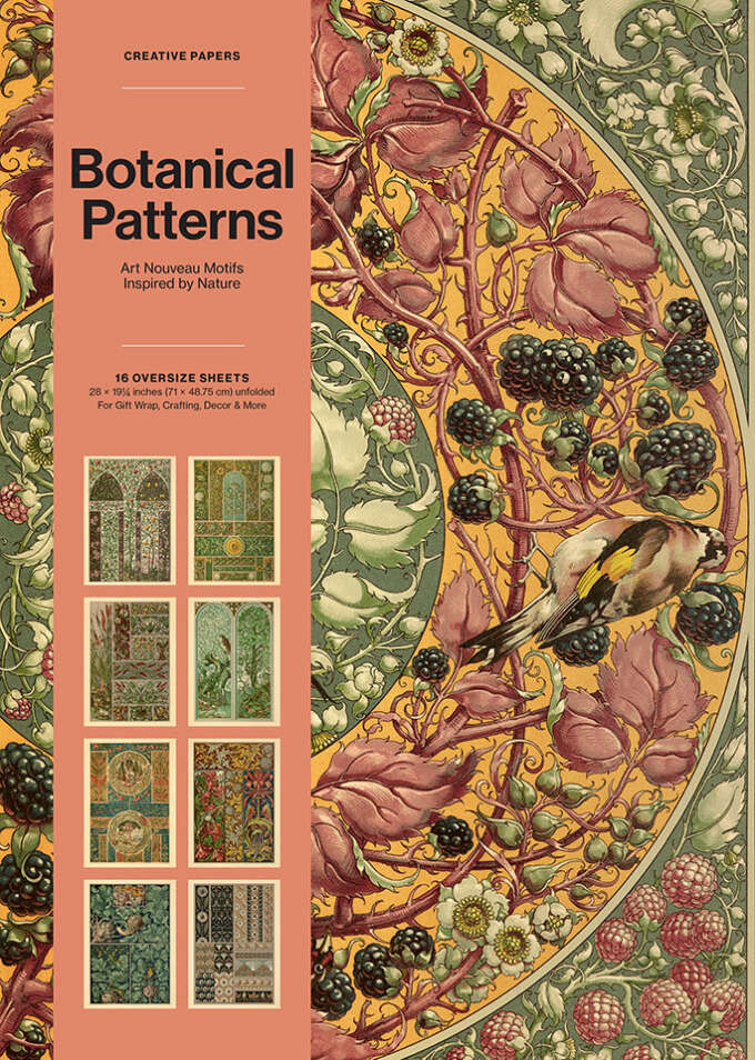
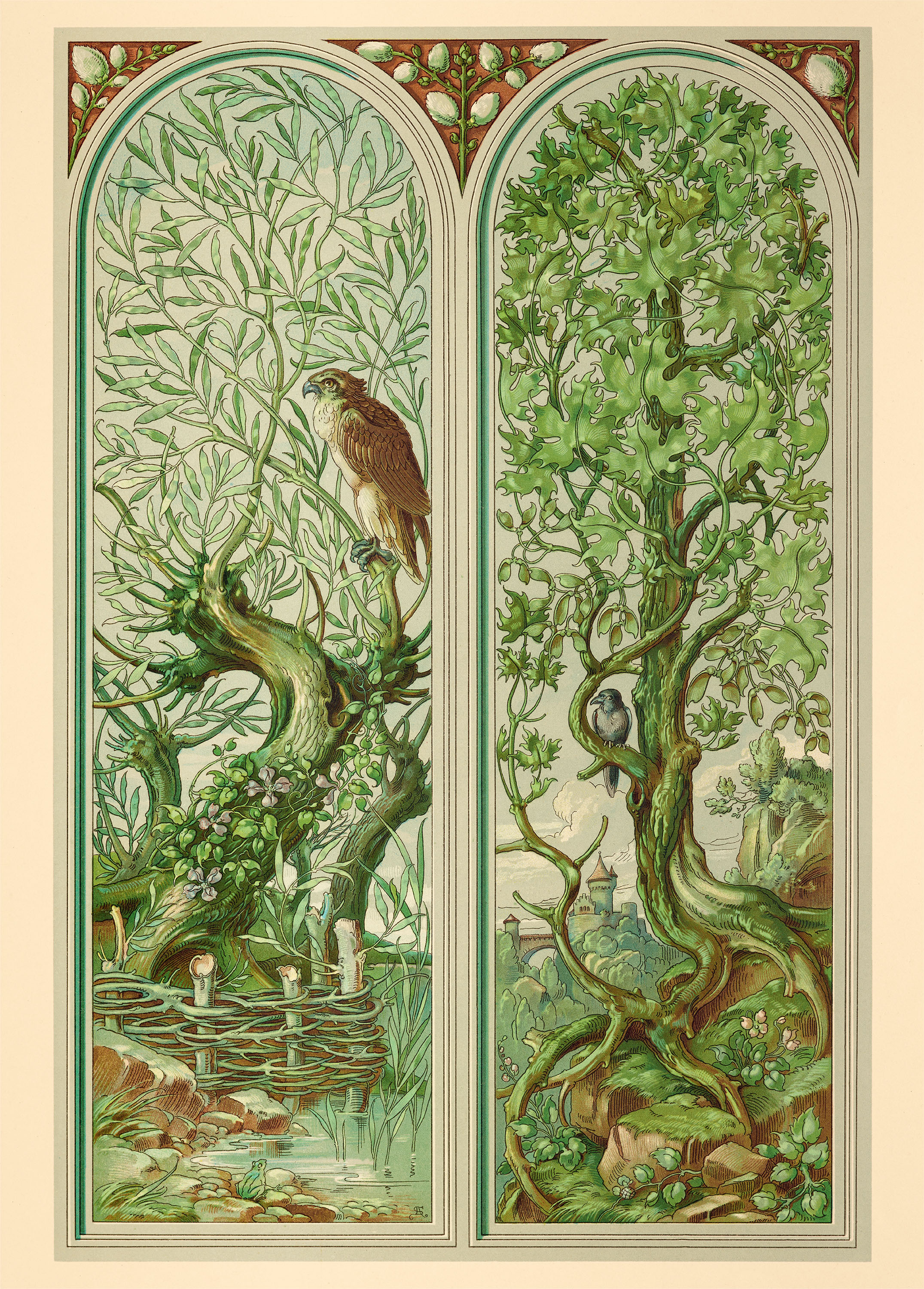
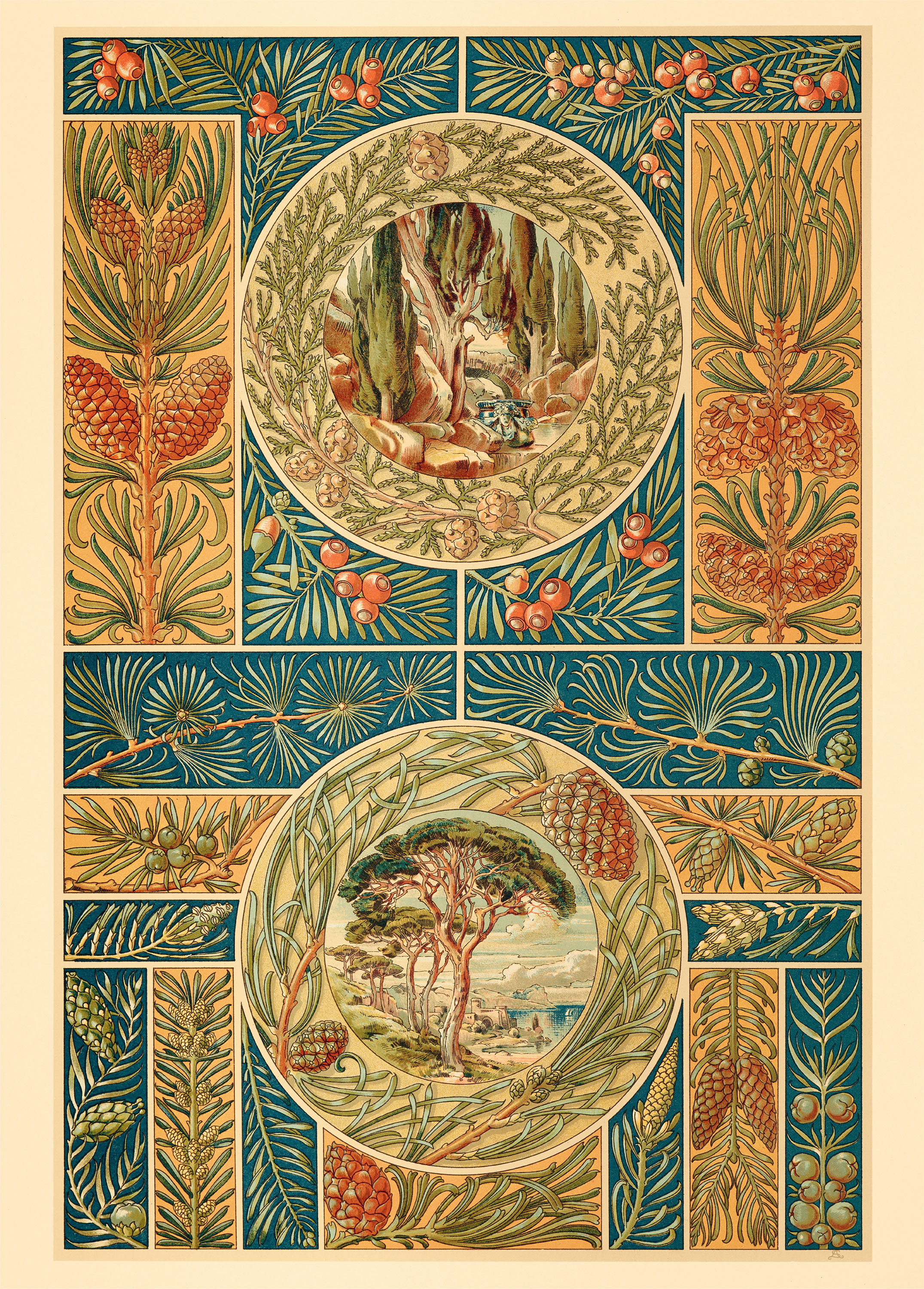
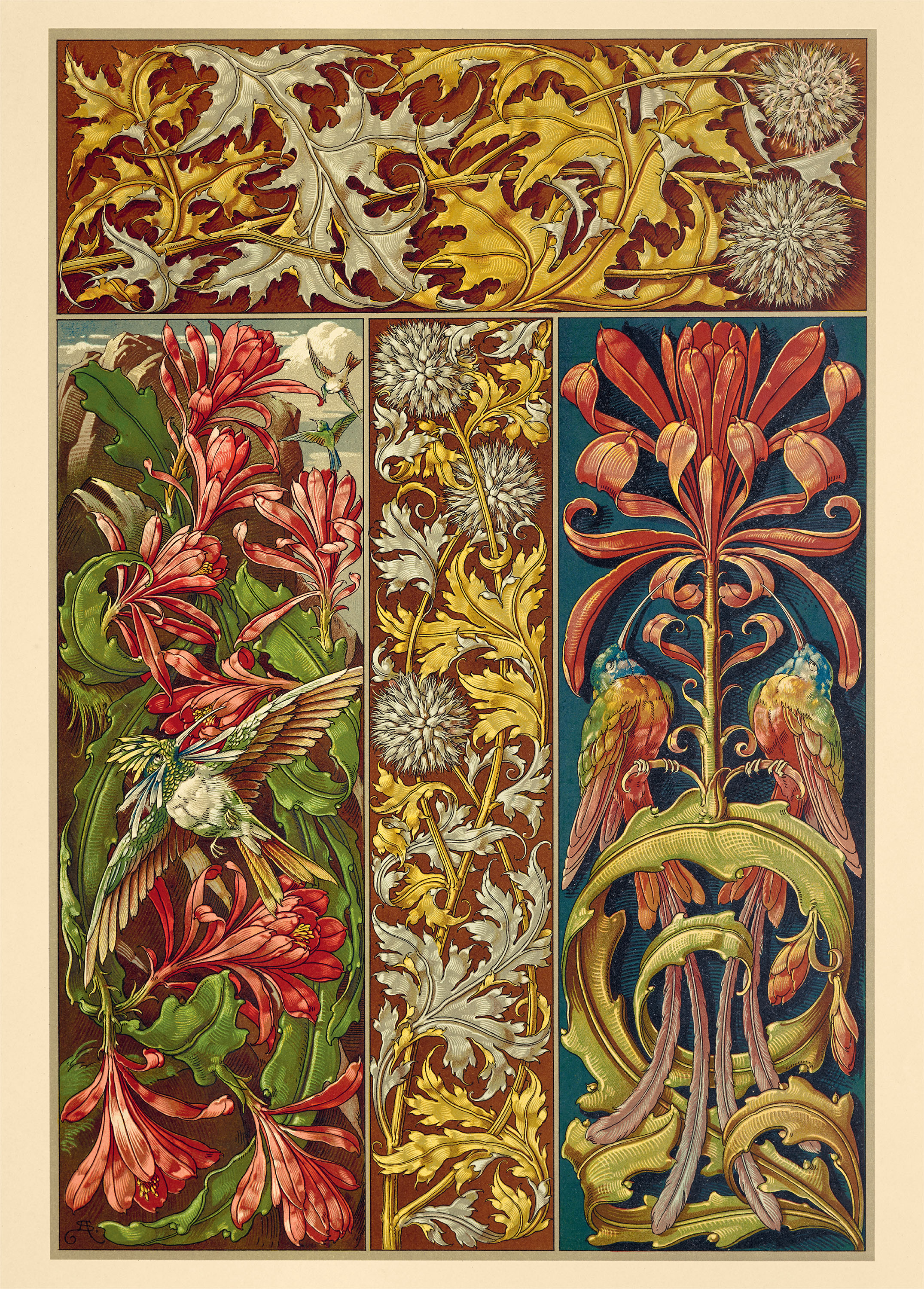
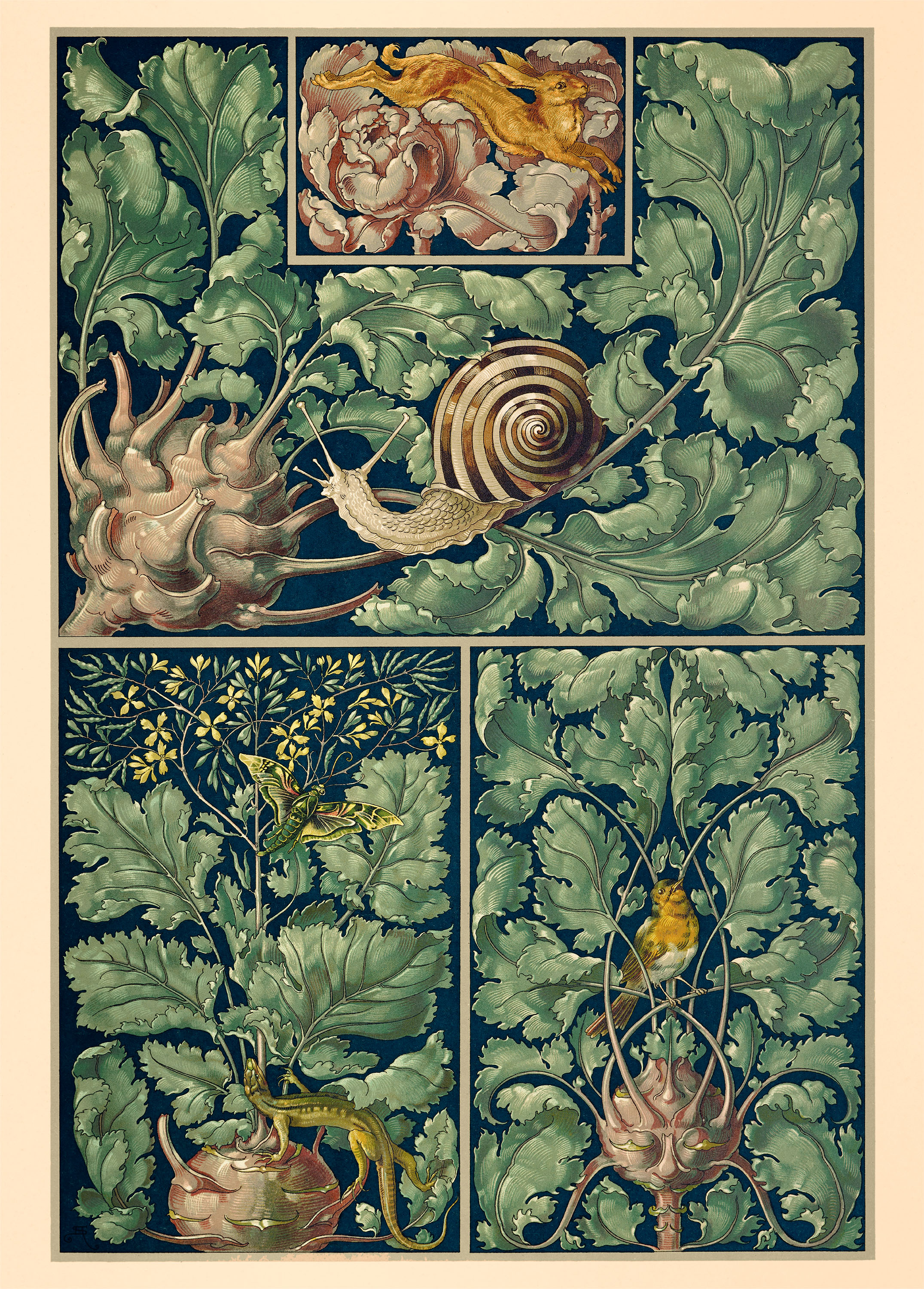
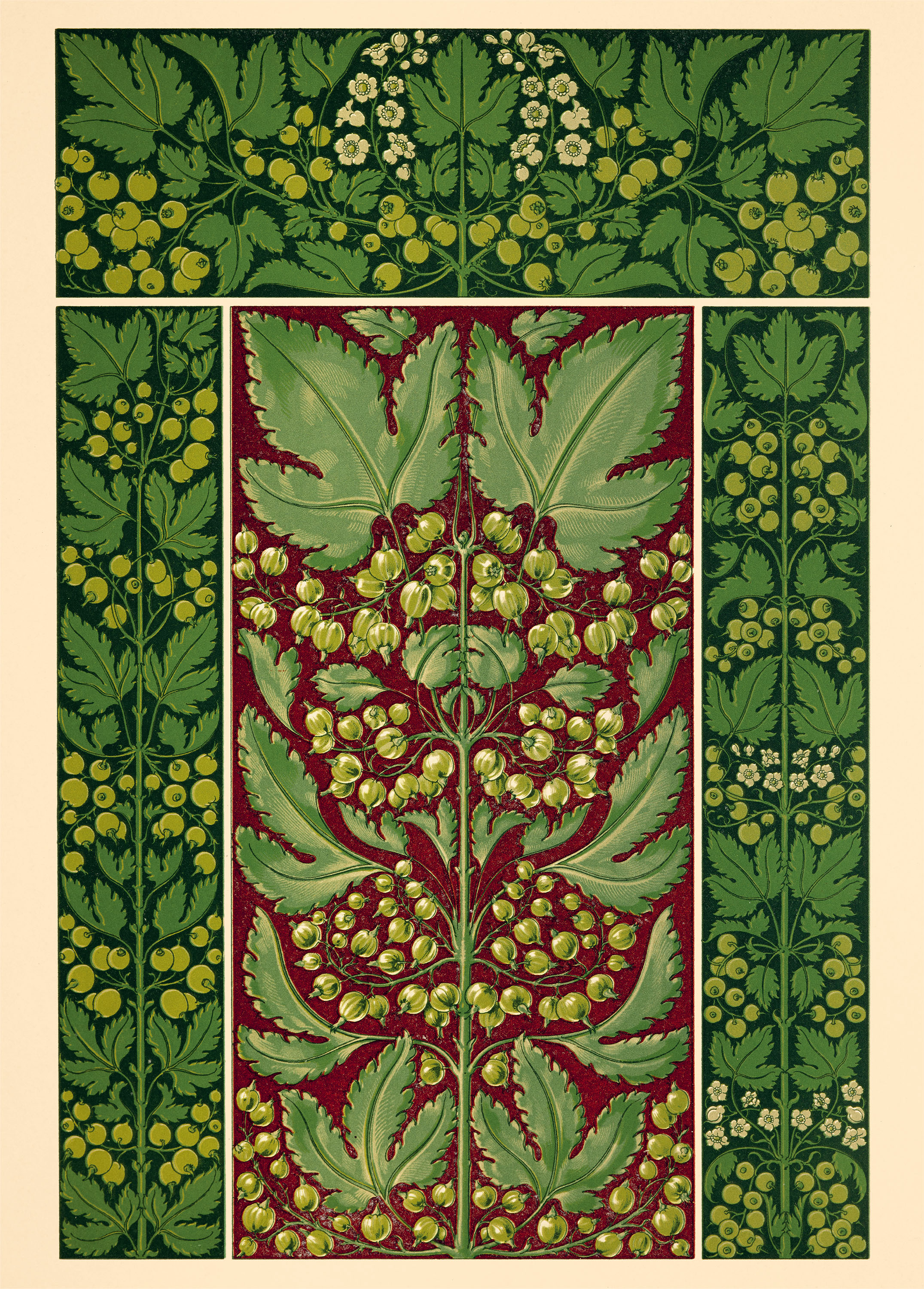
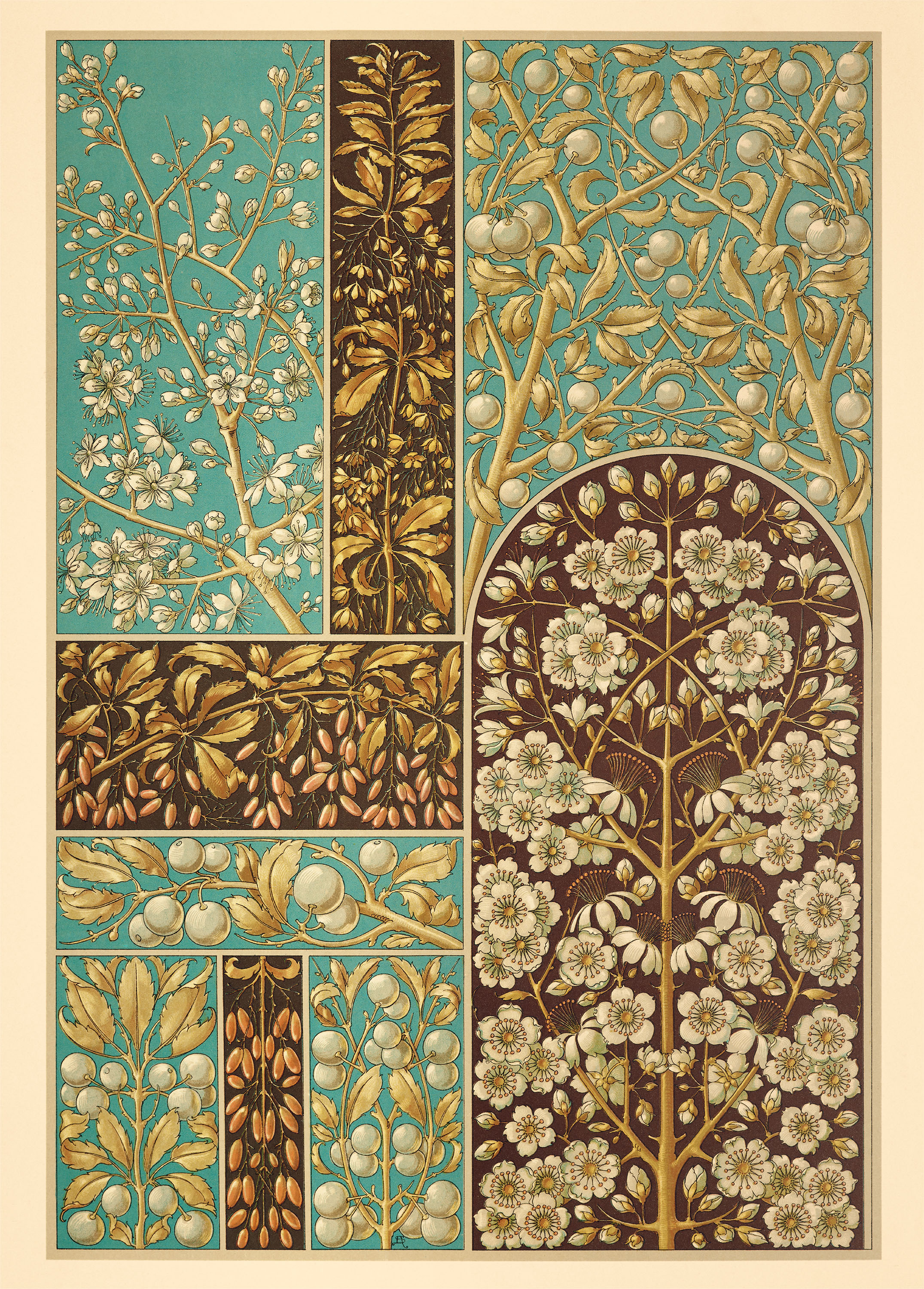
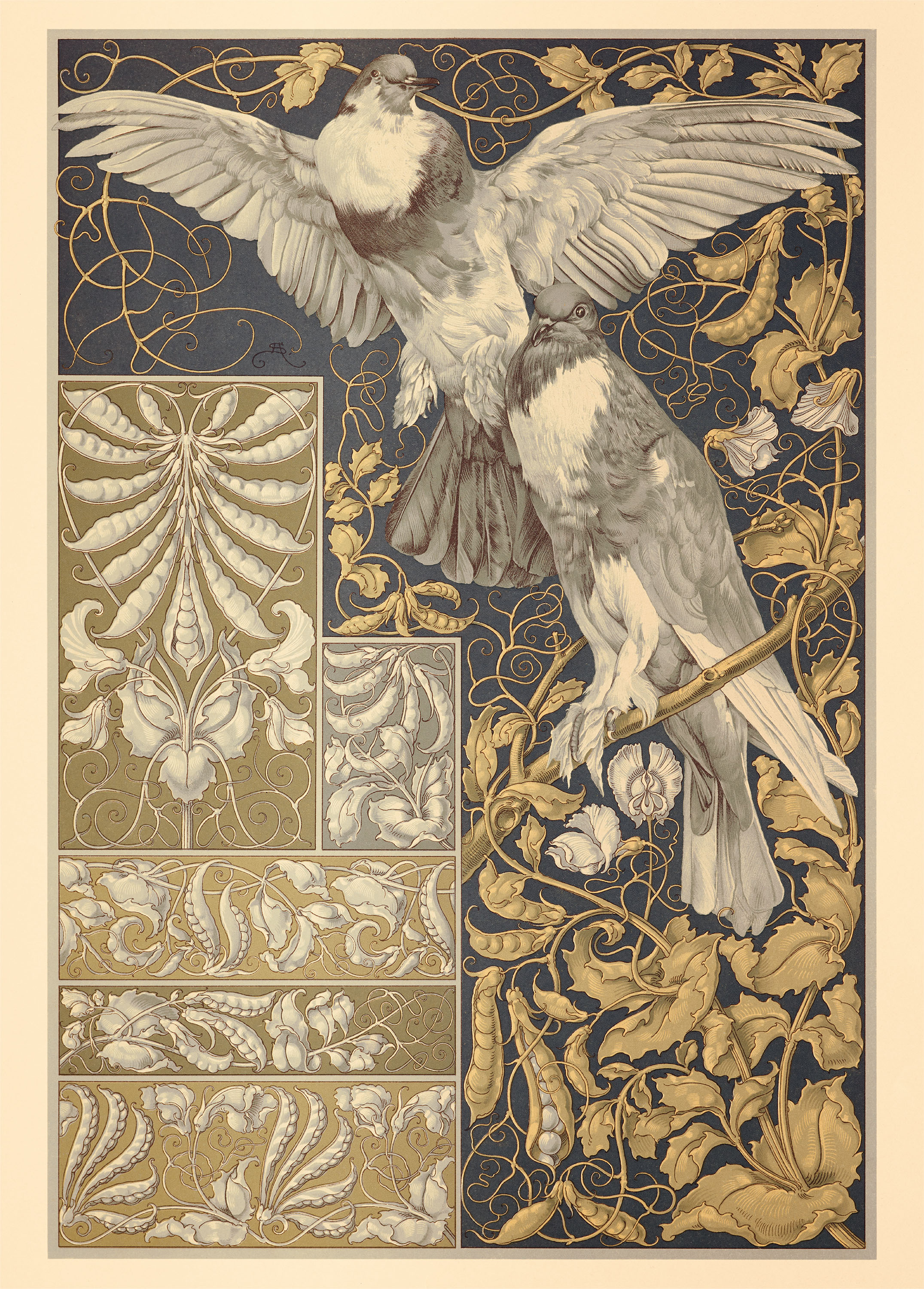
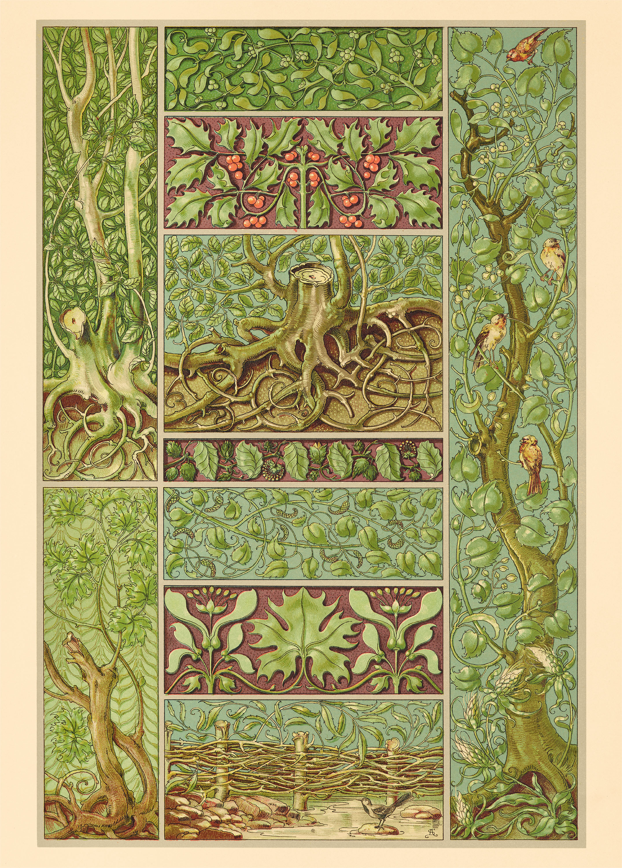
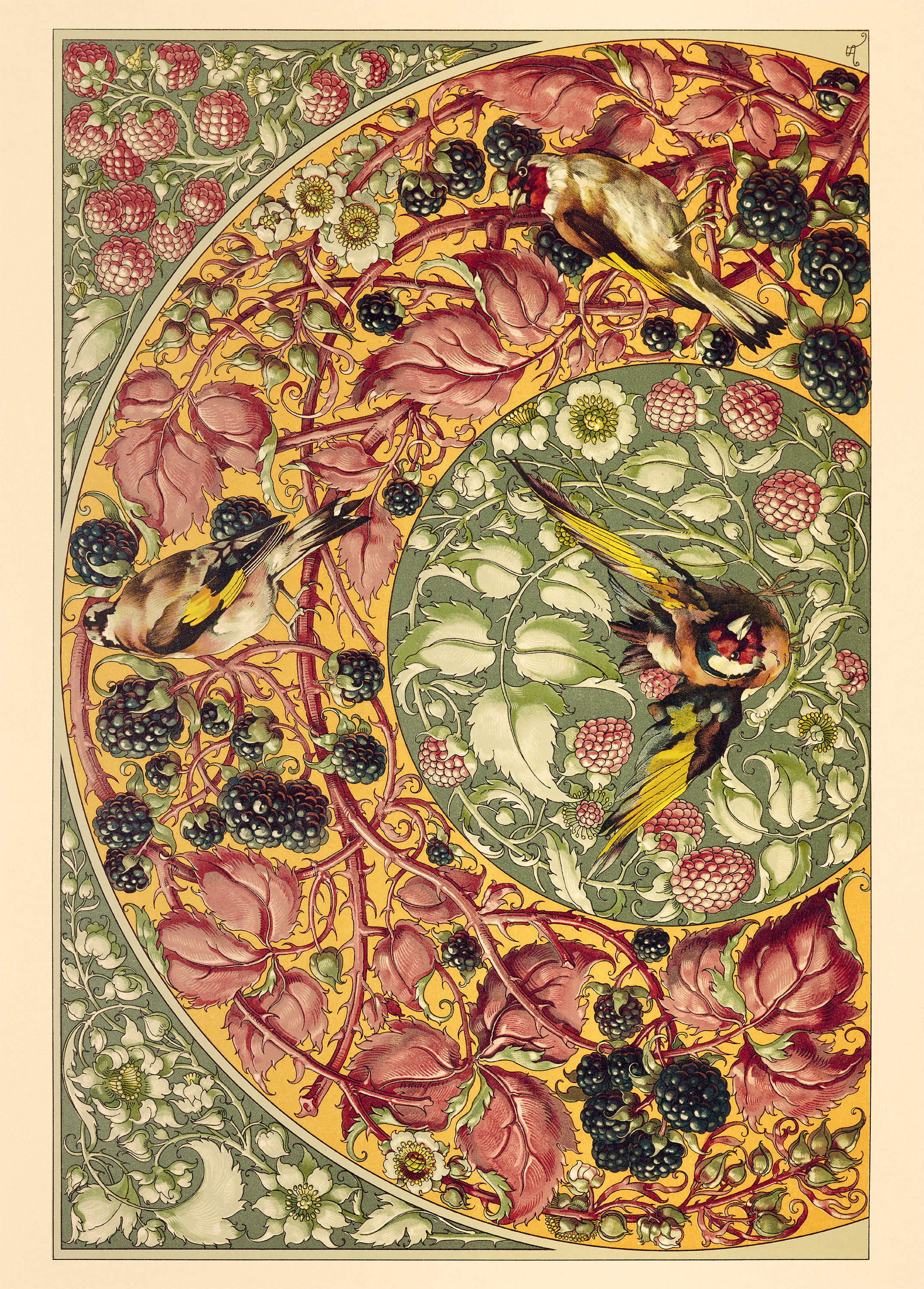
With lush foliage, twisting vines, and enchanting woodland creatures, Botanical Patterns Creative Papers features inspired examples of rich ornamental designs produced at the dawn of Europe’s art nouveau movement.
Plucked from the pages of Die Pflanze in Kunst und Gewerbe (The Plant in Art and Industry), an album of vibrant lithographs published in Vienna in the late 1880s, the intricate surface illustrations on view in these reproductions blend architectural rigor with the graceful rhythms of the natural world.
Botanical Patterns presents sixteen designs as poster-size perforated sheets that, once removed and unfurled, capture the dramatic spirit of early art nouveau in a generous scale and versatile format.
Emerging at the end of the nineteenth century, art nouveau sought to develop a new visual language by drawing inspiration from natural forms. European designers introduced meandering organic lines and uncommonly florid motifs to a wide range of disciplines, from architecture and furniture to posters, book covers, and fine art.
This uniquely modern approach gave birth to a variety of regional adaptations, including art nouveau in France and Belgium, Jugendstil in Germany, and the Vienna Secession in Austria. Exemplified by the flamboyant styles of Alphonse Mucha (1860–1939) in Paris, Otto Eckmann (1865–1902) in Munich and Berlin, and Gustav Klimt (1862–1918) in Vienna, each national interpretation was united by a shared commitment to transforming art and design.
Die Pflanze in Kunst und Gewerbe (The Plant in Art and Industry), published by Viennese publisher Gerlach & Schenk, is a stunning example of art nouveau’s emerging philosophy in print form. Issued in installments from 1887 to 1889 by its publisher alongside works by other leading figures of the movement, including Klimt and Max Klinger (1857–1920), Die Pflanze assembles the work of multiple designers and naturalists, guided by the vision German artist and educator Anton Seder (1850–1916). As lead illustrator, Seder cultivated a distinctive style in Die Pflanze’s pages, integrating the serpentine motifs of French art nouveau, demonstrated by the beautiful curled stems from sheet 2, bordered by the more geometric patterns typical of Jugendstil (see sheet 8).
Perhaps unsurprisingly, Seder developed this melange of styles at a site of cultural exchange between nations: Alsace-Lorraine, located at the border of France and Germany. Partially annexed by the German Empire in 1871 following the Franco-Prussian War, the territory began to reestablish itself by turning to craft and commerce. Here, in the Alsatian city of Strasbourg, Seder took on the directorship of a newly established branch of the Kunstgewerbeschule (Schools of Applied Arts), which were established throughout the German-speaking world to promote the advancement of the decorative arts.
Often fantastical and bizarre, the compositions of Seder’s Die Pflanze reflect the creative spirit that energized Strasbourg’s artistic milieu at this time. With bold, graphic lines framing a myriad of arboreal vignettes, its pages are home to a tangle of leaves, branches, and flowers woven into intricate patterns that evoke the sprawling forests and wetlands of the Rhine (see sheets 5 and 15). Departing from established conventions, elegant botanicals curve to impossible shapes, and thick, luxurious vegetation threatens to burst from the frame (sheet 16). In several plates, whimsical fauna hide within the wild overgrowth, including feathered creatures in flight, leaping mammals, slithering reptiles, and even the occasional snail (sheets 6, 7, and 16). Although keeping with the stylized qualities of French art nouveau, sheet 14 features exquisitely rendered birds that exemplify the careful attention to detail typical of early nineteenth-century scientific illustration.
Die Pflanze also reveals the connection between art nouveau and the concurrent Arts and Crafts movement. Led by British designer William Morris (1834–1896), this style looked primarily to pre-industrial times—particularly the Middle Ages—to excavate historical examples of artistic achievement. For example, sheets 1 and 12 allude to the dense embellishments of medieval tapestries, replete with twisting foliage accented by wildflowers and ripened fruit. In a pair of verdant landscapes on sheet 4, flora and fauna are glimpsed through vaults reminiscent of the Romanesque cathedrals of the eleventh and twelfth centuries, while the pointed arches of sheet 1 hearken back to the High Gothic architecture of the thirteenth.
Taken together, the diverse compositions found in Die Pflanze recall Europe’s rich cultural heritage, only presented in a compelling new style. In turning to history and nature as sources of reinterpretation rather than imitation, the exuberant designs of Die Pflanze continue to express the enduring familiarity and dazzling originality of the late nineteenth century.
All images in the gallery below are hi-fi captures. Click an image to enter fullscreen view, then click or pinch to enlarge.
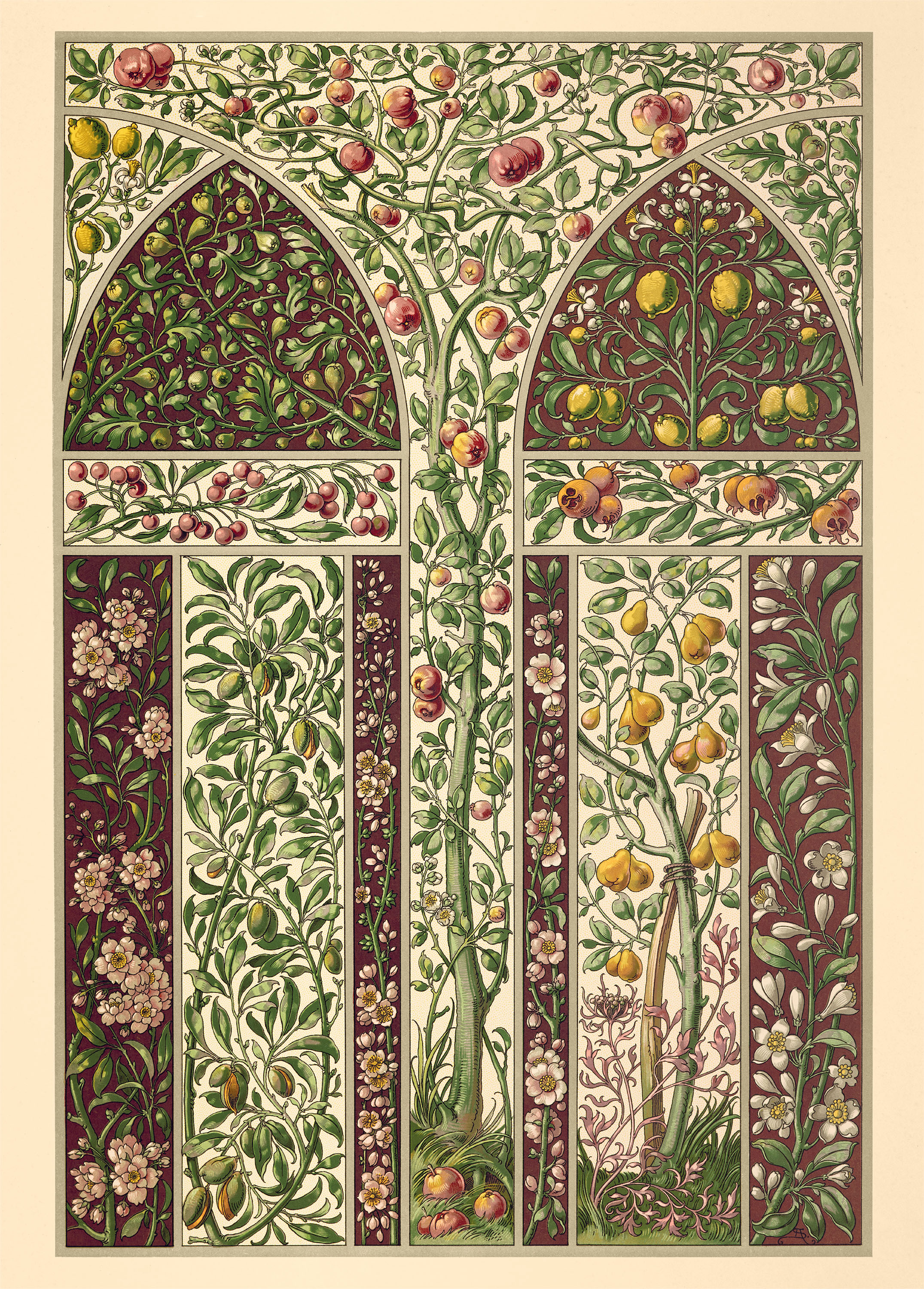
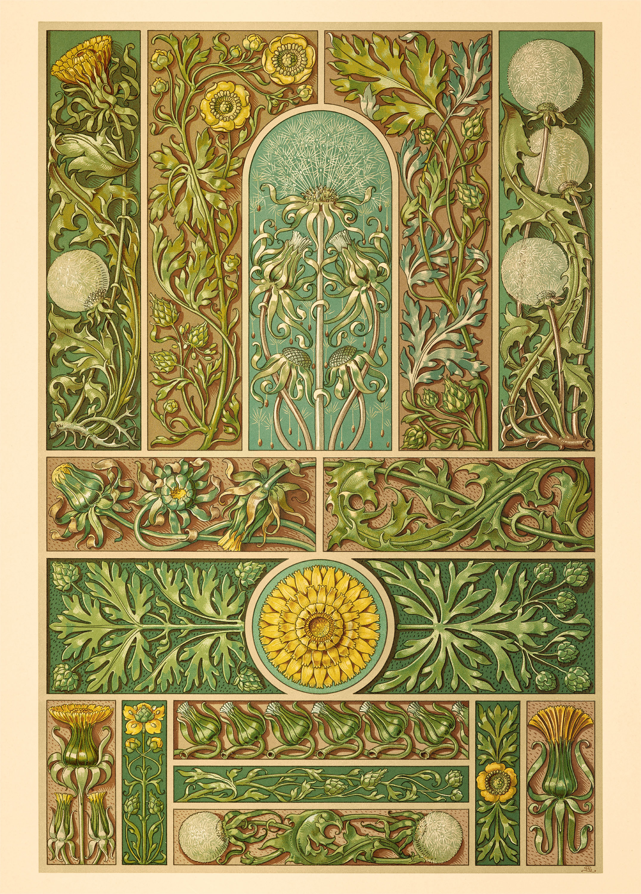
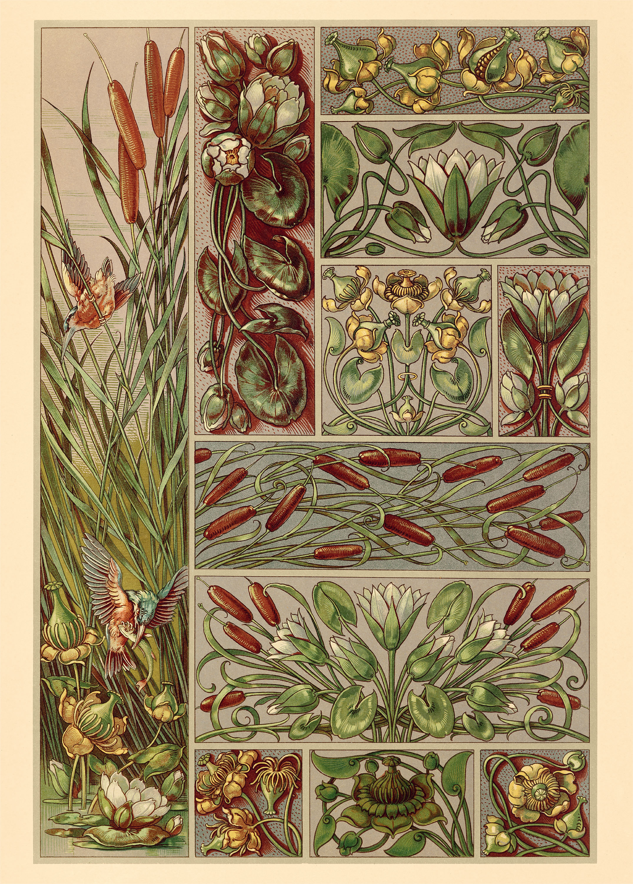
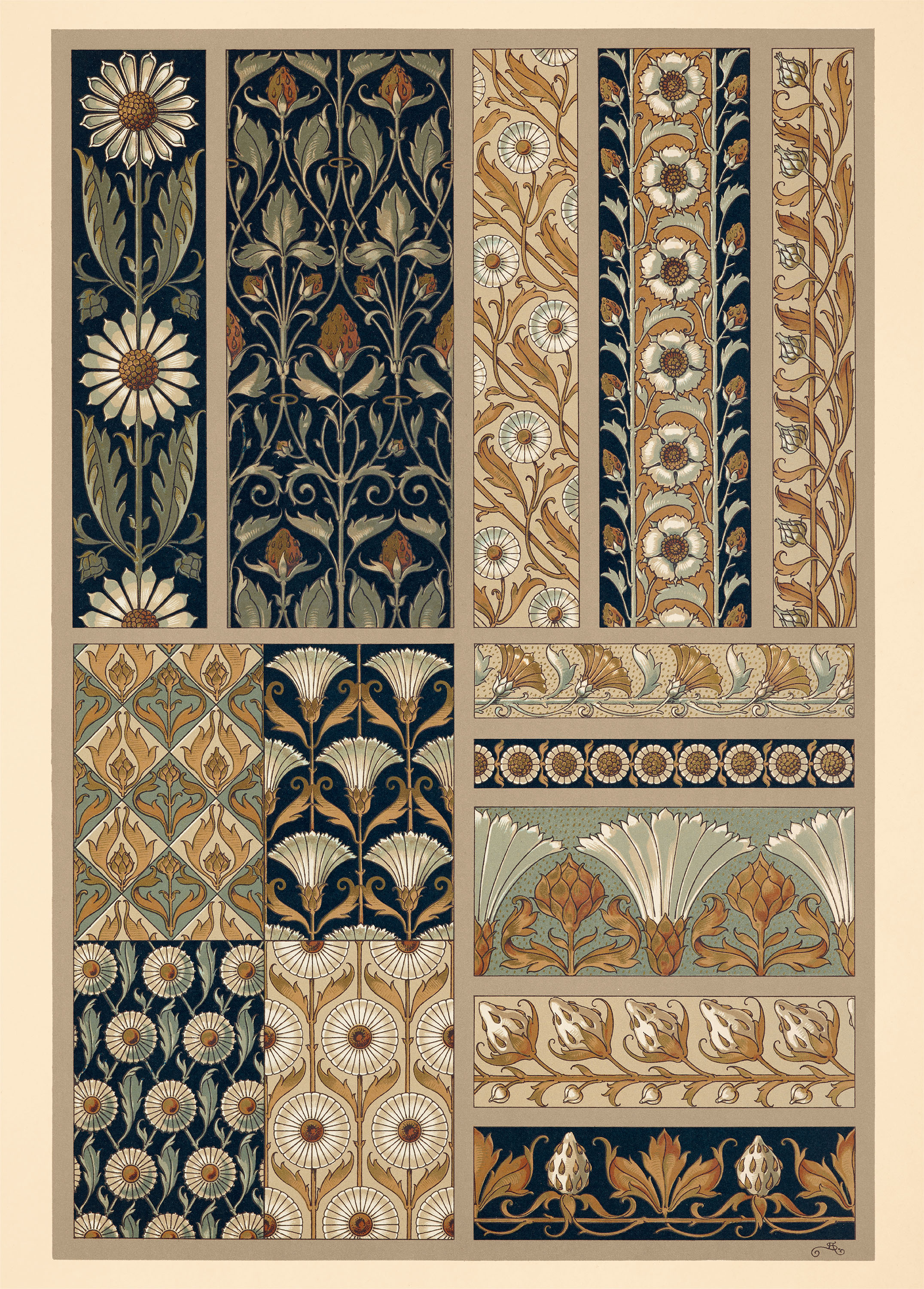
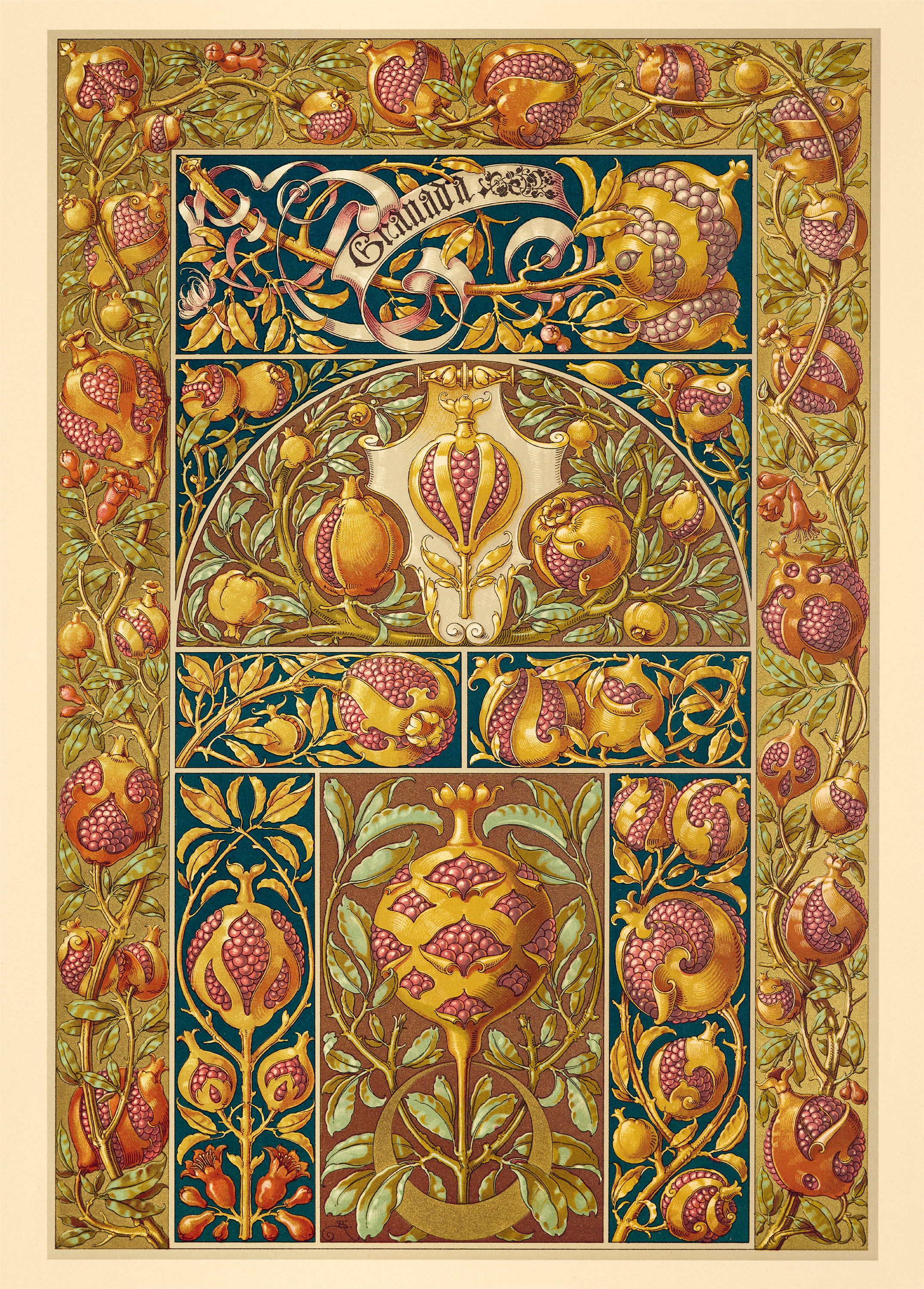
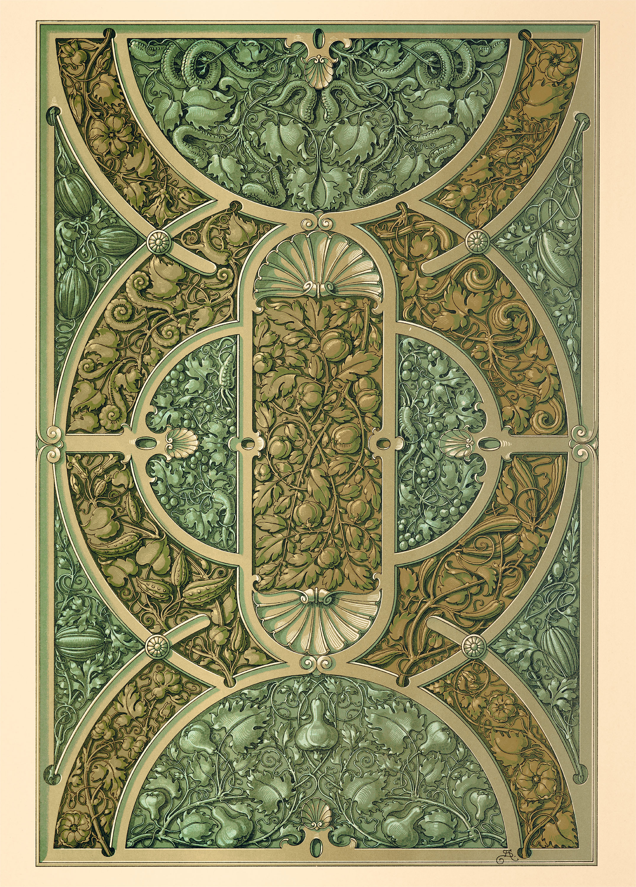
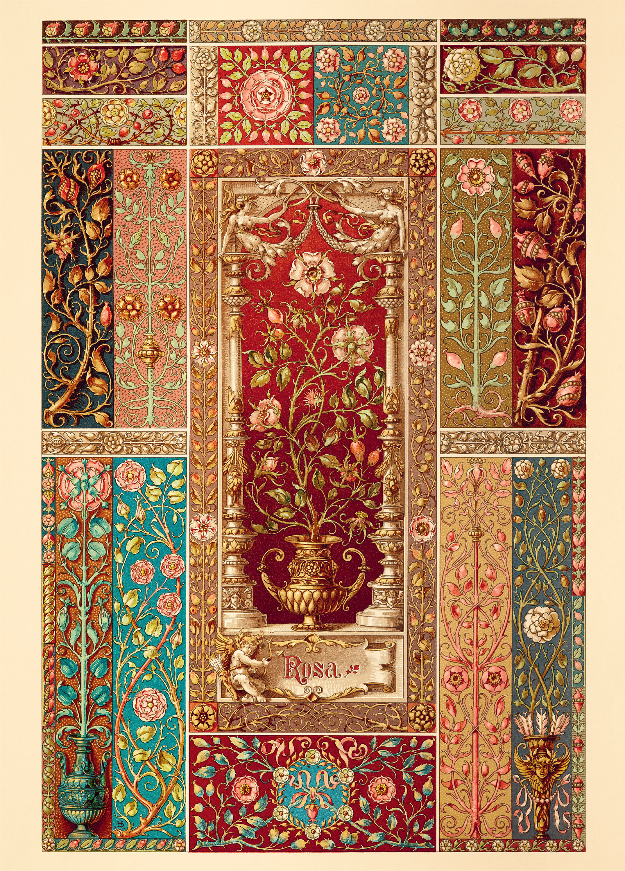
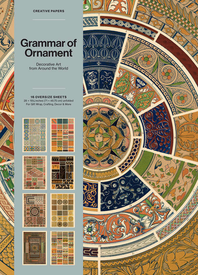
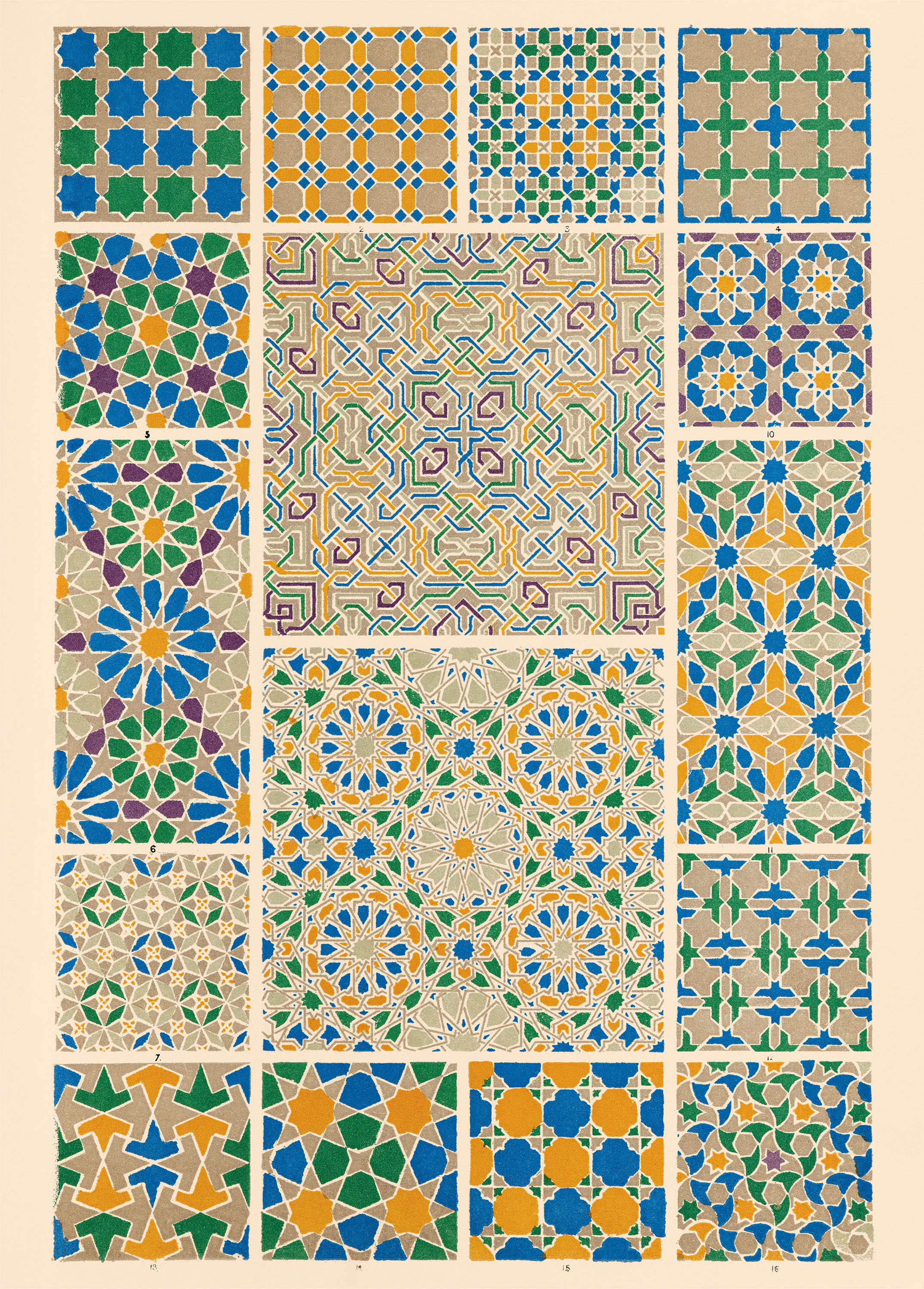
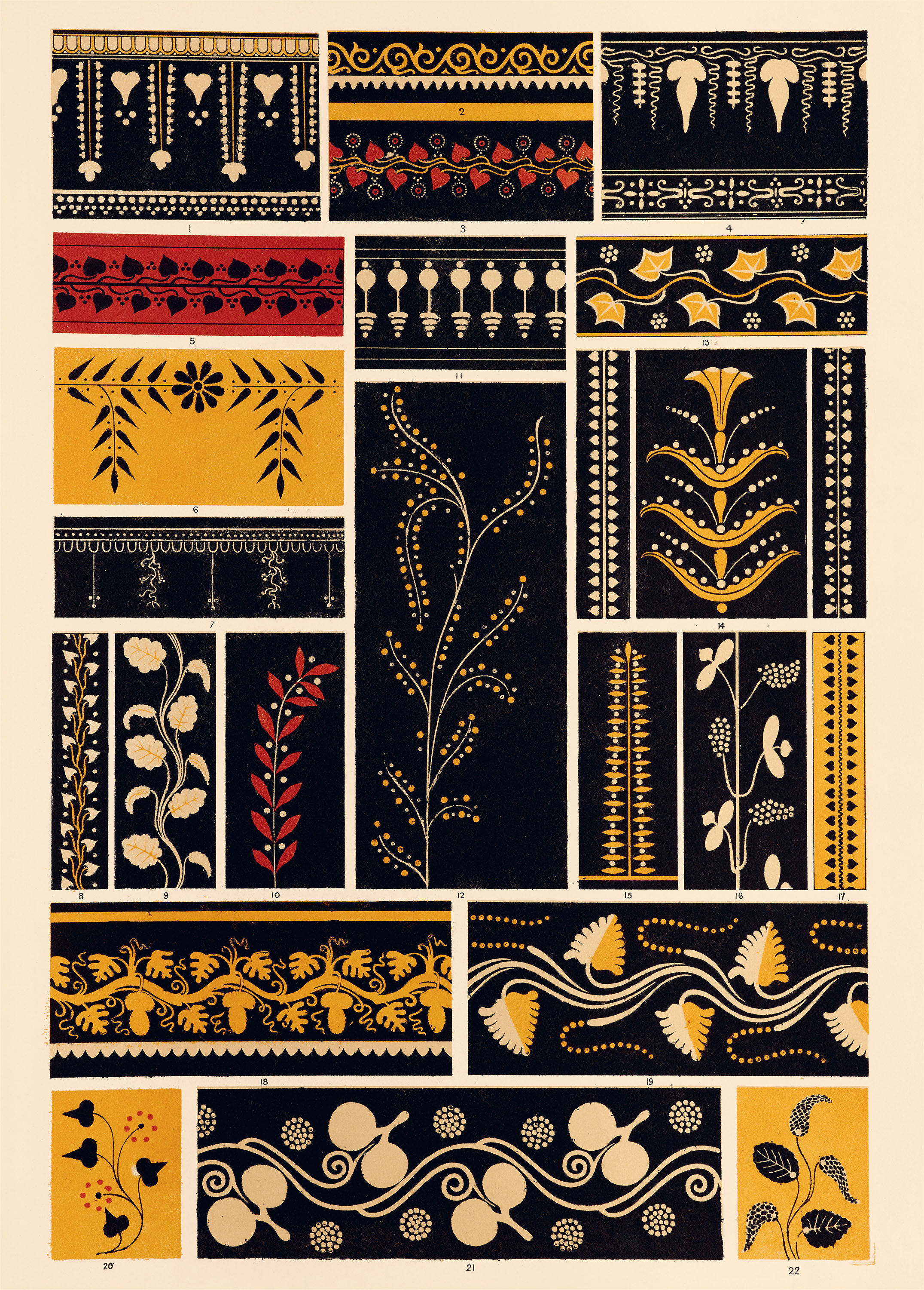
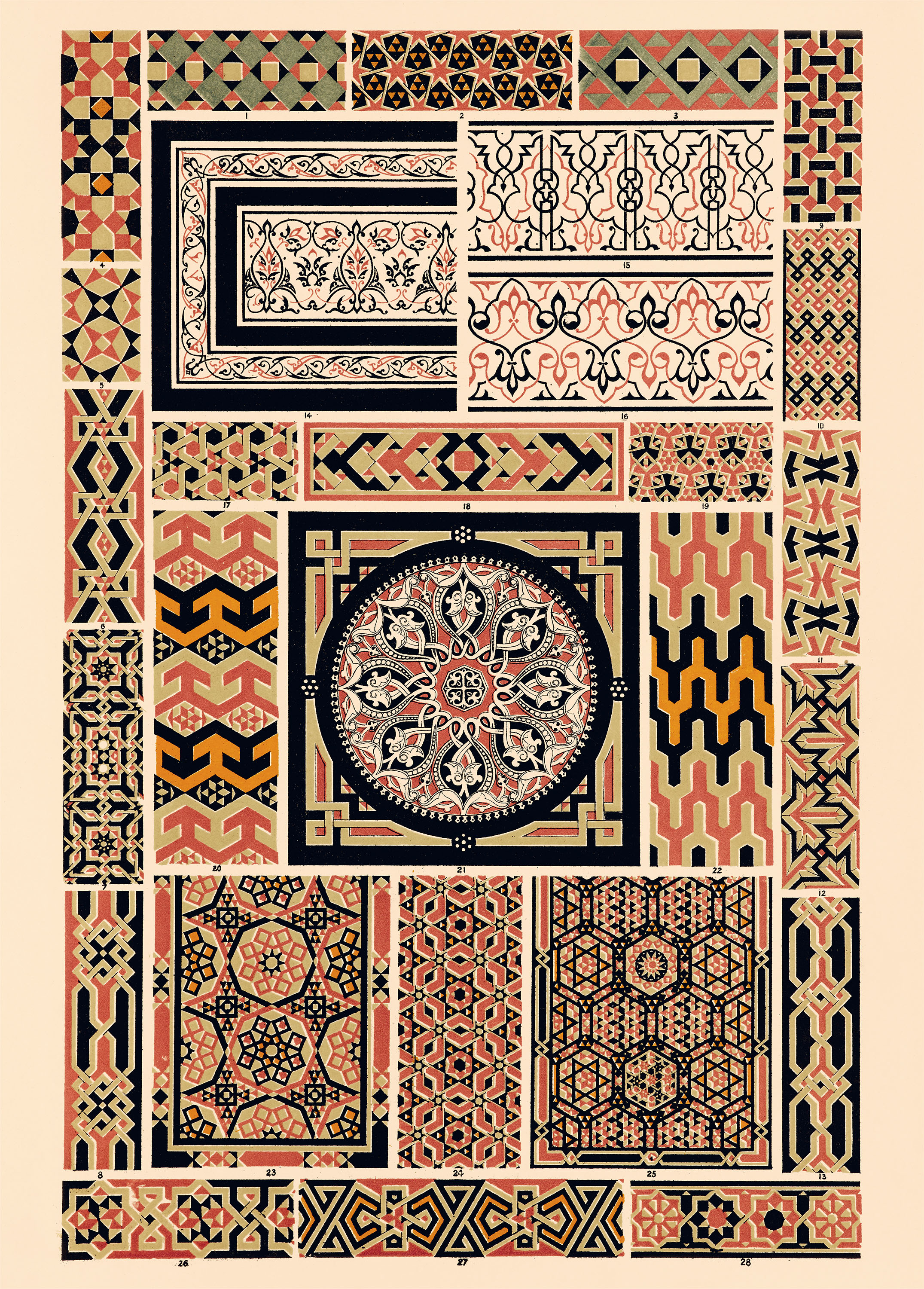
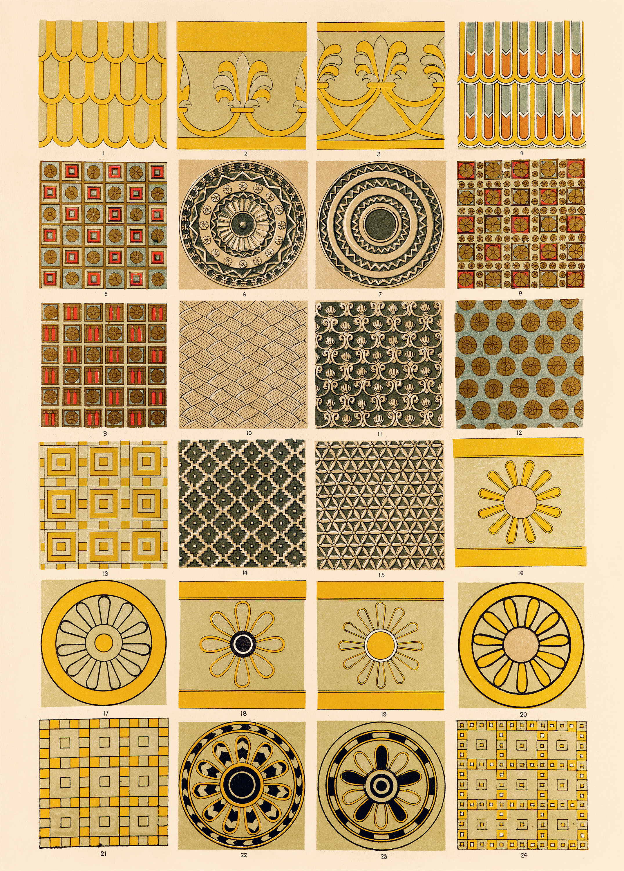
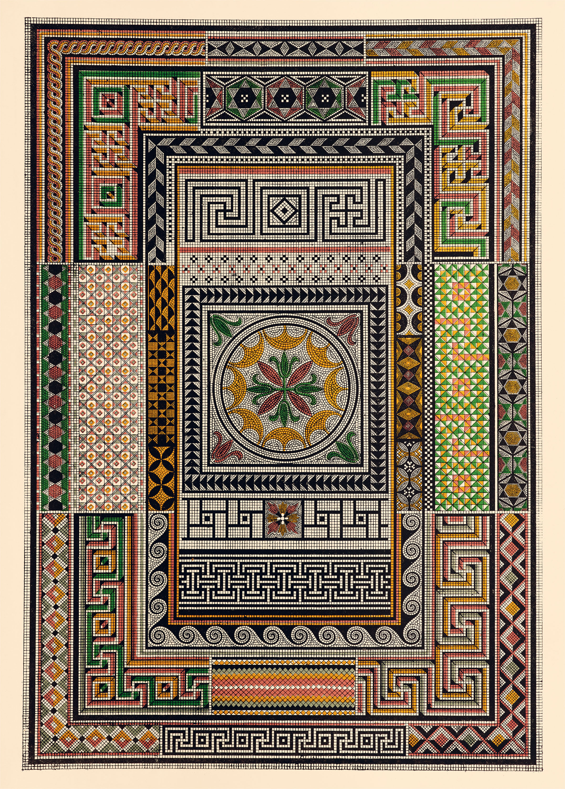
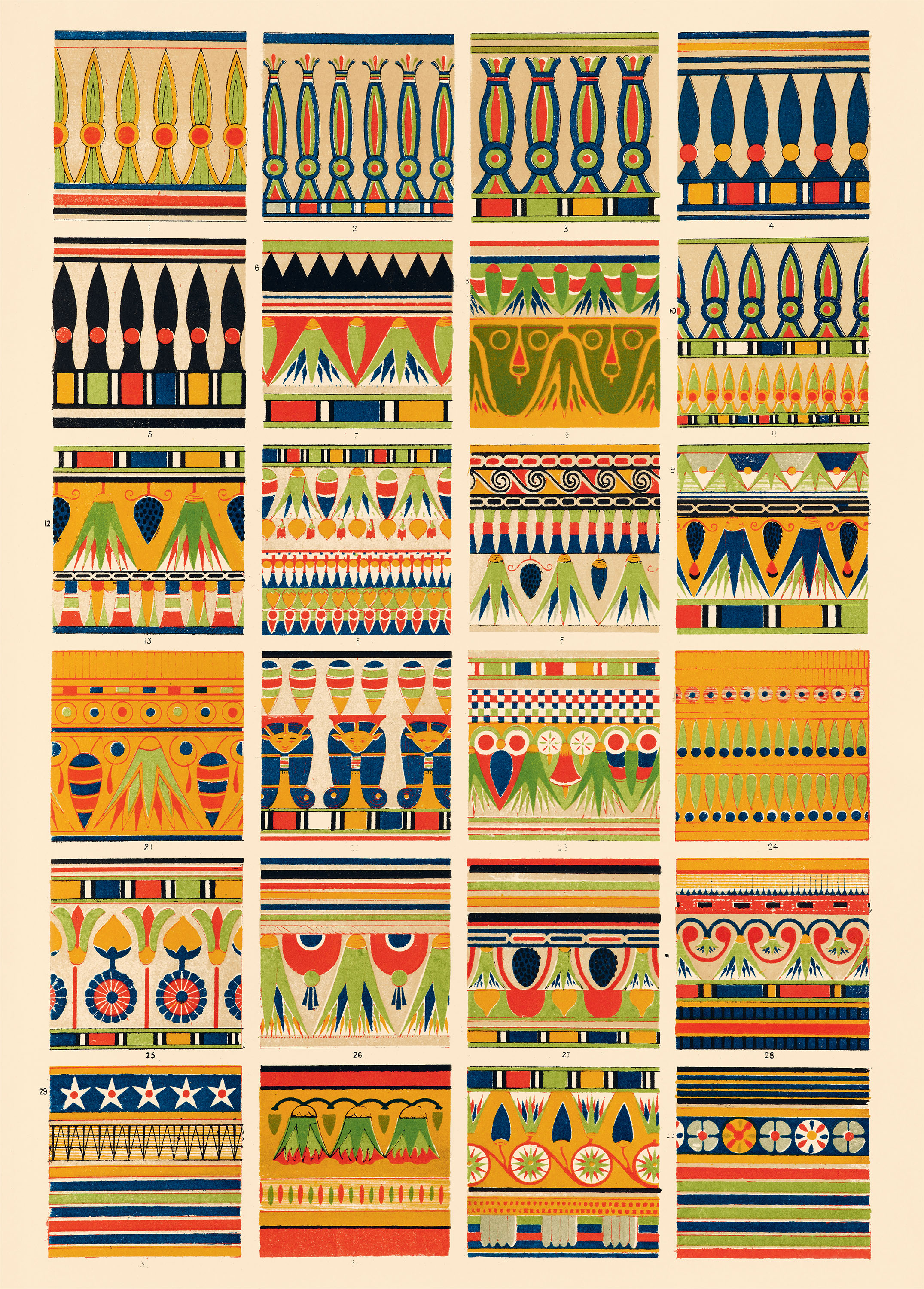
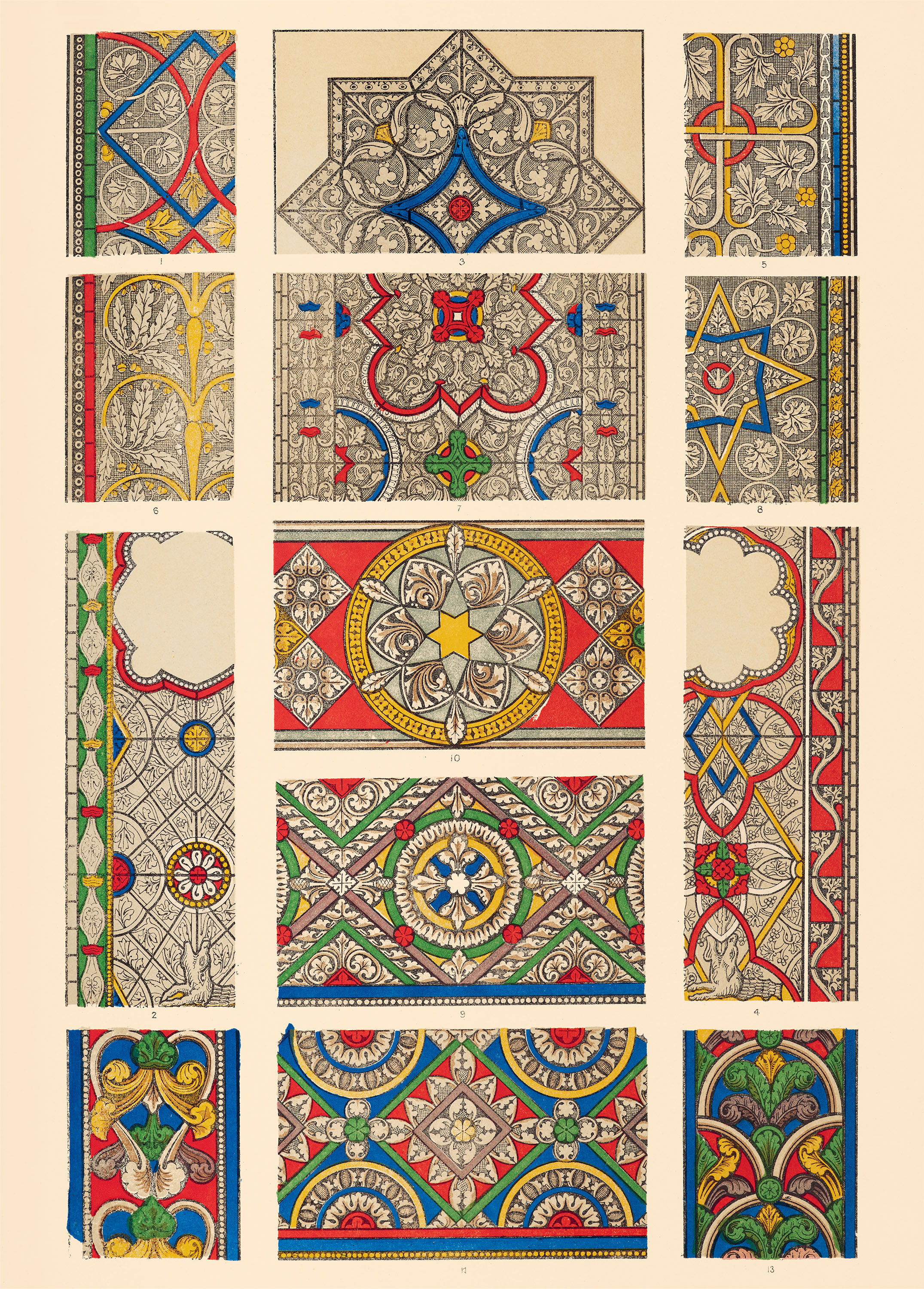
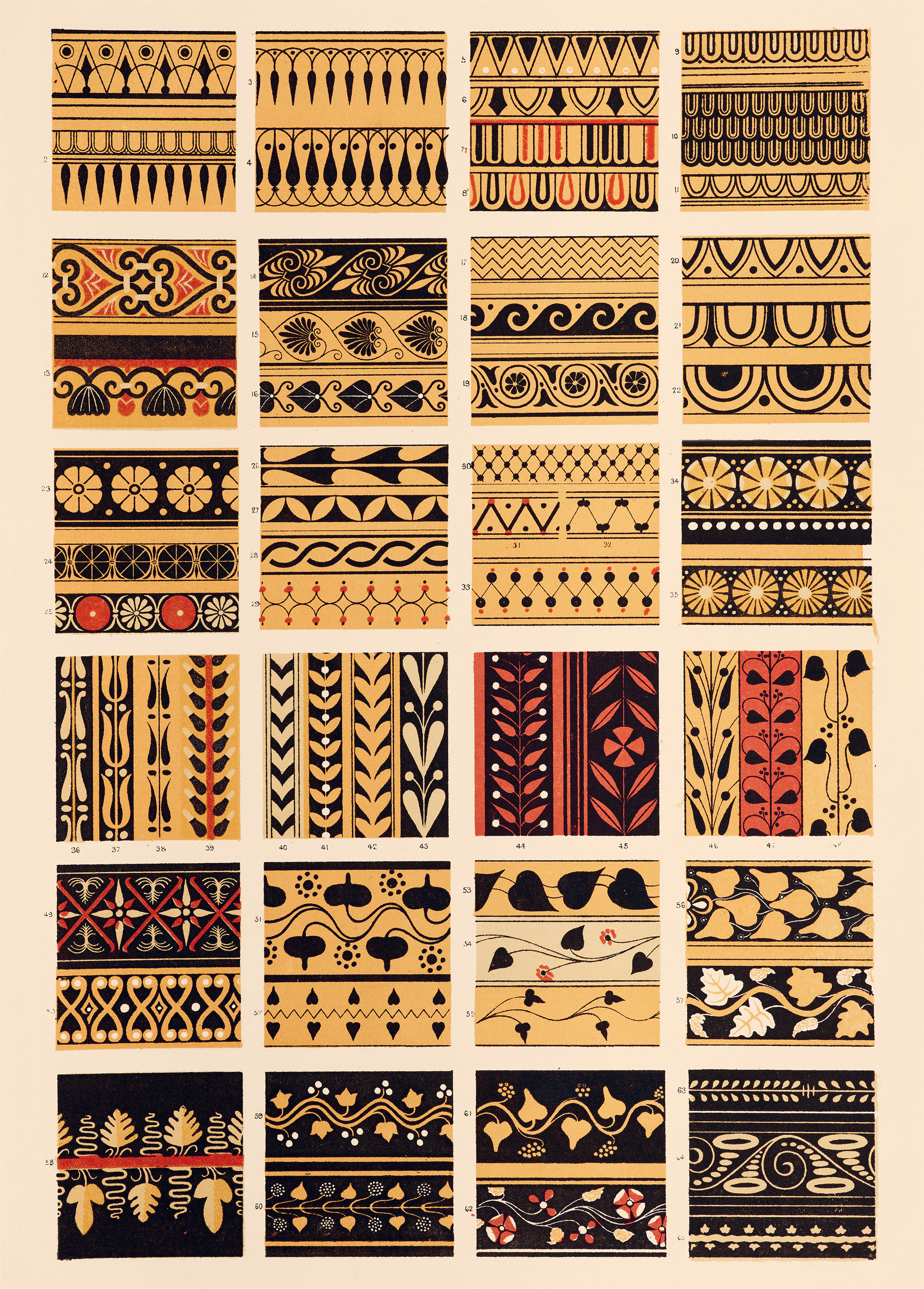
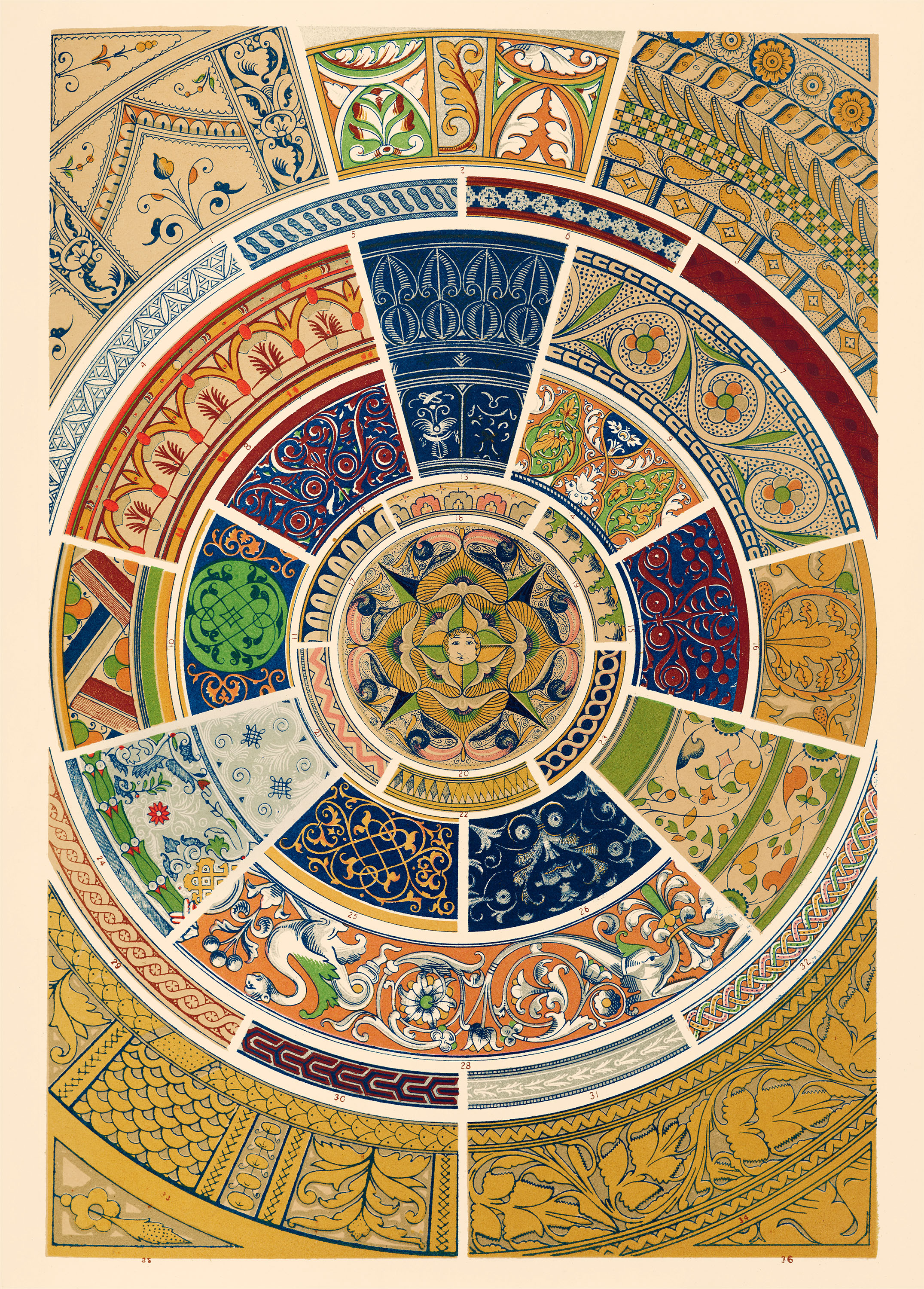
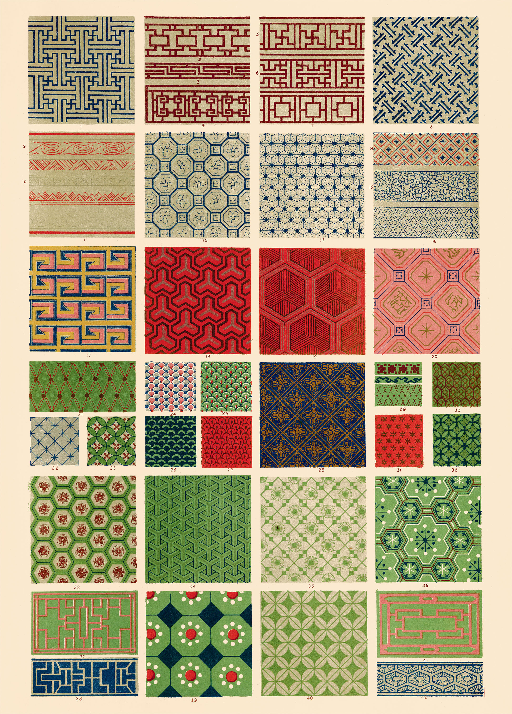
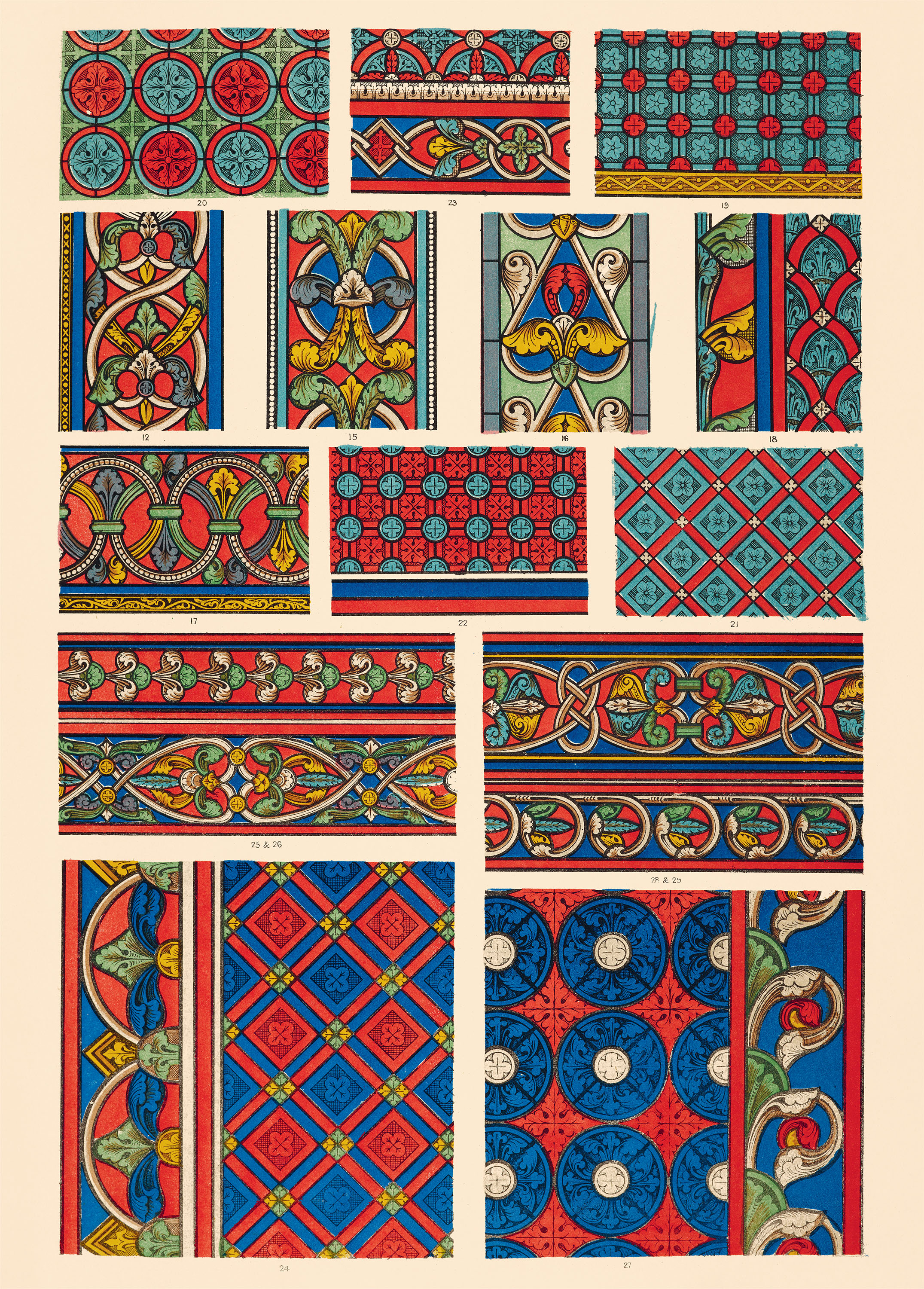
First published in 1856, The Grammar of Ornament is a landmark work of international design history, offering a dazzling study of surface patterns from a wide range of cultural traditions. Featuring colorful Islamic tilework, splendid Indian textile patterns, and intricate borders inspired by medieval stained glass, this lavishly illustrated title served as a global sourcebook for architects, textile artists, and craftspeople during the late 1800s.
Grammar of Ornament Creative Papers gathers selections from this substantial edition as an assortment of sixteen oversize perforated sheets to use as posters, wrapping paper, and more, facilitating a new generation in their decorative pursuits.
In the mid-nineteenth century, the rise of industrial manufacturing transformed the decorative arts in Britain. Largely replacing the work of skilled artisans, innovations like rotary printing, mechanized woodworking, and commercial stonecarving allowed for the explosion of ornamental styles that came to characterize middle-class Victorian homes. Faced with these new consumer goods, connoisseurs grappled with how to reconcile artistic integrity with the realities of industrialization. Advocating for a return to craftsmanship and authenticity, Prince Albert (1819–1861) and arts commissioner Henry Cole (1808–1882) organized the Great Exhibition of 1851, bringing together exemplary works to reflect the globalized world—and to overcome the perceived crisis of taste created by the Industrial Revolution.
The Great Exhibition’s main hall, the Crystal Palace, was decorated by British architect and designer Owen Jones (1809–1874), whose participation in the international showcase presaged his creation of The Grammar of Ornament. First published in 1856, Jones’s overview offers an encyclopedic survey of surface decoration that presents sources from foreign and premodern cultures as models for good design. He assembled hundreds of examples of Indigenous, Egyptian, Greek, Middle Eastern, East Asian, and European styles into a series of 112 full-color illustrated plates, with each section accompanied by analyses of the aesthetic principles that Jones—glimpsed from the viewpoint of the British Empire—believed to be essential qualities of preindustrial society. His book redefines ornamentation as a set of universal principles that can be learned, adapted, and applied to modern industry.
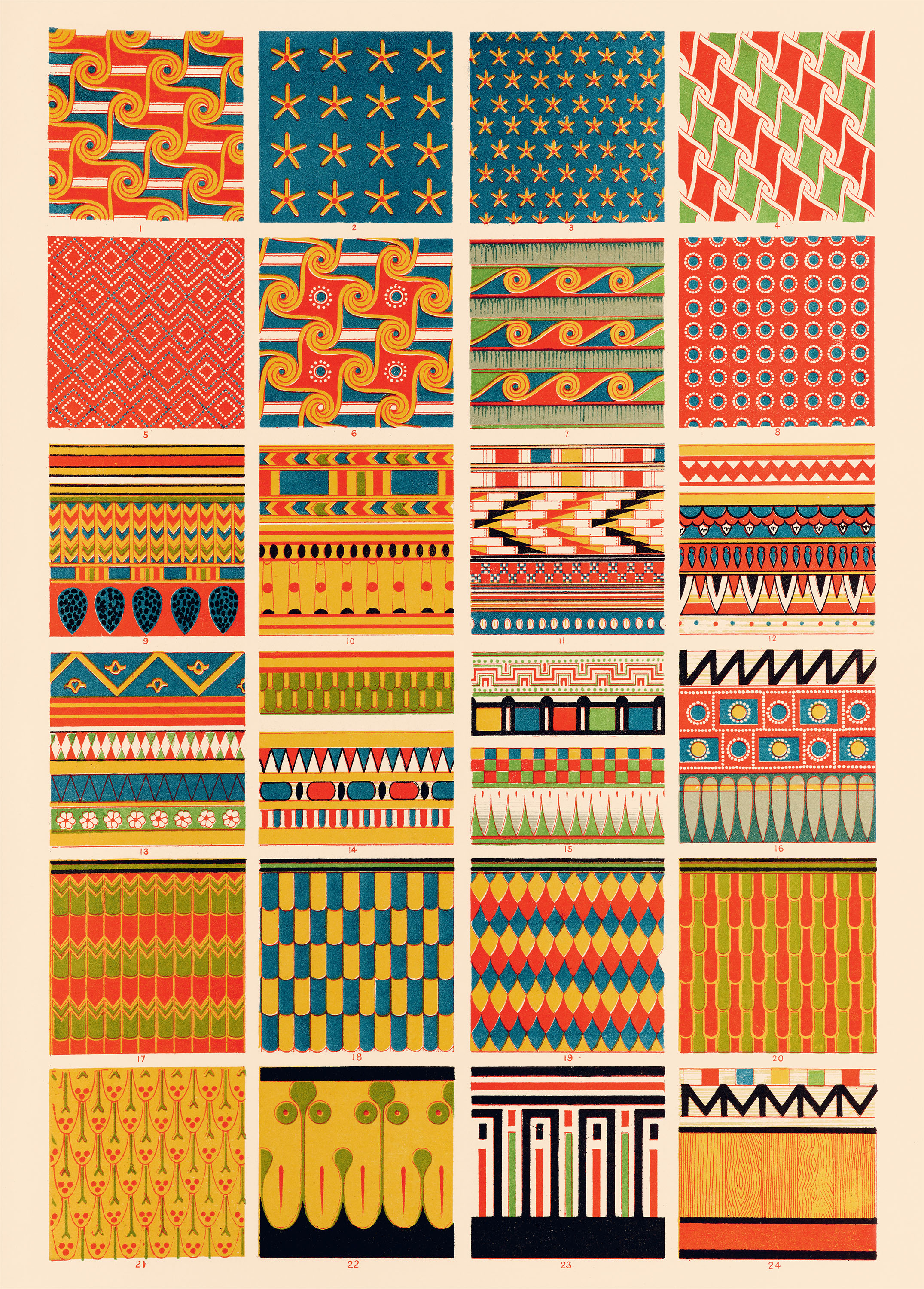
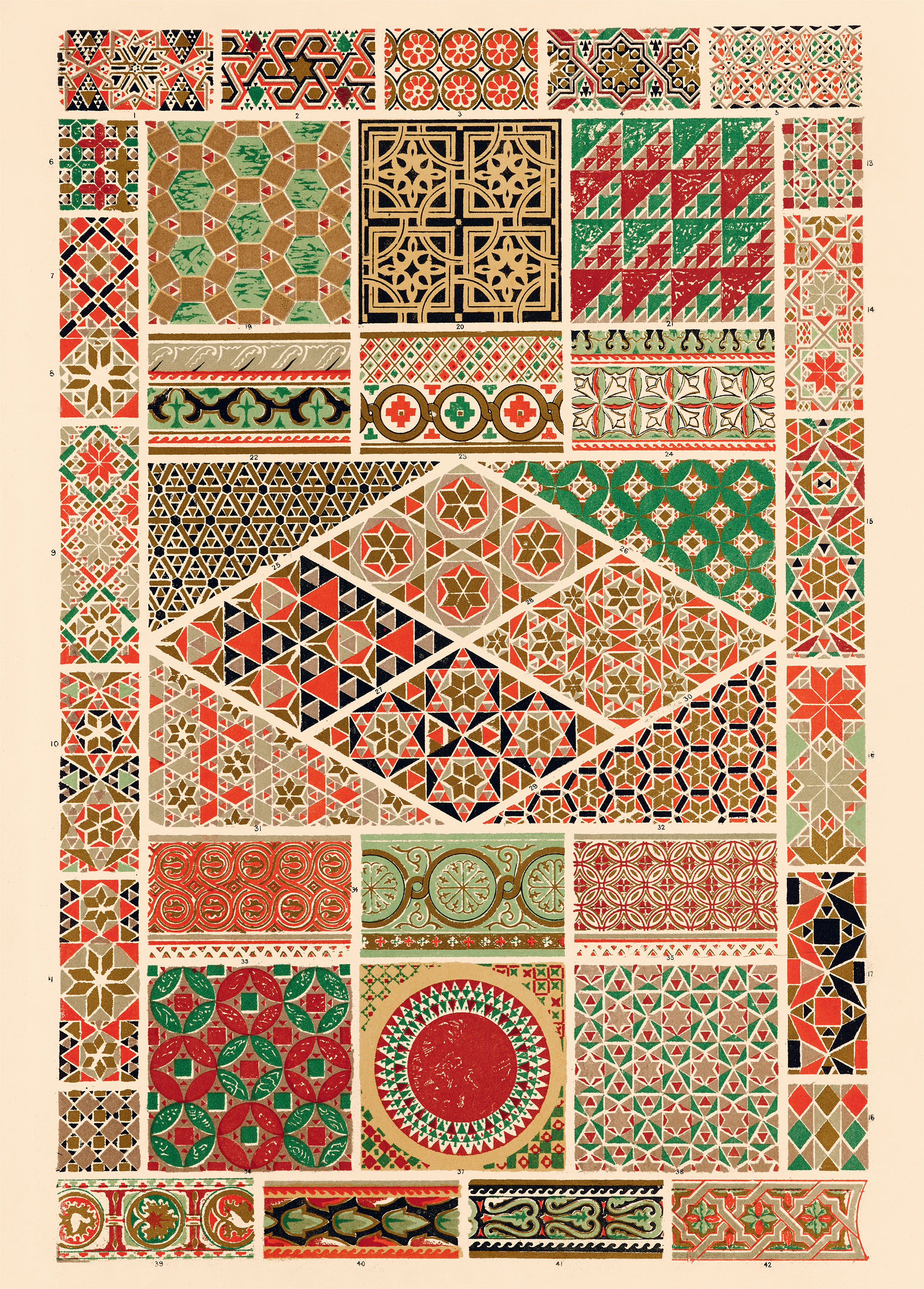
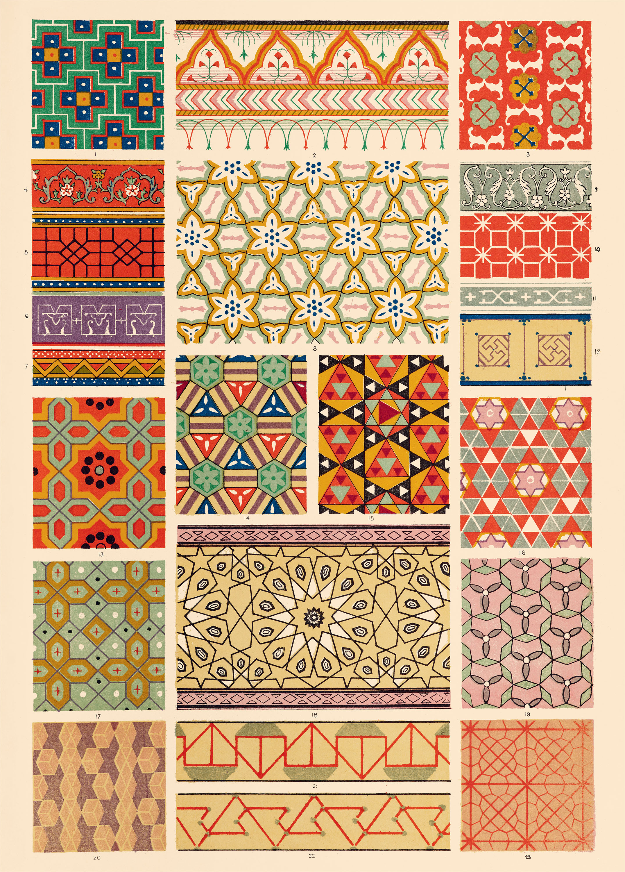
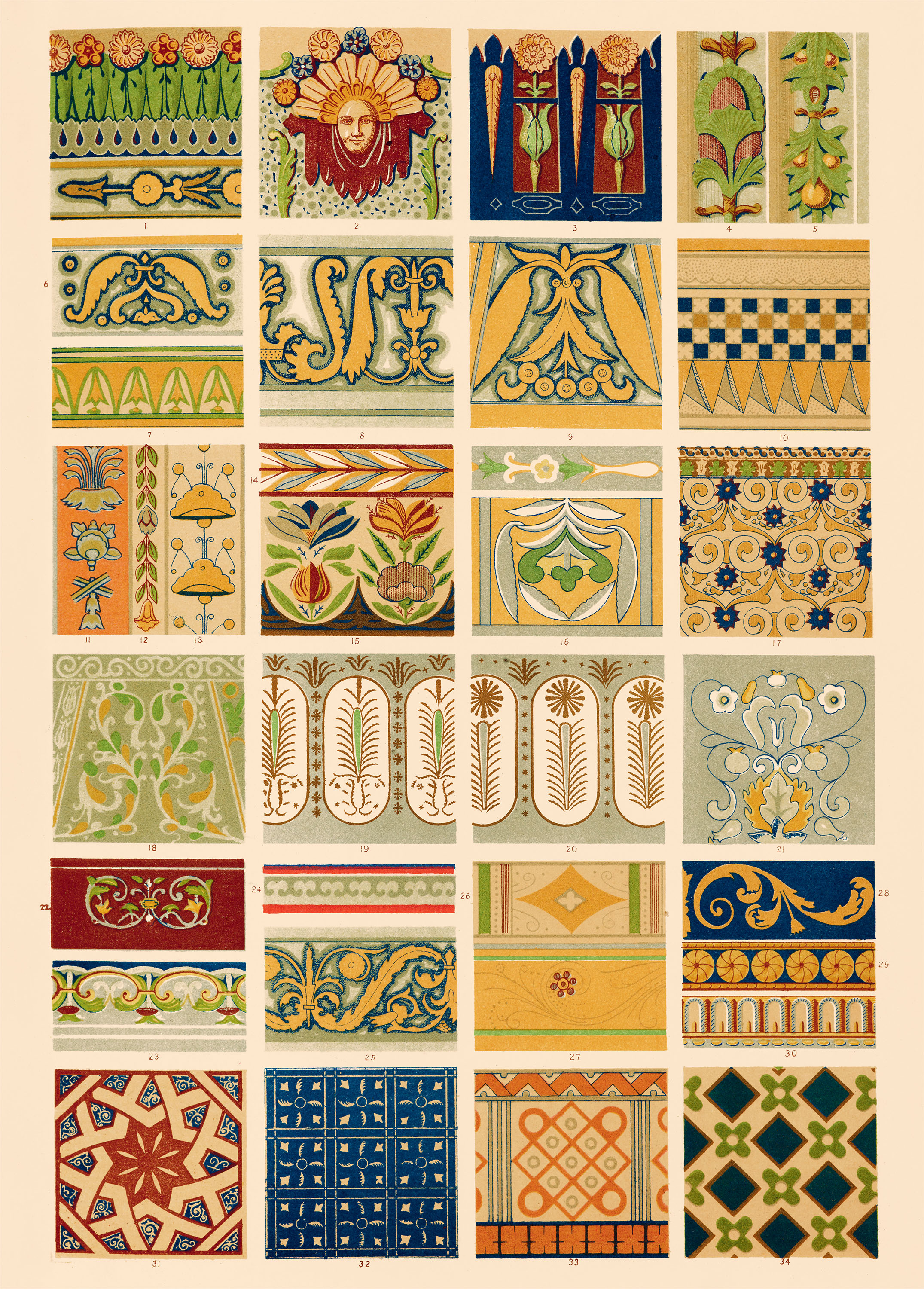
Central to Jones’s project is his study of Islamic design, particularly the Alhambra, a thirteenth-century palace constructed in Spain under Muslim rule. Captivated by the orderly repetition of geometric shapes and harmonious color combinations, Jones made drawings of the site’s mosaics that later informed his designs for sheet 1. Meanwhile, sheets 2 and 8 convey his interest in the architecture of Ancient Egypt, Greece, and Rome, which was originally adorned with vibrant polychrome. His celebration of Greco-Roman ceramics and tilework underscores a preference for abstracting natural forms rather than imitating them (see sheets 4 and 7), to the delight of many contemporary critics who found fault with the Victorian era’s illusionistic wallpapers, intricately carved wood veneers, and representational textile motifs. He also sought historic examples to admire closer to home, such as the medieval ornament of sheets 9 and 16.
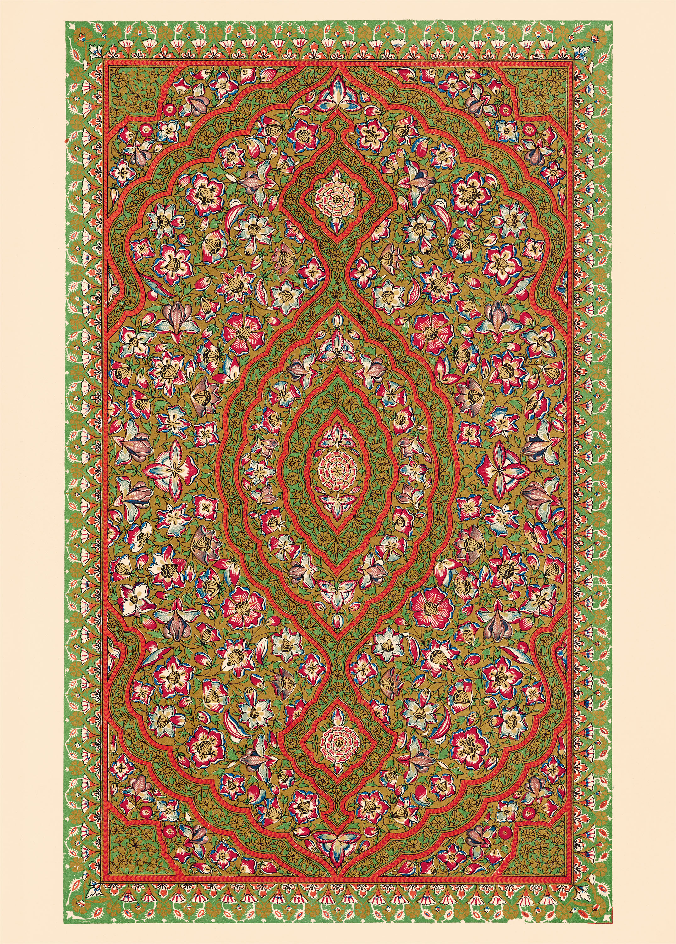
While Jones made firsthand observations during his travels, a number of his designs ironically depart from their original source material. For example, some of the Asian motifs surveyed in The Grammar of Ornament are derived from trade goods produced for the European market. Resembling a carpet in a Victorian parlor, sheet 13 features the dense floral patterns of India, rendered with saturated colors and gold foil. Similarly, the Chinese patterns included in sheet 12, while likely based on Jones’s study of porcelain, lacquerware, and cloisonné held by European museums, do not represent the diversity of Chinese ornament, and many were often reinterpreted to suit his preferences.
The multilingual publication of a second edition of The Grammar of Ornament in 1865 demonstrated Jones’s ongoing influence. He was also instrumental to the founding of Henry Cole’s visionary Victoria and Albert Museum in 1852 and taught his philosophy of form and color at the Government School of Design, Britain’s first design academy.
Although Jones’s revisionist approach was symptomatic of British colonialism, The Grammar of Ornament remains a foundational text in the history of design. As a vehicle for design reform, his survey attempts to organize the rapidly expanding visual culture of the Industrial Revolution, setting more tasteful standards that integrate the richness of global artistry for the modern age.
All images in the gallery below are hi-fi captures. Click an image to enter fullscreen view, then click or pinch to enlarge.
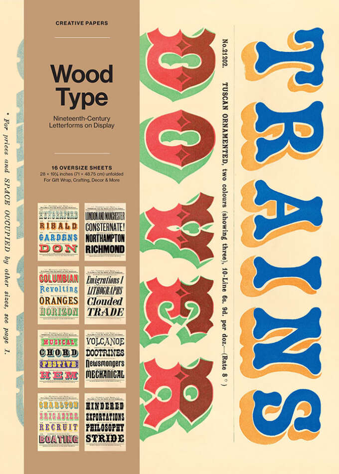
In the 1800s, as people migrated to urban centers, and the walls of the city increasingly became a surface for printed broadsides and posters, wood type emerged as a splendid and economical tool in the creation of large-scale advertisements. Lighter in weight and less cumbersome than metal, it was quickly available in an explosion of expressive styles.
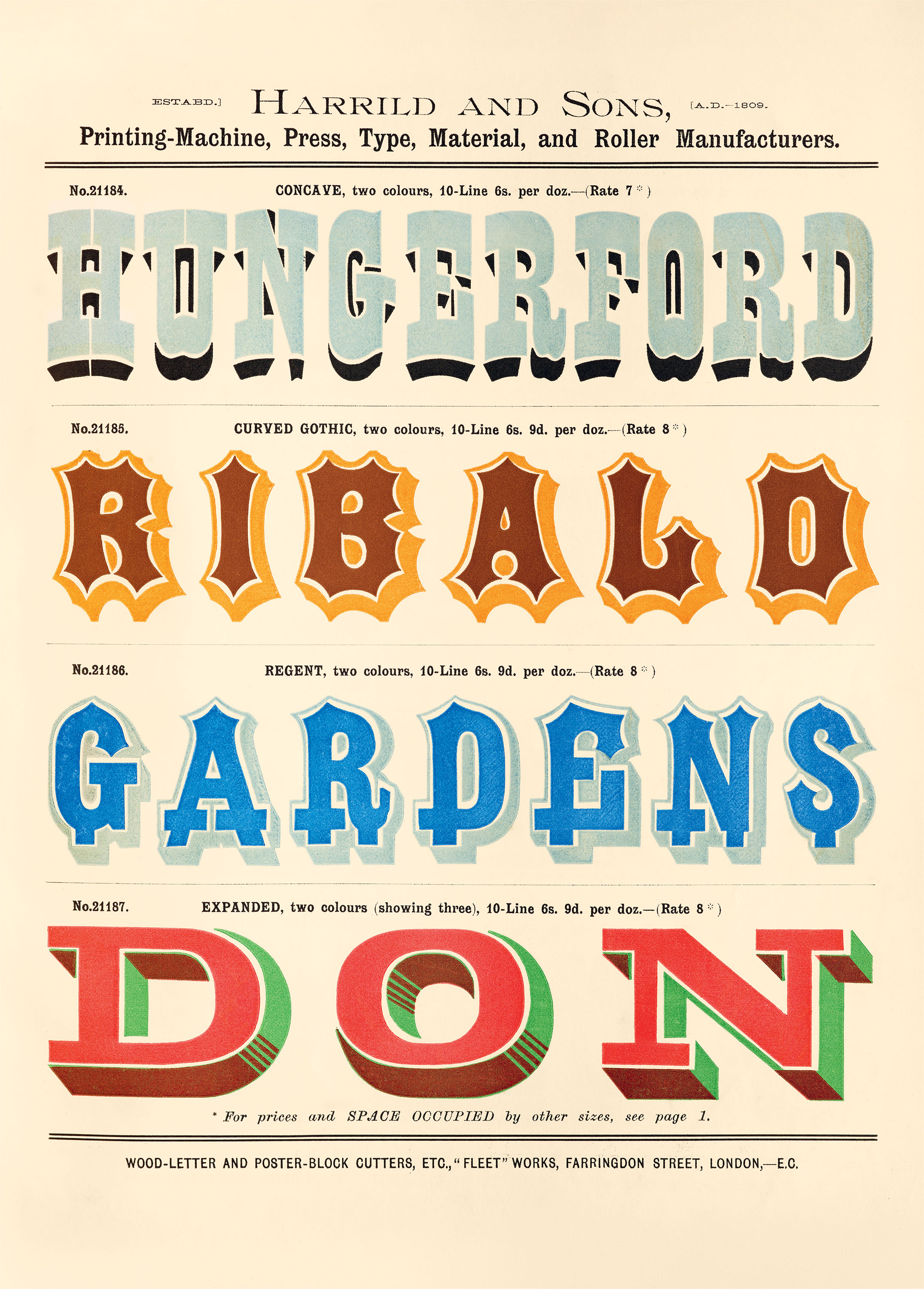
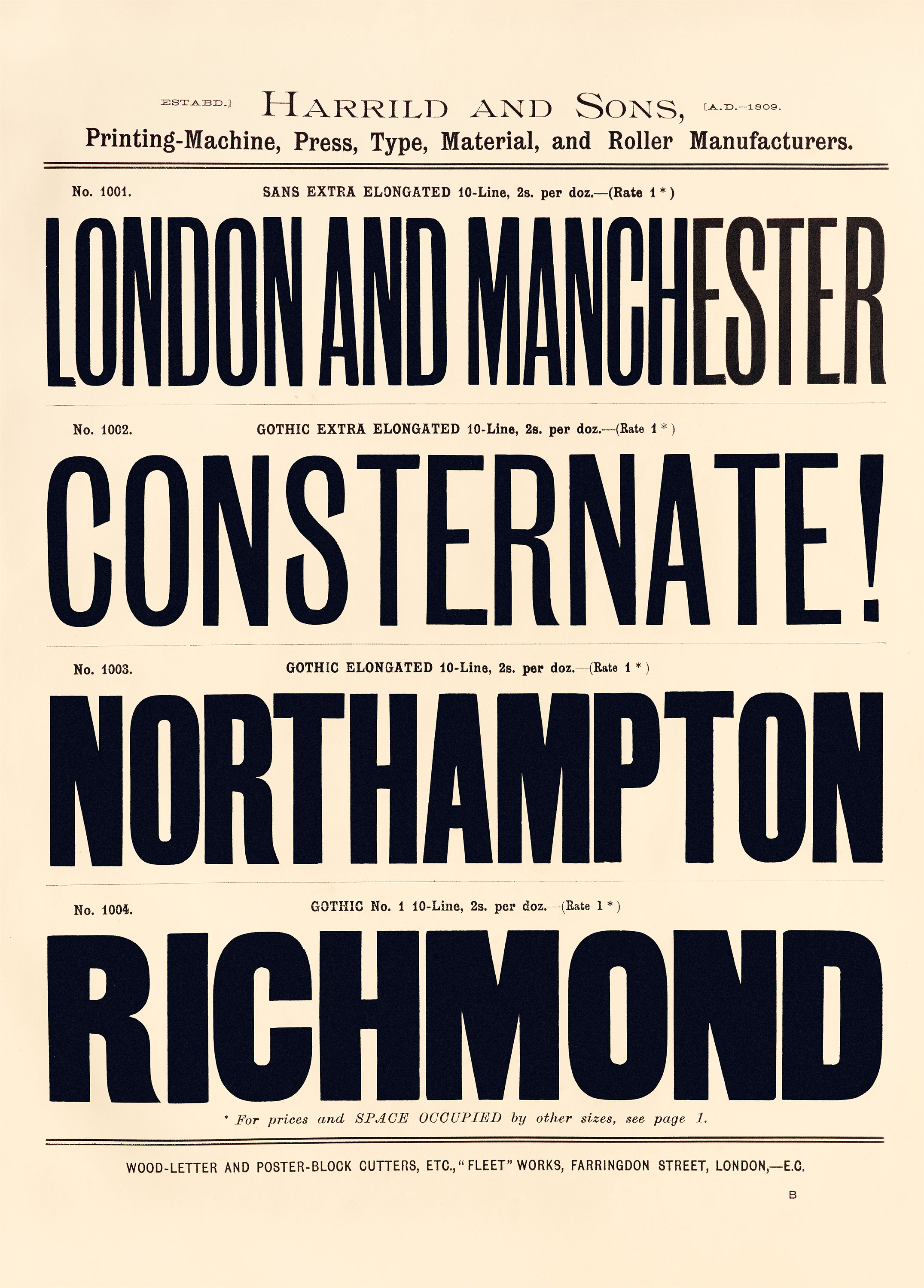
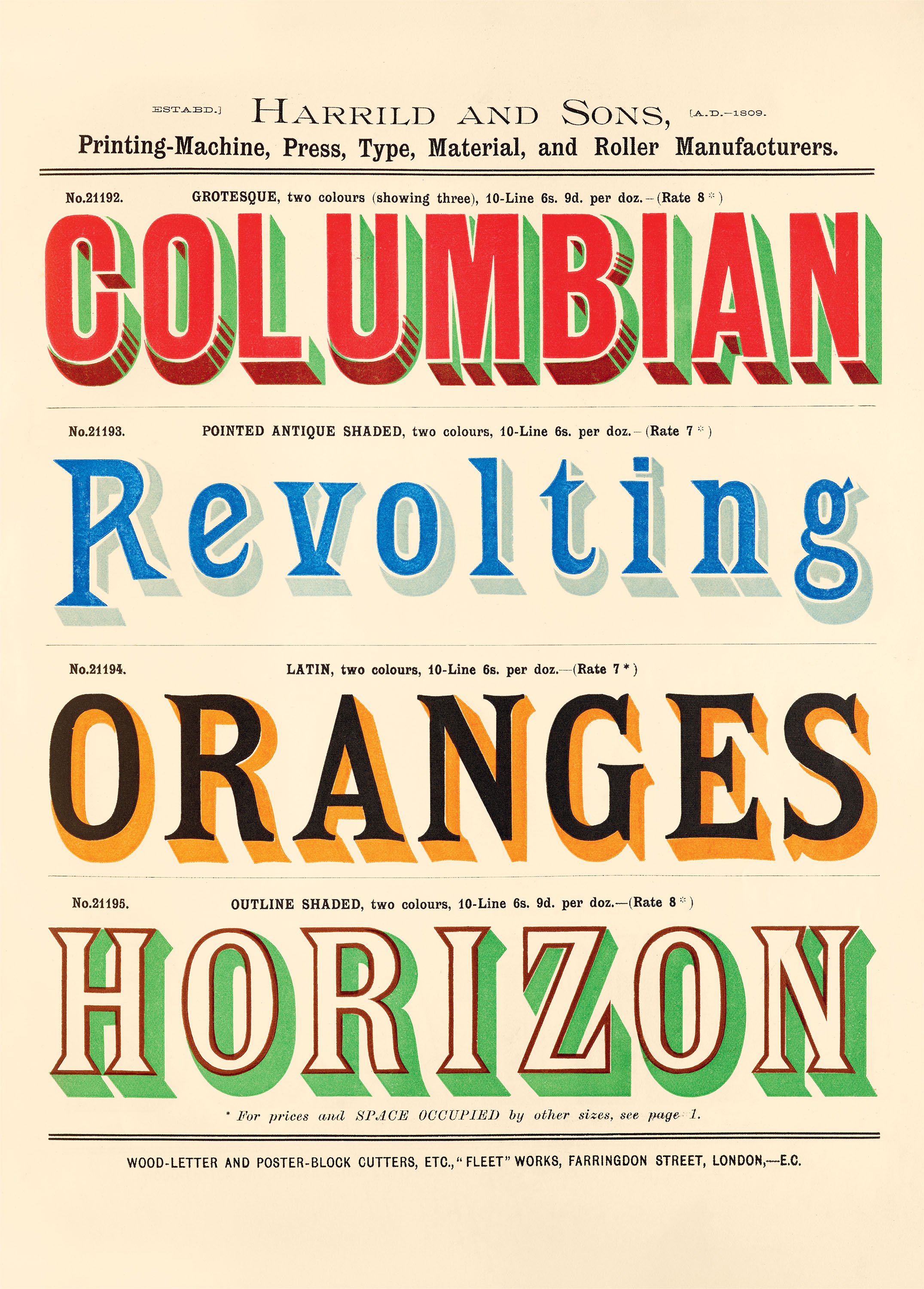
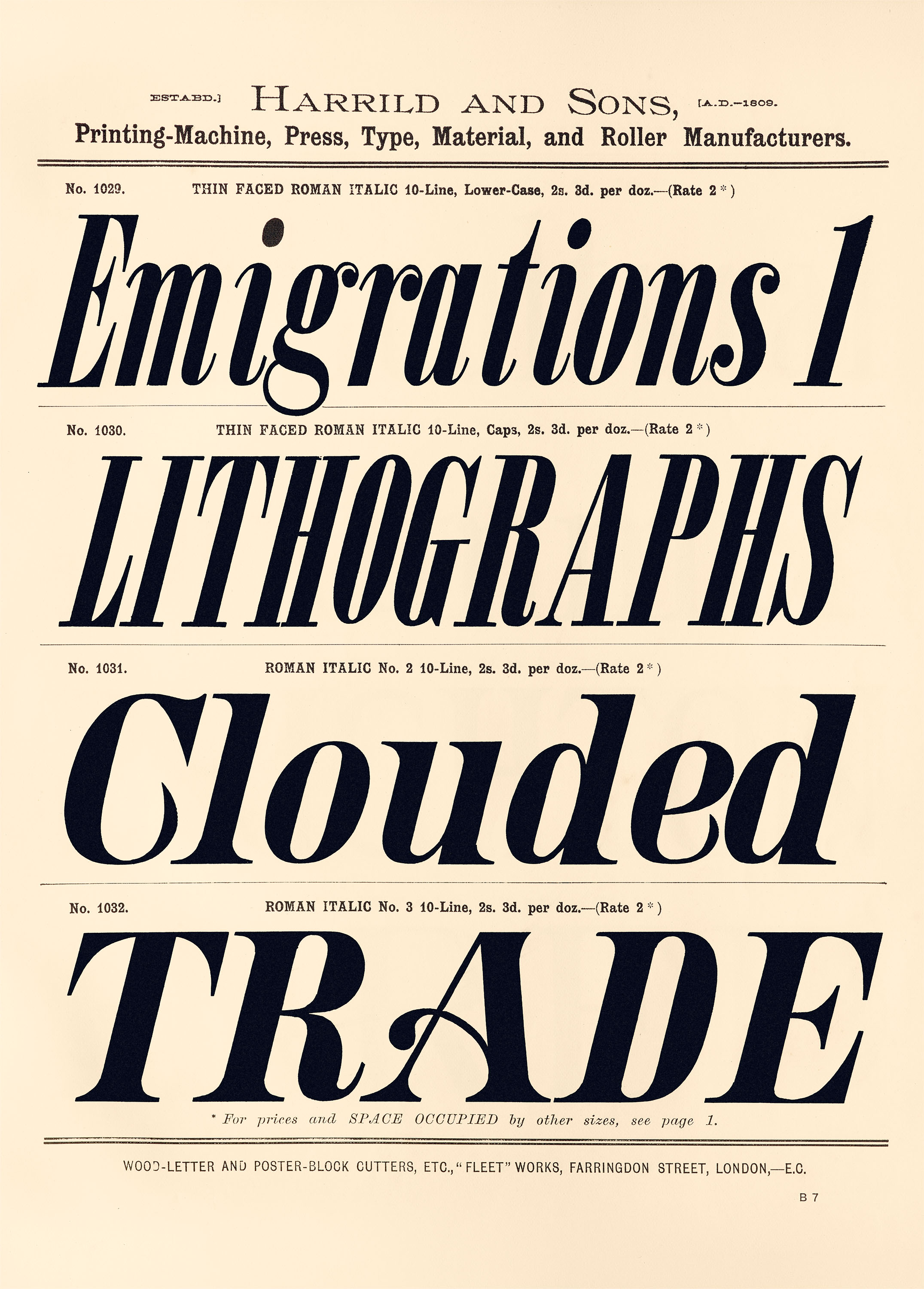
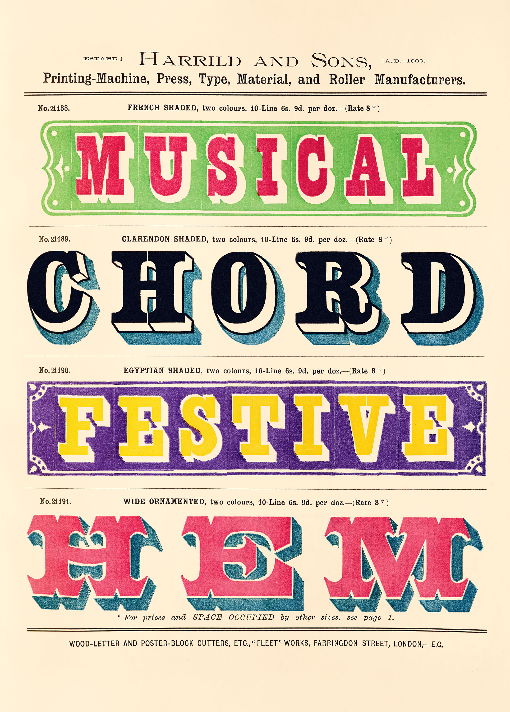
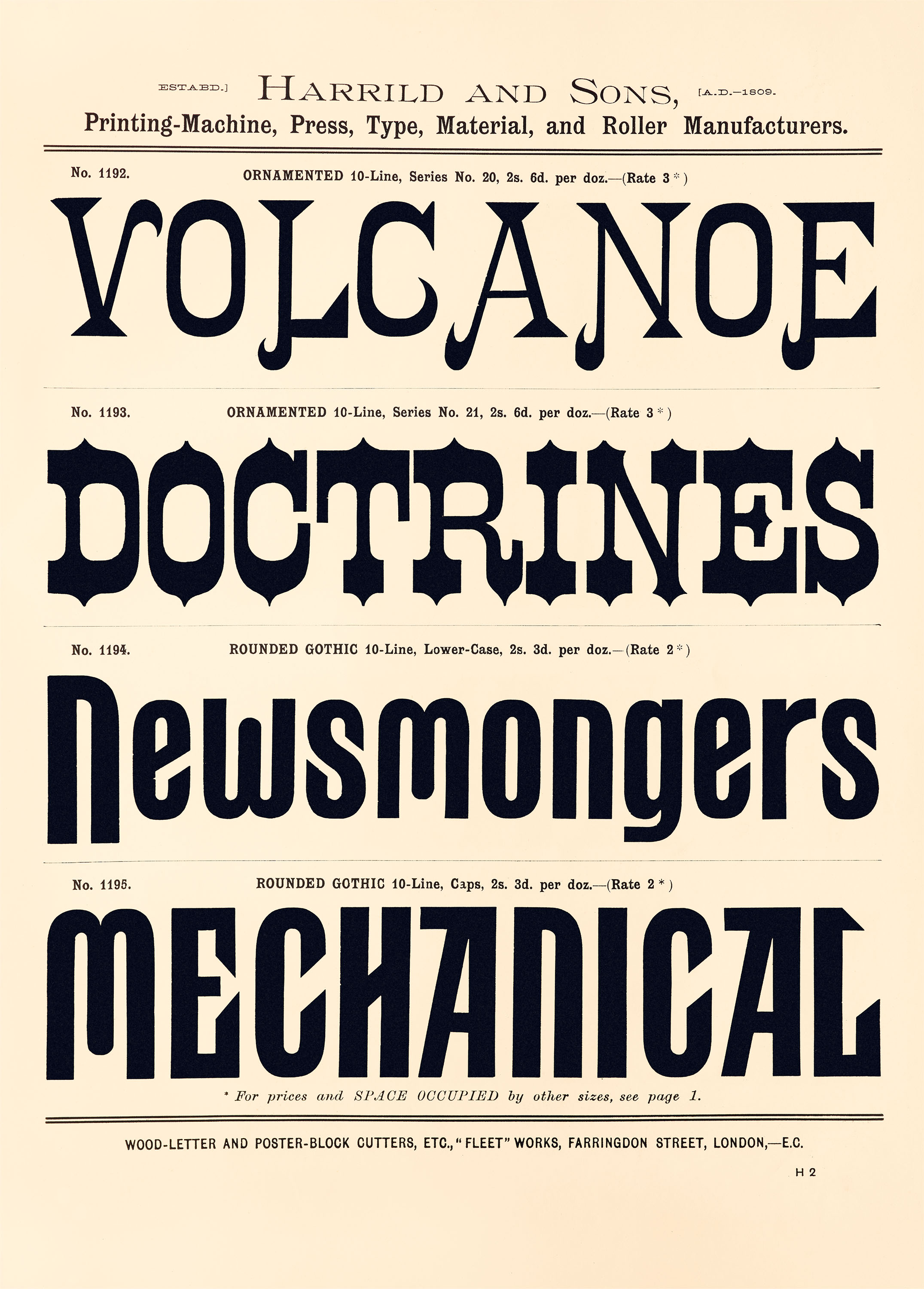
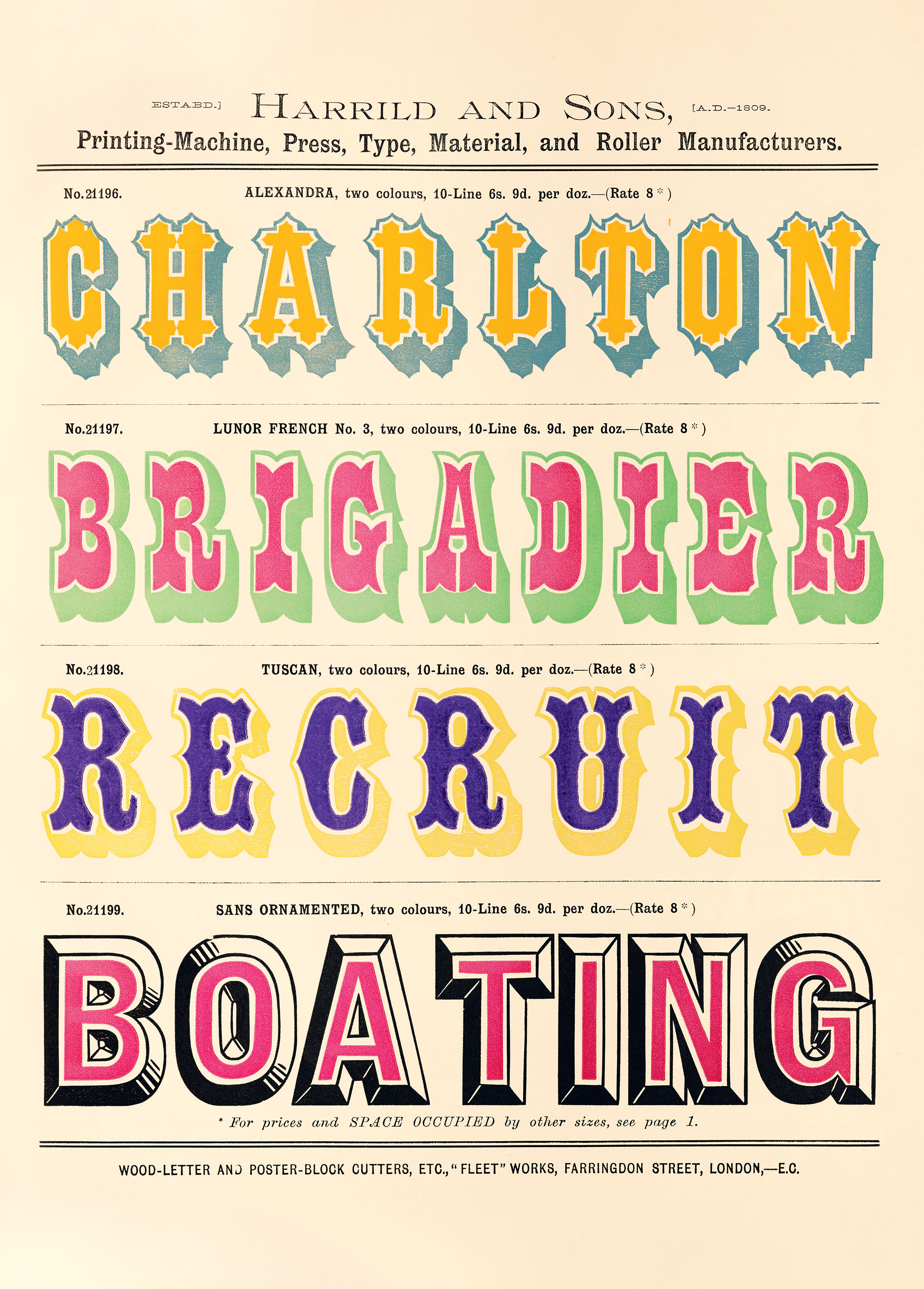
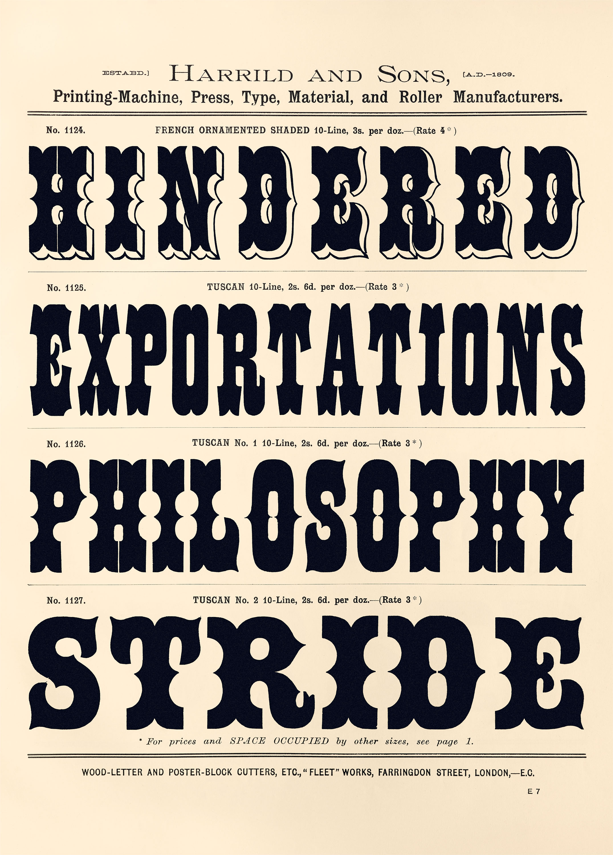
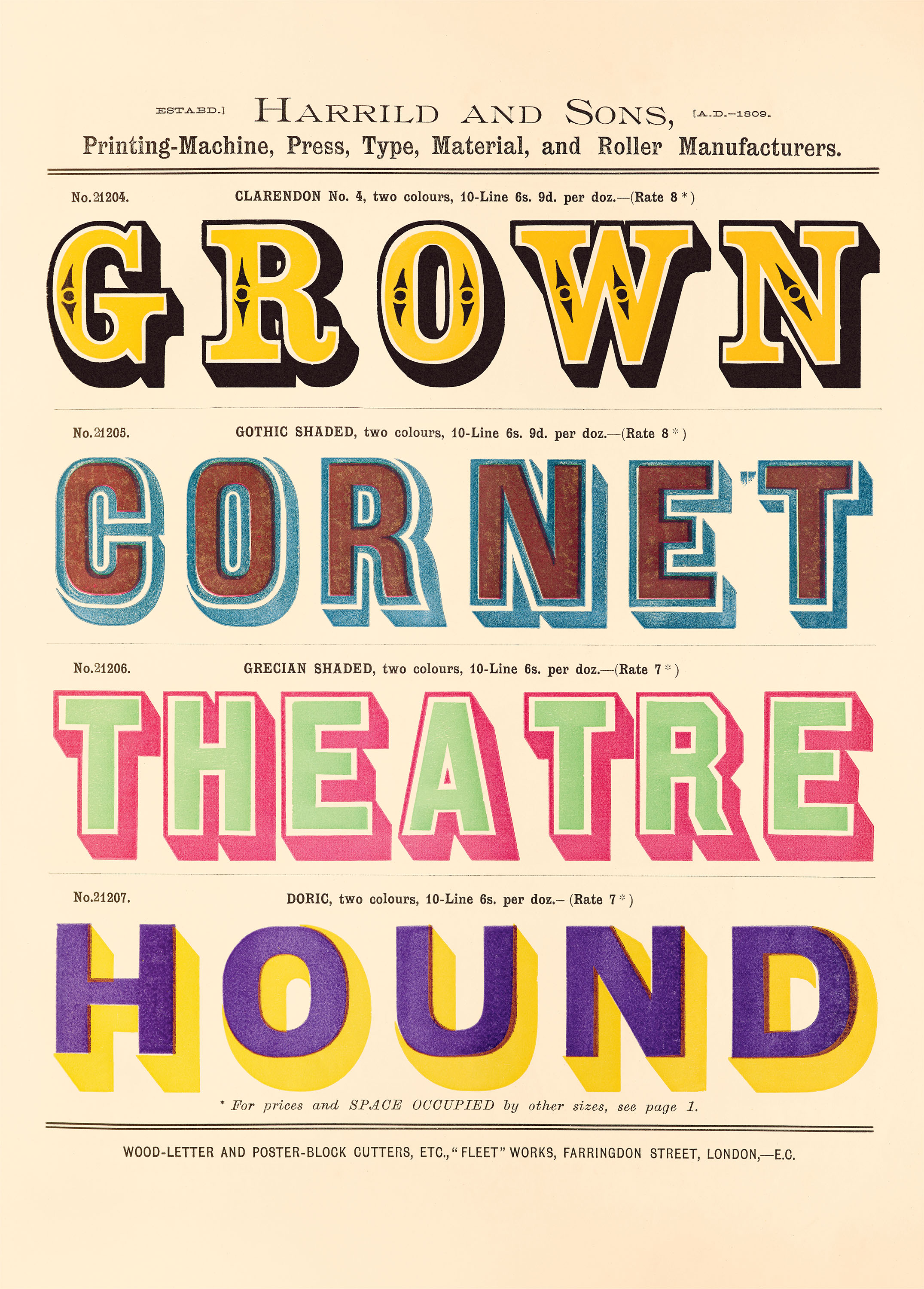
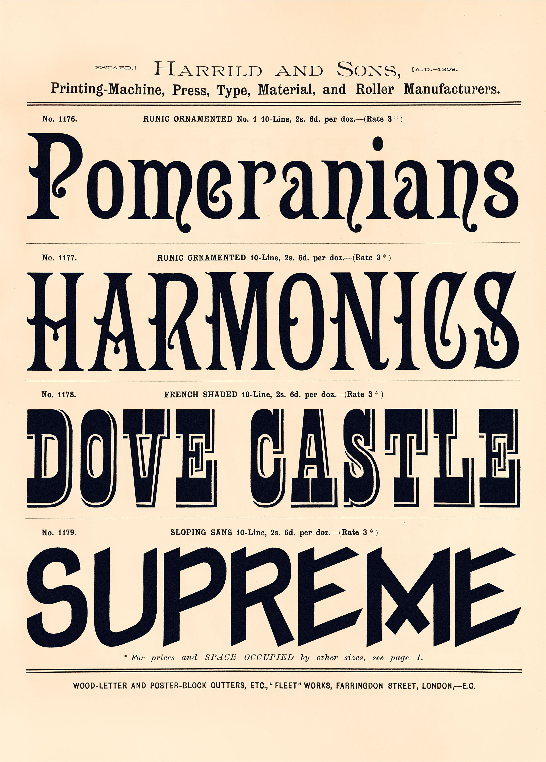
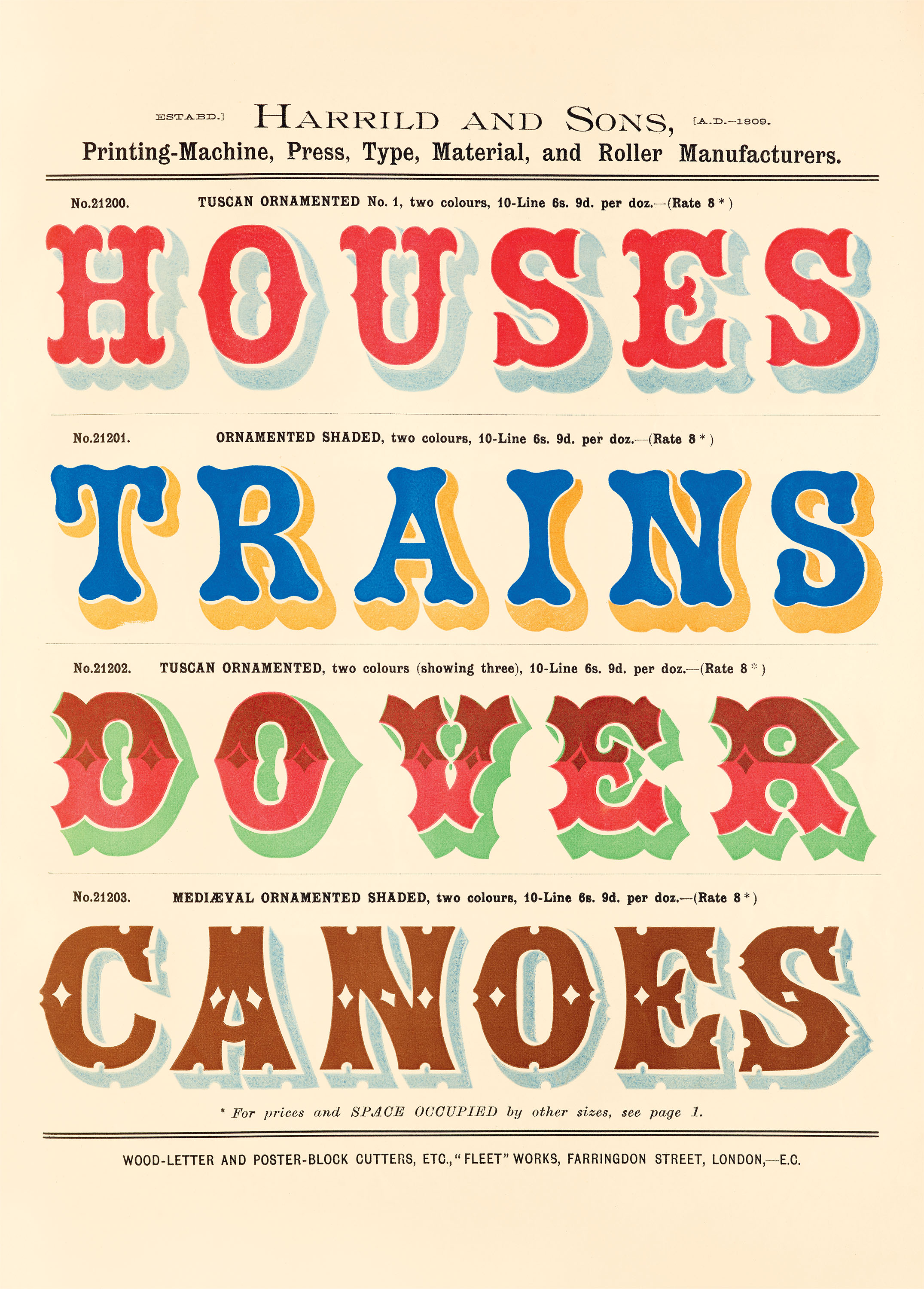
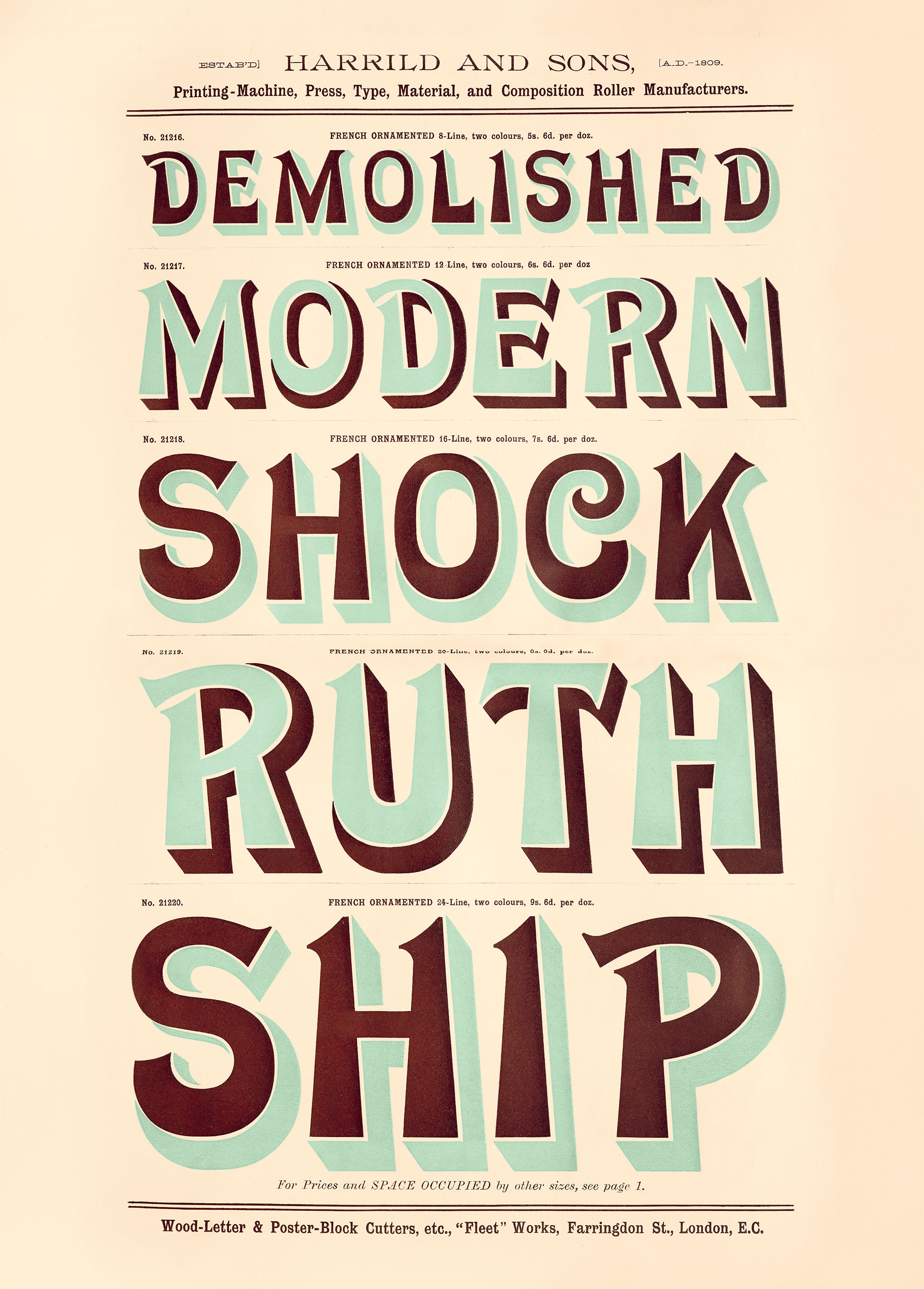
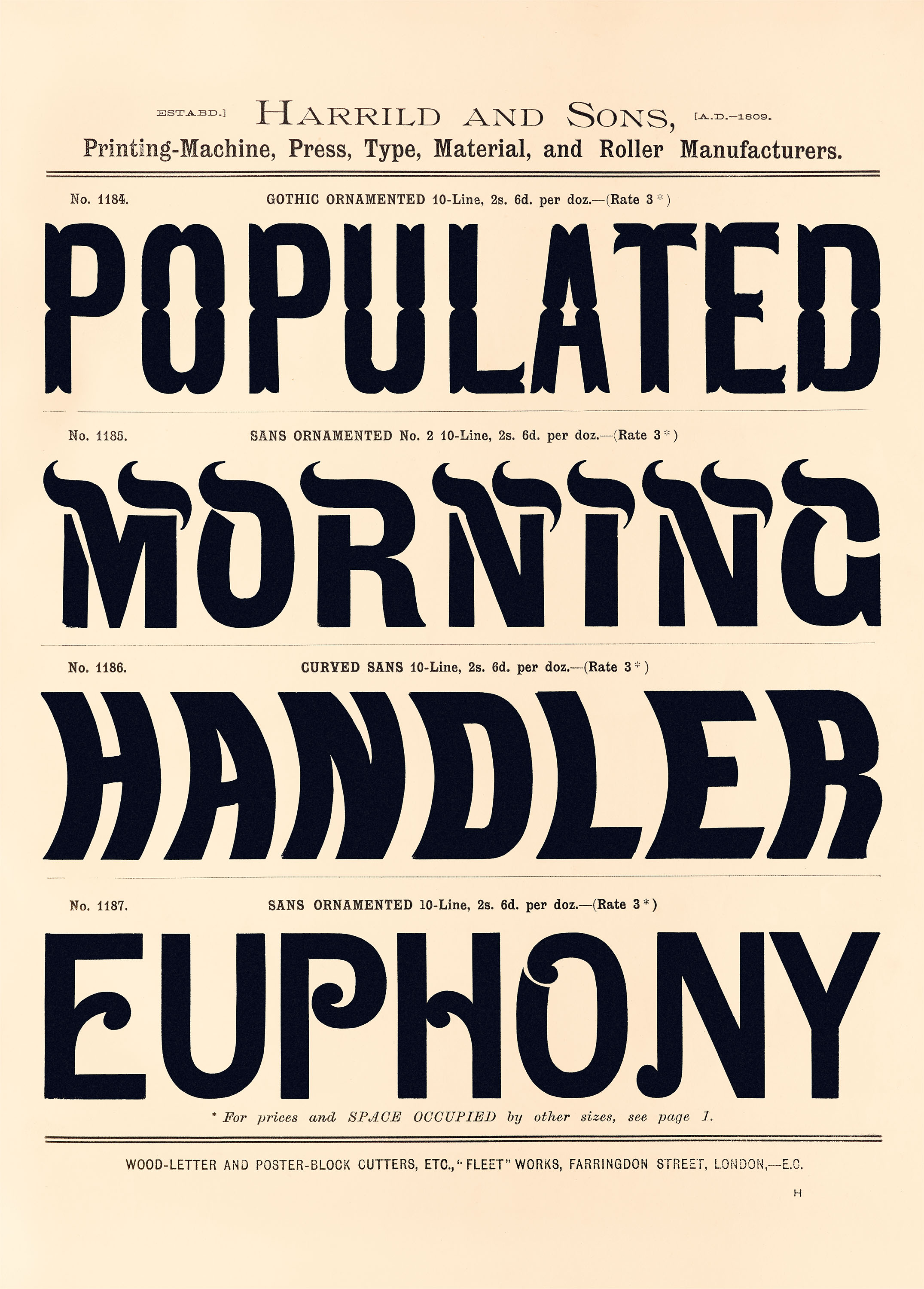
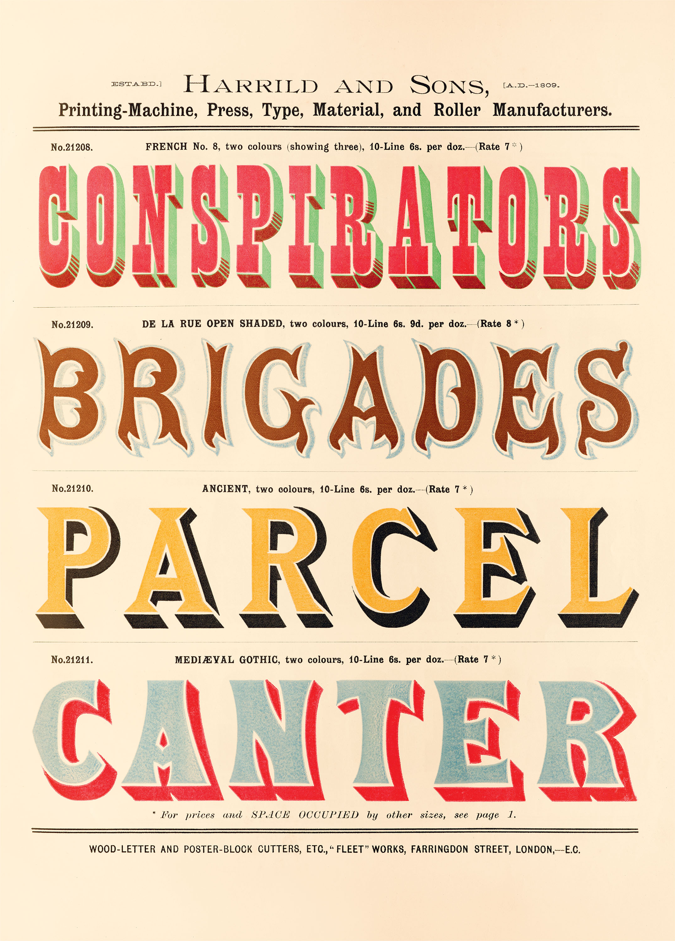
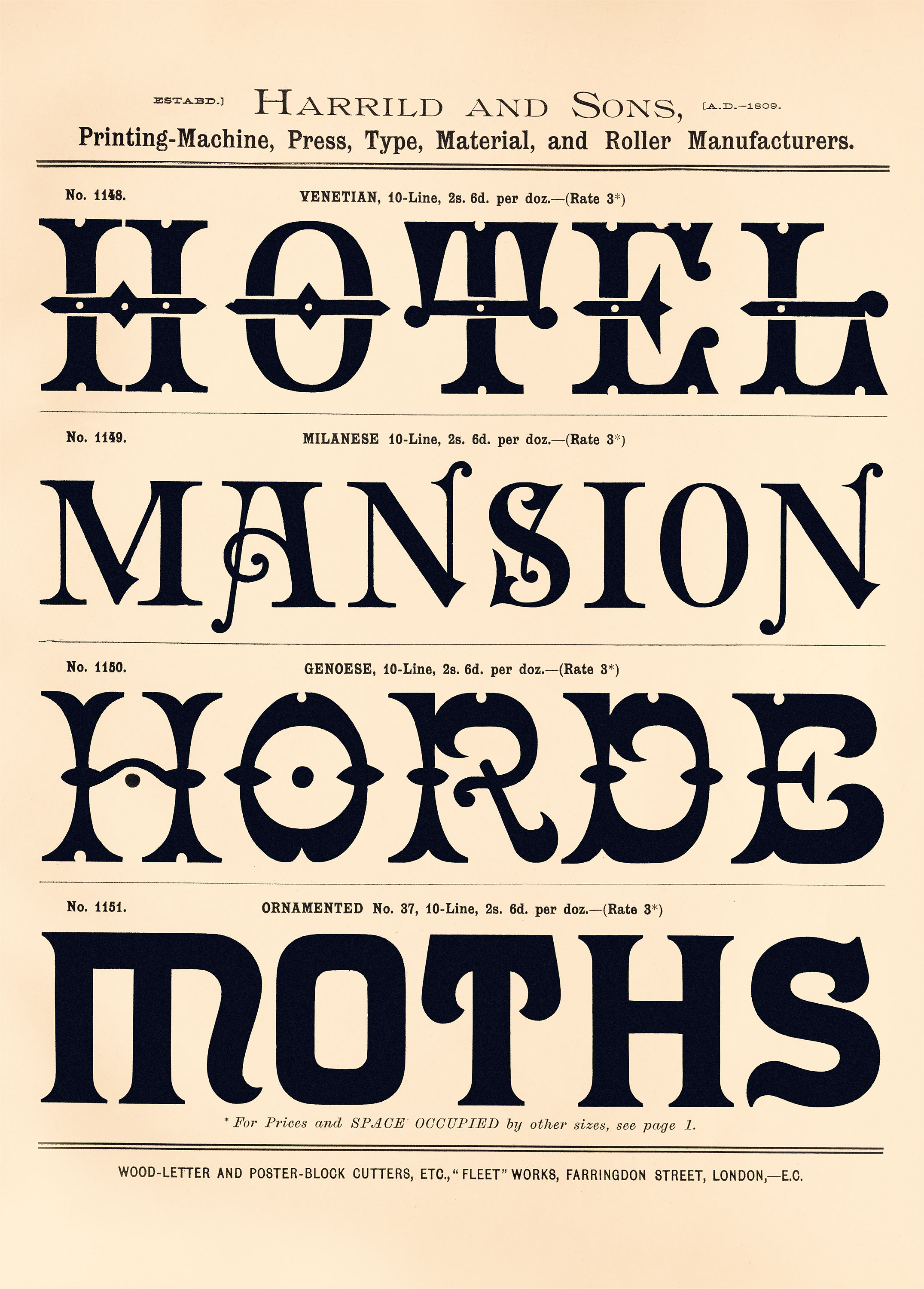
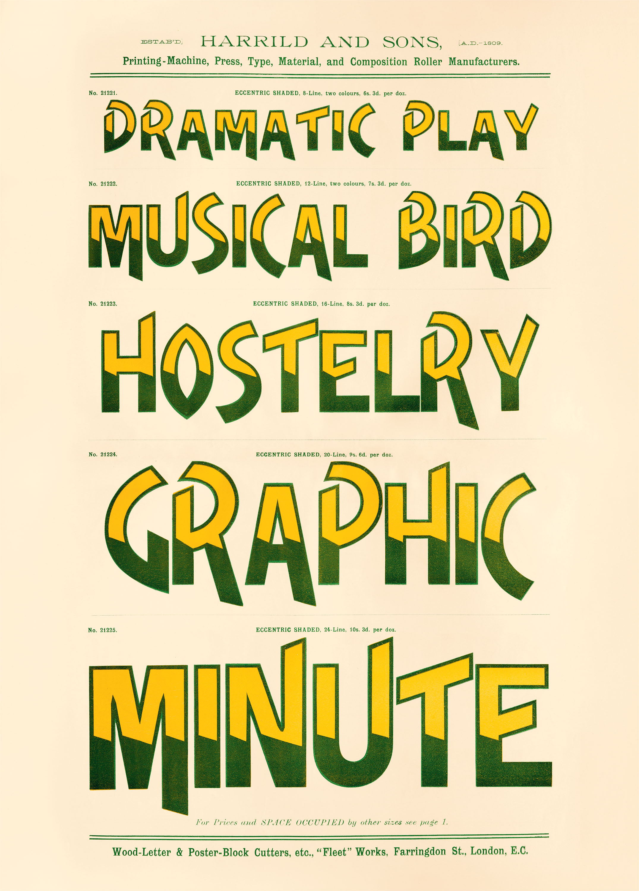
Wood Type Creative Papers gathers sixteen distinctive designs from a nineteenth-century catalog by noted purveyors of letterpress machinery Harrild & Sons. These oversize perforated sheets offer dynamic black-and-white typography, astonishing decorative fonts, and vivid chromatic letterforms, attesting to wood type’s rich and enduring appeal.
During the Industrial Revolution, rapid technological advancements transformed Europe and America into manufacturing superpowers. While laborers left rural villages for expanding urban centers, mass media thrived as mechanized production lowered printing costs and increased output. The broadside and poster emerged during this period, with eye-catching messaging in big type that appealed to modern consumers.
To create designs at these sizes, printers increasingly sought economical alternatives to large-scale metal type. Lightweight and relatively inexpensive, wood type proved ideal for colossal letterforms that stood out amid the bustling city crowds. Two New Yorkers aided in its popularization: Darius Wells (1800–1875), who in the late 1820s created a lateral router for cutting it, and William Leavenworth (1799–1860), who in 1834 enhanced Wells’s design with a pantograph that allowed for precise enlargements.
Founded across the pond in 1809 by Robert Harrild (1780–1853), Harrild & Sons became one of London’s premier manufacturers of printing equipment. They also provided the market with stylish wooden letters, as shown in the late nineteenth-century type specimen catalog featured here. As printers clamored for this new display type, producers like Harrild & Sons amplified the proportions of standard Gothic, Roman, and Antique typefaces (see sheets 2, 4, and the second row of sheet 3, respectively), but also added further flair with decorative elements, such as the notched serifs and cruciform slabs seen on the third row of sheet 1 and the playful crossbar of the A at the bottom of sheet 4.
To attract an even wider audience, printers moved beyond exaggerated scales to produce lavish ornamental typefaces, and Harrild & Sons delivered with options that reflected this Victorian taste for novelty. Their embellished alphabets featured overstated serifs, dramatic shading, and sharply contrasting line weights, all of which could be wielded by the typesetter to emphasize the message of the text (see sheets 10, 13, and 15). They also made Tuscan-style faces: Often associated with the wanted posters and saloon signs of the American West, these styles—seen in Europe and the New World alike—featured accents like bifurcated serifs, decorative spurs, and inline details (sheets 8 and 11). To demonstrate each font in use, the company’s specimen book presents four single words or short phrases per page, sometimes resulting in evocative or humorous combinations, such as “Revolting Oranges” found on sheet 3 and “Modern Shock” on sheet 12.
The rise of wood type dovetailed with chromatic type, a nineteenth-century innovation in which each letterform is composed of multiple blocks that can be independently inked in different colors, with dazzling and dimensional results. Originally developed by engraver Edmund Evans (1826–1905), chromatic wood type is believed to have first appeared in an 1841 catalog from American foundry George F. Nesbitt & Co. In 1853, Harrild’s son-in-law George Baxter (1804–1867) introduced a method for cost-effective color printing, and printers were able to enthusiastically seize on chromatic type’s possibilities. Harrild & Sons’ own chromatic specimen pages demonstrate the inventive use of two-color printing, including high-contrast drop shadows that leverage negative space for dynamic three-dimensional effects, bold decorative frames made by printing rows of modular type blocks, and skillful overprinting that blends the first and second colors into a third (see sheet 9, the first and third rows of sheet 5, and the first row of sheet 14, respectively).
By the early twentieth century, new printing techniques were revolutionizing the industry; within one hundred years, offset lithography would ultimately replace previous methods of commercial printing. Harrild & Sons continued to manufacture letterpress machinery and materials until 1949, when declining sales forced the firm to shutter. Although typography constituted only one small facet of its operations, the company’s turn-of-the-century wood type catalog demonstrates the technical ingenuity that helped foster the charming eclecticism of the Victorian era.
All images in the gallery below are hi-fi captures. Click an image to enter fullscreen view, then click or pinch to enlarge.