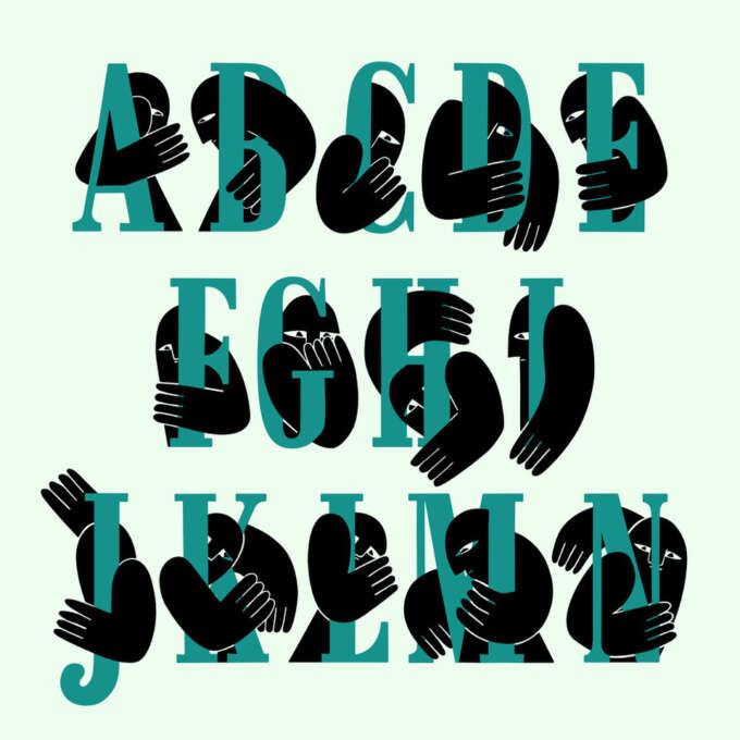
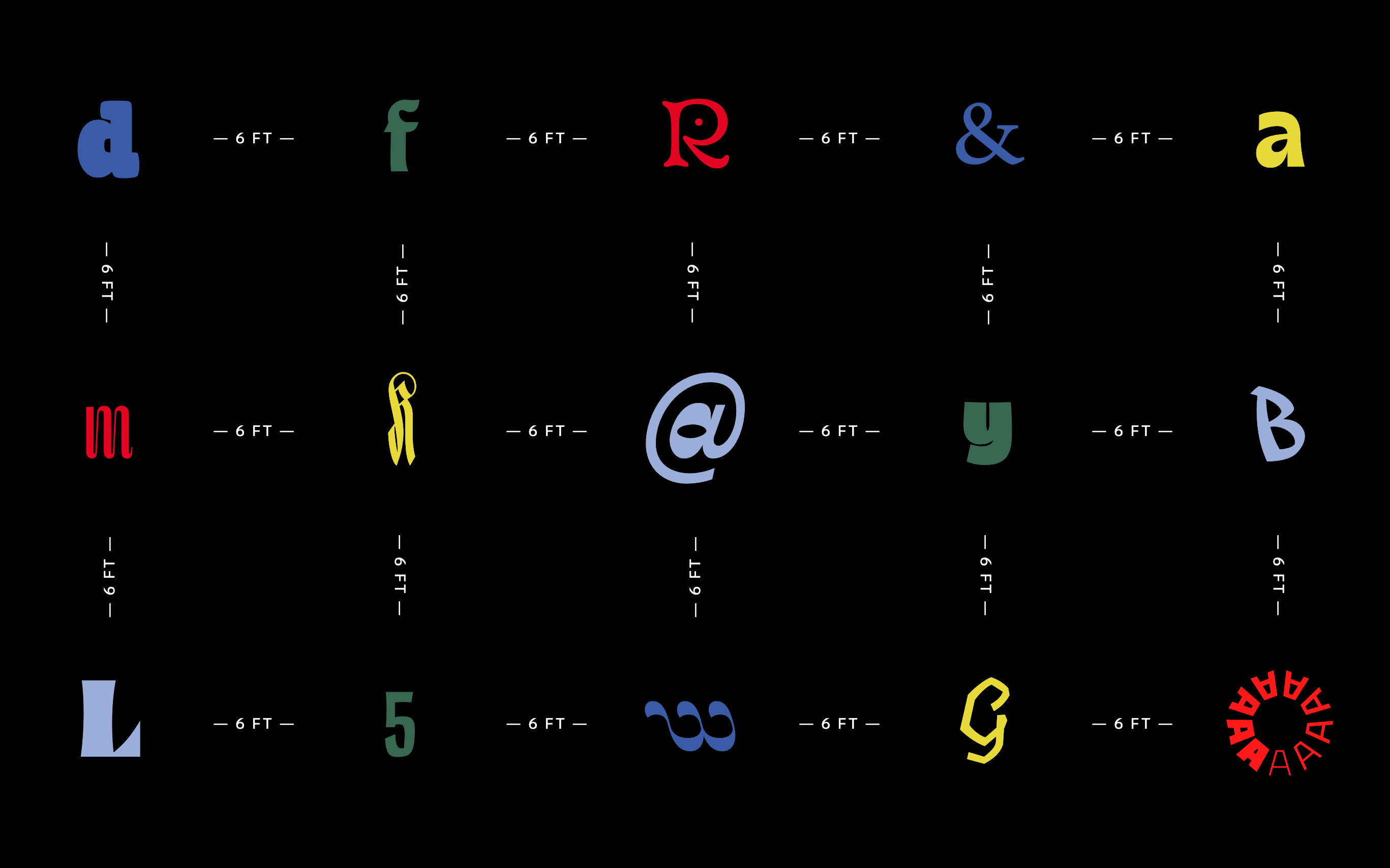
Spirit & Bones
Malutzki Initials Fonts
$40.00
MSRP:

Letterform Archive’s guide to font and typeface resources will inspire and improve your graphic design.
First, let’s get some terms straight. What’s the difference between a font and a typeface? These words used to have very clear distinctions in letterpress printing — a font was a set of metal sorts (or blocks) in a specific size and style of a typeface. This definition became muddled in the digital era where most people interact with type through a “Font” menu. So, it’s understandable why folks use these terms interchangeably, but it can be useful to distinguish them to understand where type comes from and more clearly communicate your choices. For our purposes at the Archive, here is how we define the two terms:
Typeface: the design of a set of characters
Font: the vessel for a set of characters
Put another way, the typeface describes the way the letters look, and the font is the delivery mechanism for those letters, whether it’s a set of wood blocks, a phototype film strip, or a digital file (like an OTF or WOFF). One of our favorite metaphors, coined by Nick Sherman, can help you understand the difference: a typeface is like a song, a font is the way you hear that song, be it a vinyl record, CD, or MP3. Sometimes, “font” can also refer to a single style (Bold) and/or size (12 point) within a type family (Univers), but in the clearest and most widely usable terms:
The typeface is what you see,
Norbert Florendo
and the font is what you use.
Now that we have the definitions out of the way, on this page you’ll find Archive resources to educate and inspire you as you search for the right typeface or learn to use fonts.
Character: The basic unit of written language. Can be a letter, a number, a punctuation mark or another symbol. (See Glyph.)
Typeface: The design of a set of characters. What you see when you’re looking at a page of text.
Font: The vessel for a set of characters. What you use when you create a page of text.
Foundry: A company that designs, manufactures, and/or distributes fonts.
Glyph: The visual representation of a character. A font can contain several glyphs for each letter – a lowercase ‘a’ and small cap ‘a’, for example – and can also have alternate forms, such as an ‘a’ with a swash tail. In this way, a single character can be represented by different glyphs. (see Character.)
Weight: The thickness of a stroke. In type design, the geometry of a line (or shape) is usually described using the terminology of weight, e.g., “light” or “heavy”.
Style: A stylistic member (e.g. bold, italic, condensed) of a typeface family, typically represented by a separate font.
Header image: The developing Univers, ATF, ca. 1965.
See our guide to calligraphy and lettering, and stay tuned for an upcoming page on typography (the use of type in graphic design). Sign up to get notified.
Letterform Archive workshops are short weekend or weekly courses for learning lettering, type design, or typography. See what’s coming up, onsite or online.
Ready to plunge deep into type design? Type West is a postgraduate certificate program in type design available in-person in San Francisco or online to students worldwide.
Get the latest type updates by joining our mailing list. Better yet, become a member: join our worldwide community, attend exclusive events, and get member discounts.
This section includes our best content on fonts and typefaces, from artifacts in the collection, to articles in the blog and lecture recordings.
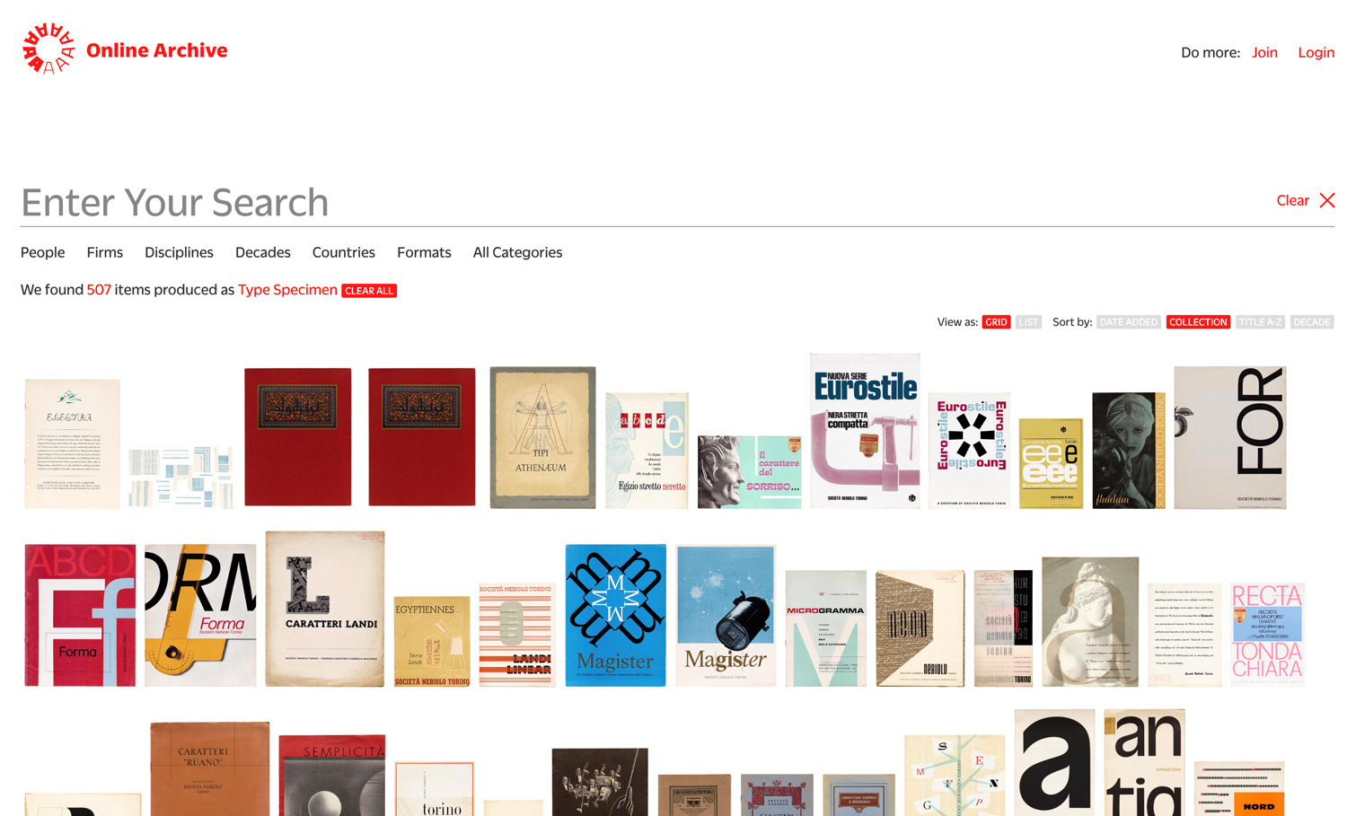
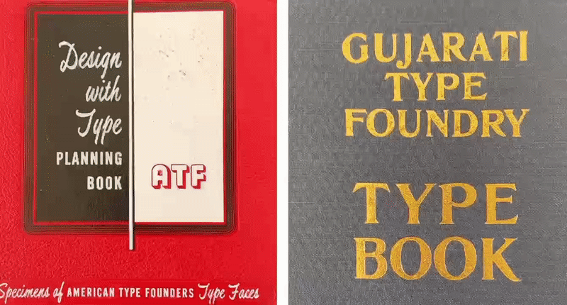
The Online Archive lets you explore Letterform Archive’s physical collection from anywhere in the world. There are hundreds of type specimen books and booklets in the OA, advertising designs in metal, wood, and digital. They offer plenty of design ideas, for both type choices and graphic design.
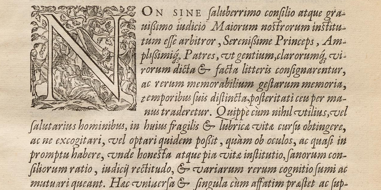
Where did Garamond Italic come from? The Archive houses books that are major developments in letterpress printing, featuring key typefaces, such as Jenson, Galliard, and Gutenberg’s type for the 42-line Bible.
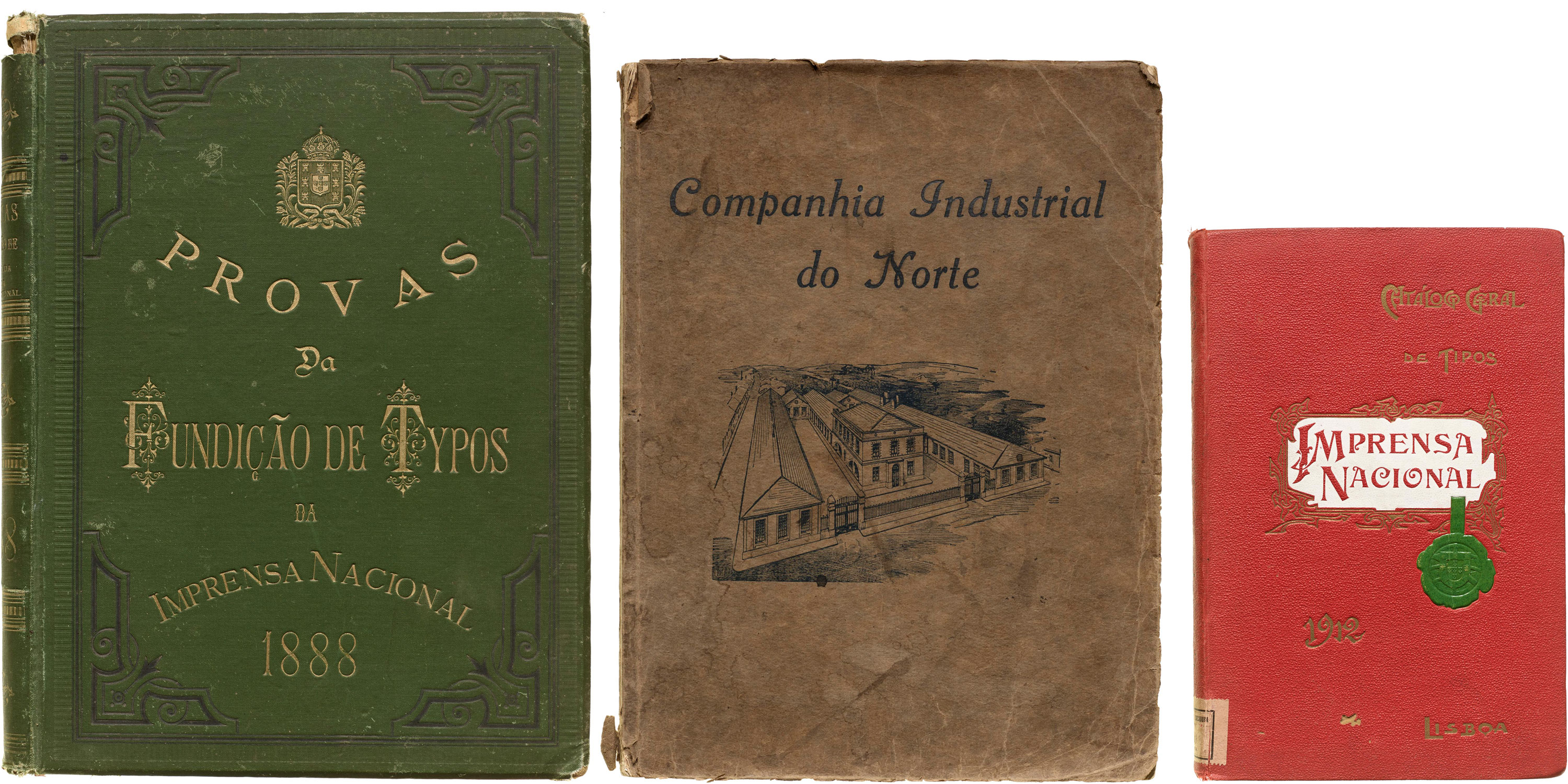
Guest expert António Fonseca surveys our collection of metal type catalogs from the foundries of Portugal.
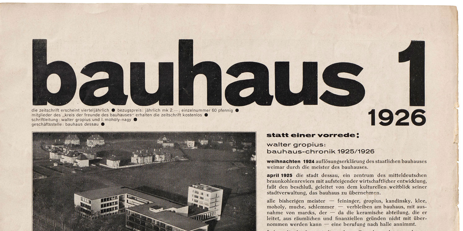
Our inaugural exhibition, Bauhaus Typography at 100, showcased the school’s influence on printed design. The Bauhaus’s main typographic story is not about inventing radical typefaces, but using existing typefaces in a radical way.
From Futura to ITC Bauhaus, our survey of Bauhaus type continues with a look at typefaces that adopted the school’s simplified, geometric ideals.
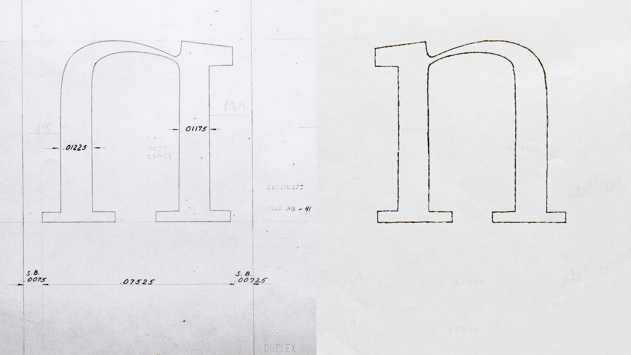
Once threatened by dispersal, over 60,000 letter templates from the British Linotype company now have a home at Letterform Archive.
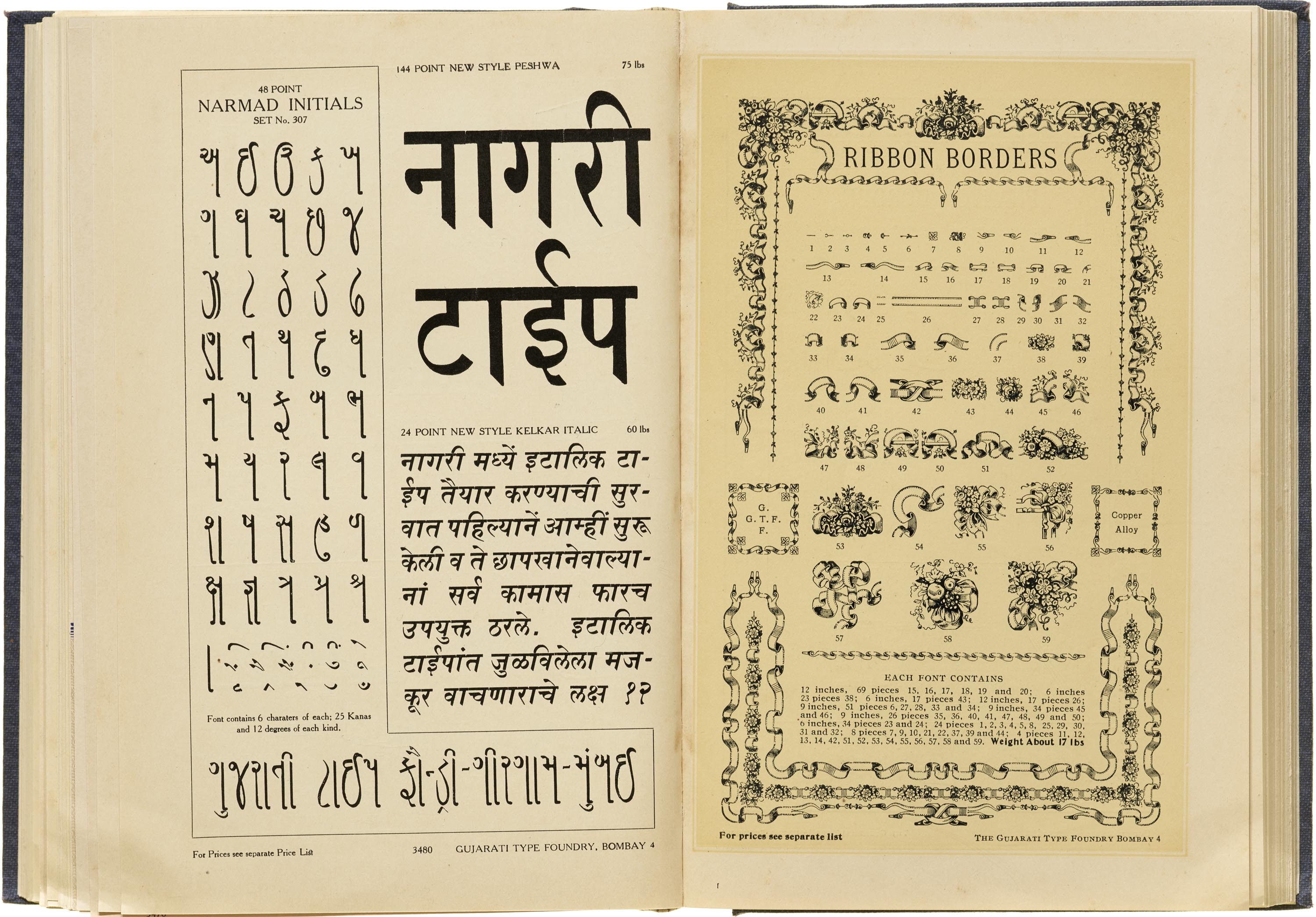
Reporting from India, Tanya George offers a glimpse into one of the country’s most extensive catalogs of locally produced metal type.
Our correspondent Tanya George dives into the Archive’s type specimen collection to explore the many ways typeface designs changed hands in the metal era.
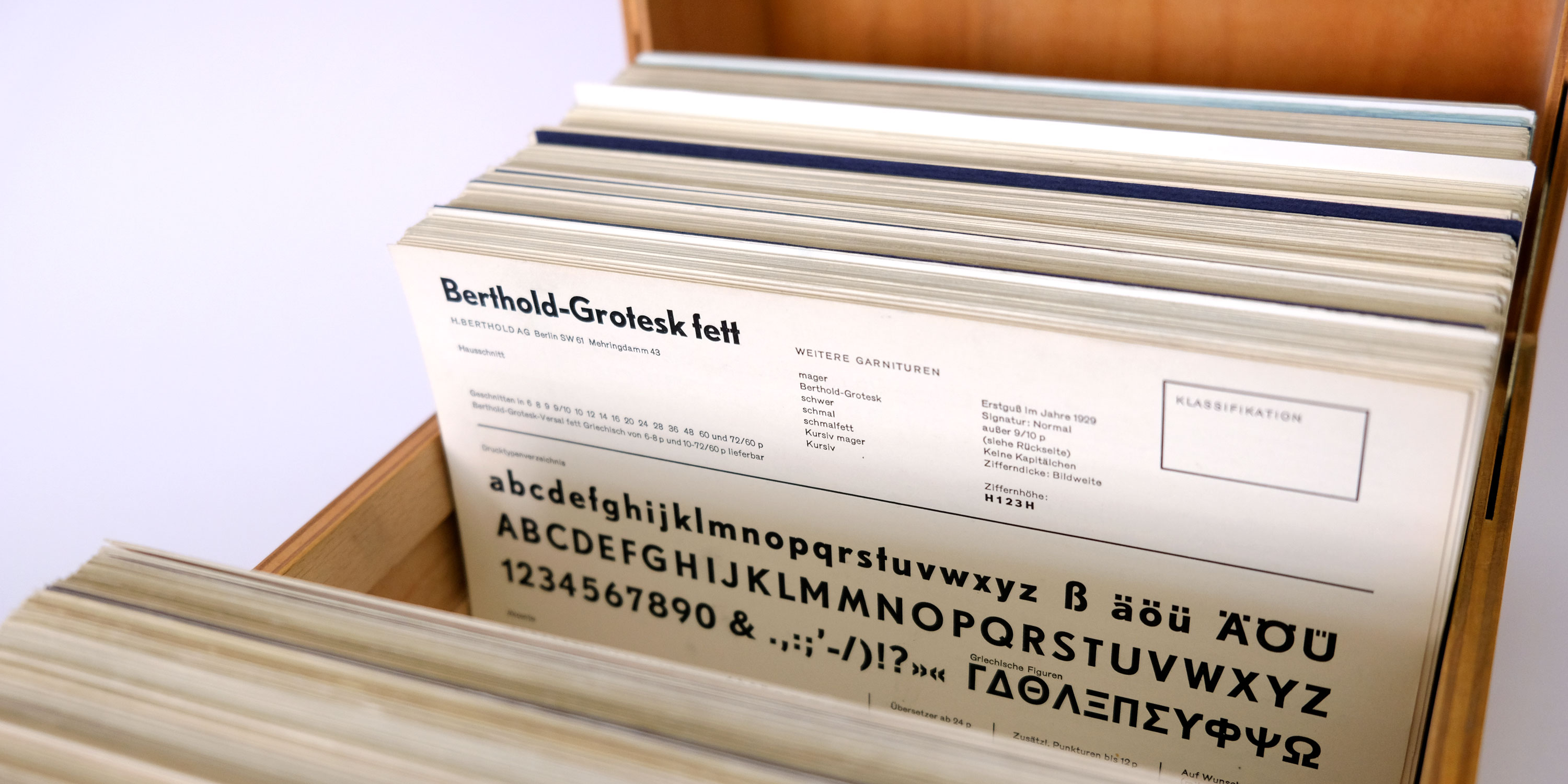
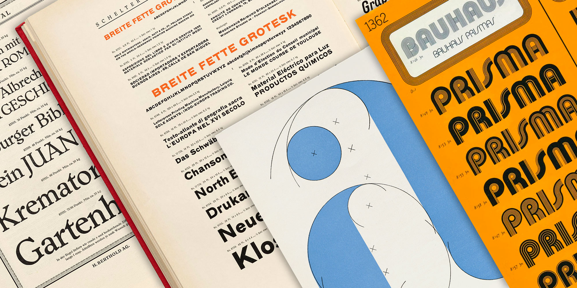
This treasure chest of 600+ specimen cards holds a complete snapshot of the last metal type foundries in Germany.
Guest researcher Anne Galperin reveals unsung contributions to a major sourcebook of mid-twentieth-century type design.
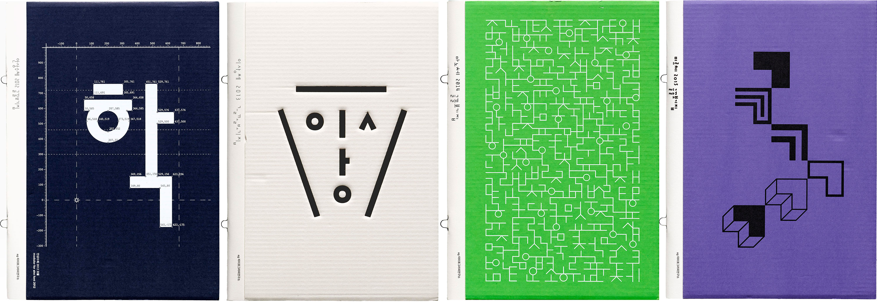
Dating back to 1985, specimens of the Korean’s digital type represent the origins of exploration and play found in Hangul design today.
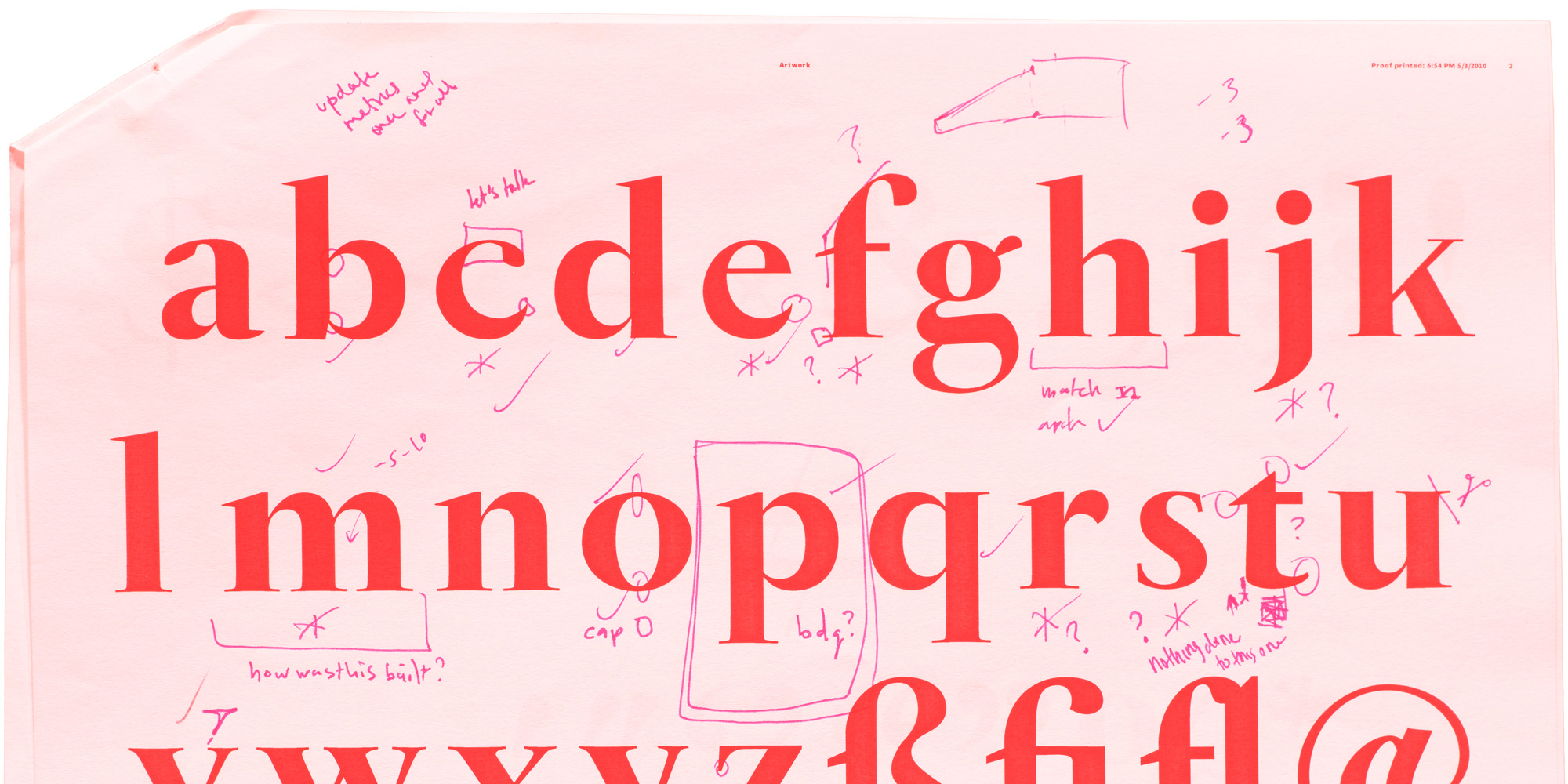
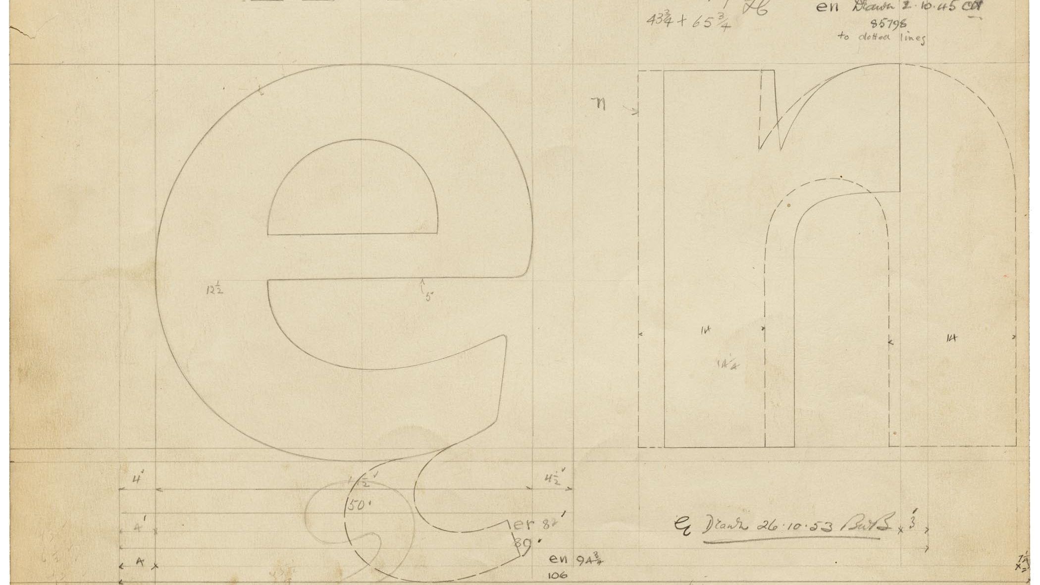
Hundreds of annotated font proofs from Joshua Darden document and illuminate the process of making typefaces.
Jim Parkinson tells us about reviving Electra for Bruce Kennett’s W. A. Dwiggins biography.
The award-winning author of Morla : Design shares her secrets for choosing the right typeface for the job.
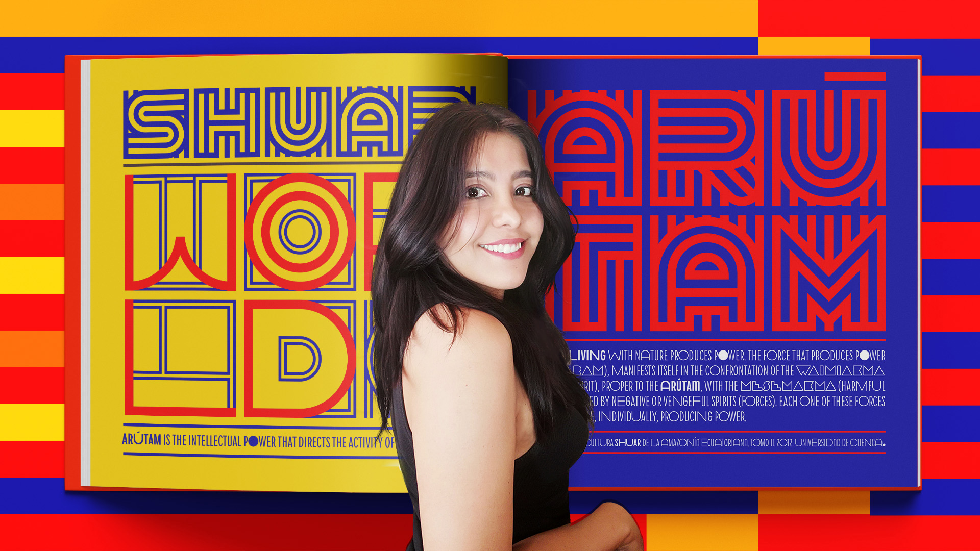
Vanessa Zúñiga Tinizaray refocuses geometric and systematic design principles on a culture far from 20th-century Europe.
Web and print specimens showcase 14 original typefaces produced by recent graduates of our yearlong program in type design.

We’re celebrating Type West alumni and 125+ original typefaces since Letterform Archive opened the first yearlong type design program on the West Coast.
Spirit & Bones
$40.00
MSRP:
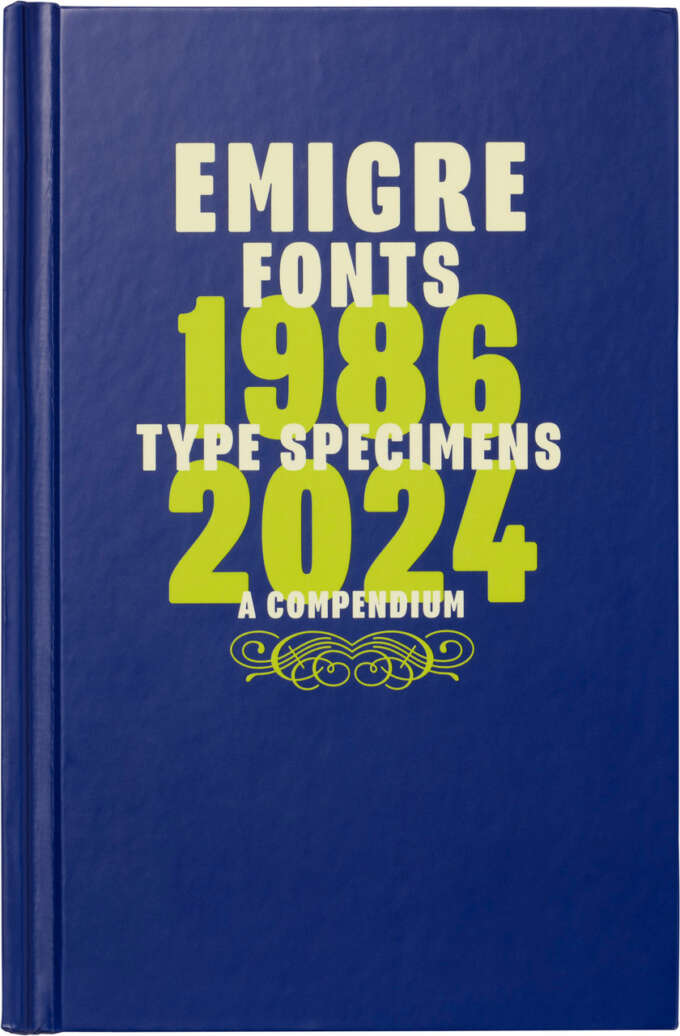
Letterform Archive
$75.00
MSRP:
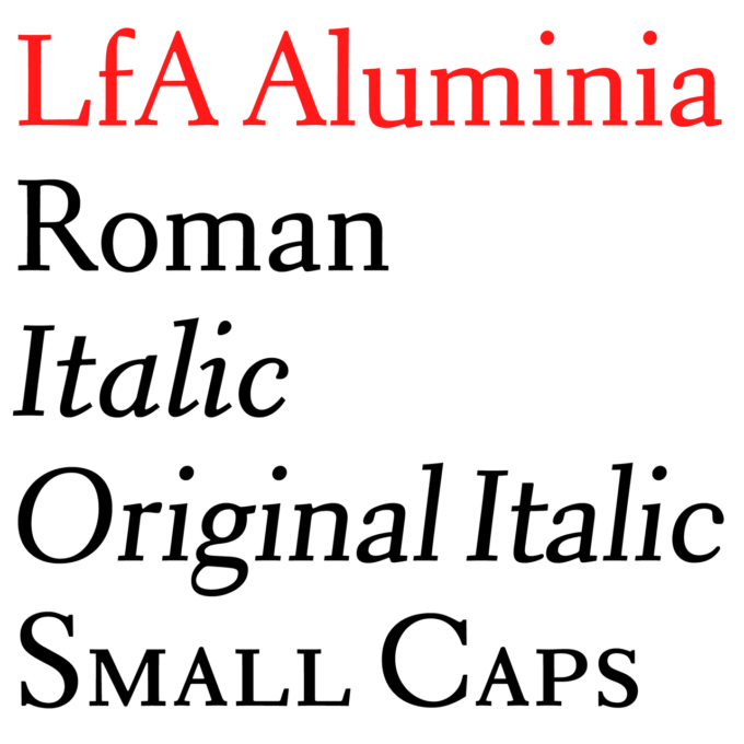
Rudy VanderLans (editor), Stephen Coles (preface), Mr. Keedy (foreword)
$75.00
MSRP:
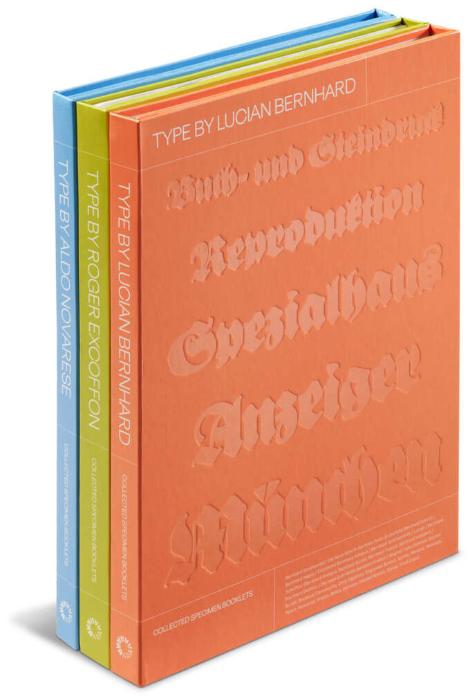
Letterform Archive
$150.00
MSRP:
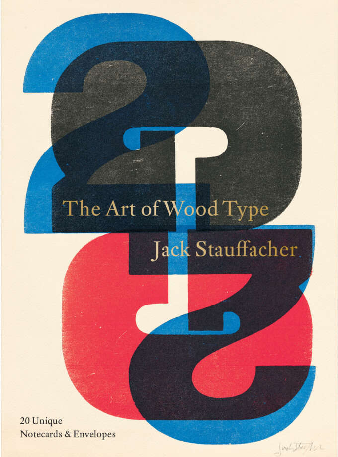
Jack Stauffacher
$19.95
MSRP:
Zuzana Licko
$120.00
MSRP:

Used & Rare Books
$350.00
MSRP:

Used & Rare Books
$125.00
MSRP:
Used & Rare Books
$125.00
MSRP:
Used & Rare Books
$100.00
MSRP:
Used & Rare Books
$100.00
MSRP: